Leaderboard
Popular Content
Showing content with the highest reputation on 08/27/2023 in all areas
-
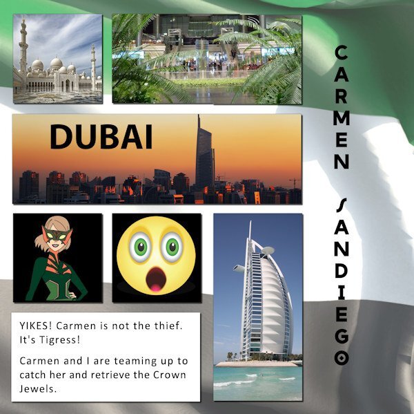
Day 5. The thief has been apprehended, and the jewels safely returned. Good work gumshoes! And thus ends another chapter of Where in the World is Carmen Sandiego. All of the pictures came from Pixabay. The Carmen and Tigress images came from DeviantArt. Red, white, and blue are the official colors of Australia. However, green and gold are the adopted colors for their sports teams.11 points
-
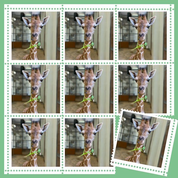
This is page 5 - visiting Ripley's Aquarium in Toronto. I incorporated the stamps to showcase the many photos I was given. Thanks to Gerry for the inspiration! I used the cass-Scattered Photos script but had to re-arrange everything anyway, but it gave me a start. The background is another photo from the aquarium but with a layer effect of Luminance (Legacy) which allowed the colors of the scatter to stand out.I will now do page 6 and incorporate it with this one into another Open Book layout.10 points
-
9 points
-
I suppose this counts for day 5 because it has a postage stamp and a postmark too. The tag from day 4 will come in day 6 otherwise it doesn't fit my photos from this trip. I used the extra template from day 6 but changed it for my needs. Just like some of you have said, a template is only a starting point. The postage stamp has an Apache (if I'm right) textile. I used very toned down colors, I first tried more different papers but for me that was too busy with all the other elements and the story. This layout gave me the opportunity to use the tire track tube and thanks to the vector workshop it was easy to make a nicely curved line for them. The highway shield I have made some time ago and I just have to put the right number on it. Ladies thanks I'm feeling ok again, not really great yet. I do not have those dizzy spell often, the last one was maybe 2 years ago.9 points
-
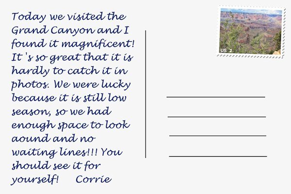
I'm getting on track now and this one counts for day 6 because I made a postcard with a little story. I used the Extra template of day 4 as a starting point but I changed it (as always) for my photos. The Grand Canyon is thrilling and the photos don't do it justice. My photos were a bit hazy because when we started out it wasn't clear, but I'm becoming a fan of the new Haze removal tool! However it should be used with care not to overdo the effect. Later in the day it became more sunny and my photos are ok from there on. I'm going to make a day 2 as well. I included a separate image of the postcard for better viewing here. On the big layout I smudged the text a bit, my cards always became smudged when they arrived. One more advantage of using email of facebook, whatsapp etc.8 points
-
8 points
-
Travel Tale -4: I used a different template so I could place the 2 pictures. better. The template is part of the Templates Carole offered during a workshop. (Template P) The pictures show the Residence Palace in my hometown Würzburg. The photos are mine, I added the date stamp and Würzburg's Coat of Arms. The Font is Franklin Gothic Heavy, which is one of the default fonts on my computer. I will work on the fine leather tag tomorrow. Here is a short description about the Residence Palace which is right downtown Würzburg. I used to sped a lot of time in the beautiful gardens to do my school home-work and feed the birds and squirrels. One of Würzburg's famous landmarks is the Würzburg Residence Palace with its Court Gardens and is considered by UNESCO as “one of the largest and most beautiful” palaces in Germany. It was built in the 18th century by the most skilled architects and artisans from all over the world, led by Balthasar Neumann. .8 points
-
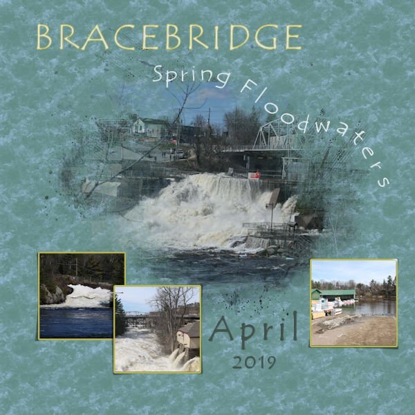
I started the Masks Workshop and decided to combine the August Palette Challenge. The pictures are my own of the heavy flow of spring melt which flooded some properties like the lumber yard in town. The Template is from the class courtesy of Alinamaria. I used the Wet Fall Leaves texture scaled to 250 to give the background a tumbling water look, and used Tempus Sans font with some kerning near the end on a vector path to give the look of the letters going over the falls. ? Both are included in PSP. Thank you Carole for all the lessons taught that I managed to learn to create this page. @Sue Thomas your Humming bird layout is beautiful and your back stories are always so interesting.7 points
-
7 points
-
7 points
-
6 points
-
I had a lot of trouble with this tutorial. It's taken me a couple of days to get these done. In fact, I tried so many different things that I'm not sure I know what I did. By the time I got a result I liked, I had no idea how I got there. For someone who usually keeps great notes, this is very frustrating. lol6 points
-
6 points
-
6 points
-
6 points
-
6 points
-
Halfway through finishing uploading my holiday photos and creating masks for them from the template, I suddenly realised that I had previously purchased Cassel's 'Clip To It' script and not only that had been useful and bound it to my layers palette! Duh! Much easier now changing the template areas to Masks. I haven't tried it yet but wondering if the photos would benefit from a drop shadow like on the pots card. I am not sure what layer to use for each Mask group in the template though.5 points
-
I do the same thing, Rene...sometimes it doesn't resemble the original when I have completed my project...but templates are a starting point. My mojo is dead...creating is not happening. I have completed each day but with the element only...no scrap pages. Day 2 I used Google maps; took a screenshot; cut out Virginia and highlighted our route.5 points
-
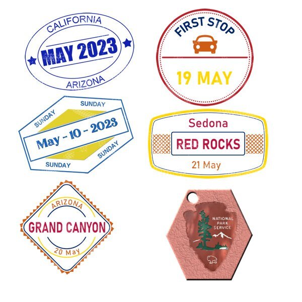
.It's Sunday and I found some time for this incredible workshop. Many thanks again, Caroline and everybody else who has posted their fantastic projects here!. This is my day one with the region shape done in what I intended to be a distressed or chalky stamped look. Not sure if it is recognizable as such but I am not too unhappy with the way the shape turned out. Supplies I used are all freebies by Robyn Denton of Dancing Tiger Designs (dancingtigerdesignsaustralia.blogspot.com) Here is my day 2 indicating the way to get to the destination. Again supplies are all by Robyn Denton, except the background by myself. My version of the day 3 prompt 'postage stamp'. Leather tag was the prompt on day 4. I'm sharing them here. [img]https://i.imgur.com/GzsnyJu.jpg[/img] I made a tutorial on how to make a chalked look (like on the day one prompt layout) in Corel PSP. You can dl my tut here. I must have mixed up something with the postage stamps.... Anyways here are the missing days, and some snail mail elements and a frame template that I am sharing here. Some more leather tags, prompt day four. These tags are a bit traveled , which happens going from France to Belgium.... Click image to download.4 points
-
4 points
-
As promised; here are my date stamps and a tag. I haven't done very much and it seems a general feeling for a lot of us. For me it was an unexpected busy week; our son had his birthday and we went over there for the day, it is about a 90 minutes drive with very busy traffic most of the way (I know for Americans/Canadians that is just around the corner). Then there came extra doctor's appointments for my husband and myself, nothing to worry about but it costs a lot of time because we have to go to town for it. Searching for a present for a friend who will be turning 80 shortly and we will celebrate with a lunch in a very posh restaurant in 2 weeks time. That resulted in another trip into town, because we couldn't find what we were looking for locally. Then in the evenings I had videocalls with my daughter and with the grands because that is the only timeframe when there is a time difference of 9 hours. And last but not least I had a spell of dizziness and wasn't able to even come out of bed for most of that day, but I don't complain it will be okay. It only means I'm hopeless behind and I'm doing the scripting course too..... I postponed lesson 4 until next week and concentrate on the Travel layouts first this weekend, at least if all goes according to plan! I have seen very lovely and diverse layouts being posted when I had a look.3 points
-
3 points
-
I have to admit I do not understand templates. When I snag a template, say one from this week, I spend too much time trying to find 4 horizontal photos and 1 vertical one (or whatever configuration) to match the template. Plus those photos might not even be my 1st choice for what I want to scrap! Well let's just say I do not understand templates for this kind of project. Here is my Day 3 page. I'm trying to do my trip in order, but it isn't quite going the way I had hoped. So, I am offered a template and told to make a postage stamp. And I tried. Spent a good long time on it, but alas! I had too many pics. I'm not sure this will stay the way it is. The top pics are really drab compared to the stamps - probably for the bevel. Maybe they need to be stamps, too. and there's a script for that! LOL! I ended up buying Stamps 3 script in the shop, and I am so thankful I did because I would still be putting the pieces together if I hadn't! I'll throw this up here in the forum and see what it looks like. Edited to add - Interesting. The page didn't crop when I saved as a .jpg. So I'll keep it tat way and see how far out my printer will print because I think it gets really close to the edge. Here's the text - it's pretty blurry at 600 Coppes Commons in Nappanee, Indiana, was originally the factory for a leading manufacturer of the famous “Hoosier Cabinet” at the turn of the 20th century. The renovated factory now houses a variety of specialty shops offering locally-made, handcrafted, and freshly-baked items and treats. Get a glimpse into the history of the Coppes Kitchens while visiting the Hoosier Cabinet museum on the 2nd floor and shopping within this rambling brick building full of twists and turns. Watch ice-cream treats freeze before your eyes with liquid nitrogen, browse the aisles of multiple boutiques, a bookstore, a toy store, contemporary clothing, handcrafted artisan pottery and soaps; sample 50 flavors of gourmet popcorn, hot soft pretzels, buy fresh baked old-fashioned goods, local cheeses & meats, hot BBQ lunches, bath & beauty products, teas & coffees, bulk foods, home and gift items.3 points
-
2 points
-
If I remember, they light mostly when they fly. If they are just immobile or walking only, they don't light (or not much). When walking down the road at night, it could be dark, but if you throw a rock in the bushes, suddenly they would start flying and lighting. Pretty impressive!2 points
-
When I was a child we'd capture them in Mason jars and create little lanterns.2 points
-
Ik heb ze ook niet gezien in het echt. Alleen op plaatjes. Het lijkt me een geweldige beleving.2 points
-
After some thought when I was outside, I came up with this for the Random challenge. I created round beads for the numbers, and a label specifically with a place to put the numbered beads. After looking at Julie's cut out page, I decided to do a cutout for the word Robin. Scalloped edge is always effective, and simple to do. I wanted the labels to be together. I thought to pin them, tape them, thread sting though them to keep them together, and thought no, it might look to busy. Any suggestions would be great, but for now I'll leave the labels as they are. This random challenge was ideal for creating a page on the cycle of the Robin, as I said I was going to do, after doing the Oriole page. Only the Wrens are left to showcase in a similar fashion. Once the Robins have fledged, like many of the Blackbirds, and some other birds, they spend several days on the ground, before taking to the trees. They are able to fly short distances, but when on the ground they aren't to far from low cover, to dash to when they feel under threat. Within 10-13 days they go from hatchlings to fledglings. I have documented that process too.2 points
-
I just started a trip my cousin's daughter took with her family last Thanksgiving to Iceland. She posts the photos on Facebook and I download to use in layouts. It appears most of them are going to be portrait instead of landscape (think she used her phone) so will have to look for templates that have more portrait spots than landscape. But most of my templates have landscape spots! Just last night I used a template with landscape spots and rotated it to make them portrait. There were 2 smaller spots that were more square and I did have 2 photos that worked in those spots. I've gotten to the point that I use templates as a starting point and by the end, they quite often they don't even look like the template!2 points
-
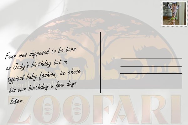
Wanting to feel like I'm making some progress, I'll post my page 3, just finished. I'm always hesitant with embellishments, preferring to showcase the photos themselves. Here daughter, Laurey, and granddaughter, Jackie, find the young rhino hilarious at the Toronto Zoo! Font is Bauhaus. Changed the background gradient.2 points
-
2 points
-
I definitely am late in getting out of the "start gate"! I know this isn't a race, but it has felt like that for me. I am really not sure, but I have the trip that Joe, Laurie and I took back in 2021 in the RV to visit family in the north and west of us. It was a great trip, I found that I can't take the heights and I am definitely a mountain girl more so than the beach. Oh, Well! I take it easy and am able to do some things. This album will be longer than usual since we had so many places we were going and I am definitely going to do more journaling. I usually journal whenever I take a trip. It does help when designing the album. All the elements and papers are mine. The 2 elements at the lower left corner and the upper right corner came from Marisa Lerrin at Pixel Scrapper. The font is Britannic Bold.2 points
-
2 points
-
2 points
-
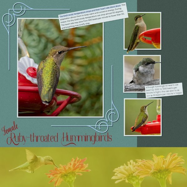
This was a quick easy one, once I found photos that had similar colours to the Palette. The norm for me is firstly choosing photos, and not the other way round. the B7b44e was used in the bottom element, where I used a photo, overlay soft light, luckily it retained most of the colour in the palette. The frames around the photos and the text paper is dce6e7. Decorative frame is 9bc0de. Background papers are 40524b and 618a84. Out of bounds, inner bevel on decorative frame, a little noise on the background papers to give a little texture. The little female in the middle photo, (I think she is a juvenile) is in a state of torpor, all fluffed up. I put their feeders out at 5.45am, as I fetch them indoors at night, as the evenings can get quite chilly, and the last thing they want is chilled feed. I gently picked her up, warmed her in my hands for a couple of minutes, placed her back on the perch, next to the feeder. She was fine, ready to start the day after a long feed of sugar water. I don't scimp on the sugar either. Every year the hummers arrive by the 3rd August, they stay for the whole of August before embarking on their long journey south. The feeders stay out until mid September just in case stragglers pass through. They are truly flying gems, with amazing powers of flight and often glittering iridescent colours. To me when they arrive, I know that Autumn is quite literally around the corner.2 points
-
Natalie, thank you for your kind words on my page. The spring melt and run off is as impressive as your layout. Superb work! I have to drive across the South Saskatchewan River to go shopping, when the rive starts the thaw, and the ice can be up to and more than 18 inches thick in places, to watch the ice flows, and to listen to the cracking of the ice and the thunderous sounds of the ice colliding with each other and the roar of the water is powerful. The old bridge is now a walking bridge, each year I take videos of ice and water flowing. I see that the melt waters can cause a lot of damage in your area. I hope there wasn't anyone hurt. Buildings can always be repaired. The South Saskatchewan river starts in the Rockies, so we also get the run off from the Rockies, which also feeds Lake Diefenbaker.1 point
-
I haven't seen any for a several years now. If I'm not mistaken, it's the males that flash in flight to attract a mate, the equivalent of our Morse code I suppose, and the brightness of his flashing. The females stay on the ground until a flashing male catches her eye, and she will respond with a flash.1 point
-
When looking at it up close, it did look puffy but then it looked cutout for me. If I look at the shadowing especially on the R, I can see that it is cutout. But if I look more at the right side of the letters (the B) it appears more puffy. Looking back on the full layout, it does look more puffy but it looks great either way!1 point
-
Love this idea and what you have done here. I have the script too so may give it a go.1 point
-
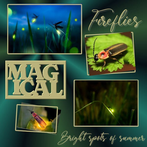
This is STUNNING Julie! I've never seen fireflies before. They look very magical. Really beautiful layout.1 point
-
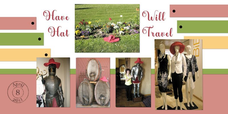
Thanks Carole for letting me know. I found it very had not to let the pictures look squeezed together, especially the barrels. I tried again today without success.. Any tips and advice will be greatly appreciated. I tried clip it, and also resizing the pictures.1 point
-
He is a cutie, isn't he. There is a video on FB of his birth. We are going back to the zoo this Fall to see him. https://www.facebook.com/nczoo Scroll down to May 26...it's pretty far down.1 point
-
This layout came about b/c I wanted to do some cutout text. I found Lab5-11 and had a go. It was straightforward and I made a made a few of them for future use. I like easy and fun. So then, last night I was watching fireflies (which are actually beetles) flitting across my backyard. They just make my heart sing and lift my spirit every time I see them. Sadly, there aren't as many as even a few years ago, but they are so delightful. Of course, it takes me back to childhood when we chased them through the fading light of dusk. The photos are found online; background has a radial gradient. Pretty basic overall. But I enjoyed doing it. (I gotta wonder if Sue T. has ever captured them on her camera or if she has them out in the west.)1 point
-
I have not worked with real leather, but my guess is that the blur would simulate different effects you would get. As you change the blur value, it will vary the sharpness of the design.1 point
-
I too will have to pass it by. I had good intentions but life has it's own design. At least we have all the prompts and can work in our own time. I actually thought we were only making one page and building on it each day with a final reveal at the end. Oops, that's shows that I am even more out of touch with what was really going on. ?1 point
-
I'm not doing the workshop but I will offer this suggestion... Rotate the template to fit your photos! A template is just a starting point and does not have to be used exactly as is. Loving all the layouts from everyone so far!1 point
-
you all have done beautiful work here is now my doublepage for day 3 and 41 point
-
1 point
-
1 point
-
Here is Travel Tale 3. The Hat really enjoyed meeting the knights that handle security at the fortress and also the good looking models (mannequins) at the store. I think it is time I shall give the hat a name. How does Mr. Red sound? Font is Anberta, Date stamp was made by following Carole's tutorial (I need more practice on that). Photos are mine, Background colors were picked from photos. I do not have the Dozi's grunge brushes and her website does not have them listed. I used the marble 2 brush as someone here recommended, than you! Sty tuned for more Travel adventures from Mr. Red.(a.k.a. Mr. Hat).1 point

Resized.thumb.jpg.d25811db03a63358cedab1e79f527635.jpg)






















.jpg.2a6a27e849c348ffb23225ac4dc04f36.jpg)

