Leaderboard
Popular Content
Showing content with the highest reputation on 07/06/2023 in all areas
-
here is my Image. It's a book review. Might be more of you have read the book. It was in 2019 America's bestseller. I've made all the attributes myself as background. And tubed the crawdad myself, which was enormously difficult. AI could not do the job. So it took some more time. But hurrah it's finished.6 points
-
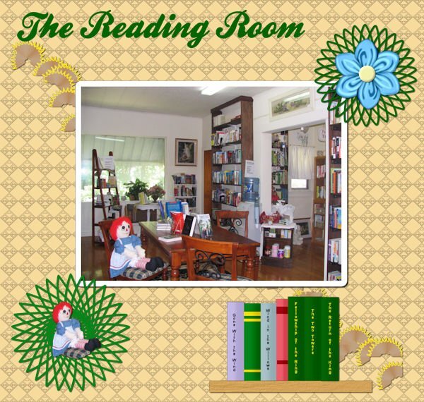
Back in the Labs until the Vector Workshop - I"m really looking forward to that! This is Lab 11 Mod 1. Requirements: Books on a shelf; pencil shavings (I made mine into a picture tube because I couldn't decide what to do with pencil shavings except put thin in the wastebasket!!! Circle Doodle - this was fun and I made several and think I might play with that again. One I put under the Cass folded flower and one I put under the Raggedy Ann Doll. The font is one of my favorites, Ballpark from CF.4 points
-
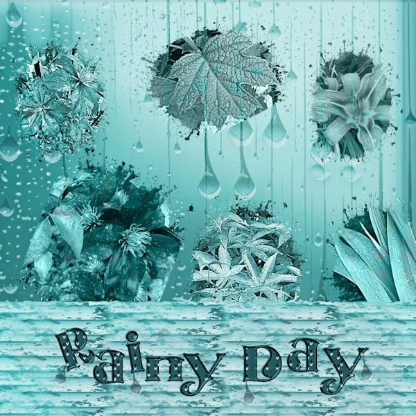
I was experimenting with Adobe Express AI and created the raindrop background. The flowers are my own photos, the wood texture is from Filter Forge. I used a blend mode for the light aqua color on the background. I thought that the bright colors of the flowers sort of clashed with the background, but by accident, the first one added turned the aqua color. I sort of liked it, so I just left it. From the Adobe background, I created a pattern and added it to the font, Centaury Display which I also beveled. The masks are my own.4 points
-
3 points
-
3 points
-
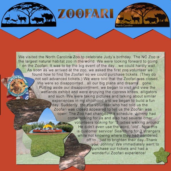
We went to the NC Zoo to celebrate our friend, Judy's, birthday. An amazing day from beginning to end. We were really looking forward to the Zoofari, an open-air truck ride to see animals in their natural habitat...up close and personal. All photos are mine. The text reads, " We visited the North Carolina Zoo to celebrate Judy’s birthday. The NC Zoo is the largest natural habitat zoo in the world. We were looking forward to going on the Zoofari. It was to be the big event of the day…we could hardly wait. As soon as we arrived at the zoo, we asked the first zoo volunteer we found how to find the Zoofari so we could purchase tickets. (They do not sell advanced tickets.) We were told that the Zoofari was closed. We were so disappointed…all our big plans and dreams…gone. Putting aside our disappointment, we began to visit and view the wetlands exhibit and were enjoying the cypress knees, alligators and such. We were taking pictures and talking about similar experiences in my childhood and we began to build a fun day. Suddenly, the zoo volunteer who had told us the Zoofari was closed appeared to tell us the Zoofari was open! The Zoo had changed the schedule. Johnny had come looking for us and also had several other volunteers looking for “3 ladies walking around”. He didn’t even use the word, “old”. Now this is customer service! Searching for 3 strangers while not knowing where they had wandered off to…just to brighten their day. Thank you, Johnny! We immediately went to purchase our tickets and had a wonderful Zoofari experience!" I used a template from Day 6, Journaling Challenge, August of 2022.3 points
-
Well, guess what? I have one more QP for the Day 8 assignment. I downloaded a few from Digital Scrapbook and this one is from Marisa Lerin called QP-Slovenia03. I decided to combine this with the Random Challenge to tell a personal story. The title font is Corlita Sans; the journaling is in Droid Serif. Behind the text I brushed some dark blue with a brush called cass-Dispersion2. The journaling is a bit small so I'll repeat it here;3 points
-
2 points
-
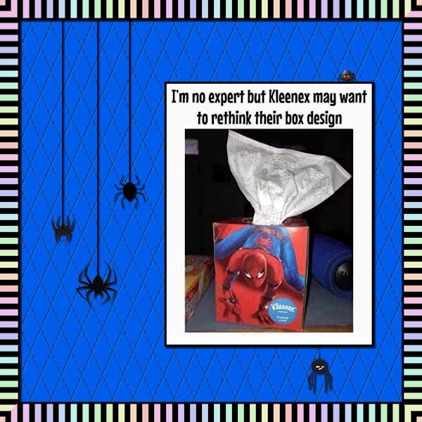
Lab 6-11 Rainbow Striped Paper (The border, with mitered corners - dont look too close, I missed on two corners) Diamond Shape Paper (the blue one) Spider Web (on the tissue paper) I'm looking forward to the vector workshop. it took me some time to get the spider web happening. Once I was following the tutorial properly I got it done. I couldnt fit it in well to the layout so I put it on the tissue paper (remember the decorated toilet paper of the 70-80's). The diamond paper; I was trying out different percentage (for size) and forgot to hide a layer and it made the cross lines appear. I liked the look. I also textured it with Effects>Texture Effects>Texture. And used the magic wand to select the diamonds and inner beveled them to give more dimension to the sparse (read: boring) layout. The spiders camer from Creative Fabrica. The photo with the quote was from Facebook and I thought it was funny. I really liked the Rainbow Striped Paper tutorial, although it is hard on the eyes.2 points
-
2 points
-
1 point
-
I = Imu. In Hawaii, an underground pit lined with hot rocks. Kalua pig, a whole hog, is cooked in an imu. It is wrapped in leaves and/or wet cloth, laid on the rocks, and buried by covering the pit with dirt or sand. And, yes, I Googled it.1 point
-
1 point
-
1 point
-
Go to the Blog and in the Drop down menu choose Themes, from there you'll have to find the correct blog and at the bottom of each "theme" blog there is a link to put your name and email in and get the shapes sent to you. I just did that, there is incredible ideas and inspirational pages in the theme part of the blog. I cant remember exactly which one had the vase preset shapes, I did download them. Sorry, I couldnt be better help.1 point
-
I too have registered for this workshop. I’m also going to put in my two penn’orth. Whether you are schooling/training a young horse, or training a border collie for sheep dog trails, the key for success is to be consistent and repetitive, until a particular discipline has been mastered. When I was in school I was taught by learning everything parrot fashion, which paid off. I suspect Carole will be using the techniques used in her masterclasses, with possibly a different approach to some techniques. I’ve said it many times before to many newbies, learn one technique at a time, until it is mastered, and not dive in to try and learn everything at once. That just creates an overwhelming confusing feeling. Using vectors isn’t any different. In my experience it's best to zoom in to have a good view of the handles, and to not to move to quickly, when using them.1 point
-
1 point
-
Really nice. I recognize that background paper too. Wowee, for getting to Lab 11. I will be starting 6-12 soon. I have so far to go. I always think of you when I'm doing labs and thinking how did you keep going. The last layout, I was a blank for ideas. It took several days to come up with something I could work with. I really like your pencil shavings, good idea to make it into a picture tube.1 point
-
1 point
-
Fine make up:))))) I've never seen so good&right on a football match.1 point
-
I went a lot less "razzle dazzle" for this one. I made the framed one back in 2016. Unfortunately, I didn't save it in layers and only had about an hour to change it up for this year. I managed to find the original stars and stripes and background in my files ~ probably downloaded from a free wallpaper site. Added a few solid papers with a bit of texture and the stars scatter (from Janet Kemp at PS). The fonts are Amaldemo (a free version of Amal) and Arista 2.0 Alternate Light (a system font).1 point
-
Sue, great job on the sta,ps….since you aren’t using the script, you *could* vary the text. Merry Christmas, for example . (Of course, I bet you say Happy Christmas, but you get the idea.). And I have a question you can answer…. I’m currently thinking about how to get some horse manure for my garden. I know where the horses live, but the properties are walled and gated off. Would it be too weird for me to put a note in their mailboxes and offer to clean out stalls if I got to keep the manure? Susan, those Labs are terrific! The rainbow stripe is eye popping, but I love that style so much! So when my corners don’t line up, I take the opposite corner where they *do* line up and copy, paste and mirror it, then zoom way in, microscopically, and place the corner where it goes, leaving absolutely no seam. (It is a trial and error, but can be done if you need it perfect). It sometimes doesn't work in perfect quarters, but in your paper’s case, I believe it will work. That Kleenex is hilarious! I’m doing some YouTube videos on drawing flowers to make my own patterns. Doodling, not really drawing. One of the videos is 48 minutes long!!! The artist is Asian, and the music is a bedtime lullaby. I don’t mind telling you I can last ALMOST 5 minutes before my eyes start closing! (So it will take me nine or 10 sessions, unless I put it at 2 x speed, but then it goes too fast for me to keep up.) This lead me to a book called “How to Draw Modern Florals”, where my complete lack of drawing talent has become obvious, but the book is awesome. My Newsletter was published in June - if you want to see https://dafflibrary.org/wp-content/uploads/2016/06/Ledger-34-2-2023-June-IDS.pdf1 point
-
I don't have anything exciting to post. Currently making the most of the great outdoors, cycling, kayaking, gardening, horsing around with my girls, taking photos and plodding my way through creating 2023 calendars, and general greeting cards. I have created some of Carole's date stamps. This one I particularly like. I create the template, in psp format. All I have to do is change the text, as it's already centered, etc and change the colours.1 point
-
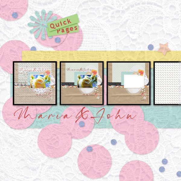
Just finished the wedding card for our neighbours that is based on one of the Quick Pages in Carole's recent workshop. They marry at the end of this week so it's timely. I have put the development stages on a template (from Marissa Lerin of Digital Scrapbook) to show from the original template supplied with the workshop to the finished card (the left hand image). I created a monogram of their initials and made a pattern for an overlay and added a lace effect texture for the background. Lightened up a few things here and there and dotted a bit of heart confetti. Voila! Typefaces 'Maria & John' = The Billion and 'Quick Pages' = Trebuchet MS Since doing the workshop I have been inspired to look at templates differently. Digital Scrapbook has a heap of them.1 point
-
Thought I would have fun with the theme today. I applied the mosaic weave effect to a plain background. The font is *TINTIN*; my Windows File Explorer is being finicky tonight so I can't search for it to tell you where I got it. Ron Payne posted a link on the FB page to a cool batch of seamless glitter patterns from CF. I used one for the text; it came along just at the right time! I found the flapper girls years ago by, I think, Mallory Carlson.1 point
-
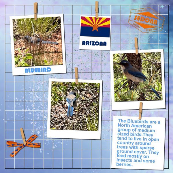
On my recent trip to the States I have visited Sedona and the Red Rocks in Arizona. While the rest of my family wanted to do part of a trail up Bell Rock I stayed behind. I walked around a little bit lower where the terrain was a bit better for me and I was taking photos of all sorts of wonderful flowers. I spotted something blue on the ground and went to investigate; it was a Bluebird but when I came nearer he flew away and sat in a tree. In the end I managed to take a couple of photos and made this layout with them. I used some of the latest freebies from Carole because I haven't had the time to play with them. I used: Hanging Photo Grid, but I changed it a bit because I only had 3 photos Date stamp 13 Days, again changed it for my needs Bow 22, a double bow and I was lucky to win that script when I was on my trip. I made a ribbon with a bluebird silhouette and one without and used those for the bow. Background consists of different layers with blendmodes of color and luminance to get a nice blue color Fonts are Bauhause and Arial1 point
-
1 point
-
Crawdads are crayfish...river lobster is a pretty close translation. "Crayfish are freshwater crustaceans belonging to the clade Astacidea, which also contains lobsters. In some locations, they are also known as baybugs, crabfish, craws, crawfish, crawdaddies, crawdads, freshwater lobsters, mountain lobsters, mudbugs, rock lobsters, signal crawfish, or yabbies." Wikipedia1 point
-
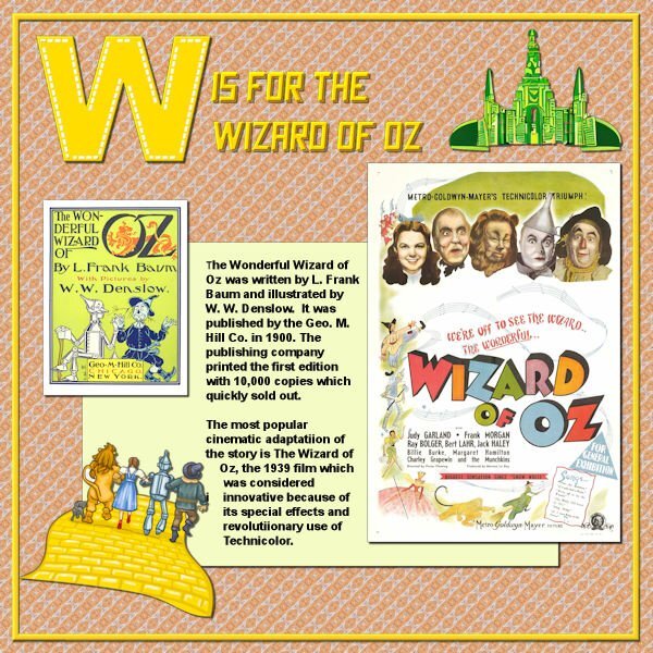
Well, I finished W. Wizard of Oz. The emerald city is extracted from a CF Spark png I asked for, the yellow brick road with the travellers on it is from a clip art, the font is Crash Demons from CF; the poster and the book cover are from Wikipedia and the journaling was extracted from that site; the papers and the W are mine.1 point
-
1 point
-
1 point
-
1 point
-
I wanted to have a go at this. I decided to go with the flow and use purple! Images all from online and only papers I made with some torn edges. Font is Bombshell Pro. I'm not that big a Coco Chanel fan, but I do adore some of the fragrances and have a few in my collection. I just couldn't think of another subject for the layout.1 point
-
1 point
-
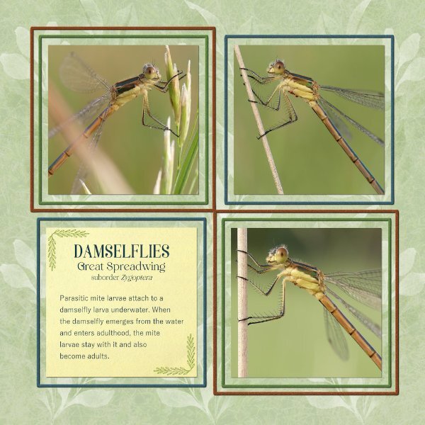
wow what an interesting insect, great use of the sketch here is mine, I used the warp tool to make the two papers uneven font is Underwater World1 point
-
1 point
-
1 point
-
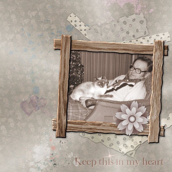
I did another layout for Father's Day, this time using a more up-to-date photo of my Dad (Rudy with his kitty in his favourite worn out chair). I started with Merisa Lerin's Yesteryear paper for the background, then threw in some splatters and splashes (b/c I like to). I added a Starburst overlay that I created from the Tutorial that Carole recently highlighted. I made the rustic wood frame from Lab 13-6 (which took me a bit of time to get shadows sorted, and looking at it, not sure I got 'em right), and I made the punched out paper strips from the same Lab module. I used the flower to cover a glass ashtray by the chair rather than cropping. It took an unconscionably long time to do, but it's done.1 point
-
This is my take on remembering my father on Father's Day. I have pictures of Rudy as I knew him (when older), but I have such a soft spot for this photo of him (from his passport) when he looks so young and vulnerable. He was beset with many trials when he was young (in Europe), but he became a gentle and kind man despite the challenges. My dad....? I used several backgrounds of paint splashes and splatters b/c I love using them. The background paper is from Digital Scrapbooking (M. Lerin, yesteryear) and lots of recoloring and blending. None of the materials used are mine, except the bevelled frame. I like ripped and torn pieces and asymmetrical designs.1 point


Resized.thumb.jpg.d25811db03a63358cedab1e79f527635.jpg)
