Leaderboard
Popular Content
Showing content with the highest reputation on 06/19/2023 in all areas
-
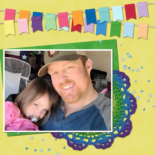
I'm in for some revision because I always take ages doing a page! For this first layout I have taken the decoration literally as the crochet doilie is the same colour as a beanie I made for my cousin, who at the beginning of the year was undergoing chemotherapy. Beanie shown here on the wrapping paper I sent it to her in.9 points
-
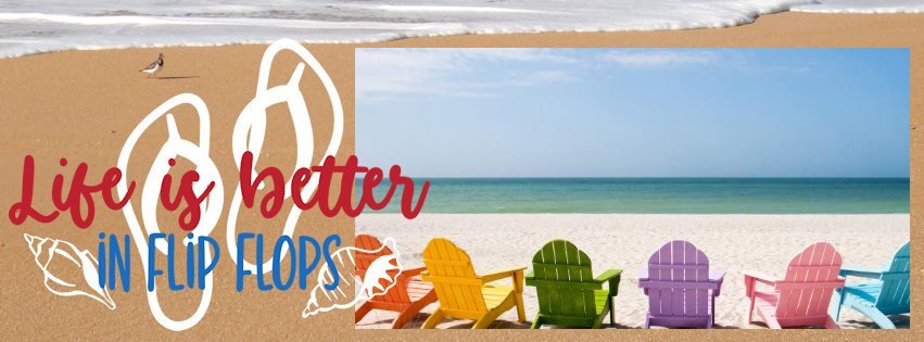
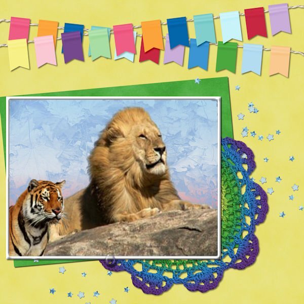
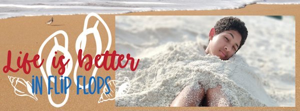
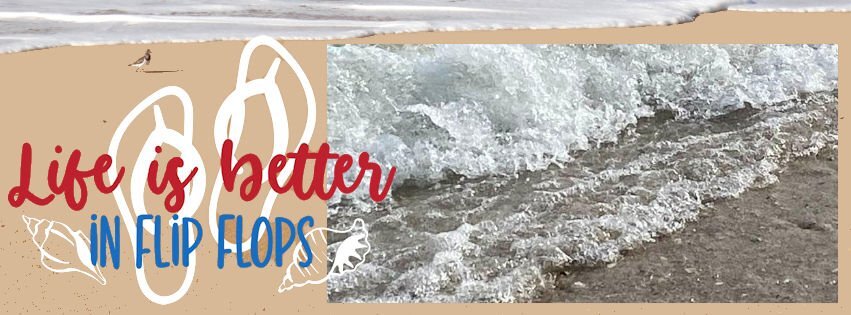
Since I don't scrapbook, I chose the FB cover layout. It takes me SO long to find an image, so what should've been 5 minutes of work turned into something longer. I'm not organized enough, and I don't have a sufficient number of my own pix to choose from. But hey, it's about the fun, right? (BTW, flip-flops not my thing. Too tricky to walk in outside of the house.)8 points
-
7 points
-
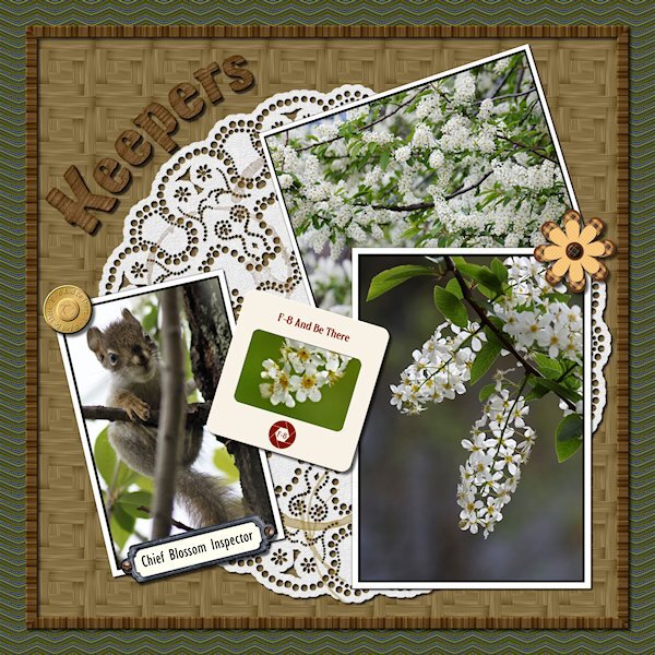
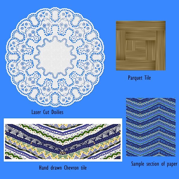
Lab 6-10 Hand Drawn Chevrons Laser Cut Doilies Parquet This was a fun Lab. My hand drawn chevrons were too busy so I had to make them really small in the layout (background paper). Good learning for next time. Fun to make though. The doily was cool how it comes together. Thanks to great directions I managed to get it done. Again, i was a little too ambitious with the design. My favorite was the parquet tile. Funny, I neve liked parquet floor, but I loved this tutorial. the color I chose makes it look like bambo (albeit a little darker). I used the original tile (used to make the parquet square tile, which is used as a pattern for a paper) to make a frame around the "table" my pictures are on. I used an alpha instead of a font and changed the color a bit to match and really liked the look. Go Alphas! Here's the deets: Flower/brass button/slide frame: from my kit in the Build a Kit workshop Bookplate: KMRD-A Good Day-bookplate (Digital Scrapbook) Screws: cass-screwheads (picture tube) from Creation Cassel Alpha: Digi-Dewi-Kumbaya Photos: mine7 points
-
I'm in too. As I do not shoot many horizontal photos I must make a choice from what's in my stock. I only have a cellphone to take photos. But here is my first result. Quickpage 1 is made in the psp2023 I changed the background, the original had a uni color blue as the sky, not so interesting. Quickpage 2 is made in the 2020 edition of PSP. I made an edge with a bevel of 15,8,8. font s name is Butterfly with shadows 1,1,60,1.6 points
-
I received a surprise gift in the mail from one of the big aquarium supply houses that I buy from. This is a hand-painted portrait on canvas of my first Betta, Sampson. He's called a Veiltail which was the prevailing style of Betta in the early stages of the hobby. I photographed it to show it to others and now decided to frame it using the Painted Frame 1 script that I just bought. The background paper is from my Beach Life kit by Tracey B Creations.6 points
-
5 points
-
Hi all, I have a little bit free time, so I decide to enjoy the workshop here is my 1st page photo is mine, font is Arnold Story I used a fine brush under the text for better reading5 points
-
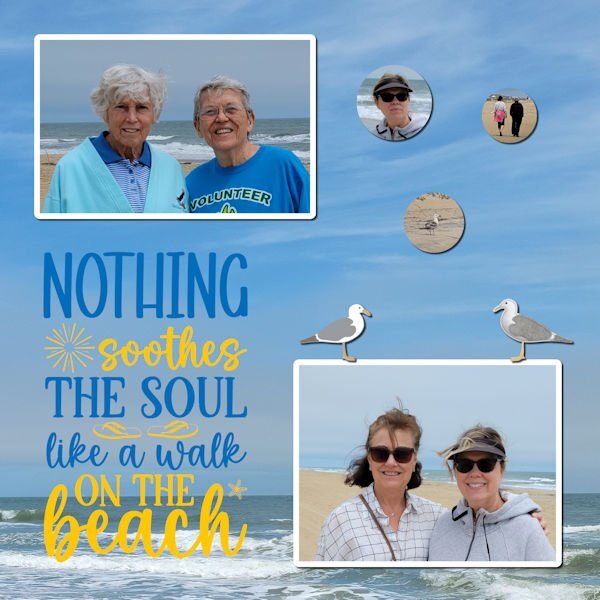
June 1 - 4 four of us went to the beach for a "girl's weekend". We had a wonderful time playing games, pickleball, walking the beach and eating ice cream. It was drizzley, cold and windy but they weather couldn't stop all the fun. 20 minutes away it was sunny and warm and we had a blast in a pickleball tournament. This layout shows us on the beach.5 points
-
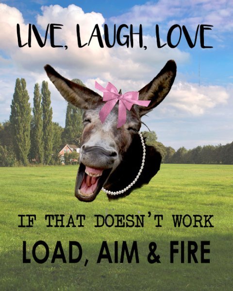
I downloaded a $1 special from creativefabrica (https://www.creativefabrica.com/product/animal-jokes-sublimation-bundle/)and this developed from one of the paged from that. The original one had a cute cow and no background. My 81 year old Sister has always loved the Live, Laugh, Love saying and she also aced her Concealed Carry shooting test. I sent her a picture of the original and this evolved from there. She wanted it made with a Jackass, but I think this is a mule picture that I have no idea where I got it from some time ago. I did add the bows and pearls so that it was obvious that it was a female. She loves it and is going to print it and put it in a 8x10 frame.5 points
-
5 points
-
4 points
-
4 points
-
4 points
-
4 points
-
4 points
-
3 points
-
I'd like that too. I dont use it as often as I want. I still have much to learn about PSP. It's hard to find the time to fit everying in that I want to learn.3 points
-
Weird to get complaints about FF, I know I had asked for it(the class). If you have something I dont have or do, it's still interesting to me to see what it's about so I know if I want to get it or not. And usually later on, it does become something I want and I am pretty grateful there's a workshop on it.3 points
-
I have considered doing a class on making fonts, but it would involve a paid program so I am not sure how well-received that would be (I got some complaints when I did classes on Filter Forge). On the other hand, making an alpha is so much simpler and very accessible to all. Maybe that can be another class!?3 points
-
3 points
-
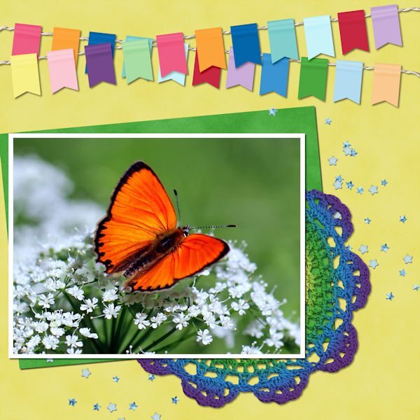
wow what an interesting insect, great use of the sketch here is mine, I used the warp tool to make the two papers uneven font is Underwater World2 points
-
You're really cooking in the kitchen with all these great lab results and projects. Way to go!2 points
-
2 points
-
For me, both classes would be great. Even if it is a paid program that I don't have or cannot afford to get it now, it could be in the future. Perhaps, It will show something I don't know and never thought about doing. IMHO, it is not in our best interest to have your creativity limited.2 points
-
I'm in too. I might do the non scrapbooky layouts this time around. Or not. I dont know.2 points
-
Holy cow, Susan, that doily is gorgeous! And even more gorgeous is the detail on that Chevron tile! The pattern, the colors, everything. I just love it! I use those kinds of patterns to make “fill” I call it. Where I just need to use it as a pattern fill for the border of a card, or maybe something I would use instead of a ribbon….or maybe a ribbon. Or a full for a shape or letter or text. Chevrons are hard to use, but I would use the mitered corner frame script to make it all go the same way when doing a border. Well, it’s gorgeous.2 points
-
2 points
-
2 points
-
First of all, come and say HI once you register for this workshop. We want to know who else will be there, on our side to encourage us. Every page we will make will be different, based on each others' photos, stories, and preferences but we can all get inspired by everyone's projects. Once the workshop is started, on June 19th, you can post your pages in here. Make sure to resize your image to 600 pixels before uploading it so it won't slow down the site when we have all those pages. Remember that each page should not take you longer than 5 minutes to complete. (if you missed the registration link or if you want to invite a friend to join you, HERE it is). DIAMOND members will get extra pages to work with. Non-scrapbookers will also get some non-scrapbook supplies. Who is going to be doing their FIRST digital scrapbook pages?1 point
-
Learning scrapbooking is often done with practice, looking around for inspiration, and trying to recreate projects we admire. Sometimes, we can be inspired by finished projects, but sometimes, we also have to use our imagination to interpret something. This challenge will give you an opportunity to envision something from a “boring” base, and you will have to imagine the end result differently. The sketch is only a written idea, and you can fly with it, modify it, and customize it to fit your vision, your photos, and your supplies. This sketch has lots of room to add stories about your photos, or you can focus on the stories instead of the photos. And if you want more information on using sketches, check out this article. Post your project in the gallery.1 point
-
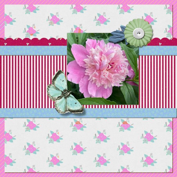
And these are my day 1. The turtles sunning themselves is a pic taken by my son, Chris, when he and his family visited the park in New Orleans. The peony in the extra is from a trip with my eldest son and his wife when we went rv-ing in 2021 in the northwest - this pic was taken at an rv park in Nebraska. The rolling waves on the beach in the FB header is a pic my son, Chris, took when he and his family visited the Gulf.1 point
-
How neat - filling out the space when you have a vertical picture instead of a horizontal one!1 point
-
They are a good challenge and keeps me focused on actually creating something, instead of sitting down and staring at a blank screen and not knowing what to do.1 point
-
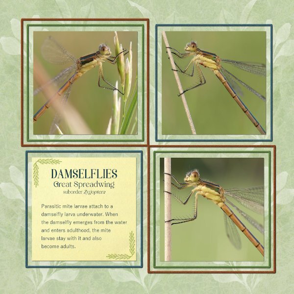
For those that may be interested in the photos I've posted a much larger file on Facebook for better viewing of these living jewels.The background is a leaf element duplicated several times and a grass photo of mine, using the blend mode. Frames were done using the grid and vector shape. I rarely edit my photos if I do I use a touch of brightness and contrast, and the crop tool. These pics weren't edited, other than cropped. Wonderful work being created by all. Between my other outdoor interests. I've been shooting pics for future projects. Summers are short here.1 point
-
Thank you Suzy. It was really absorbing to make the pattern. It was too busy as a full size paper, for me anyway. But I played around with sizes and changing color and made something I liked. I managed to mitre the corners on the frame around the parquet. that was brain teaser....might have to get that script. I like your idea of using that patter in a letter or shape. Same with the doily, you can get absorbed in making the dots. They will always be one of a kind elements.1 point
-
1 point
-
If any of them would be interested in learning PSP to make cool things like you did, invite them for the Quick-Page Workshop!1 point
-
1 point
-
1 point
-
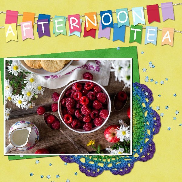
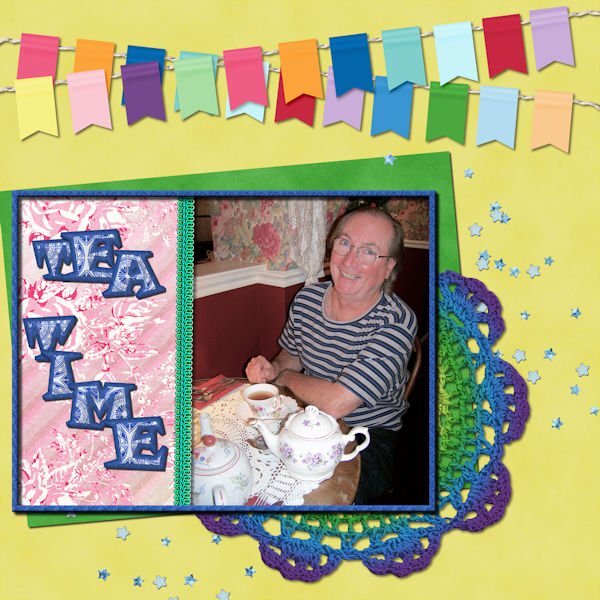
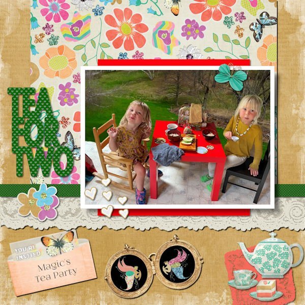
Unlike Michele, this took me two whole days! Deb sent this photo of Magic and her friend having a tea party and I couldn't resist using Janet Kemp's Garden/Tea Party Kit. Even the title is word art from that kit. I spent too much time changing the background on the photo. (Learning as I go here, this subject proved to be too detailed for an easy background change. I used part of a photo from my previous home that had a big lawn for the background.) This is probably more "scrapbooky" than my usual layouts but it seemed to call for flourishes! ?1 point
-
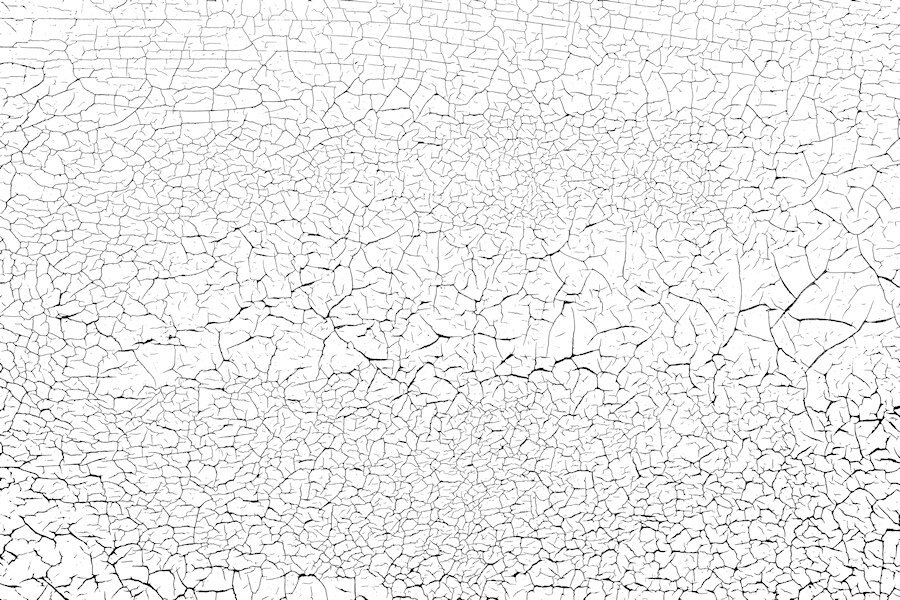
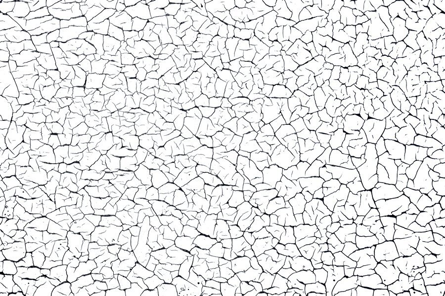
Here's another one I can also send. I shot quite a few (it's actually the horizontal slats on my garage door) different areas and will try shooting with my wide angle lens if it ever stops raining. I love shooting this kind of thing. Once I learn how to zip and use something like drop box I can send more and the orignal photos for you to make the overlay in the way you would like. these are reduced size so might not be that great. This overlay was made using a lower tolerance with the magic wand where the one above had a higher tolerance and produced thicker and blacker blacks. that's why you might want the photo as well.1 point
-
Of course you can. Just home from work (late) and need to hit the bed. I will get to it tomorrow. I think I can put the file on the FB page. Do you want the overlay and also the original photo as well so you can make an overlay. I changed the brightness contrast when I was trying to make an overlay (never done that before) to emphasize the black lines and used different tolerance levels with the magic wand and got different thickness of black crack lines. to me they are a little too thick so next time I would try and contract a pixel or two and see what that does. I also just left the photo and did unspeakable adjustment with the brightness and contrast and came up with a cool paper on it's own. I'm just learning how to make them and guessed my way through it. Here is the one I used, a smaller sample. i will upload the full size file tomorrow. I would love copies of what you made too.1 point
-
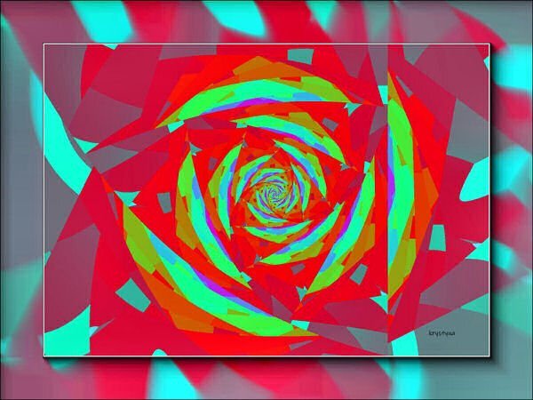
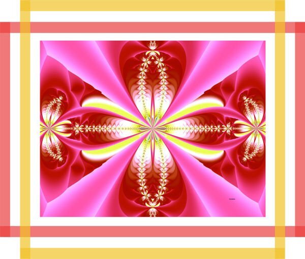
Suzy and Susan. It is not easy to use and since it was free I just messed around with it. PSP is easier and especially since Carole is so good at explaining things and knows so much. You all can have the patterns I managed to make as noted above or I can post them as png's on Facebook (can I?) Only if you want to. I have to quit. I made one more pattern and 1 more paper but it is too time consuming for me to continue with it. It won't do what I would really like it to do. I have a few ideas in mind since fractals are just repetitive patterns in nature. I'll post the new pattern and the new paper here.1 point
-
1 point
-
1 point
-
1 point
-
1 point


Resized.thumb.jpg.d25811db03a63358cedab1e79f527635.jpg)
