Leaderboard


Resized.thumb.jpg.d25811db03a63358cedab1e79f527635.jpg)

Popular Content
Showing content with the highest reputation on 05/22/2023 in all areas
-
I think this serves for 2 challenges...DIY and April's Font Challenge...although a little late. The Blue-eyed Grass volunteered in my yard and I love it! There is also a white variety and I think we have a small cluster of it...the white is rare, they say. Blue-eyed grass is deer resistant and drought tolerant. It is a wildflower but they say you can buy it in nurseries. It should be planted in early Spring...I've missed that deadline for this year. Last year I tried to transplant it but critters dug it up. I hope to buy some plants next Spring.
 5 points
 -
Project 2 I get the opportunity to sing at a couple of Special Care Homes in my province. So I thought I would show my guitar. I don't take pictures of the residents singing along with me as there is usually a warning somewhere about taking pictures. The background papers were from suggested packs for project 1 and 2. I did change the colours on a couple of them. The Treble Clef was from Digital Scrapbooking. I cannot recall where I got the musical notes.4 points
-
4 points
-
May DIY challenge. In order to retain the size of the small shape I opted to creating an out of bounds effect.
4 points
-
Late...but done... I have another font very much like this and I used it on a layout just before Carole posted this challenge.
4 points
-
In the April Q&A I had asked Carole how to make a Stencil effect. My idea was to make different papers with it. But at my first try, I wasn't sure for which project I could use such papers. My eternal problem is what shall I make as a project. So I just did something, and tried things out for several days until I finally came to something. I didn't use the stencil technique here to make a paper but saved it as a png. The alphas are a freebie from Carole, as are the screws. Of the photo, of course that is Poncho, I first made a B/W version, duplicated it twice, on the first layer the blend mode: overlay, on the second layer: screen and on the third layer I applied: soft light. Font is from DaFont and is : PaintyPaint 1 and a watercolor bruch for the stripe.4 points
-
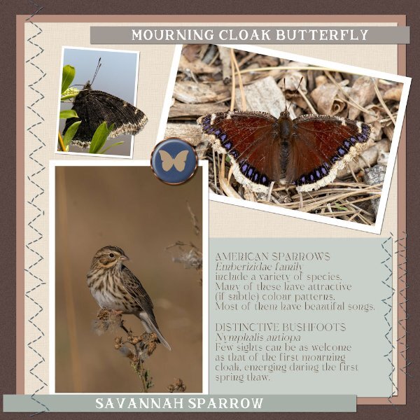
This was inspired by an article in The Washington Post about the healing benefits of the songs of birds. The article featured sound clips of the birds in the layout - meadowlark, bobolink, and woodpecker. The glitters were created using Carole's script Glitters-C. The papers and elements are from a kit, Celebrations, by Whispey D'Zines. The fonts are Spring and Ernestone, both from Creative Fabrica. I forgot to note that in the previous project, I used Carole's Smoothener script to eliminate the jagged pixels appearing in a selection's expansion. It did an amazing job.
3 points
-
My Project 3. I made the papers, the book cover images are from the books themselves, and the clip art is from freepik.
3 points
-
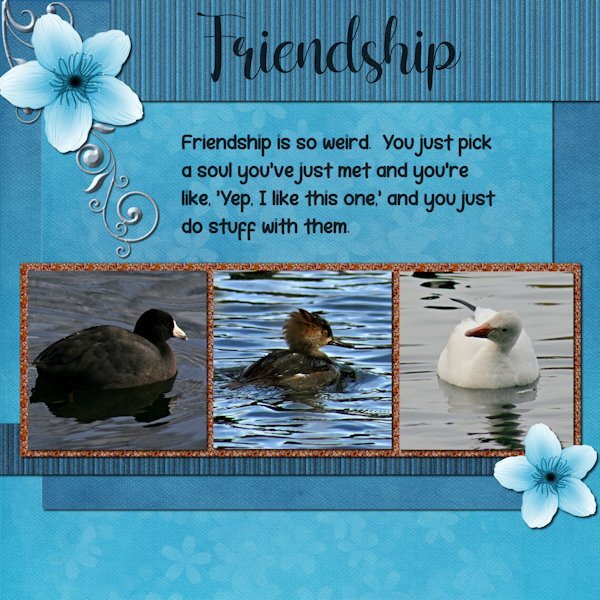
Project 3. I used the kit provided "Welcome Spring" from Digital Scrapbook and by DB Magnolia. And I used the orange glitters. Are you sitting down? Are you ready to hear this? I did not change the blue/white flower or the background paper. I did however change the glitters (darker) ?. I used the background paper twice, once for the background and once upside down for the mat behind the photos/glitters. I used the an extraction of the same background paper and added texture effect>texture> blinds, then added noise, then went back to try a different size blinds on a duplicate copy and accidently applied it again to the one with the texture already on it. it made it look more like stripes. Same for the bottom striped one, which I made darker. I used a scatter of little flower petals and changed the color to white (from pink) and reduced the opacity a lot. It might not show at this resolution. There was no metal element so I extracted a design (part of one) from a card in the kit and then changed the color and added an inner bevel, hoping it looks like metal. Fonts are: Shelly (title) and Robeek (quote). from Creative Fabrica or Google (as my font program came with google fonts as well). Quote: found on internet search "unlikely friends", but could not find who made the quote. it has "human" instead of "soul" that i added because, well, these arent humans. Photos: are mine from the the same photo shoot day, weird changing weather. The layout would have looked best if all the water was the same color as the one in the middle. I may swap out two photos from another photo day that has matching water.
3 points
-
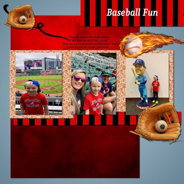
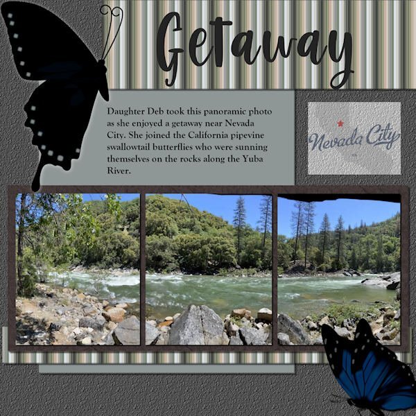
Scrap Bootcamp: Lesson 5 - Yuba River Getaway - Daughter Deb took this panoramic photo as she enjoyed a getaway when she joined the California pipevine swallowtail butterflies who were sunning themselves on the rocks along the Yuba River outside Nevada City. The title font is Berlin Kitchen, the journaling font is Goudy Old Style. Background color fill with asphalt texture, photo mat wood tile01 pattern with hardwood texture. Butterflies are from internet searches for pipevine swallowtails. EDIT: Forgot to mention the stripe pattern; used the directions for making a plaid but stopped before adding a second, rotated layer. The colors are from the portion of the photo that shows on the far left.
3 points
-
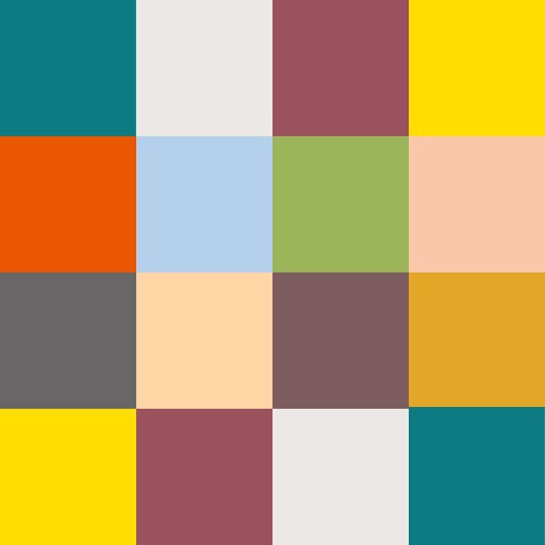
Yes, I always love what you do with the Fabulous Divas, Michele. I'm still playing. Made an image of my Chattanooga Pallet - putting the colors in squares. Then I made a copy of the jpg and played with Kaleidoscope and at the last, played with a copy of it and twirled it, kaleidoscoped it and twirled it again and then kaleidoscoped it again. These are the results. I can't seem to get to making layouts and I need to finish my 2022 Alphabet challenge - S, T, U, V, W, X, Y, Z. Still a lot to do before I can make a photo album of it. And, then, there is the rest of the double page workshop that I didn't finish. My, my - my To-Do List is overflowing! LOL.
3 points
-
Here is yesterday's daily look for my gaming group. The fashion illustration is by Megan Hess, a wonderful artist. I used some elements from AnnieC's contribution to the SYHO (Scrappin' Your ❤️ Out) Lavender Fields Blog Train. One of her flowers worked great as a picture tube ~ created a vector and used the vector tube script to make the frame. The font is Palegina free from Creative Fabrica's 12 Days of Christmas-Beauty-Handwritten-Font-Bundle last year; the bundle is still available as the Beauty Handwritten Font Bundle of 43 fonts for $7. I added a white drop shadow using offsets of -10 and another dark one using offsets of 10.3 points
-
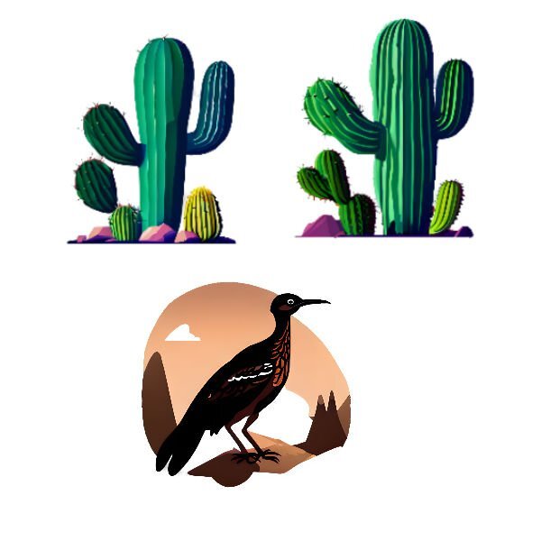
Well, I finished the Chattanooga trip and have ordered it to be printed by Shutterfly. I have enjoyed looking at the neat layouts in the Bootcamp. So I can't seem to get back to created anymore layouts. I played today with Creative Fabrica's CFSpark and with Abstract Curves. Made some patterns in Abstract Curves, and played with AI in CFSpark by asking for the roadrunner and cactus plants. These are my results.
3 points
-
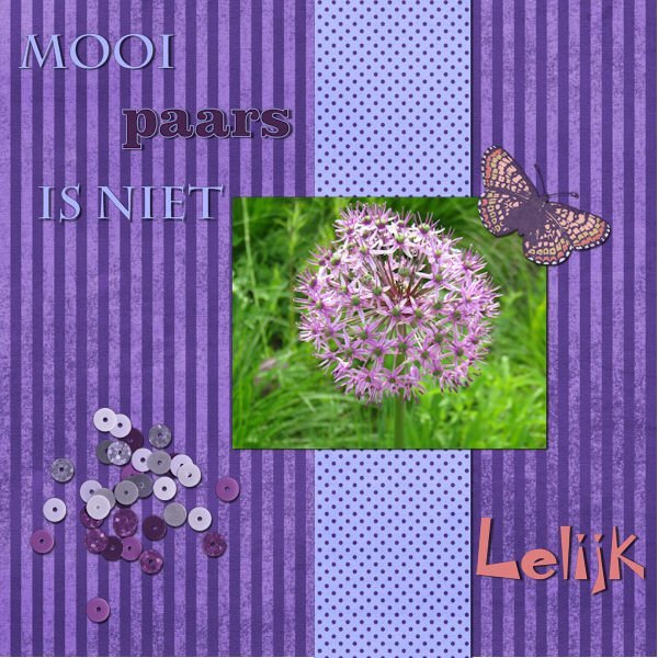
I'm late as usual, sometimes life is demanding ? The textis translated: Beautiful purple isn't ugly, that's why the text in the right corner has an odd font ? My first project:
2 points
-
I was going to say that it wasn’t Poncho at all - it was his great-great-great grandfather! ?2 points
-
A truly outstanding page. textures, overlays and the blend modes, is all a matter of trail and error, to achieve the desired effect, but well worth taking the time.2 points
-
Amazing layout, Marie-Claire! It paid back all the work you had!2 points
-
@Bonnie and Sue, really fantastic works! Last week I thought of you both. I watched a short report at TV about Pickleball growing more and more in Germany and a bit history of it. I was a bit surprised because I never heard before about this german trend. Thursday, (holiday because of Ascension), there were documentaries (landscape and wildlife) about Ireland, Scotland and England. A special about Wales, that was so beautiful....I was virtually travelling .2 points
-
@Sharla Next year, you might be interested in the Build-a-Kit workshop! It is all about creating coordinated papers and elements from all the tutorials inside the membership. You can have a look at that section in the private area for DIAMOND members to see what the participants did a couple of months ago. @Ann Seeber Nice way to display a panoramic photo! @Rene Marker Thanks for the tip. I don't have dual monitors so I would not have been able to help anyone on that topic.2 points
-
Stunning! I love everthing about this. It looks like a photo from the 1800's. Really incredible, complex work. Thank you for the instructions. Very interesting to have different blend modes on the different layers.2 points
-
Thanks for your comments Carole - all good ideas but I'm just playing at the moment. I already keep an image and summary of books that I've read in A5 folders with plastic inserts - just as an aid to remembering what I've read and listened to. Before ebooks and audio books it was easy - the books were on the shleves to see but these days a lot of mine are no longer visible in that way. What I don't do is record my thoughts and feelings about books - I rely on a feeling (and memory) being generated by the cover. Using books as a theme for this bootcamp is pushing me to learn how to do things differently as, apart from the book images, I'm trying to explore how to create papers etc..2 points
-
The last one which was so much fun was skipped. Let me try again to upload it (I reduced the size to 500
2 points
-
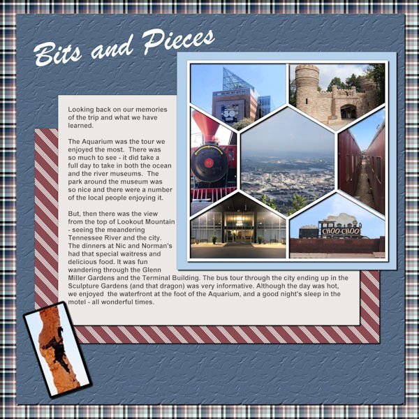
Last layout for the Chattanooga trip. You all may remember the hexagon template we got probably last year or the year before. This is my first time using it (and I forgot I had the pspimage and made one from the png LOL). But I must say that it was good practice!
2 points
-
Mother Nature does purple wonderfully doesnt she. The color geek in me wants to tell you Magenta-Blue is what I call purple and of course Blue is Cyan + Magenta. So we should be loving Magenta for pouring more of itself into the mix to make that wonderful purple we all love. But, I wont be a color geek and tell you that. ?1 point
-
I think God gets mad if you walk by the color purple in a field somewhere and don't notice it. - Alice Walker (paraphrased) I can't walk or scroll by the color purple without stopping to admire it.1 point
-
WOWZERS! This is beautifully done. One the smoky days we had last Wed, I came home from work and it was eerie because no birds were flying or singing, dead silence. A world without birdsong is a world I dont want to live in.1 point
-
Mooi paars is niet Lelijk - Google says: Beautiful purple is not ugly ?1 point
-
now that i look back at it...i might have to put a shadow on the screws in the four corners ?1 point
-
This is so beautiful, Michele! Everything fits so well together, and I love the color, the illustration, everything.1 point
-
Definitely one way around the limitations! I read often that working within limits tends to generate more creativity. This is a great example!1 point
-
Most if not all of them have a rewind for at least several hours. You can click anyplace on the rewind and it will start the view from there, so you can pick whatever is on the screen at the time for a screenshot. There is no way I could spend enough time on any of them to get a decent live pic. The resolution is fairly good, but I do shop the pics and sometime resize them before using them.1 point
-
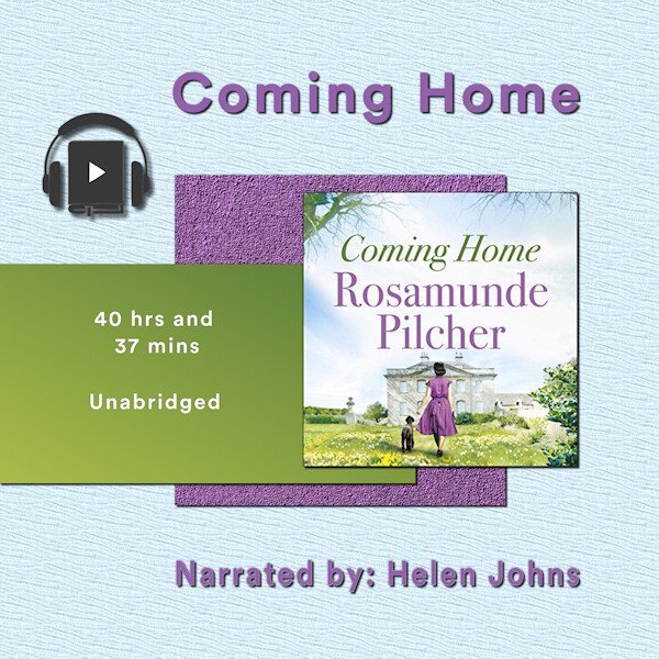
Project 2 - Book number 2. The papers are my creation, the book image from the book cover, headphones a bit of vector art I copied and adjusted. The 'home' in the title is Cornwall for the heroine who is catapulted away during WW2 A very long gentle story. I listened to it whilst doing jigsaws in the winter. It took me weeks to finish it...
1 point
-
This is beautiful and thank you for all your explanations. The white -10 offset on the drop shadow is brilliant. It pops out the title more.1 point
-
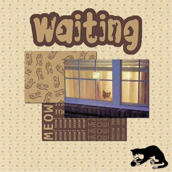
The papers are from Marisa Lerin. The font is The Cat from Creative Fabrica, and the silhouette is from Jessica Dunn at Digital Scrapbook. The little guy in the window is Rudy. He watches when I leave and pops his head up when he hears me pull into the driveway. A side story ... In Lynda's younger days, she would get very excited when I came home. Even though she was deaf in her last few years, she would still poke her head up in the window and meet me at the door. I had no idea how she did it. I finally realized Rudy would wake her to tell her I was home. He was a devoted companion and protector.
1 point
-
My new kid on the block or 3 my 3rd entry my new kid is my mom Just Passsed.1 point
-
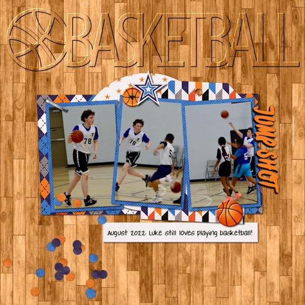
Love your layout! Amazingly, that is one set of SWL templates that I don't have (and I have a lot... over 42MB of her templates). I do have the cutout version of the globe though. Liz has had some wonderful shape templates over the years including the now retired cutout sets for all 50 states, DC and USA. She also had previously done over 10 years ago some state templates that had photo spots inside the shape of the state. She never completed the series and retired them before she moved to The Lily Pad in 2016. I have been using some of her cutouts as titles on pages and experimenting with different ways to highlight them. These were my latest (basketball done in March and the other in April).
1 point
-
I should have given some details on my Mother's Day pic, but I was sad and missing my mom. Anyway, Cristina and Suzy: I used one of Cassel's edge punches for this project. I absolutely adore all of her punches, but the edge punches are so versatile. I had a bunch of layers as I had to do a bunch of cutouts. Thanks for all the positive feedback. ❤️1 point
-
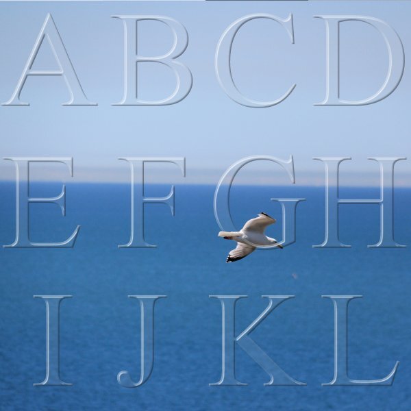
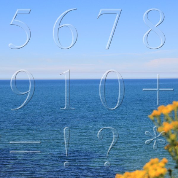
I've been busy making transparent alphas. With the help of Masterclass Alpha Making 2 I made the full upper and lower case alphabet and the digits, as well as some punctuation marks. Here I have posted some examples.
1 point
-
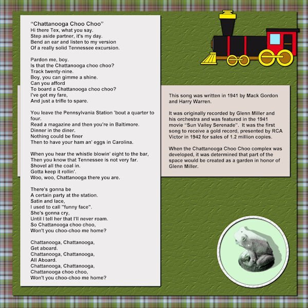
So, now I've finished the pictures of the Chattanooga Trip. I've completed what will go on the front of the album and the first page.
1 point
-
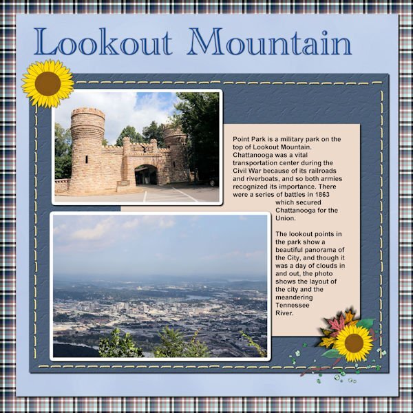
Last picture layout for my Chattanooga Trip. Next are the layouts for journaling and an opening page and a closing page.
1 point
-
Here's what I've been working on --
1 point
-
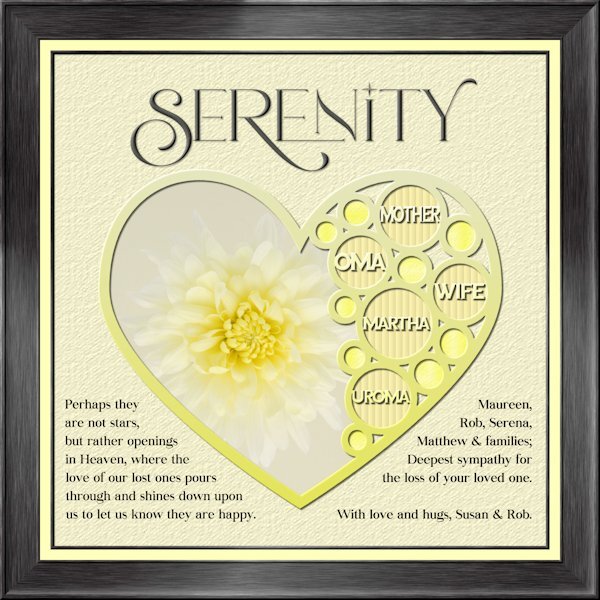
I havent made a tag yet. An unexpected passing away of my sister-in-law's mother on Sunday had me working on my condolence layout instead. Whew, that goodness I was able to go back to the Build A Kit workshop to the frame section and follow the instructions again. I used Lab 13-1 again for the shape, hearts looked weird inside hearts so i used circles. Frame is using Add borders from the master class Framing 101. My photo, and fonts are Romantic Serif (title), Sea Gardens (words in the template) and Audaciti (journaling). The title does have a bevel to help it stand out a bit, also has a very small shadow. reduced opacity on the title and journaling because black was too contrasty. I used the selection tool to fit my words in on the left side. the right side I just used a right aligment as it looked better that way. Nothing bad to report with PSP 2023. today it outshined me and any issue's I had was my dull brain at work and not paying attention.
1 point
-
First Bike Trip....this year.
1 point
-
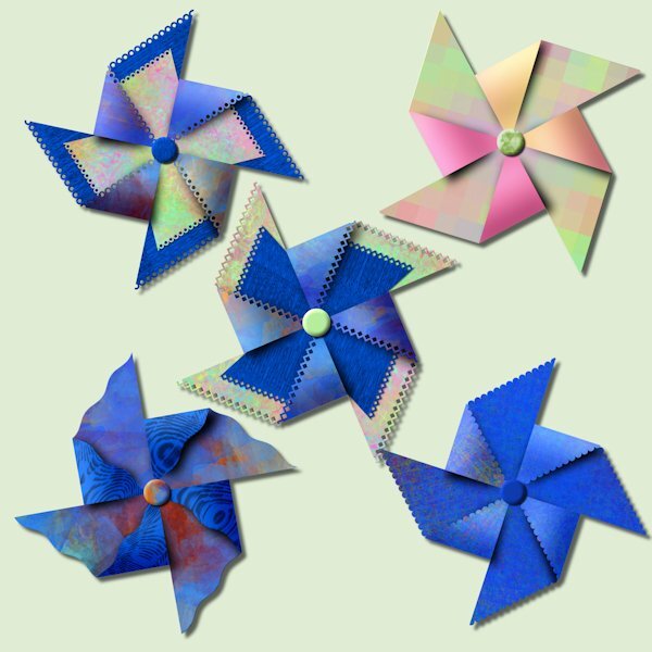
I cant find the post about our purchases from the recent sale so I'm posting here. I had a pinwheel party tonight. There is limitless combinations you can try, it was fun. I used papers from just watching A Beautiful Mess masterclass. And one has gradient on the folded forward part (pink&orange) that I had made previously. It's really quite something to watch it come together.
1 point
-
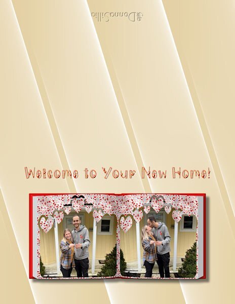
I have a separate folder for my 64 bit plugins. I copied the Abstract Curves plugin to that folder and directed my file locations to that folder, and it shows up under Effects plugins. Here is a sample of a background where I used Abstract Curves to make a background for a card that I am making for a new home party for my great niece. I thought the lines sort of echoed the slats in the house. You can easily change colors, and I wanted to match the house colors.
1 point
-
Playing further. I got some freebies, I think from CF, they are from "T" and the picture for them showed them as metal outlines. Well, when I got them, they were just outlines! So, I've been playing around with 2 alpha creation tutorials that were here last month, but were old. Well, one was to create an alpha metallic, so I used it to apply to my freebie. This is the result.
1 point
-
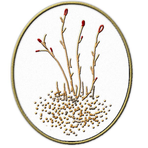
And so, just playing again - can't seem to focus on the layouts I need to be doing to finish my attempt at the Double Page Workshop, and to finish up on my Chattanooga Trip and the Alphabet Soup from 2022. This was just playing around with the flora element in the Desert Kit.
1 point
-
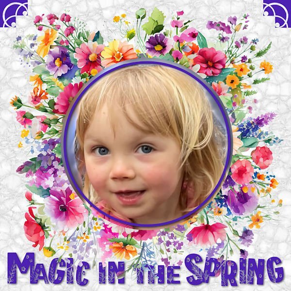
I combined Carole's flowery spring frame with the flora font, added my great-grand Magic with a little linoleum as a background and two corner brushes and came up with this. I sort of thought the font would look a little puffy on its own but mine didn't so I helped it along with one of our title lessons from March.
1 point