Leaderboard
Popular Content
Showing content with the highest reputation on 04/29/2023 in all areas
-
5 points
-
Here's today's pic for my gaming group. Used a bunch of layers and effects. The florals are from Marisa L at PS/DS (I wish I had more time when I do these so I could be a little more creative instead of using other people's work). I picked Brush Script MT to keep it simple and to match the width of the silhouette.5 points
-
3 points
-
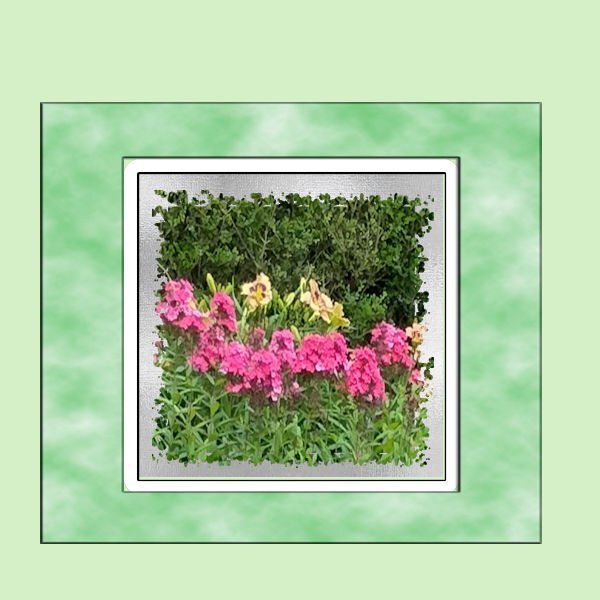
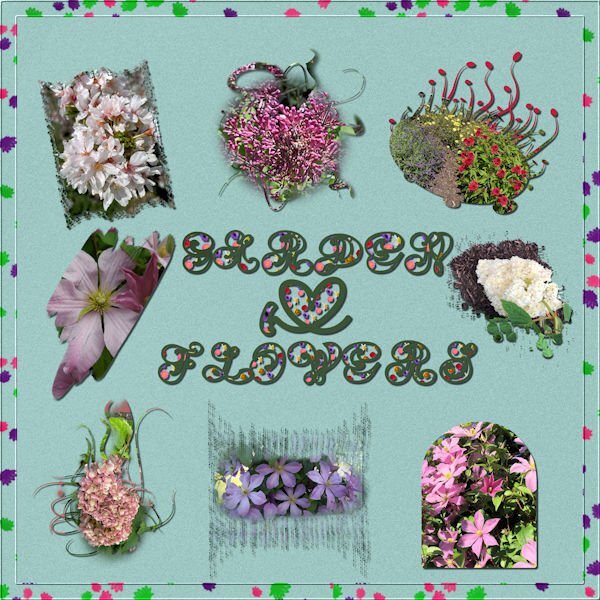
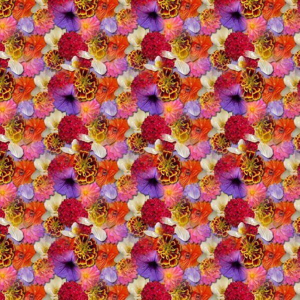
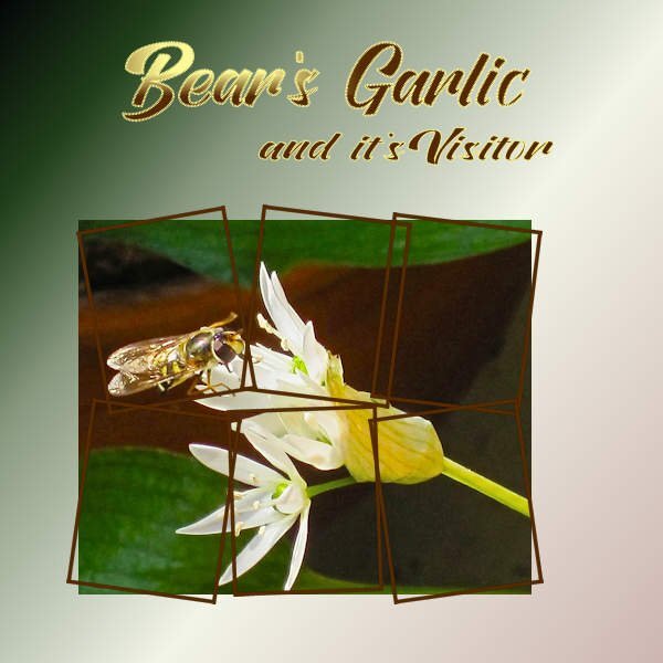
This thread made me realize that I had already purchased the raster to mask script. I used it on my flower pictures. They are all from flowers in my yard. I also used the seamless pattern script to make the letter fill and the scatter script for the border. The font is Amen which was on my computer. It is not as clear as I would have liked it. The background paper is a solid paper from my kit. Most of the masks are from brushes except one.3 points
-
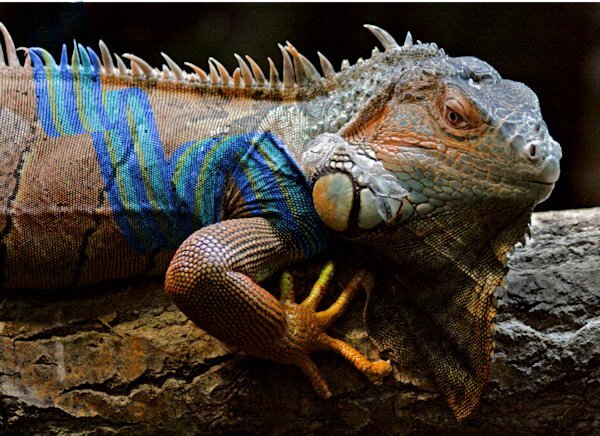
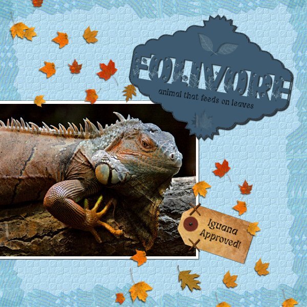
Here's a funny thing I noticed. No, I'm not into tatooing iguanas. I was moving my Stripe Ribbon around and passed over the photo and it looked like the iguana had a tattoo. I think this was a blend mode of "color", not the one I used in the layout. Now I can see what people are doing when they color animals or other objects, they are likely using blend modes.3 points
-
2 points
-
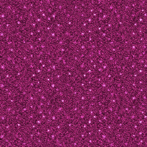
I am not very good at scattering which is why I purchased the scatterbrush script. After experimenting, I created a star scatter to use on the glitter papers that I made in my kit. The original image was 500 by 500 px, made seamless with Effects and put on a new raster layer above the glitter paper. I added the pattern and changed the blend mode to dodge. The script was just what I was looking for to make scatters.2 points
-
Me too out-of-sight out-of-mind is me to a T. I havent had very much luck with the Windows search, works sometimes but mostly seems to take too long. I need to organize better so I dont have have to hunt for files, because on that day I thought to put a file somewhere brilliant. So brilliant, I'm too dull to find it.2 points
-
this time i bought lot of wonderful things not all used, Airbrushed Paper - PSP script Contact Sheet - PSP script Open book - PSP script Stack'n Cluster - PSP Script Color Paint - PSP Script Curved photo - PSP script Paint Splash - PSP Script Pop Art - PSP Script Split Photo - PSP Script Watercolor - PSP script Netting - PSP Picture Tubes Skyline 2 - Picture Tube Spiral Binding #1 - PSP Tubes Colored Pearls - PSP Picture tubes2 points
-
@Michele You are the absolute "Fabulous Divas" expert!!! It's a real pleasure again and again to see all the creativity using the great choice of scripts and other elements we can find on Carole's Creation page. Thumbs up for all of you!! By the way, thanks Sheila for mentionning the squiggles script, another cool script. I wondered too because I didn't discover it till now.2 points
-
I combined the April Front Challenge with Lab 6-8 Stripe Ribbon Custom Label Cross Stitch I didnt like my Stripe Ribbon so I put all 4 together, merged and made a couple layers and used it as a border with a blend mode. The Custom Label; I saved the two parts before putting together and ended up using that version with the Flora Gardent font for the challenge in between. I hummed and hawwed with the edging, if I should omit it from the text or continue it. I tried just the top and bottom of the 'E' but it looked unfinished, going around the th outter edge looked weird, so I just closed it all up. the shadow needs work on the offset so it makes it hard to see. I believe the pictue tube leaves are Carole's. The tag is KMRD-My Fathers Study Tag 01. The Cross Stitch I used as two stitches to hold the tag on. The photo is mine I found while cataloguing shoot dates. I had passed it off as a bad photo, but thought I'd see how much I could do. Adjustment layers were used and I made selections and used the Adjust option on the top of the tool bar for selections (3 different ones in total). Does anyone know if you can make separate adjustments layers for selections, would I need to group them so the adjustment doesnt affect the whole photo? I used a texture layer on the backgound to simulate reptile skin. second font is Funky Grim (CF). This was fun to do and a surprise at what I did with the photo. Cant wait to get better at the photo editing/adjustment layer part of it. Again, I must add, my monitors are very bad so i really have no idea what anything I do looks like.2 points
-
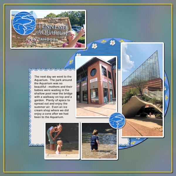
Back on Chattanooga. This is about the park surrounding the Aquarium. Anna and I enjoyed this day - it was full. The picture Anna is taking of the Aquarium sign is what I chose to be a title for this layout. I put a Cass stitch around the journaling paper; I made a brad from the Aquarium sign. The background is the same one I used for the 2 Aquarium layouts I did (which were the first layouts of this trip that I did).2 points
-
2 points
-
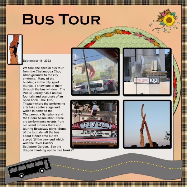
Back to the drawing board! Back to the Chattanooga trip. This is about the bus trip we took the day after we got there. Unfortunately I didn't take as many pictures as I should have. Too busy just looking, I guess. The dragon climbing the sculpted tree trunk really fascinated me. Woops - the file I saved as 600 px wouldn't load - just over size. Hold on and I'll change it. Well - seems I didn't check to see that it was resizing by % and not by pixels - increasing the size to 600% was quite a load!! LOL.2 points
-
2 points
-
2 points
-
1 point
-
https://scrapbookcampus.com/wp-content/uploads/2017/04/1-2-3-Challenge.jpg Let's make things a little fun for you. Are you looking for ways to spark your creativity and still create something meaningful? This will be a new monthly challenge for you. Every month, you will be given instructions to use 1, 2, and 3 of something. Would that be more than you usually use? or less? Let's see. Create a layout using : 1 frame 2 folded elements 3 buttons You can create those elements or use what you currently have in your stash. Showcase any photo, use any template (if you want). Just make sure you include the required elements.1 point
-
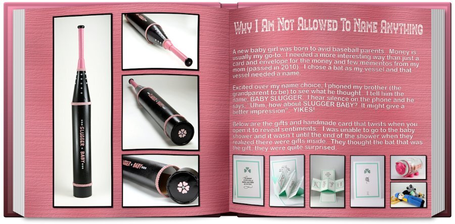
here I used the curved photo script , the airbrush paper script and the openbook to finish my day 6 project1 point
-
Believe it or not, I still learn and discover things while "playing" with PSP. Even accidents can be happy at times!1 point
-
Yes, you have that option. When I code scripts, I try to offer as many options as I can.1 point
-
Since it is left in layers, you can enlarge the photo or size down the mask ?1 point
-
I am a visual person and like having the icons where I can see them either on the taskbar or on my desktop. I also use the stuff when it is readily available. I also dislike the search function in windows and prefer not to use it if I don't have to. But that is just me!1 point
-
That is often a motivator for members. I often use buttons either in clusters or in corners, a bit like they are holding the photo. But that is far from the only way to use them!1 point
-
I am not sure what the original size is for the pre-loaded frames, but notice that in the preview, you can see if they should be square or rectangular, vertical or horizontal. I think the PSP frames are a good way to go fast for someone who does not know better.1 point
-
I have always steered clear from using pre made frames, including the psp frames. I create a one of a kind frame for each photo. All to often I see frames that are not of equal proportions, or if they have been rotated, the shadowing is wrong. The majority of my frames are used only once. Personally I enjoy creating unique frames. Carole now has a frame script, for convenience and time. Also she has 2 frame materclasses.1 point
-
I would strongly discourage you from doing that as it will distort when used in various situations: if you have a square frame to start and use it on a rectangular image (or vice versa), the proportions on the edges will be inconsistent if you have a frame of a certain dimension (say 1000x1000px) and use it on something larger (say 3600x3600), it will become blurred This might need a blog post as you are not the first one thinking that.1 point
-
1 point
-
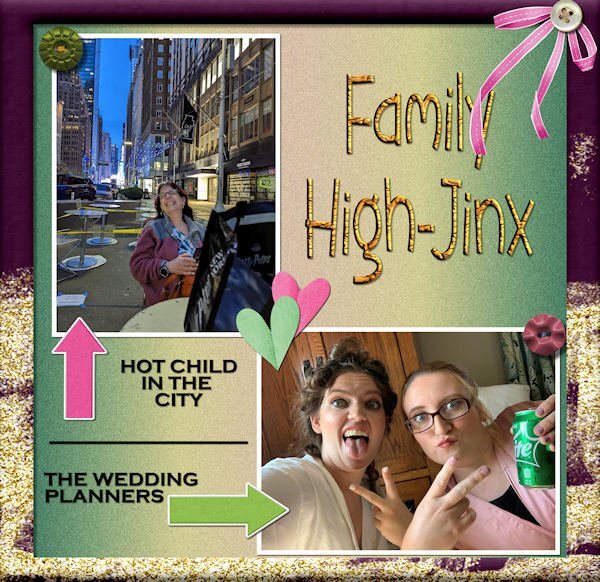
Figured it out - decided on folded hearts and a bow. 3 buttons and a frame round out the requirements. Here's my daughter, Laurey, top left; granddaughters, Ilana & Jackie, bottom right. All the decor is from my stash; frame from PSP frame. Edit: I forgot to mention the background is a PSP gradient called Nature Glow and I added some noise for texture.1 point
-
1 point
-
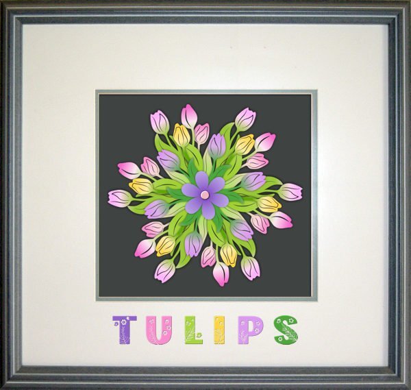
By mistake I had downloaded a 3D flower mandela with 6 layers, colored and in png format. I had now clue what to do with it but decided to "assemble" the flower to give it a try before deleting it. The normal shadows didn't give a good result so I tried shadows without an offset and a blur and opacity from 100% on the backlayer to 40% on the toplayer and the little heart has a slight bevel to let it stand out a bit better. I choose a frame from the frames inside PSP and used the Flora Garden font with different colors. At least I had fun making it!1 point
-
The question is not whether the scatters need a shadow but what shadow to add. Anything that might be made of paper or such would require a shadow, but when you are talking about translucent elements, that is trickier. Maybe you can get some details in the Shadow Challenges Master Class. However, you are probably on the right direction with reducing the opacity. Remember that the more translucent something is, the less shadow it casts since the light goes through more.1 point
-
Hi All, Since I seen your Greenhouse and flowers I just have seen so many ideas on making lil flowers its really in! One was tiny crochet ones daisy's and almost sent it to you but then knew your so Awesome you probably seen all the things long before me lol I want to get good enough to make some pages I am trying still. Just got new glasses it was my cataracts and needed stronger ones so going to be super trying I am a Diamond in the ruff as they say and boy am I rouff1 point
-
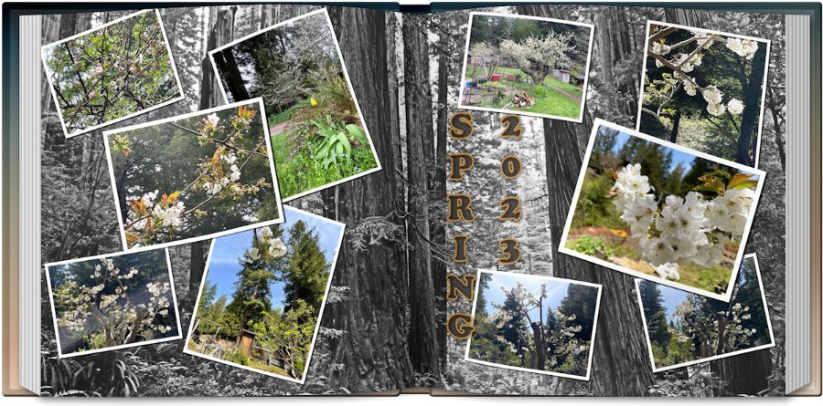
I finally came up with a sixth layout but it's not the style of that assignment. I used the scattered photos script, the open book script and the title style from last month's title workshop #1. Not real happy with the title but it'll do. The photos are from my daughter in California of her flowering trees in the midst of the redwoods so I went to Pixabay and found a shot of the Redwood National Forest as a background which I treated to a Multiply over a white background and that removed all the color. I liked the effect as the flowering tree photos were more visible. The title font is Cooper Black with Vector Tube effect with rope.1 point
-
Being the resident fontaholic, I would be remiss if I didn't participate in this challenge. I took the pic I made for my gaming group today and adapted it to this challenge. The Honeycomb font and clip art are from CF. The font on my original is Abongia which was in the Absolute Font Collection bundle from CF, too. I believe it might still be available for the next day or so.1 point
-
Something new to put on my wish list. (And, Carole, are you sure you're not a hobbit? You keep showing us miniatures that you make at home. lol)1 point
-
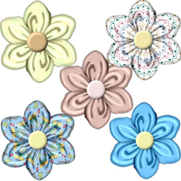
Couldn't find where to post so I'll post here. Carole, I hope you had a simply marvelous, happy birthday. You are so special to all of us in the campus. Hobbits give gifts on their birthdays, but I know you are not a Hobbit. Thank you for your gift. My favorite script of the ones I purchased on your birthday is the folded flower one. I will post my flowers.1 point
-
1 point
-
1 point
-
Paper is from digitalscrapbooking from Janet Kemp The mask I made with Cassel's script cass-MaskMaker Font: Flora Garden and Misha Gergoval1 point
-
I have just played with the Open book script so far. When I saw Gerry's book I had to have it. Now I'm going to add the Merge Group rename too to my wish list. I always think I will go back and rename it, then I dont. I bought 24 items so it will take some time to get them all installed and tried out. I did buy lots that would be good for making kits, like button machine 3, a number of bows, some tubes, confetti maker, paper pattern type scripts and the two tone font. I'm looking forward to playing with that one. After watching the Vector Master Classes and now on the Brush Variance classes I can see how that font will come in handy. I could see scheduling in time for just playing with tools to see what they do (with assistance from the master classes) without having to think of and end layout in mind. I'm taking a PSP short break while I catch up on an ongoing abstract photo project so I can eject the flyers (I'm photographing) out of my house.1 point
-
1 point
-
I been busy sewing and playing with PSP and my goodies purchased from the store today at a very generous reduction in price. Seems to have ignited my brain again into doing stuff in PSP as I had got kind of inert with it. I wanted to do things but could not muster much enthusiasm and felt very dull. Anyway, I have had a play and was so pleased with my spoils. I didn't buy many Scripts and things as I already have loads that I really should experiment more with. I really like the Squiggle Script and think it gives a different and pleasing effect to a shape. I applied it to the flower which first started out as brush blobs. The leaves was made from Caroles Leaves Font and the Star was a preset shape. I also used Caroles Sparkling Script to the star.1 point
-
1 point
-
I started with a template by AnnieC Digitals from the A Love For Layout Templates March 2021 Blog Train. AnnieC makes probably my favorite templates (she has a couple of FB pages and an Etsy shop if you're interested). The photo was found on google and the font is Floural from Creative Fabrica.1 point
-
1 point
-
1 point
-
1 point
-
1 point
-
1 point







Resized.thumb.jpg.d25811db03a63358cedab1e79f527635.jpg)
