Leaderboard
Popular Content
Showing content with the highest reputation on 04/24/2023 in all areas
-
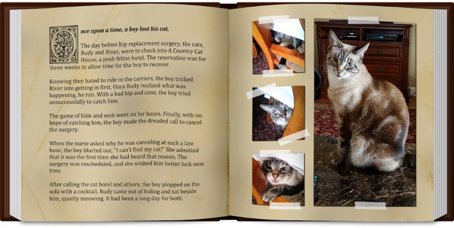
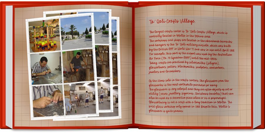
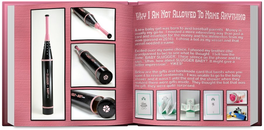
Lesson 6 with the "Open Book" script. What a fun script. How does everyone save it to keep the transparent background? PNG? (I mean as well as saving pspimage file). Fonts: title is British Columbia rough, there are several styles of this font which i had to have, since I born there. Arial is used in the journaling since I used white I needed it to be very readable. This is a pretty way to showcase to pages. This packaging for the gift took a couple weeks to do. Lots of components and time waiting for things to dry or glue to set up. The card is the same, first I have to make a mock up to make sure it's going to unfold properly, then comes measurements (ugh, my nemesis) and then cut the piece and do the build and hope it all comes together.10 points
-
9 points
-
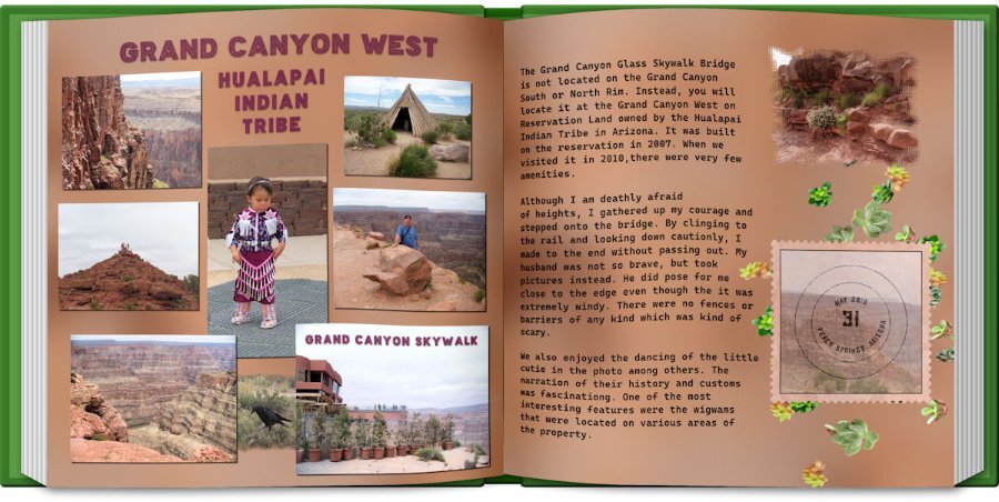
Day 6: The photos are old, but we enjoyed this trip to the reservation so much. I made the grunge background per Carole's instructions. The Title font is an Open font License called "Baltic Boden." I am loving the ofl fonts that I found on the Internet. The text font is "Cascadia Code" and was in my font list. I used cass-shadow for the pictures. The Title shadow was done manually because I didn't like the shadow used by the script. The postage stamp was made by FF, but the stamp is from a scrap tutorial. The stamp font is "atara grunge" which was purchased from Deeezy.com. I used a mask on the photo on the second page and the cass-scatteredelements script using the succulent tubes. I also used the book script.9 points
-
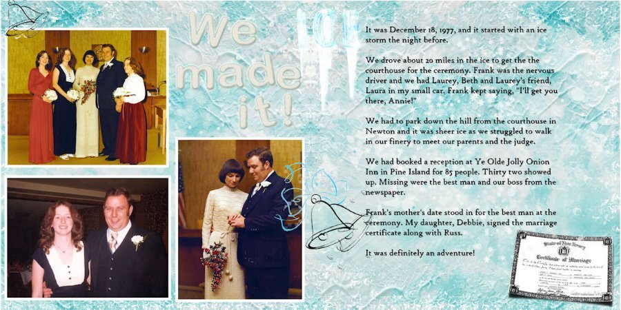
Here is my photo project for Assignment #1 of the Double Page Workshop. It is in Memory of my Dad "Digger" Don Carey who passed away in July of 2003. This July will be 20 years since his passing. He was a wonderful husband, father, and Grandfather. He was married to my mom for 40years before he passed away he raised 3 great-kids (myself and my 2 sisters) I am the baby of the family and the only boy.(Aren't I Cute LOL) The baby in the last photo is his only grandchild my oldest sister's daughter. Sorry I'm a little behind on the projects but it's been a busy week. Hope everyone enjoys this as much as I have enjoyed viewing the rest of the projects here.7 points
-
6 points
-
5 points
-
And here is day 6 and the last of this workshop! The left side of the double page has photos of a few of the lakes to show something more than the mountains which I love so much. On the right side are some details of the country as a whole. The background is as in the lesson but when I had the left single page background I mirrored it to the other page to avoid a noticeable seam. The embellishments I already had done some time ago and could use here again. Between the photos I used the picture tube water. Fonts are: Lucinda calligraphy and Joaquin Regular which I used throughout this Workshop.5 points
-
I have just played with the Open book script so far. When I saw Gerry's book I had to have it. Now I'm going to add the Merge Group rename too to my wish list. I always think I will go back and rename it, then I dont. I bought 24 items so it will take some time to get them all installed and tried out. I did buy lots that would be good for making kits, like button machine 3, a number of bows, some tubes, confetti maker, paper pattern type scripts and the two tone font. I'm looking forward to playing with that one. After watching the Vector Master Classes and now on the Brush Variance classes I can see how that font will come in handy. I could see scheduling in time for just playing with tools to see what they do (with assistance from the master classes) without having to think of and end layout in mind. I'm taking a PSP short break while I catch up on an ongoing abstract photo project so I can eject the flyers (I'm photographing) out of my house.3 points
-
I agree, this was a wonderful workshop. I have never attempted a double page before and quite liked the results of them. Lesson 7 was also very informative about how to print them and learning about the gutter. I like the look of having a lot of photos and pages of having few photos. I was wow'd by all the different interpretations of the layouts.3 points
-
Rene, after seeing your comment, I added this script, Merge Group Rename, to my Wish List. Ann and Bonnie, like both of you, I also got the Open Book Script. ? I am sure this script was a hit this time, thanks to Gerry Landreth posting layouts with it... At least, it was the reason I purchased it!3 points
-
Wow love all your wonderful pages , with so different themes and pictures I am ready now with day 4 and 53 points
-
3 points
-
3 points
-
Well, haven't had a chance to play with all of them but the one script I did use I'm kicking myself for not getting it sooner... Merge Group Rename. I always drag and drop my photos into the layer palette of the template I'm using so it keeps the image name but I always lost that when merging the group so would have to rename the merged layer. Now I don't have to ?3 points
-
My favorite script is not a fancy one with which you can make great layout but the humble "Raster to Mask" script. It is such a time saver but I did buy it on another occasion. From this sale it has to be the "Custom Confetti" and I only gave it a quick try, because this weekend we had visitors and I wanted to finish the Double Page Workshop first. But I like that it makes confetti from any image design or shape, so it will always match the project I'm doing.2 points
-
hahaha, you crack me up. Not sure if you remember that abstract spines of the flyers I was taking pictures of. It's those. I keep saying to myself I"m not going to bring home any more flyers. But I see some with a cool color combo or design and I end up at home wth copious bundles of flyers. I'll post a few, but right now I'm late leaving for work. Work is such a hassle when it cuts into my creative time.? PS. they are quite dead (if dead means "stale dated").2 points
-
Lesson7. Carole, thank you very much for the recent workshop:)))))) It was a fine work with a double page. I knew some trends of doble page. I know certain places where I can use/find really great templates of double page. In short words: THANKS FOR ALL:))))))))))))))) Thank you for all members who were working with double pages. Your works inspired me. THANKS:)))))))))))))))2 points
-
2 points
-
2 points
-
2 points
-
I tried it out on almost all of my double page lessons. I had layouts that were 7200 wide and had to split them but soon realized I also had to SAVE the new half-versions or the script would fail. I managed to Open Book 4 of the 6 lessons. #5 was not doable because the title would split. Here's #3 which I wasn't sure about because it wasn't designed for two halves but it looks fine to me...2 points
-
2 points
-
Happy Birthday Carole. I celebrated a little early as I was up late last night(or rather early this morning). I enjoyed your birthday very much, thanks for inviting me.? Lesson 5. I had no panoramas that I could find and my photos when enlarged covered all the 3600 x 7200 so I ended up cutting off the bottom of the wall unit and putting in the gradient. Which weirdly looks the same color as the lights that shine from under the upper part of the wall unit. I like the style of this layout, at least the ones everyone else did, but this is not my greatest work. This was a fail, but I loved the tutorial on the text, converting to curves and character shapes. that has a real nice look as it uses the whole gradient in one letter. This is a wall unit (teak-Danish) that my uncle owned and I inherited. I decorate it differently each year at Christmas. Mostly this is where my old camera collection lives. It's the 60's-70's style I love. The fonts are DDCooldness and Amoreta from Creative Fabrica.2 points
-
Lesson 5: The only panorama that I had was the last Iceland template that I made. I used it as a faded background, but it is much better full color. I also had to reuse some of the photos since he didn't send me a whole lot. The Title font is Guinness Stout, and the lower font is Gill Sans since it had the first letter its character shapes. The background is the ice texture that I made in Filter Forge. The icicles were also made in FF. I used the cass-shadows script that I just downloaded today. I am not sure if I used it correctly, but it looked ok to me. BTW, Happy Birthday, Carole. I celebrated with a bunch of new scripts.2 points
-
Too bad. If you have a recent version of PSP, you might have to test the various fonts by typing the same word you used, and scroll through the fonts dropdown list. The new versions of PSP will preview the fonts as you hover over them.1 point
-
1 point
-
Inquiring minds want to know what KIND of "flyers" are you "ejecting"? Are they alive or dead? ?1 point
-
I see where it shows the compatibility in the script. I'll have to see if it can be removed without crashing the script, or edit it in some way to prevent that change. I'll check it and get back to you as soon as I can.1 point
-
Well, that explains the problem I had earlier with saving the files. I was playing with some of the scripts earlier and like I said when I went to save the template, the compatibility had changed to PSP8. I know I didn't change it. But I just thought I'd go through some of the scripts that I had tried out and check the compatibility after running the script. First script I tried: Open A Copy. Just used it on a photo. Checked the compatibility.... PSP8! My compatibility before running the script was X8-2021. Changed the settings back to X8-2021 and double checked by trying to save a blank image. Correct settings. Did a second test. Ran the Open A Copy script then checked compatibility... PSP8. So is there something in that script that is changing the compatibility in the save as option?1 point
-
1 point
-
1 point
-
1 point
-
1 point
-
1 point
-
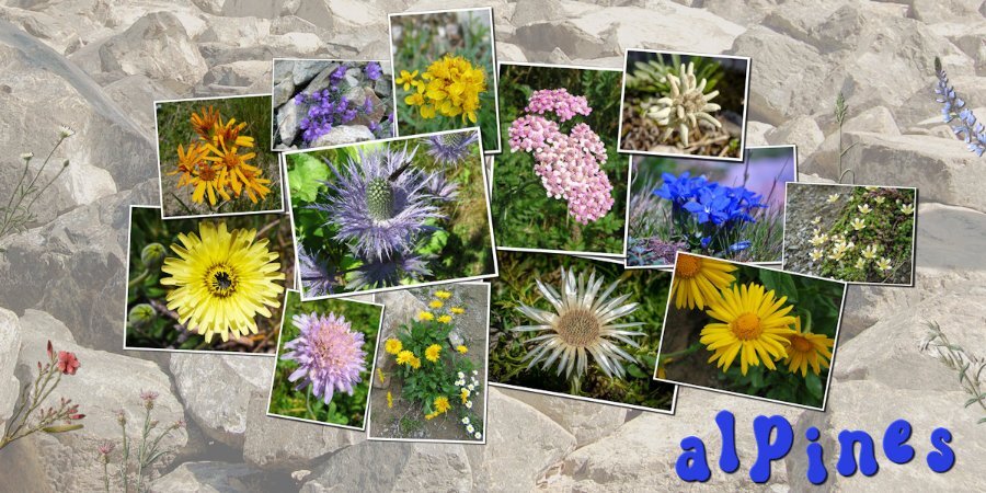
Day 4 and it was a struggle to get something to my liking. I already did the Double Take Challenge as it was called then and that was all about flowers. My theme this time isn't about flowers, but in the Alps are growing beautiful ones and I wanted to use them for this layout. The dilemma was that I didn't want to make more or less the same page although with different flower photos. The idea for this layout is based on template by Yin Design and the background is a photo by Alicja on Pixabay. The font is Groovy Yellow and the little greenery is from my stash.1 point
-
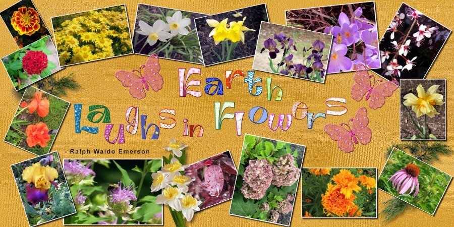
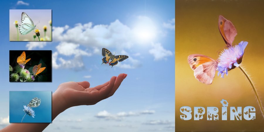
Lesson 4: I decided to use my flower pictures since I had so many of them. I used batch processing to add the white borders but not the size because of the different orientations. I used a script to change the sizes. The background is my gold shimmer, the leaves are from a kit that I purchased and the daffodil bouquet is my own. The font is Ambidexter, another open license font. I had downloaded the cass-alphaseparator script by mistake, but it came in really handy with the title. It not only separated the letters, but they were already formatted to change the fill and the stroke. The butterflies are from my kit and are beveled because a shadow ruined the transparency. I also beveled the title letters(saved the unbeveled file in case Carole doesn't like the bevel) because I thought that they stood out better. I also remembered to save the shadows on a new layer in case those need to be changed. Love that script, Carole!1 point
-
Day 5 The panoramic photo is a free wallpaper from wallpapersafari.com. because my own photos are much too small to make a panoramic photo. The small pictures below are my own pictures.1 point
-
1 point
-
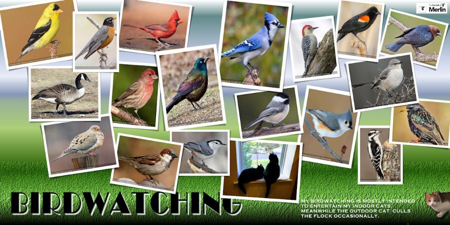
Like Gerry, I chose birds for my Day 4-Scattered. Mine are from using the Merlin App on my mobile phone which records birdsong when I'm out in the yard and then will give me a nice photo to match. The cats are not from Merlin. ? I also used a Yin Template. The background is a Waterfall Gradient with some grass texture at the bottom. The title font is Broadway with an embossed white shadow. My indoor cats, Adam & Eve, are looking out the window and outdoors, Maybelline holds court with the bird flocks. She is quite feral and will not come near me when I leave some food out for her.1 point
-
1 point
-
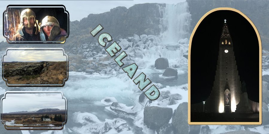
I finally gave up with trying to remove the line. The mask had created some spots where the canvas could be seen, so I made a new layer underneath which I matched to the gray of the mountains. The pictures are from my grandson who visited Iceland in 2019. The masks are from preset shapes. The font is Berlin Sans FB and filled with an ice texture that I made with Filter Forge.1 point
-
1 point
-
1 point
-
1 point
-
1 point
-
1 point
-
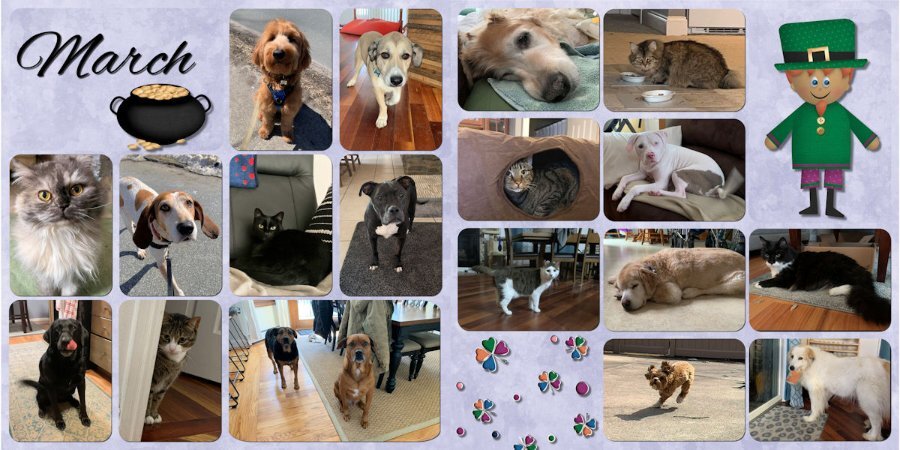
As usual, my project is animals because that's what I have the most pictures of. Part of plan behind this is to create a monthly page (or double page) of the pets I take care of each month and then at the end of the year, put them in a book and gift the book to the pet parents. These are my March pups and kitties.1 point
-
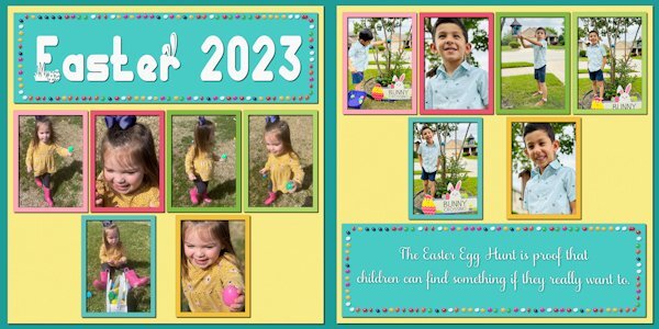
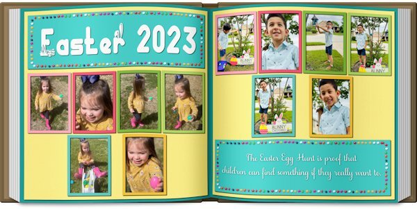
Double-page projects are always challenging. In this case, there were not enough pictures to fill the spaces, and I had trouble finding clip art that I liked. So I resorted to an old theater technique ... spread them out and make it look full. I've done a couple of picture books, and Carole's Open Book script is an excellent tool for previewing the layout. NOTE: The blurb may be hard to read: "The Easter Egg Hunt is proof that children can find something if they really want to."1 point
-
Hi all, I started after work with my first page, I choose my photos with old cars we saw on a Classic Days Show 2015. I hope to do the next side tomorrow evening https://scrapbookcampus.com/invision/uploads/monthly_2023_04/large.KTCLTemplate_9photos2-claasic-cars-anja-1a..jpg.4cce92712fb74b91a0562434dc67ff72.jpg1 point
-
1 point












Resized.thumb.jpg.d25811db03a63358cedab1e79f527635.jpg)

