Leaderboard
Popular Content
Showing content with the highest reputation on 04/20/2023 in all areas
-
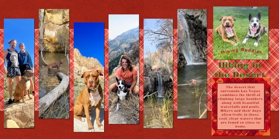
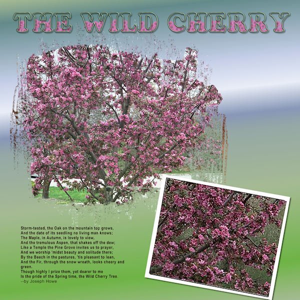
Day 2: The pictures are from my grandsons who live in Las Vegas and frequently hike, taking their dogs with them (and sometimes a girlfriend). The background and frame are from my kit. The font is an open font license called Centaury Display. I filled the Title with some help from Carole using a rust texture in my pattern files and outlined with a green grass texture. I finally figured out how to combine the two images and how to eliminate the line between the plaids thanks to the Blending Pictures Master Class. My grandsons are also trained to send me interesting pictures.10 points
-
9 points
-
7 points
-
7 points
-
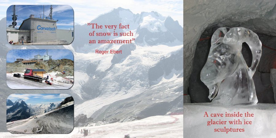
Day 3: I continue with my theme and the photos are from 2004. I'm very sorry to have to tell that the cave inside the glacier with its sculptures is no longer excisting due to the fact that all the glaciers in the Alps are rapidly declining. You can see climate change happening right in front of you. The font is Imprint MT Shadow.6 points
-
I started with a template by AnnieC Digitals from the A Love For Layout Templates March 2021 Blog Train. AnnieC makes probably my favorite templates (she has a couple of FB pages and an Etsy shop if you're interested). The photo was found on google and the font is Floural from Creative Fabrica.5 points
-
Day 4 The datestamp is made with Cassel's script : cass-Datestamp8 Font of the big title is Ravie.4 points
-
What beautiful colors. Nature is amazing and super creative dont you think? Fish are so relaxing to watch. I didnt know they are intelligent or social. Are they from the carp family. I do know those are social even with people. Or is it they just know who feeds them....yeesh, they are "cats" of the water worlds.3 points
-
3 points
-
Day 2 and also the continuation of the holiday photos The font is Simplefire3 points
-
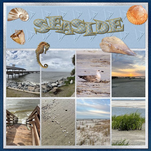
Here is my first double page as I am running behind. They are pictures of that my daughter sent me after her vacation at St. Simons Island. I have her trained to take pictures for my projects. The first page is of the sea and the second is the lighthouse and her climbing and descending the stairs. Two of the shells and the seahorse are downloads from DigitalScrappers. Two are from Filter Forge, and the rest are mine extracted from shells collected by my grandson in Thailand. The font is from my kit with changes to the stroke and fill to a plaid that is also in my kit. The papers are my shimmer papers. I had to edit to change the size of the pages.3 points
-
Bright beautiful colors. I like that you used the slats for one photo on each page. It's really nice looking like that.2 points
-
I'm posting here because I didn't join the double page workshop. Sorry - after looking at the postings, I'm sorry I didn't. It might have helped the kit i'm working on - the Chattanooga trip my daughter and I took last year. I've been working on it for some time, and after the Build-A-Kit Workshop, I'm finally trying to make it a kit. I had done a few extractions in some of the pictures, since that is what I like to do. But, today I decided on a palette (Yeah, I know, it is a little late in the game!)2 points
-
2 points
-
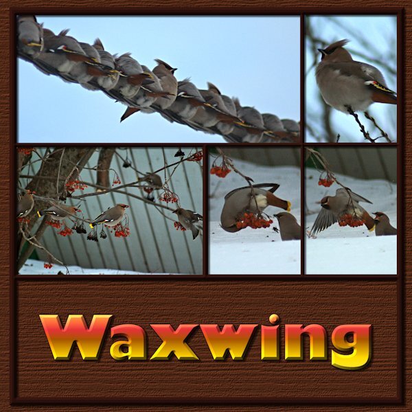
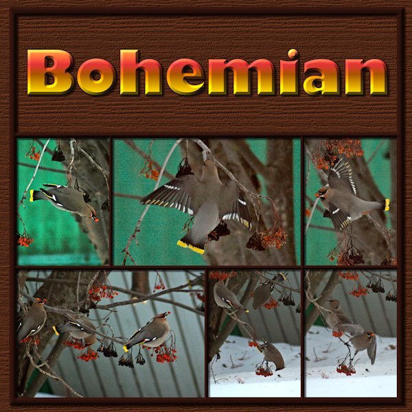
Finally got to Lesson 1. As I am culling photos to make room on the HD I came across these Bohemian Waxwings. They are described as wandering vagabonds by google. Really they are a rowdy bunch of dunkards! They feast on the Mountain Ash tree in our yard and the neighbourhood. These images were very bad; very dark and very soft/grainy. I was about to delete the lot when I thought I'd see what PSP can do. Now I will have the memory preserved even if I delete the bad photos. Font is Gill Sans Ultra Bold, a windows font that is a favorite of mine. I used the magic want to select the mask groups I had made and on the second to bottom layer (I think it's the black layer in the psd file) it the delete key. Ending up with a frame that I moved above all the mask groups and put an inner bevel on it (hard to see because it's a dark frame). Used a wood grain texture (texture effects>texture>wood grain-at about 400 or 600). Bevel on the title as well. Loved this template, it's very versatile. I really enjoyed and was motivated by the layouts from everyone so far. Here's page 12 points
-
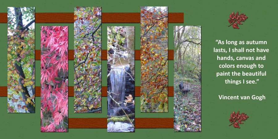
Day 2: I used the slats horizontally because that fitted my photos better and I made the paper with the little Edelweiss flowers to go with my theme. All the photos are mine except the one with the cars in bad weather, that one came from the internet (no name mentioned). The background paper is made by using an overlay with the blendmode Color. Font is Joaquin Regular, a freebie by Creative Fabrica.2 points
-
2 points
-
2 points
-
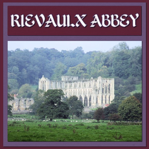
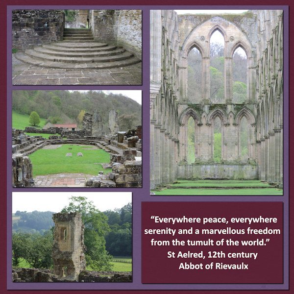
Sharla very nice to see the ruins of the Abbey. A very long time ago I visited there too and it is a magical place. I only have photos on paper in an album, at that point in time we didn't have digital photography at all.2 points
-
2 points
-
I used another one of the templates from Yin Designs. The Clip-to-It script is an indispensable tool when working on a layout like this. My parents were armchair birdwatchers. The feeder was strategically placed where it could be seen through the sliding glass door, and the tattered reference books were nearby in case an interloper flew in for a snack. When I moved back to Alabama, I carried on the tradition. Several feeders were strategically placed where we could enjoy the birds when the dining table. Mother even dragged out the 20-year-old reference books when needed.1 point
-
1 point
-
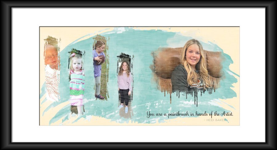
Carole - The black frame for Day 2 was created using IMAGE/PICTURE FRAME. The one I used is square, which is why the sides look a bit thick, and the top/bottom look stretched. On the layout, I used a brush set called Paint Strokes by Resource Boy (don't remember where I got it.) I used them as masks.1 point
-
1 point
-
1 point
-
1 point
-
1 point
-
1 point
-
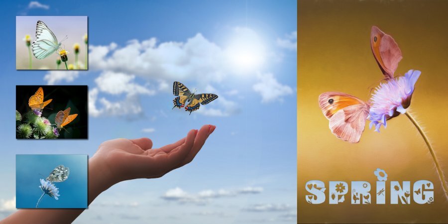
Finally took some time to complete a challenge. Thank you as always Cassel for stretching my comfort zone and teaching me countless lessons. Paper inspiration from Marisa Lerin"s - Hello Spring Kit but were coloured to follow the given pallet. I created the Elements and filled them with the paper patterns. The fonts used were Culrz, DeVinne, and Cooper Black Out . The photos are mine taken on a sunny morning when the sun was back lighting them so they had some transparency which I found interesting. Love seeing all the creative talent in this Campus,1 point
-
1 point
-
Sometime ago I saw a layout a bit similar to this and I liked those drops which are perfect for showing little flowers. In my flower photocollection I found some which have the colors of the palette. The fonts are Bistern and School Sketch. Backgrounds are also in the colors of the palette and are made using 2 papers and a blend mode. The april with the ducks is a stamp.1 point
-
1 point
-
1 point
-
April Palette Challenge. Created the little flowers for the background paper (pattern, flood fill). Background paper overlays, blend modes, and colours, using several layers. Replicating colours from the photos. Some of the first things I learnt to create were the eyelets and stitching, when I first joined the campus. Due to adding noise, and textures some colours have have changed slightly. Some flower pics I have taken on one of my trips home.1 point
-
1 point
-
1 point
-
The main pic is from CF. The next layer is from PS (DS) by Gina Jones. I picked up one of the colors from the pic for a background and used one of Cassel's edge punches to decorate. To anyone celebrating, have a sweet Passover.1 point
-
I'm in and have never done a double page before. Not sure what pictures to use yet.1 point
-
Thanks Carole. I do a lot of double layouts but hate doing them as one layout. I prefer using separate templates but I do have them open and work on them at the same time. Put a paper on one, then put it on the other so things flow between them. And, it was always a hassle to split them for printing back when I started. I struggled with that a lot! And, if photos were in the middle, some of it was lost when printing them. That's when I learned to never put anything right on the edge unless it was something you didn't care about getting cut off. Even today with the advances in technology, things will get cut off when printing whether it is individual pages or books.1 point
-
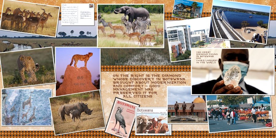
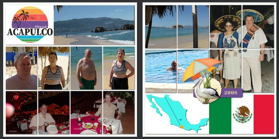
I'm signed up. In the past I've created travel pages (real and fantasy). It was really fun to do a set of pages for a trip to Botswana, Africa, which I'll never do IRL but admire from reading about the country in the No 1 Ladies Detective Agency book series by Alexander McCall Smith. I'll show you a sample. The very first project I did when I joined the Campus was double page layouts illustrating our family vacation to Acapulco, Mexico. Not sure what I will do this time around. We'll see...1 point
-
I have just been informed that one of our members, Colin Hooson, passed, last week. He loved our classes and had started a gallery HERE. His health was limiting his work but he always enjoyed it. It is always sad when we lose someone from our community. We are such a tight group. My condolences to his family.0 points

















.jpg.22aff9baba0f0e5fc7c22504cde6f283.jpg)

