Leaderboard


Popular Content
Showing content with the highest reputation on 01/21/2023 in all areas
-
Like mother, like daughter. The main font is Nonplussed and the handwriting font is Annisa, both from Creative Fabrica. The background and drawings are from Pixabay. The papers are by Marisa Lerin from Digital Scrapbook. Anytime I can use SpongeBob SquarePants lyrics in context is a good day.
 8 points
 -
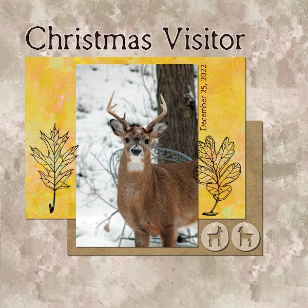
Project 2 We had a couple of buck visit our yard Christmas early evening. It had been a frigid day and they were hungry! I had my camera handy. The font is Remington Typewriter, and I used the chisel effect on the headline. I used the Janet Kemp Woodland Winter kit, from DigitalScrapbook.com
7 points
-
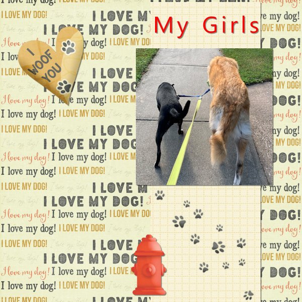
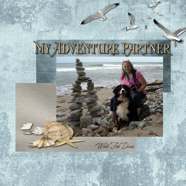
Belana my Adventure Partner !!! RIP my Girl !! Fonts used .....top one ...Captain Kidd.....bottom small one ...A&S Heartbeat embellishments ....PNG's from PNGTree
6 points
-
Lab 6-6 Dingbat Riboon (vertical edges of frame) Measuring Tape (left vertical edge) Multicolor Ribbon (top/bottom of frame) This layout didnt take to resizing well. I had noise on the backgound and it came out really light. The full size jpg is darker and the pspimage file is even darker still. The text is much clearer in the full size versions as well. I will post the larger one on FB. The fonts for the Title and the Quote are Abiyah (Creative Fabrica) and Arial Bold for the rest. The quote is a Zen Proverb. My photo of a recent hoar frost day that was also very cloudy and foggy. The city is putting a new water reservoir in this park (where the trees are) so this might be the last time I got to photograph them. I also had a big help from the blog post (July 18, 2016) "Text on a path in PaintShop Pro". And I loosely used ideas from the "Masterclass Scrap by Numbers". The ribbons have the blinds texture added but it's hard to see in the small version. Edmo is Actually Edmonton (Alberta, Canada). My friends who just moved here have taken to calling it "Edmo" and it has kind of stuck with me. I live in the city of St. Albert at the North west corner of Edmonton, we are separated only by streets.
6 points
-
Project 1 I created a feathers scatter from one of the patterns in this (Watercolor-Feathers-Collection-668831(1) ) The feathers under the eggs was also from this download.
5 points
-
Project2, JK's taken shot at the seaside, Carole's free template Cluster2, I only painted my Project2;) BTW, there are so many free templates created by Carole:)))
5 points
-
Day 5 - Project 2 - Magic on the Beach in Costa Rica. My California family is there as we speak, and Magic's mother, Lucy, sent all the photos used on this layout. The frame for the photo is a PSP frame called Transparent; the title font is Hello Butterfly with an inner bevel #7; the text on the right is done in Kleymissky font. The flower embellishment is from my Just Beachy kit by Lin Jane. The toucan is from the eyeinspire fruitloops kit. Lucy included a little poem with the photos she posted. Pura Vida Slow flow Sunshine and resupply of vitamin d Much appreciated after weeks of NorCal rain A new heart home deep on mama Pacifica Magic home Water baby Pool obsessed Heart full of deepest appreciation and reverence for this beautiful planet we call home
4 points
-
4 points
-
My stencil ?
3 points
-
Buddy showed up one day, under nourished and looking for a home. He instantly became a part of the family. He enjoyed "hanging ten" and surveying his vast estate. He also spent a lot of time in my lap. He loved his new wonderful life for years. He developed cancer and you know the rest. Buddy was my buddy. RIP Buddy.
2 points
-
Project 2
2 points
-
Project 2 really enjoyed this.
2 points
-
here is my project 2 , Photo is mine and the fonts are Hi Summer and Chicle kit credits in the gallery -2 points
-
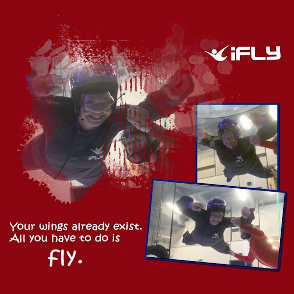
Another iFLY...one more to do...not sure when. This is my friend, Michelle. Template 122 by Lady 22, Bourcio Casper.
2 points
-
Project 1. I used the Frosty Fall kit. The drop shadow on the script text looked odd, so I didn't add it.
2 points
-
They are tiny but leave a huge hole in your heart when they are gone. So sorry for your loss. A beautiful tribute layout for Buddy.1 point
-
Susan, I haven't had a chance to ask Lucy about the horses. I will when they return to California. It is her poem and all the photos. Looking more closely at the photo, I see posts and wire fencing so I'm sure they're not free-roaming.1 point
-
LOVE the poem, Ann! Beautiful sunset and beach. Are the horses just walking around where ever they please? Are they wild or tame? Alberta has a wild horse population. One of my favorite photographers, Rick Price, shoots them (with a camera!). His work is stunning and the wild horses are really skookum, not skinny like I've seen in other wild horse populations. You can find his picts on Flickr...he is Rick Price (RED DEER). There are a number of Rick Prices on there so make sure it's red deer. He has really incredible shots of bears and other animals too.1 point
-
@TonimarieWe often change our minds when doing digital scrapbooking. That is the beauty of the digital medium: we CAN. In your projects, I would be careful about two details: the shadows are a little inconsistent, like the button is missing some, and the distortion in resizing (the photo in the frame of the bottom right is obviously distorted, maybe when you tried to fit it in the frame?). For resizing, check this article for tips. Looking forward to many more pages! For your project 2, that is such a fun photo to use! I would say to be careful with the bevelling/buttonize; applied to the whole page, it makes the edges look a little unrealistic. A simple shadow would be enough. @kasanyVery simple yet effective page. You might want to add those details like the location and date on your page, as subtlely as you want so that someone looking at it without you, would know what it is about. For the project 2, you would get more realism if you were to add shadows to the individual elements in the cluster. When using a whole background to show a photo, you can either make sure we see it all (so not putting something big on top of it) or apply an effect so we are not trying to look behind that element. For example, you can lower the opacity so the focus is on the small version, or create a watercolor effect, or something like that. Instinctively, we are looking at that large photo, while we can't see it all, and it is showcased in the small one very nicely. @Anja PelzerHave you ever considered using a QR code on a page to add a link to more information? I plan on having an article on the subject in the near future. @Steve Kovacsthat is a wonderful choice for the background. That rich color and texture really makes the photo stand out. Personally, I might have used a lighter color for the title but that is just a preference. @Gerry LandrethThose faces defiinitely look like fish. That is a great connection! @Linda J WalkerThat is definitely a photo to showcase! And with the date on the page, it shows how it was a nice Christmas visit! @GabrielaWonderful photo. I think you might have forgotten the shadows on the papers OR might have those layers hidden (that happens when we work). Do we still have some lurkers? Don't be shy! And if you are just visiting and not part of the Bootcamp, remember to "like" all those wonderful projects.1 point
-
Thank you Ann, you recall correctly. It's called "Scrap by Numbers". The masterclass had cool icons too. Remember, Carole used picklball as on of the layouts (in collaboration with Bonnie). Thank you Corrie, I agree and I was surprised that it came to mind to use. I knew what picture I wanted to use but had no idea for a layout design. the measuring tape was foremost in my mind and so I kept thinking how do i tie a measuring tape to this winter photo. That's when i thought of the masterclass I'd seen and of course everyone talks about how much snow they get then it all started to come together.1 point
-
Linda, I second Susan's statement! Love the photo and love the layout!1 point
-
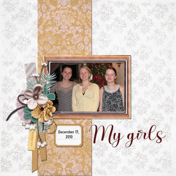
Linda, WOW and WOW. For the picture and for the layout. I wish I had that kind of Christmas visitor.1 point
-
When I see these wonderful Bootcamp projects, I am amazed at how good they are! Well done everyone. When I look back at my very first attempts, they make me laugh, and not with good humour....but with embarrassment! ?1 point
-
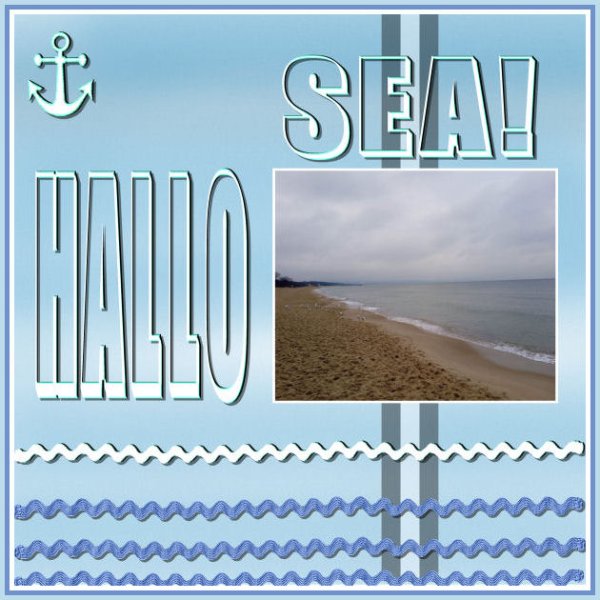
Project1. Shot taken by JK. He has been at the sea for one day. Very intensive short trip. Fonts-FatFree.
1 point
-
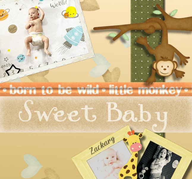
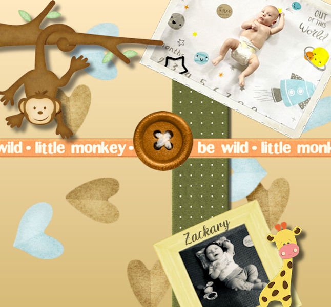
Hey there, I just wanted to stop in and say hello. I signed up for the bootcamp, which is very exciting. I am very new to scrapbooking, but I have been using PaintShop Pro for many years. I will probably be scrapbooking a lot of pictures of my children. This is my first photo for the bootcamp project; it's of my 3-month-old son (Zackary) , I'll post my first project; I did two of them (kind of roughly the same), ) I couldn't decide which one I liked best.
1 point
-
1 point
-
Project 1. I made the cluster with the elements in the fall kit from PS cpJess frosty fall mini kit offered for this project. Since I decided not to use fall colors in the mini kit, I colorized the fall leaf scatter provided by Cassel with the hue/saturatiion/lightness to green. the gold flower is from the kit also. In making the cluster which I saved as a pspimage, I made shadows on the individual elements - thanks for that tip, Carole - not sure where you mentioned it, but I remembered it.
1 point
-
Here is my Day 3 Homework - this is my newest tropical fish. With Bettas (Siamese Fighting Fish) you can only do one per aquarium, otherwise they fight to the death. I have one small (5 gal) tank and he has a snail as a tankmate. The snail's name is Roomba. My photo for the background, colorized. It's so busy I didn't want to add much embellishment.
1 point
-
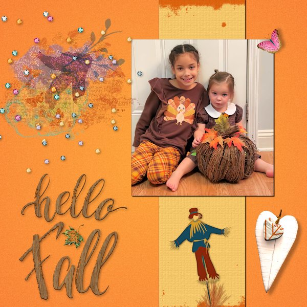
My great-nieces, Corinne (6) and Amelia (2). The papers and elements are from a kit called Autumn Joys designed by Digital Design by Jodi.
1 point
-
1 point
-
1 point
-
here is my project 1 , day 3 ein Besuch in Berlin, I blended the photo into the background1 point
-
I just finished project 1. It's always about my kids.
1 point
-
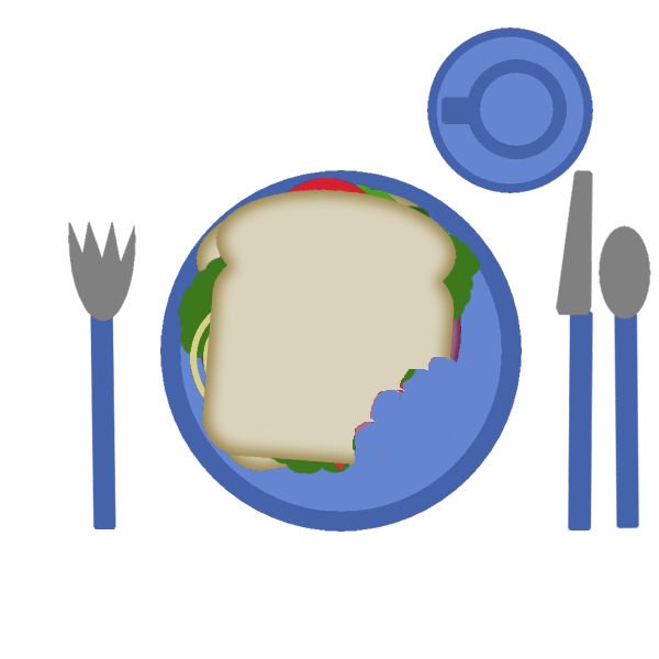
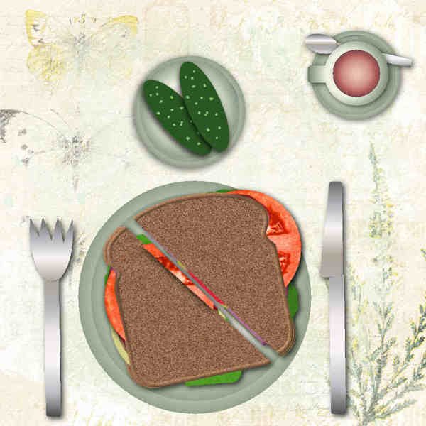
Day 2....I see I need to up my game and add some personality into my lunch!
1 point
-
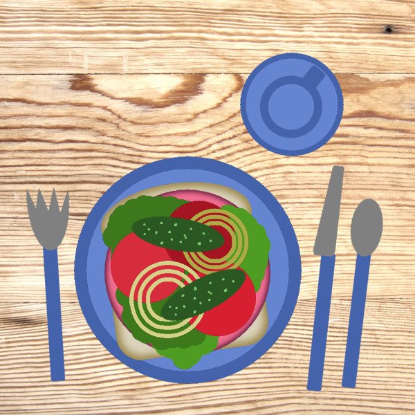
I'm not happy this time. I tried to make a folded napkin, but it's not pretty! lol! I am also not really happy with the cutlery as I would really like to make it look like metal not plastic. I am drinking hot chocolate with those tiny marshmallows. I added cheese this time to the sandwich. The placemat is from Rush Ranch- Helpful kit. I like the dark oak table.
1 point
-
I rarely use a tablecloth. And watching the carbs, so only one slice of bread ? I need to get some of Ann's tomatoes, they must be fresh from the garden! It is too cold here for growing tomatoes now. Wood paper is from Marisa Lerin at digitalscrapbook.com
1 point
-
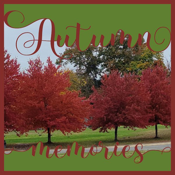
Manassas Park Community Center is my gym and this Autumn I stopped on the way home to photograph some trees showing off their Fall color. Template by International Word Art.
1 point
-
I love to decorate a table. As you can see, I've done this before a few times. The tablecloth is a paper by Jessica Dunn of Pixelscrappers. I like to keep my pickles separate from my sandwich, unless it's a hamburger.
1 point
-
I too had a difficult time choosing what I wanted to do, changing some aspects etc. But in the end I have something to show; I used all the elements but rearranged them. My topic is bridges; here in the Netherlands we live partly in a delta area and have a lot of rivers and waterways. Which in turn provide us with a lot of bridges and here are just a couple that I managed to take a photo from. The water background I made using a small part of the water in one of my photos, gave it a slight blur and a blend mode. The sky is also a photo that I put on top of the water to create a less sharp edge.
1 point
-
This was my enjoyable club sandwich. Although it does not look like it, it is toasted but the toaster was not working properly. There is a side plate of extra crunchy pickles.1 point
-
My sandwich (with a blue plate under}. BTW, Carole. your free staff is great:)))) I'll check it out to the end when I have my spare time;)
1 point
-
I ended up quite pleased with this, though it was a struggle at first. This is my grandson, Will, and his family in California, on the Mendocino headlands. Luckily, no rivers to flood with the deluges they are having right now. All 5 photos were just taken by my daughter, Debbie. I combined two of the small rectangles to accommodate the journal card on the lower right from Elif Sahin at digitalscrappbooking.com, adding circles and some flowers clipped from the large photo. I took the scallops and did a clip-to-it with the flower photo and then used the torn edge technique on the scallops. Maybe I went overboard with scallops because I continued and created the white framing with them on the photos, also! I tucked a little beach grass behind, so the photos look like they're waving in the sea breeze. I have to complement everyone's work. You all inspired me!!
1 point
-
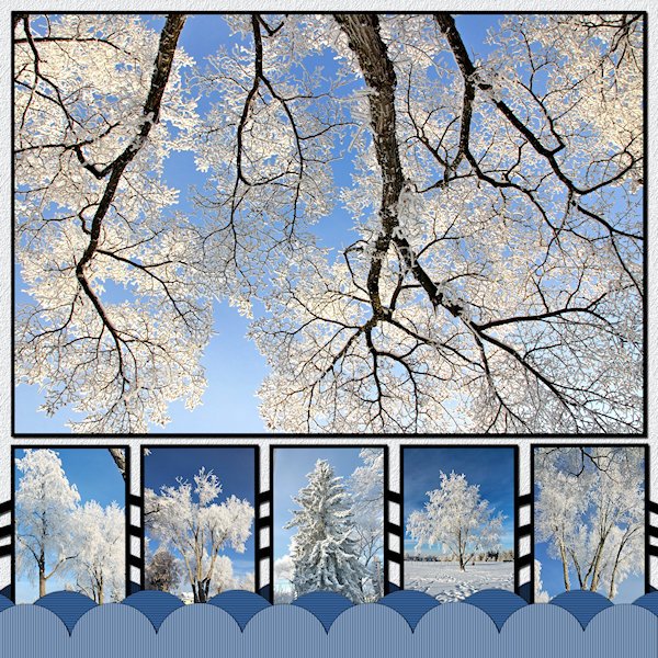
I got 'er done! No words. Mother nature speaks in visuals. These are trees on my street or down the road in the park (the little one second from the right side). And no, that's not an upside down tree in the big photo. that's my favorite of the trhee trees in front of my house. It has a big wide canopy and i always look at it when I'm stretching after my workout. I was standing under it shooting straight up. I added more scallops, not sure why, it doesnt really add to the design. When I lined up the boxes on the bottom I thought, "Yikes! they look like gravestones", until I added the pictures then it started to come together. The ring was the hardest to fit into the design. So I made many duplicates and lined them up on the bottom to make a design pattern with them (between the small pictures). I used the blinds texture on the scallops and a texture on the background that might be too small to see. Photo's are mine from Dec 31, day two of the hoar frost days. That was actually the day it was more crystally type frost (I cant remember the name tough).
1 point
-
Lab 13 - 01: Stencil Design Papers : thematicgnoliapatch.blogspot.com 2 Scripts : Creation Cassel : cass-bow3 and cass-RibbonFactory Alpha : cass-RustedAlpha Own pictures. A walk in 2019, with my best friend Poncho, enjoying nature, the beautiful sky, the flowers....1 point


Resized.thumb.jpg.d25811db03a63358cedab1e79f527635.jpg)