Leaderboard
Resized.thumb.jpg.d25811db03a63358cedab1e79f527635.jpg)


Popular Content
Showing content with the highest reputation on 01/17/2023 in all areas
-
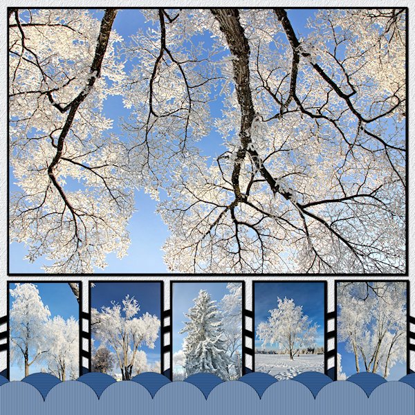
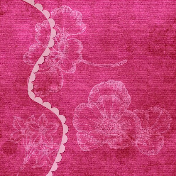
I got 'er done! No words. Mother nature speaks in visuals. These are trees on my street or down the road in the park (the little one second from the right side). And no, that's not an upside down tree in the big photo. that's my favorite of the trhee trees in front of my house. It has a big wide canopy and i always look at it when I'm stretching after my workout. I was standing under it shooting straight up. I added more scallops, not sure why, it doesnt really add to the design. When I lined up the boxes on the bottom I thought, "Yikes! they look like gravestones", until I added the pictures then it started to come together. The ring was the hardest to fit into the design. So I made many duplicates and lined them up on the bottom to make a design pattern with them (between the small pictures). I used the blinds texture on the scallops and a texture on the background that might be too small to see. Photo's are mine from Dec 31, day two of the hoar frost days. That was actually the day it was more crystally type frost (I cant remember the name tough).
 5 points
 -
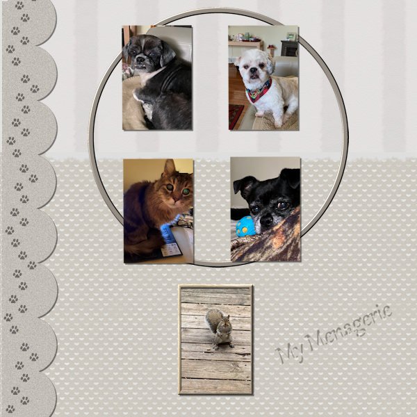
I wonder why it takes me SO-O-O long to do one of these. I dither and worry and then change things around and then don't feel really satisfied with the results. But then I just want it out of my sight and posted. Later, I will want to make even more changes, but can't (thank goodness). I am thankful to have those two Cass scripts (open as new layer and clip to it). These are my rescue animals who share the house with me. The one at the bottom is the one who lives outdoors with his/her tribe and gets chased all the time.
5 points
-
I ended up quite pleased with this, though it was a struggle at first. This is my grandson, Will, and his family in California, on the Mendocino headlands. Luckily, no rivers to flood with the deluges they are having right now. All 5 photos were just taken by my daughter, Debbie. I combined two of the small rectangles to accommodate the journal card on the lower right from Elif Sahin at digitalscrappbooking.com, adding circles and some flowers clipped from the large photo. I took the scallops and did a clip-to-it with the flower photo and then used the torn edge technique on the scallops. Maybe I went overboard with scallops because I continued and created the white framing with them on the photos, also! I tucked a little beach grass behind, so the photos look like they're waving in the sea breeze. I have to complement everyone's work. You all inspired me!!
4 points
-
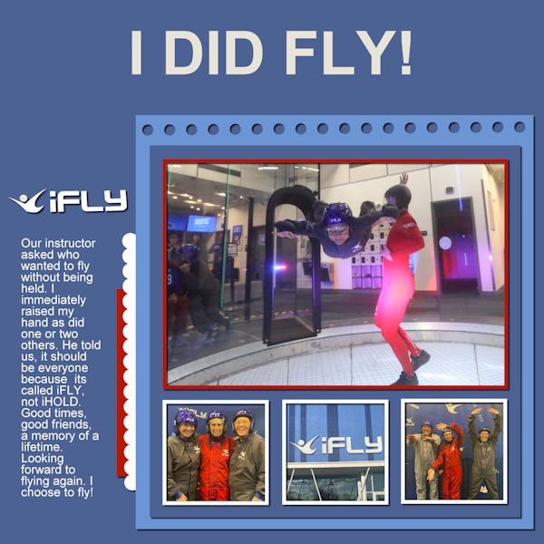
iFLY was great fun. I am looking forward to going again. Inspiration Template A...Carole gave all 26 to us for Christmas. It was my turn to fly.
4 points
-
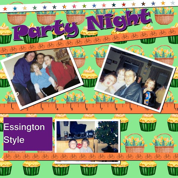
Hi, Have to take things easy so have time to work through some of the Lab exercises so her is the latest offering number 6 06. The background is a more a spring paper, I downloaded from somewhere, with the theme of cupcakes and baskets of daffodils. The ribbons are made following the instructions in Lab 6 06, using the Webdings text the bicycle is the letter "B" and the tape measure is also from the Lab 6 06. The photo's came from a night out over 20 years ago, so we all look a little different, my son is now 30, I won't tell him I used that photo of him.
3 points
-
I too had a difficult time choosing what I wanted to do, changing some aspects etc. But in the end I have something to show; I used all the elements but rearranged them. My topic is bridges; here in the Netherlands we live partly in a delta area and have a lot of rivers and waterways. Which in turn provide us with a lot of bridges and here are just a couple that I managed to take a photo from. The water background I made using a small part of the water in one of my photos, gave it a slight blur and a blend mode. The sky is also a photo that I put on top of the water to create a less sharp edge.
2 points
-
I've been a member of The Campus for over 2 years but I decided to try something new with my PSP setup. I activated the Navigation on the Manage tab in order to create thumbnails and then switched to the Edit tab and added the Organizer palette for the first time and voila, the thumbnails appeared as if by magic! It seems I'm forever hunting for the photos or elements I need so now I can gather them all in a Tray, which is also new to me. Here's my setup:
2 points
-
This is how I will be set up within the editing screen for working.
2 points
-
here is my screen, I use the dark grey mode, made toolbars and sometimes I use the ruler I want to use photos from Berlin , we visited 20102 points
-
Hello. Looking forward to learning how to capture my memories in a different manner other than just photos. I mainly enjoy hiking and camping as a source for many of my photo inspirations.
2 points
-
2 points
-
I extracted the buck head at the top. I'm pretty pleased with it. I think it is my best extraction to date. Interestingly, I had been thinking I would like to do a layout with deer heads and this template appeared. Perfect!
2 points
-
This was my enjoyable club sandwich. Although it does not look like it, it is toasted but the toaster was not working properly. There is a side plate of extra crunchy pickles.1 point
-
My sandwich (with a blue plate under}. BTW, Carole. your free staff is great:)))) I'll check it out to the end when I have my spare time;)
1 point
-
I got it now. I had to check the Advanced and AI-Powered checkbox to get to the lock aspect ratio checkbox.1 point
-
I use my mouse on my laptop which is definitely not as good as a tablet and pen. I've never entertained a tablet and pen; as I told you earlier I cannot draw to save my life. LOL1 point
-
Joining Boot Camp was a last minute decision. I always enjoy going back to the basics where I always learn something new. Because of major life changes, I wasn't able to finish the workshops at the end of 2022. I went from helping out with my mom to being her full-time caregiver. The pace of Boot Camp fits perfectly as I learn to carve out time for little projects. My workspace is basic with some adjustments. I use larger icons and have a couple of Carole's scripts, Open as New Layer and Clip-to-It, bound to menus. As a recovering "Early Adopter," I use the latest version of PSP. However, I always keep the previous version in case there are bugs in the new version when it is released. The picture in the workspace is my niece and her daughter. The other picture is of her boys.
1 point
-
I have not changed my workspace since the first bootcamp I attended. I like the light grey background and the palette that Carole Cassel uses. However, I notice that Ann Seeber is adding the Organizer palette to hold the pictures etc. she will be using in the layout. Well, I had used it at first and then discarded the idea. But, I think I will use it again as Ann is.1 point
-
One way to "play" with those is to see which shapes you can "line up" or which ones you can "overlap". Typically, those shapes come from an existing template that I just tweak around for you ?1 point
-
I am going to use 2021 for this Bootcamp, because I am not very comfortable with it and I have it. I am most familiar with X9. This is my workspace. Not sure what photos I will be using, but I opened one of my middle daughter being a teen, about 12 years ago. She has grown up a bit since then ? We are both wiser now.
1 point
-
Yeah, it seems to be missing in the forum and gallery. It might be due to the different platform. I'll check if there is a way to get it back OR to get something comparable. Thanks for pointing it out.1 point
-
Just a question for Cassel: On the introduction to Bootcamp email today it says: "Post the question in the forum or, if you are shy, click on the NEED HELP tab on the right side of most pages to send me a direct email" The NEED HELP tab would be useful here, but it's gone. How do newcomers reach you now if they need help? ?1 point
-
Sizing is correct now I just need to work on the image quality. Eventually I will get there.1 point
-
I can assume so. You will find that resizing images is something you will do very often with PSP so it is a good practice to get started.1 point
-
Thanks for the quick response. I guess this would apply to the image that I am trying to use for profile as well as I cannot seem to get below the 51k threshold.1 point
-
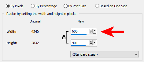
In your PSP, go to Image > Resize and under the first tab (by pixels), you should see the option to enter 600 in the width value. Then, make sure you save a copy of it with -600 in the filename so you don't overwrite your full-size image.
1 point
-
So, my first question is how to size the screen capture or image that I am posting here so that I do not improperly oversize them as it looks like I may have on the first one above. The sliding bar refers to image quality and not pixel size when saving. I want to make sure I am following the 600 pixel sizing. Thanks1 point
-
Go to the top right, beside the "photo", click on the little triangle and select Profile. There, you should see a little icon on the bottom left of your "photo" where you can click and follow the prompts. I should make a tutorial for it with screenshot. I'll try to do that later today!1 point
-
Hi Mary Solaas I see that you have correctly applied the instructions I gave you on January 5, January 6 and January 13/01 following your desire to know how to proceed to reproduce the side paper (section Forums The Lab Lab 13 - 01 Stencil design). You went through the point-by-point description that I’ve known for a long time as if it came from you. Thank you for quoting me.(that’s a bit of irony).
1 point
-
For today's daily theme I had these wonderful illustrations by Lorraine Dell Wood from her Flirty Hat series. I used a template from Corel and made it my own. In order to get the borders around the pics: 1) Merged each of the groups; 2) Selected the outside of each one with the magic wand; 3) Inverted the selection; 4) Select selection borders and flood filled. I followed the Lined Paper tutorial in the Campus for the background. The font is RiotSquad, free from DaFont. I actually had a tough time picking a font and settled on this one as my deadline was quickly approaching.1 point
-
I want try again, I hope to find enough time to scrap with you all1 point
-
The 4 of us went to iFLY...what a fun day...full of memories. Template from Kim's Creative World, ALFLT, August, 2022. Does Judy look like she is having fun?
1 point
-
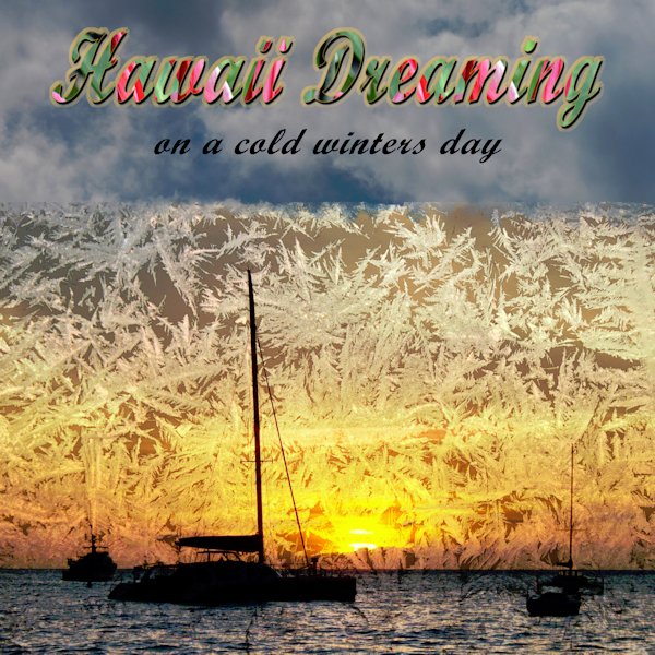
The topic on PSP Manics is frost but I thought I would post it here also. Hawaii Dreaming on a cold winter's day. All photos are mine, Maui Hawaii, my living room window and cloudy sky. The font is Script mt bold. The frost over the sunset was done with the overlay blend mode.
1 point
-
OK. I've been playing around ((SO OCD)). I couldn't make the curved papers with the pen tool UNTIL I made the path go around the sides of the layer to meet with the beginning of the curve. Then I could make the magic wand select the inside of the path in order to color the "curved paper". Then trouble with using the Vector paint script - maybe it had to do with F11 ???? I'm not sure at this point. I also used the Vector Tube script to make the chain edge and the rope edge. The scalloped edge was made with the Vector Paint script. So here are my results. The 2nd layout shows how I had to go around the edge of the paper in order to make the different colored pages (I pulled the edge made with the rope forward - that's why it is not actually on the edge of the page).
1 point
-
My friend, Michelle, at a professional pickleball tournament. Center court is behind her in the larger photo. She is posing with pro player, Lucy Kovalova, in the smaller photo. Template 94 by Lady 22, Bourico Casper. Word art from Creative Fabrica.
1 point
-
Never underestimate what you can do by combining several different pics to make one cohesive project. Removed a few backgrounds, recolored the abstract background, and the font is Airport. It actually took me a lot longer than I thought it would, mostly due to the different proportions of the originals and my OCD need for perfection. ?
1 point