
Resized.jpg.46eaf2dbce9171c9f3a489ed9ad45018.jpg)
Bonnie Ballentine
-
Posts
3,009 -
Joined
-
Last visited
-
Days Won
57
Content Type
Profiles
Gallery
Forums
Posts posted by Bonnie Ballentine
-
-

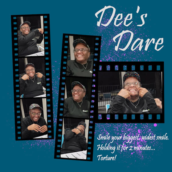
Truth or Dare...she held that big smile for the entire 2 minutes. The next day her cheeks were sore.
Template 194 by Lady 22.
-
 1
1
-
 2
2
-
 2
2
-
-
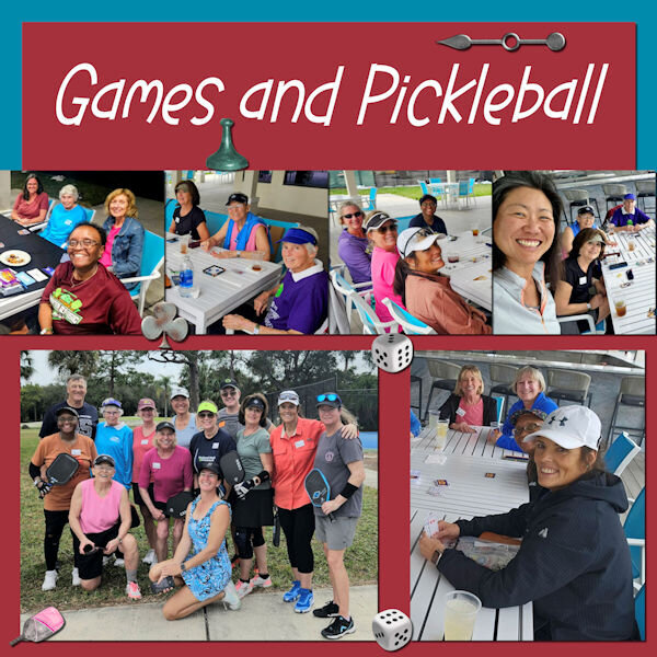
Template 309 from Chantahlia Design. Game pieces from Digital Scrapbooking, Family Game Night, Game Pieces by Marisa Lerin. Pickleball paddle from Creative Fabrica.
-
3
-
3
-
-
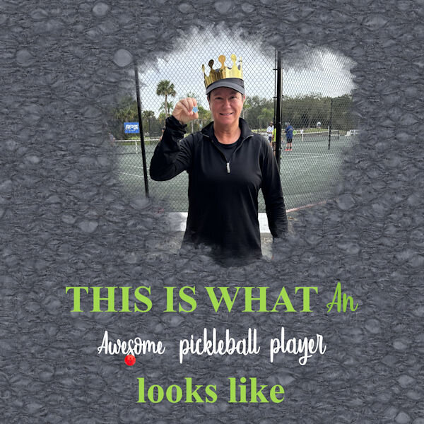
Another layout from our pickleball clinic trip. I created the background paper during the mask workshop. Wordart from Creative Fabrica (paid).
-
8
-
-
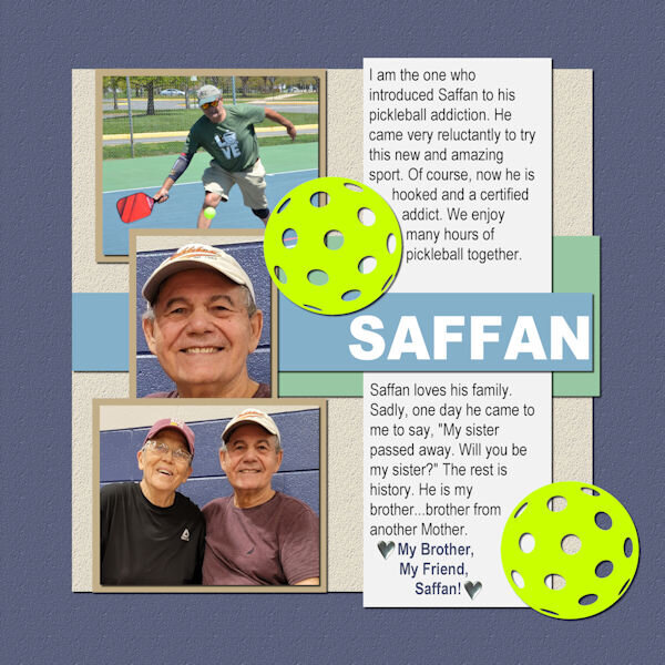
And here is my Brother From Another Mother:
-
7
-
-
My story is similar to Corrie's. However, I was first born and, like Corrie, had a sister who did not survive birth. I do not remember the event at all. My parents did tell me about it but with no details...you now know what I know. My Mother was told by the doctor not to try to have another child...therefore, in a sense, I am an only.
This layout will tell you about my Sister From Another Mister:
-
7
-
-
4 hours ago, Ann Seeber said:
Thank you, Marie-Claire! You're not late, I celebrate all month anyway. 😉😊
Birthdays should be celebrated all month!
-
5
-
-
11 hours ago, Cassel said:
@Bonnie Ballentine The Linoleum pattern is very addictive. It always gives something slightly different so it piques your curiosity! Your style is very simple and always focused on the photo as the star.
@sharon thompson If you use a monochrome noise, the effect will be more subtle. If you want something bolder, use a multicolored noise. That is one way to control that. You mentioned that you converted the abr brushes using a freeware. What version of PSP are you using? You can import them directly in PSP starting with version X5. Check this video. The ability to open a font and have it available in PSP is not something that came with PSP, but it was a Windows feature. That was lost with Windows 8 (I think). I used to LOVE that feature. Since then, I have always used TheFontThing, which still works on my Windows 10.
@Susan EwartI tend to find the point-to-point selection a bit frustrating as I find that it is hard to stop midway, and if you make a mistake in the selection, I find it harder to fix. Your Palette-1 layout is so colorful! That is a very creative way to use masks. About the Palette-2, isn't that interesting how the shadows will give a completely different effect?
@Harmony BirchMaybe your shadow had a horizontal offset but 0 for vertical. At least, that is what it looks like, which is similar to a typical shadow when the element is rotated afterward. That font is nicely used!
@Jen Brown Be careful with the kaleidoscope effect: it is addictive! LOL
@kasanyThe little caterpillar and butterfly come from where? I have seen those shapes before.
@MoniqueN.A simple brush tip can give a great result. You don't need anything fancy. And when you can play with the Brush Variance palette, it opens a whole world of options.
@Anja PelzerYour use of the brush blends it so well with the photo. Great result.
@Sue ThomasI would not know what a spanner is either! I heard a plumber call it an adjustable just yesterday. That was new to me too.
@fiona cook It is great that you chose a font to match the photo. It makes your layout very cohesive.
@Gerry LandrethAre you posting a different image? I still see the shadows on the top left of the title. Using snowflakes instead of polkadots is still using the same technique!
@Ann SeeberYou used the corner punches in the mask? That is a cool idea.
@Marie-ClaireThat last photo of Poncho makes me smile. How can you resist such a face?
@Donna SilliaThat is quite a large kaleidoscope pattern! It is fun how to make that title look like a layered font.
@Corrie KinkelAdjusting the blur of a mask is one command that you can do and it will suit your photo/project.
@Carolyn RyeAs I have mentioned to others, be careful as the kaleidoscope and the linoleum patterns are addictive!
I have been getting several requests for a "Brush Workshop". That was not in my to-do list for this year, but I might add it. I had something else in the pipeline, but I guess I can change that.
A brush workshop would be great! Could you include Suz Shook's script for making custom brushes from pngs and for custom brushes from dingbat fonts? The mask workshop has been a blast! Thank you, Carole!
-
3
-
-
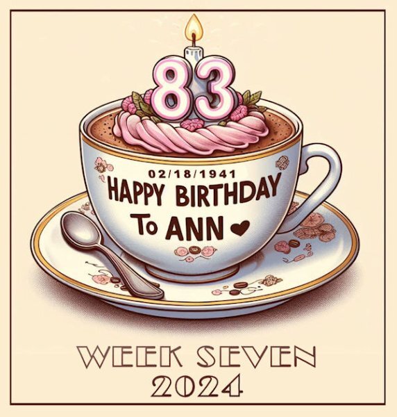
14 hours ago, Ann Seeber said:
The font for the title at the bottom is Broadway and yes, it is my birthday today.
Happy birthday, Ann! Wishing you all the best. Hope your day has been filled with family, friends, fun...and some ice cream!
-
1
-
 1
1
-
-
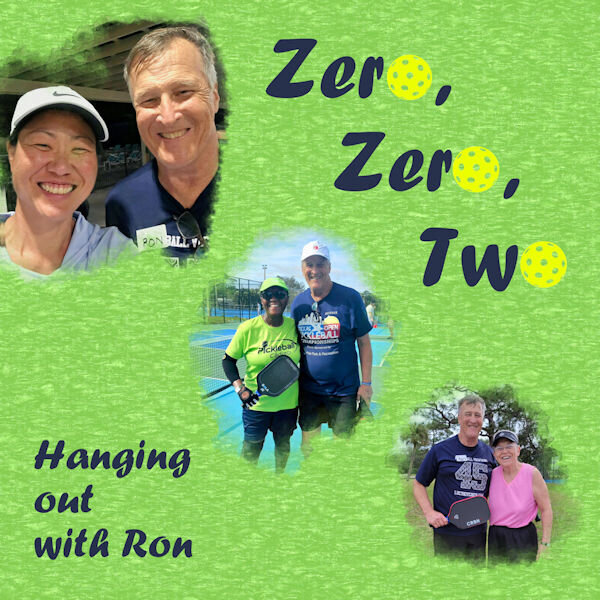
This photo was taken on the golf course after the clinic. Two of our number remained in Florida for a couple more days to visit friends and play golf.
-
1
-
7
-
-
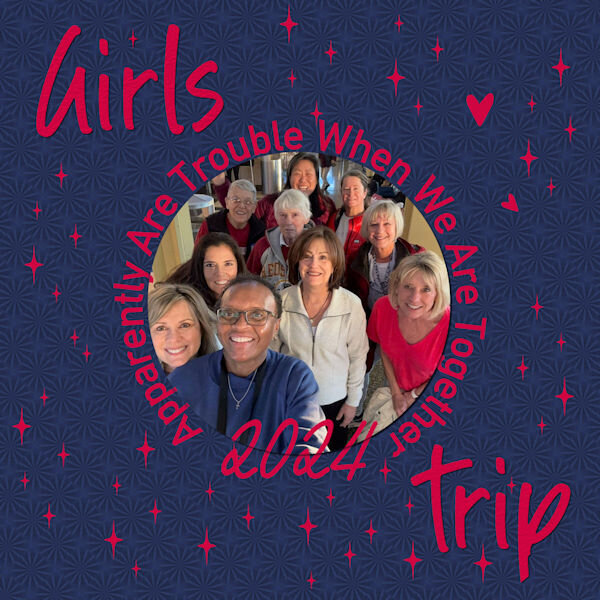
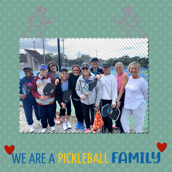
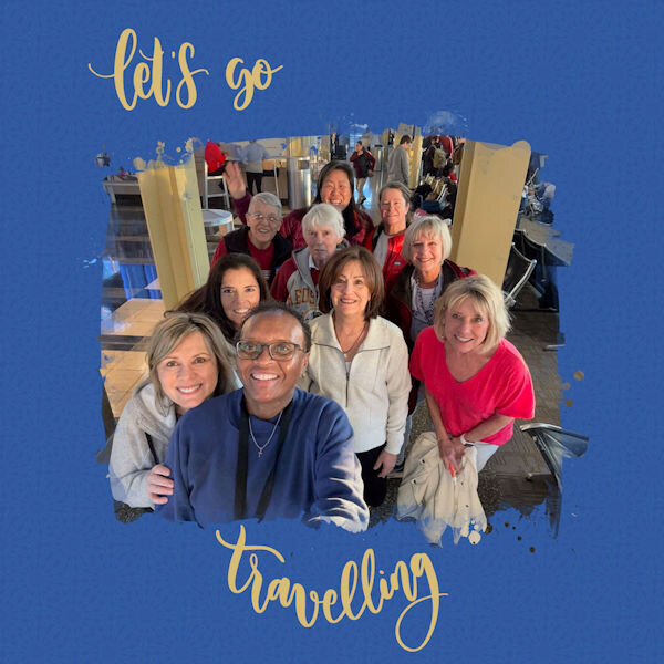
Day 7...once again, 2 layouts.
These are the 10 who attended the clinic together. There were also 30 ladies from Massachusetts. We played card/board games when we were not on the court and it didn't take long for the Massachusetts ladies to join us. We had so much fun...we are planning another clinic with both groups.
I had all sorts of elements in this layout and decided not to use them. Does this surprise you, Doska?
-
2
-
7
-
-
6 hours ago, Ann Seeber said:
Wow, this is great! I think we call that big guy a Monkey Wrench?
I call it a pipe wrench.
-
9 hours ago, sharon thompson said:
Day 5 - I loved that linoleum effect though I had to make it a bit more subtle as I was using the same color as the photo background and mask. Added a small frame to make things pop out a bit. I don't remember where I got the butterfly photo, probably from a naturalist site, but the kaleidoscope of butterflies (yes, that is what a group of butterflies in flight is called) is from Pngitem.com and the font is MingLiu from Fontsgeek.
I love the text...great quote!
-
1
-
-
8 hours ago, Susan Ewart said:
I love the paper. Good call to lower the opacity. I dont like it too busy either and end up doing that often. This sample is really nice.
Thank you, Susan!
-
Once I got into this, I couldn't stop.
I placed the linoleum paper under the green paper that was used to create the linoleum. The linoleum paper only has a repeat of 2 or 3. I changed the blend mode to lighten.
-
4
-
9
-
-
Day 6
I really struggled with this lesson. I find this paper so busy. I didn't think black would work well but I like it OK. I did lower the opacity..
-
3
-
9
-
-
Day 5.
Day 6 is done and waiting for text.
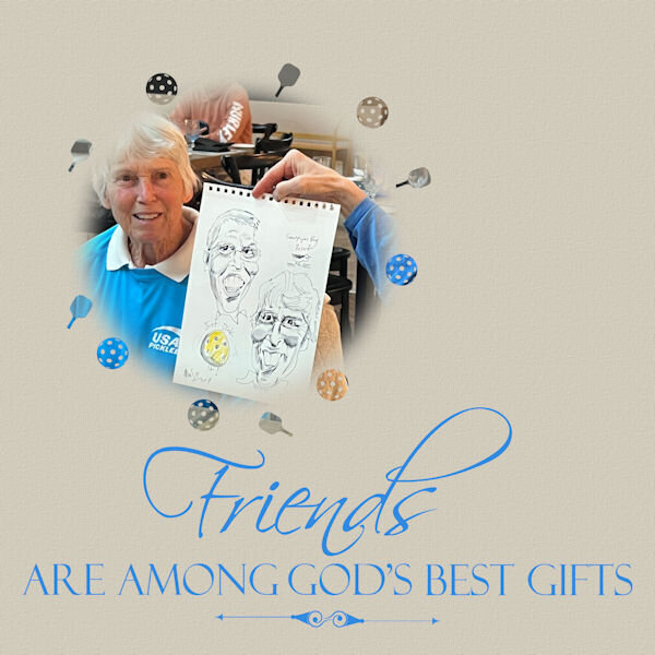
While we were at the pickleball clinic...at dinner one night, a woman approached me and explained that her husband drew caricatures and would draw one for me. He was working for the resort. This page shows his caricature and Judy. It was a nice surprise. We were very careful to pack it carefully for the trip home. Pickleballs and paddles brushes created from pngs.
-
2
-
12
-
-
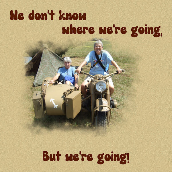
Day 4...an old photo...blast from the past. There is a "Tank Farm" nearby. Old military equipment is restored there by volunteers. Once a year, they bring out everything to display to the public. They even fire the big guns a couple of times. Somehow, I lost my photos of the tanks, etc. A friend took this one of the motorcycle and sidecar.
-
3
-
1
-
10
-
-
28 minutes ago, Cassel said:
Were you customizing your workspace? I have never seen just a single menu go missing. Usually, it would be the whole toolbar.
Can you try to go to View > Customize > Menu and click the Reset button?
No, I was working on my workshop layout and clicked on the File menu and tried to pull down to save and it disappeared. Thank you...your suggestion worked! I had been to view>customize>menu a dozen times but never noticed the reset button. Thank you...now to get back to work!
-
3
-
-
-
My entire File Menu has disappeared. Of course, the Corel help exists no longer and I have forgotten how to find the new forum. I have tried all I can find online and here in the campus. Help, please.
-
S = something blue
-
Day 3...the kaleidoscope is very faint. I have played more with this technique and have learned somethings that make a better selection and therefore, perhaps a better effect.
This pattern is from another layout but chosen from the same photo.
-
2
-
9
-
-
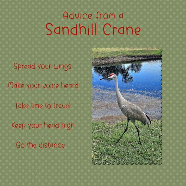
18 hours ago, Susan Ewart said:
The big question is.....how did the crane do at the pickleball clinic? and who got to partner with him/her...the badger? or maybe a giraffe, both having long necks and all? 🤣. All kidding aside, good choice to leave the background a textured yellow and great touch with the little foot prints. Beautiful photos.
Ha, ha, Susan! The crane did very well and ended up winning Queen of the Court that day!
-
3
-
-
7 hours ago, Cassel said:
@Rene Marker Oh I see. I wonder if a reverse shadow would make a little separation between the two photos? That is going to be a great album and hopefully, you will have enough templates to help!
@Susan EwartIt is interesting how you combined the two photos into a single mask. Great job.
@Carolyn RyeHopefully, these exercises will help you grasp the concept of masks more than before. Those children are adorable!
@bina greeneI understand your reasoning for not putting the exact location. However, I am curious and it is nice to get even a general location (even just the country) when you have such beautiful photos. I have not heard back from Lady22 yet, so I put a link to a different template that is of similar type.
@Julian AdamsYou raise a good point. The steps that include the Float is a bit like making a selection with the Magic Wand to then reporting it onto the mask. The difference is that the Float command will maintain the semi-transparency of the section while a selection made with the Magic Wand would not, and would give a very pixellated shape. After a while, it will just become a habit.
@fiona cookIt is great to see that you are comfortable enough with the mask to adjust it to fit your need. Corrie was spot on about the shadow being inside the mask group... so it was masked!
@Ann Seeber I thought I recognized that font! I have used it before too!
@MoniqueN. I didn't know that about the green color. Isn't that interesting?
@Barbara Caulton I don't know why that step would freeze your PSP. Did you manage to get it done? Otherwise, you could try with the Hue/Saturation/Lightness and change the Lightness to get the same effect. I love your idea of the first seven weeks of the puppies' life for the 7 lessons!
@Emerald Jay That is such a cutie! I am glad you found another template on the blog. She has so many to choose from!
@Donna Sillia I love chocolate too. Will we have more chocolate pages? For the page with the red plaid, it definitely matches the blanket. I think that the outline on the text makes it a little harder to read. What would it look like without it?
@sharon thompson I am glad to see your progress. Your reasoning is really on point in how you do things and why. I am sure this "thinking out loud" will be helpful to others reading it.
@Corrie KinkelYou know that the X's are placeholders for whatever element you want to add, right?
@Gerry Landreth In order for the plaid to not overpower a page, you can do like you did and have it quite large and faint, or you can use a smaller scale, but depending on the colors, it sure can be tricky. You managed it well. It is great that you paid attention to the direction of the shadow for the butterfly!
@Marie-ClaireIt seems like Poncho is always ready for a photo shoot, right?
@Bonnie BallentineAre the shadows missing on your white crane layout?
@Anne Lampwhy did you give up on the plaid? Were you encountering issues?
@Anja Pelzergreat photos of those birds!
@Harmony BirchThe Dissolve blend mode is something that is not often used. You found a great way to integrate it effectively.
Yes, they are! How did I miss that? Thanks, Carole!
-
1
-


What are you working on (in February 2024)?
in Showroom
Posted
Template by: The Cherry on Top, Newletter Hop, 2024. Elements from Creative Fabrica.