

Susan Ewart
-
Posts
3,884 -
Joined
-
Last visited
-
Days Won
119
Content Type
Profiles
Gallery
Forums
Posts posted by Susan Ewart
-
-
5 minutes ago, Ann Seeber said:
Thanks, Rene. It was the Yin_template 501.psd that I used for the scattered photos for Lesson 4 of the Double Page Workshop. I think two of the photo areas refused to process with the raster-to-mask script so I did them by hand. The script saved a lot of time considering there were 19 photos all told.
I didnt use the template, just made the masks myself. Raster-To-Mask would have saved me a lot of time. On the other hand, I've finally committed to memory how to make the masks. Actually, it really didnt take that much time to make them. I wonder which would be faster to see. Carole making a mask or the script making a mask...my bet is on Carole.
-
 4
4
-
 1
1
-
-
2 hours ago, Corrie Kinkel said:
My favorite script is not a fancy one with which you can make great layout but the humble "Raster to Mask" script. It is such a time saver but I did buy it on another occasion. From this sale it has to be the "Custom Confetti" and I only gave it a quick try, because this weekend we had visitors and I wanted to finish the Double Page Workshop first. But I like that it makes confetti from any image design or shape, so it will always match the project I'm doing.
I got one called Confetti Maker and one called Punched Confetti. I couldnt decide, so I got both. The Build A Kit workshop really taught me that I want to make more of my own elements/papers etc, So I bought things with that in mind. That workshop had a big impact on me. And now I see the value in the Double Page layout too. Love the workshops.
-
4
-
-
31 minutes ago, Ann Seeber said:
Inquiring minds want to know what KIND of "flyers" are you "ejecting"? Are they alive or dead? ?
hahaha, you crack me up. Not sure if you remember that abstract spines of the flyers I was taking pictures of. It's those. I keep saying to myself I"m not going to bring home any more flyers. But I see some with a cool color combo or design and I end up at home wth copious bundles of flyers. I'll post a few, but right now I'm late leaving for work. Work is such a hassle when it cuts into my creative time.?
PS. they are quite dead (if dead means "stale dated").
-
3
-
1
-
 1
1
-
-
5 hours ago, Cristina said:
Rene, after seeing your comment, I added this script, Merge Group Rename, to my Wish List.
Ann and Bonnie, like both of you, I also got the Open Book Script. ?
I am sure this script was a hit this time, thanks to Gerry Landreth posting layouts with it... At least, it was the reason I purchased it!
I have just played with the Open book script so far. When I saw Gerry's book I had to have it. Now I'm going to add the Merge Group rename too to my wish list. I always think I will go back and rename it, then I dont. I bought 24 items so it will take some time to get them all installed and tried out. I did buy lots that would be good for making kits, like button machine 3, a number of bows, some tubes, confetti maker, paper pattern type scripts and the two tone font. I'm looking forward to playing with that one. After watching the Vector Master Classes and now on the Brush Variance classes I can see how that font will come in handy. I could see scheduling in time for just playing with tools to see what they do (with assistance from the master classes) without having to think of and end layout in mind. I'm taking a PSP short break while I catch up on an ongoing abstract photo project so I can eject the flyers (I'm photographing) out of my house.

-
2
-
3
-
-
I agree, this was a wonderful workshop. I have never attempted a double page before and quite liked the results of them. Lesson 7 was also very informative about how to print them and learning about the gutter. I like the look of having a lot of photos and pages of having few photos. I was wow'd by all the different interpretations of the layouts.
-
3
-
-
Here is the 2nd page as a layout. It might be easier to read it here.
Ugh! I see a typo. That will have to wait until tomorrow. FIXED!
-
1
-
8
-
-
Lesson 6 with the "Open Book" script. What a fun script. How does everyone save it to keep the transparent background? PNG? (I mean as well as saving pspimage file).
Fonts: title is British Columbia rough, there are several styles of this font which i had to have, since I born there. Arial is used in the journaling since I used white I needed it to be very readable. This is a pretty way to showcase to pages.
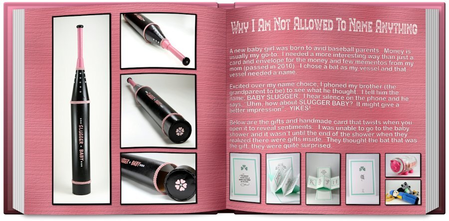
This packaging for the gift took a couple weeks to do. Lots of components and time waiting for things to dry or glue to set up. The card is the same, first I have to make a mock up to make sure it's going to unfold properly, then comes measurements (ugh, my nemesis) and then cut the piece and do the build and hope it all comes together.
-
4
-
6
-
-
21 minutes ago, Anja Pelzer said:
Wow love all your wonderful pages , with so different themes and pictures
I am ready now with day 4 and 5

Anja, what beautiful layouts. The Karneval layout is superb!
-
 1
1
-
-
16 minutes ago, Ann Seeber said:
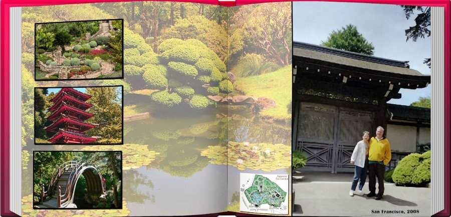
Yes, the cover color is a choice at the end. I liked how the red picked up the pagoda color. ? I got in the habit of using gradients, mostly. And, I experimented with half-sized sheets (3600x1800) and they worked just fine using category #1. I'm also learning the hard way not to crop too close at the bottom or I lose some shadowing.
Good tips, thank you.
-
2
-
-
18 minutes ago, Ann Seeber said:
I tried it out on almost all of my double page lessons. I had layouts that were 7200 wide and had to split them but soon realized I also had to SAVE the new half-versions or the script would fail. I managed to Open Book 4 of the 6 lessons. #5 was not doable because the title would split. Here's #3 which I wasn't sure about because it wasn't designed for two halves but it looks fine to me...
It looks great to me. thanks for the infor about splitting and saving each half. Did you get to choose the cover color too?
-
1
-
2
-
-
6 minutes ago, Ann Seeber said:
I had to try out the Open Book Script I just bought so here's my OLD Lesson 6 - (still trying to come up with a story for a new version).
I love this. I bought it too! Cant wait to use it.
-
1
-
-
11 minutes ago, Julie Magerka said:
Me too! Have never seen it before in the store.
I wanted it too, but had to put it on my wish list for next time. I got my load and blew the budget. I'm most pleased with myself.?
-
4
-
-
9 minutes ago, Cassel said:
@Connie Collier It is ok to choose not to have shadows when it makes sense and often, the only way to know is to try. You tried, and you saw you didn't like it, so you made the conscious decision. Who knows if, on a different project, you might want to try different settings for the shadows and then like the result?
@Anja Pelzer Very interesting shapes too. Those diamonds definitely stand out.
@kasany On your project with a photo overlapping both pages, I suspect that you stretched the photo vertically to make it fit the space available. That is distorting the photo. Can you add that same photo and adjust the height to fit, but let the width extend where it may, by using only a corner handle to resize with the Pick tool. That way, you can have part of the photo under the smaller ones, without being distorted. For the Winter Walk, I love the background you used!
@Ann SeeberI also have the Merlin app and love it, however, it we don't seem to have that many different birds around here. Maybe 5 or 6 at the most (or I am not listening at the right time). You know, that drive-in layout could be enlarged and printed as a poster and displayed at the drive-in!
@Susan Ewartthe choice of colors for that silos layout is stunning as the yellow contrasts well with the blue and both emphasize the other. The Day at the park layout is great! Your grungy effect on the text is very well executed! It really looks like pyrography! You used the same trick I used with a "regular" photo cropped to make it look panoramic! That is just another tool in your box!
@Marie-Claire I don't tend to have many panoramic photos either, but since double-pages are a great way to showcase them when we have some, I had no choice than have a lesson on it. And using photos from free resources it totally ok; is that what they want you to do with those photos??
@Donna SilliaThe beveled letters are ok if you want to give them that look. Sometimes, it depends on the color, the border, the background, etc. I tend to use more shadows than bevels but I am certainly not opposed to bevels! Did you also add a shadow to the letters? I hope you had fun with the scripts.
@Corrie KinkelThe background for those flowers works very well. I almost envision those flowers growing on the rocks! As for the panoramic photo, I would not have known it was not one if you hadn't mentioned it!
@Louyse ToupinGreat start with your first double page. I am wondering if some photos have been distorted. Did you try to fit them in the spaces? Since you are using the space as a mask, it is ok to only showcase what is visible in the mask and not try to fit it in the space. On your second page, you have also squeezed the images to fit the space. HERE is an article on resizing images without distorting them.
@Gerry LandrethAs long as you save a .pspimage version of your project, you can certainly take a break when needed.
@Lesley Maple Did you take those photos just for the layout? Are there already that many flowers out?
If you have not posted yet, don't be shy. And if you feel you are behind, don't worry. The tutorials will all be available for another week, so you will have some time to catch up.
Thank you so much Carole. I really enjoyed Lesson 3 and like the look of that type of layout.
-
3
-
-
Happy Birthday Carole. I celebrated a little early as I was up late last night(or rather early this morning). I enjoyed your birthday very much, thanks for inviting me.?
Lesson 5. I had no panoramas that I could find and my photos when enlarged covered all the 3600 x 7200 so I ended up cutting off the bottom of the wall unit and putting in the gradient. Which weirdly looks the same color as the lights that shine from under the upper part of the wall unit. I like the style of this layout, at least the ones everyone else did, but this is not my greatest work. This was a fail, but I loved the tutorial on the text, converting to curves and character shapes. that has a real nice look as it uses the whole gradient in one letter.
This is a wall unit (teak-Danish) that my uncle owned and I inherited. I decorate it differently each year at Christmas. Mostly this is where my old camera collection lives. It's the 60's-70's style I love. The fonts are DDCooldness and Amoreta from Creative Fabrica.
-
1
-
12
-
-
38 minutes ago, Gerry Landreth said:
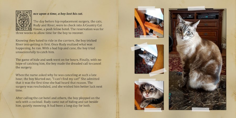
Day 6. Every time I had a follow-up visit with the surgeon, someone would always ask about Rudy. How's Rudy? Or where's Rudy? Followed snickers.
I added an overlay over the grunge to give it an aged paper look.
This is so swesome.
-
1 hour ago, Corrie Kinkel said:
Susan very nice use of your always lovely photos!
Thank you so much Corrie. Your mountain layout is really amazing. You live and visit the most picturesque places and your photo's are a delight to look at. Expecially your flower photo's. I've being so inspired by everyone in the campus (their design sense and their photography) that it has rekindled my love of photography.
-
1
-
-
1 hour ago, Ann Seeber said:
Impressive, Susan. I've never encountered an angel at the only farm in our family, out in Granby, Connecticut, USA. Those cars buried in the weeds look authentic, though. ?
You never know when or where those angels pop up....if you are familiar with the "Weeping Angels" from Dr. Who, you best not take your eyes off them. Kidding aside, it was in a garden at by the house. The cars and the trucks were my favorite. Just parked and never moved for 30+ yrs or longer, I should have asked. I love that kind of stuff. I wished I found more rusty stuff though. I was going to head back there but Covid happened and then I found out my hamstring issue was a torn hamstring (1.5 yrs prior!) and sitting for 9 hours in a car was out of the question. Maybe this year or next I hope. One of my pipe dream holidays was to go to Connecticut and what I heard was called the North East Kingdom area. Especially in the fall.
-
2
-
-
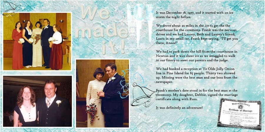
2 hours ago, Ann Seeber said:
I suddenly recalled doing this series of classes before and found Lesson 6 from two years ago. This one will be hard for me to top... !
An exciting adventure you and your family, bride, groom and guests who made it, will never forget. Thanks for sharing.
-
1
-
1
-
-
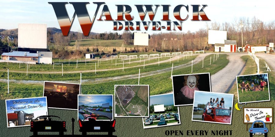
11 minutes ago, Susan Ewart said:
I agree with Mary, I love these Drive in layouts. It's got to be one of the most beautiful Drive-In settings I've ever seen. I didnt realize you were that close to NYC.
I was so busy looking at all the cool layouts that I forgot to post mine.
Here is Lesson 4. I used Amerio for the font and grunged it some more with the eraser tool and lowered the opacity slightly. I had to composite two of the wood slat papers together. It had on each side of the paper, ends of the wood with nails, which would had both sides wit the nails smack in the middle of the layout. So selected the middle of one and pasted over the middle portion and lined it up. I cold see a line on one side so I used the eraser tool large and very soft with very low opacity and and erased over the line and it disappeared. Yay, nice to have success. More from my cousins farm, me wandering around shooting whatever caught my eye. Coffee stains are from a brush set (or two) at Digital Scrapbook.
-
1
-
10
-
-
3 hours ago, Ann Seeber said:
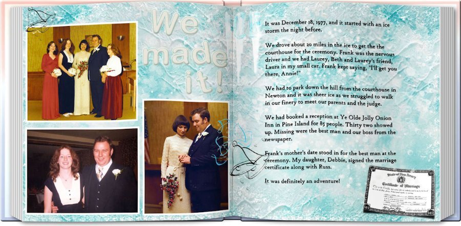
Here is Lesson 5 - My husband and I owned and operated the Warwick Drive-In Theater from 1977 - 1997. Frank's daughter Beth and her husband took over ownership and are still operating it today. I do a little work from home on advertising and social media for the theater. It happened to be a panoramic photo I had handy so, though I don't usually "toot our horn" here we are! The title font is Elephant. The background is a gradient with a little grass texture. We are open every night from March through Halloween. We're located in New York's Mid-Hudson Valley, about 60 miles from New York City. Our visitors have been know to drive up from Long Island for the weekend as there are lots of things to do in our area, including the newest Legoland.
I agree with Mary, I love these Drive in layouts. It's got to be one of the most beautiful Drive-In settings I've ever seen. I didnt realize you were that close to NYC.
-
1
-
1
-
-
51 minutes ago, Marie-Claire said:
Day 5
The panoramic photo is a free wallpaper from wallpapersafari.com. because my own photos are much too small to make a panoramic photo. The small pictures below are my own pictures.
I really love all the colors in this layout. What a great palette you could get from here.
-
2
-
-
27 minutes ago, Donna Sillia said:
Lesson 4: I decided to use my flower pictures since I had so many of them. I used batch processing to add the white borders but not the size because of the different orientations. I used a script to change the sizes. The background is my gold shimmer, the leaves are from a kit that I purchased and the daffodil bouquet is my own. The font is Ambidexter, another open license font. I had downloaded the cass-alphaseparator script by mistake, but it came in really handy with the title. It not only separated the letters, but they were already formatted to change the fill and the stroke. The butterflies are from my kit and are beveled because a shadow ruined the transparency. I also beveled the title letters(saved the unbeveled file in case Carole doesn't like the bevel) because I thought that they stood out better. I also remembered to save the shadows on a new layer in case those need to be changed. Love that script, Carole!
This is beautiful. I love the title and that script sounds interesting. I better add that to my list. the sale starts tomorrow!
-
1
-
1
-
-
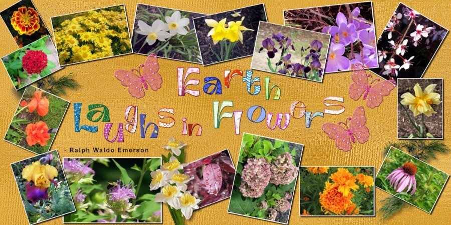
Lesson 3 in the bag....or in this case in the silos. Photos from a 2017 trip to Saskatchewan to my cousins farm. I found the silos endlessly interesting and somewhat abstract. the sunset there were really amazing (which I didnt take advantage of -a regret). as the crops were not tall I used grasses as a stand-in for crops. I might title it but havent thought of a name yet. I enjoyed this lesson and managed to combine them okay, thanks to tutorial. I used a very light yellow layer below the grasses and reduced the opacity so that I could maintain the yellow-red of the sunset otherwise with the white it got too desaturated.
-
5
-
9
-
-
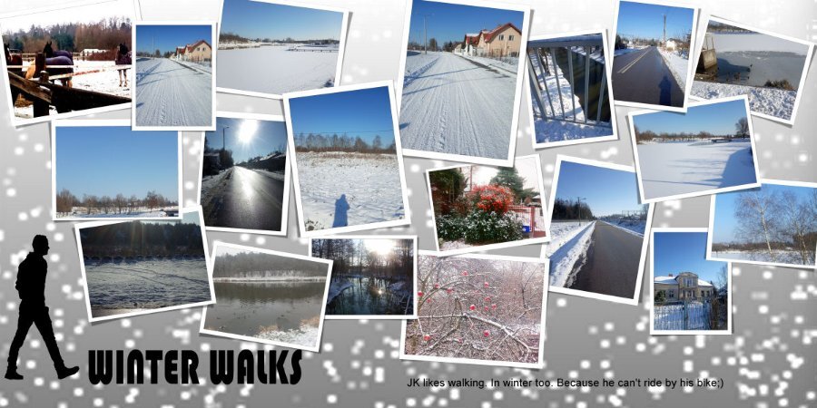
47 minutes ago, kasany said:
On Feet. WinterWalks.L.4.
This is wonderful Kasany. I live in a very snowy part of Canada and I'm shocked at how many people still ride their bikes in snow and -30 celcius. they have studded winter tires for them, who knew such a thing existed. I think it's crazy, but then I dont care for the cold.
-
2
-


What is your "favorite" purchase?
in Chit Chat
Posted · Edited by Susan Ewart
This is a sample the of the flyer "spines". the big one is a shiny very thin 1/4 fold furniture flyer, the upper right is Safeway (food always makes cool colors on the spine) and bottom right is another thin, not shiny 1/4 fold Michaels flyer. They make neat patterns. Not sure what I'll do with them but maybe one day i'll figure it out. Right now, they just look cool to me. This is a layout from a past sketch challenge.