

Susan Ewart
-
Posts
3,884 -
Joined
-
Last visited
-
Days Won
119
Content Type
Profiles
Gallery
Forums
Posts posted by Susan Ewart
-
-
7 hours ago, Marie-Claire said:
Happy birthday Julie !

Is it too early to put my birthday order in...hahahah, just kidding. This is fabulous.
-
 2
2
-
-
17 minutes ago, Anne Lamp said:
I signed up for this one too, I regret I didn't get signed up for the Build a Kit one. I think I would have learned a lot.
I was surprised to not see your name for Build a Kit. It really got me out of my fear box and got me to try new things. Especially supplies I dont use, like alphas, ribbons/bows, fasteners etc. Under the guise of making these supplies I'm learning to be more comfortable with the tools in PSP, and what can go wrong and how to troubleshoot the setting - which is usually something I've done wrong or in the wrong order, or a box is or isnt checked in the settings etc. Also I've learned about using tools I've never used and what setting to use. I hope my memory can keep it all in past the workshop. It really helps direct you to the right tutorials (all availalbe in the Diamond membership-tutorials, master classes, notebook labs etc) and having it around building a kit really helps you focus on creating a cohesive body of work one step at a time. Hoepfully it will be a yearly workshop.
-
 4
4
-
 1
1
-
-
6 hours ago, Michele said:
I thought I would go very "scrapbooky" for this theme as I thought it was a silly phrase to address Daylight Saving Time. All of the papers and elements are from Chantahlia Designs except the bow. I used the CD ribbon with Cassel's Bow 18 script. The font is Sunblast from FDR (Free Design Resources).
Everything on the Chantahlia Designs website is free...yes, everything! I don't remember how I learned about CD, but I'm so happy I signed up for her newsletters. Lots of her papers come in many different hues and her themed sets usually include papers, elements, washi tape, brads, alphas, etc.
This is a fabulous site. thank you. I love that she has catagories and you can pick and choose what you need or get the whole kit bundle. Very interesting resource.
-
1
-
-
7 hours ago, Ann Seeber said:
Happy Birthday, Julie. Here's one of my Irish Wolfhounds making the announcement! ?
There is a person that walks her two Irish Wolfhounds by our house. the person is short (like me) so they look even taller than normal. It was definitely one of those stop what you are doing and just we wowed by the size of them.
-
1
-
-
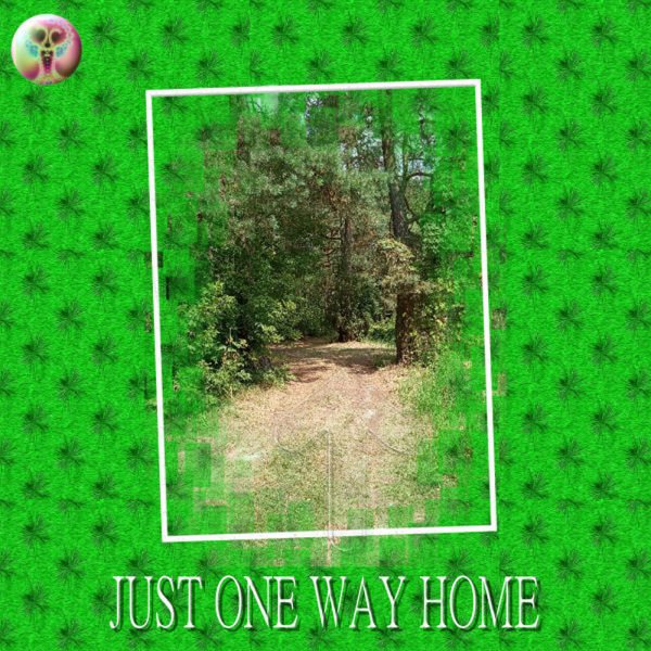
41 minutes ago, Julie Magerka said:
March...I didn't spend much time on the Build-a-Kit project. It would have required a lot of time in watching videos to figure out how to make some of the components, and I just couldn't spend the time lately. But March 17 is a day I can't ignore....no, no Irish in my genes...it's my birthday. And I like to make a Facebook greeting for the day just for the few friends I have on there.
Nothing in this layout is mine. It's all from somewhere....Digital Scrapbook (frame), elements (from ?), and photo of the Emerald Isle from Unsplash. But I had fun playing with it and it didn't eat up a lot of time.
Happy Birthday Julie. Hope you had a super fantabulous Birthday!
-
1
-
-
5 minutes ago, Ann Seeber said:
I found the artist... Palette knife art by Howard Behrens | ART BLOG MarkovArt (wordpress.com)
He has some really nice work. The website has a lot of interesting artists too. thanks Ann. The next time I misplace something I'll know who to call.
-
1
-
2
-
-
I am registered too. I have never taken this workshop. Looking forward to the texting adventure ahead.
-
2
-
-
6 minutes ago, MoniqueN. said:
Because my Outlander project was a bit of a story, I added all projects in Canva and made a video of it. It has white edges, but if I change that the pictures change too quick.
That was neat to watch.
-
1
-
-
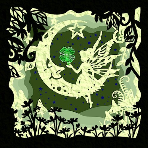
52 minutes ago, Anne Lamp said:
I I used what I learned in the shadow box master class and created this using (Fairy-Moon-Shadow-Box-47020851) from Creativefabrica and the shamrock in her hand was created from (Layer-st-Patricks-day-leaf-25320553). Now my Irish ancestors can either say well done or turn over in their graves.
I think they will say "well done"!
-
2
-
-
Nice layout. And a cool theme to do, "Foto Focus", I can imagine this is a magazine. "This months Foto Focus" featuring (insert featured photographer). Great idea.
-
 1
1
-
-
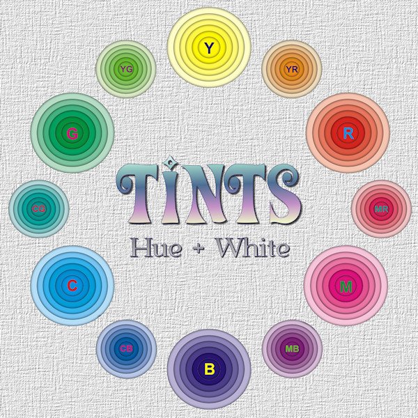
21 minutes ago, Cassel said:
@Susan EwartIn the presentation, I used a 2000x2000 pixels image. If you used a larger image to start with, you might want to double the shadow and maybe add an extra Gaussian Blur.
Thank you for the tips. I was wondering how to make the layers look farther apart. I did work on 4000 x4000 image for the 12 "spokes" of the wheel. Is doubling the shadow just doing Control-Y? I never thought of gaussian blur. I'm going to try that. I had envisioned it looking deep, but it didnt turn out that way. I tried white shadows but it looked weird and too much opacity in the shadow made the tints start to look like tones (adding grey). I was going to ask how to make it look really far apart, so I can try these ideas. I had an idea of of layout with random sized holes, some offset, some not and only a few layers but really far apart (looking) with only one color ring and the rest of the rings white. I guess I could have just said an abstract image. I'll gvie it a try.
-
1
-
-
5 hours ago, Ann Seeber said:
Nicely done, Susan. That's a beautiful layout in its own right and very enlightening. Color wheels will never be the same again! ?
Thank you Ann. It was a mental challenge to figure out and keep it all straight in my head. there was a lot of layers. I probably did some of it the long way but I got some practice with using groups when I needed them. Even though you cant see the dimension in layout, I should do a layout for the Shades and Tones as well. Good practice.
-
1
-
-
I was playing with the Shadow box Master class. And I had this color wheel in mind (although I don't actually subscribe to the "color wheel" model?). As it turns out, those little circle layers are too small to be effective at showing the depth. it was a good learning experience, and I've included a larger version so you can get the idea of the depth. It's good for big layouts. I look forward to trying the ones from the masterclass.

-
3
-
 2
2
-
7
-
-
40 minutes ago, Rene Marker said:
I did what Carole suggested. I had a bunch of brushes that I had gotten from various designers. I had always been using the png file then I learned how to import them from the abr file the designers included. They all ended up in the Brushes folder in my documents folder. So I went and created a folder for each designer and moved the applicable files to their folders. Sure has made it easier when I just want to look for a brush.
Good to know, this is my problem. I have a very large assortment of brushes (mostly abr, some of which I've had to use ABRmate to convert them to PS7 files) that I have to scroll through. I wish it was like my Font Viewer and the brushes in the folders stay turned off until you need them and you can turn one the ones you need and not have to wait till ALL the brushes load. I'd like to see a check box iin the drop down of the folders you could turn them on and off as you please, there could be options for ALL on or only selected on and what it does when you open PSP, ie. leave it at the last setting or turn all on or off. A girl can dream.
-
34 minutes ago, Cassel said:
@Susan EwartI actually have that very question as a future blog post, but I can do a demo during the Q&A if you want. And the answer would still be "YES, just create the folder in Windows and NO, you don't need to tell PSP since it is inside a folder it already knows of"
Only if you have time in the Q&A. I can wait (and look forward) to the blog post too. Thank you for the answers.
-
1
-
-
L= Leaf, clover leaf
-
1
-
-
I need some clarification on how to organize my brushes. I use a separate folder (as instructed by you) called "MY PSP RESOURCES" on a separate drive than the default PSP folders. File locations are pointed to this location. I would like to make sub-folders within the Brushes folder(ie. watercolor, light rays, coffee cup stains etc). Do I just make the folders file in windows and move both brush files into the sub-folders? Do I have to tell PSP just where the brushes folder is (which is already knows) or do i have to point PSP to each and every sub-folder within the Brushes folder? then will I see the catagory name in the brushes drop down menu when I'm using a brush?
In File Locations there is had an option "Create Sub Folder". Do I have to use that? I do have "Use Subfolders" checked as well as "Enable".
New: I tried a test with Create Sub Folder but it put the folder in the default Brushes folder, even though it said save to My PSP Resources.
-
17 minutes ago, kasany said:
I coudn't active participe in MaskWorkshop'23 in different cases /home problems, router-problems-no net for a week, covid-19 as an end/. I hope all's fine now:))))
So I can play PSP right now and be happy with you:))))))))))
Excuse me Carole, my absence during lessons, I'm sorry...
I hope you are coming out of the life-storm and on new path to wellness. That photo is beautiful. Nature never disappoints and is a wonderful therapist.
-
13 minutes ago, MoniqueN. said:
What a difference! I didn't like the first one I made, (the brown one), then I rememberd I had a mask made at a previous Mask workshop. Now I used it again and with a gradient added it looks far better!
These are fabulous!
-
The crosses are really nice!
-
1
-
-
On 2/25/2023 at 4:14 AM, Ann Seeber said:
Scraplifting is one of my favorite challenges. I always start with copying the example and enlarging it to 3600. Then I reduce the colors to grayscale. From there I build a template, keeping the original as my base layer, and filling in shades from black to white for each component, be it full sized paper or embellishment. I make all photo areas black. At the end, I increased the colors to 8bit so there will be a full palette available. Here is my finished template in a reduced version for posting here. I will put the full sized version on our Facebook and the .pspimage in the Files area there for those who want a head start. Feel free to download it and start creating! I will be back with my own new creation in a while.
Edit: I did discover that the black areas for photos didn't work in the Raster-to-Mask script until I used Negative Image on them again and they turned white. Then the script was ok.
Thank you for explaining how you do this. I have not tried to make a template before. I'm always impressed to see yours.
-
6 hours ago, Ann Seeber said:
I found it here Simple Pen Solid Font | zeenesia studio | FontSpace
It's also at Creative Fabrica, Zeenesia studio is a designer at CF. At least it's a commercial licence if you download it from there (free if you are a subcribing member).
-
1
-
-
1 hour ago, Ann Seeber said:
Actually, notices would be correct in that sentence.
1 hour ago, MoniqueN. said:Oh thank you! *blushes* ?
I thought "when she notice one of the men" had to be notices instead of notice ?
Oops, I never noticed that. Further proof that my English is not very good.
-
2
-
-
9 minutes ago, MoniqueN. said:
Quoting my own project, but wanted to ask if the English I used is ok? ?
Your English is better than mine! And I'm a Canadian (English speaking)! I'm a bad Canadian who miserbly failed French (our second language).
-
1
-


What are you working on (in March 2023)?
in Showroom
Posted
Fabulous! That shadow box has awesome depth. Is there anything cuter than bunnies? They are so sweet. I like how you colorized the lace.