

Susan Ewart
-
Posts
3,884 -
Joined
-
Last visited
-
Days Won
119
Content Type
Profiles
Gallery
Forums
Posts posted by Susan Ewart
-
-
3 hours ago, Ann Seeber said:
I fully support this effort to reclaim the wild plants for the pollinators. Tidy lawns now make me shudder.... ?
I'm sure my neighbours cringe at my "lawn" it's mostly weeds. Weeds are green, it's look the same to me as when it's mowed. I wont allow pesticides on the lawn that animals go on, I have reluctantly allow ant extermination around the perimeter of the house as I do not like ants in my house, thankfully the "ant garden" where the mound is for the birds is out by far end of the garage in the back yard.
-
 3
3
-
-
4 hours ago, fiona cook said:
Hi, Bug hotels as they call them come in all shapes and sizes and I think started out by people leaving old bits of wood and leaves in a corner of a garden so the bugs could have shelter. I've seen huge ones made of layered pallets (not PSP palette layers!) in-between which would be all sorts of organic matter. Our councils in UK place them in parks or wild areas, some made of decorative carved wood or use bird boxes with the fronts replaced with things like bamboo, straw etc. Kids like them and it's a way of introducing them to the importance of natural areas and gardening.
Susan, you will now need to make your own bug hotel to go with your bird baths.
Michelle, I try not to use insecticides or such like chemicals and make compost for the garden from vegetable scraps and also get a bit of exercise digging the heap over. We have a smallish lawn that this month I have let grow wild as encouraged by the environmentalists to help wild life thrive mainly for pollination purposes, so called 'No Mow May'. It doesn't look tidy but it's not a problem. Now you've given me a couple of subjects 'vegetable garden' and 'No Mow May' for other scrapbook projects. Hopefully I won't take so much time doing those ones!
Thank you for the explanation on Bug Hotels , it's really quite interesting. I inadvertently followed your no mow May objective too. I love dandelions and lately have been photographing them. I put a "no-mow" decree on the the backyard (to my husband) and it was gloriously yellow and the seed heads were stunning, until the wind blew them away, and I cut some to photograph (soon to be in a layout). I had also read that bees hibernate in the ground and they need the dandelions as the flowers aren't out early enough. I did not know this. My husband was saying he hasn't seen as many bees on the dandelions as there usually is. How sad is that.
This year my tiny garden (I am a terrible a growing things)got a soil refresh and I was lifting up some small paver stones and there was an ant colony. I felt bad so I put the stones back and covered over with the really fine soil/dirt they seem to make . So, they still had their solid roof, then I used the cement pavers to mark the edges of the ant "garden" section and that's where the little brown birds go for their dust bath. They dont like the garden soil but they love whatever it is the ants make. Also the Magpies and Crows will use the ants to eat the mites off them (there's a word for it, but I forget right now).
-
2
-
 1
1
-
-
1 hour ago, Gerry Landreth said:
Carole - I didn't make the connection with the Scraplift Challenge. It's amazing to see the continuity between generations.
Mother finally adjusted to the cats, and they rewarded her acquiescence with abounding love.
The fonts for this project are Cute Cat and Stay at Home, both from Creative Fabrica.

Love this, the laughing cats are the best!
-
1
-
 1
1
-
-
27 minutes ago, MoniqueN. said:
I forget a lot too, espcially when you don't use it a lot at paintshopping. But I have Carole's tips and tricks book nearby and try to find what I want there. ?
yes, I refer to the book too. so much to remember, and thankfully we dont have to if we have the book nearby.
-
1
-
-
46 minutes ago, fiona cook said:
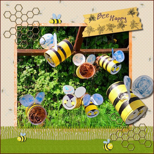
I have finally completed my project 'Bee Happy' so this is what I have been working on in May. I made the hanging bees for the purpose of decorative bug hotels for my garden.
In PSP I used the Fringe Effect technique from Lab13 Module 5 for the grass layer & a reverse shadow then added a texture with the grass picture tube.
I used various papers and images from the Digital Scrapbook site and studied 6 ways to add borders from the Campus Blog.
Fiona, those are so cute. what a great idea. I have bird baths and bird feeders and this year I thought, what about the bees and the butterflies? So I have been researching a water station for them too. I've never heard of bug hotels and will have to look that up.
-
2 hours ago, Sharla said:
I love your layout and your photos are delightful. Barnacle geese arrive in their thousands every year on the Solway Firth and we drive out to see them in the winter. I've taken many photos over the years but with little success - I get side tracked with watching them and miss the shot. One day...
Thank you Sharla. How lucky you are. I cant imagine what that must be like to see that many geese at once. I have many many bad photos and a few good ones. My timing is usually pretty bad. Thank goodness for digital, I can shoot a lot on continuous and hope I get something. I'm much better taking pictures of things that dont move.
-
1
-
-
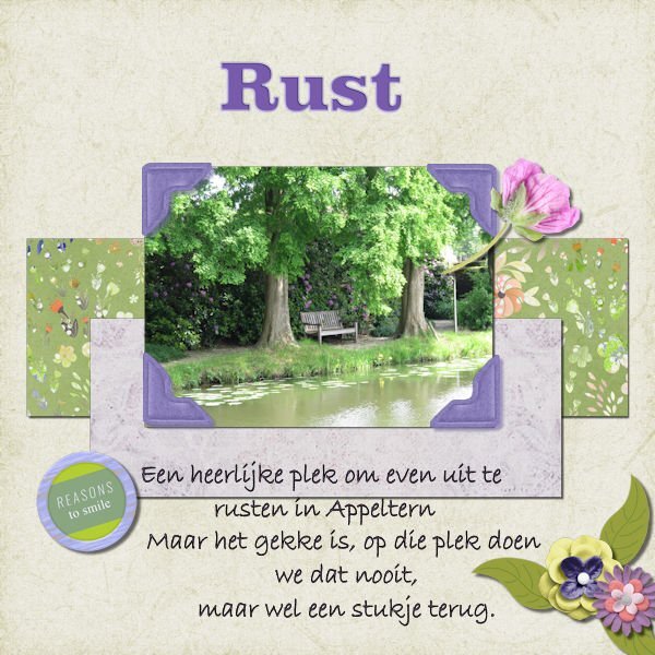
2 hours ago, MoniqueN. said:
Repost: Flower at the right now on top instead underneath the papers. ?
I like the flower and the stem showing. The flower is bright so your eye naturally goes there, then it meanders down the stem with a huge payoff of the photo and in particular, the bench...which is the "Why" of the photo...The perfect peaceful place to rest and destress. I wont get into angles and triangle in photography, they are there too, a huge thing in composition. Great color choice in that flower; magenta based with green all around as it's complementary color.
-
1 hour ago, Mary Solaas said:
It is so much fun playing around in PSP!!
I want to do the squares like you did and try effects on them. I did that in the Build A Kit workshop but didnt do squares, I did blocks of color and strips and rotated them, I found there was too much of one color. So many possibilites. I was just watching the the Distort It Masterclass (havent finished it yet) and there is a really cool paper idea I want to try out too.
-
6 minutes ago, Marie-Claire said:
Susan,the result with the birds in the background turned out well! It's fun to play with different layers and blend modes. ?
It sure was fun and surprising. I was not liking my layout, it was too busy when it was a photo background and lowered opacity just looked grey and dull. Then I thought about blend modes and was moving layers all over when the happy accident happened. I could never have predicted what the blend layer (difference) would do since I had multiple layers with adjustment layers below it.
-
1
-
-
Project 4
I used the kit that came with this Project (cpjess-spring skies). But you wouldnt know it, unless you took a peak in my layers palette. I used the blue sky paper, duplicated it and turned it upside down so the clouds above were same below - but you wouldnt even see that now as it all blended in, all these two layers had adjustment layers applied to them and both paper layers had different reduced opacity. I used the blue paper (with newspaper writing on it) with a reduced opacity and above that layer I promoted a selection of it to make my pinking shear effect. And above that layer was a photo of mine of Canada geese flying into the pond. I didnt like the photo background look so I played with blend modes and chose "difference" and it made the birds look like a graphic and the pinking shear was lightened against the background of the same paper below it. I thought it looked interesting. Lots of this was me moving layers around and seeing what would happen with the blend mode. This again, was a happy accident. that works better with the two smaller photos. I made the other little strips of paper from the original blue paper and from the new brownish paper. Used also in the title.
Font: NNSafari Serif (Creative Fabrica)
Photos: mine
This was shot on November 20, 2011 and these geese (over 800) had only 2/3rds of the pond as the rest was frozen, and they had to share it with about 6 other species that flew in. It takes about 10 minutes for the geese (coming from the farm fields nearby) to all get landed. the sky is black with Canada geese, it's really quite a site and fun to watch them come in for the landing. This is a very different kind of layout for me.
-
6
-
-
27 minutes ago, Randy said:
PROJECT 4
Fonts used
Which - Impact
Path? - Cursive Serif - https://www.dafont.com/cursive-serif.fontAll elements came from the suggested pack.
I did modify one paper
I used Color Foil
Then I used TypographyCarole, Thank you for the information on the Music resources.
Thank you for the info on the font, it's a nice one. Where did you post your project 4? or did I miss it in this post.
-
33 minutes ago, Mary Solaas said:
Susan - I love that "just playing around" you did with the papers and I love that element.
Thank you Mary. It is a good (read: hard) challenge for me to use just one kit, make it work and be happy with the end layout. I'm learning that "playing around" and "happy mistakes" are a good thing. Also the photos from this one day of shooting werent that great (started sunny then got really grey and dark) so I'm also seeing if I can get acceptable ones to use. Good thing the bootcamp doesnt need a huge amount of photos.
-
1 hour ago, Cassel said:
It is so interesting to see three different water colors. I guess the angle of the photo and the sky reflection can give great variety!
The weather was going from sunny to really dark overcast that day. It was November and the day started out sunny, that's why I went to the park, but it turned quite dark very quickly. The water went from having blue sky to reflect on it to a grey sky. There is trees around the pond so there is also lots of shadow from them too.
-
1
-
-
1 hour ago, Gerry Landreth said:
I think God gets mad if you walk by the color purple in a field somewhere and don't notice it. - Alice Walker (paraphrased)
I can't walk or scroll by the color purple without stopping to admire it.
Mother Nature does purple wonderfully doesnt she. The color geek in me wants to tell you Magenta-Blue is what I call purple and of course Blue is Cyan + Magenta. So we should be loving Magenta for pouring more of itself into the mix to make that wonderful purple we all love. But, I wont be a color geek and tell you that. ?
-
1
-
-
1 hour ago, Gerry Landreth said:
This was inspired by an article in The Washington Post about the healing benefits of the songs of birds. The article featured sound clips of the birds in the layout - meadowlark, bobolink, and woodpecker.
The glitters were created using Carole's script Glitters-C. The papers and elements are from a kit, Celebrations, by Whispey D'Zines. The fonts are Spring and Ernestone, both from Creative Fabrica.
I forgot to note that in the previous project, I used Carole's Smoothener script to eliminate the jagged pixels appearing in a selection's expansion. It did an amazing job.
WOWZERS! This is beautifully done. One the smoky days we had last Wed, I came home from work and it was eerie because no birds were flying or singing, dead silence. A world without birdsong is a world I dont want to live in.
-
1
-
-
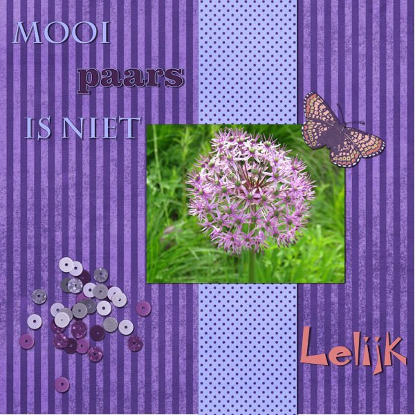
2 hours ago, Ann Seeber said:
Mooi paars is niet Lelijk - Google says: Beautiful purple is not ugly ?
My hubby and I watch a lot of shows that are subtitled (I hate dubbed) and we often laugh at the translations.
-
1
-
-
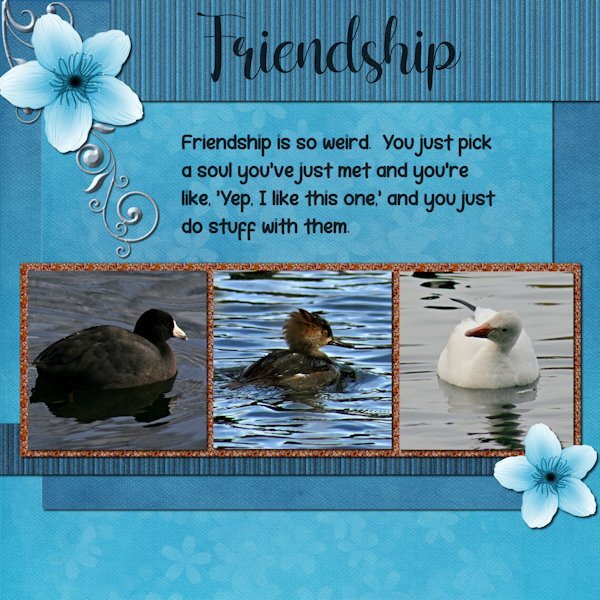
3 hours ago, MoniqueN. said:
I'm late as usual, sometimes life is demanding ?
My first project:
I love the colors in this layout.
-
Project 3.
I used the kit provided "Welcome Spring" from Digital Scrapbook and by DB Magnolia. And I used the orange glitters. Are you sitting down? Are you ready to hear this? I did not change the blue/white flower or the background paper. I did however change the glitters (darker) ?. I used the background paper twice, once for the background and once upside down for the mat behind the photos/glitters. I used the an extraction of the same background paper and added texture effect>texture> blinds, then added noise, then went back to try a different size blinds on a duplicate copy and accidently applied it again to the one with the texture already on it. it made it look more like stripes. Same for the bottom striped one, which I made darker. I used a scatter of little flower petals and changed the color to white (from pink) and reduced the opacity a lot. It might not show at this resolution. There was no metal element so I extracted a design (part of one) from a card in the kit and then changed the color and added an inner bevel, hoping it looks like metal.
Fonts are: Shelly (title) and Robeek (quote). from Creative Fabrica or Google (as my font program came with google fonts as well).
Quote: found on internet search "unlikely friends", but could not find who made the quote. it has "human" instead of "soul" that i added because, well, these arent humans.
Photos: are mine from the the same photo shoot day, weird changing weather. The layout would have looked best if all the water was the same color as the one in the middle. I may swap out two photos from another photo day that has matching water.

-
3
-
3
-
-
17 minutes ago, Marie-Claire said:
In the April Q&A I had asked Carole how to make a Stencil effect. My idea was to make different papers with it. But at my first try, I wasn't sure for which project I could use such papers. My eternal problem is what shall I make as a project. So I just did something, and tried things out for several days until I finally came to something.
I didn't use the stencil technique here to make a paper but saved it as a png.
The alphas are a freebie from Carole, as are the screws.
Of the photo, of course that is Poncho, I first made a B/W version, duplicated it twice, on the first layer the blend mode: overlay, on the second layer: screen and on the third layer I applied: soft light.
Font is from DaFont and is : PaintyPaint 1
and a watercolor bruch for the stripe.
Stunning! I love everthing about this. It looks like a photo from the 1800's. Really incredible, complex work. Thank you for the instructions. Very interesting to have different blend modes on the different layers.
-
3
-
 1
1
-
-
49 minutes ago, Anne Lamp said:
I have again used a screenshot from an Explore live cam. I added a lighter paper under the horizontal text because I didn't think it showed up enough.
Wow those Explore live cams have nice screenshot resolution. Do you get to watch them moving and choose your own screenshot. I will have to check that out.
-
1
-
-
33 minutes ago, Mary Solaas said:
The last one which was so much fun was skipped. Let me try again to upload it (I reduced the size to 500
Love this. Just because you arent into layout making right now doesnt mean your arent doing something meaningful. Play is one of the delights that sparks creativity. Keep on doing what you are doing and the layouts will come when they are ready. I too feel like I'm behind in stuff I'm doing and taking a note from your playbook today I think I will do some photography and see where it takes me.
-
3
-
-
32 minutes ago, Mary Solaas said:
Yes, I always love what you do with the Fabulous Divas, Michele.
I'm still playing. Made an image of my Chattanooga Pallet - putting the colors in squares. Then I made a copy of the jpg and played with Kaleidoscope and at the last, played with a copy of it and twirled it, kaleidoscoped it and twirled it again and then kaleidoscoped it again. These are the results. I can't seem to get to making layouts and I need to finish my 2022 Alphabet challenge - S, T, U, V, W, X, Y, Z. Still a lot to do before I can make a photo album of it. And, then, there is the rest of the double page workshop that I didn't finish. My, my - my To-Do List is overflowing! LOL.
Great idea. what cool shapes you could make into brushes or tubes as well. Or a mask in the middle. So much possibilities.
-
3
-
-
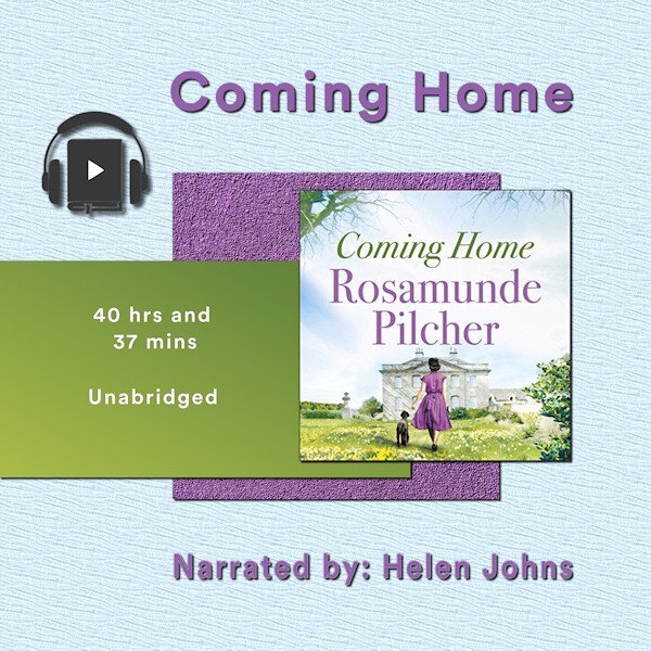
17 minutes ago, Sharla said:
Project 2 - Book number 2.
The papers are my creation, the book image from the book cover, headphones a bit of vector art I copied and adjusted.
The 'home' in the title is Cornwall for the heroine who is catapulted away during WW2 A very long gentle story. I listened to it whilst doing jigsaws in the winter. It took me weeks to finish it...
Your papers are beautiful. I particularly like the texture on the background light blue one.
-
2
-
-
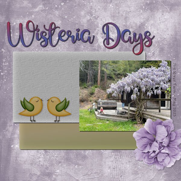
36 minutes ago, Ann Seeber said:
Using the photo I displayed earlier, I toned it up and it's now the star of Wisteria Days. Title Font - Glamlips w/custom gradient,
Background paper-Marisa Lerin (colorized), Photo by Debbie Lennox of her granddaughter Magic in Mendocino, CA. Detail font - Harrington,
Flower - AFT-Love Life, Bird art - found in my birds folder.
Your custom gradients are very beautiful. I like the choice of greens that you used with this.
-
1
-
2
-


Scrapbook Bootcamp - May 2023
in Showroom
Posted
Project 5
Again, I used the kits provided (except the one kit that is a 7z file that I cant open) and changed the papers/elments a bit, mostly darkened them. The frame was actually a polaroil frame that I used the custom selection to select the inner portion to delete to make the frame. I added a bevel. The bolt or silver item in the "O" of the title came from one of the kits in the bootcamp as there wasnt anything suitable for the "O". I followed the same shadow as in the tutorial. Is it too big? Given what item it is and that it's one a thicker frame it would be pretty far from the background paper. I was riffing off of the Penguins of Madagascar cartoon and "Kowalski" name in military shows. I did look up the Royal Canadian Air Force and found that there was 408 (Goose) Squadron formed June 24, 1941 that flew many missions in the war. It's patch/insignia (whatever it's called) has a flying goose. I didnt know the etiquette around using military likeness without permission so I turned to hollywood and used the penquins instead. And I loved that show, especially Kowalski the very capable Frist Lt. who had deep pockets filled of all kinds of things he'd pull out when needed by Skipper (his Captain)...who knew peguins had pockets in the first place. ? I tried to tilt the photo enough to look tilted but not look like the geese would be sliding off the photo. Just the way the ice is, it still looks like that's happening.
Fonts are: Off War, Olivetti Typewriter Wide, Old Typewriter (all Creative Fabrica)
Kit used: PSBT Nov 202 Songbird So Thankful
Photo: mine
Thank you for another wonderful Bootcamp. I have realy enjoy everyone's layouts. So nice to come home from work and head to computer to be inspired.