

Susan Ewart
-
Posts
3,884 -
Joined
-
Last visited
-
Days Won
119
Content Type
Profiles
Gallery
Forums
Posts posted by Susan Ewart
-
-
Lesson 2 page 1
I didnt do this as the double page as the background on both sides are slightly different color. I need to work on it more and blend the edge of the one into the other. Sigh. I found this type hard to fit images into. If I had gotten it together I'd have done the abstracts like I had hoped to do. they are good with long rectangles. I do like very much what others have done. So many wonderful places people have been. The layouts are beautiful.

-
 1
1
-
 8
8
-
-
1 hour ago, Gerry Landreth said:
I used another one of the templates from Yin Designs. The Clip-to-It script is an indispensable tool when working on a layout like this.
My parents were armchair birdwatchers. The feeder was strategically placed where it could be seen through the sliding glass door, and the tattered reference books were nearby in case an interloper flew in for a snack.
When I moved back to Alabama, I carried on the tradition. Several feeders were strategically placed where we could enjoy the birds when the dining table. Mother even dragged out the 20-year-old reference books when needed.

This is a beautiful layout Gerry! Beautiful photography.
-
15 minutes ago, Ann Seeber said:
Here's my Day 2 - My fishy ??
What beautiful colors. Nature is amazing and super creative dont you think? Fish are so relaxing to watch. I didnt know they are intelligent or social. Are they from the carp family. I do know those are social even with people. Or is it they just know who feeds them....yeesh, they are "cats" of the water worlds.
-
4
-
-
23 minutes ago, Marie-Claire said:
Day 2
and also the continuation of the holiday photos
The font is Simplefire
Bright beautiful colors. I like that you used the slats for one photo on each page. It's really nice looking like that.
-
 1
1
-
2
-
-
4 hours ago, Mary Solaas said:
I'm posting here because I didn't join the double page workshop. Sorry - after looking at the postings, I'm sorry I didn't. It might have helped the kit i'm working on - the Chattanooga trip my daughter and I took last year. I've been working on it for some time, and after the Build-A-Kit Workshop, I'm finally trying to make it a kit. I had done a few extractions in some of the pictures, since that is what I like to do. But, today I decided on a palette (Yeah, I know, it is a little late in the game!)
On 4/17/2023 at 10:51 AM, Ann Seeber said:Thanks, Susan. Actually, it's one lino paper with a frame that has a wide translucent border to allow the background to show through. Here they are in the PSP Frames file...
Ann, that is very cool. I thought it was two papers. You are really good with the frames, I love what you make. I must try and find some time to practice with that tool.
Mary, that's a nice rich palette. A good amount of colors to choose from. I would love to see you in the Double Page workshop, hope you find the time to joing. I'm behind. Only just did my lesson 1 and soon off to work so by tomorrow I will be 3 lessons behind.
-
1 minute ago, Gerry Landreth said:
All of the pictures are from Pixabay. The font, aptly named Spring, is from Creative Fabrica
Everything about these layouts is just beautiful and peaceful.
-
1
-
1
-
-
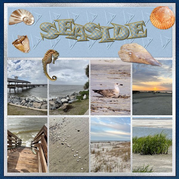
2 hours ago, Donna Sillia said:
Here is my first double page as I am running behind. They are pictures of that my daughter sent me after her vacation at St. Simons Island. I have her trained to take pictures for my projects. The first page is of the sea and the second is the lighthouse and her climbing and descending the stairs. Two of the shells and the seahorse are downloads from DigitalScrappers. Two are from Filter Forge, and the rest are mine extracted from shells collected by my grandson in Thailand. The font is from my kit with changes to the stroke and fill to a plaid that is also in my kit. The papers are my shimmer papers. I had to edit to change the size of the pages.
Beautiful Donna. I see that lovely shimmer paper behind, it looks great. Great photos, you trained your daughter well.
-
2 hours ago, Cassel said:
Click on the tiny triangle arrow on the left side of the word Preview on top.
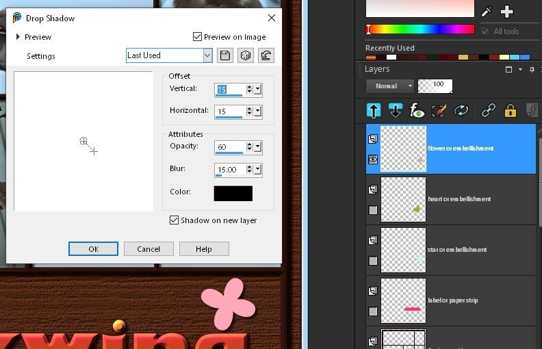
Oh my gosh! so simple. Thank you. I was expecting it to have a box like the preview on image box. It is happy now and altough it's a small thing, I surely wont forget it.
-
I forgot to add this. When I'm using the drop shadow I'm not getting a preview. Is there setting that I might have unchecked to not be getting a preview. I just starting using PSP 2023 and this is the first layout from it. I just turned on the pink flower to check an existing layer. but no previews for the frame layer (that I had beveled). the inner bevel showed previews, just the drop shadow wasnt showing it.
-
here's page 2
-
2
-
8
-
-
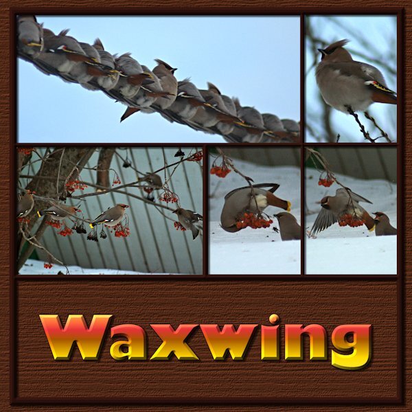
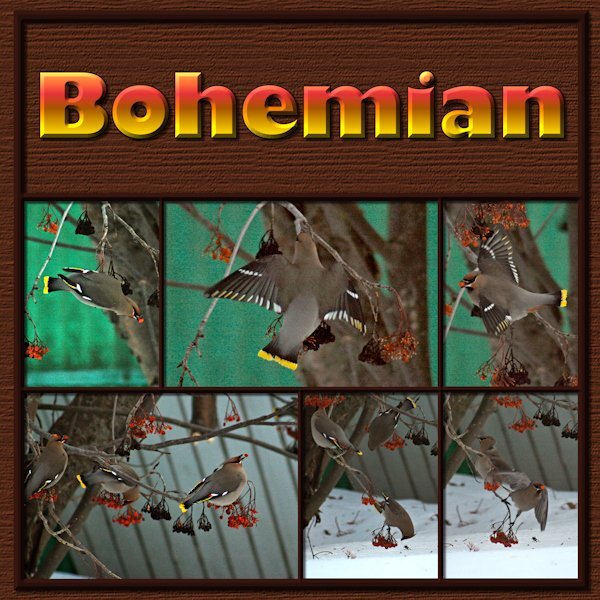
Finally got to Lesson 1. As I am culling photos to make room on the HD I came across these Bohemian Waxwings. They are described as wandering vagabonds by google. Really they are a rowdy bunch of dunkards! They feast on the Mountain Ash tree in our yard and the neighbourhood. These images were very bad; very dark and very soft/grainy. I was about to delete the lot when I thought I'd see what PSP can do. Now I will have the memory preserved even if I delete the bad photos. Font is Gill Sans Ultra Bold, a windows font that is a favorite of mine. I used the magic want to select the mask groups I had made and on the second to bottom layer (I think it's the black layer in the psd file) it the delete key. Ending up with a frame that I moved above all the mask groups and put an inner bevel on it (hard to see because it's a dark frame). Used a wood grain texture (texture effects>texture>wood grain-at about 400 or 600). Bevel on the title as well. Loved this template, it's very versatile. I really enjoyed and was motivated by the layouts from everyone so far.
Here's page 1
-
2
-
6
-
-
48 minutes ago, Mary Solaas said:
Disc is full! Oh, my disc is not full, but I have an old computer (it tells me it cant handle Windows 11) and my 1T SD Cdrive that my son put in for me is 1/2 full+ which slows down my working in PSP. Cleaning up unwanted data is a chore I'm in the middle of. Some pspimage files have a hard time saving and some in opening. Life is interesting - I'm not ready to get a new mega mega PC.
I feel your pain. my 2TB SS HD is almost full (on a separate drive with my photo's). Is sure does slow it down. I think we have 32 GB ram. That's my husbands department. I am also in the middle of clean up but I have really bad monitors so i cant really tell if I should delete photo's or not. I have monitors picked out that I want but I dont want to be out of pocket so i will sell off a piece of exercise equipment I think. It's really hard to cull photo's but it's sorely needed. Another SSD will be installed sometime in the future as will more ram. Of course then I need equal amount of space for back up. UGH. Sometimes I watch the green "saving" line and it's so slow and i'm saying, dont stop, dont stop. Never have I cheered for a green line so much in my life. Hubby says: the HD is too full, get rid of stuff.
I also followed Ann's recommendations and clear the temp folder after and sometime during a PSP session. New computer stuff is exhausting, I dont want to move up to Win 11. As opposed to new stuff in PSP...that's exciting!
-
2
-
 2
2
-
-
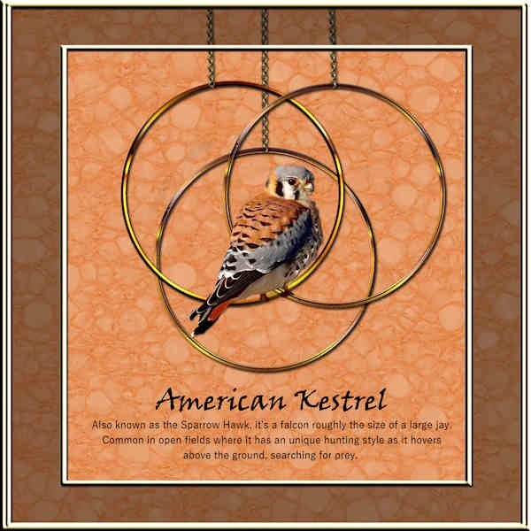
6 hours ago, Ann Seeber said:
That Merlin is very similar in size and behavior as our American Kestrel, also known locally as the sparrow hawk. I did a layout with him back in the Masks Workshop. Beautiful little hunter.
the little raptors are so cute. I love your lino papers. they are suble and go well together. I say the merlin definitely has more "attitude" with that intense stare.
-
17 minutes ago, Sue Thomas said:
I was outside shooting some native sparrow species, which arrived today, when a thought popped into my head. On how to showcase the Merlin. I love these small predatory birds. Now that they have returned, hopefully they will thin out the Common House Sparrow population I have here, as they are an invasive species. I suppose this page could be used as a poster. A simple layout with a small amount of word art, a label with text on a path.
I love the merlin. We have a breeding pair in my 'hood in the city. One actually landed my my yard twice now. Once to sit in the tree and wreak havoc amongst the magpies and LBJ's and once to finish up his/hers little snack they brought along. Talk about clearing out the yard. Wish they'd cut the pigeon population down in my yard. You can here them communicating with each other, quite far apart (to my ears). This photo is great as it allows me to see what these little guys really look like (not the just the usual blur as they hit the after-burners above my yard).
-
1 hour ago, Ann Seeber said:
The wild cherry is finally blooming in front of my patio. Used the first lesson from last month's titles and filled with a picture tube flower 08 where the color seemed to echo the cherry.
That must be s sight to see. I loved the poem.
-
1
-
1
-
-
28 minutes ago, Donna Sillia said:
Oh, Mary, I do love that one. How did you make it silver?
I agree, it's a beautiful silver.
-
11 minutes ago, Cassel said:
That is the exact point of that script. And yes, it is a free script.
That's good because I use it A LOT. it gives me peace of mind. Thank you for making it. It's easy when you are distracted (okay, maybe just me being distracted) to right click and CUT when I meant to do COPY. Especially if I've been doing other computer work where I am using CUT. I've caught myself doing cut instead of copy several times. So having your script protects my images.
-
3 minutes ago, Cassel said:
You got me searching as those are old scripts! ?
Open Duplicate is a Corel script, that will duplicate the image you want to use and close the original.
Open a Copy is a script of mine, which is very similar to the previous one. The main difference is that it will rename the file to the same name as the original file plus _copy and SAVE it. The purpose is that the auto-save would only work on saved images; if an image is never saved, the auto-save has nothing to "save".
Thank you, I will stick with Open a Copy. Wasnt that the one that was free from your store. I use that so I dont accidently forget duplicate my images and end up changing them be accident. I used to just take a copy of my images I might use to a working folder but then I got too many extra images floating around my computer and not knowing if I accidently took the original file by mistake so I try to use the Open a Copy with images most of the time. thank you for the quick reply.
I did all my file preferences and same thing happened as last time. it didnt save all the preset shapes from the last 3 versions even though I chose that option. luckily I made a copy of those files(for just this reason) and just put the corel ones into My Resources separate file. All the other ones worked beautifully. I got all my preset shapes in the end so I'm happy. Corels user files are in their regular spot and a back up copy on a different drive. On the whole, this went smoother than any other time. I have made a big check list to follow, with instructions, it worked good for me.
-
I am setting up my PSP 2023 and wondered about the difference between Open Duplicate and Open a Copy. I had used Open A Copy for 2022 and generally it worked good but sometimes the script failed (I cant remember the circumstances). Is Open Duplicate PSP's own script? what is the difference between them. I usually bind the one I use. thank you.
-
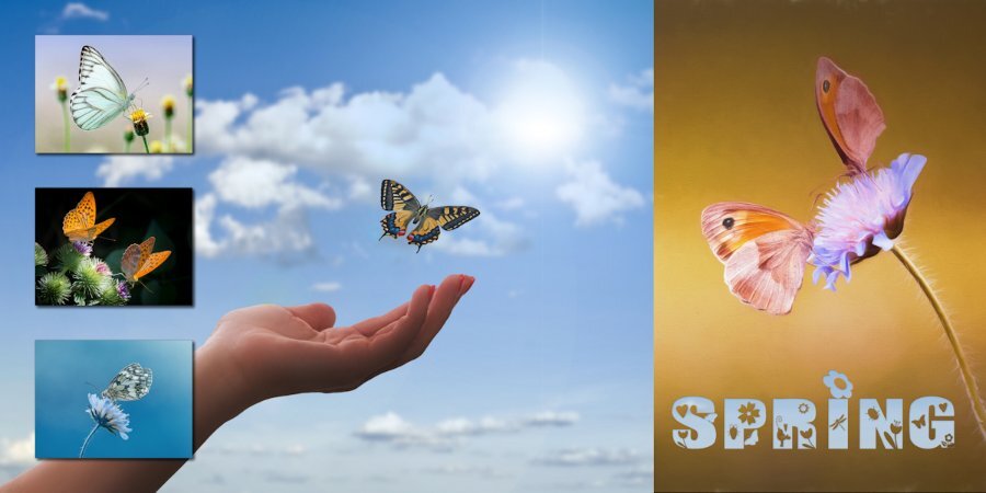
2 hours ago, Natalie Spooner said:
Finally took some time to complete a challenge. Thank you as always Cassel for stretching my comfort zone and teaching me countless lessons.
Paper inspiration from Marisa Lerin"s - Hello Spring Kit but were coloured to follow the given pallet. I created the Elements and filled them with the paper patterns. The fonts used were Culrz, DeVinne, and Cooper Black Out . The photos are mine taken on a sunny morning when the sun was back lighting them so they had some transparency which I found interesting.
Love seeing all the creative talent in this Campus,
This is so pretty. Your lighting is beautiful on the flowers.
-
1
-
1
-
-
1 hour ago, Sue Thomas said:
Thank you for the comment Susan. I hope it may give you some ideas and inspiration.
It sure does. thank you.
-
1 hour ago, Donna Sillia said:
I got tired of trying to match the Photoshop shimmer paper, so I made a grayscale one and saved it as a png. It doesn't change color with hue saturation, but colorize works. Another alternative is to create a color layer above the gray and use blend modes.
Very nice Donna. Neutral or middle grey is popular amongst fashion, portrait and still life photographers. It is very easy to add texture overlays and use blend modes (overlay or softlight is the ones I've seen them use) with a mid-gray background. It's actually my next photo project soon as I get some mid gray paper (seamless photo paper is expensive). Middle grey is the same as the 18% reflectance gray cards used to determine exposure back in the film days. For RGB it's 127 for each value.
-
1
-
-
1 hour ago, Sue Thomas said:
Experimenting with new styles of labels. I used a photo for the background along with overlays. and blend modes. This layout isn't a template but one I created myself. April palette challenge.
WOW! so much wonderful stuff to look at. The upper right circle and the way the top one is cut if so interesting. The beautiful tinted lines. Of course the out of bounds picture and frame. The background is super. April rocks! not only did it bring much needed showers to clean off the world, it brought your beautiful layout.
-
2
-
-
33 minutes ago, Corrie Kinkel said:
Sometime ago I saw a layout a bit similar to this and I liked those drops which are perfect for showing little flowers. In my flower photocollection I found some which have the colors of the palette. The fonts are Bistern and School Sketch. Backgrounds are also in the colors of the palette and are made using 2 papers and a blend mode. The april with the ducks is a stamp.
FABULOUS! I love everything about your layout. raindrop shape is beautiful isnt it. I really like the background paper and the upper left corner piece. Nice touch.
-
3
-


.jpg.22aff9baba0f0e5fc7c22504cde6f283.jpg)

Double Page Workshop 2023
in Showroom
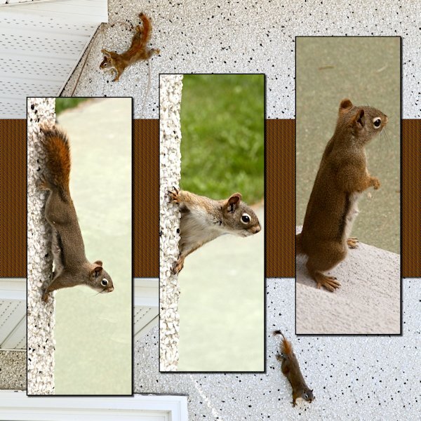
Posted
Here is Lesson 2 page 2. . The back ground photos are Spider Squirrel and her baby, whom she had brought out to show my husband. Momma is the one with the almost hairless tail. Mother squirrels will pull their own hair out to line the den for their babies. BEST. MOTHER. EVER. Being the lady she was, she took time to stay grounded (on our back step) andliked to visit the spa for a much needed clean up. She had two litters a year. All the pictures in the slats are of her in the summer. the background photos are early spring. I did a bad extraction of the baby on the bottom left background of this page. I added it because he/she was looking right at me. (side note: that awful green in some of the shots is the patio slabs the previous owners painted. It's the most sickly color...but it's way down the to-do list.