

Corrie Kinkel
-
Posts
2,450 -
Joined
-
Last visited
-
Days Won
17
Content Type
Profiles
Gallery
Forums
Posts posted by Corrie Kinkel
-
-
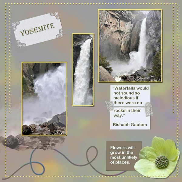
A bit late but I had so many other things to do first, like the card workshop and the photo album about my trip. Both are finished now, my album is at the print service and they estimate it will be ready on Saturday. I like the DIY challenges so I did this about the visit to Yosemite National Park. The waterfalls were spectacular because in Spring they carry a lot of water from the melting snow. The background is a full size photo of one of the falls with a heavy blur and the blendmode color, the paper underneath was a muted green. On the rectangle with the word Yosemite I used a holiday punch from Carole because when I was there we had snow as well as rain and sunshine. The 2 smaller rectangles are papers glued together with some washi tape by Marissa Lerin which I have in my stash. I gave the dots a color and a slight bevel.

-
 6
6
-
-
16 hours ago, Cassel said:
@Jeni Simpson I LOVE that font you chose!
@Sharla Great theme for that card and the image is very appropriate for an achievement!
@Petra Nuijten You will still have a week to catch up. Looking forward to your projects.
@Sue Thomas It is a great idea not to add a shadow. If you did, it would have to be quite faint anyways.
@Doska St. Is that happening only with 2023 but not with other versions?
@Michele Were the butterflies already in those colors or did you need to colorize them?
@kasany I think that the very fancy and delicate font you used would work better (easier to read) with no shadow at all.
@Bonnie Ballentine For the card "I am rich", I wonder if the text reads well in full size? If not, maybe it can be emphasized with a glow around it?
@Anne Lamp I would not necessarily have noticed the template you used if it was not the fact that I was using that same template in the book I am writing, and I was on that chapter!
@MoniqueN. I don't know if you did it on purpose or how you did it, but the sort of "see-through" on the left of the watercolor scene is very interesting.
@fiona cook I am glad that the classic Materials Properties has helped you.
@Gerry Landreth I am glad you enjoyed the workshop.
@Donna Sillia I think that the text on the banners could be done with the Text on path, so you could have it follow the banners more.
@Harmony Birch It is fine to tweak the templates. That is the beauty of templates! I think that on the last card, you flipped the ribbon. It shows as the lighting on the bevel is now in the wrong direction.
@Sheila Hogg Thank you for your kind words. I am also thrilled by all the cards that were created.
@Peggy Dyar For the corner punches, have you thought of using the guides?
@Corrie Kinkel I always love to see your little logo on each card. It looks so professional!
@Louyse Toupin On your card, if you have a black outline on text, you don't need as much of a shadow. In fact, you can even skip the shadow since that outline creates a nice definition of the edges.
@carol Woudema Again, I think you resized the photo incorrectly. Those poor ladies will have a headache! Did you check out this article on resizing photos?
@Anita Wyatt I am glad you are safe. Things can always be replaced. I am sure you will have time to catch up.
Today was the last tutorial of the Workshop. Tomorrow will be my last day of adding comments to each poster, but the thread will stay open so even if you are still taking a few days to finish, you will still be able to post.
Carole it already is such an old logo! It is approximately 20 years but I like it and all my family and friends always look for it on the back of my cards. I only change it for X-mas.
-
 2
2
-
-
And here is card 7 and already the last one. It is said before but I have enjoyed doing this workshop for the 2nd time and a refresher is always a good thing. Inevitably there are things that I have forgotten! I have loved seeing all the different cards made from the same templates and the inspiration they provide. Carole thank you for hosting this class again.
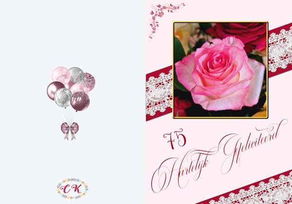
This card is made for a friend who will turn 75 next month. I did a background as well because I want to print it as a double card. The photo I took some time ago from a bouquet I got. The lace comes from my stash, I think it was a freebie by Carole and I placed it on some sort of a ribbon for better visibility. The corner is a brushset of 4 floral corners that I found somewhere a very long time ago.
-
1
-
15
-
-
6 hours ago, Susan Ewart said:
What a nice neat and tidy workspace Corrie. I'm jealous.
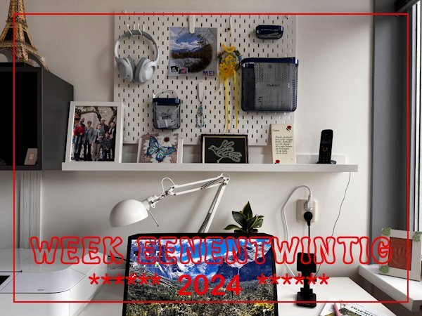
I have just a small workspace and if it gets too cluttered it interferes with getting things done. Hence the pinboard and I have a small chest of drawers behind me where I have my ordners with all the paperwork, old fashioned dictionaries, print papers etc.
-
1
-
-
Card6-Extra
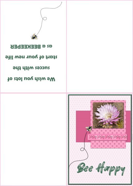
For this card I followed the tutorial to make a folded card with a text printed inside. Although the card isn't square for me that isn't a problem because my printer and so do I, use European A-4 paper which is better suited for rectangle layouts. I used a photo of an Echinopsis flower and the ribbon is from Chanthalia Desig. The backgroundpaper has an overlay of a honeycomb that I made some time ago. The other papers are colored and one has a little flower again from CD as a pattern, the other a blinds texture. The font is Better Brush and on the inside Berlin sans. The flying bee comes from my stash,
-
1
-
 1
1
-
12
-
-
3 hours ago, Michele said:
I decided to follow the video closely; I need to refresh my techniques. I love how it came out. The balloons are from my stash. The main font is Amsterdam from CF and the font is Billy Signature from FDR (Free Design Resources).

Nice card Michele and I like that font too and I have it as well. No surprise there as I live in the Netherlands and Amsterdam is the capital!
-
2
-
 1
1
-
1
-
-
41 minutes ago, Sharla said:
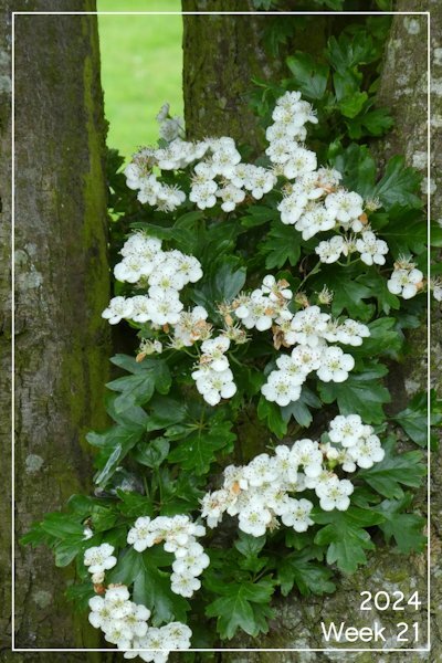
Week 21 Hawthorn flowers photographed at the start of the week. I walked past the tree again yesterday and all the flowers had been dislodged by the heavy rain of the last few days so I was glad to have caught this image when I did.
With hindsight a lucky shot!
-
I have no photos of this week, very unusual for me! We have had bad weather with lots of rain and we had to make some alterations in the house that were waiting until I was back from California and had slept off the jetlag. Therefore I decided today to make a photo from my workspace where I do all my scrapping; I already had decided to have that idea as a backup for when there really wasn't anything else going on.
-
4
-
-
1 minute ago, Michele said:
I decided to follow the video closely; I need to refresh my techniques. I love how it came out. The balloons are from my stash. The main font is Amsterdam from CF and the font is Billy Signature from FDR (Free Design Resources).
Nice card Michele and I like that font too and I have it as well. No surprise there as I live in the Netherlands and Amsterdam is the capital!
-
 4
4
-
1
-
-
Card5-Extra
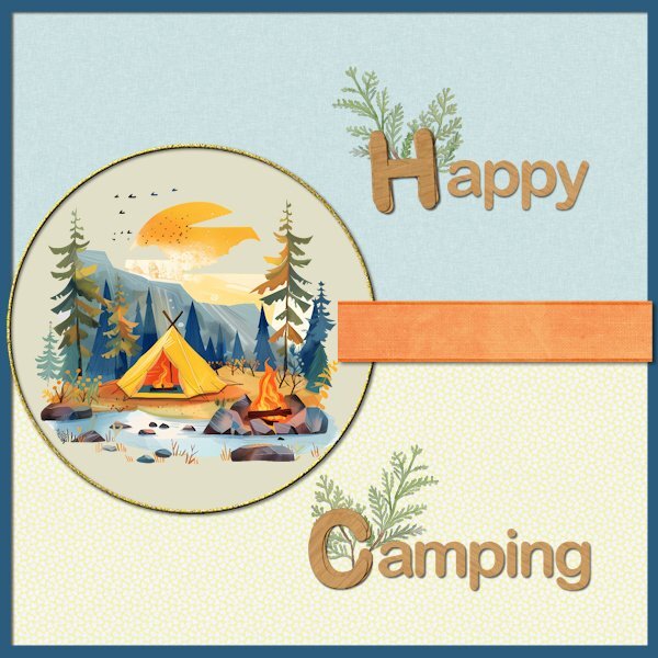
This time I wanted to create a card for my family because they told me they would go camping this summer. I have no camping related photos but I found this clipart on clean png. Papers and ribbon are from Marisal-sweet moments; the papers have a slight texture but that is almost invisible in this reduced version. The letters H and C are made with cass-Stacked Alpha script and use Arial just as the rest of the text. The greenery is from my stash and all the colors are chosen from the clipart. I'm going to email this card therefore it isn't a problem that is a square card, for printing I wouldn't use it because that doesn't go well with my printer and A-4 paper.
-
14
-
-
Day 4
For this card I used a flower bouquet clipart from my stash (I suspect it was once a freebie by CF), but instead of the hearts I used a flower and a leaves corner by Lyleya; the font is Mimosa script. I needed a more generic birthday card and this one is not with a specific recipient in mind. Like always I keep one version as a psp-image to change text or colors when needed. I will probably, at a later moment, use the extra template, but for now this should do because I'm working to make my album at the same time as well.
-
2
-
16
-
-
6 hours ago, Sharla said:
Hi Susan, I grow lots of things in raised beds and containers. The larger the container the least likely I am to change the soil but, in some cases, like with blueberries and the acer, I remove a couple of inches of the top layer of soil and add some fresh. If I don’t do this then I make sure that I give the plant a liquid feed during the growing season.
Most of my annual plants like tomatoes, peas, and asters get planted into containers that still have some of last year’s soil within them – I just top up with fresh compost to give them a good start and feed them during the growing season. The old compost is added to borders or to the compost bin.
The idea of changing the soil is just impossible for me with the number of containers that I use so I generally don’t. To be honest, I never found it very useful advice because it usually means that if the plant has a large root ball you need a bigger pot each year – and that’s just not practical as well as expensive. I just accept that some plants will thrive under my method and that some won’t.
I never move pots around to catch the sun like you describe – once they have their spot that’s where they stay for the growing season. Out of the two you mention – if the conditions are good, rosemary really thrives (not in my garden!) but thyme always tends to get woody and needs to cut back drastically after each growing season or replaced. The best advice I can give you is to experiment, accept both the successes and the failures, and enjoy the process. And, if you don’t want to repot then start your young plants in a larger pot.
You’ll always have some plants that thrive and others that don’t. I used to try follow gardening advice but I’m not very good at following rules so I just experiment. I celebrate the good results and accept the failures as part of the learning process which never ends.
I wholeheartedly agree with Sharla, plants in pots/containers are always a risk and sometimes it is a mystery or a miracle. Nowadays we only have plants in containers and we try to give them shade or sun according to their needs. But that is only a rule of thumb and some experience from our gardening days.
-
2
-
-
Card 3-Extra
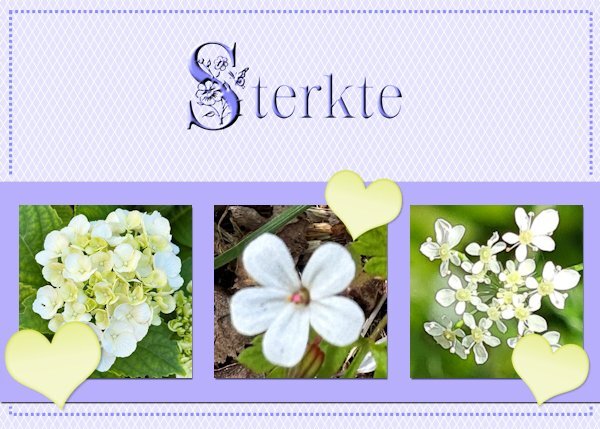
I have used the normal template so often for X-mas, Easter, New Baby, Birthday and Thank you that I now choose the extra one. However I used some of the ideas like the lines on the background and some sort of frame. My photos with white flowers and I gave them a little bit of shadow, just as the strip behind them. The heart is from Chantalia Design but recolored; the fonts are Crocus Monogram and Clarissa stories and both have a inner bevel to let them stand out a bit better. The Dutch word sterkte means you wish somebody courage with a particular situation, for instance this card is meant for a friend who has to undergo an unpleasant medical treatment. It has a backside and in this case I will write something inside by hand not printed.
-
1
-
17
-
-
On 5/20/2024 at 11:25 PM, Sharla said:
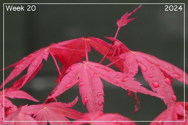
Week 20 I have small acer tree in a container and just adore the bright colour of the leaves as they appear. I was pleased to catch this image with raindrops on the leaves.
Sharla I wonder does your acer well in a container, do you have it in a fairly big container? I would like to have one and it must go in a container, we only have a small patio. However our local gardencenter is advising against it, so I would like to hear how well yours is doing. By the way the leaves are gorgeous.
-
6 hours ago, Michele said:
Loving everything, especially from our "newbies." I'm very impressed.
I was so looking forward to this workshop, but I don't know if I'll be able to participate due to an injury. Since there is no time limit for the workshops, I hope to be able to start soon and catch up. 🤞
Michele that is very unlucky, I hope you recover soon.
-
2
-
1
-
-
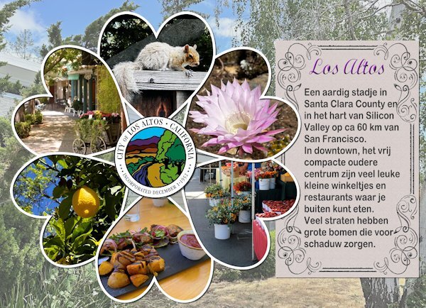
I was struggling to make an intropage for the photos I took from the daily life and things I did at home. After some thought I concluded that there was one item that covers it all: the place where they live! So I used the cass-photocircle template script again, this time with hearts and photos I took in Los Altos plus the seal of the city (thanks to google). The family photos will come on the next photo pages in the album. I wrote a short story about the place, of course in Dutch, but roughly translated it says: "Los Altos is a nice city in Santa Clara County in Silicon Valley and ca 40 mile from San Francisco. Downtown, the compact older part of the city has a lot of nice shops and restaurants to eat outside. Many of the streets have big trees that provide shadow". The background is a photo with reduced opacity of the frontyard of their house.
-
1
-
8
-
-
Workshop day 2
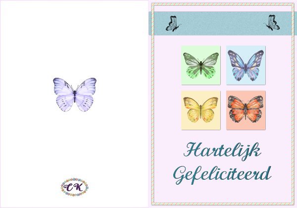
This time I used the original template and it is again a birthday card, probably all my cards will be for birthdays and this one goes by mail. It is intended for my cousin who likes butterflies very, very much; she has butterflies on her plates, cups and saucer, posters, photos, bracelets, brooches etc. Every year I try to make her a card with butterflies or send one that a bought when I come across one. I indeed need a double card so that's what I made and show here. The text is in Dutch but I kept a psp version for use with a different language. The butterflies are a bunch of watercolor cliparts that I have for a long time in my stash, I knew that one day they would come in handy. The font is Calligraphy and I it often because it is easy to read.
-
3
-
16
-
-
On 5/20/2024 at 9:15 AM, Cristina said:
I have the same feeling as I have created just a few layouts over the last few years. I don't know how long it will last, but I'm on a roll, as Sue said. 😄
What a great start, Corrie! Which size are you using? I am still thinking of changing the size of my layouts to make it easier to get it printed.
Thank you Cristina and I'm glad you have the same feeling as well. I am going to use the same printservice I always use and I measured another of my albums. It is 29 x 21 cm (landscape format) and I had to calculate how much that would be for a scrap layout to fill a whole page of the album. I figured it will be 5140 x 3720 pix/inch and that let me use all of my supplies, but this is only for the 4 intropages. For the rest of the album I use and adapt the printservice's templates so I have at least an idea how to fill my album with my photos and text.
-
1
-
-
18 minutes ago, Dee347 said:
Here's the card I made for the workshop. I used a image from Creative Fabrica. Added texture to the scalloped panel and a drop shadow. Added a ribbon and tag from Craftsuprint.com
(I make cards for the Cards For Hospitalized Kids Charity. The kids range in age from 2 to 18 so I think this will work for the older girls. Hopefully it will brighten their day.)
Nice card and a very nice charity to make cards for!
-
2
-
1
-
-
Card # 1
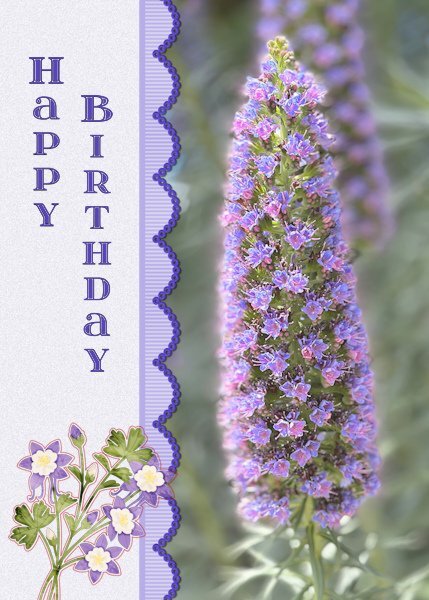
I used the extra template for 2024 and I changed the landscape format to portrait format to accommodate the photo I wanted to use. I'm very happy with the new extra templates for diamond members, because I have used the ones from the first workshop over and over again. That's not a problem as such but new templates give new ideas! As soon as I had taken this photo, I thought of a friend who loves purple very much and her birthday is coming up next month. I used a ribbon that I have made earlier and recolored it with hue, saturation, lightness. the flowers at the bottom are a sticker and the font is itsadzoke S01 and I think it came from a lab. The name of the flower is Echium candidans - Snakeweed
-
5
-
15
-
-
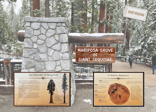
I'm on a roll! This is the last one of the intros and it is again a simple layout using a photo with a reduced opacity, except for the Mariposa Grove sign that I kept at 100%. There were information boards and I extracted them from the photos and put them here as info before the next photo pages in the album. I couldn't resist to make an admission ticket with my own script 😉.
I will make another intro but that one is with the family photos and I will not show those here because my family doesn't want me to do so. Which I of course will respect.
-
7
-
-
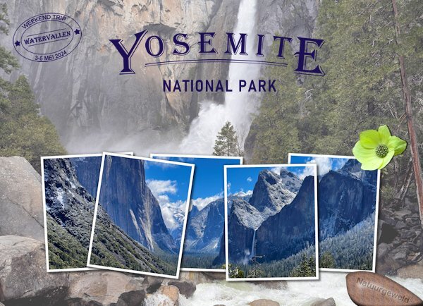
This is my second intro and it is a much simpler layout because it is all about Yosemite national park. It has a photo with reduced opacity as a background and I used cass-Multi frames collage freebie (as many of you have done) with another photo. Made a datestamp with cass-Datestamp 9 and an engraved rock (also a cass script). The flower is extracted from a photo; it is a California Dogwood and they were in flower throughout the valley in the park. I think I will use it on some of the photos in the album as well. The font of the title is Algerian and the rest is Bahnschrift. The idea for the title comes from a poster about the park which I bought when we were in San Luis Obispo. By chance we happened to come by an art gallery where they had posters of all the national parks. The old posters were, many years ago, made by an artist who gave before his death a young artist, named Thomas, the rights to design new poster. The only condition was that he had to do them in the same style and they are now printed and available in a limited and numbered edition. I don't have the font that he used on the poster but something similar that kept the idea. My son-in-law bought another one of a different park. The gallery packed mine rolled up in a tube and it came home with me where it has been laying under some books to get it straight again. We will frame it next week.
-
9
-
-
2 hours ago, Sue Thomas said:
Thank you Corrie, coming from you that is quite the compliment. As over a relatively short period of time in the Campus, compared to more seasoned Campus members, your work has evolved into something quite spectacular, as have so many others.
Yes, I started off with the best intentions of doing stitching. Had I been allowed to make the stitching much larger, it would have been feasible. The embossed effect is a good substitute.
Sue thank you and I have to quote you in stating that this compliment coming from you means a lot to me! If and when I have time I will give this DIY a go, because it is a challenge I love.
-
2
-
1
-
-
13 hours ago, Sue Thomas said:
I maintained the sizes of all the pieces. As for the dashed shapes, I started of by trying to create proper stitching, with holes and all, but they proved to be to small. I opted for creating an embossed effect instead. As for the squiggly line, which I'm not fussed on, I decided to create alpha, weaving the letters through the line. I used two of the pieces for journaling, and the other two, to create a sort of split photo. The framed ivy, is one I created some time ago in gold, all I had to do was to colourize the ivy, and frame. As per usual I used tutorials from the creative scrap on the two journaling tags, to make them less boring. Due to the piece on the top left being a little taller than the other two, I opted to tilt the pieces, so it wasn't obvious. Keeping everything exactly the same size is a bit of a challenge, but none the less fun.
Sue a lovely page and you were quick in making it! As usual you have set the bar pretty high. I like how you used the curly line and I'm glad with your remark about the the dashed lines. Stitching was what came into my mind as well, so I will happily discard that idea!
-
3
-
1
-


Newsletter chitchat - May 28, 2024
in Chit Chat
Posted
I live in a fairly large village and there are incidents happing throughout the village. Like houses set to fire to settle an argument, criminal related of course, drug problems, problems with addicted persons, shootings once in a while. Luckily we never had such serious things going on in the street were live. However circa 15 years ago, in our old house, we had a neighbor who had a nephew that was a drugaddict, convicted for petty crimes and homeless, so he took him in. That started the problems because that nephew had friends that were the same as he was and they gathered in the front yard where they openly used drugs, fighting amongst each other, lots of yelling and they started selling drugs to schoolboys. Of course I spoke to my neighbor but he was unable to stop it. At one point, in the backyard under the covering they made a fire on the barbecue and put grass and old clothes on it and left it unattended. My husband was seriously ill and just home after 3 weeks in hospital, unable to do anything; every time I came home I had to pass those guys and had to ask, or command them to remove their bikes that were blocking our garagedoor. I had spoken to the police before and they talked with my neighbor, which didn't help. So now I called the police again because I was really scared they would set fire to the whole block of houses and this time they came to investigate and interview us about the situation. That helped, my neighbor had to come to the police station to get his nephew out. That guy was put in a closed institution for a while, but later when he was out again and visited his uncle I was frightened that the whole story would start all over. Since 7 years we live in another house in a very quiet street and until now. nothing has happened