Leaderboard
Resized.thumb.jpg.d25811db03a63358cedab1e79f527635.jpg)


Popular Content
Showing content with the highest reputation on 04/28/2024 in all areas
-
day 5 again with photos from the knight festival day 4 Fun on the Playground font is Bigger Summer Fest6 points
-
Lesson 66 points
-
The background paper and word, Florida, are from Bits Of Scraps and were part of a Digital Scrapbooking blog train, May, 2017. The fern, top left, from Jessica Dunn, May 2017 blog train, Digital Scrapbooking.5 points
-
here comes day 3 font Kinder Journey I flipped the page fonts are papierkind and Becket-Kanzlei5 points
-
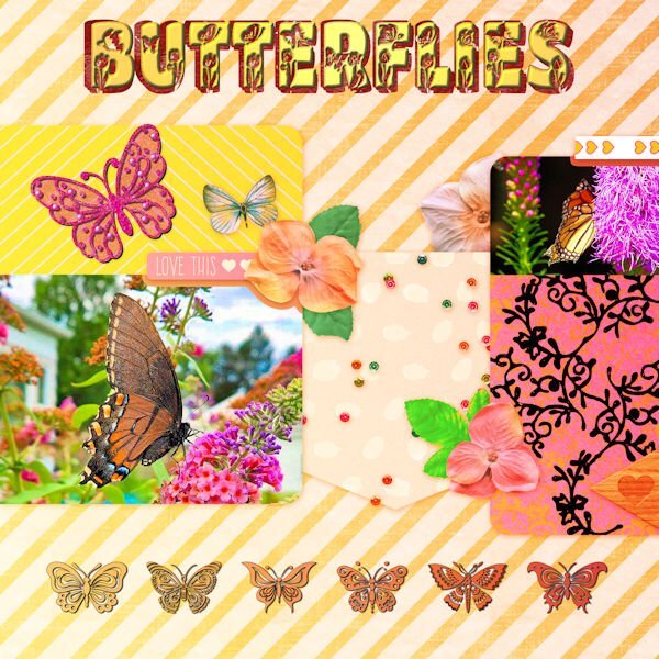
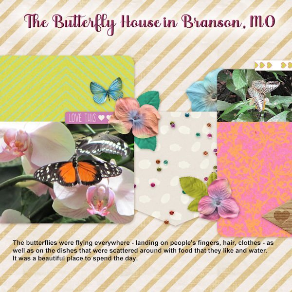
The butterfly photos are my own. The pink butterfly is from my 2023 Build a Kit. I changed the color with a gradient under the original and a blend mode and made the floral design mostly black to match the picture above it. The font is Butterfly from CF. Using the pen tool, I added a block font behind the original and filled it with red. The bottom row of butterflies is from a CF font called Butterfly Joyful.
 5 points
 -
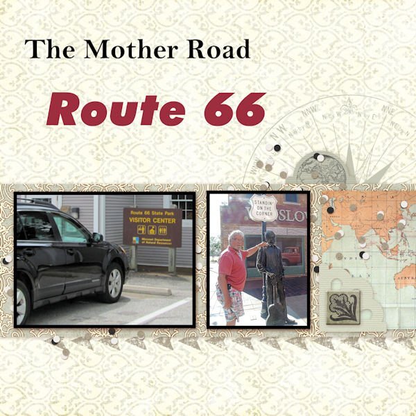
The extra QP for lesson 5. Pictures my brother and I took on our trip to the Glass Bridge on Route 66 back in 2014. The fonts are: Bell MT for The Mother Road and FutureXBlaklt BT for Route 66. Unfortunately the wording on the signs in the pictures doesn't show clearly. The large one is the sign for the Route 66 State Park just outside the St. Louis area near the Merrimac River. The smaller picture is my brother standing in Winslow, AZ by the sign "Standin' On The Corner".
5 points
-
I posted my QP in the wrong thread. Here they are again:5 points
-
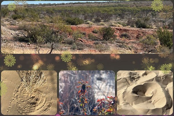
Non-Scrap 4. Desert pictures by Laurie again. I changed the layout colors with Hue-Saturation-Lightness to go along with the desert colors.
5 points
-
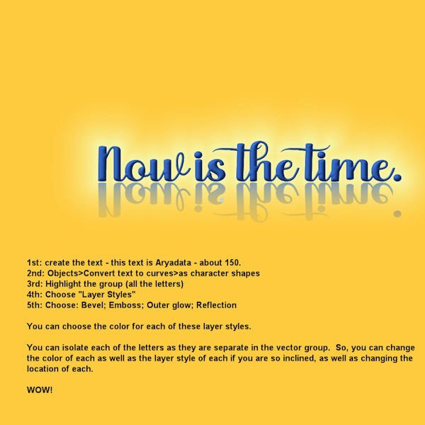
On to lesson 5. Aryadata is the font and I did choose Layer Styles - Bevel, Emboss, and Outer Glow.
5 points
-
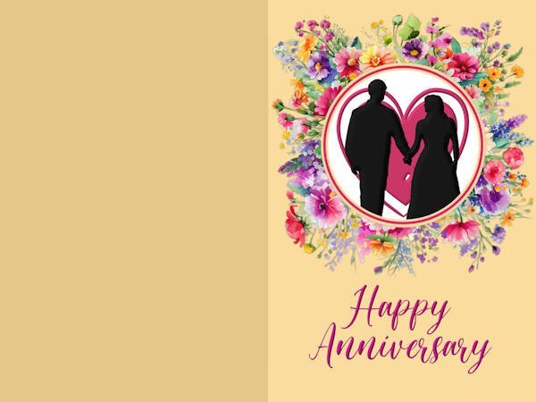
Lesson 5 non-scrap - card. I made an Anniversary card. The silhouette I had made for one of the labs. The font is Pretty Smile. I used the layer styles to bevel the font, the silhouette, and the heart.
4 points
-
You know everything already. I've sent not corrected pic. Sorry...This time the picture is better. Sorry once more, friends.
4 points
-
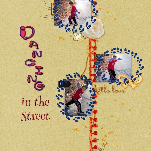
Day 6 The photos are mine taken several years ago in Virginia. The footsteps are from Canva, made into a tube with VectorTube applied. The fonts are DanceStep which is free on Dafont and Henny Penny.
4 points
-
I seem to have Dogwoods on the mind lately. 🙂4 points
-
I also like this QP. I have a script to create this effect. I forget to use it. 😞4 points
-
Lesson 7: I really like this QP. My layout from the last workshop using this QP is one of my favorites.4 points
-
@Susan Ewart Wow, Susan. You sure are on a roll. Your creating the text and then using Objects>Convert text to curves>as character shapes - really got me going. I believe Carole taught us that in one of the workshops we've been attending - maybe the Text workshop??? Anyway, so I got to playing with it and this is what I came up with. Because using layer styles means you don't have to change the text to rasters in order to bevel, etc. them. Carole also introduced us to layer styles in one of the workshops. We have to remind each other of the different things Carole is teaching us - so much to learn (and maybe forget until one of us reminds us of them)!
4 points
-
On to lesson 6. Title font is Ravie.
3 points
-
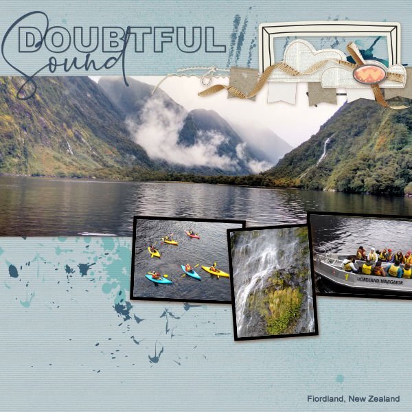
Mary, many Lord of the Rings scenes were filmed around Fiordland, although I am not sure where exactly. There is a guide book available. Fiordland is an area where I lived and worked and I have travelled over quite a bit of the places tourists go. One of my jobs in the off-season, was to guide travel agents to the various destinations available. Much of Fiordland is only accessible by boat or helicopter. There are few roads, the most travelled would be the Milford Road taking people to Milford Sound. I have not been to Hobbiton.3 points
-
I started out with the best intentions of sticking to the sketch, by creating something using the grid. That soon went out the window, when I decided to use multiple frames instead of the set blocks in the sketch. Some of you will have the frame with the Swallow in as I created a template and made it available to download, back in 2021 I believe. The other frame I created today. The tag is mine, the bow is one of Carole's scripts, along with the decorated bottom paper. The design on the right is created using the brush and brush variance tools, which can be found along with many others in the brush variance masterclass. Birds and creatures of all kinds are now making an appearance, for me this a positive sign that Spring is for me literally around the corner.
2 points
-
My Lesson 6 - font is Myanmar Text and Santa Claus. I turned the entire layout sideways and re-arranged a lot of the elements. I enjoy fiddling with stuff like that. The tall center row of hearts is a cass-heart brush tip used with the eraser tool and an added background layer of burnt orange.
2 points
-
Mary, THANK YOU! this is brilliant. And it looks fabulous.2 points
-
we call them "candles"2 points
-
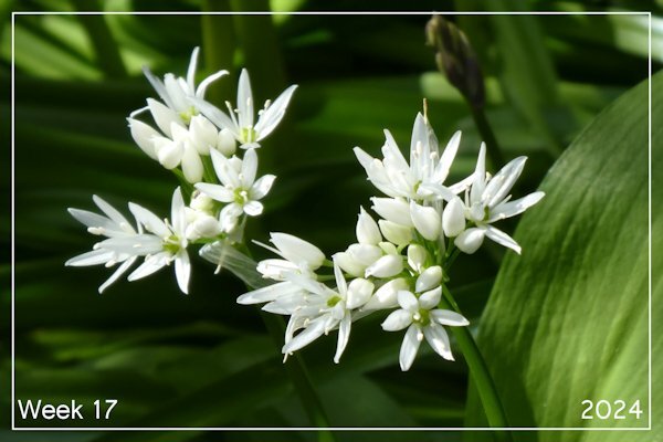
Week 17 We have a small patch of wild garlic in the garden. The photo is of wild garlic flowers. I really like how bright the white came out on the photo.
2 points
-
Thank you so much, Mary, Susan, and Sue, for the kind words; they are immensely appreciated. ❤️ I have to say that I got the idea of adding greenery to the background paper from a Lilypad artist-designer (lgrieveson) who often adds them to her pages/kit, but in her case, more in an artsy way. Here are the paper and some of the stickers I used (here in jpeg):
2 points
-
2 points
-
Thanks for looking that up for me! I will be checking it out.1 point
-
Yup, I know that feeling. Starting out with good intentions and a plan, but seeing them go out the window as the layout develops. What I envision is usually not precisely what I get. But it's fun anyway. Love everything about this one. Those frames are wonderful.1 point
-
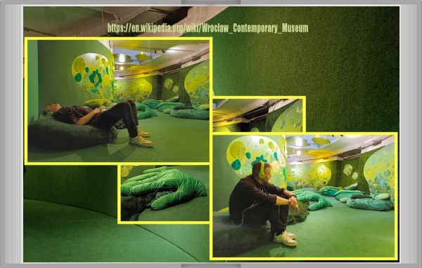
Jacek's visit in Wrocław's C.Museum with his friend. Shots taken by this girl. It's a first part of the story where are shots first of all. No words rather.
1 point
-
I've aways meant to but have never got round to it. I do, however, appreciate the smell. When it's flowering it gives of a light garlic scent - I love it but I know some people hate it. In the UK you tend to find it in woodlands.1 point
-
Beautiful pic. Do you ever use it to cook? I had to look it up and found out it is edible.1 point
-
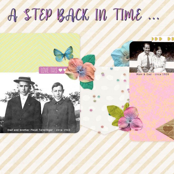
Not a fan of this QP but I fiddled with the decor and the opacity to create a display of some black and white photos from my family's past. The title font is My Butterfly massaged a bit with the Sculpture Effect.
1 point
-
@Jeni Simpson Thank you for all the wonderful pictures and stories about New Zealand. I had read and viewed stories and pictures about Australia, but not New Zealand. A beautiful country. Oh, by the way - have you been to the places where they made Lord of the Rings? Peter Jackson left Hobitton there and it is a tourist attraction now.1 point
-
@Cassel I went back to the pspimage for the Museum piece. The picture was placed in the slot for the picture. The shadow of the fern leaf that comes over the picture shows up. Only in the reduced image is it to faint to be seen. You have such a good eye.1 point
-
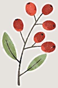
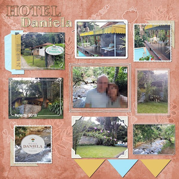
After many moons, I have something to post here... It's one layout from the folder I called Unfinished Layouts... There are still many in it! I finished it a few weeks ago, but I only remember to post it today. Credits: Template from Scrapping with Liz (SwL_LotsofBlocksTemplate3) Background paper: DiHiller_PSJul2021_Paper5 plus Greenery and berries stickers from mommyish_AAM. I played with the blend mode. Alpha (Hotel): APennington_TLP Treasured Font: Astorica Display Black Cassel: I followed different Frame Tutorials from the Creative Scrap tutorials.
1 point
-
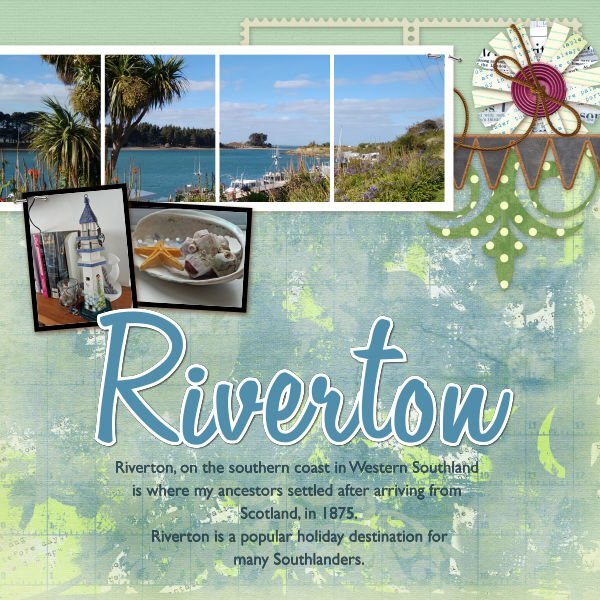
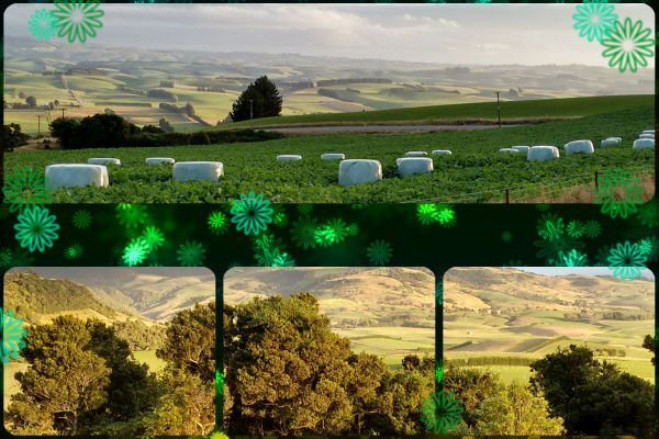
Doubtful Sound in Fiordland is accessible by boating across Lake Manapouri, then travelling by bus across the Wilmot Pass to Deep Cove. It is a popular tourist destination and somewhere I worked on the first overnight launch trip to the Tasman Sea in 1992. On the overnight journey passengers have the opportunity to either take a kayak onto the Sound, or to enjoy being taken out on board a tender. I spent my 70th birthday in Riverton, about an hour away from my home in Eastern Southland. It is a beautiful fishing village on the south coast where my great-grandparents lived, and mu grandfather was born. Travelling down from Venlaw Forest, near where I live, one gets a great view across farmland in Eastern Southland, New Zealand. Jeni
1 point
-
What creatures are you seeing, Cassel? The only animal I have showcased this time is one bird, the white-crowned sparrow. Are you sure you are talking about one of my layouts?1 point
-
I remembered from Build A Kit - Alphas about making the text into characters. I felt pretty happy that I remembered it. About Filter Forge, currently it's a stand alone product for me. I didnt want it in PSP because it used to really bog down my system when it was rendering the effects on it's own, I thought it would make PSP crash. But now my system barely has to lift a finger to use FF. Here's my problem. I don't know how to make it a plug-in in PSP. Does the masterclasses show how to do that?1 point
-
Yes, the trail camera. I don't have it up now...should get it going again.1 point
-
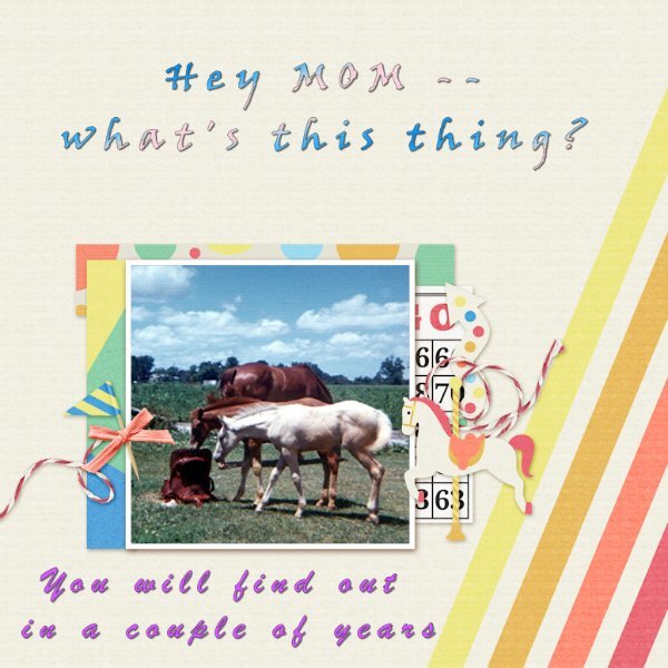
While going through my pictures I ran across this one I took a bunch of years ago at the farm I boarded my horse at. I wound up using the (QP2024-Extra1) to showcase it.
1 point
-
Though I posted this in the Flowers Challenge I'd like to show it here as it's inspired by the webinar and Sue Thomas' layouts. I also made templates. Here are Spring flowers in Warwick. The clipart lower right is from Jessica Dunn.
1 point
-
Another excellent masterclass today. When I read what it was going to be about, I knew what I was going to showcase. I used the first layout which Carole demonstrated.
1 point
-
I have a book going for a young family member. Here is my cover. Graphics Marisa Lerin. Font Qiara.1 point
-
Revisited and revised an old one. I have no idea where I got the cherry blossom clip art or the lovely pic I used for the slats, but the font is Asia Pacific, free from DaFont.1 point
-
April Showers Papers and puddles from Jessica Dunn on PS/DS. The people are characters from the game. The font is AlphaShapes raindrops, free from DaFont. The creator is Fonts & Things and they have some very interesting fonts https://www.dafont.com/fonts-n-things.d1209.1 point
-
And here is a second project, about a place in Germany (say shtorkoh, meaning storks in English) Storkow about a 40 minutes drive east of Berlin and 20 minutes west from the Polish border. It is part of the outer, historic military ring around Berlin. Interesting place. Graphics JBS and Marisa Lerin, fonts are Qiara on title and Poppins on body.1 point

.jpg.dd085516c77d877e2bb4b6192fbfe99c.jpg)