Leaderboard


Popular Content
Showing content with the highest reputation on 03/19/2024 in all areas
-
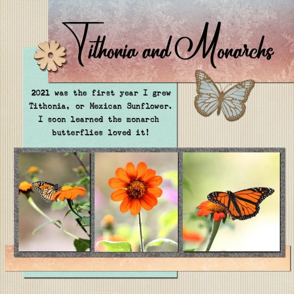
Project 3-- It is always so interesting to see how everyone uses the tutorial in a slightly different way! I used the glitters, but I didn't like the color so I adjusted it....and it doesn't look very glittery now. I used the guides, it is a good way to make things the same size that don't start out that way. I am not sure I am entirely happy with my choice of papers and colors, but I am finished for tonight. Maybe I will like it better tomorrow 😉
 11 points
 -
I think I may have posted in wrong thread. Project #3, 'Adventure'. I was away for the weekend so catching up now
10 points
-
Hopefully, this image is okay for this project. I used a snowflake brush I had in PSP, and covered my background with that, instead of adding any elements to my image. Where I live, I am lucky, because I have such beauty on my doorstep. Thanks Jeni
10 points
-
Scrap Bootcamp Day 7 - Project #3 I loved using the guides to line up the photos.
7 points
-
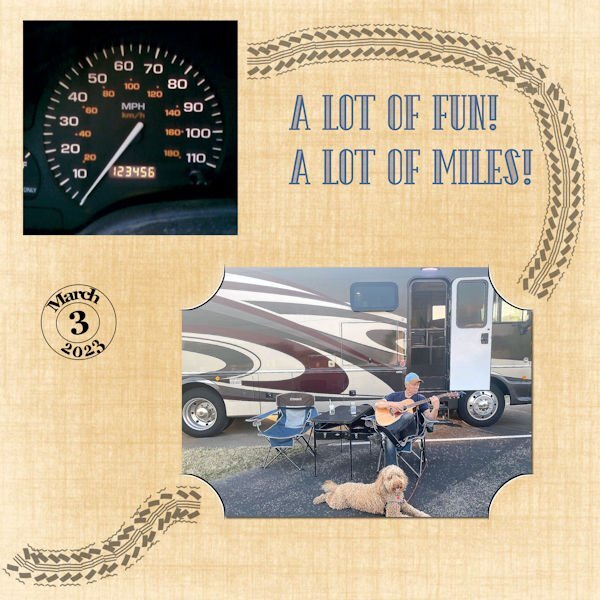
I used the pspimage. Font is The Camping from Creative Fabrica. Joe took a picture of the mileage on 3/3/23. Of course the mileage has increased - don't know if he took a picture when it was 234567 or not, but I thought it would be a good choice for this challenge. The pic of him playing the guitar was taken in April 2021.
7 points
-
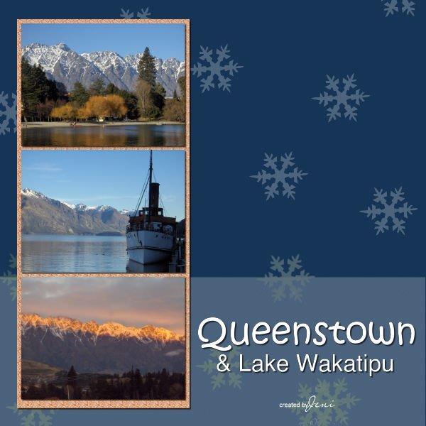
Bootcamp, Day 7 Project 3 I chose 3 images, sized them as per instructions, and altered the alignment to fit them on the page better. I will try and create one where the images are all sitting the same way. Papers and elements by Janet Kemp. Font is Gill Sans. Jeni
7 points
-
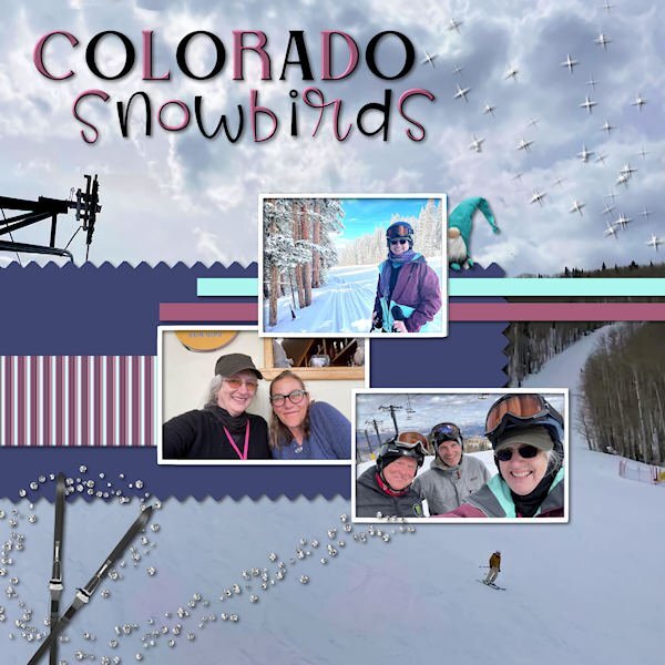
Scrap Bootcamp-Day 9-Project #4. I rotated the photos as I had horizontal ones from my daughter's ski vacation in Colorado last week. Aaron and Deb were visiting her daughter-in-law, Lucy's parents; Magic & Raja's other grandparents. The background is also her photo. The title fonts are Belisha and Birdy. The troll, gem scatters and skis are from my Iceland mega kit.
6 points
-
@Michele I have a curious mind and want to keep learning...anything...until the end. I totally agree. I have captured the Layout of @Sue Thomas (Thank you) and the conversations between her and @Susan Ewart (Thank you) that are very informative and instructive, @Cassel Thank you for this group and your instructions and the group you have formed here.5 points
-
My project 4 , day 9 . Supplies myself, fonts are Arvo on title and Lato on body.4 points
-
Oscar Mayer Wienermobile came to Manassas!4 points
-
How great that we can spend a lifetime continually learning something we love.4 points
-
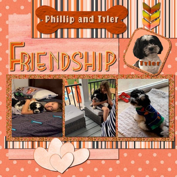
A day late, but yesterday I was feeding my addiction for layered fonts. For the bottom papers, I used a cpjess kit call cherish mini, and the hearts from cpjess cranberry mini. I couldn't find stripes to match so I created some using the cass stripes2 script. The bone is from Creative Fabrica with an added texture that I created on AI and recolored. The photos are my own. The glitter was created using cass glitters B script to match my colors. The font from Creative Fabrica is Rainbow which I used in my Kit and recolored to match. The arrows are my own.
4 points
-
As I commented to Cristina's words, I deeply appreciate your, and many others within the campus family for their exceedingly inspiring, complimentary comments. It’s an absolute pleasure for me to share my photography, through showcasing them with you all. As I have said many times before I am very much an amateur photographer, learning and improving as I go along. I have learnt to think more about the elements of an image which will make them more appealing to myself and the viewer. Showcasing them isn’t any different, in my layouts, first and foremost the layout must not take presidence over the image, whilst still making it appealing to myself and the viewer.4 points
-
Day 7 Project #3 Used 1 paper from site provided “DSF March 2013 Blog Train – Designs by Marisa Lerin.” Glitter also from site provided and paper from Nellie Bell. Pictures, flowers and rainbow strip from Bing search. Fonts are BankGothic Md BT and Vivaldi with a small bevel applied.4 points
-
I have a curious mind and want to keep learning...anything...until the end.3 points
-
I created this page for my Alphabet Book.3 points
-
Project 2 - 'Adventure'. Took a bit more doing, as lost it all halfway through. This is from a long weekend last spring with daughter, hubby and dog. Downloaded a nice set of backgrounds, but I think it may be a bit dark and fussy to have writing on.
3 points
-
Sue you put into such lovely words what photography is all about, much better then I ever could or maybe only in my own language. But I totally understand and agree with what you are expressing and you are able to show it in your layouts to us all to enjoy!3 points
-
My project 3. I was aiming for a midcentury modern-ish vibe. Supplies myself, Jessica Dunn, Sharon Dewi Stolp. Fonts are Georgia on date and Cuciniere on title. @Cassel: Yes, especially in a PSP WS, lol!!!! 💕😉. I have been playing with them, not enough it seems tho. I find EC gives me what I want faster. The layouts so far are the most elegant recipes ever! An absolute fool proof way to a great layout. Many thanks. Many great examples here in this thread. Fab recipe!3 points
-
Over the hump: page four of my seven stocks project. On peanut butter. Any fans here? Supplies myself, fonts again Pacifico on title and Lato on body. By now I think I need an extra double page spread before the initial page one on canned tuna and move the first part of the text on page one to that preceding page...( questions...) project.2 points
-
Thank you, Carole, the photos are all the same size, and the waterfall I thought needed to be portrait, not landscape. The second one, the photos are all going the same way, so they probably work better. I rarely do long skinny pix, mostly I try for landscape, except when the subject demands a tall skinny pic, as per the waterfall. Jeni2 points
-
I play like that with my odometer also. Fun!2 points
-
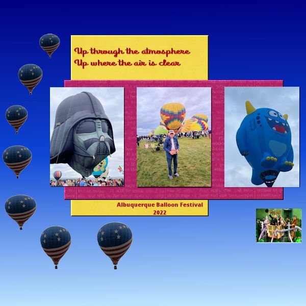
Scenes from the 2022 Balloon Festival in Albuquerque, NM. To be truthful, this pic does not capture the colorful event very well.
2 points
-
Jackie (on the left) and I have been friends for over 20 years but this was our first time together since well before Covid. I was a real blessing to see her again and catch up! The rose on the table in the center photo is repeated on each of the photos. Actually, this is one photo. I separated each of us into our own photo.2 points
-
Project #3 For this layout I used the kit cpjess-Vintage Blooms (Jessica Dunn) with glitters from my stash which have a color similar to one in my photos. I had to cleanup the photos, after all they are from 2008 and taken indoors. Instead of the glitter outline of a butterfly I used a paint splash from the kit. I have some elements like the butterfly but those didn't looked right on my page. The admission tickets are done with my own script and the font is Berlin.
2 points
-
I decided to do the basics and show them here in 1 thread day 11 point
-
Project #4 This time it is all about The Wall and Checkpoint Charlie in Berlin during the Cold War. When we visited there it was a rather gray day, fitting for the feel of the place, it was a bit gloomy! All the papers are from Marissa Lerin gl-20 kit and I didn't use the brighter colors only the more subdued. The tank is a sticker I found on digitalscrapbook.com; the stop sign comes from Travel by DB Magnolia; the fonts are Berlin and Montana rough; the stamp is again made with my own stampscript and I made some paintsplashes .1 point
-
I used my bee flowers in my last bootcamp and had to search for pictures to use. I am trying to use the kits that I have, but always seem to have something missing. The background and the papers are from Marisa Lerin. The pictures are my own. I made the bee from a font called Bee cute and the title from a font called Kid Zone both from Creative Fabrica. I love the cass stripes 2 script because I can pick the colors from my project and make stripes that match. I don't care for those pointy things on the black layer so I used the cass script quick scallops. The blue things are sequins and the pink flowers are tubes that I made using the cass script directional tubes.
1 point
-
Hello everyone! Stunning images here, such a treat. I'm not sure if I'm playing this challenge correctly. Or should I rather just post a photo instead of a layout? Supplies myself (love the plaid trick @Cassel), font is Times New Roman.1 point
-
1 point
-
@Rodney Boyd If you are to add some drop shadow, it will give a more realistic appearance. All the papers, photos, and flowers can use shadows. @Bill Pearson great to see that you resized the photos evenly without distortion. @Donna Sillia Layered fonts can be addictive. It is amazing that they can be available for free or very little. @Jeni Simpson You know, you CAN use those three photos to make them the same height. Of course, they won't be the same width but it is possible if you want to try it. But your second layout is great! @Sue Booth I see that you tweaked the shadow on the ribbon a little bit. Great job! @Linda J Walker Using the "glitters" with a different color would simply make an interesting texture, so why not?1 point
-
Thank you Ann, like all the layouts for this Bootcamp I used photos from a trip to Berlin in 2008, so the museum is in Berlin too. When we were there it was a fantastic experience and the museum is really big, so we concentrated on a section of it that had these big mosaic structures. We thought we would do another trip to Berlin because we didn't see all we planned. Unfortunately the next year my husband got seriously ill and all though he survived we haven't travelled (together) anymore!1 point
-
As always, you are profoundly complimentary. I reciprocate, by saying I profoundly appreciate your words, my dear friend! For nice clean circles I use a vector shape (circle), then use selections, from vector object.1 point
-
Not quite from scratch. thankfully, Carole shows how to use the first one to make the other three, saving some steps. It's to get the 4 directions of the prong with the highlight in the right spot for each direction. I am thinking I need to "think" in template terms too, going forward. It would be so much faster. On the bright side, I did a lot of cutout effect today so I'm hoping that got stuck in my brain. And it helped to understand using the cutout for highlights is different than using the effect to indent (such as for the wax seal). Imagine how much more I could have done today if I'd just followed the directions. 😪1 point
-
Always time to ride again 😉1 point
-
Did you create all 12 from scratch? For many elements, you can create a template, save, and then create others to your liking, colour, size, orientation etc. Remembering to save each one first, to enable you to keep the template in tact. It can be very frustrating when you have put a lot of time into doing something only to find something wrong, and unable to work out what you did wrong.1 point
-
here is my very simple layout with the template, gradient and title1 point
-
I totally hear you. I have learned in the past few years to back away and not engage in conflict that just isn't that important (As a child I was the temper-tantrum Queen!). I'm trying to save my words ("those" kind of words - we all have them) for really important situations. Thank you about the tip. I was making Photo Prongs today (12 of them) when around prong number 6 to 12 I saw a little something weird on the prong (of course AFTER I was done). Ugh, I had switched one the steps with another one which cause the issue, took me some time to figure it out. Yup, any and all tips are important...so is following the steps in the correct order!1 point
-
What a wonderful photo! So lovely. Great layout as well 💕1 point
-
@Cassel: Here is another one following the project 2 layout suggestions. I used to make a lot of layouts like this, wonder what got me off track... I think it is a great way to make a page. 12x6 inches, all graphics from my All You Need, font (on jc) is Chelopace1 point
-
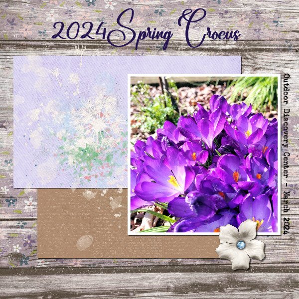
Project 2, but I don't know what day! Guess I am on a spring flowers theme. I took this photo this past week when I visited a garden that my fellow Penn State Master Gardener's maintain, at the Outdoor Discovery Center. I'm not able to participate in gardening activities right now, because I am in 'recovery mode'. The weather has been tempting me tho! I used part of the same kit I used on Project 1, and the same fonts. I tried rotating the background paper so it would look different, but it just looked odd to me, so I used contol + Z and undid it. I also used part of another kit called Dandelion Wishes. I loved seeing the crocus blooming at this garden. Either the chipmunks steal the ones I plant, or the voles eat them, or both....but I keep trying...gotta feed the wildlife 😉
1 point
-
Oh Rodney, that makes my heart beat faster! I was an HD rider for many years and just love this!1 point
-
DAY 7 - My fantasy Viking River Cruise. 😉 (For the new members; I"ve done this before with a fantasy trip to Gabarone, Botswana, Africa.) I mostly used the kit Carole offered, True Heart. The gold leaf is from Nellie Bell. The title font is Belisha and the journaling font is Franklin Gothic Medium. This color scheme is a bit of a departure for me as I usually use bright, primary colors or deep tones.
1 point
-
And project 2 under the belt. I like the keyboard shortcuts as a timesaver.
1 point
-
I posted the challenge in the bootcamp, not realising they are two different entities. Here, now, posted in the correct place, I hope. Jeni
1 point
-
I decided to do a follow up page to the one I did for the mating hares. Once again I have used Carole's punches, simillar colours too. Now that the snow, and snow banks are slowly disappearing as the sun warms up, it's lovely to see one of my resident hares out feeding during daylight hours. Rather than use borders I used the selection tool, select selection borders, delete Instead of round I went with oval for thw photos. Although I use square layouts, I much prefer to use rectangles. We now live in a digital world, a far cry from when I was a child, when we didn't even have calculators. It doesn't matter whether you area a pro, amateur, use a pro camera or a phone. For me photography is far more than pressing a button, but in the ability to weave a narrative through pixels. Immortalizing the fleeting beauty of a moment no matter what it may be. Using the powerful impact of PSP to tell the photos story, by showcaseing them.
1 point
-
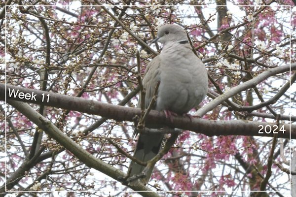
Week 11 This collared dove is a regular visitor to the garden. She is perched on a walnut tree branch but behind her you can see some pink and white blossom on other trees - spring has definitely started.
1 point
-
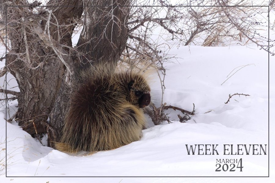
Here is my week eleven. Doing this challenge really does make you realize how quickly the weeks simply fly by. Saturday is the start of a new week for me. I was quite privileged, and awe inspiring to be allowed to get fairly close to this big procupine. (Danielson Park, trail hiking) I didn't feel threateneed by it, as it didn't display any signs of being threatened itself. AS they will retraet up a tree rather than attack. As it was feeding on bark and twigs. They have a more varied diet during the summer months. They have such tiny eyes for its size.
1 point
-
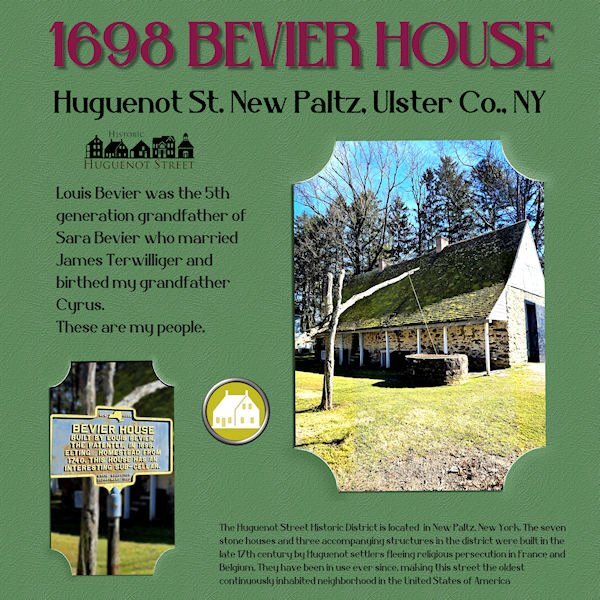
These photos showed up in The Hudson Valley in Pictures yesterday and I couldn't resist as I'm related to Louis Bevier through my father, Harold Terwilliger. His grandfather was married to Sara Bevier, a great-granddaughter of Louis. I've never been to Huguenot Street but a trip is planned! My "template" was just a .jpg so it took some maneuvering to create the "slipped-in" look. Thank goodness for promoted layers! I had to stick with the plain background because of that so I did a colorization and added a texture. The title font is Belisha. I created the brad from a piece of Huguenot art and one in my stash.
1 point
-
day 2 with my own Kit JustForFun you can find the link in "What are you working on (in January 2024)?" Thread font Underwater for the MainTitle1 point


Resized.thumb.jpg.d25811db03a63358cedab1e79f527635.jpg)