Leaderboard


Popular Content
Showing content with the highest reputation on 05/08/2025 in all areas
-
Firstly would like to say Thank You to all who have left me Hearts for my projects they have been a great encouragement and appreciated very much. This is Lesson 6, the ribbon elements are freebies from Chantahlia Design, the floral elements are from a purchased Digi Kit that i got for Craft Artist software quite a few years ago. The Birds i painted in oils many years ago now from instructions in a book called SongBirds. The font is Brock Script. did not know what to use for this template but my hubby said to me, what about your painted birds and he was full of encouragement for me to use them.. so here it is. Still using Affinity Photo. Best wishes to everyone, Dawn
 7 points
 -
hello everyone, here is my Lesson 5... slowly but surely i am getting to the finish 2 more to go. the flower is a freebie from Chantahlia Design. Photos.. parrot with bottlebrush from pixabay by Buntysmum and the 2 pink bottlebrush from pixabay by Sandid. the top one have had a long time and can't remember where i got it from. Font is Broadway. leaves used from an abr brush set. Middle green paper i created in inkscape using a filter called cracked glass. Background paper created in Affinity Photo using Procedural Texture filter and a youtube tutorial by Graphicxtras.com by Andrew Buckle called Affinity Photo Eye Popping Diamond Pattern and i tried various layer modes to get this result that i really liked. I am enjoying using Affinity very much. thank you again Carole for this workshop. best wishes to all,
6 points
-
Oils? Good for you. These are beautiful, and the colours work beautifully with the ribbons and papers you have used. You are very fortunate to have a husband who must be very supportive of your art, too.4 points
-
I had fun with this, the gold flowers were two flowers that I had made in psp previously. The template was marisaL-layout460, the mask rachelM-lydia-photo-mask01. The photos ones from my 25 year collection of photos.
4 points
-
So here we go with my H, another item from one of my altars, I fell in love with this hour glass when I found it in a charity shop. I have never seen such a large hour glass before, it times 15 minutes.
4 points
-
Well here's my I, this is one of my favourites of all my incense burners, it is fascinating to watch a candle burning in such delicate glass
3 points
-
I have been getting to know my way around Affinity Photo by watching videos I came across a one to turn your image into a pencil sketch .I downloaded the wooden background with the note book on it copied the note book on a new layer and then placed my pencil sketch into it and resized it to fit the notebook page. I placed it on top of the notebook that was on the wooden background and this is my finished effort.
2 points
-
Ann, I love your photo! Ah, I want so bad to drink coffee, but it bothers my stomach. I can have one a week but that's about it. Can you imagine that. I have to admit I like black teas like english breakfast, orange pekoe and earl grey. I"m not so much into the interesting teas, but they sure smell good.2 points
-
Bonus! I can get discounts soon.2 points
-
Due to my trip I'm a bit late for the letter I, but I already had it done before, so now I'm back I just have to post it. The I stands for Imari porcelain and my parents got this wand plate when they had their 25th wedding anniversary in 1971. Imari is an old Japanese painting technic for porcelain. I suspect this plate isn't that old, because nowadays the technic is still used.
2 points
-
Even when it's officially over projects are always nice to see, so keep them coming!🙂😄😇2 points
-
Lesson 5 Template I'm not sure if I should be posting here as the workshop is long over. All the papers are made by me with either PSP Textures or from my various Build A Kit papers, with the exception of the paper used in the background of the tea leaves, that was Riley B Graphics (Creative Fabrica). The ribbons are from my first build a kit called "F8 And Be There". I changed the size of the 4 papers to fit my elements. The cards are one of the elements from last years P52 Challenge. I pick all the things you'd need for a cup of tea. The doily is from a lab I did and magnet is an element from the P52 Challenge. The background started out as a paper from the "Time" Build A Kit last year; then I added about 3 or maybe 4 different PSP textures onto it. Photos are also mine. Fonts are Fugenta Script and Kingneverdie from Creative Fabrica.
2 points
-
I just love the colour combinations of your layout and the birds are just beautiful, actually I love it all.1 point
-
Let it Glow Again
1 point
-
I love your paintings. When I saw you had to quit using the oil paint because of being allergic, I wondered if there was an alternative to the regular thinners. I googled it and came up with this answer. It would be as shame to have to quit painting them as you create beautiful work. "Yes, there are alternative thinners available for oil paints for individuals with allergies to traditional solvents like turpentine or mineral spirits. These alternatives include low-odor solvents, natural alternatives like citrus-based turpentines, and even solvent-free painting techniques" I don't know if this will be helpful or not, but I figured it could not hurt to post it.1 point
-
Wow! April, your paintings are so beautiful. The detail in them is incredible.1 point
-
Thank you so much Jeni, yes my hubby of 53years has alway supported me in my craft endeavours he is a real blessing in my life. The papers are from the template itself just re-coloured. after i did paint those birds i became allergic to the thinners used for oils so had to stop using them. . have 2 bird paintings hanging on our wall and gave 1 as a gift to a friend . hubby took photos of them and we scanned them into my computer so could use them for card making etc. and for use in my campus projects. Best wishes to you Jeni, Dawn1 point
-
This really takes me back as I used to buy and sell Japanese and Chinese antiques mainly fine porcelain1 point
-
Here we go with my childhood fears, one of which I have overcome and the other that still bugs my life, I am still absolutely terrified of wasps and bees and with good reason having been stung again last week when a bee managed to get itself stuck in my hair. Template is Joey_template_DCS_avril Not sure where I got it from and the font is Best School
1 point
-
Congratulations to you and your husband for your 40th anniversary! It is a nice idea to make one page with the most important facts for each year and I hope you will be able to find photos for it and finish it. I don't think I will start such an album and if I do, I would certainly have many years with text only. I have trouble enough to make something for the timeline album, due to not having photos . I don't like to do pages without photos, but that is a personal preference of course.1 point
-
Mmmmm, so tasty1 point
-
JK's recent trip by bike, shots taken by JK, my work with the documentation of the trip /a bit long trip;)/
1 point
-
Thank you Jeni and Cristina for your words of encouragement i appreciate it very much. my 71year old brain is not as quick in the creative department as it was 9 years ago when i joined the campus. Lesson 4.... as i could not find a way to create a border with a repeated angle gradient that i was doing in PSP decided to create it in PSP as a png file and import it into Affinity Photo. Wattle Photos.. the bottom one is from Unsplash by Megan Clark the other i can't remember where i got it, so long ago now. The Australia map was created with Carole's Hammered Metal script in PSP. The font is Bodoni..... Now on to lesson 5 Best wishe to all, Dawn
1 point
-
I had a little fun with Affinity on this project. Do you have a "sharp" eye?
1 point
-
Here is Day 6 - Affinity Finding a kit with the papers/colors I thought would fit the photos took me a long time. Of course, I could create my own paper with the colors and textures I wanted, but why do I get the kits I ike if I do not use them? 😄 So, for this page, I used papers and elements from Lynn Grieveson's Happy Place kit. Cassel's DateStamp#12 script, done in PSP. Font: Bungee Outline Now, for Day 7, I still have to look for photos I feel like scrapping and suitable for the template.
1 point
-
hello everyone!... finally got to do lesson 3 after having to get new computer. Beige painterly stroked paper free from Rita at the Coffe Shop Blog, recoloured the original. Plaid pattern paper free from Chantahlia Design. Heart shape created in PSP from a shape preset and glow, 3D and shadow effect done in Affinity Photo. Font is the same as Carole used in the lesson. Now on to lesson 4.. i will get to finish eventually. best wishes to all, Dawn.
1 point
-
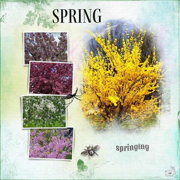
I posted this in April. Thanks for pointing that out friends. Early May...is there a sweeter, more lovely, time of year? At least here in my part of the world. The flowering trees are spectacular and colour is back in the world. Grabbed a few quick shots while I was out today to capture the beauty of it all. (Except the Forsythia, which I got online.) Used PSE 2024 (my Affinity has expired and I can't afford to get back into it) and a template from Anna Aspnes. Some papers from a kit I won from ET Designs. The metal bee is also AA. I will be looking at this next winter.
1 point
-
Here are my projects from days 2, 3 and 4 with "Affinity". Although the "Look" is very similar to those made with PSP, I admit that Affinity offers useful tools (Place, move a photo on a mask, etc.). It's a shame that Corel no longer makes modifications to PSP 😞
1 point
-
When I first saw the photo I felt that it wasn't real. Unlike Albino birds which are caused by a genetic mutation. In other words albios are lacking in melanin, the pigment resposible for dark colours. Many colours, such as orange hues in plumage can come from pigments in the food that they eat. Not the case in the Snowy Owl, as their diet soley consists of mice, voles, rabbits and the like. Snowy Owls have very little melanin.Which mean they can not change colour. The Snowy Owls white plumage, with barring is a natural camouflage for their habitat. I doubt this colouring is the result of genetics, in my opinion humans have played a part somehow. One of my recent Template workshop layouts was about Melanin and Keratin. By the way this Snowy Owl, is a female
1 point
-
I made it 🙂, the 7 lessons with Affinity Photo. Day 7 Papers : aimeeharrisondesigns Burst Forth Mini Kit Photos : Belinda Fewings (flowers) and Nick Fewings, on Unsplash Fonts : Al Sandra, Gyparody1 point
-
Happy May - I've adapted my typical wild cat calendar to be wild nature this time, featuring a bird instead of a cat. And it is a very special and unusual bird. A snowy owl is typically white; to blend with snowy landscapes but this individual has beautiful orange coloring and was photographed by Julie Maggert. Here's a link to My Modern Met with the story of “Creamsicle,” as the photographer called her. I will post a full-size image for printing in the Files area of our Facebook group Scrapbooking with PSP and Affinity. The May title is in Bananas Pancakes font and the journaling is Banditas. The calendar template is from our workshop last October with Cassel.
1 point
-
H is for Headphones. I bought these in 2014 from Amazon. They have been invaluable, especially before I got my hearing aids. The background paper is from Cassel and the font is Bremen. I used Cassel's Edge Cut script. The headphones are Audio-Technica ATH-M30x Professional Studio Monitor Headphones with advanced build quality and engineering. They have 40 mm drivers with rare earth magnets and copper-clad aluminum wire voice coils. They are tuned for enhanced detail, and have excellent mid-range definition. They are also collapsible for space-saving portability. Designed to excel for studio tracking, mixing, and field recording.
1 point
-
H is for History Books. When I was cleaning out the basement in 2018, I found these books in a box. I recognized the books on American History and Ohio History. They were the textbooks when I took these classes in 8th grade and 7th grade respectively. I had never seen the other book which is a book on the early history of Auglaize County Ohio. That is the county I live in. When I opened it to look at it, my mother's name was written on the first page. Evidently this was a textbook for her when she was in school. All 3 books are now on the bookshelf in the living room.
1 point
-
I love gold and use it a lot. For this challenge, I used a flower from AE with a sculpture effect using one of the gold patterns. The flower pattern was made using Carole's scripts--pattern maker and seamless pattern. I used a slight layer style on the flower and a gold gradient for the background.
1 point
-
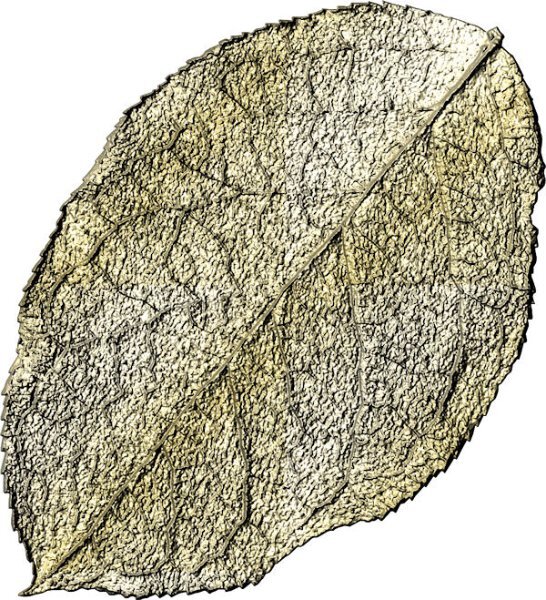
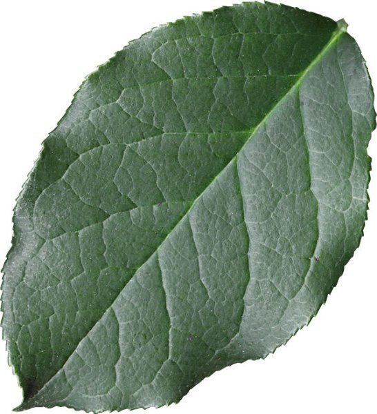
I finally figured out I had to add a gold texture file to the Corel documents folder. Then I called up a leaf from my stash and made it gold. Somehow, it looks more like the underside of the leaf compared to the original. Which setting needs adjustment? I just added the original leaf element so you can see it is smooth and not as veined as the gold variation looks. Don't know how that happened!
1 point
-
This is my bit of gold (the text) to send wishes to all good Irishwomen/men. For today we can ALL be Irish. And it's my birthday, so I get to do this!!!! Cheers and to your health! ☘️
1 point
-
When I started to think Gold I made quite a lot of golden elements. 🤣 I took the photo of these crocuses just a couple of days ago, they are coming in spades now and these lilac ones are always the first, then come the yellow, purple and white ones. The mask is by Jessica Dunn, I like her masks and often choose one of my collection. Then I started to make a golden crocus from an extracted crocus from my stash and duplicated and flipped it. Well I continued with cass-stitch-flower1 brush at the bottom and at that point decided all my elements will be in gold. Therefore the butterfly and fern leave from my stash turned into gold as well. The font is Arienne and I honestly tried it first in lilac but that looked somehow a bit funny and it became gold too. I wish I could turn my money into gold that easy, I could fly business to California!
1 point
-
Gold elements challenge. I turned a stem of green ivy leaves to gold, and an insect which I extracted from a photo.I thought using the Shiny scarab beetle was appropriate for this challenge. Besideds the Shiny, other scarab beetles have metallic green or bronze hues. They are a very diverse species. In the top left image, you can see how this scarab spent the night, in a state of torpor. The layout is my own, which I created for this challenge. Again I used snowy, icy photos using the blend mode for the background paper.
1 point


.afphotocorgipencilcleanedup20258thMay.jpg2x.jpg.440831b86305a104aac778a0cd635c9c.jpg)