Leaderboard


Popular Content
Showing content with the highest reputation on 02/23/2025 in all areas
-
Day 5.
 15 points
 -
Page 6:
15 points
-
Day 6 and a visit to the amazing Lake Ballard - I tried to walk out to the hill but trying to keep my shoes on in the mud was too difficult! I have added my 2nd D5 page from a previous magazine workshop on Menzies.
15 points
-
Day 3 that I missed posting. An interesting exercise to colour part of the text.
14 points
-
Day 3 re-done
12 points
-
here is now my day 6 page12 points
-
Day 6 I'm all caught up, at last. I had another photograph of the cattle in their summer retreat, this one overlooking the township of Roxburgh, in Central Otago.
12 points
-
Day 6 using Affinity. This was fun. I still believe Affinity is easier to use with Templates. I tried to do an outside border again, and I did manage to get the color I wanted but for some reason, it was wider on the right borders than the top borders. I could not find where to adjust this.
11 points
-
Day 5 Using Affinity. Finally got to do this. I found the Templates were easier to adjust than PSP. As said in the beginning - some good, some not so good. We need to be able to combine them both. I still have not been able to change the color of the blue border. I did copy it from the prior template but there must be a way to change the border color.
11 points
-
Day 2 re-done I altered the headline text to Lemon Milk, the headline font used on all other pages. I think it improves the page, and brings it into line with the others.
11 points
-
Day 5. I had a hard time with the Text technique shown on Day 5, using the Recolor Adjustment Layer and Mask Layer. The outside part of the Text would disappear as soon as the mask was created. To make a long story short, after watching the video quite a few times and comparing it with my setup, I noticed a difference in the Recolor Adjustment Layer shown in the video and mine. I was working in Affinity 2.6. I tried the technique in Affinity 2.57, and it worked perfectly. However, I didn't add it to the layout because I was tired of working with it. Nevertheless, it was a learning process, and it is an interesting technique.
10 points
-
I'm making some extra pages for my magazine with more photos I want to use. I used 2 of the extra diamond templates, but adjusted them to accommodate the photos. I rearrange the order in which they will be presented. On the right page is a photo of one of the informationboards around the area and above it is a photo of the sign at the entrance of the Grove.
10 points
-
Lesson 3, only 3 behind now. Will likely finish next week as I need to do some "adulting" now (errands, boo hoo) Fonts are Gill Sans Ultra Bold, Gill Sans MT (older windows versions) and the other one is Girlie...something (sorry) from CF. I couldn't decide if I wanted to add the word "Rock in the empty space or not. I didnt for now and will probably add the logo I had made up for the "Office of Oddities). I also added the frame, very small and put it behind the mask. I'm living with it for a bit to decided if I like it like that or not.
9 points
-
Day 7. I ended up making the same basic template in both PSP and Affinity using the instructions Carole gave for each of them. Not sure which way I liked doing it the best.
8 points
-
Day 7 and that is the end of our visit to Yosemite NP. I have used the Cover template to make a backside for the magazine, but rotated it to landscape. I kept the lines to have consistently, but used a different color to suit the photo. The website I mention is the existing one for the national parks website which also have the black rectangle to point you to their apps. Originally I wanted to have a QR-code on the back but the website and leaflets from the NPS doesn't have one. All the photos are by me. I still have to make 2 extra pages to complete my magazine. I don't know if I'm going to print it, maybe I will try to make a flipover as mentioned in the last Q&A and send the links to some people.
8 points
-
Here's my day 6 and my day7
8 points
-
Day 6, pg 7. So hard to choose photos for this project, I have way too many!
8 points
-
Day 7 - Creating a template for a double page. I have changed the title text on this last submission for the Workshop. I regret having chosen Forte as the font for my title font. Thank goodness for digital, I can go back and change the font to my new font without any problem.
7 points
-
Day 4. The pictures aren't the best, but they bring back nice memories.
7 points
-
Well, here is my day 6 entry. We're almost at the end of this fun project. One more day to make the best magazine page of the bunch. There are so many great ideas in this forum. It's a joy to see them and get new ideas for designing meaningful images that catch people's attention.
7 points
-
@Euka I am glad that the program upgrade fixed your issue. @Jeni Simpson You can definitely create lots of textures and with a little bit of work, make them seamless too. @Jean Naumann It is fun that we almost have "live" photos! @Carolyn Rye Yes, learning new tricks and techniques can be a bit challenging, but with repetitions, it will get easier. @MoniqueN. Looking forward to seeing your magazine pages, even if they are not all of the same format for now. You might be able to resize them later. @Jen Brown I am particularly enjoying seeing all those embroidery/sewing projects! @Jenny MacKay Great pages. If you plan on printing them or displaying them together, make sure you create some consistency. For example, some pages have shadows, others don't. Some text looks printed on the paper, some look like they are paper cutouts. They can all be great, but it might give a more cohesive look together. @Jacques I will have to explore that option too. I still have a lot more to explore! @Connie Collier These pages are meant to be revised throughout the workshop since I am not teaching all the techniques on the first day. As long as you keep a layered version of your pages-in-progress, you are encouraged to go back and tweak the previous pages. @Corrie Kinkel That is really the perfect photo for that template! I love to see some of those extra templates. @Rene Marker That is frustrating. It has not (yet) happened to me so I don't have any suggestion/explanation for that text issue. I'll keep an eye on that and if it happens to me, I will explore further (and also put notes in my notebook). It looks like saving in PSD in Affinity does not save the "mask" part, unless it is PSP that can't read it. I wonder if there are specific settings needed for the file to be usable in PSP? @Linda Rexford It is nice and very subtle how you used photos as backgrounds. @Anne Lamp That is a magnificent tree and perfect for this template. @Clarine This will end up to be such a wonderful album for her! @Donna Sillia It is fun to see how even a resized template can still be used effectively. @Art Kuiper If you are inspired by what others post, I am sure others are inspired by yours! @Gerry Landreth It is a great idea to post both pages together. If you make them as a double page in one image, you can make them up to 1000 pixels in width. The 600 pixels limitation is mostly for the single pages since it makes them 600 pixels high. That last page, where you cut the template diagonally gives a great result. I think you are the first one to cut diagonally! @Susan Ewart That reminds me of a show called "Third rock from the sun". It didn't last too long, but I remember watching it. @DianeM That photo is perfect for the 4 quarters template!6 points
-
A second lesson 4 and lesson 5
5 points
-
My Day 7 : A summary of the giant puppets...
5 points
-
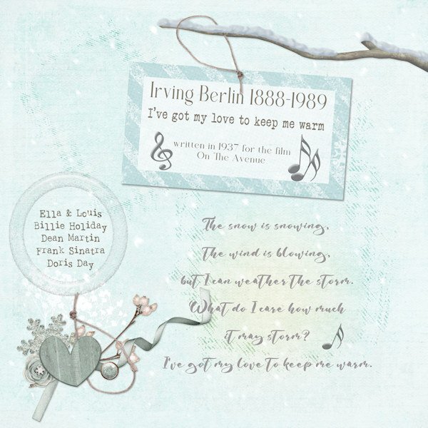
Years ago, I listened to Vinyl Tap. A friend in another town also listened. We considered it to be listening together and would talk about it later, in the days before social media. This is my take on the challenge. Any song sung by Ella Fitzgerald is one I love. Many of the winter elements come from Jessica Dunne mini kits that were free.
5 points
-
I used to watch it. I should have remembered and got the title that way. But I was looking up other names for the earth and one description started as, The 3rd rock form the sun, Earth..... etc" Then I remembered about the show.5 points
-
I would love being there. What an awesome experience you had.5 points
-
@Cassel A coaster is the term the embroidery fraternity uses for round or square coasters. Coasters become mugrugs when they take on a more rectangular shape. The size I like is the 5" x 7" ones. In effect though mugrugs are coasters too.5 points
-
What I like about Merge-Group-Rename is that as long as you run the script when you are on the photo layer of the group, it gives the raster layer the photo name instead of something like "merged group" or another generic name. Very helpful if I use an image from my camera where I took a lot of photos of the same thing. Knowing exactly which image I used can be useful if I want to know in the future.4 points
-
Hi all, the background paper made with 3 AI-created papers that are blended together, Picture is also AI, ribbon and flower my own4 points
-
I have never saved the full photo in PSP from the time I started digi-scrapping in 2008. I always trimmed the photo as well. Raster To Mask has made it easier to get what I want to show of the photo. Then Merge-Group-Rename after I have decided I'm happy with the placement of the photo. I tend to put all my photos into the mask groups first. Then I fuss around with all of them until I'm happy with what is showing before using Merge-Group-Rename. I have those 2 scripts bound on my customized toolbar.4 points
-
I doubt if Dr. Who would fit into that phone booth, even with sci/fi magic! 😉4 points
-
wow great layout and wordart @Sue Thomas oh and I love this wonderful spring layout @Corrie Kinkel I bought the Affinity Photo 2 days ago and tried to use it in this challenge , it was fun to clip the papers so easy to the shapes, and I found make a bevel on the little circles with fx and 3d effect,4 points
-
Day 6 - David sent me this photo in 2019 just before Covid. The monk photo is from 2024. I love this saying which a friend found and shared with me. There was some shifting when I resized the template using the cass script resize template, but it was not difficult to correct.
4 points
-
Our little granddaughter is growing so fast. She is such a joy to hang out with.
4 points
-
My day 6 (I used "New Mask Layer|Show Selection" to include the giant inset.)
4 points
-
I think I've caught up now with Day 6. I'm still using V1 and managing ok.
4 points
-
I'm still catching up, so Day 4 & Day 5 together.
4 points
-
Day 6 - Page 6.
4 points
-
In the background, I'm working on my magazine ,but forgot to look here to see what you "guys" are making 😉 Love what I've seen! I wanted to make the magazine in real magazine size and not square, but only thought of it after lesson 4 and now I don't have the energy resize the templates and to start all over again. 🙂 Will post my projects later this week.4 points
-
Day 7 I chose to re-create the cover on the back. Using a photograph taken on that same day we travelled over Mount Hope, we popped across the road to another farm that comes under the umbrella of Mount Hope Station. It is run by one of the sons currently. It encompasses the creek, Shingle Creek that goes down to the Clutha River. Far in the distance is a mail boat that brings cyclists to the cycle trail and wanders around the lakeside and across farmland before joining the main highway through this part of Central Otago. I created 3 different back covers, with the photograph cut into 1, 2, and 3 pieces. I chose a single image in the end. I stayed with white borders and chose to do all text in the green, with the title and body copy aligned right, in the panel.
3 points
-
It merges the group so then, the photo is trimmed to the size of the mask.3 points
-
The bit about the kids made me laugh out loud! Enjoy seeing your tour of Malmo.3 points
-
Anne, I love your comments! 🤣3 points
-
I couldn't even get text to work on a single layer image. I know I'm doing something wrong but haven't figured out what yet. I should look at some youtube videos and see if I can figure it out.3 points
-
What a cutie! Are those glitter shoes? I love glitter and have glitter shoes in black, gold and silver.3 points
-
Day 5 using Affinity. The trip up to the valcano was quite a walk! It was beautiful and so different from anything you see where I live in Michigan!
3 points
-
Day 6. PSP layout. I did rotate the template because most of my photo were landscape orientation. I did the instructions as given for the photo. But, I also wanted to include 2 more photos that were landscape orientation. Since there were the 3 mask groups hidden, I used the top two putting a single photo in each one. Then I linked the 2 photos and moved them to the bottom of the page and aligned them with the other photo. Affinity layout. I used the template as is with 4 individual photos. That was no problem at all. My problems started when I wanted to add text. I did a lot of screaming and scared the dog. I wanted the text at a specific point in the layers panel but it kept flipping to a different layer and changing to the Pan tool. I tried both Artistic Text and Frame Text multiple times and it wouldn't let me type any text. I even tried saving the layout in psd format and doing the text in PSP. Definitely didn't get what I expected when I opened the psd file in PSP (I'll put a jpg of that in another post). That didn't work so I had to keep trying in Affinity. I even tried Affinity Publisher and had the same issues. I finally typed my text in OneNote (where all my tips and tricks notes are for both PSP and Affinity), then tried to copy/paste to the layout. Even that took several tries before it actually worked. If my hair wasn't already grey, it would be after this session!!! I did get the layout done.
3 points
-
Day 6 and I have a photo that is fitting for this kind of layout. You feel very small when you are standing in front of those giant trees. I plan to use more pages for my magazine and depending on the photos I want to use I'll pick a template or adjust one. For me when doing a workshop I mostly use the templates as is, this way I just seem to learn better new things. Later on after understanding the new techniques I can be more fancy and adjust or make my own. In the end I probably will rearrange the pages of my magazine.
3 points
-
Day 6 - it's dangerous to start adding new elements this late in the game because I'll want to go back and tweak all the previous pages. But I can't help it. The page needed a sprig. 🙂
3 points
-
I fiddled around and tried another way to get the download of v. 2.6 activated, and it worked! It says I have 50+ days left in the trial.3 points