Leaderboard
Popular Content
Showing content with the highest reputation on 11/20/2024 in all areas
-
Day 1 and already behind.... When I filled the text with green, it didn't fill to the full width of all the letters. I am using 2019. When I selected inside each letter, I could select the full width. But I didn't like any of the tubes I tried, I think I was agrivated/frustrated by the fill not being as I expected it...so I stopped.12 points
-
Here is my Page 2 of the Text Workshop. Our cat Bella loves to check the bookshelves for some interesting stories. I enjoyed playing with all the different fonts: Anberta, Calisto, Cherly, Black Chancery, Cat Paw, Arienne, Cat Paw, Brush Script, and Hesthia Austine. Some items are from Digital Scrapbooking.The cat and books are mine.11 points
-
11 points
-
10 points
-
10 points
-
Here is my text for day 2. I am still working on the project where I added this text and will hopefully finish it this evening.Used some kerning. This text class is fun. Fonts used: Anberta, Calisto, Cherly, Black Chancery, Cat Paw, Arienne, Cat Paw, Brush Script, Hesthia Austine, and I added drop shadow.10 points
-
10 points
-
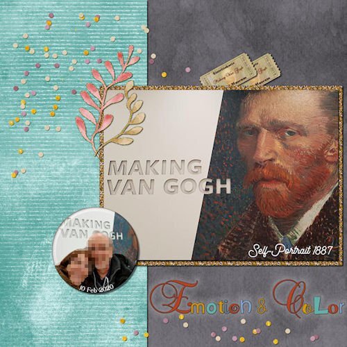
This time, instead of creating new layouts altogether, I decided to complete the Workshop that I started years ago and had never finished. I tweaked the first layouts a bit. The layouts are all about the visit to see the "Making Van Gogh" exhibition. Credits: DiHiller PS2020Mar My Tribe mini kit freebie / Cassel Admission Ticket & Confetti Tube (Lab7-M09) -- Flair Button Lessons 1 and 29 points
-
9 points
-
Day 2 This was an interesting exercise, I must say. I enjoyed creating a word from many fonts, it really did make me think. I had to cut and paste the 'unk' from the 'steamp' to bring the letters closer together. It was such fun choosing the letters to use. We have a steampunk museum in Oamaru, a town about 3.5 hours away. I love the museum and the displays around this town. The old town is full of steampunk memorabilia. I used papers from Raindrops and Rainbows, recolouring them to suit. I also used a rust texture to bring the black paper into a more steampunk rust colour. The other paper is a mix of Janet's black and orange papers.9 points
-
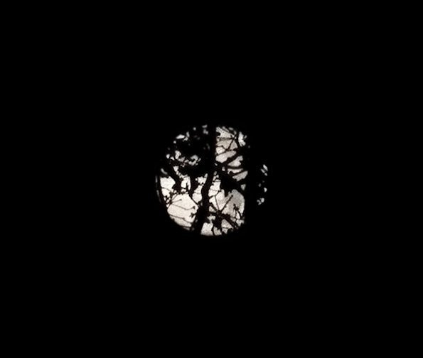
The moon photo with the "beaver" silhouette was taken by myself and I added the beaver for this project (that one was "actually" the October Super Moon). The main November moon photo with the branch was the original photo that I took in early morning with the moon behind some very tall trees in my back yard. I had to keep moving around to get one that wasn't overwhelmed with the tree silhouettes. (See below). These photos were actually taken with my Samsung Galaxy S22 Ultra cellphone. The camera on that thing is amazing for a lot of things.8 points
-
8 points
-
7 points
-
7 points
-
7 points
-
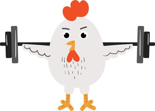
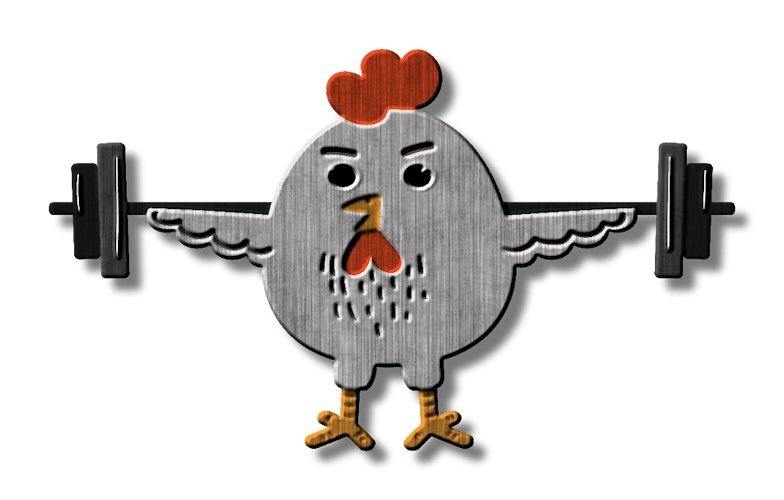
Lesson two Picking fonts it really hard. But I did enjoy using the sculpture effect on the chicken. I used cass-steel pattern then put the original chicken clipart above it and used a blend mode (multiply) and it brought back the colors in the feet, beak and red parts (what ever that is called). the weight plate (45lbs) was a icon image that i selected certain parts to give a inner bevel to and other parts got a cut out to make the plate more realistic. I know, I spent more time on the layout and elements that the text. I just noticed I forgot to add the shadow to the photo. I included what the chicken clipart looked like before and after the effects were added. And for some reason the chicken got fatter 😆. I think I really like that sculpture technique. the only other time I've used it was in the last Text WS. I hope I remember to use it often.7 points
-
7 points
-
7 points
-
6 points
-
6 points
-
Susan, this is just great. You are not only an artist with your photography, but an artist in using the tools in PSP and displaying your photo work.6 points
-
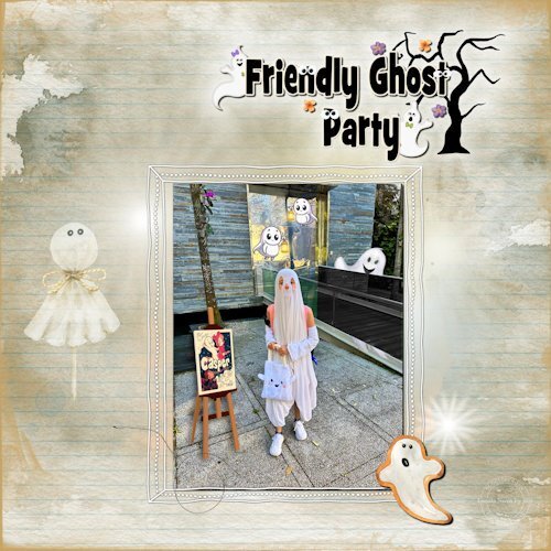
Another Halloween layout. I don't know if anybody else has experienced this, but many times, I start with the photo and get an idea of how it's going to be. And then, as it progresses, and I'm not too fond of this or that, I end up with different papers, how I showcase the photo, and so on. No wonder it takes so long to finish a layout. 😄 I created the Word Art inspired by one I saw on the internet. (attached) Credits Cassel: Googly Eyes (Lab10-M11) -- DateStamp#8 script -- ."How to add Glowing Lights" 2020 Jan blog post -- Hand drawn frame (Lab12-M01) Ana Aspnes: Papers - Artsy brush - Overlay - Elements DiHiller: Flowers elements / Eyeinspire: Word Art ghosts / Creative Fabrica Halloween Clipart freebies Font: GrilledCheese BTN Toasted6 points
-
6 points
-
5 points
-
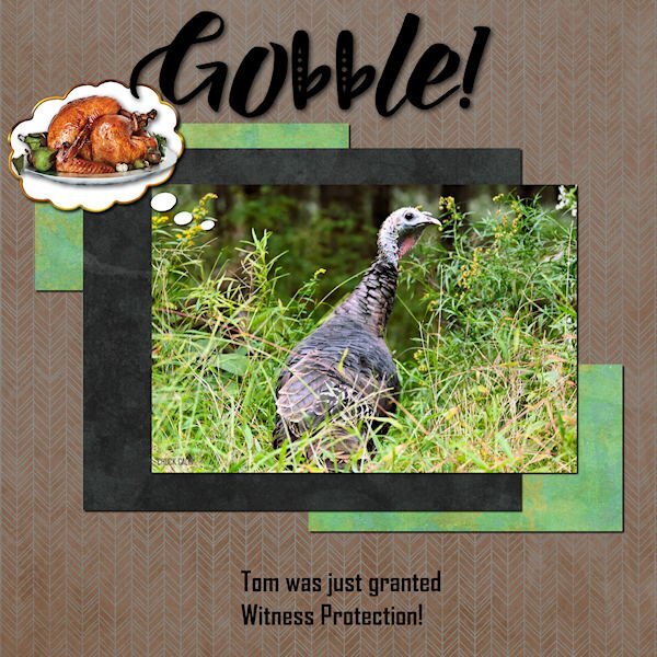
Ann, wow, a jumping spider! I've seen them fall, but never jump! Eeew, that's pretty scary! The turkey is great. I'm so glad you showed him this year. I hope witness protection is looking after him well. Both images are fabulous!5 points
-
5 points
-
@Jacques Do you have specific plans to use those titles yet? For babies photos, are they photos of the mom and the son when they each were babies? @Dan Greenwood Great start with your project. Do you plan to add shadows to the elements or treat the page like a printed magazine? @Susan Ewart That is a great font to add the daisies to: it is fat and lets you see the details well. @Carolyn Rye Now that you have some practice, you can always go back to your layout and change it if you are not 100% happy with it. Inspiration might strike another day. @Jeni Simpson That translucent text is fun to see the rocks. And the gradient matches well the water theme. @Anita Wyatt When you reduce the opacity of a color, it will be affected by the color below. If you see, on white, it looks lighter, but it is normal that it will look darker on the yellow paper. If you add some shadows to your papers and photo, it will match the shadows on the little leaves. @Ann Seeber If you ever want to get color-specific confetti, there is always a script in the store to make them. Click here for it. For the Jumping Spider layout, normally, I would say that the title has too much shadow making it float, but with the theme of JUMPING spider, it is very fitting! @fiona cook You certainly managed to get something done with the technique. I really thought that issue with the spacing was only in 2023. @Daniel Hess Did the moon photo include the silhouette or did you add it afterward? @Mary Solaas Great work on the title. You are good at manipulating the tools in PSP to get the result you want. @Anne Lamp Nice way to combine two tutorials in one project! @gwen jewitt You created a really nice background! @Corrie Kinkel That is a nice card. What size it is? Is it too large for a normal envelope to send it in the mail? @Linda J Walker It looks like you are affected by the same issue as others with one layer not matching the size of the other. @Donna Sillia It is fun to have those different letters on banners! Keep them coming!5 points
-
5 points
-
Like the subject very much and like your artwork. Can you tell me how you make the fuzzing out for the discreet portrait photos please?4 points
-
4 points
-
4 points
-
4 points
-
I love steampunk too. You did a beautiful job with the fonts and layout. How cool to have a museum. I bet you could photograph the day away in a place like that.4 points
-
4 points
-
Ik houd ook van steam punk. Ik heb een paar files vol met SP attributen. Maar om te kijken, niet om te dragen.4 points
-
Those fonts work so well together, Gwen, and that owl, such a wise choice for Watching You! I love what you created with the background, too.4 points
-
4 points
-
4 points
-
I'm slow as usual. However, this is a photo of my daughter's dog, Murphy, which she took while they were on a morning walk. The font is - I dont know as I didn't save the text file I just converted it - and I used a pattern where the color was a medium tan for the outline, I used a blue for the transparent inner layer. I used the Lock Transparency tool to put the grass patch picture tube in the bottom of the text and for the birds tube in the "Sky" top of the text. I know, it is hard to see the birds, but they are there. I had to merge the outline layer and the bottom fill layer of the text in order to enlarge the word. the papers and elements are mine. Fun. I don't remember this from the first Text Workshop I did, so this refresher is great. I didn't remember that the sculpture layer not only puts a pattern, but you can change the "light color" color as well as those numbers puts a bevel on the object.4 points
-
Hello everyone. Here is the first day's project. Hard to spot the "wave" in the title at this resolution but it's there.4 points
-
4 points
-
4 points
-
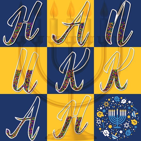
I had been playing with Carole's Word-Grid, so I went ahead and used the Lesson One technique on the letters for Hanukkah. The font is Babilonia and the decor is from the internet. I'm not very handy with Picture Tubes and was wishing I could have a confetti in the blue, gold and white of the holiday. The large menorah is the top layer set to Multiply and at 45% opacity.4 points
-
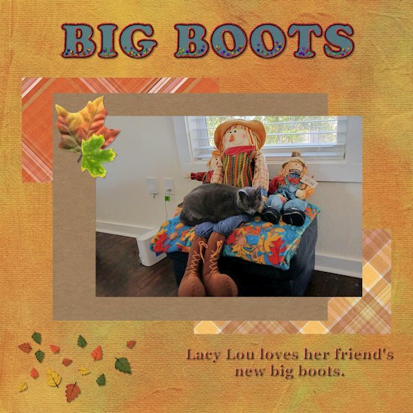
Here is my Day 1. My friend sent me a picture yesterday of her cat Lacy Lou and when I saw it, I asked her if if I could use the picture for this workshop. I noticed that after I added the background paper the blue text seemed a bit darker, even though I had used an opacity of 65. Papers and leave scatters are from Digital Scrapbooking and font is Cooper Std Black. (Thank you Carole). I used the clip-it mode to fill the shapes around the picture, but realized that after that the layers formed a group and 1 could not see the drop shadow that I added. However, I had a lot of fun playing with this layout and I am learning something new every time I join a workshop.4 points
-
Day 1 I played around with this one, when creating the page, I used the same settings for the papers and the photograph, yet they look different, not sure why! I wanted the idea of waves crashing into the shore with rocks flowing in with the water. I used Cafe Rojo for the word BEACH and 1 Archer DNA for the remainder of the text. This lovely photograph of a friend's son and his family at the beach. It was Ruby's first trip to the beach.4 points
-
3 points
-
3 points
-
This looks great Anita. I had such a hard time picking fonts. I didnt care for what I did, but I love what everyone else did.3 points
-
Thank you Jeni. It's like I've discovered flowers for the first time (well, since 2021, when I started with the Campus).3 points
-
3 points


