Leaderboard
Popular Content
Showing content with the highest reputation on 11/11/2024 in all areas
-
I've been working on the type of mask that was in the 2025 Calendar Workshop. I created the square first, then added the brushes, merged visible and finally, converted to mask using the raster to mask script. I saved the square because I don't know if I can remember how I did it the first time. I have created some brushes using a few AI patterns that I made.5 points
-
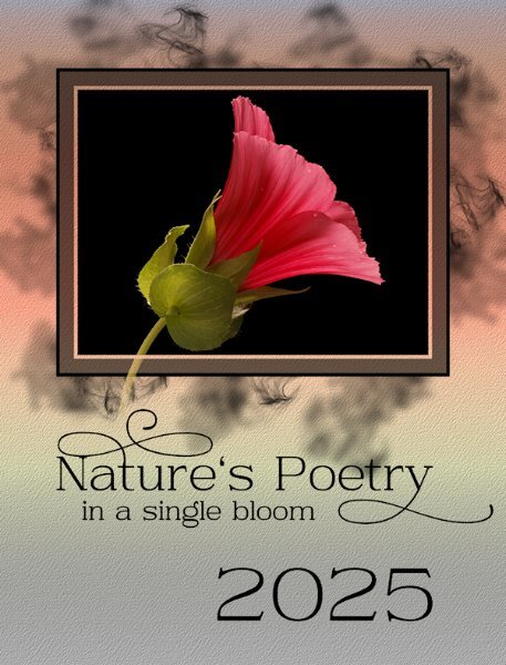
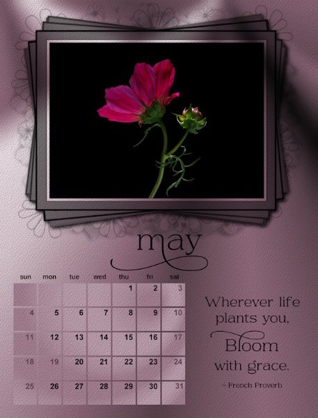
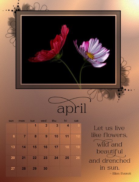
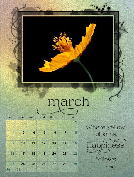
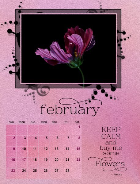
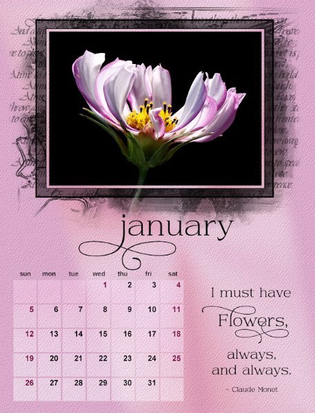
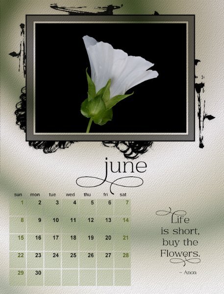
Now that the Calendar WS is over I'll post here I'm starting with the last layout which is actually the first layout of the Calendar. I ended up going quite dark, not like I had started out doing. Kept black for the text/mask and numbers (except the weekends and stat holidays for my province). The font is Daisy and Violette from CF. All the backgrounds are from gradients I have in PSP. Often they are altered (pulled, twisted, stretched, squished, angled, blurred and even stomped on - okay, maybe not stomped on, but if I could have, I would have), blended and I even tried using some masks on them. Oh, and they have a PSP texture added.4 points
-
3 points
-
3 points
-
3 points
-
3 points
-
3 points
-
3 points
-
3 points
-
3 points
-
2 points
-
As a kid I was totally HORSE CRAZY. I collected anything to do with horses, figurines, pictures, books, you name it. For my 8th grade graduation my dad bought me a horse, well he was at that size right between being a pony and and a horse which was the perfect size for me (5ft tall). Dad built a small one horse barn where he could get in out of the weather with a small corral attached. It was my job to feed and take care of him. I don't think I ever saw him go in that stall except when I fed him. I remember seeing him with icicles hanging from his mane and several inches of snow on his back.2 points
-
2 points
-
2 points
-
What a beautiful photo, Julie! I can only imagine how the photographer waited at the right spot to get this shot. You created a lovely layout to showcase it. "Playing is fun even if the results are not stellar!" -- I agree. I also just want to have fun creating something, although it's no piece of Art. 🙂2 points
-
I saw your comment only today, Ann. 😞 Lucky us, there's always someone here ready to help when we have questions or doubts. 🙂2 points
-
Yes, you do have to run the script for each group. But that is what I like about it since it gives me the control. I also like that as long as the highlighted layer is the layer with the photo when you run the script, it renames the merged layer to the name of the photo. In my case, the image number from my camera. If I ever want to see what photo I actually used in the layout when I have multiple images taken at the same time, the image number is right there in the layers palette.1 point
-
1 point
-
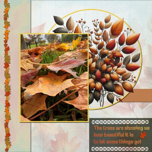
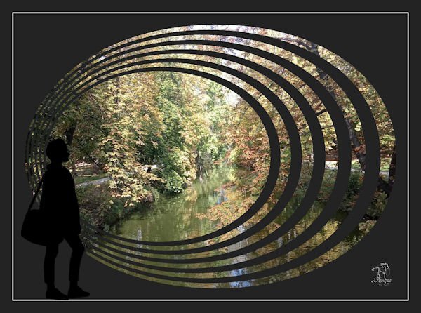
Finally I have completed this layout! I don't think I ever have done that long about making something. However the calendars were a lot more work to complete and print; the first one is in the mail by now. Before doing anything else like the AAM-Challenge I wanted this one done. It was difficult to take it up again and remember what I wanted to make, but this must do. I used a photo of fallen leaves that we have in abundance now, every street is littered with them. The background I have in my stash and I used a leaf picture tube from Carole as well as an Edge punch. The font is Fantasy Snowman, a freebie from CF a couple of days ago and the leaf bouquet came also from CF if I remember correctly. All the colors are taken from the leaves in the circle.1 point
-
1 point
-
1 point
-
The dark really adds to the impact of the overall layout! I love it.1 point
-
I love this layout style. You chose the background and elements perfectly. Great photo, must've been awesome for the that photographer in person.1 point
-
WOW! Donna! This is breathtaking. to get the opacity, did you lower the opacity of the layers before merging (visible). Super super work!1 point
-
We could be soul sisters. I was horse crazy too. Only I didn't get the horse. But later as an adult I worked/lived on various breeding farms (thoroughbred farm with 10 stallions and a Quarter horse farm) and hunter/jumper farms. Did you collect Breyer horses and Mark's Best of the West horses and gear? Some had moveable legs and necks and came with lots of gear, like saddles and bridles...it was as close as I got to owning a horse.1 point
-
1 point
-
Well done Corrie! What a truly thoughtful and personal gift for others in your life.1 point
-
1 point
-
I am waiting to meet with the Jane, who will be doing the printing of my calendar. She will show me a sample of the printed calendar, and I was flattered that she asked if she could print one for herself.1 point
-
Julie that is a spectacular photo and this layout does it justice1 point
-
1 point
-
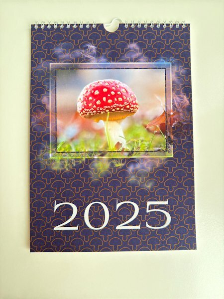
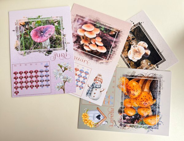
When working on the calendar workshop I promised Carole that I would show my calendar when printed and today it is completely finished. I have taken a photo of a couple of pages laid out on the table. In the next post is the calendar ready to hang on the wall. I printed the pages at home but went to the Copy Shop, a local smaller version of Staples, to have a binding. I can't upload 2 pages on the same post because I have kept them at a fairly large size when resizing for posting.1 point
-
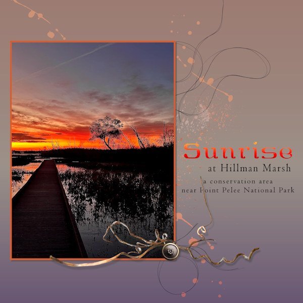
When I come across a photo I admire or enjoy, I grab it and then hope to use it for a layout. I don't take that many pix but I like seeing what others do. This one was posted on FB for the Hillman Marsh, taken at sunrise on November 3. I used a Dissolve blending mode on it to intensify the spectacular colours. Then just played with bits and pieces to create the layout. Playing is fun even if the results are not stellar! The marsh is protected wetlands where birding is a favourite activity. The boardwalks make it navigable.1 point
-
Yes his name pointed in the direction of the northern European countries, like Norway, Sweden or Denmark.1 point
-
I had missed it, anyway, I appreciate you taking the time to translate these documents. Jack is absolutely chuffed to bits to finally know what the documents say. As you rightly say, he wasn't Dutch, but Norwegian.1 point
-
Thanks for helping out here Cristina. It might well have been Lilypad. And I can fully appreciate her feelings over some tough times and losses. She did a great job on that layout.1 point
-
And here is my translation. No. 9577 Deposit no. .../... Ziekenhuis aan den Coolsingel Deposited for the later settlement of the nursing costs for the benefit of L.P. Nielsen the amount of 28 guilders for 14 days in the 3rd class ward. Rotterdam, 19 October 1916 for the administrator Deposits are made in advance of 14 days instalments at the office of "Het Ziekenhuis aan den Coolsingel" on every working day from 9 to 12 am and 2 to 4 pm. After the treatment, a receipt for the total costs will be provided. Sue I did some calculations and the total costs of f 52,05 in 1916 are the equivalent of CA$ 835 in today's money. I'm not sure if it was common practice to pay in advance for hospitals, but I think it might be because mr. Nielsen hadn't a Dutch address. Do you know why he was in the Netherlands at that time during WWI? In those days Rotterdam was a very busy port, the Netherlands were neutral, and in a port are a lot of merchants or sailors............ If your friend has more documents/letters that need translation, please let me know, Corrie1 point
-
I'll make a translation somewhat later this evening. At the moment I have to cook dinner, but at first glance it is only about how and where to pay the bill and nothing else. See you later with a full translation.1 point
-
Yes, they can be transformed to PSP via a free script https://levifiction.wordpress.com/2018/02/20/import-custom-shapes/1 point
-
1 point
-
1 point
-
1 point
-
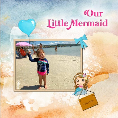
I have finished another layout to practice Cassel‘s Lab12-Module 03 Tutorials. Glitter4 – Paper Bow – Metal Plate I added Metallic Element and Engraving effects on the plate. Credits: DiHiller : Background Paper - (DiHiller_PSAugust2021_Paper1) / Grafitti (Paints/Transfers) - (DiHiller_PSJune2022) & DiHiller_PSAug2021 / Balloon (DiHiller_PSAug2021_Balloon1) Mermaid Clipart from Wallpaper.com Font: Mermaid & Mermaid Swash Caps (dafont freebie)1 point
-
1 point
-
Beautifully done, Julie. 💟 I get the weekly newsletter of a Lilypad designer. After the kids left home, she started creating layouts with her photos, sometimes documenting the good and also the not-so-good times. She went through a harsh period for some time (she didn't elaborate on the reason), and this was a way to express the feelings she had back then.1 point
-
Julie, this happens to me a lot; I post something here and see the mistakes I haven't seen while working for hours/days with the layout. 🙂 I just love fall colors, and the photo is beautiful. It's a perfect place to sit on a bench, relax, and enjoy the view.1 point
-
kasany, I very much like the effect achieved with the CSH file.1 point
-
I'm at a loss (no pun intended) so I'll say: J = Joseph, my late dad's name on his headstone.1 point
-
My niece's engagement/proposal. Template by Tinci Designs #116. Word Art by Rachel Martin, Hilary Word Art. Green and blue papers by Janet Kemp, Boehmian Love Solid Papers Kit.1 point
-
Template by AnnieCDigitals. Background paper provided with template. A Love For Layout Templates Blog Train, October, 2024.1 point













Resized.thumb.jpg.d25811db03a63358cedab1e79f527635.jpg)