Leaderboard
Popular Content
Showing content with the highest reputation on 09/29/2024 in all areas
-
6 points
-
5 points
-
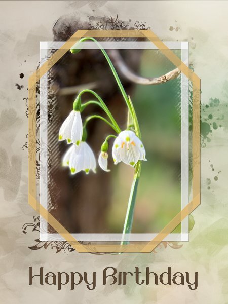
I needed a new card to send to a friend of us and I know he likes flowers too, but I didn't want the card to be too girlie. I used one of my photos taken of summer bells (Leucojum Gravetye Giant) with a mask by Jessica Dunn and of course the freebie frames. I had to change the colors of the frames for something that goes with the photo but I kept the transparency of them. The background is made of the same photo with a lot of blur and an overlay of paint streaks that I did for another project with reduced opacity. To let the frames stand out a bit they got a very light shadow with an offset of 1 and no blur. The font is Belinda. The card has to go in the mail so it is a double card with my logo on the back and I'm going to print it later today.4 points
-
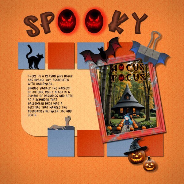
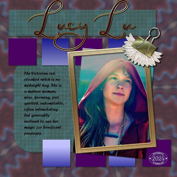
I changed the photo. Except for the "hocus pocus," it was made in My Edit program. It took a while for My Edit to get what I wanted. My Edit is a Cyberlink program which is a yearly subscription. I just downloaded the full program called PhotoDirector 365 to my computer since it was on sale for $39.3 points
-
3 points
-
Marc is a renowned British actor, I remember him as a child in Grange Hill. Van Der Valk, is an excellent program.3 points
-
You're fortunate to have someone who takes lots of photos you can then use for layouts!3 points
-
3 points
-
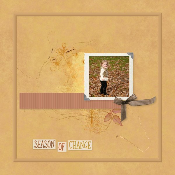
Likely the last layout for September. And another month passes by! Our fall days don't look like the photo yet. That will be later in October. Lately it's been damp, cloudy, but still very humid which keeps the temperatures in the 20s C. Old picture of my niece's daughter who is a lot more grown up now. Only things I made/did were background (blending papers), the ribbon, and outer frame with bevel. All other elements & brushwork from Janet Kemp (DS) or Erika Designs. I am simply too lazy or time-constrained to make many of my own elements. Especially when so much good stuff is available for free often.2 points
-
Assuming the elements are all the same shape and size, you could even flip, rotate, or even mirror them once the texture had been applied.2 points
-
I happen to be watching Band of Brothers right now and he's in it. That was a long time ago. I don't normally watch war movies/mini-series, but this one is exceptional.2 points
-
2 points
-
I just looked at the radar again and the "eye" is pretty much still sitting and spinning in the same area as this morning. After no rain earlier today, I'm at 90% chance for the rest of the day but it does seem to be light rains and not heavy downpours.2 points
-
2 points
-
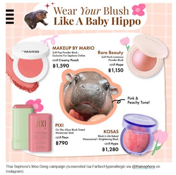
I had to check it out because I have never heard of Moo-Deng, but I found something!2 points
-
Just checked in with Jackie & Corey who now live just outside of Nashville, Tennessee. They had a lot of rain Thursday into Friday, but it has eased off now and she said they never lost power. They are very lucky! 🍀2 points
-
I agree and do this always, it is such a timesaver! Isn't it great that we can learn something new on each bootcamp we do!2 points
-
I use your painted frames all the time to showcase what I'm watching today on tv. I got a new 36" monitor for Christmas with lots of space for displays! For example, here's what I had for Friday 9/27 - @Corrie Kinkel This is set in Amsterdam. The actor's name is Marc Warren and I first saw him on The Good Wife so I thought I'd try this show, also.2 points
-
There is nothing wrong with using "stuff" that is available so widely and you used it in a great way too. It is not always easy qua time or inspiration to do everything from scratch!1 point
-
I really liked Kalinda. Great character to offset the "good wife".1 point
-
I did use the texture command. If Corel added an angle option, that would be great, but it doesn't sound promising. Adding the texture was a last-minute decision and I was tired so I left it as is. I like your idea of rotating the file and saving it as a new one. I'll keep that in mind (if my mind works lol).1 point
-
Yes, it seems to be. I'm really into it but I started back on Season One. The first I realized who the actor was is when they announced the start of Season 4, so I have a lot of viewing pleasure to look forward to...1 point
-
1 point
-
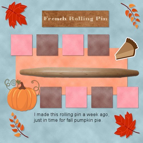
@Jacques Lacerte It is nice to know that the photo you used is a real person in your life. That painting effect made me think, initially, that it was a stock photo since you had not mentioned who it was. Glad to see that little smile! @Euka Sometimes, the resizing can do odd things, especially when you go from 3600 to 600. The best way is to save as a .pspimage and .jpg, flatten the whole image and then resize. That way, you should not have issues with elements disappearing (which is notorious for wrapped text). @Daniel HessI think that SOMETIMES, a very small bevel can give an interesting result, but it also depends on what you want to simulate. If you want to make it a paper element, then a bevel is not needed. If you want a cutout, a bevel is not needed. But if you want to make it a plastic element, then a bevel is quite appropriate. You can always start with a shadow on a separate layer, hide it and add the bevel. If you find the bevel ok, you can keep it. If not, you undo the bevel and unhide the shadow. @MicheleLet us know if you get any response from him! And yes, it looks like your shadows are correct on the clip/flower combo. For the texture, did you use the Texture command? I find it very annoying that one cannot rotate those textures (something I have pestered Corel to add, unsuccessfully). If you want similar yet different textures, open the files used in those textures, rotate them and save them with a suffix. That way, you can get something similar. @Ann Seeber Yes, I see the shadowing is "neater". I still see some feathering on the purple square. Is it possible or is it an optical illusion? @Carolyn Rye Great layout and I am glad you are feeling more comfortable with your PSP. Your work really shows! @Clarine I hope you have all the time you want when you retire. I love my retirement and it gives me so much more time to work on this site (it used to be just a side hustle). @Donna Sillia You never have to use the same title or theme as in the tutorials! I should make it in flashing multicolored instructions for every tutorial!!! 😉 @Leslie Gifford Cook Yes, I open files directly from the menu icon instead of the Organizer. I don't have a very large monitor and I find the Organizer just takes up too much valuable space. Even if I was to get a huge monitor, I probably won't use it. It didn't exist when I started with PSP, so I never needed it. For your shadowing, I think the pie sticker is missing one, and for the rolling pin, you can try a much larger one, with lots of blur and lower opacity. It would just give a 3D effect for something that would be thicker than paper. Give that a try to see. The issue of "disappearing text" is explained in this article. It is not really disappearing, but that is what it looks like. For those who started to post projects and have not posted at least 4, keep them coming. You have until Monday to be entered in the draw! You don't want to miss out!1 point
-
I watch most PBS dramas, but this is one that comes on late and is very dark. I usually turn it off, but I'm sure I'm missing something really good. I do not recall this guy from The Good Wife.1 point
-
We make the best with what we have. I too have a very cheap set up for my studio and I make the best of it. Some shots I'd like to do i cant because I dont have enough power (in the constant lights). One day maybe...1 point
-
Thank you, sometimes it is being in the right place at the right time! Those shots mostly happen if I'm not going for a walk with the intention to find something to take a photo of. I'm very excited because I have ordered a new iPhone (16 pro) that has the ability to take macro as well. It will take at least another month before I have it completely installed to my liking and have learned the new camera features. I will not go back to having a separate camera because I don't have that always with me; I live in a very build up area and have no direct acces to wild life spots, nor do we have a big garden where I can sit still to watch what is going on around me. However it is what it is and I can enjoy all the lovely photos you post!1 point
-
1 point
-
As per Cassel's request in the Day 12 email, here is something I learned (or relearned) during this workshop. Believe it or not, I don't think I've ever used the Magic Wand Tool set at opacity to select an element. I've always used it to select outside of the element, and then invert the selection. It's definitely quicker using the opacity setting.1 point
-
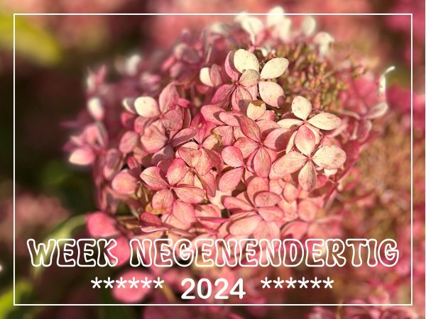
You know even as flowers fade and decline as summer draws to a close, and enters Autumn, their organic pigment diminishes. Yet, even those diminishing pigments have a beauty all of their own, when you look closely, just like the flower in the image. A laudable shot Corrie!1 point
-
1 point
-
It is going to look a bit like autumn with the Hydrangeas slowly getting browner. In one to two weeks time all its flowers will be brown and stay so over winter. Most of the leaves are still green. When I was taking a short stroll I noticed this autumn beauty. My own plants are getting brown too, but I haven't taken a photo yet.1 point
-
It looks like this little bird is enjoying its bath! Great photo, even in this reduced version I can see the fluffy feathers so well.1 point
-
@ Carole, me neither but that is the beauty of traveling to new countries or regions. I'm curious and always keep my eyes open for new things.1 point
-
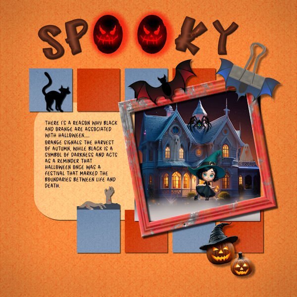
I just couldn't find a photo that I liked for "Concentration," so I decided use some of my Halloween (not my favorite holiday) stuff. I made all the backgrounds using FF and changing them to different colors. The title font is called "Hello Jack" from CF. I experimented with a layer style bevel in orange and was pleasantly surprised that made the letters smokey inside. The journal font is "Halloween" from CF. I used AI quite a bit. I am not sure where I got the house, but it was treated in My Edit, an AI product from Cyberlink. The witch and jack o lanterns are also from AI in My Edit. The bat and frame are from Canva. The clip is my own with bat wings added. The cat and the hands, I think, are from font extras from CF. I have been adding Carole's shadows to my presets after I label them to indicate their use. For example, "cassdropshadow for frame." Since I am shadow deficient, this labeling really helps me when I am making something without having to scroll through a video to help me.1 point
-
Day 11 - Project 5 I'm not very good with flowers so I hope I identified it properly. If not, please correct me. The photo is mine. I used various papers and elements from Mizteeques, AnnieC, Melisa Lerin, Janet Kemp, and the little flower under the text from Freepik. Whew. I made the little boxes by filling in selections with triadic colors and adding some texture. I can see now that I probably should have varied the textures. The clip and flower were two separate elements so I tried adjusting the drop shadows as we learned in the Shadows Workshop. I think I did it right. The title font is Acmatic Personal and the text font is Aguafina Script.1 point
-
Day 11. Bundy and his Champas have now passed but we constantly think of them. They were a very big part of our lives. Millie our now 8-year-old little girl, was lucky enough to spend a few years with Bundy. Thank you Cassle, for all your advice, because I have learnt so much from all your tips and tricks and pointers. This is how I have got to this point. I still have a lot to learn but I am getting there.1 point
-
@Michele Yes, a common occurrence for me when working inside a bounding box. It may have something to do with conversions of PS files to PSPIMAGE. I find if I duplicate and rasterize the text it behaves better. @Cassel I fixed the shadowing on the squares and replaced the font on the journaling with Forte which seems more readable than Curlz.1 point
-
I already sent him a copy of the layout in the messages on his 501 North Photography FB page. I hope he likes it.1 point
-
I got in habit of doing that for some reason. I guess I should be stingier on the use of bevels. I thought for the "post-it"s, it would allow a better visual of "cutting out" shapes from the bottom row and gluing them onto the top row i.e. leaving a "hole" in bottom row and raised portion on top. Looking back, I overdid it by adding the bevel to the final layer of Post-its top and bottom AFTER doing the "detail" work inside each using selections. Should have done only shadowing at the end?1 point
-
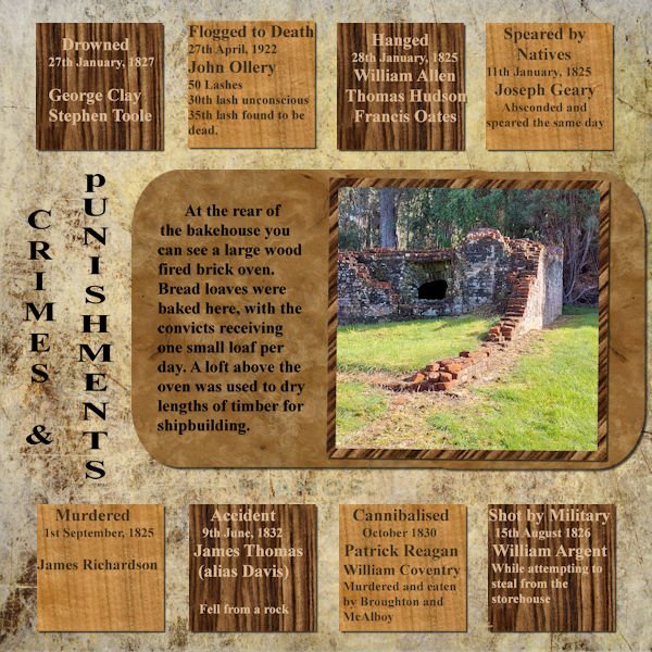
Well this has taken me all day ....and still not how I wanted it ... I was playing with the background trying to get something I liked and ended up using the wrong squares - not sure why I didn't see it when I was working on sorting them out!! The difference is the colour of the font to make it show up better and the dark brown made slightly lighter. I still have the others so "one of these days" I will switch them out. My shadows were on a separate layer and looked good until I resized to 600 and lost half of them ... so I redid them on the same layer and think they are ok now.1 point
-
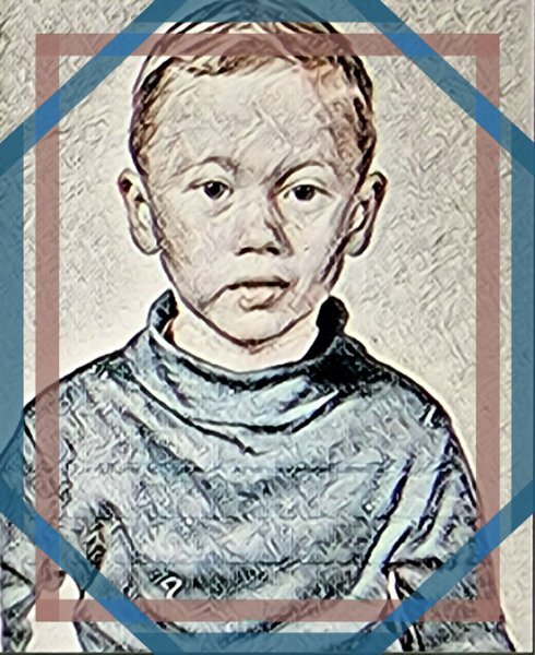
@Cassel This is my grandson (Ludovyk), the younger brother (Noah) who appears in the photos of my other projects. This is one of the photos I converted into a painting using the "Corel Painter" software in the "Van Gogh" style (nearly a week of work)1 point
-
I decided to do another one, something quite different, but a layout I like to do, as many may know. Hopefully, whilst abiding within the rules of this challenge. Duplicated the photo, promoted a selection, in this case the Robin. Created the frame using a heart font, extracted the head to give that out of bounds efffect. All I did for the background was to lower the brightness and contrast, Keeping the framed Robin colours as they were taken by the camera. Male Robin taking a blueberry back to the nest. After he had, had his fill.1 point
-
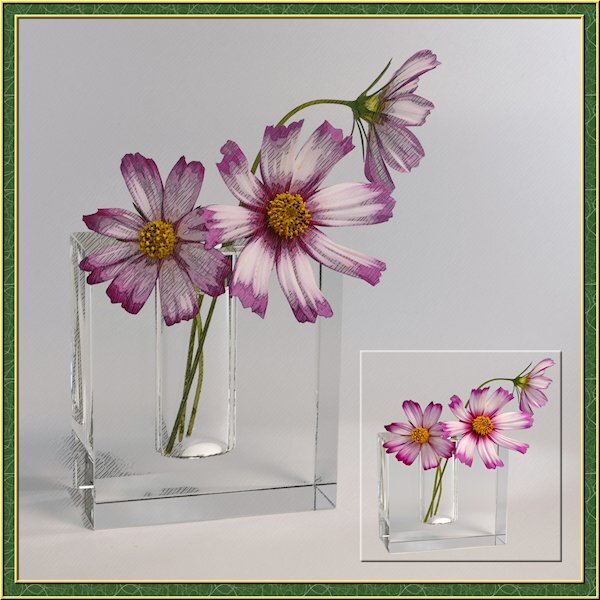
I've been busy lately with another project so this is a sparse layout from me. I needed a little PSP time so my brain could reset for the other project that I'm running into more challenges than expected. the little photo is framed with a cutout. I actually extracted the flowers and vase then made the selection around them and added the cutout. the good part was I didnt need to be perfect with the extraction as it blended in with the background. I got lucky on that. I also used the pencil sketch 2 script. I played with the opacity of the layers and used a mask to make the centre yellow part show through a little more. I turned on the photo layer that the sketch leaves intact to allow the the color to come through. maybe a little too much though.1 point
-
1 point
-
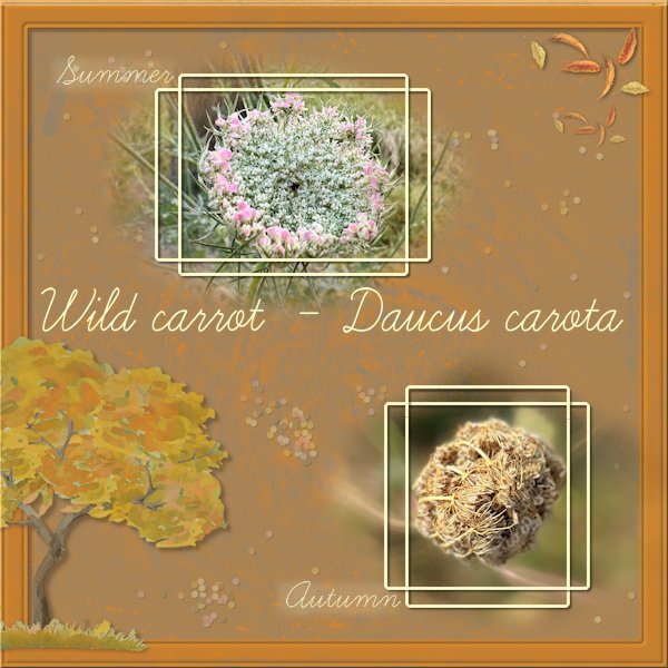
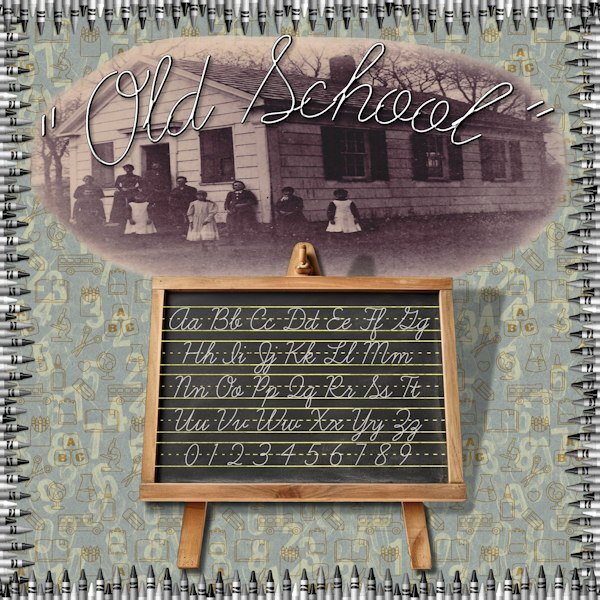
I didn't go for a school theme as well. This font is so easy to read that I probably am going to use it often. Besides the frame by Carole I made the rest from scratch with a lot of different blend modes and reduced opacities. Both my photos are from the same wild carrot in the small meadow where I often pass by. When the plant dies down it makes a tight ball over the seeds in the flowerhead which give it its nickname "vogelnestje" (in Dutch) and that translates to birdnest.1 point
-
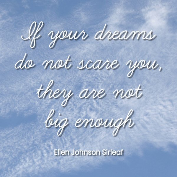
Didn’t go for the school theme but used the font for a quote layout. “If your dreams do not scare you, they are not big enough” is a quote from Ellen Johnson Sirleaf who was president of Liberia from 2006 to 2018. She was the first elected female head of state in Africa. The background is one of my photos of clouds.1 point
-
1 point
-
1 point
-
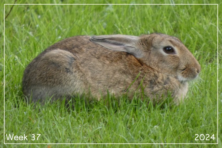
What a difference a few days and the remnants of a hurricane can make! My grass is a lot greener than it was due to the rain we've gotten in the last 36 hours. Rain is still forecast off and on throughout Monday. We are not out of drought conditions though, we didn't get enough rain for that. The "eye" of the hurricane is settled over western Kentucky and the outer bands to the northeast are over southwestern Ohio sometimes coming as far north as me. I know it is not as bad as those who have suffered much worse in Florida, Georgia, South Carolina, eastern Tennessee and North Carolina but southeastern Ohio had extremely high winds yesterday and a lot of power outages. Over 320,000 last night is down to around 200,000 today. A lot of power companies in Ohio actually sent units to FL to help (we had one go from my town), never expecting that there would be outages here from the storm! Most of the outages are because of trees coming down from the winds. But, some areas in western North Carolina and eastern Tennessee are actually cut off from the rest of the world. Roads have caved and floods have wiped out whole towns. The town of Ashville NC can only be reached by air, no roads are passable to get in or out. Mother Nature must have really been upset about something!0 points








.jpg.6a3d56a5a88f925eac65549fb66f89b8.jpg)
