Leaderboard
Popular Content
Showing content with the highest reputation on 09/21/2024 in all areas
-
6 points
-
6 points
-
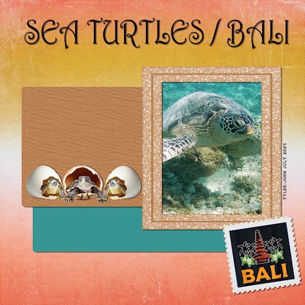
Here is my Project 4 - Adventure Park - I downloaded the kit Carole offered: By the Stream so I chose a photo taken by my grandson Tyler-John on his trip to Bali, Indonesia in July. The title font is Harrington; the frame is from Jessica Dunn's Nana's Kitchen kit, the background paper and the stamp format from By the Stream. EDIT: @Corrie Kinkel I added a sand texture to the brown paper and found some baby turtle clipart to replace the original.6 points
-
6 points
-
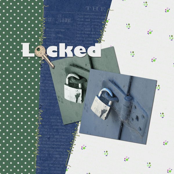
For some reason, I am having difficulty posting, every time I go to the bottom of the page to reply to topic, I get the entire page come up, so I am replying to Carole's comment this time. For Day 5 Project 2 I have chosen to use a photograph I took years ago at a dam in Central Otago. I often take photos to create textures and I loved the cobwebs on this old lock. I decided to use a copy of the same photo, with a Sheilsoft script, a soft ultra tone, then altered this copy's hue, saturation, and lightness. I used Jessica Dunn's Spring Skies mini kit, altering the colours to suit. The green polka dot paper was quite bright and I felt it took over this image so I adjusted the green to a more muted grey/green. I also adjusted the white paper's hue, saturation, and lightness, not changing the white, and changing the flowers instead. The stitching is from Marisa Lerin from Digital Scrapbook, the key from Sheila Reid, also from Digital Scrapbook although I used the artistic effect chrome to brighten the key. I have been playing with the Beginners' Scrapbooking projects and had created something for this particular layout, and decided to do something different for the bootcamp.6 points
-
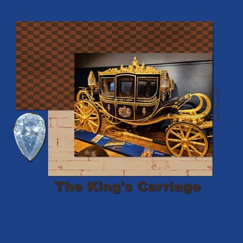
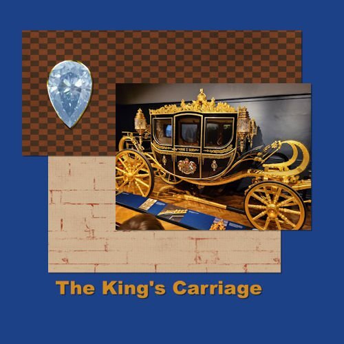
Project 2 We travelled to Paris and London this summer and this was one of the sites we visited (Royal Mews). The Royal Carriages were quite spectacular. Love to use these shortcuts, but might not remember them for long. It's lucky they are listed with the menu options. Made a few changes based on feedback from Cassel. Shifted the elements and changed to gold text. Thanks for the suggestions. PS Cassel - Regarding the Lace Spools from yesterday - No I have not made Lace, just make the spools so far. I used to Knit and Crochet, but now my time is mostly taken up by woodturning. Thanks6 points
-
My grandson David sent me this photo of him and his girlfriend while they were in Thailand playing rugby. David educated me on the difference between Asian and African elephants. I had to download a photo of the Asian elephant from Canva. The cartoon elephant is also from Canva. The font is Asian Pacific from CF, and the texture is "elephant skin" from FF. The background and first paper are from CF and called "oriental reds." The second paper I made from a sample of Rachel's shirt. According to David, the elephants in the picture are rescued old elephants who are no longer able to work. The Thailand stamp was a free png downloaded a couple years ago. The picture frame pattern is from stripes created with cass script stripe 2.5 points
-
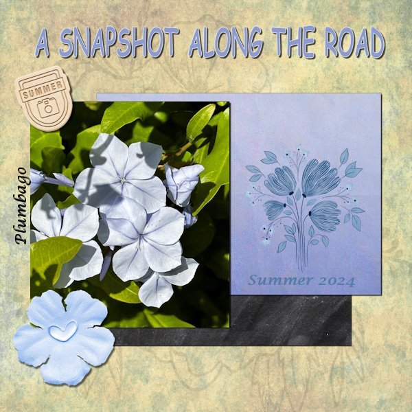
Project 2 I didn't use a kit for my layout but made a background with different papers from my stash and a blendmode. The other papers, the flower stamp, the flower and the little label are all from different designers and come from my stash. The font for the title is Comic sans and the other font is Lucida calligraphy. The plant's Latin name is Plumbago, in Dutch Mannentrouw, but I couldn't find an English common name, so if anyone knows?5 points
-
A couple of ways to "quote". Highlight the sentence or piece of text to which you want to reply and watch for a pop up that says "quote selection" under the highlighted area and if you click that it will open a reply with the quote. Or under the "post" there is a + sign and the word quote. When you click that a new reply opens with the entire previous post, photo and all in which you can reply.4 points
-
3 points
-
Frame is from Cassel, the reading dragon came off the internet. Rest was just "Moi". Font was Fraktur BT at 550 Pixels.3 points
-
Mine too! I walked away twice, going back thinking that I would approach it and work on it in a way that would make it look realistic. 😆3 points
-
Thanks, Corrie. I know it's not as effective as individual elements, but I wanted to showcase the baby turtles heading out to sea after their hatch, showing they're on dry land, not in the water. It's an evolving thing... 😉3 points
-
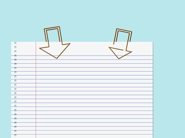
You've got my head spinning with those paper clips. I think both examples work, but the one on the left just looks better aesthetically.3 points
-
I would say that the left example is more likely to happen. Just imagine that you are holding the tip of the shape, and push the "inside" piece and slip the paper in-between.3 points
-
3 points
-
2 points
-
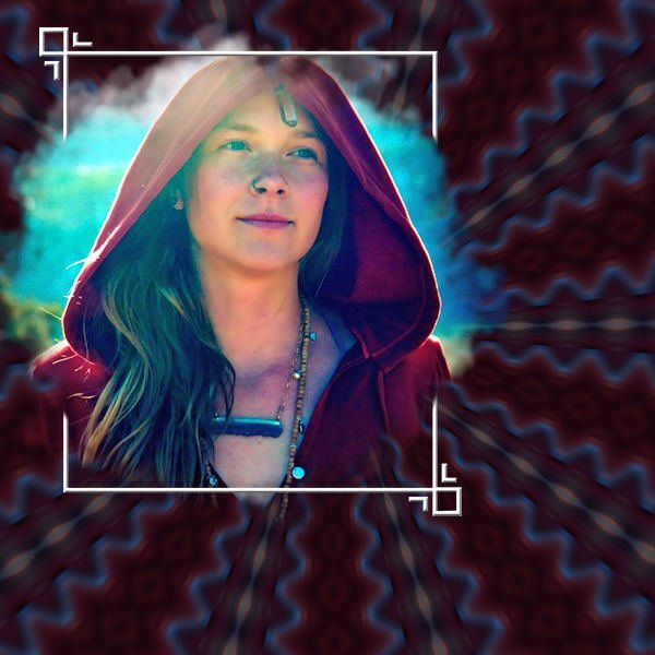
Template is from Cassel "Artsy" - The frame has been inner beveled. I used the Kaleidoscope treatment and then used Blur/Radial/Twirl on the photo in the background. This is my granddaughter-in-law Lucy Lu, mother of Magic and Raja in California. Her 35th birthday is coming up on the 30th so I'll be adding more to this for her birthday.2 points
-
2 points
-
2 points
-
Very clever how you used the key in your text. It makes it so interesting to look at.2 points
-
Glad to see some more projects. Hopefully, you will have even more time this weekend. @Daniel Hess I went ahead and got you skipping the earlier delays. I think you should be receiving the next email at the same time as everyone else. For the tubes, I am not sure why the link is not clickable, but it works if one copies and pastes it into the URL bar. @Corrie Kinkel I don't know the name of that flower, but I love how you used very different types of papers combined together. Simple layout, but effective in showcasing that photo. @Leslie Gifford Cook Great photo to showcase. Since your background paper is dark, I think that the title and date (?) would be easier to read if they were in a lighter color. I think that if you offset the photo slightly so that all the edges don't align, it would give a more dynamic look. Just a thought. Don't hesitate to post your projects. Remember that you can win some nice prizes if you post four out of the five projects in the Bootcamp.2 points
-
I would say that like any paperclip, you have one "middle section" that can be either in the front or in the back. But also, like any regular paperclip, you can put a tiny segment to put in the front or in the back but it would not "hold" anything.2 points
-
This paperclip has really made me think. Am I correct in saying that it can be used in one way only. I even got out a paperclip and a piece of paper. Lol2 points
-
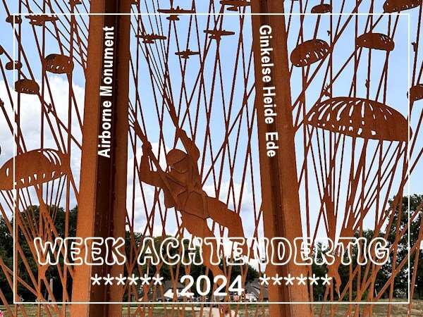
Over here this week it is 80 years ago that the airborne landings that were part of operation Market Garden in WWII took place. There is a special monument to commemorate the droppings on the Ginkelse Heide in Ede where they landed with their materials and vehicles. It is made out of Corten steel, 6 meters high and has 5 panels. At the bottom of the panels are plaques that tell the story. A couple of weeks ago when I visited my son we took a look at it when we were passing by on a walk on the heath. It was impossible to get all the panels in one photo because there were way to many people. In this photo is a full size para in his harness with the planes and other parachutes around him. The other panels all have planes and parachutes with all their gear and some other much smaller figurines. Besides that you could take a walk that had a great number of info panels at the side with the complete story of the Battle of Arnhem. The book "A bridge too far" and the rather famous film with the same title tell that story in detail. In the end operation Market Garden failed and the Netherlands had to face a terrible famine in the winter before we were liberated in1945 and the war ended. Sorry for the history lesson, but otherwise there isn't any context for this photo.2 points
-
2 points
-
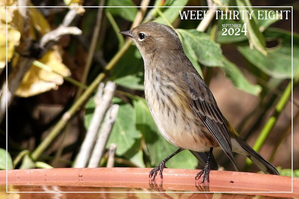
I love the way you have the bird walking the photo edge. An "out of bounds" effect without actually having to trick folks' minds LOL.2 points
-
Donna, it has happened many times to me. I post something here, and it doesn't take long to see that something isn't right. And if it's a Workshop and I don't catch the issue, Carole has eagle eyes, and she immediately spots it! 😄 I like it, so it helps me to improve my work.2 points
-
I said a couple of days ago, I was going to improve my nautical scatters picture tube and share it with everyone. Here is the results of that. My McAfee hiccuped when I double clicked the link below although it is OK. I suggest you copy the link and paste it into your browser address line to get the download. Place the PspTube file into the "documents/Corel PaintShop Pro/2022 (or your version)/Picture Tubes/" folder. The other file is just an image where I set the size at 30 and painted around the canvas (over a white background layer) as a sample of using the Tube. Noticed can't change the default "size" after you have exported the tube...I think the default is 100. The Images/paintbrush stamps were originally sized at 100. http://www.toroscope.com/shares/dhess-nauticalscatters.zip PS...This is assuming you are interested in a nautically themed picture tube to create some scatters. It's not exactly generic but good for anything that is boat or ship or ocean themed...or perhaps some other categories.2 points
-
Good you persevered and as you learn to follow the logical steps it will get easier on other projects too!1 point
-
1 point
-
I found the history lesson interesting. I'm glad you shared it. In North America we cant even imagine what that would have been like and that there would still be people living now (young kids then) that had to experience that. The detail in the parachute harness is neat.1 point
-
1 point
-
Ann, simple but very nice. I only think that it would be more effective if you could have used a turtle on its own instead of the small photo, or had that photo blend in to the background. It is just a thought and no critic what so ever 😘1 point
-
1 point
-
@Daniel Hess I am not sure how to 'quote' but thank you for the nautical tubes, they work perfectly!! Also thank you for your kind comment on the seagull - out of bounds was not what I was thinking - but I will take it 🙂1 point
-
1 point
-
Art sorry to hear this and good to see that you had the courage to finish his model boat. My husband has made some too but don't want to start on a new one because he is afraid that he never will finish it in the rest of his lifetime. By the way it is nice seeing you here again!1 point
-
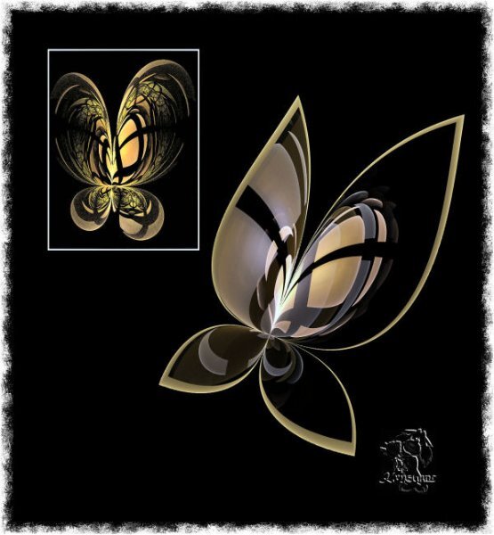
I have used recently my favorite fractal generator Apophysis=APO in short word. Sure, I use APO editor first of all but PSP later /everything, believe me/. I don't write scripts for APO, I only can modify in APO editor look/pic of used script. This time butterfly-before modification in a white frame, the second butterfly is without a frame. Excuse me English mistakes, please:)1 point
-
We are all learning here, no matter how long we've been here. We learn not only from Carole but also from each other. It's fun, and the community is very supportive.1 point
-
@Cassel Had to look for it but found the registration link and signed up.1 point
-
1 point
-
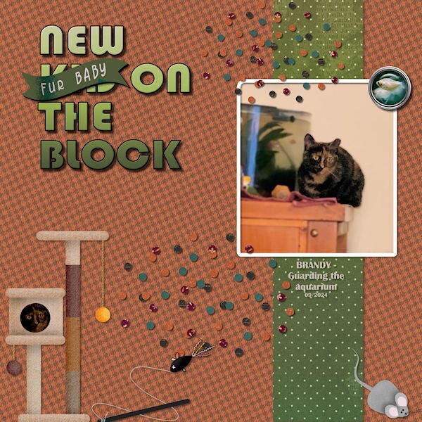
LESSON 3 - NEW FUR KID ON THE BLOCK 😉 This is the photo I showed earlier of Brandy guarding the aquarium with the White Skirt Tetras. (I made a flair button using a template from Marisa Lerin and a photo of the tetras.) I used the kit Carole offered cpjess-Behold-Autumn and I incorporated some cat accessories from the Gina-Jones-Every-Day-is-Caturday kit. I reduced the opacity a bit on the background paper. The title font is Bauhaus 93, the Fur Baby banner is from Gina Jones. The scatters are from the Autumn kit.1 point
-
Day 3 ~ When my favorite aunt turned 90, the family got together for a wonderful party. This is a picture of my cousin and his grandson. I used a kit by EmeraldJay from the PS September 2024 blog train. The fonts are 11S01 Black Tuesday and January Is Coming. And, yes, @Donna Sillia, I am now seeing my errors. 😄1 point
-
1 point
-
1 point
-
1 point
-
1 point
-
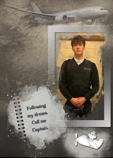
I was fortunate to receive a recent photo of my great-nephew who is about to start his Aviation School training (his long-term dream) at Sault College in Northern Ontario. As always, more challenging to make a "male" layout, but I can live with this version. He has worked so hard and done so much preparation for this venture.1 point
-
Template 6 by Lady 22. She has started sharing some of her templates at Digital Scrapbooking. She also shares on her own web site. Word art, paw prints and paw print heart from Creative Fabrica. This is Poppy as a kitten. She is now 12.1 point











Resized.thumb.jpg.d25811db03a63358cedab1e79f527635.jpg)