Leaderboard
Popular Content
Showing content with the highest reputation on 08/19/2024 in all areas
-
I have modified the file to include the string. Good catch again. If you want to re-download it, you can, but you don't have to.4 points
-
4 points
-
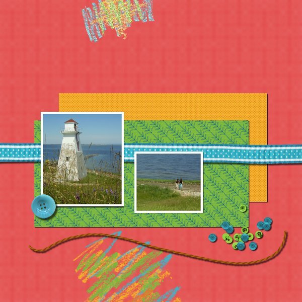
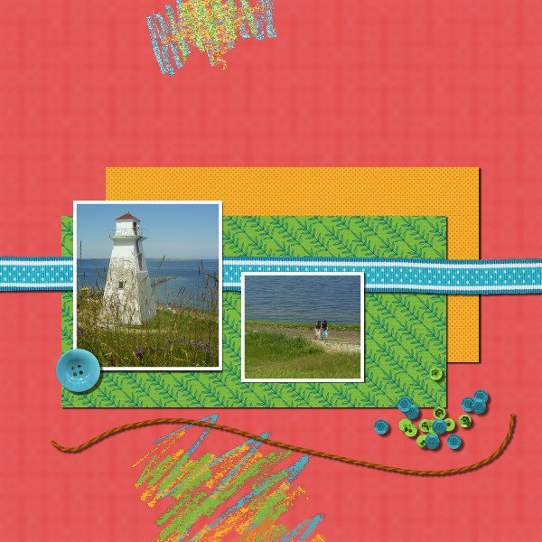
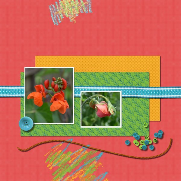
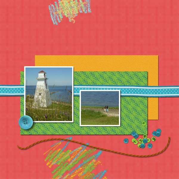
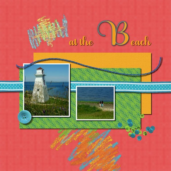
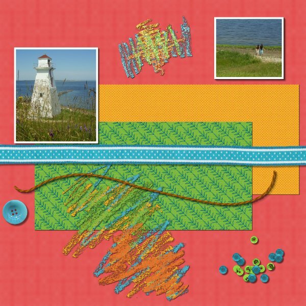
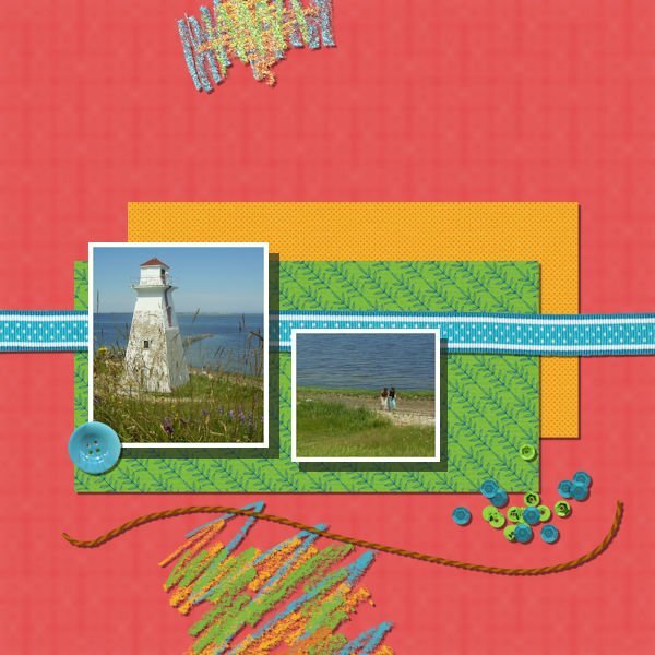
I have my own shadows as a preset and they come from tutorials for different elements. My shadows for papers and photos are the same as in this lesson. I have no shadow on the chalk scribbles because even the tiniest of shadows makes that chalk a bit less opaque and it looses its texture. I noticed that when I shadowed the sequin scatter the shadow only appears on the outside of that scatter and not on the parts that are on top of each other. On the top right blue parts of the scatter there is a shadow on the left side which looks funny because all the other elements have the shadow on the right side. The settings for the string are offset 14,14, opacity 68 and blur 14 because the string is thicker than paper and thinner than the button.3 points
-
3 points
-
3 points
-
Since I've been using PSP for digital scrapping since 2008, I have set up presets for my drop shadows. I currently have 28 presets. Over the years I have learned and changed the way I do shadows. Which is to say that my shadowing on my actual layouts is quite different than what we are learning here. That being said, I did try to do the lesson as Carol presented with a few tweaks of my own. I used a basic shadow of 10-10-70-20 on the 2 papers. This was my basic paper shadowing for years. For the string I used a shadow setting of 15-15-60-15. For the button, I went off script and used a setting I got from a scrapper that is on the creative team at a store that uses PSP. It is 20-32-67-59. For the sequin scatter, I used a setting of 3-3-70-20. This gives a little definition but it still appears to be flat on the paper. For the ribbon, I used a setting of 15-15-50-25. With it being a thicker ribbon, I felt it needed a larger shadow setting to show depth. With the photos being on top of the ribbon, some depth needed to be added. On one of my normal layouts, there would be additional elements nearby in a cluster so I have no problem with the ribbon being under the photos. My setting for both photos is 20-20-50-20. Lastly is the chalk. I did nothing to the top chalk. But I did add a small shadow to the bottom chalk just to show the difference. That setting is 2-2-35-1. That setting happens to be the setting I use when using washi tape.3 points
-
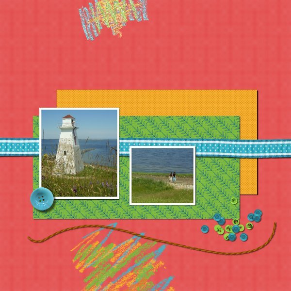
Here is my Lesson 1. I have to say that since I started here, I have saved Carole's shadow settings as presets. Depending on the color, size, etc., I tweak them as needed. I added the usual shadow to the photos. Having said that, I would not have photos on top of a ribbon. There would be a distortion because of the thickness of the ribbon. I didn't add any shadows to the doodle elements. I am already enjoying this workshop. Sometimes, I am unsure if the shadow I added is correct; this way, Carole will give her feedback immediately. Edited: " I would not have photos on top of a ribbon"—unless they were made of thin paper. In the layout below, I considered the ribbon to be thick.3 points
-
Yes, all the tutorials in The Lab SHOULD be listed also in the Creative Scrap. Otherwise, there would be no way to know where to look when you want to create a particular element/effect.3 points
-
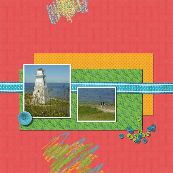
Here is my first lesson. The instructions mention a string but there is no string visible for me. There is another raster layer at the top which was hidden. It had a completely finished page, including a string, but no way to shadow it. Also, there was another .pspimage file included labeled "Shadows-Lesson One-Tutorial.pspimage" which had the exercise Carole used for the demo but still, no string.3 points
-
3 points
-
Michele, I like the card, the illustration, and the colorful guitar picks very much. Many people would not imagine how many techniques were needed to create it.3 points
-
Ya, that's what it is...it's a "Canadian" thing...🤪. You crack me up...and keep me honest. Here's my excuse: Due to economic restraints and cut backs here in Canada, we pay extra if we go over our allotted amount of keystrokes in a week. Justin Trudeau himself will phone me and tell me which ATM to meet him at so I can withdraw and hand the cash directly to him! OR..... Maybe I just like Mr. T. I pity the fool who doesn't spell T-cups/T-pots the Mr. T way!3 points
-
3 points
-
3 points
-
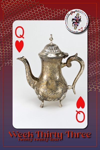
Week 33 Tiny little T-pot, only about 7-8" tall, but oh so cute. Gradient background, with no texture because I just realized I forgot. I was so into playing with the netting! From the new book; Digital Scrapbooking Made Easy with PaintShop Pro. In the Scrap With Me - Scraplifting section, Project 2. The netting is really easy to do and tackling the warp brush is easy with the instructions in the book. I added a tiny bevel and the shadowing settings from the book (which I now saved in the shadow presets). Fonts are Neug Asia and Neuton from CF. I also added a small bevel to the three Vectors (should've made the outline thicker first) and a drop shadow. Forgot to add, there is a gradient on the netting, I think next time I wont do that as it looks like shadowy spots, it's distracting.3 points
-
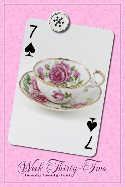
Week 32 This was the pattern my mom's t-set was, although this is not from her set. I got this many years later when I realized t-cups were little pieces of art I could afford. Fonts are Mea Culpa and Medina from Creative Fabrica Background is a PSP pattern that I added a very subtle round dot halftone effect to. The three vectors got a tiny outer glow layer style for a bit of contrast around them. It and the texture might not show up here.3 points
-
3 points
-
3 points
-
2 points
-
2 points
-
I assumed it was too simple to simply add drop shadows so I added drop shadows for all elements except for the photos. For the photos I selected them, promoted selection to layer, filled layer with dark colour, changed layer transparency to 65, moved the layer down a level, manually moved the layer down & right to give it a shadow look.2 points
-
Many of the labs are in the creative scrap tutorials. So you can find them referenced in both places! I actually have a spreadsheet that I have them cross-referenced but need to get it current... I'm a few months behind.2 points
-
kasany, nice way to showcase many photos with this template and the cass-HangingPhotos script. I have this script too! 🙂2 points
-
Julie, this is so cute. I don't have pets, but I've seen many times that cats loooove boxes. I recognize DiHiller's cats. 🙂 I have collected her freebies as long since I started here.2 points
-
Corrie, this is a lovely and meaningful layout for your granddaughter, who is starting another important chapter in her life. I especially love the blackboard you created and the colorful elements from CF.2 points
-
Just curious, why do you call them T-cups and T-pots and not teacups and teapots? Is it a Canadian 😉 thing?2 points
-
Wow, thank you so much Ann. It's such a good tutorial too, easy for anyone to follow and get a cool button.2 points
-
Julie, Corrie, and Susan, thanks! 💟 I agree about the lack of time. I see many techniques and uses of elements I want to replicate, but I am not a fast scrapper who can create one layout daily. On the opposite, and that doesn't work in my favor. But it's okay, one step at a time. 🙂 I've separated the photos for the Lab11-Module 12 and stopped there. I'm also enjoying the good weather, as we never know how long it will last. Another subject: About the paints, transfers, etc., I have so many things in my stash that I should go through them more often. There are some gems in it. Also, Carole's freebies have an array of wonderful elements, alphas, you name it!2 points
-
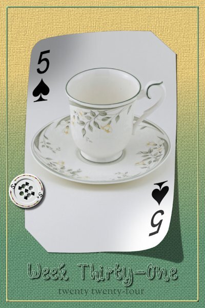
Week 31 Slipped in corners technique from the book (Digital Scrapbooking Made Easy with PaintShop Pro) Scrap With Me - From Scratch section, Project 2. Lifted Corners from the script. Button, again from the tutorial called "Button". Background is a Background-Foreground gradient. I added a halftone (squares) to the gradient and a texture on top of that and I think a wee bit of noise. Fonts are Winter Story (CF) and Sorts Mill Goudy, which sounds more like a Google font, but I'm not sure. A pretty little delicate cup that I am keeping.2 points
-
2 points
-
2 points
-
2 points
-
2 points
-
Here's a birthday card I made today for my old boss from when I worked concert security. My goal was to create guitar picks to put my text on. I created a preset shape, added a pattern, and colorized each. After adding my text on each guitar pick, I used magic wand select on the outside of the letter, inverted the selection, and added an outer bevel on the pick level. Then I hid the text layer. It's not my favorite card, but it helped me practice some PSP skills that I don't often use, especially working with vectors to create the shape.2 points
-
We have a door to the basement that has a cat door. It's translucent but not really see-through. It allows them access to the basement where one of the litter boxes are. One cat goes through fine, the other not at all. It's a swing door so we've had to use a chain going from the cat door flap to the door to hold it up so the other cat would go through it. The door to the basement is usually open as that's where the laundry room is and one of my studios. And even when the door is partly open they will go through the cat door and not just the people door. We also built floating shelves(with carpet on them) for them in the upstairs "cat room/ my husbands office" they are set in a ascending stairs that lead to the top of built in bookshelves, where they sleep and on the other side is two more stairs coming down. they will race through the house, up the cat stairs and down the other side. Other than cat trees by the windows we put a permanent shelf behind the couch which is in front of the living room window, so the cats can sit on the shelf (about 5 feet long by 8-10 inches wide) and watch outside. It is a very well used. And this older gentleman that delivers the flyers will stop and talk to the cat through the window.2 points
-
2 points
-
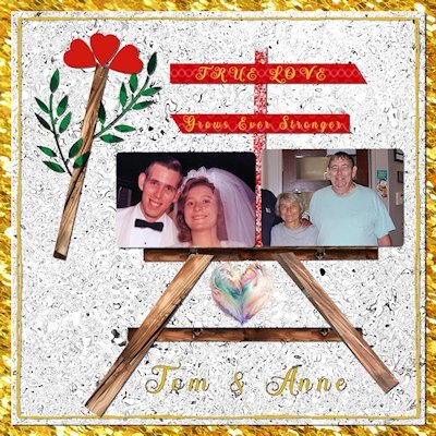
I had always thought I would like to see Alaska and I am glad we did this. I think the cruise part would have been better if we were the the kind of couple that liked the entertainment they had available, but is just isn't something we enjoy doing. When we mentioned at breakfast on our Anniversary that is was our 50th. There were several other couples that said that is what they were celebrating too.2 points
-
It's like a kid in a candy store! I look through the previews when I'm looking for something specific because we don't always call things the same. When I'm simply teaching myself, I go through it alphabetically which I'm doing right now. I'm skipping the ones from the Labs because I want to do those in full.1 point
-
This came out great, Michele. Isn't it amazing what we can create with Carole's tutorials? I remember looking for the first time at the Creative Scrap Tutorial Preview Photos, and it was like Christmas for me. The Tutorial Preview with the photo is still my go-to when I want to create something more than the Tutorial Alphabetical, which can be very useful sometimes.1 point
-
1 point
-
Unfortunately not. They are the last birds to arrive in the Spring. Letting everyone know that they have arrived. Their visit is short but sweet, with their melodious song, and mischievious, bold character1 point
-
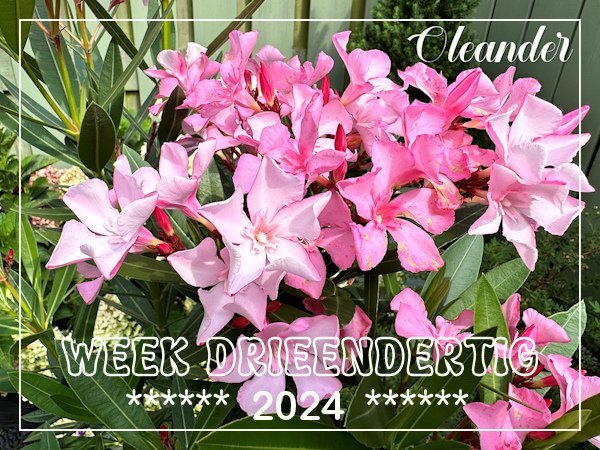
It was a joy to look at and it will be again in 1 to 2 weeks if the rest of the buds will open. But just after that downpour it was looking very sad with most of the flowers on the ground. It is in the corner of my small patio and it makes having a cup of morning coffee very pleasant.1 point
-
I'm a bit early with my week 33 but I was very lucky with this shot of my oleander in full bloom. After all the rain we had it enjoyed the warm and sunny weather and had a lot of flowers. I took the photo on Tuesday morning and in the evening we had a sudden downpour and a lot of the flowers were destroyed and on the floor the next morning. Most of the buds survived on the plant so it will continue to flower but maybe not so abundant; we are already half way in August and that means less hours of daylight over here.1 point
-
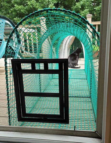
Yes, we've had one of these cat doors in our screen for many years. Our deck extends into the backyard, and the cats have the best time out there! We have a couple kittywalks connected, so they stay safe. When it's the right temp, the cats come & go as they please. It took a little while for them to figure it out, but once they knew what was on the other side, they made it happen! During the summer, they beg to go out first thing in the morning. They can see the birds, deer, chipmunks, squirrels, turkeys, and anything else in the woods out there. It's their greatest joy!1 point
-
1 point
-
They rarely show themselves, as they spend almost all of their time on the ground lurking in the dense undergrowth. They also nest on the ground.1 point
-
Oh man, I was pinning my hopes on all this time opening up for me. Guess I better get better at managing it now.1 point
-
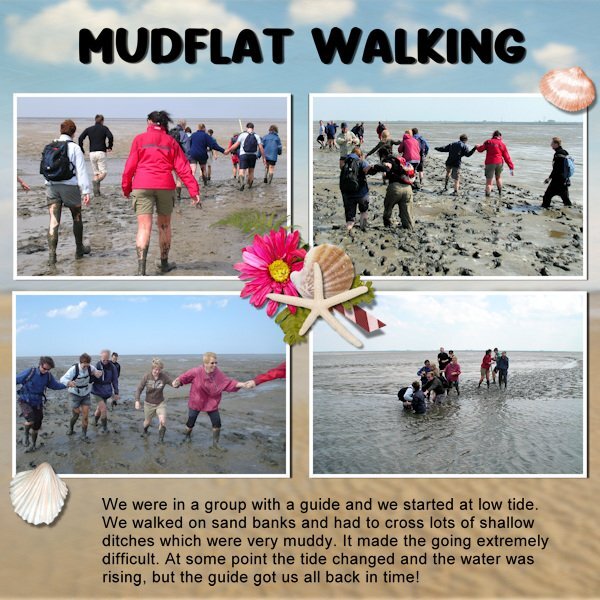
Many years ago we went mudflat walking with the company where my husband worked. Every year there was some sort of activity, like visiting something work-related but that year (2005) we had a whole weekend in the north of the Netherlands. Part of it was a tour with a guide on the mudflats or "Wadden". It is a popular activity because it is a real adventure. The guide had a long pole with him to measure the depth of the ditches we had to cross and had to get everybody of the group back before it became high tide. The tour started with a speech about the mudflats and a warning to stay together and do as he said to keep it safe. At first the going was fairly easy, we walked on a sandbank but later it became rather difficult. The soil became muddier and especially the ditches we tough. We helped each other because it was difficult to keep your balance and we got muddier and muddier and the water started to rise again so the ditches became deeper. I will never forget this adventure, but it is once and never again.1 point
-
1 point
-
1 point


