Leaderboard
Popular Content
Showing content with the highest reputation on 07/26/2024 in all areas
-
Hi all, I haven't signed in, but found some time today for day 1 and 2 font is Arnold Story ,8 points
-
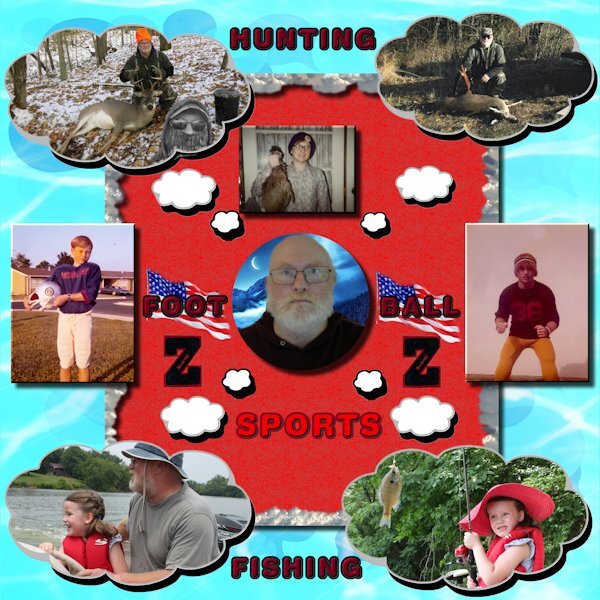
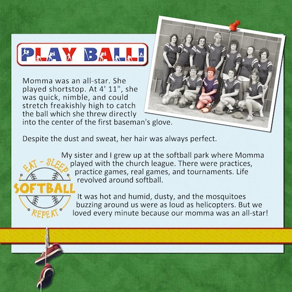
Picture of my Mother after we played bball at the local elementary school. Picture of me playing high school bball. Basketballs are from an old mega kit by LC Potts, Auntie's Extreme Hoops.7 points
-
7 points
-
Since Cassel went with Christmas for Day 2, I went with Hanukkah. We always had a big family get-together on the first night until my mother retired to Florida. December brought a plethora of presents for me...Hanukkah, my birthday, and Christmas. The rest of the year...nothing! I found some beautiful papers and elements by Maria Lerin from Digital Scrapbook/Pixel Scrapper. I also had some things in my stash. The font for the tag is Malgun Gothic, and for the story is Mandala Handmade.6 points
-
6 points
-
A Day late but took some extra time with the day 4 entry; trying to practice some of the "lessons" LOL. No real stories spelled out. I also played A LOT of baseball in my youth but although there are a lot of photos in my parent's photo albums, I somehow never actually scanned any of those. I'll be going back to IOWA for a wedding next month and if I get to spend some time in the old house, I might peek into all those albums and see about taking some more memories out of them. That's my granddaughter (who is now going on 17 years old) with the fishing pole, the first time she went out in the boat with me.5 points
-
Day 2 I'm behind, it's hard to come up with stories. My life is pretty plain and boring. I used 2022 for the wrapping and it's so nice to not have to fight with it. I wish Carole could write a script to make 2023 do text wrapping, or a script for 2022 to see all the blend modes as you scroll through the list, like in 2023. that way I could stick to using just one program instead of two.5 points
-
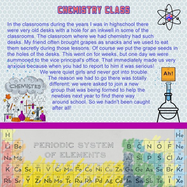
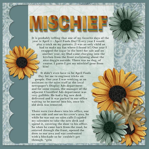
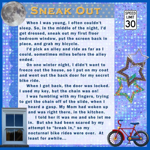
I never was a very naughty child and as mischief is concerned I can't remember much else as ringing the bell at someone's house and running away before they could open the door. I think almost everybody has done this. But in highschool my friend and I had a narrow escape and were almost caught. Yesterday I was away on a daytrip, so I'm running a bit behind and I'm still working on this week's challenge too. This layout has a background paper called Periodic System by Melo Vrijhof, just as the erlenmeyer and test tube. I made the extra "periodic" tile because I saw it on line and it fits to my theme. The atom is from kissping and the chemistry element I found on Freepik. Title font is School & College Outline. I have mentioned I have the same problem as others with the wrapped text in 2023!. I think that maybe I have found a solution. This time I made the selection for the wrapped text, typed my text and before I did anything else I duplicated the text and converted the duplicate to raster, which to my surprise indeed worked. Next thing was hide the vector layer and last deselected. I could resize to 600 for posting. Tomorrow when I do day 4 I'll try this again. But I wanted to mention this here already for others to test my theory.5 points
-
5 points
-
4 points
-
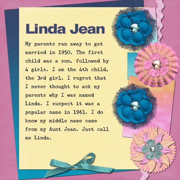
I think my mother just spelled it wrong. I sometimes tell people we were too poor for a second L. Other times I say that my brother, Alan, used the other L. 😁4 points
-
4 points
-
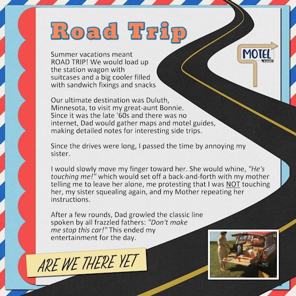
Day 3 I was more of an annoying child than a mischievous one. Having a younger sister was a perfect foil. The picture is from Pinterest. Our station wagon setup was not even close to that elaborate. Ours was a large Igloo cooler and a grocery bag of paper plates and plastic utensils. @Cassel The Universal Birthday Party was a way to get everyone together for my mom. I knew that the number of opportunities for gathering was dwindling. Although her decline made it difficult to do it again, she had good memories of it, which was what I had hoped.4 points
-
4 points
-
4 points
-
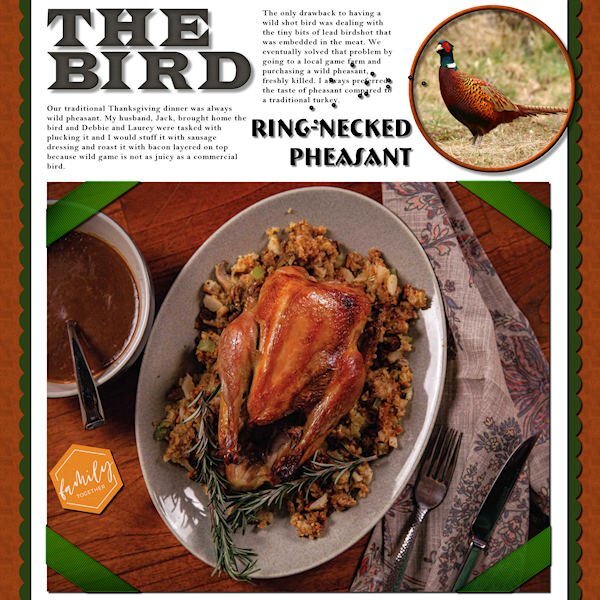
Story Time #2 - The Bird, a Thanksgiving tale. I will post the text here as I doubt it will be large enough in a 600 format. The title is an alpha from Sheila Reid, the fonts are Bremen Bold for the pheasant and Bell MT for the text. I used the template but added my own extras to it. I had a lot in a Thanksgiving kit that I had stashed. I used wood pattern for the background and the round frame. The photo corners were in the kit. Here's the text: Our traditional Thanksgiving dinner was always wild pheasant. My husband, Jack, brought home the bird and Debbie and Laurey were tasked with plucking it and I would stuff it with sausage dressing and roast it with bacon layered on top because wild game is not as juicy as a commercial bird. The only drawback to having a wild shot bird was dealing with the tiny bits of lead birdshot that was embedded in the meat. We eventually solved that problem by going to a local game farm and purchasing a wild pheasant, freshly killed. I always preferred the taste of pheasant compared to a traditional turkey.4 points
-
4 points
-
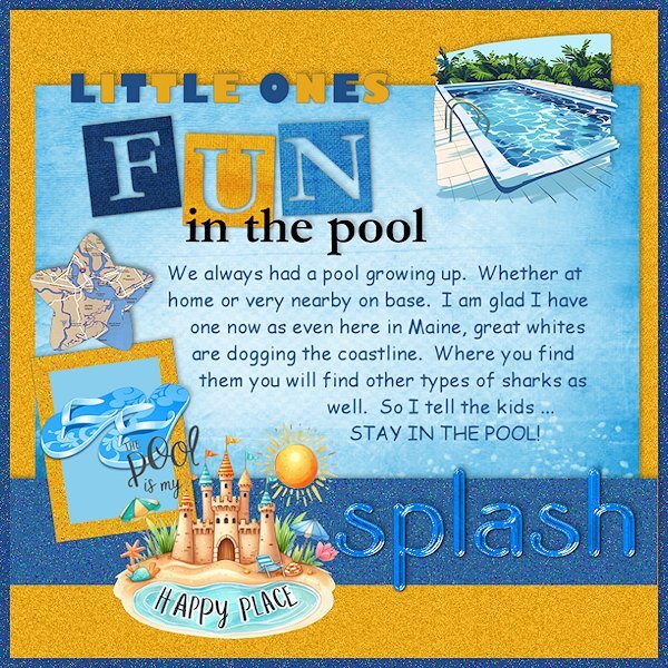
I had time to play this morning while electricians were here ... fixing of all things ... the pool! LOL The alternating color title I found so much easier than the two papers one, which I WILL play with again later. I'm glad to have a pool this year as it seems every beach for miles around me has had shark sightings and closures. Some of those sharks even have drones following their journey. I saw JAWS once many years ago! That's enough to convince me to stay in the pool! We have always had sharks out to sea, but as our waters warm in the Northeast, it seems the sharks are acclimating, too. It is their home, so I guess I will let them have it. We have had whales, too, deliberately attacking boats ... one close to here that threw the two men aboard into the water. Yikes. Scary. They were fine, but the boat I bet wasn't. Yup, POOL sounds like a great idea!4 points
-
3 points
-
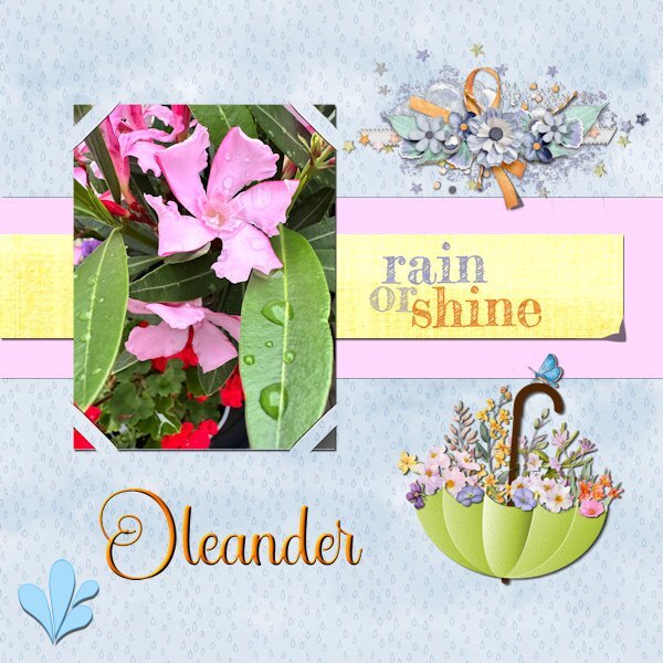
I started this layout last saturday but with the story workshop and a very busy week I just finished this one. I wanted to make the lifted corner by hand, but I'm not entirely happy with it. Next time I'll probably go with the script that I have. However I used the cass-SlippedInCorner2 which I won last week! I tried all the different options but settled here for this one. Script is nice and easy to use, love it! For the background I made an overlay with raindrops. Somewhere on the net I saw an umbrella adorned with flowers and made this brolly myself, just as the watersplash. The cluster is by Jessica Dunn and the rain or shine text comes from my stash. The title font is Star Bright.3 points
-
I love how you created the date. I have to start thinking outside the box.3 points
-
Old, old story. Blue and red papers by Becky's Creations, Christmas Freebie, 2016. Ornaments by Brook Gazarek, Digital Scrapbooking, A Touch of Sparkle Ornaments. Winthrop College, simple sticker script by Carole. Not this time, shaped text script by Carole.3 points
-
2 points
-
Corrie- that reminded me of a situation I had here at my condo. Some little girls from next door came over and rang my doorbell and ran away. I looked at my porch security camera and saw them run so I walked out on my patio and there they were. The littlest one bragged that she had rung my bell and I said, I know, I took your picture when you did it with my porch camera. They shrieked and ran home! 😆2 points
-
Me too. I wish they'd spend less time making their uber fabulous resource hungry AI better and just make what used to work...work! The more AI stuff a program has the more power it needs to run properly. And the more money I have to spend on upgrades to my computer.2 points
-
Ditto for my family...my brother (2 yrs older) was the cheeky little devil. To this day I hate being poked and soon as someone knows that, they can't help but do it...even grown adult husbands!2 points
-
2 points
-
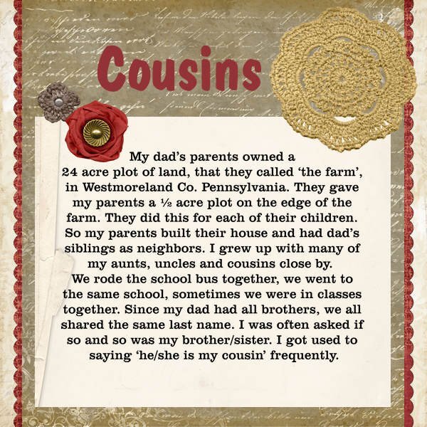
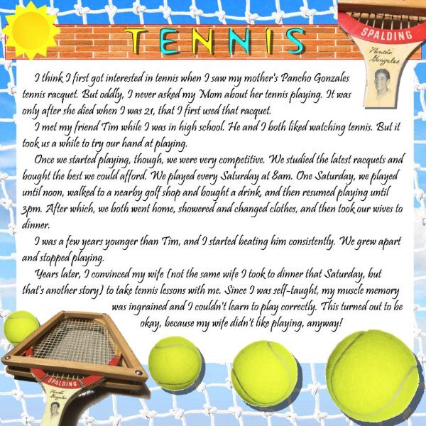
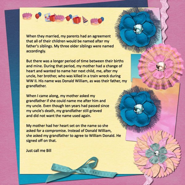
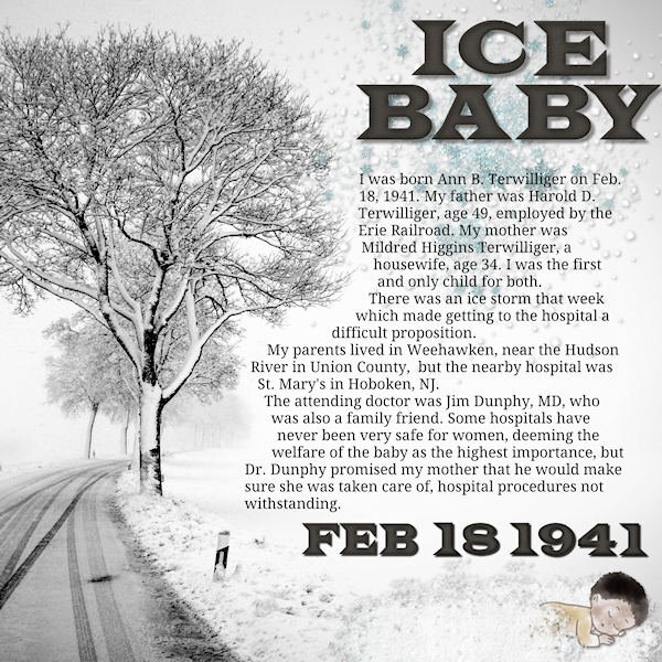
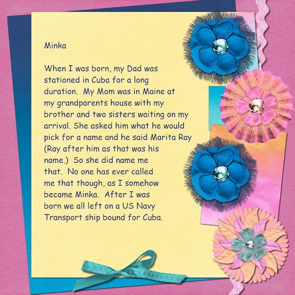
@Bonnie Ballentine That is quite a prank to do. Hopefully, it didn't keep going back and forth pranking each other! Fantastic that you have a photo of your mother playing sport!! @Michele I was in a similar situation when we chose the name for our daughter: we wanted it to be bilingual, so we spelled it Michelle (with one L it would have had an accent in French). @Daniel Hess Did you get my response to your email about the "broken link"? @Minka Glasier Are you referring to the accident that happened this week where a whale tipped a boat, and it was captured on camera? I typically am not fond of going in the sea (or the bay here), not for sharks, but for jellyfish! @Donna Sillia Ah, those shadows are really adding to the layout! @Ann Seeber I never thought of the fact that game birds might have pellets in them. Yuck! @Anne Lamp Those alphas are so cute. Do you happen to have any pictures left of a child in the middle of all those papers? That must have made for fun and colorful pictures! @Gerry Landreth "Are we there yet?" Quite a typical phrase for a kid!!! @Dan Greenwood Maybe you should try pickleball? You would have a few people cheering you up in this forum! @Corrie Kinkel Reading your story, I also thought you might have been caught for those seeds! Sh... we won't tell anyone! @Linda J Walker I can definitely envision that many kids with the same surname in rural areas. By the way, did you add shadows to your flowers or are they not visible due to the resizing? @Anja Pelzer It is nice to see that you have some photos of yourself. Often, at our age, we don't have as many as the younger generation!2 points
-
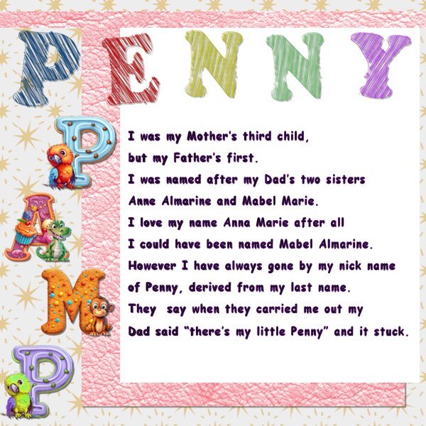
My initials including my nickname and real name at birth. Penny Anna Marie P----2 points
-
Day 1, finally. I've been working on it a little at a time for several days. (I still have a bit of brain fog and the heat is still kicking my butt.) I used an arsenal of Cassel's scripts to create the background paper and all the beads. One of her edge fonts helped me create the edge of the yellow paper. The story font is Sugarstyle Millenial. I'm not thrilled with my shadows, but that's par for the course.2 points
-
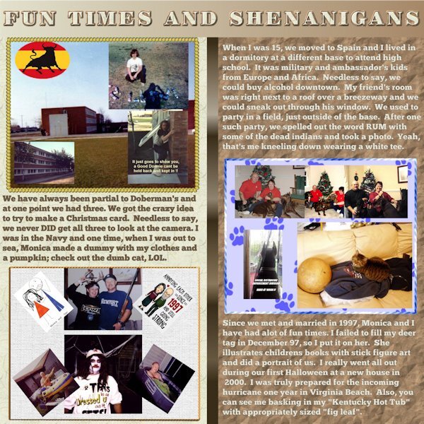
@Cassel I try to be very careful when resizing. A LOT of my photos are very old and were scanned many years ago when storage was very expensive and in short supply. I cut a lot of corners by resizing down, "proportionally" in 99 percent of the cases, and moving the compression slider down towards the lower quality side. So like you said in your article, sometimes I even have made myself cringe a little bit. Huge case in point...I did the yearbooks for my high school in Spain for every year it was in existence and posted them online. Folks from all era's sent me either the yearbook (or a zerox copy in the case of most of the pre 1970 books) and I pretty much wore out a flatbed scanner working on that project. This was back when we were using dial up modems so storage wasn't the only issue...page loading time was also important. Each page was originally HUGE after being scanned then I killed quality trying to optimize for loading times and storage. You can see those pages at www.toroscope.com which is my yearbook site. I remember the standard I set was 600 width and 765 height (pixels) and the real crime was moving the quality slide down to keep the images in the 25 to 70 KByte range. My personal photos when I scanned from my parent's photo albums back in those early days were much the same. As you said, sizing down is easy with a lot of forgiveness possible but it's very hard sometimes to size up.2 points
-
I'm always trying to think of different ways to do anything. Not that I watch much telly, but when I do I look for interesting material that I can recreate and use, especially in adverts.1 point
-
Got it! Thanks. See the results in the Lesson 3-Mischief I just posted! 😁1 point
-
Jaws has ruined me for ocean swimming (I lived on the Westcoast in British Columbia, Canada). That's scary to have Great Whites where you are.1 point
-
Used Carole's shaped text for the title. Font is National Park. Elements from Creative Fabrica. The wraped text was awful...wouldn't let me edit or copy or duplicate. Kept going to a single line. Finally I converted to a raster and hoped there were no errors. I later found 2 and jumped thru all sorts of hoops to correct them.1 point
-
1 point
-
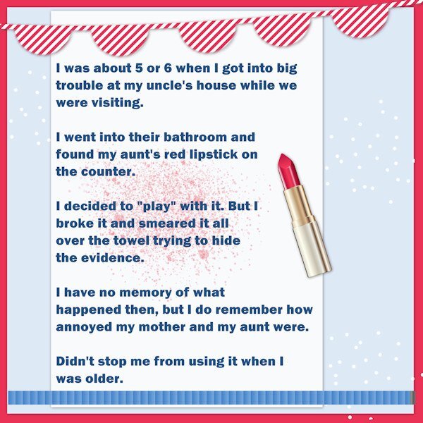
I think there are likely many stories of my mischievous behaviours as a kid, but I have lost many of them into the mists of time! I was known as a bit of a "tear" as a kid, always curious and always pushing the limits. Isn't that what kids are supposed to do? This lipstick episode strikes me (now) as minor, but it wasn't at the time! If some child played with a lipstick in my bathroom, I'd wipe it up and clean her off. And maybe have a laugh too. Kept this one simple.1 point
-
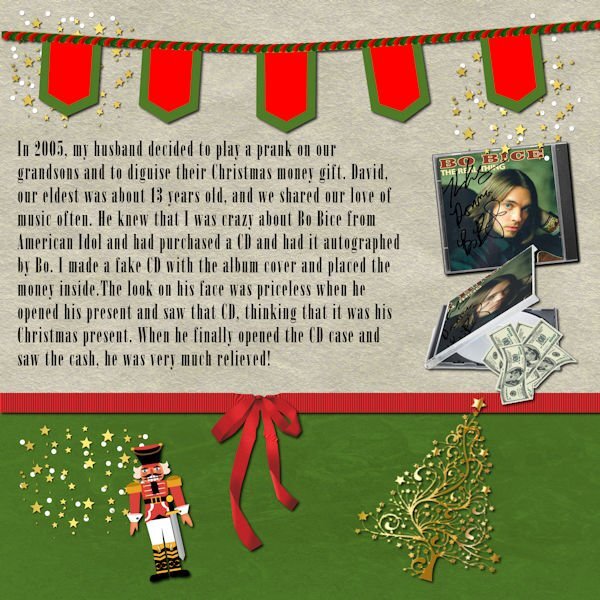
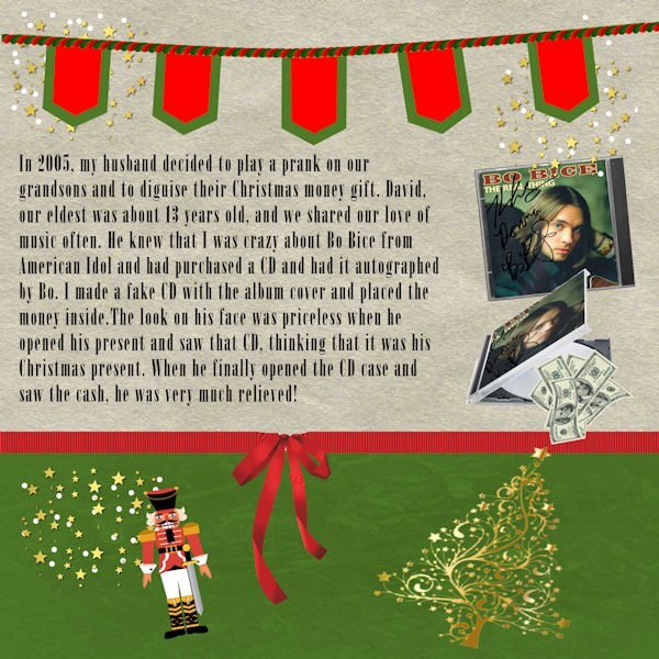
Day 3 Since the prank was at Christmas time, I used some of the graphics from my build a kit. I made the banner using Carole's banner fonts. I copied the front of the CD and downloaded an partially open CD case from Canva. The money is also from Canva. I use raster to mask to place the CD cover into the partially open CD. The font is called onyx which is a windows font. Carole, I wanted to edit my paragraph, but had trouble keeping it in the selection. I didn't want to type the whole thing over, so I just left it the way it was. I duplicated it and made a raster layer. I think that I may have removed the selection and then decided to go back. It didn't work.1 point
-
1 point
-
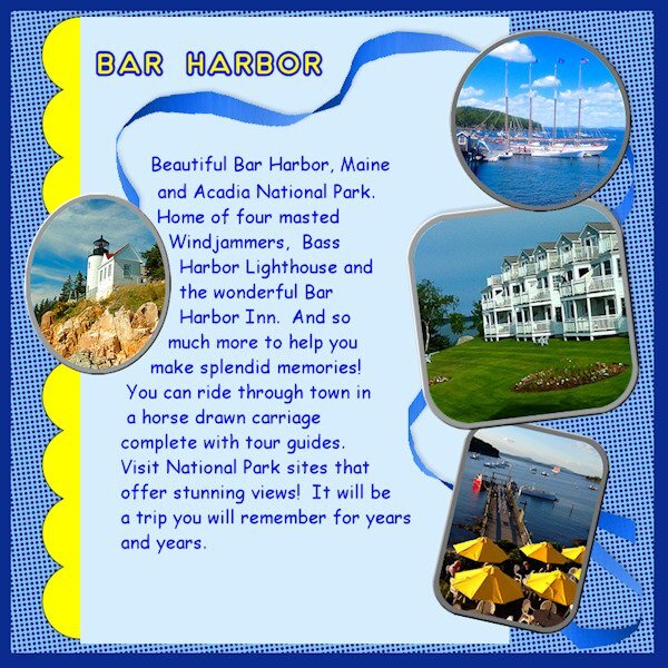
Carole was right about these things bringing back memories. In looking at pictures to use, I decided to revisit a trip my husband and I took before his passing. Kind of sad in a way, but also bringing smiles for the fun time we had. I had trouble with the two papers title and going to revisit that again to get it logged into this noggin ... but I just ran out of time for today. Will play with it again tomorrow to see if I have better luck. OBVIOUSLY, I need to watch that video again (and maybe take a couple of notes!)1 point
-
1 point
-
1 point
-
1 point
-
My mom and dad together with my aunties and an uncle were very fond of the cryptic crossword puzzle that was in the Saturday edition of our newspaper. There was a lot of rivalry between the different families and most of my cousins were involved too. I'm by far the youngest of all and of course I wanted to be involved too. So my parents started to explain to me how I should think in a different way. There were much simpler versions and I liked the to solve those riddles and started to ask them to let me try their puzzle too. I still know how it felt when I could solve a riddle they hadn't: triumph! We used the dictionary and some other books to find the answers, a lot of pencils and erasers were in use and many telephone calls to the rest of the family. Lab 14-3 has a tutorial about seamless pencils which I had made and could use here. The old fashioned telephone we used in those days is from Digitalscrapbook.com and the lightbulb is by Melo Vrijhof. Font is Table of Contents and the rest of the elements comes from my stash.1 point
-
1 point
-
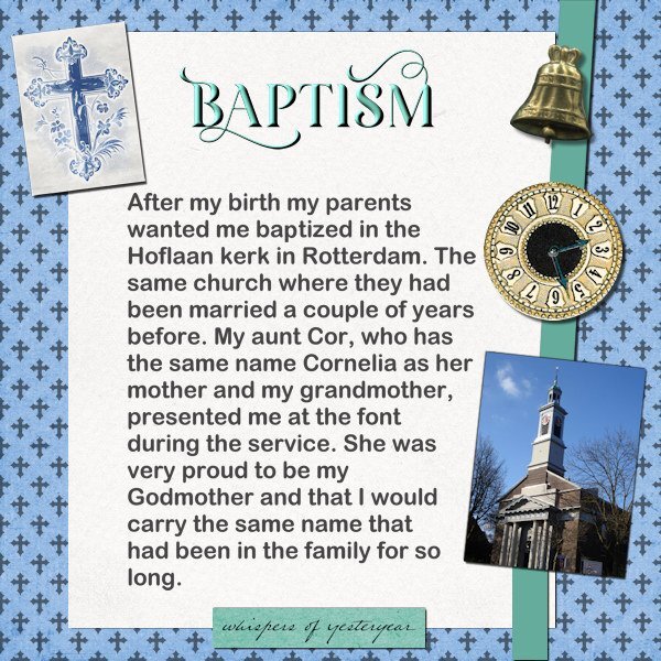
This layout was a bit of a difficult "birth" so to speak. I have done this workshop/challenge before and didn't want to repeat what I had done. I'm doing the AAM (All About Me) challenge as well and that is a bit overlapping with this workshop. I'm intending to print the layouts from the AAM and like to be able to combine that with the ones I'm making now. Firstly I had to come up with a topic for today and after some searching my stash and the net came up with the story of my baptism. When I started to work on the actual layout my PSP starting to misbehave badly and just before I was posting here I realized I had made a spelling error, which in itself was easy to correct, because I learned the hard way to always and always keep my text in vector format!!!!! I have a copy of the text in Dutch as well because I do the AAM in Dutch. For the background I made an overlay with the crosses which are a cass-picture tube from another challenge. The fonts are Arial and Arienne for the title. The cross on the left was made with a blend mode to get rid of the black version in which I found it on the net.1 point
-
1 point
-
1 point
-
1 point
-
1 point



Resized.thumb.jpg.d25811db03a63358cedab1e79f527635.jpg)

