Leaderboard
Popular Content
Showing content with the highest reputation on 07/24/2024 in all areas
-
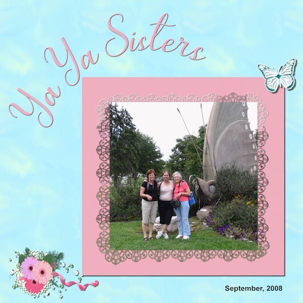
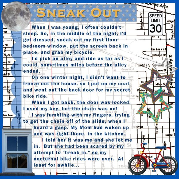
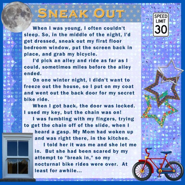
Just playing with this one again to get the wording thing down pat and also wanted to see just how busy you could make it and still see stuff - once you make it small. It's surprising just how much you can put in there - but I'll admit, I got a little carried away. LOL It's just a practice piece - not being saved or going anywhere. I'm thinking of it as a "Learners Permit"! LOL9 points
-
8 points
-
6 points
-
5 points
-
5 points
-
5 points
-
4 points
-
My mom and dad together with my aunties and an uncle were very fond of the cryptic crossword puzzle that was in the Saturday edition of our newspaper. There was a lot of rivalry between the different families and most of my cousins were involved too. I'm by far the youngest of all and of course I wanted to be involved too. So my parents started to explain to me how I should think in a different way. There were much simpler versions and I liked the to solve those riddles and started to ask them to let me try their puzzle too. I still know how it felt when I could solve a riddle they hadn't: triumph! We used the dictionary and some other books to find the answers, a lot of pencils and erasers were in use and many telephone calls to the rest of the family. Lab 14-3 has a tutorial about seamless pencils which I had made and could use here. The old fashioned telephone we used in those days is from Digitalscrapbook.com and the lightbulb is by Melo Vrijhof. Font is Table of Contents and the rest of the elements comes from my stash.4 points
-
4 points
-
4 points
-
3 points
-
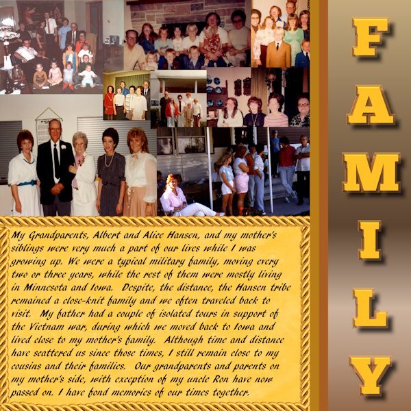
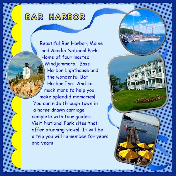
Carole was right about these things bringing back memories. In looking at pictures to use, I decided to revisit a trip my husband and I took before his passing. Kind of sad in a way, but also bringing smiles for the fun time we had. I had trouble with the two papers title and going to revisit that again to get it logged into this noggin ... but I just ran out of time for today. Will play with it again tomorrow to see if I have better luck. OBVIOUSLY, I need to watch that video again (and maybe take a couple of notes!)3 points
-
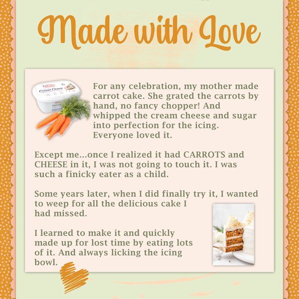
My husband loved carrot cake. He and I used to make it together for special occasions after he retired.3 points
-
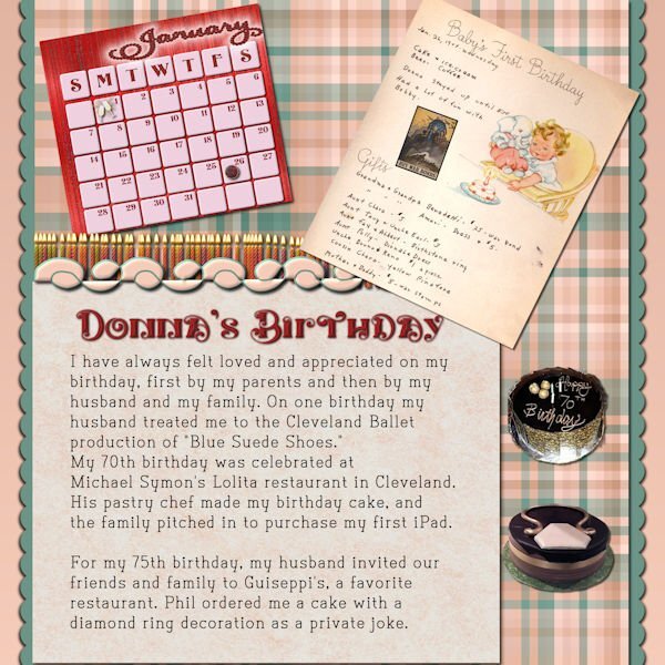
I stayed with my baby book theme for Day 2. The calendar is from the calendar workshop. The cakes were extracted using Cyberlink's My Edit. The war bond was downloaded from the Library of Congress which has free downloads. The candles are tubes, and the decoration is a cass preset shape. I just downloaded the title font, called, Karlburns, from CF and the journal font is also from CF called Type Write. Unfortunately, both the restaurants mentioned hear have closed.3 points
-
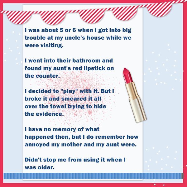
I think there are likely many stories of my mischievous behaviours as a kid, but I have lost many of them into the mists of time! I was known as a bit of a "tear" as a kid, always curious and always pushing the limits. Isn't that what kids are supposed to do? This lipstick episode strikes me (now) as minor, but it wasn't at the time! If some child played with a lipstick in my bathroom, I'd wipe it up and clean her off. And maybe have a laugh too. Kept this one simple.2 points
-
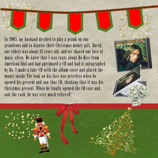
Day 3 Since the prank was at Christmas time, I used some of the graphics from my build a kit. I made the banner using Carole's banner fonts. I copied the front of the CD and downloaded an partially open CD case from Canva. The money is also from Canva. I use raster to mask to place the CD cover into the partially open CD. The font is called onyx which is a windows font. Carole, I wanted to edit my paragraph, but had trouble keeping it in the selection. I didn't want to type the whole thing over, so I just left it the way it was. I duplicated it and made a raster layer. I think that I may have removed the selection and then decided to go back. It didn't work.2 points
-
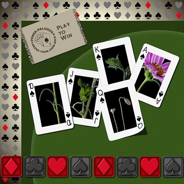
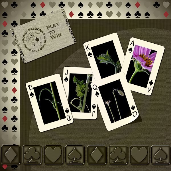
Lab 7-3 Pattern Paper Metallic Element2 Fabric Tag As it turns out I used the same pattern as Carole used in the tutorial, only because my P52 challenge is playing cards so I ran with that theme. I loved the Pattern Paper and Metallic Element2 tutorials. The Fabric Tag was also good but I did encounter a problem I couldn't overcome. I couldn't get the eraser too to un-erase. I followed the video and used the written instructions, but it just would not erase and I'm not sure why. I really wanted the fringe part so I made the background of the fabric available for a pattern fill, and use the brush tool with the same settings and added the fringe on each side. I have them as separate layers (fringe below the fabric layer) so I could slightly change the saturation of the fringe and add a bit of noise and the tiniest of bevel. I merged the layers so i could add a drop shadow. I used the Custom Playing Card script and the Lifted photo script. Font from Creative Fabrica.2 points
-
Euchre was a natural for me as a young girl. I grew up in the Catholic church in a small rural area, and it was almost required to play it! I still enjoy it, but not as much opportunity to play.2 points
-
Thank you, Corrie I've had my baby book for a long time, but, yesterday, I just realized that it is 82 years old. It's in pretty good condition, too.2 points
-
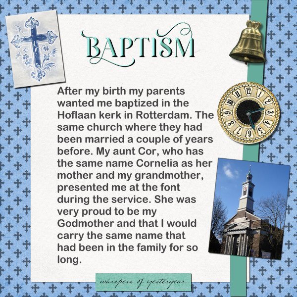
This layout was a bit of a difficult "birth" so to speak. I have done this workshop/challenge before and didn't want to repeat what I had done. I'm doing the AAM (All About Me) challenge as well and that is a bit overlapping with this workshop. I'm intending to print the layouts from the AAM and like to be able to combine that with the ones I'm making now. Firstly I had to come up with a topic for today and after some searching my stash and the net came up with the story of my baptism. When I started to work on the actual layout my PSP starting to misbehave badly and just before I was posting here I realized I had made a spelling error, which in itself was easy to correct, because I learned the hard way to always and always keep my text in vector format!!!!! I have a copy of the text in Dutch as well because I do the AAM in Dutch. For the background I made an overlay with the crosses which are a cass-picture tube from another challenge. The fonts are Arial and Arienne for the title. The cross on the left was made with a blend mode to get rid of the black version in which I found it on the net.2 points
-
2 points
-
2 points
-
2 points
-
This is gorgeous! You did such a nice job on the metallic elements! I like both versions of them.1 point
-
1 point
-
Lab 7-3 here is an alternate version. I took the gradient background and duplicated it then moved it to almost the top and added a blend mode. I like what it did to the metallic elements. they really look metallic now. I still wanted some color so I selected the "red" diamonds from the background layer and promoted them to a new layer and brought them above the blend mode layer and lowered the opacity of them (they were red already). I also brought another duplicate of the background gradient above the playing card group and made a mask of the gradient (New Mask Layer > Show All) and used black to block the layers below that have the blend mode so the middle of the cards would retain their original colorful-ness.1 point
-
Julie I love carrot cake and had a piece today when I was on a daytrip with my cousin. I have backed them myself but not any longer. It is just my husband and me and hubby isn't a fan of carrot cake, so I eat it when I have an opportunity like today.🥕1 point
-
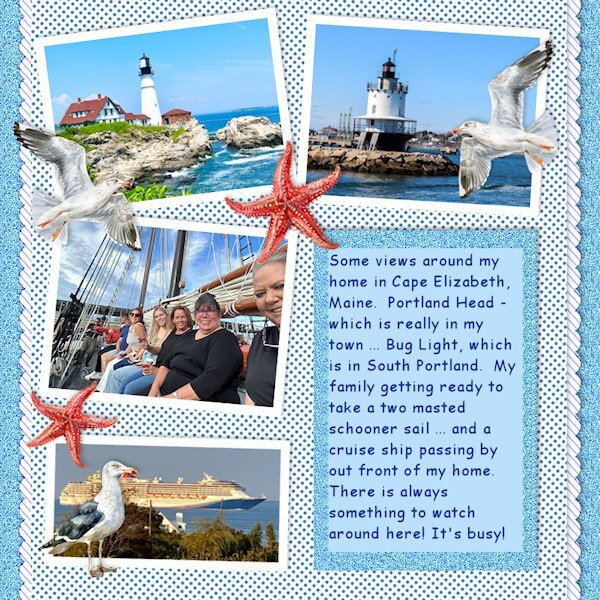
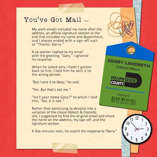
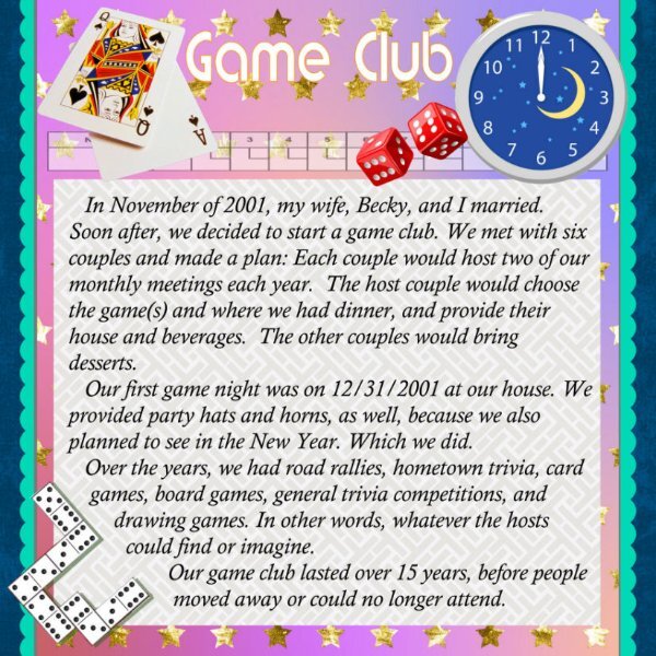
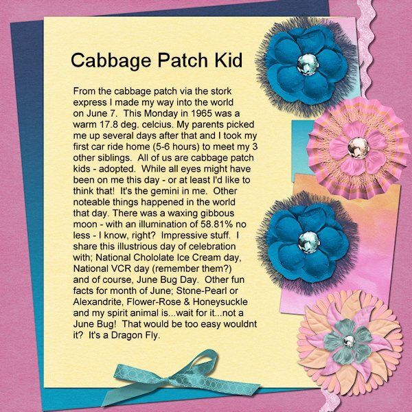
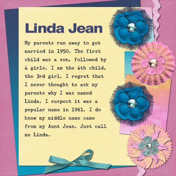
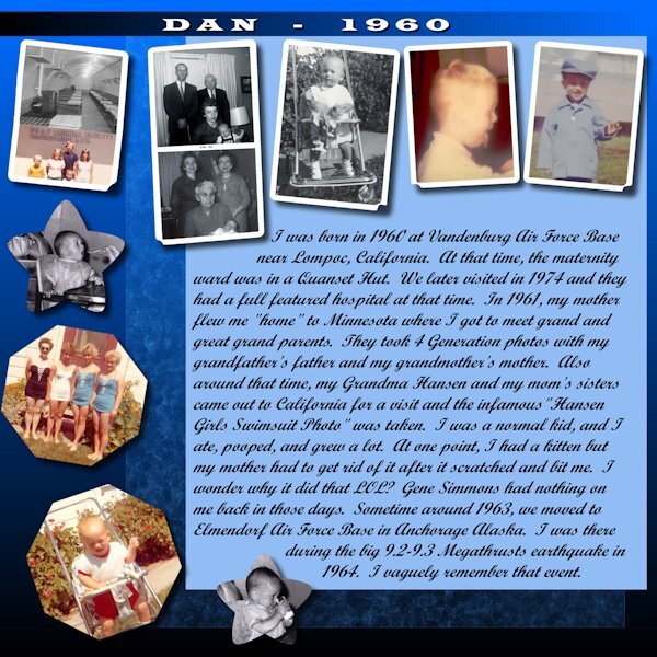
@Linda J Walker Isn't it interesting all the questions we never think of asking when people could answer us? @Susan Ewart I had never heard of the Cabbage Patch kids to mean adoptees. Something I learned today! @Corrie Kinkel So is your name Corrie or is that a nickname? @Minka Glasier That is a very appropriate theme for the topic! And great photos for your extra layout! @Dan Greenwood That is a fun club you had!!! I bet you had many great game nights! I only learned about Euchre after I met my husband as their family used to play that all the time. In fact, tonight, my son was over and that is what we played! @Donna Sillia That is an interesting way to use those presets. I would not have recognized them if you had not mentioned it. @Gerry Landreth I bet he just relied on what he HEARD when your name was pronounced! @Julie MagerkaHow old were you when you finally "liked" carrot cake? @Bonnie Ballentine Yes, I remember. I called them "weather-brellas". I had a few printed for my kids and myself. For those who don't know, it is a twist on the temperature blanket idea. Now, let's see more posters. I know you are there!1 point
-
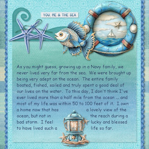
I really like this layout. If you made the starfish and birds smaller, I think it wouldn't look as busy.1 point
-
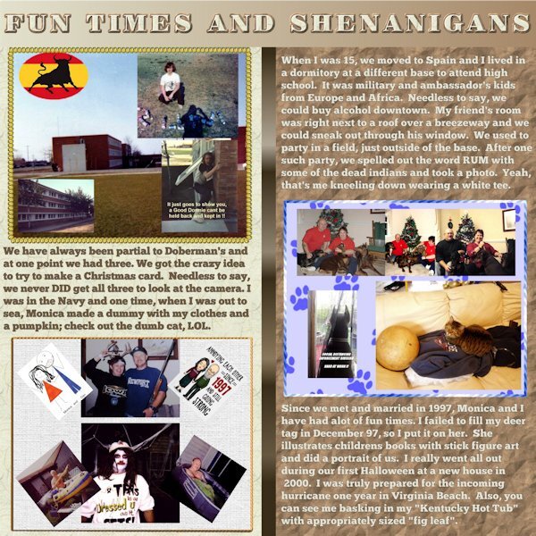
I posted this and it seems to have disappeared. Oh, well... I used to attend the Not Too Late Senior Women's Basketball Camp in Portland/Southern Maine CC. I loved to visit Portland Head and have included it in a couple of my layouts. Good memories, Minka. Thank you!1 point
-
I had no trouble with the wrapped text (in 2022) on the first layout. But on the second one, when I wanted to edit the text, it would revert (sometimes) to unwrapped. Finally got it, but I also saved what I'd typed so I wouldn't have to redo that.1 point
-
I love cryptic crosswords. Took me a while to learn how to solve them, but it's very satisfying.1 point
-
1 point
-
I love this Dan. I grew up in a card and game playing family. Reading your layout brings back my own memories.1 point
-
1 point
-
1 point
-
1 point
-
1 point
-
I'm so glad to see you back, Minka. Are you in Maine or Florida? Do you still winter in Florida and summer in Maine?1 point
-
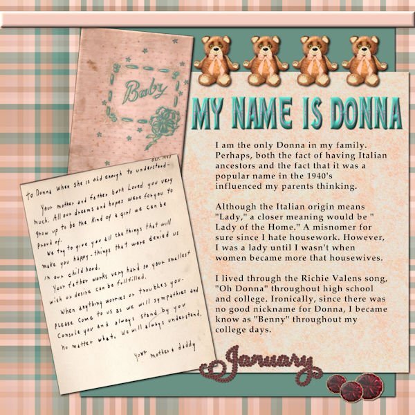
I used the Diamond template, but did quite a bit of revising. I still have my original baby book and scanned the cover and the first page that was written by my mother. I made the plaid using cass-stripes 2 script and the colors from the front page. The teddy bears are my own which were lined up using cass-repeat script. The title font is a layered font called Edith from CF. I recolored it and used cass-element stacking script and then the cass textcreator script. My birthday is in January so I used the garnets and garnet January from the Calendar workshop. The text script is called Domitian which is an open source font.1 point
-
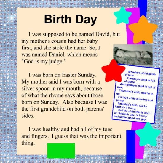
I saw there were two templates, and because flowers didn't seem to fit, I chose the other one. To choose the text outline, I first selected all of the stars and rectangles, and then inverted the selection. Then, I unselected everything outside of the story page. Finally, I condensed the selection to where it looked like good spacing to me. The poem box was a pain, because putting text in it kept the text horizontal. If I rotated it, it kept the angled shape. So, I copied that rectangle, pasted it as a separate image, used the straighten tool to make it horizontal, selected the inside, cut out an approximate of where the star would be, placed the text in it, merged visible, and pasted it back into the layer it came from - of course, rotating it back where it had been. Whew!1 point
-
1 point
-
1 point
-
Sadly, I haven't had a lot of PSP or pickleball time lately. Lots of work in the garden...and now, the yard needs attention. It will wait....tomorrow is pickleball, picnic and table games. Clusters and background paper by Jessica Dunn, Into The Woods, at Digital Scrapbooking. Template 242 by Lady 22.1 point
-
I need more work/practice with this technique. I gave up and used Carole's script. Brushes/PNG's - Deer Tracks Sheila Reid at Digital Scrapbooking1 point
-
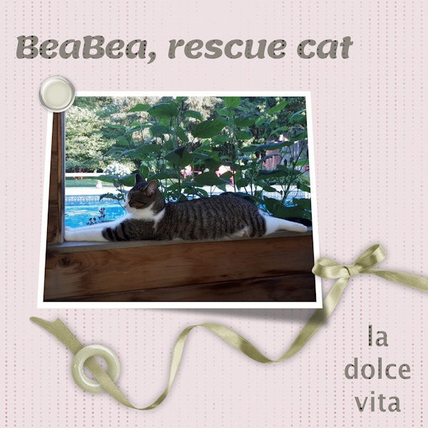
I'd say I threw this together quickly and easily, but it wasn't quick. I dithered around with it for too long and just wanted to keep it simple to align with the challenge. BeaBea belongs to a friend. I have no kitty, over a year now.😢 Now that I've conquered the Interlacing Technique....you'll likely see it often! 😁1 point
-
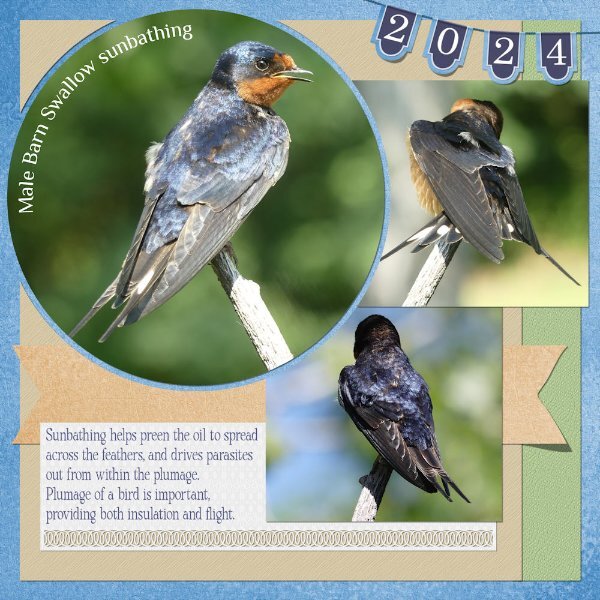
Here is my page for the Tut /tech challenge. I create the page a week or so ago. I added, by creating the date banner, lifting some of the pennants, also I added a ribbon, and lifted one edge. I replaced the date stamp with the banner. Head on over to the facebook page, if you want to see a much less compressed layout, to see the details and colours in the photos. I rarely edit my photos. If I find there is a need to, all I tend to do is use the brightness and contrast, and crop tools. In this case the photos weren't edited. Also, for those that may be interested, birds are like dog, they don't perspire, instead they pant like dogs. For the past fortnight the temps have been in the high thirties, again today it is 37c, and hazy, due to smoke blowing in.1 point
-
I thought I would try the split page technique using text today. I'm not thrilled with how the text came out, but it was my first try. The main font is Jean Jingga and the journaling text is Jezebel Pro. The background is from Peakpx. I had to merge all the layers before reducing the size to 600. Otherwise, the journaling text disappeared. I think others have mentioned that it happens when the text is in a selection.1 point


Resized.thumb.jpg.d25811db03a63358cedab1e79f527635.jpg)

