Leaderboard


Popular Content
Showing content with the highest reputation on 06/19/2024 in all areas
-
Day 2 Vectors I had fun with this. I am not sure how many times I played with this one. Finally...
 10 points
 -
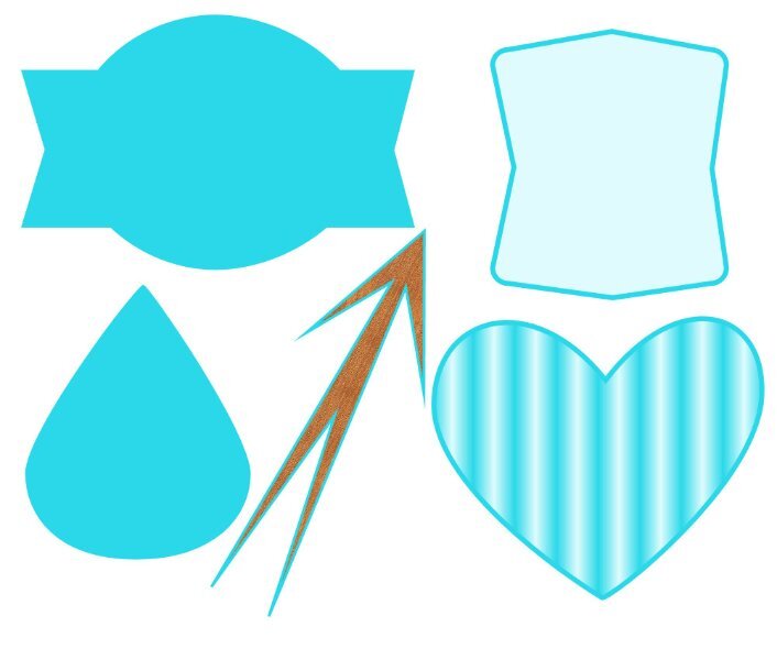
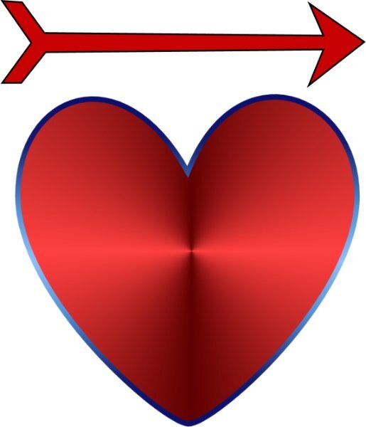
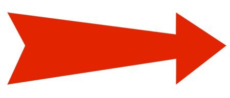
Lesson 1. I did the heart and the arrow, but I also did the splash required for my Lab 12 Mod 8. I fiddled around and ended up using the layer styles - Inner Glow and changing the settings and colors on both the arrow, heart and splash.
10 points
-
Day 1 - I kept getting turned around with this project, and I'm unsure why. It was likely the distraction of purring cats. Daddy was cornered in his tiny office, and they took full advantage.
9 points
-
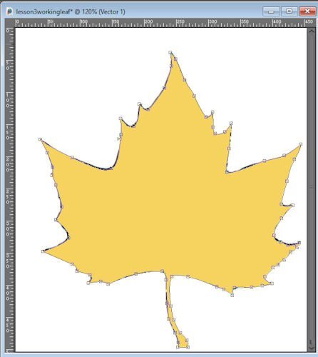
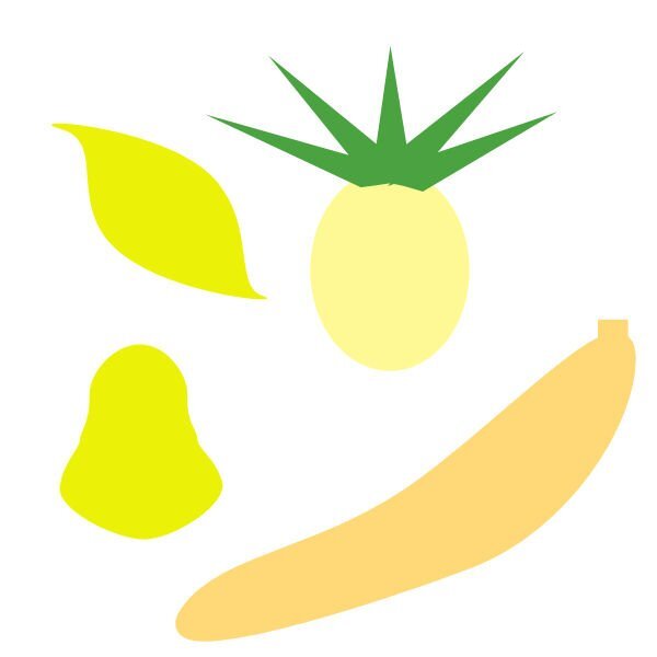
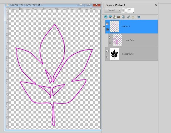
Lesson 3 First image shows the leaf after I edited all the nodes. Second image shows samples after the vector was exported.
8 points
-
Lesson 2
8 points
-
Didn't have a lot of time today to work on Lesson 2, but wanted to be on time. We have temps in the 100s (F) and my A/C went kaput yesterday. It has been fixed but it knocked me sideways to endure high indoor temps. The poor dogs too were listless. Just played with a few shapes. I have NOT mastered those (#@^$*) nodes - my shapes are often a bit wonky - but I refuse to let them beat me ultimately! I will prevail! (Ha)
8 points
-
Day 3 - contour It is not a great contour, but it serves the purpose of practicing, practicing... 😄
7 points
-
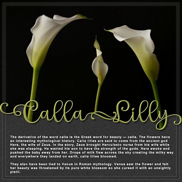
Yup, I spelled it wrong. ARGH! I didn't notice until I was looking up information about Calla Lilies. Weirdly, I found some Canadian sites that use two Ls. I'm pretending it's the Canadian spelling or maybe I accidently bought Left handed lilies? They are spelled with two Ls, right? I didn't quite get the layout horizontally in equal halves either. It was fun to make though. The font is Lophinky from CF, which has LOTS of glyphs by the way, and Arial. Photo's are mine, I used 3 photos and a blend mode to set to Lighten. I didn't know the flower is actually the pointy thing in the middle (pistil?) and what I thought was the flower is actually a leaf. They are quite beautiful.
7 points
-
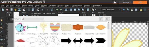
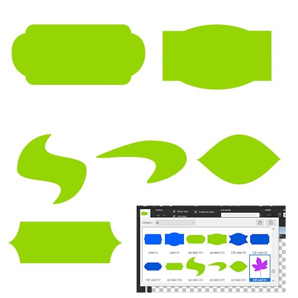
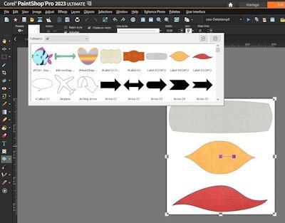
For day 2 I have kept it really simple because I have so much trouble to see those nodes and although I have set the node size bigger you still have to click in the middle otherwise it won't work. Sadly my eyes won't cooperate at the moment. I have not only the shapes of today but also the ones from day 1 exported in one file and everything is in this blue color to distinguish them from the purple ones of last year. When exporting I got a warning that there were already preset shapes with the names Labels so I had to come up with different names or numbers to avoid getting duplicates. I didn't make a screenshot of my preset shapes because the results of the coming lessons are there too and I won't spoil what is to come the next days.
7 points
-
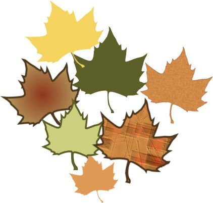
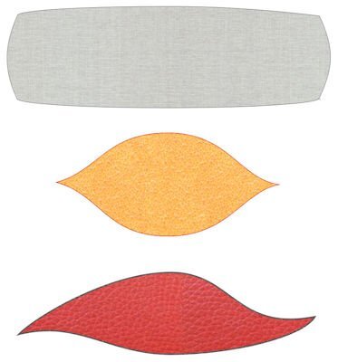
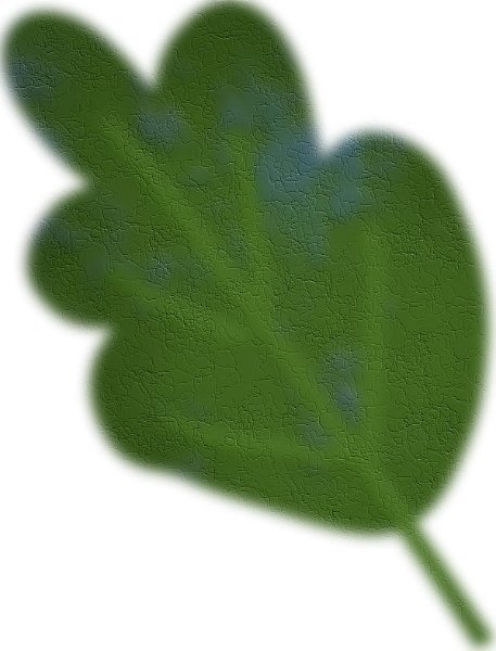
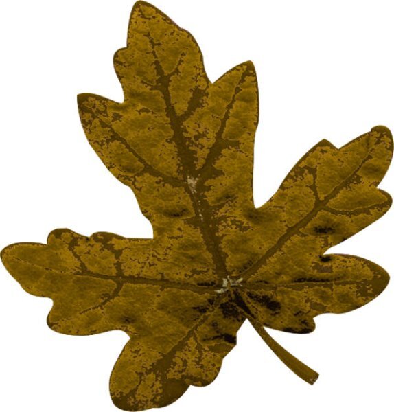
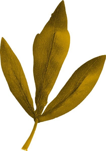
Today's leaves
6 points
-
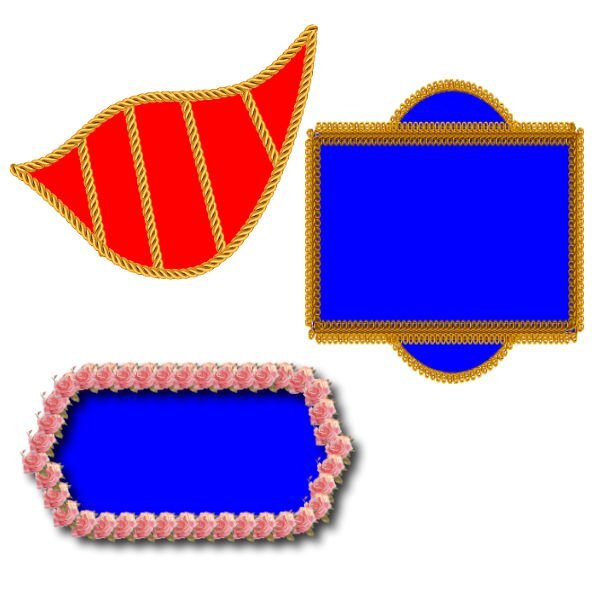
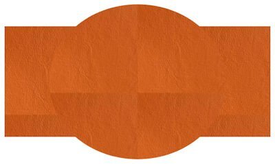
Yesterday's labels. I was hungry; can you tell?
6 points
-
here is my day 3 I used one of the leaves and from the picture the walfish I used no bevel here , only the lighten darken tool this was my old lesson 36 points
-
Nothing fancy. I just added some vectortubes. This lesson was very helpful because I had forgotten about the cusp node.
6 points
-
day 2 the new lesson, with shadow and the old one with innerbevel and shadow6 points
-
Here is my lesson 2
5 points
-
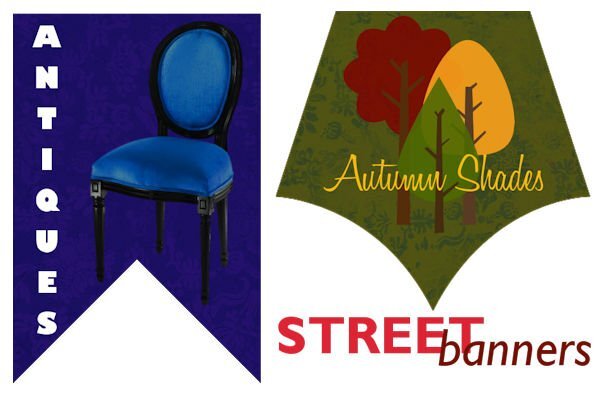
Wow, Jeni, those are awesome. They immediately make vectors more interesting to me. I think my fav is Autumn Shades.5 points
-
They don't just multiply, they seem to change from one node type to another or be unavailable to work with. They are diabolical!5 points
-
I decided to try to make a character based on the ellipse. I am struggling to alter the shape with the pen tool. It seems that I get knocked off the vector layer I am trying to edit or I just don't have the right tool settings for the pen to easily grab the node and alter the shape or to add a node to alter the shape. Then, when I first tried to save the image after resizing, the version was terribly pixelated. Oh and I see the grey ellipse I put on the image below for a shadow, I forgot to reduce the opacity so that it would look more like a shadow!
5 points
-
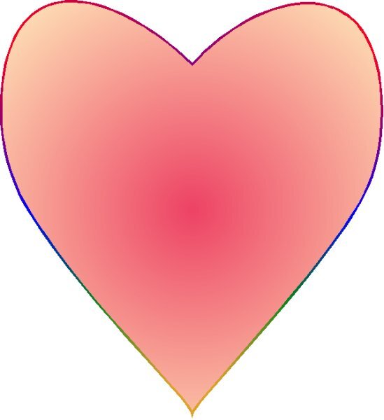
Lesson 1 Heart and Arrow. Lots of fiddling around. I see some very cool hearts and arrows from everyone. It's pretty inspiring. I am keeping it simple for this workshop, as others have said, just concentrating on the forms and taming the nodes. Some of those suckers like to multiply when I accidently click too much.
5 points
-
I have not signed in, but I can follow the Lessons as a Diamond, this is my 2nd try in this WS. so here is my new lesson and this is the old lesson.5 points
-
Lesson 2 Felt a bit better, less panic when I over click while trying to catch the nodes. Lots of UNDO! Still, it's really satisfying playing with the nodes and getting a better "handle" on the handles.
4 points
-
Text translated with Google Hello to all participants. I arrive late, because I am in the boxes full to bursting from our 52 years of life together for my husband and me. I think I will have enough to sort through, throw away, keep and give away everything we have accumulated over these 52 years. In addition to the move, I was surprised when I turned on my computer that all my saved passwords had disappeared. I think I'll have to change them all because the ones I have in note don't go through, as if I needed that!
4 points
-
@Trevor Andrew I guess the simplest explanation why we need to activate the Pen tool is that with the Pen, you will edit at the LINE level, which has the nodes, while the others offer different settings, but on the overall shape. So, if you remember that the Pen, will let you edit the nodes, it will be helpful. And the reason why PNG are not allowed in the forum is due to the file size, which uses a lot more bandwidth and storage. If you want to create shapes, you don't have to have a transparent background. For me, it is just a habit. @Daniel Hess Don't worry about symmetry. Not all shapes are symmetric and you will often use nodes in asymmetric design. You will see tomorrow! @Doska St. To change the colors, you usually will get better results and more control if you open the Vector Properties dialog window. Is that how you tried to change them? @Jen Brown Great start. How did it go? Was it easy or challenging? @Cristina I am glad you remembered an old "trick" with the corner nodes. And yes, it is all about practice, which is the whole purpose of this workshop. @Anja Pelzer Glad you are still following with the lessons. @Susan Ewart Yes, keep it simple and manage the nodes. It is all about becoming comfortable with them. @Alice Daniel Yes, nodes might be a little finicky and hard to "catch", so if you click a tiny bit off, it will activate some other layers. Have you considered using larger nodes? It might help? You are definitely getting some practice with that character! @middie We have a very supportive community here. Although I saw your request for help, someone was faster than me in answering you 🙂 @Donna Sillia Simple shapes are great. For those who might wonder, we will look at adding picture tubes in a future lesson. @Corrie Kinkel That is an interesting idea to choose a different color for this workshop. Since the colors used in making the shapes will display in the drop-down list, you can also choose a specific color for your own shapes. I tend to have blue shapes when I create scripts, or preset shapes that I need to share. They end up associated with me 🙂 @Julie Magerka You are doing good. You will get the hang of those nodes. @Gerry Landreth Aren't the cats your supervisors?? 😉 If you need more practice, try to turn a rectangle into a single letter. That is another project you can try. Don't create letters with "holes" yet. That will come later in the workshop.4 points
-
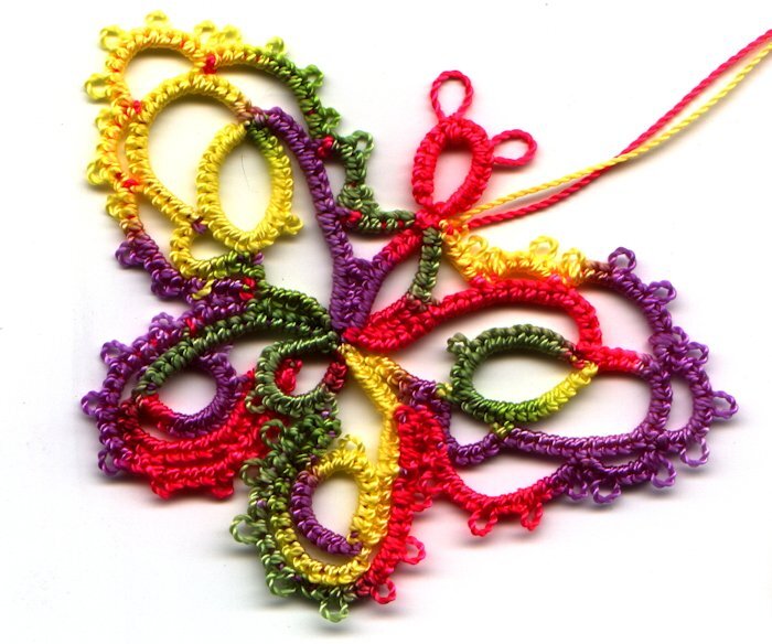
Well this one was on (or I guess IN) my hands for quire a while. It is a tatted butterfly I made for my Sister a few years ago.
4 points
-
It worked!! Thank you so much. I had not altered the radii figures on the top before. I guess it does that automatically from the last time used. Now I have another post-it note on my computer warning me to check for that. My computer screen will soon be covered in them. When I get struck with something I usually open my freezer and take out a box of shortbread to eat (shortbread is so very comforting) but I had eaten up all of my stash so I had to bake some more today. I try the lesson again after I have had some tea and warn shortbread. Thank you for such a quick and efective response.4 points
-
Hi Middie The round corners are set from the “horizontal radius” and “vertical radius” Your settings show as 115.50 (view your menu bar at the top) Reset those settings to zero, simply type in a 0 and the corners will be a right angle. Carole shows how to set the corners as round in the video.4 points
-
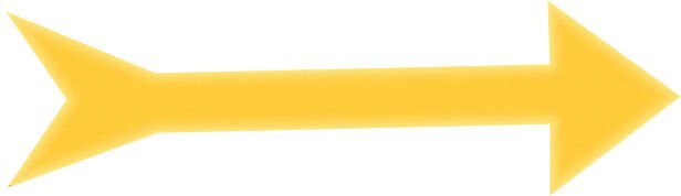
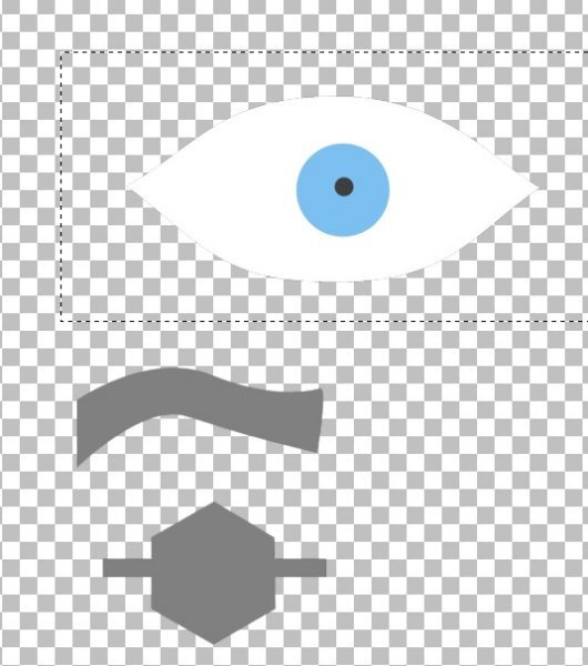
That arrow reminds me of one of the "angry birds" from the computer game. It just needs some eyes.4 points
-
Working with vectors is all about practice, practice, and practice. In the beginning, we hate it; the nodes disappear, and lots of annoying things happen, but after a lot of trying and error, we start to have fun with it. 🙂 There are a great number of tutorials and masterclasses inside the Diamond Membership. Here is Lesson 2: Edit: The tip for the corner nodes is genius. I have totally forgotten.
4 points
-
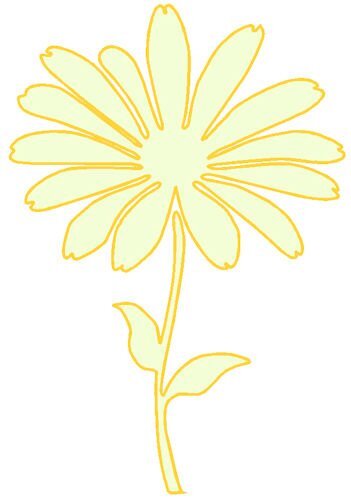
Day 3 and I decided not to do the leaves again because I already did them last year. However I didn't fancy the diamond extra shapes. I know it is all about exercising but I have to like it too. Instead I found a flower shape and Ivy to use. This time I had less problems with clicking and changing the node types from symmetric to cusp and back, it went rather smoothly to my own surprise. 😕
3 points
-
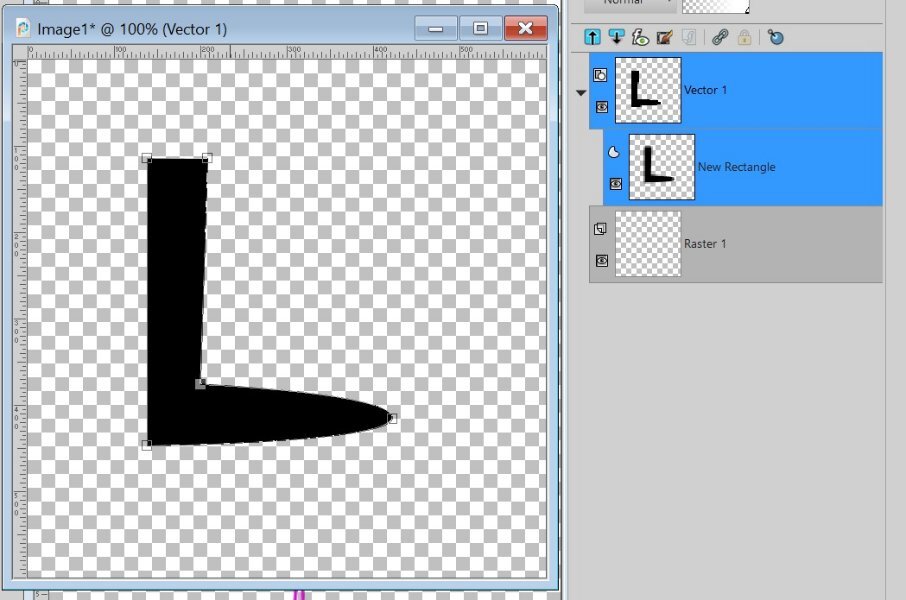
In Carole's comment after her comments to us, she suggested making a letter from a rectangle. So here's mine. The easiest one I could think of (maybe letter I would be easier.) It's supposed to be the letter L but it could be a black boot for a cartoon character or perhaps a boomerang? Just wanted to try!
3 points
-
I remember now, from the last Vector Workshop, that the leaf design made my eyes glaze over! It was just too much node-work for my skill level. This time, I managed the nodes better but I did something wrong b/c when I fill in the shape with a solid colour, the three cutout parts in the middle get filled in too. I'm just too pooped to figure it out right now. But hey, I did the outline! Don't have to get an A every time, right? I will try again if I can get some direction on what I did wrong. Update: just read Carole's note (after her comments to us) about not using a shape with holes! Which is what I did.
3 points
-
I got the silent treatment from my PSP last night. I however, wasn't so "silent" about PSP's rather abrupt and rude behavior. .3 points
-
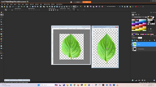
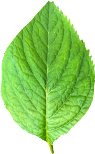
"On the blog Speaking of vectors, did you ever wish you could turn a selection to a path? Well, you can with this script!" I downloaded this script, found it very easy to use and saves a lot of time. I used the selectiontopath script on the leaf, created a pattern from one of my leaf pictures and filled my vector with the leaf pattern. Carole, thanks for the tip on the blog. Is it ok to to use the script? I do realize that it will not work for all projects and want to continue learning how to manipulate nodes. Now that I viewed on the forum, I see where the pattern did not show all the spikes.
3 points
-
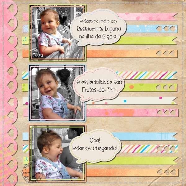
I was able to finish another layout from my "Unfinished Layouts folder". Credits: The edge strip and the ribbons were created using papers from a Pixel Scrapper/Digital Scrapbook freebie by DiHiller (mini kit DH_SummerLovin) Cassel's DateScript#8
3 points
-
Stunning simplistic page. They are easy to create, providing there aren't any gaps in the text from edge to edge of the page. The correct spelling for the flower Lily is spelt with one l. As it comes from lilium which is its genus. A child's name Lily can be be spelt in several ways, including two l's. There are other variations on creating this type of layout in the no kit masterclasses if you are interested.3 points
-
Thank you, Ann, that really is a lovely boost to my confidence, I've avoided vectors like the plague, and, on seeing what others were doing, I felt I needed to up my game somewhat. I spent hours during the night thinking about how to create labels, and when I tried to do what I had in mind, it didn't work, so I went with outlines. The banners just came to me as I was creating them. I should have mentioned I used Jessica Dunn's damask papers from her Good Old Days kit, her teal paper on the blue banner, and her lime paper on the green banner. I then blended them, I think I used multiply for the blue banner and luminance legacy on the lime one.3 points
-
How beautiful, Suz! You are a wizard. There's a tiny error in the text. Where it says "Zeus brought Hercules to nurse.." you need a space between "Hercules" and "to." I'm not getting into lilies with 3 Ls! 😉❤️3 points
-
here I used my own kit, to test it, template by Marisa Lerin, font is Starline3 points
-
Here is my Lesson3:
2 points
-
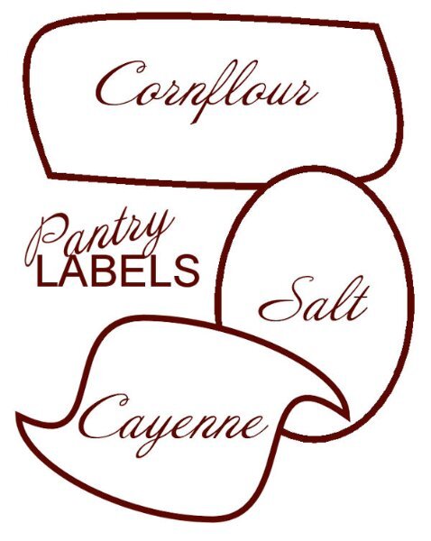
I love the cornflower shape, it reminds me of 50's-60's design. I have just made a similar one like your Cayenne one. And like Ann, I love that Autumn Shades.2 points
-
I have all these issues too. I had to turn the node size back to small because I couldn't seem to hit the middle when they were bigger. Lots of zooming in required. Oh, and sometimes the arms are so short I don't think they are there. I'm trying to watch the cursor better as it switched to arrows doesn't it. And sometimes I get the 4 arrows but don't know why. they don't let me click on the nodes, this did stop once I went back to smaller nodes.2 points
-
Changing node types Working with lesson 3 I found I was switching node types from cusp to symmetric and back many times found that a bit of a pain. Are there keyboard shortcuts to achieve, I found Ctrl+S switched node type to symmetric but cannot find one for cusp.2 points
-
Thank you Sue, accolades from you mean a lot to me. I sure did experience not getting the text edge to edge and wondered why my magic wand was acting oddly. Until I zoomed in real close and saw I was a few pixels shy on one side, therefore, opening up the whole top part of the canvas. I will have a look at the "No Kit" masterclass this weekend, after I get through the busy work week (next week is the lighter work week - we all like that one better!).2 points
-
Why have only 1 or 2 Ls when you can have it all with 3 Ls, am I right? And thank you for having my back. I see the error of my ways and will get it corrected. This is the brain that gets up at 5am and is still on the computer at 11:30pm. Yeesh, what has happened to me. It almost looks like I changed Hercules name to Herculesto, or maybe he's Herc's cousin from Italy. 😁2 points
-
Nice to see you using your own kit!2 points
-
Lesson 2 I followed the video and saving the shapes worked correctly and now show in the pre-sets. Thanks Carole I did start to create a group of arrows all went well until the program decided to do its disappearing act, at the time I was working on layers and grouping, then a silent closure. Next time it works ok. Png images are not allowed on the forums so is there any benefit in using a transparent background. For me the squares get in the way, I find it better to use a white background with the grid view, now I find it easier to keep things in proportion. I have also noticed that I can use the arrow keys to move nudge the nodes making positioning much more accurate, need to investigate further I’m sure drawing and using those nodes will get easier with practice, I need to watch that video again.2 points
-
Nice!2 points
-
That pencil is adorable!!!2 points
-
Show off!!! Wish I could do that.2 points
-
Yes I forgot that little tip way to often, so I now have made a note in my own list of most useful tips!2 points