Leaderboard


Popular Content
Showing content with the highest reputation on 05/24/2024 in all areas
-
This came in handy today for my dear friend Lorraine's birthday! I forgot to mention that the font is Zooky Squash which I got from FontBundles years ago during one of their $1 sales. It came with seven versions including alternates, swashes, and ornaments. I think I got my money's worth. 😄12 points
-
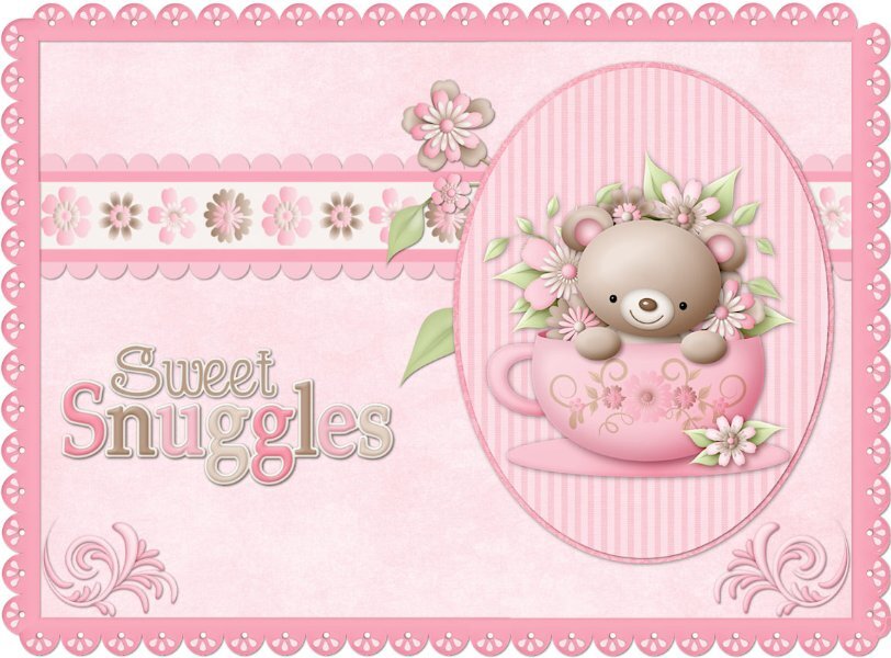
I think I must be doing something wrong here...I'm not really sure about where to put my post...should it be where it says "Quote" or is that only to reply to the previous message? Anyway here is my Lesson 4 - I used a Kay Miller scrapkit called Sweet Snuggles.
 12 points
 -
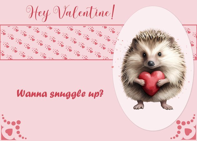
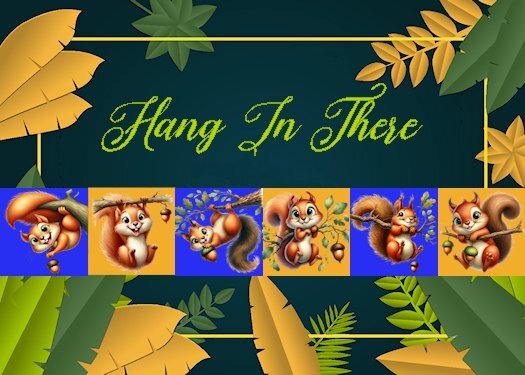
Lesson 4 - Followed the instructions and layout pretty closely. Used a border around the "ribbon of hearts" so I didn't have to delete any (lazy). Love hedgehogs so that was my choice for the clipart.
12 points
-
Hello, here my cards day 2:
12 points
-
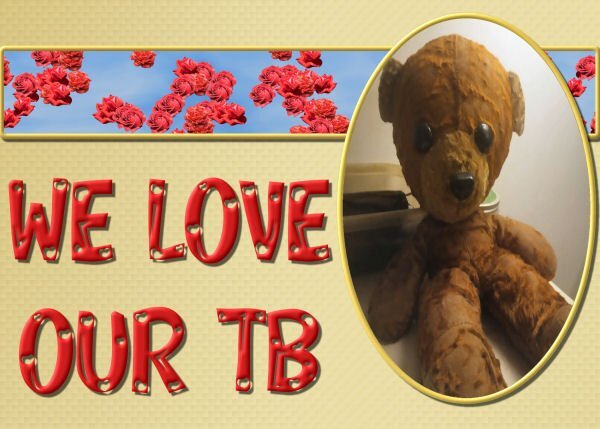
L4. Card 4. TB---Teddy Bear. Each man has a Teddy Bear and loves he/it.
11 points
-
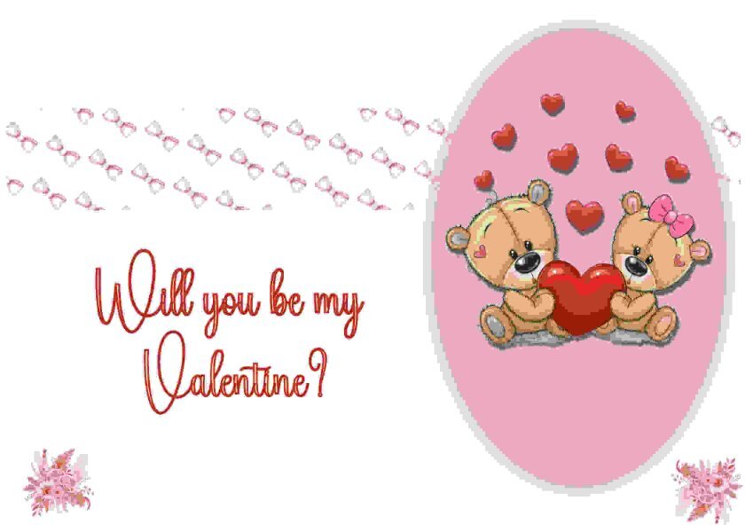
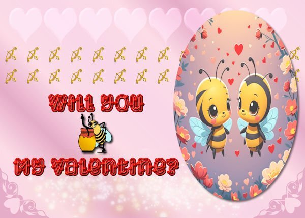
Day 4 The image is an AI image from a paid Cyperlink program call "My Edit." I made a vector oval and cut the image to fit the oval. I made the background with preset hearts and cass sparkle script and a lot of blending. The font is Love Heart from CF. The bee is a dingbat font call Bee Cute, and the bow and arrows are from a Valentine dingbat font also from CF.
10 points
-
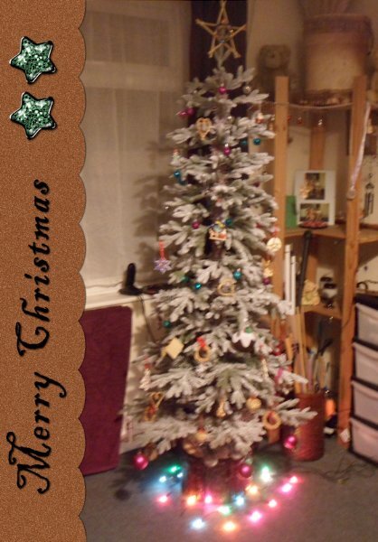
Playing catchup, here's my number 1, I did several different versions of this for all the sizes of card blanks I have. This is the one I decided to share. I am making christmas cards for next year featuring my own christmas photos, hopefully it will stir family members memories as it stirs mine. This one I am showing I took the ribbon out and replaced it with the text
9 points
-
Card 5. My male friend is retiring so my card isn't too 'pretty, pretty'. The photo is one I took in an Illusions Museum of a kaleidoscope pattern. The border is a wave pattern fill. Effect on the paper is Fine Leather. Font: Evelyne. I've used a shadow on the text in white instead of black just to lift it from the background but I am taking a gamble with the effect.
9 points
-
I am days behind but enjoyed putting this together. I see today it's not 'unique', but good to know I'm not so far out there with the idea :-0 I can't wait to get some time to go through all the posts and see what everyone has come up with. I've seen a lot of inspiring ideas in the short time I've had to check them out.
9 points
-
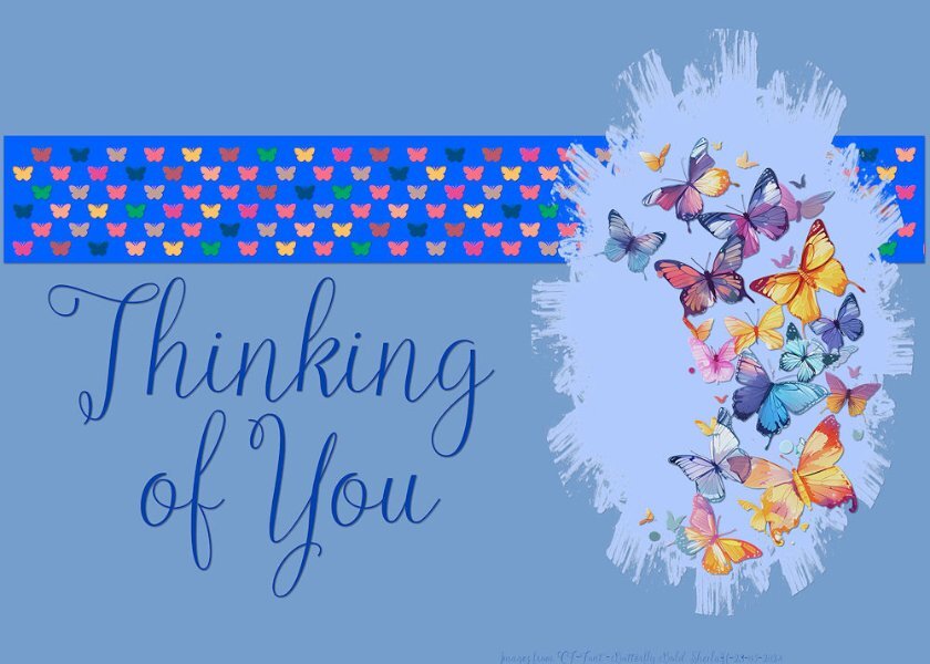
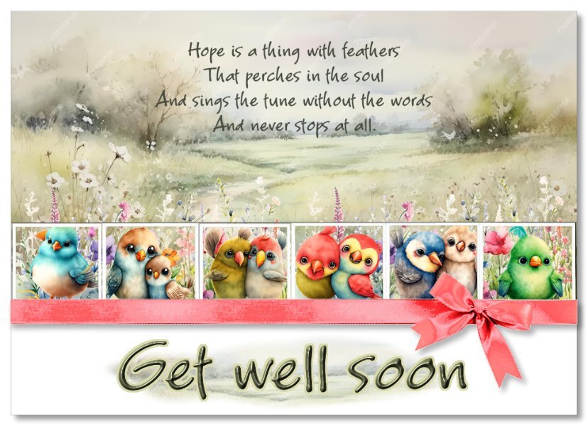
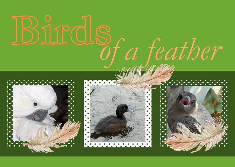
I enjoy capturing birds, especially when I get them up close. Maggie, the magpie, on the right was busy singing Happy Birthday when I sneaked up and took this pic. The middle bird is a pāpango, or Scaup, a diving duck, and is native to New Zealand. Billy, on the left, is an Australian, a Cockatoo, he loves roaming free, and befriending people. I chose to colour the font, Garamond, in shades of orange, the opposite colour on the colour wheel from green. I made the polka dot papers and the feathers came from an exchange in my one of my graphics groups. Jeni
9 points
-
My day 5 card. OOPS! Thanks Cassel for catching that typo. I will have to fix that.
8 points
-
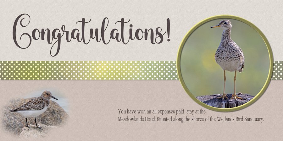
I promoted a strip from the photo to create the ribbon. Added dots, to replicate the Upper Sandpiper's chest, used my grosgrain ribbon template, overlay. Instead of using a mask, I feathered around the Sanderling. Again, all colours were taken from the photos.
8 points
-
The script is Samantha Upright. The blocks were created using the Baby Alpha Block script by Cassel. The ribbon was also created with a script by Cassel, Glitters-C. I've added one for a boy. That way, I'm covered. With two great-nieces and one great-nephew added to the brood, I can't leave anyone out.
8 points
-
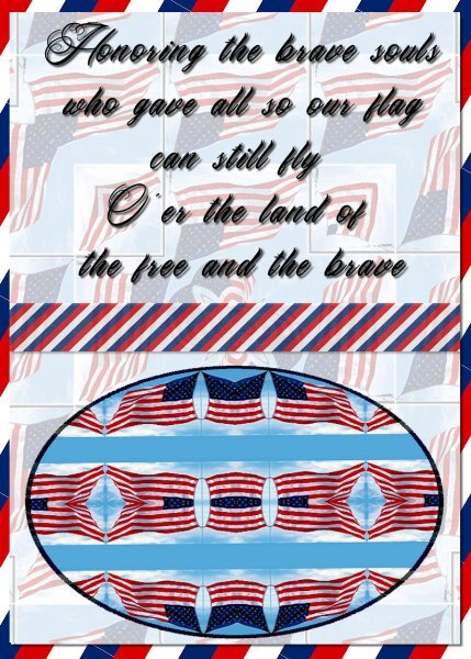
My day 4 card. The background (not the stripes) and the oval were made with a kaleidoscope image I made from an American flag. The striped stuff was made using the red white blue striped square I made a few days ago. The text is Tattoo Studio. OOPS I see I forgot to link the text and shadow when I moved the text over a little. Oh well I can always fix that. I did.
8 points
-
day 2 the font is Kayla Extrude - don't remember where I got it. I really like the custom selection ... if I saw it before, I forgot it.
8 points
-
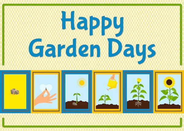
I went with a gardening theme for card 3. The font is Bubblegum sans. The sunflower sequence has been extracted from an image downloaded from Freepik. The background is as Carole showed in the video.
8 points
-
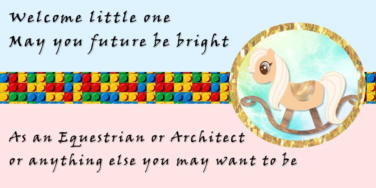
Getting in some refresher lesson's again been a long time since I really used it We have a new great grand baby coming in Aug.
8 points
-
Oh, Michele! Pinched nerve is no fun! Heal quickly. We need to see your creativity.7 points
-
7 points
-
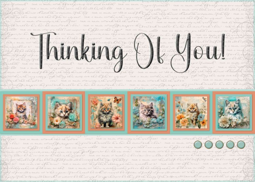
Card 3 - I used kitty images from Creative Fabrica, a script overlay from Samantha Murphy, Brad template by Josy Carson, Font is Black Letter Regular.
7 points
-
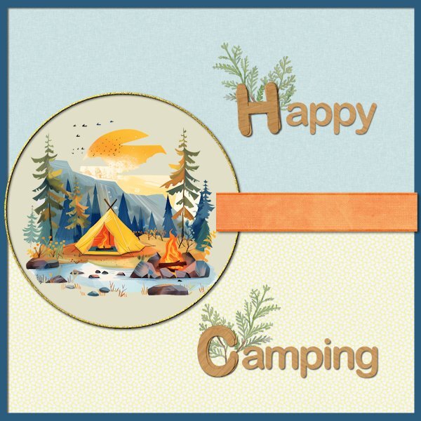
Card5-Extra This time I wanted to create a card for my family because they told me they would go camping this summer. I have no camping related photos but I found this clipart on clean png. Papers and ribbon are from Marisal-sweet moments; the papers have a slight texture but that is almost invisible in this reduced version. The letters H and C are made with cass-Stacked Alpha script and use Arial just as the rest of the text. The greenery is from my stash and all the colors are chosen from the clipart. I'm going to email this card therefore it isn't a problem that is a square card, for printing I wouldn't use it because that doesn't go well with my printer and A-4 paper.
6 points
-
So here goes with my number 2 I did something different, filling the areas on the template with promoted selections from the card, which I used inner belvel and drop shadow on. I then put a show all mask over the main layer and with the airbrish and one of the watercolour brushes I have sprayed some black in areas under the elements which reduced the visibility of the main picture making the promoted elements stand out more. I didn't feel like it needed any words
6 points
-
Fictitious invitations? Now I have to cancel my flight.6 points
-
6 points
-
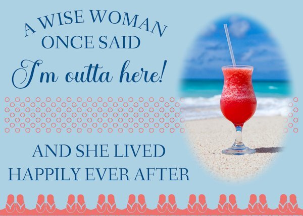
The inside of this card would read, "Happy Retirement!" The text treatment recreates a card I have waiting to be sent to a friend who retires at the end of May. The picture is a stock picture I've had for years. The sandals across the bottom and the suns in the ribbon are from Cassel's Summer Punches.
6 points
-
6 points
-
5 points
-
Cool! Even your text on a path has movement; like that of flapping wings (up, down, up down)5 points
-
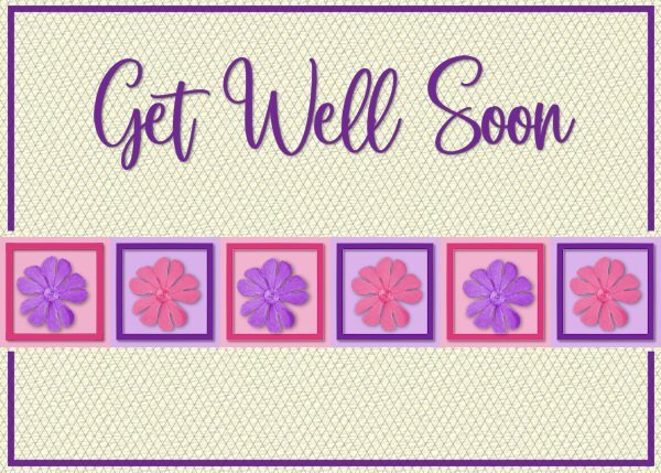
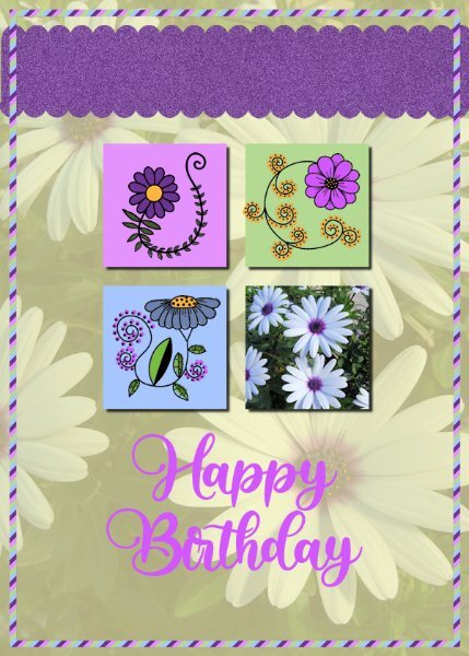
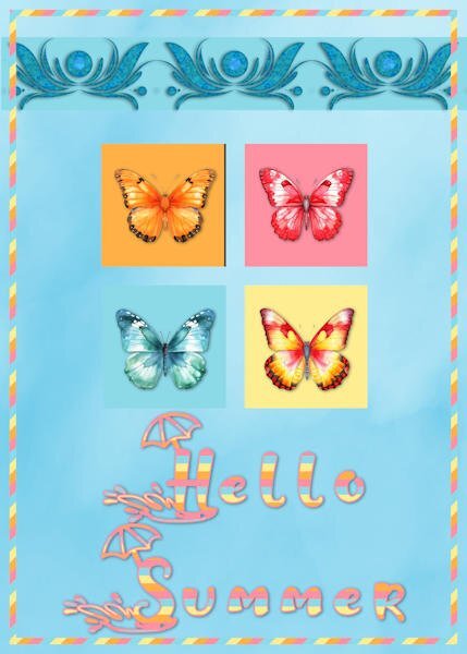
@Jeni Simpson Although I am usually picky about shadowing, in cards, it can be fine to not have any, and your card illustrates this very well. On the other hand, the shadow on the four squares creates the illusion of a window and it is very appropriate. And by the way, even though you get two templates per day, you don't HAVE to make them both if you have less time! @fiona cook Yes, it is a matter of consistency. In card making, we can create something that does not have 3D effects, just like graphics, but if we want to add some, it has to be consistently used. For the Materials palette, maybe you need to use the Classic Materials Properties, available under File > Preferences > General Program Preferences > Palette @kasany You will definitely be ready for the holidays! @Michele Go for it: use shortcuts! You deserve to rest when you can! @Wendy Sanders Those images are so cute. They are lovely with a "get well soon card"! @Minka Glasier Very colorful and cheerful despite a more serious topic. @Ann Seeber I don't know if you did it on purpose but the first thing that caught my eye was the font and the fact that it looks like a cutout, a very intricate cutout! @Donna Sillia That is a great way to use extracted elements from your own photos. @Sheila Hogg I am glad the technique works for you. Something else for your "toolbox". @Sue Thomas If there are any "real" events in your neighbourhood, you should show them your cards. They might borrow your expertise to create some real invitations! @Corrie Kinkel That is such a delicate composition! @Gerry Landreth I love that quote! That will surely be a great card to receive! @Dee347 CF is getting great publicity with all the cute images used from them! @carol Woudema What a great idea to have a card for a pet adoption event! @Sharla That is such an interesting way to use those images for gardening! @Randy Custom selection is a great tool and has so many uses! @Anne Lamp Always be careful when adding a black shadow on black text. If it is too intense, it affects the legibility of the text. If you want to add a shadow, make it lighter than you would on other paper elements for example. It is because the text has so many curves and corners. @Louyse Toupin I think that either you missed some shadows, or forgot to remove one. With or without shadows is fine, but you have to be consistent for all four. @Julie Magerka That card makes me smile. A different way to invite a valentine! I am blown away by all the different results we can see while starting with the same templates and the same tutorials. Keep it up. Maybe we'll need to open a boutique! 😉5 points
-
Day 4 For this card I used a flower bouquet clipart from my stash (I suspect it was once a freebie by CF), but instead of the hearts I used a flower and a leaves corner by Lyleya; the font is Mimosa script. I needed a more generic birthday card and this one is not with a specific recipient in mind. Like always I keep one version as a psp-image to change text or colors when needed. I will probably, at a later moment, use the extra template, but for now this should do because I'm working to make my album at the same time as well.
5 points
-
Card 4: I didn't use a punch but a heart shape that I colourised. Font: Blackbird, Loved making the hearts. No idea why I chose alpacas. Maybe because they have big lips for kissing!
5 points
-
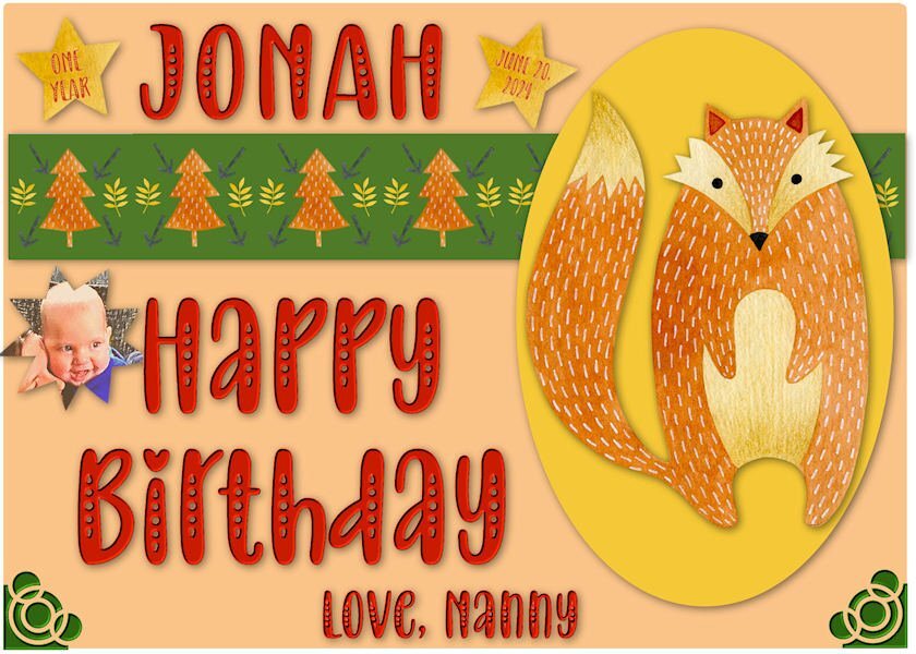
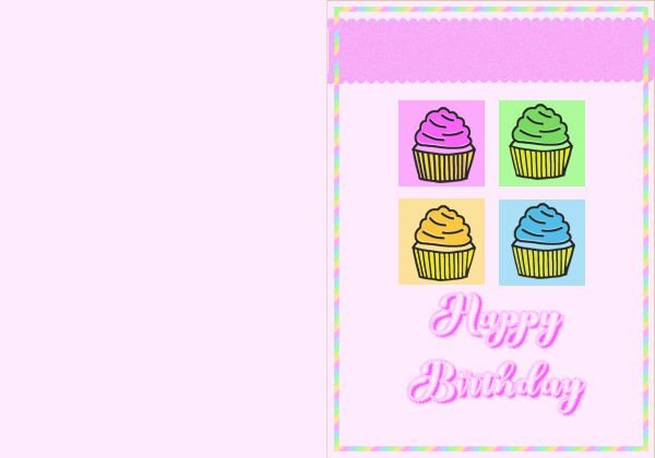
Getting ready for great-grandson, Jonah's First Birthday. He is the son of my granddaughter, Ilana, and brother to Logan. My daughter Laurey is grandma. I used a collection in my clipart from Design Bundles-Watercolor Forest Friends. The font is Baby Olivia.
5 points
-
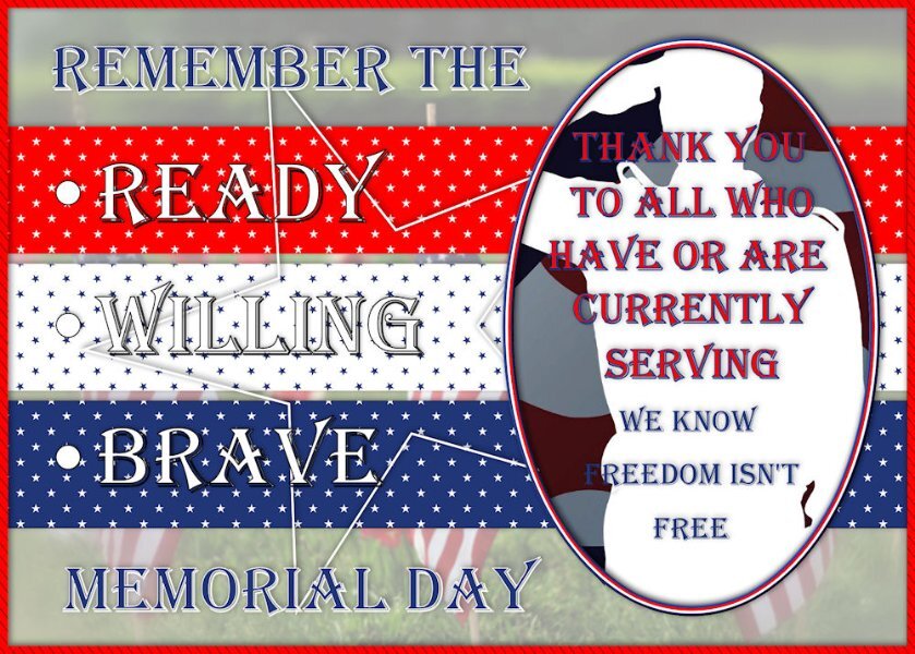
Been doing cemeteries ... so I guess I have that on the brain. Memorial Day fast approaching. I was okay with the little stars as they had color behind them. It's already super busy and colorful ... don't think it needed any corners. LOL
5 points
-
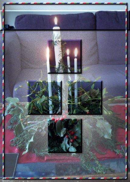
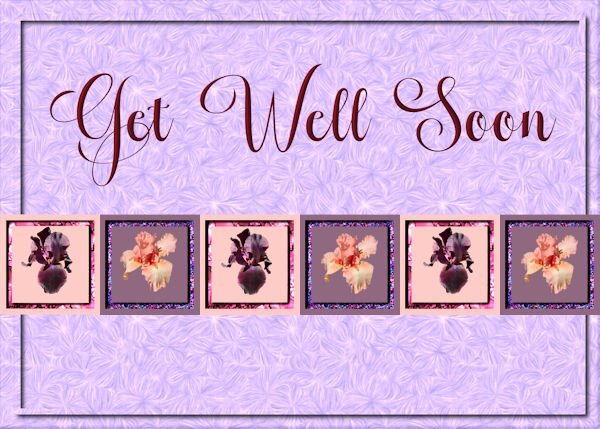
Not necessarily satisfied with this, but my arm has given out; not easy to do with a pinched nerve. 😄 I took the pic of my neighbor's flowering bush (tree?) a long time ago. I put several of Cassel's scripts to work: brad factory, ribbon factory, and bow 11.5 points
-
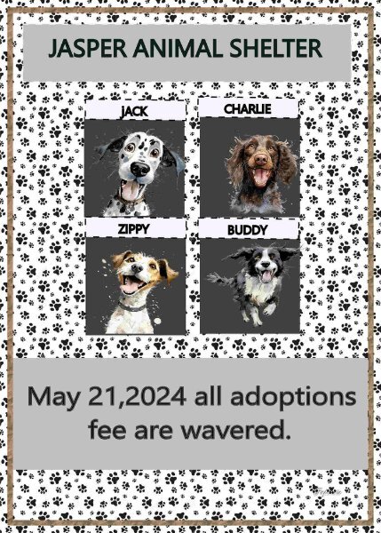
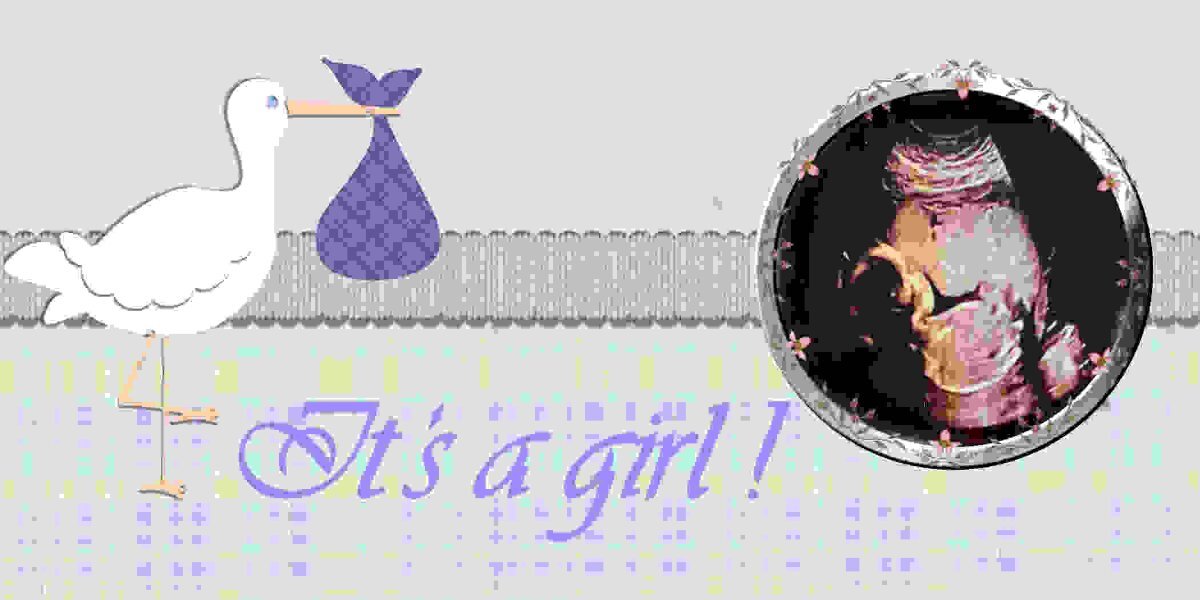
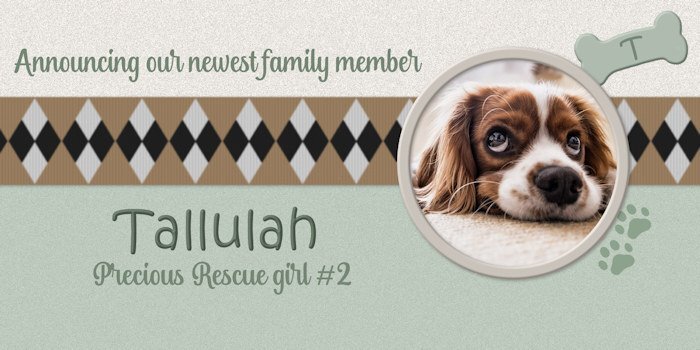
Lesson 5 - I kept it simple and took a pass on the the stork and its layers and shadows. I have done a couple of baby announcement layouts in the last couple of months. It's a fictional announcement but the type I and my friends might make about saving rescue dogs. I have three of them already, which keeps me busy (and broke 😛). Cute dog from Pixabay. Ribbon from M. Lerin at DS. Pawprints from a brush.
4 points
-
Very beautiful photos. I love to see birds from other parts of the world. The Magpies here are quite different. How luck to Cockatoos in the wild, I cant even imagine how cool that would be to see.4 points
-
Just gotta say...so many delightful and creative interpretations posted in this thread. It's hard to keep up, but it's worth finding so many great ideas! Those "newbies" are doing such a fabulous job. Congrats to all of them.4 points
-
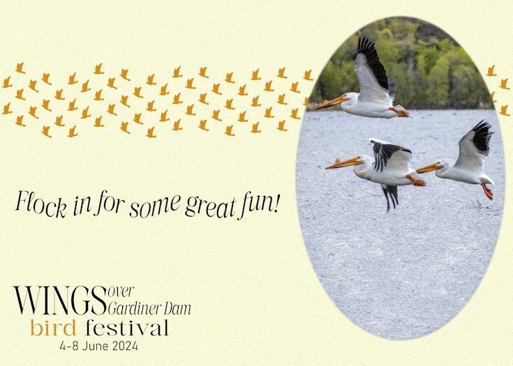
Day 4. The invitation cards are all fictitious. Although I do live a 20 minute drive from Gardiner Dam, where there is always an abundance of birds of all kind. American White Pelicans at Gardiner dam, on the South Saskatchewan river side of the dam. The other side of the dam is Lake Diefenbaker. This card shows my attemp at being witty.🙃
4 points
-
Card 3 The iris flowers are from my garden and the font is Magnolia Balmitha from a CF font bundle. The texture is from texture effects sculpture called designer effects 01 and lightened. The flower borders are glitters from my kit.
4 points
-
Card 3 : I haven't varied much with the design from Carole's tutorial but I liked the idea of the texture to the background that Sheila has used. Font: Blackbird. I am not sure when adding textures how you can change the colours from the choice in the box that opens up to any colours in your swatches. It always opens up with the wheel without a way, that I can see, of getting to your swatches in the Materials Palette.
4 points
-
L3. Card3. Fonts Christmas Tree
4 points
-
Card 3, I am slowly catching up after days with visitors. I still have the extra card to complete for Day 2, I have not decided how to do that one, yet. We have a wonderful garden planted by a woman on farmland about 8 kilometres from here. Muriel was pregnant with her son, now in his 40s, I think, and she and her husband were on a huge farm. She decided to begin planting, now her gardens are visited by people from all over the world. The font is Lemon Milk, the butterfly is a brush from Danetta. Flower photography is mine. Jeni
4 points
-
Awesome! Same template layout, yet our pages couldn't be more varied.3 points
-
The Day I learned that animals are food too! My family for years had gotten their fertilizer from a farm nearby our beach house in Maryland. They had become quite friendly over the years and around the age of seven I had my first introduction to Uncle Ben and Aunt Betty. Their grandson of about age thirteen was told to show me around the farm. He first showed me the horseshoe crabs that lived in the marsh and then we headed to the barn. They had cows and horses and a cute donkey. One of the cows called Betsy had a baby cow or what he said was a calf named Lucy beside her. We took them out into the pasture and played with little Lucy. It was close to sundown and my family called me as it was time to return home with an invite to our family to come next week for dinner. The following week we got there at dinner time and what a spread it was. I was happily munching away when their grandson asked me, "how does Lucy taste to you?"3 points
-
Ditto that for me, Michele.3 points
-
Fiona, if you hadn't said they were alpacas I wouldn't have known at all! LOL3 points
-
I don't know about alpacas, but horses will use breathing to connect, communicate and calm other horses down. I will often share breath with my girls, when they recipricate, I know that we have a trusting bond. By the way, great page!3 points
-
Card number 4. Another CF image used. I used a mask but forgot to take note of whose. I used the technique that Carol demonstrated for the band which worked so easily. However, I coloured hap hazardly and used a font called Butterfly Bold. TFL.
3 points
-
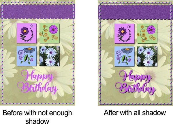
Carole suggested either add shadows totally or not at all so I have added them now so we can see the improvement with finishing all the elements with shadow. Thank you Carole for your eye.
3 points
-
Ouch. A pinched nerve can be so painful, The flowers are from a pink dogwood tree. I have a bazillion pictures of them that I take every year. LOL2 points


Resized.thumb.jpg.d25811db03a63358cedab1e79f527635.jpg)