Leaderboard
Popular Content
Showing content with the highest reputation on 04/22/2024 in all areas
-
6 points
-
5 points
-
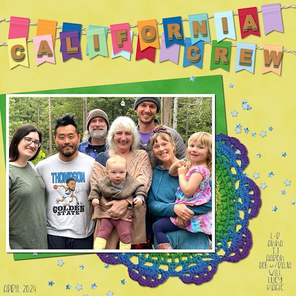
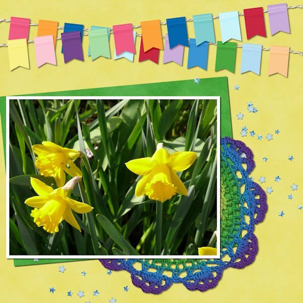
Here's my first part of Lesson One: a new photo from my California family. Great-grandson Raja is now 8 mos! Deb is my oldest daughter, Aaron is her beau, Anna and Will are her children, TJ is married to Anna and Lucy is married to Will. Raja and Magic are Will & Lucy's children. The lettering on the banners is cass-alpha-graduated-dimension. The font used is Children Funny.5 points
-
5 points
-
4 points
-
4 points
-
4 points
-
4 points
-
4 points
-
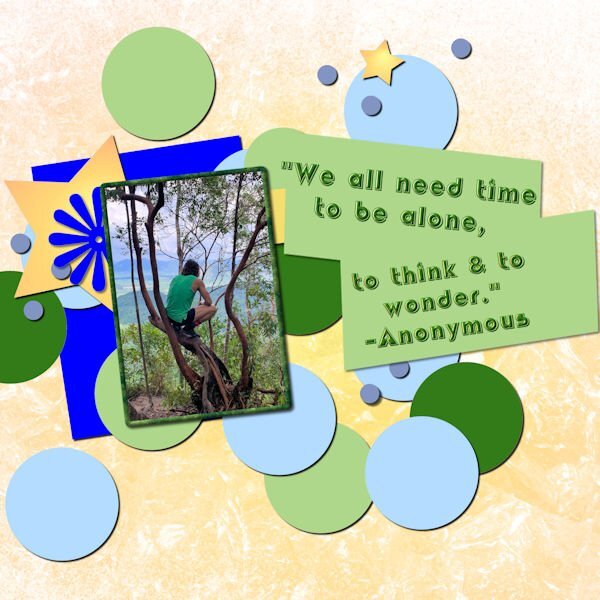
I used a Marisa Lerin Quickpage downloaded as a PSD so that I could change the colors to match my picture. The photo was sent to me by my grandson when he was in Thailand. The background is one that I used in my kit which was white. I used a gradient overlay and blend mode to change the color. The quote is from a good friend who asked me to help edit his book. We used this picture and quote in John's book.3 points
-
3 points
-
3 points
-
2 points
-
2 points
-
2 points
-
2 points
-
2 points
-
That's where I have heard that before 'A fistful of daggers' I refer to their talons as daggers. PBS is a great channel for anything nature, and British programs. BBC Earth has been streaming free for quite a while. Which has enabled me to catch up on the latest of many programs. Such as Professor Brian Cox, Steve Bashnell and many more. I watched Planet Earth 3 when I was home 2yrs ago, it's streaming out here now, so I get to watch it again.2 points
-
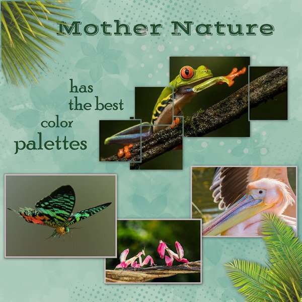
After the chat on here about the Block Photo (Sue Thomas) and a beautiful example of it, I watched the tutorial and came up with this layout. I had the red-eyed tree frog photo (from Steve Biro) as the inspiration. I looked up others online to get some other colourful critters. Nature is astonishing, whether in her delicacy, her brutality (those hawks!), or her rainbow of colours in the flora and fauna. The most flamboyant of those creatures live in tropical climes, and I have an awe for their dazzling displays, especially since our birds, insects, etc. tend to more subdued hues. The other critters in this layout are Madagascan Sunset Moth, Orchid Mantis, and Rosy Pelican.2 points
-
1 point
-
1 point
-
1 point
-
1 point
-
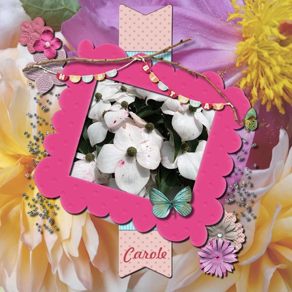
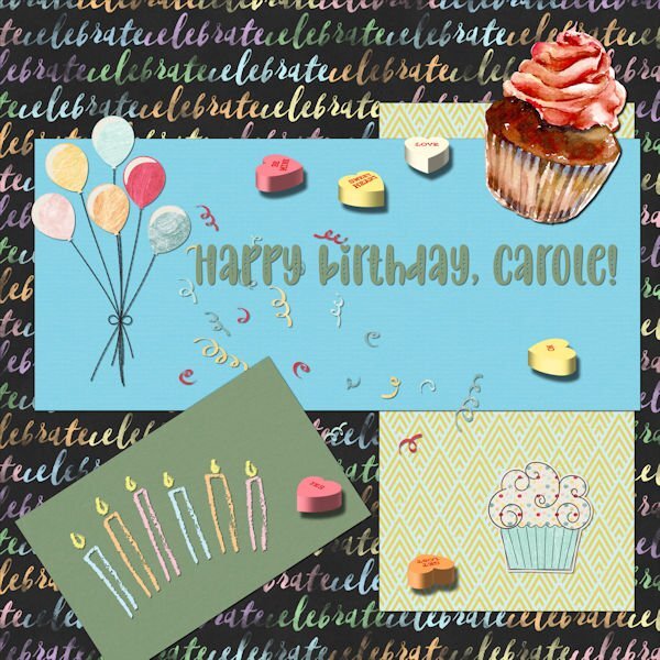
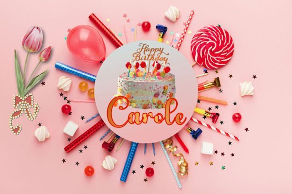
Happy Birthday dear Carole and thank you for the beautiful work and the beautiful creations you offer us so kindly.💖❤️❤️❤️1 point
-
hahaha, if only I was a Time Lord, where is "the Doctor" (Who) when I need him/her. I still have one lesson to go then my MEGA-mini Kit (the Mini Kit with 20+ add-ons 😁)will be completed.1 point
-
Thanks, Suz! The background paper is again from the SI-Stargazer kit that I also used for my eclipse layout. The "wreath" was a freebie from Cassel and the Earth Day Birthday design is from Beth Scannel. I used this design twice as April 22 is also my grandson, Will's birthday, too!1 point
-
Hi, Gwen, I’ve been super busy with daffodils which takes me out of the campus for 6-weeks, Mid- March thru April. I just now saw this. Sounds like you’ e got them going! on the woods and bridge photo you posted, that is EXACTLY what I meant. So you put that on a background of maybe off- white and change the transparency so you can see the pic, but it isn’t wholly in-your-face visible. Bottom Layer off white or white, next layer above it, your photo at 20% transparency. Or less or more… 🙂. I HATE directions like that, but it’s the truth. Now run out to your garage wall or a parking garage wall or a cement wall or even a cement driveway if you can take a pic straight down with your toes not showing, or somewhere-anywhere, and take a pic. Now put that on TOP of your photo at say, 2% transparency. This sort of pebbles your photo so it isn’t quite so crisp. You can stop anywhere along the process, but the final thing is to play with the blending mode sliders. Try “multiply” with your cement wall. Now you should have to squint to even tell it”s a bridge in the woods and the photos you’d scrap on top will take center stage. Suzy1 point
-
Wow! Ann! I cant even begin to know how you did this. But i want the script that makes the beads. These are gorgeous. The background is really cool too.1 point
-
1 point
-
Oh this is cool Ann, I'm going to look for the show. Love the font.1 point
-
It is easy, and I'm so glad you brought it to my attention!1 point
-
You wanna be a magpie too? Absolutely. That's where my layout inspirations come from. And I'm flattered that YOU asked!1 point
-
I'm inspired by your layout. Do you mind if I copy the ideas? Unique way of using the block photo tutorial to create a layout. I also like the way you use the palm leaves in the top right and bottom left corners. Really outstanding.1 point
-
Wow! You created another delicate page, typical of your style. see, I told you the photo block is easy! Giving a unique effect.1 point
-
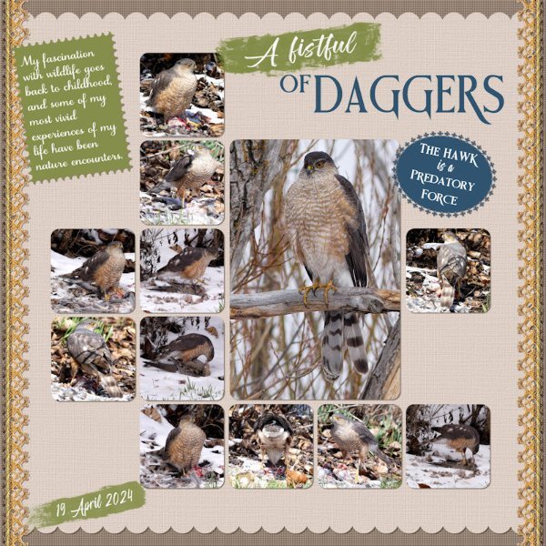
Wow, very nice, Sue. I do see Cooper's Hawks here by the condo and see the occasional pile of feathers, probably a mourning dove's remains. Everyone has to eat. I've been enjoying a series on the Public Broadcasting Station [PBS] coincidentally called "A Fistful of Daggers" which is all about raptors. Fascinating! I looked the show up on Google Images and put this on my desktop for now.1 point
-
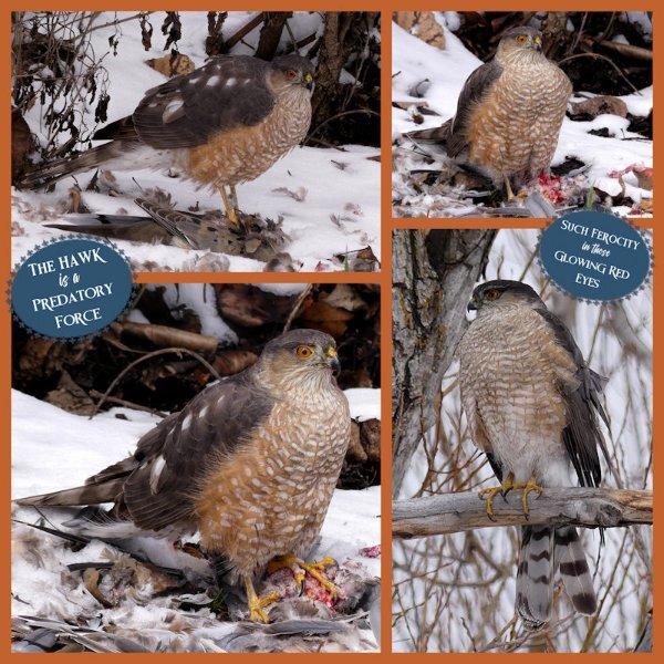
I had decied to make my Xmas cake today. Got out all the ingredients, the butter was out softening, as it had been in the fridge, lined the cake tin. Everything was ready. I went outside to fill the bird baths, and feeders when I heard the Robins suddenly sounding off the alarm. My Sharp-shinned Hawk swooped down and flew off with a mourning dove. One of a pair I have here, now only one. After a short while I heard another hawk, and loe and behold there he was up in the tree, looking down on what I believe to be the female tucking into a hearty meal. They certainly do have a fistful of daggers, and what a predatory force the Hawk is. After over two hours, with a break from eating about half way through the meal, she flew off, leaving nothing behind, other than the feathers. Here are some of the pics I took. I got very cold and wet, but it was worth it. It’s always a privilege to be able to witness a private, moment like that which happens all the time but we rarely witness much less get photos of! Some may not like these pages, and find them distasteful and cruel. I have a comment for that. By saying nature is cruel is damaging, it isn't cruel, it's indifferent, brutal and effective, but it is equally beautiful and a marvel of natural wonder. Eventually I did get my Xmas cake baked, fed with brandy, and put away in a cool, dark place. Sharp-shinned Hawks. The template I used is from lab 10-2. It's one of my favourites, which gets used often. I can remember once, that Cristina, said she liked that template too. Carole's lace , where I used a gradient and then a blend mode. a fancy font on the tag, and brush strokes to highlight some text. Scallops and postage stamp edging on the note with text. The other page is a layout demonstrated in the scrap with grids masterclass.1 point
-
1 point
-
1 point
-
I got so excited at the arrival of the Hawk, I misidentified her. I have been taking photos of the sharp-tailed grouse, which confused me. She is actually a Sharp-shinned Hawk.1 point
-
1 point
-
I want to be you! So awesome, and so lucky. I am enjoying the rabbits near work, and I'm a bit miffed someone bought the empty lot and now there is a container on it and stakes in the ground(possible building soon). Don't they know that's the rabbit(hare?) plot of land? yeesh, Humans, what can you do with them, eh? Thank you for thinking of me, very much appreciated!1 point
-
That is so true. My eyes are alway peeled for ideas, whether I see something on the telly, in the campus or out and about which catches my eye, I will try to replicate it, incorporating it into a page. I will look out for your post, which will also include your exqusite distinctive style. Scripts are awesome, and time saving, but there is something most satisfying and rewarding when you create something yourself. For me that's the beauty of the tutorials in the creative scrap/lab, and of course the masterclasses. It's a pleasure to sometimes be a sourse of inspiration and helpful when I can.1 point
-
I've been able to make a little extra time lately so I can stop reusing my old pics for the themes my game is repeating. My last two projects show a stark difference in styles that were dependent on the themes. Easter Cuteness: The frame with the rabbit is a freebie by Ditz Bitz that was shared in the FB group FTU PSP Stuff. I added some Easter grass behind it that I think was a freebie from Corel. I found the font, Thanks Bunny, a few years ago on Creative Fabrica. It comes with the cutest glyphs. Bohemian Inspiration: CF has a bundle of Bohemian Girls that I fell in love with. I combined it with one of CF's Spring Grunge Floral Background Papers and various borders/frames from Pixel Scrapper. The font is Baby Boho from CF. I use a lot of products from CF and PS. They offer free products daily and I have subscriptions to both at very reasonable prices.1 point
-
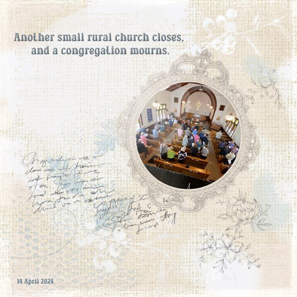
I have been playing with layouts for the last week or so. The going has been rather slow, but since there is no rush, I continue to tinker and adjust until it's time to let them go! The eclipse layout uses photos from a photographer who was mentioned on the radio as having spectacular pictures online. So I checked, grabbed a few and tried the Grid layout, which was not a great success. Each time I've tried it, the pix just don't snap to grid readily. So I leave it, out of frustration. The photog is Steve Biro. The actual blacking out of the sun in its totality was amazing, of course, but we then had a new "light" shining on us suddenly which threw us right off! It turns out it was one of the planets that was illuminated. Wish I had a photo of that! The other layout is based on a United Church decommissioning that took place on Sunday last (14th). Another small rural church has closed (near my home town). I attended to show my respects, took some pix, and observed the loss the folks there were experiencing. It was very sad. The Catholic church, not far away and the one I attended as a child, is experiencing a spurt of new attendance and the danger of closure has passed, yet again.1 point
-
1 point
-
I was short on time and creativity last night when I decided to use the Painted Background script and it saved the day. It uses the colors from the photo of your choice and gives you brush options to choose from. I've used it before and I love it. So the next time you need a unique paper, try this script.1 point
-
This sounds wonderful. I like that size, there is nothing like the feel of a physical book in your hand. I cant wait for it to be published.1 point
-
So far so good. I am dedicating Wednesday mornings to work on this book. Depending on how late I sleep in, or what else might be on my schedule, I still manage to get a few hours each week. My process is to go through all the content that is gathered from various blog posts, tutorials, and classes, and make them all in the same style. Blog posts and classes have different formats (with intro, links, etc.) so I am making those a bit more streamlined, removing some extras, shortening sentences, etc. Today, I was working on chapter 5, which had a lot of screenshots for tools and dialog windows for various PSP versions. I plan to limit the screenshots to 2023 (or whatever will be the current version when it is published if there are significant changes). I reason that although there are some differences, if someone uses PSPX8, and the screenshot is from PSP2023, it should still be easy enough to follow. I can therefore remove a lot of "unnecessary" screenshots to save space! For those who have purchased the Tips and Tricks book, that was in a 6x9 format. I feel that would be a bit small for a scrapbooking book that would include lots of images so I plan on a full-size 8.5x11 format. I don't know if it is new (on Amazon) or if I had not noticed it before, but I think it would give a better result for the reader. And I will be able to have it IN COLORS! (that was not available at a reasonable price when the Tips and Tricks book was published).1 point
-
1 point










Resized.thumb.jpg.d25811db03a63358cedab1e79f527635.jpg)


