Leaderboard


Popular Content
Showing content with the highest reputation on 03/27/2024 in all areas
-
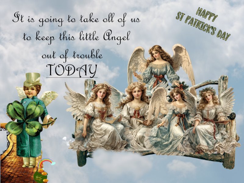
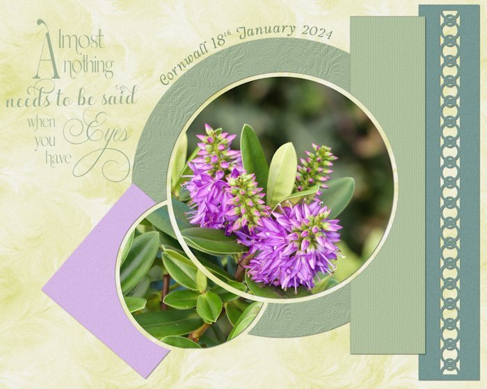
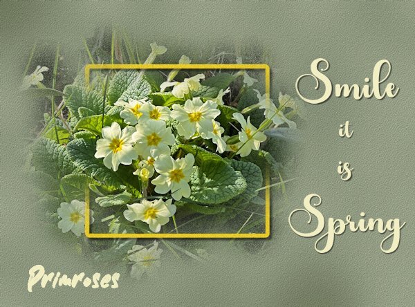
I won the Photo ZigZag script last Sunday and I have been playing with it. The colors that you get depends on the photo that is used. The more colorful photos give a very colorful zigzag and I feel that that is too much to my taste. This photo however had more muted colors and I even reduced the opacity of the zigzag layer. I could have made only a small strip like a ribbon and that is something I certainly will try. For now I just wanted to show my "win" and the font is aptly named Baby Magnolia.
 10 points
 -
I was going for the look of a poster/ad and took inspiration for this from several different pics I saw on Google. The silhouette is from Pngtree and I made use of some gold foil images I had in my stash. The font is NinjaLine, free from DaFont. I wasn't completely satisfied with the background (an old gradient I made), but as usual, I ran out of time.7 points
-
Cooper on title, Hollywood Starfire on body. I'm a big fan of these simplistic, minimal layouts and I don't mind uniformity in albums, so I often use the same 3 or four layouts for one album. Mostly grids 😉 edit: I was a whole decade off and had to change this...5 points
-
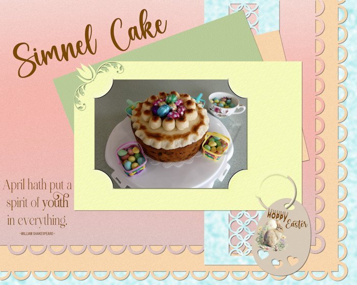
I made the Simnel cake a month back, for Mother's Day on the 10th March. The date differs every year, as do Easter. Traditionally they are not as rich as Xmas fruit cakes. It has a layer of home made almond paste through the centre of the cake and on top. Not being relgious my mother and I carried the tradition on by having the cake for Mothering Sunday. As it does have significance for that day. The eleven balls is suposed to represent the 11 apostles. I decorated it purely for an Easter photo, them removed the eggs. Finally downloaded the psp template, to correctly participate in this challenge. The colours I took from the photo. Pinned element, scallops, ring is my own, the tag is one I made back in 2021. Carole's corner and page punches.
4 points
-
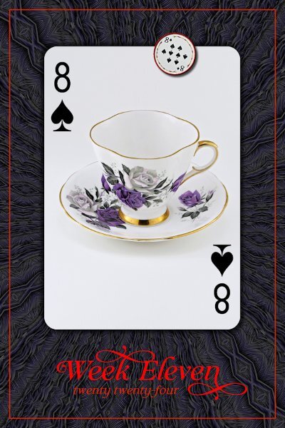
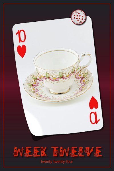
P52 Week 11 The font is Claire Murphy (Creative Fabrica). the background is a PSP pattern (feathers) at I think size 200, 120 deg. angle then I used the kaleidoscope effect. Not shown in this lower resolution; the color in the pattern has purple in it like in the T-cup.
4 points
-
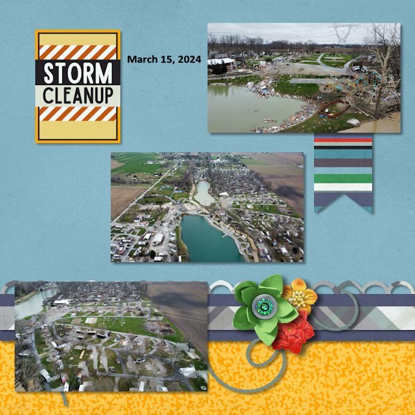
Not a whole lot of snow this winter for me. We did have extremely cold temperatures in January and the only snow that my neighbor had to plow my driveway happened January 19th. He got it cleaned off before my cousin and I returned home from Columbus after my surgery. Now we are in the rain and thunderstorms season. Had a storm this afternoon although it rained with the sun shining... and a rainbow happened. I did get photos of it and there is a very faint double rainbow. On March 14th, we had a terrible storm aka a tornado warning. I spent over an hour in the basement. Luckily the power didn't go out so I could still watch a news station that was carrying only storm coverage with reporters live in the viewing area. At one point it hailed and Peyton was barking at it since it was so loud. There was an EF-3 tornado formed and touched down just 3.5 miles from the city limits and hit a RV trailer camping area. Lots of damage but no serious injuries. The tornado ended up going over 31 miles and into the next county. In that county it touched down and destroyed many homes (most were mobile homes) in the Indian Lake area. 2 towns are on the south side of the lake and both had damage. There were many injuries and 3 deaths. It was still an EF-3 at this time. I pulled drone images from Facebook and did 2 layouts about it.
4 points
-
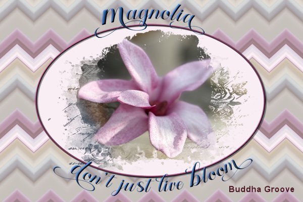
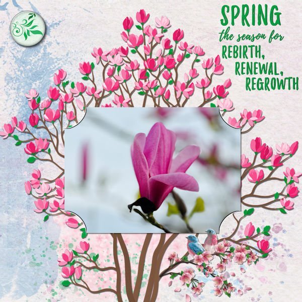
At the start of this freebie challenge I had the jpeg file and I only noticed much later that I should have downloaded the psp file! So here is a new layout with the psp file and that made it all so much easier, plain sailing like Sue said! I decided to have a bit of fun and made something not from scratch but I used papers and elements from my stash. I used a kit from the March 2021 Blogtrain called Spring Magnolia, which I found rather fitting because my photo is of a magnolia bud.
4 points
-
I have been working on this Easter page today and thought I would post it before I forgot to share it. All of the layers are from things I have saved over the years.
3 points
-
Don't mention programs that won't cooperate! It is so annoying......... but we learn to live with it and "pray" to the fontboss that they will work the next time we need them. Your layout hasn't suffered and it is lovely to see the daisies on the cup replicated in the font.2 points
-
I bumped into this layout that I created last year when we were studying in a Text Workshop. I'd like to do that class again, as a refresher.
2 points
-
P52 Week 12 I used a gradient background, meant to texture it but forgot. Cass-lifted photo script used as well. Font is DaisyRegular. My font viewer's little circuitry imploded on this font. I have another one called Daisy, but my font viewer calls "it" Daisy Regular (with a space between the words - but the font is actually only called Daisy) and no amount of manipulation or pleading to the font Gods would allow the viewer to see both of them. So weird. so I had to install this one in Windows. Programs are great....when they do what you "think" they are going to do. 😁
2 points
-
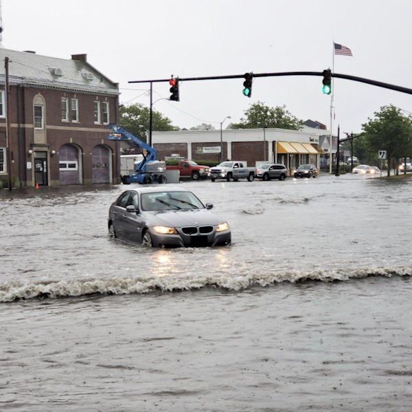
We've had flood watches and high wind alerts. The cat cabin on my porch ended up out in the street. Luckily, no cats were involved. My little condo enclave here has been relatively lucky with the underground wiring keeping the power on and we're not near enough water to be impacted by the flooding shown in this photo from the newspaper. The watchword is "Turn around - Don't drown!" Some idiots insist on trying to drive through high water with deadly results.
2 points
-
I didn't have anything specific in mind this evening to create. I randomly chose a photo from my trip home, created a layout/template, wordart, background paper, and used one of Carole's punches. Using vector shapes particularly for the circles not only gives nice clean lines, I'm able to do text on a path. Retaining the vectors, once I have duplicated and converted to rasters to colourize, texture etc.
2 points
-
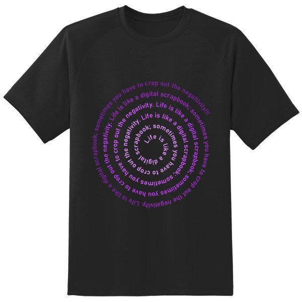
We all work with a graphic program and can create very interesting projects. How about creating a wordart from a fun quote related to PSP or scrapbooking? Who knows? Maybe we can turn them into frames, mugs, t-shirts, etc. The quote to use now is: "Life is like a digital scrapbook; sometimes you have to crop out the negativity." I will look for places where we can use those wordarts for merchandise!1 point
-
So far I could only come up with the quote in different colors on a spiral. I put it on a T-shirt just to see if it would work. It is not very original, but I have more pressing things on my mind at the moment. As no one else has posted something here yet I want to give it a start, maybe somebody else will follow. Depending on the outcome of eye tests tomorrow in hospital I'll try to come up with something else. Hopefully my eye only needs a laser treatment which will be the best option, otherwise there is something seriously wrong and my trip to my daughter is in 3 weeks...... Keep your fingers crossed for me!
1 point
-
Exactly my thoughts, this is becoming uncanny!1 point
-
Be on my way.........😉1 point
-
Thank you Corrie. It's all about compromise isnt it. ....and lots of praying!1 point
-
You chose the perfect main background element, as it would pass for the Spring Magnolia flower in the photo.1 point
-
The cake looks delicious and I would love a slice for Easter 😋. I love the colors on this layout, very subtle but unmistakably Easter!1 point
-
We had a tiny bit of snow. Blooming Camelia and Magnolia in the garden. Lilys of the valley and tulips in lots of gardens. Most narcissus are gone. The frogs already making love for 3 weeks. What a noise, mostly in the night.1 point
-
Love the layering in this one and the textures and shapes.1 point
-
Such pretty birds. We don't get them here in SW Ontario. Love the colours and the techniques.1 point
-
Thanks for sharing. It just might have been the artist's inspiration.1 point
-
Hi Michele, this reminds me of the famous photo of Man Ray. Well done, only now a man is lending his back as a cello 😉 https://image.kurier.at/images/cfs_932w/6918777/46-186805116.jpg1 point
-
Chamber Orchestra of New York was a very boring theme until I found this amazing oil painting by artist Daria Sadkova. I removed the black background and used it on several layers with varying opacities and adjustments. Cass's Word Frame script gave it just the right touch without drawing attention away from the subject. The font is Cellos Script free from DaFont.1 point
-
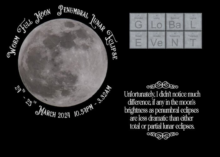
I must admit I was disappointed, as I was hoping for a more defined eclipse. I stayed up until 1.15am As the eclipse started at 10.53pm, maximum was 1.12am, ending at 3.32am this morning. The duration of the eclipse was 4hrs 39 mins. It was an ideal opportuntiy to use the Periodical script which I won. The next ecplise will be a total eclipse on the 8th April, beginning at 11.53am.
1 point
-
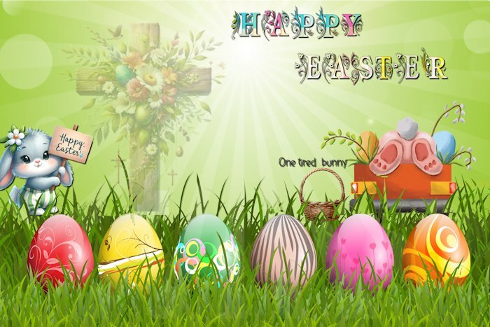
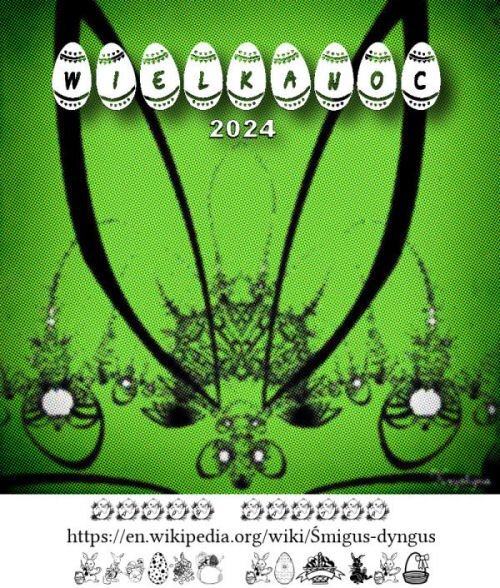
EASTER time so...some EASTER fonts, my old EASTER fractal card, added halftone in PSP.
1 point
-
I made several iterations of this silly theme. I liked the idea of the bright rainbow hairstyles and wanted to keep the rest of the l/o simple. I tried adding a rainbow border to each of them and adding shadows, but I wasn't happy with that. I finally decided to do a frame over all of them and used a cutout effect under each "hole." The biggest issue I had (I really annoy myself sometimes) was picking the gradient for the frame. I lost count of how many different gradients and blend modes I tried. I left them overnight and when I opened them today, I was instantly attracted to this one. Sometimes putting the project away and looking at it later helps if you have the time. The font is Will&Grace free from DaFont. Speaking of having a personal style, I think the purpose of the page plays a big part in it. What I did here is very different than say a birthday card I would make.1 point
-
A combination of another photo from the Heemtuin with the split frame technique that Carole demonstrated in the Q&A from las Sunday. This is my first try of it and although it isn't perfect yet I wanted to show what I'm doing. I will practice a bit more, it is a bit different from the masks I normally do, at least I had fun making this.
1 point
-
Hi all, I can't remember my toys before I was 6, but after that - it was post-war - we children mostly played outdoors or with household objects. There was no money in our large family for toys and children's books. The grandparents usually only gave us useful things, like clothes. We played almost exclusively with small toys, marbles, cards and balls, which we bought at fairs for little money. I then did a lot of drawing with my school supplies (my dream career at the time was "fashion illustrator"😁) or cutting out jewelry from catalogs. I loved reading and always devoured my new school books at the beginning of a new school year. It was only in a children's treatment that I learned beautiful fairy tale books I know, see Scrap. Things were getting better for us in the mid-1960s, then Legos, a melodica and knitting toys and the TV came along. I never had dolls, more like living "baby dolls". From the age of 6 I had to work as a co-teacher act... Today my husband and I fondly remember our childhood toys and adventures in nature. I think by playing in nature we have trained our imagination much more and been able to live out our urge to move.1 point
-
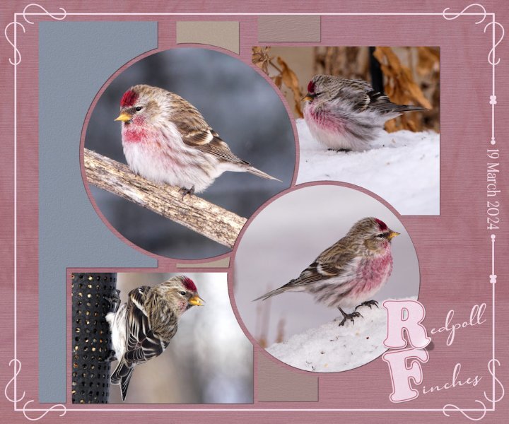
Today a flock of around 30 Redpolls stopped off en route north for a feed. The snow is slowly going. It would appear I sparked some interest in the technique I used the other day and again in this layout. I've given some tips, but should anyone need more instruction, let me know. I created a word frame with a twist, outlined text on the letters R and F, lifted the one comrer. I forgot to mention that I created the letterboard, in the previous layout, matching the colour of the wood frame with the ground squirrels.
1 point
-
Yesterday was a beautiful day, sun shining as it almost always does. Generating more and more heat every day, brought out the first of the ground squirrels. Temperature raised to +13c. Of course I had to take photos of them, also fed them with carrots and nuts. Which they filled their cheeks with to take back to their burrows. The three that emerged were half grown, undoubtedly born later in the season last year. There was a bitter cold wind today, which meant they weren't going to venture out. At least yesterday they had a chance to replenish their larders. Continuing with the topic of photography, when I take photos there are several thoughts on my mind, such as visualizing how the shot will look. Lighting, distracting objects, angle and so on. Hoping to take a shot that will appeal to a wide audience, evoke emotion and compel myself and any viewer to keeping looking. In my opinion, that is the essence of a good photo. The same applies to my layouts. When you create layouts, what thoughts run through your mind?
1 point
-
Over the hump: page four of my seven stocks project. On peanut butter. Any fans here? Supplies myself, fonts again Pacifico on title and Lato on body. By now I think I need an extra double page spread before the initial page one on canned tuna and move the first part of the text on page one to that preceding page...( questions...) project.1 point
-
Oscar Mayer Wienermobile came to Manassas!1 point
-
here is my very simple layout with the template, gradient and title1 point
-
I made this for the challenge on PSP Maniacs'
1 point
-
I posted the challenge in the bootcamp, not realising they are two different entities. Here, now, posted in the correct place, I hope. Jeni
1 point
-
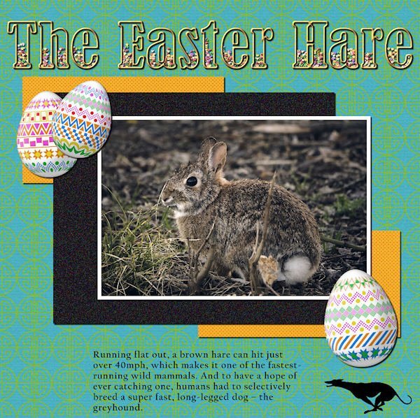
I decided to do a follow up page to the one I did for the mating hares. Once again I have used Carole's punches, simillar colours too. Now that the snow, and snow banks are slowly disappearing as the sun warms up, it's lovely to see one of my resident hares out feeding during daylight hours. Rather than use borders I used the selection tool, select selection borders, delete Instead of round I went with oval for thw photos. Although I use square layouts, I much prefer to use rectangles. We now live in a digital world, a far cry from when I was a child, when we didn't even have calculators. It doesn't matter whether you area a pro, amateur, use a pro camera or a phone. For me photography is far more than pressing a button, but in the ability to weave a narrative through pixels. Immortalizing the fleeting beauty of a moment no matter what it may be. Using the powerful impact of PSP to tell the photos story, by showcaseing them.
1 point
-
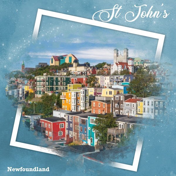
I'm in need of real colours around me these days. Saw this image online and it touched me b/c I love those primary, primitive colours in art or photos. Not much of that around here for a while. I used the spill (or split) frame technique (again). Background paper with sparkles added, and simple text. Glad to get a layout done! I have been to Newfoundland and it is absolutely breathtaking to see. We did the trip on motorcycles many years ago.
1 point
-
On the PSP maniacs there was a some talk about using the Layer Styles and I started playing with this. First I duplicated the flowers only made a couple more layers of that and added some of the the layer styles on the a couple of them. I thought it turned out pretty so here it is.
1 point
-
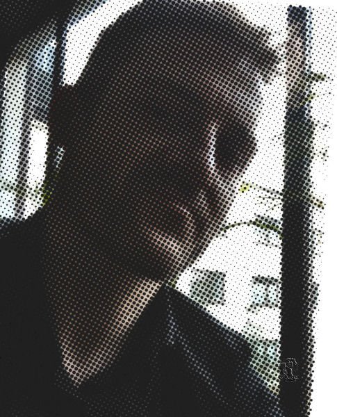
My recent wosk and enormous pleasure, believe me. Selfie taken by Jacek. Super fun in/with PSP9, which can more than I/WE think.
1 point


.jpg.94ee827e12448708b74a4c6a855bb238.jpg)
Resized.thumb.jpg.d25811db03a63358cedab1e79f527635.jpg)