Leaderboard


Popular Content
Showing content with the highest reputation on 03/26/2024 in all areas
-
Chamber Orchestra of New York was a very boring theme until I found this amazing oil painting by artist Daria Sadkova. I removed the black background and used it on several layers with varying opacities and adjustments. Cass's Word Frame script gave it just the right touch without drawing attention away from the subject. The font is Cellos Script free from DaFont.8 points
-
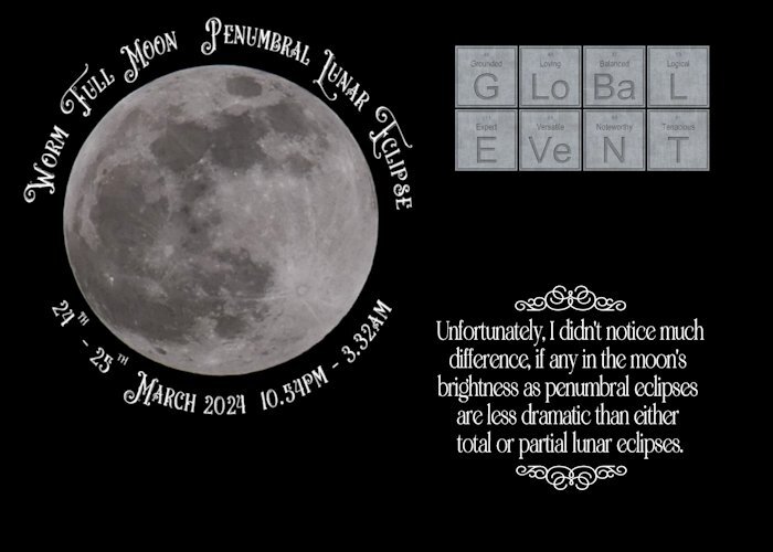
I must admit I was disappointed, as I was hoping for a more defined eclipse. I stayed up until 1.15am As the eclipse started at 10.53pm, maximum was 1.12am, ending at 3.32am this morning. The duration of the eclipse was 4hrs 39 mins. It was an ideal opportuntiy to use the Periodical script which I won. The next ecplise will be a total eclipse on the 8th April, beginning at 11.53am.
 7 points
 -
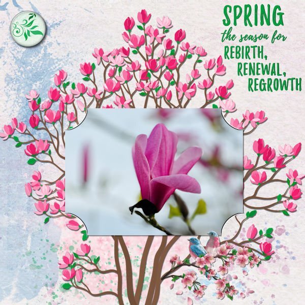
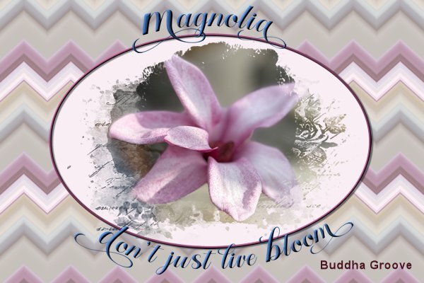
At the start of this freebie challenge I had the jpeg file and I only noticed much later that I should have downloaded the psp file! So here is a new layout with the psp file and that made it all so much easier, plain sailing like Sue said! I decided to have a bit of fun and made something not from scratch but I used papers and elements from my stash. I used a kit from the March 2021 Blogtrain called Spring Magnolia, which I found rather fitting because my photo is of a magnolia bud.
4 points
-
And weather permitting, it should be more spectacular!4 points
-
Here is my final project, hope you like it. Disappointingly tried to download some scrap book papers but they just came up as an image of the kit.
4 points
-
EASTER time so...some EASTER fonts, my old EASTER fractal card, added halftone in PSP.
4 points
-
The font is Troemys. I had a little play with the script, it certainly does have potential, along with several options to choose from.3 points
-
Great shot and I like the choice of font around the moon. I think I might need to get that periodic script. I looks really cool.3 points
-
Day 4 (I am a bit behind as I was away at the weekend) I selected some photos from a trip last spring to gardens near us, and the papers were a variety from cpjess. I have varied the shadow a little, and changed some font colour but I only have so much patience and time!!
3 points
-
I didn't have anything specific in mind this evening to create. I randomly chose a photo from my trip home, created a layout/template, wordart, background paper, and used one of Carole's punches. Using vector shapes particularly for the circles not only gives nice clean lines, I'm able to do text on a path. Retaining the vectors, once I have duplicated and converted to rasters to colourize, texture etc.
3 points
-
Hi Michele, this reminds me of the famous photo of Man Ray. Well done, only now a man is lending his back as a cello 😉 https://image.kurier.at/images/cfs_932w/6918777/46-186805116.jpg2 points
-
Most definately!2 points
-
I could eat this for the rest of my life!2 points
-
I won the Photo ZigZag script last Sunday and I have been playing with it. The colors that you get depends on the photo that is used. The more colorful photos give a very colorful zigzag and I feel that that is too much to my taste. This photo however had more muted colors and I even reduced the opacity of the zigzag layer. I could have made only a small strip like a ribbon and that is something I certainly will try. For now I just wanted to show my "win" and the font is aptly named Baby Magnolia.
1 point
-
Love the layering in this one and the textures and shapes.1 point
-
The winners of the random draw have been contacted. Make sure you check your inbox and reply to me!!! The list of winners will be announced in the newsletter, later tonight.1 point
-
I don't think naming a font is any different from any other artist naming their work. Creating power in the name and an innate ability to draw meaning for it. The font I chose besides having a dramatic name, also has a dramatic style to it, which I considered to be appropriate for the event which was taking place, meaning the eclipse. I also think that many font names are chosen to advertize the font, which have many extras. Displaying them for marketing purposes. Being artists I think the former is more the case, when it comes to naming fonts.1 point
-
You might like Carole's book too, also with helpful suggestions and shortcuts 🙂1 point
-
Day 11 Project 5 Finally got this done. Computer or user error. The latter most likely the problem. File just would not open so therefore could not change file to a Jpeg.
1 point
-
I've changed the shadows 😎
1 point
-
Same here, Michele! ... I think this applies to all of us here. 🙂1 point
-
I made several iterations of this silly theme. I liked the idea of the bright rainbow hairstyles and wanted to keep the rest of the l/o simple. I tried adding a rainbow border to each of them and adding shadows, but I wasn't happy with that. I finally decided to do a frame over all of them and used a cutout effect under each "hole." The biggest issue I had (I really annoy myself sometimes) was picking the gradient for the frame. I lost count of how many different gradients and blend modes I tried. I left them overnight and when I opened them today, I was instantly attracted to this one. Sometimes putting the project away and looking at it later helps if you have the time. The font is Will&Grace free from DaFont. Speaking of having a personal style, I think the purpose of the page plays a big part in it. What I did here is very different than say a birthday card I would make.1 point
-
A combination of another photo from the Heemtuin with the split frame technique that Carole demonstrated in the Q&A from las Sunday. This is my first try of it and although it isn't perfect yet I wanted to show what I'm doing. I will practice a bit more, it is a bit different from the masks I normally do, at least I had fun making this.
1 point
-
Hi all, I can't remember my toys before I was 6, but after that - it was post-war - we children mostly played outdoors or with household objects. There was no money in our large family for toys and children's books. The grandparents usually only gave us useful things, like clothes. We played almost exclusively with small toys, marbles, cards and balls, which we bought at fairs for little money. I then did a lot of drawing with my school supplies (my dream career at the time was "fashion illustrator"😁) or cutting out jewelry from catalogs. I loved reading and always devoured my new school books at the beginning of a new school year. It was only in a children's treatment that I learned beautiful fairy tale books I know, see Scrap. Things were getting better for us in the mid-1960s, then Legos, a melodica and knitting toys and the TV came along. I never had dolls, more like living "baby dolls". From the age of 6 I had to work as a co-teacher act... Today my husband and I fondly remember our childhood toys and adventures in nature. I think by playing in nature we have trained our imagination much more and been able to live out our urge to move.1 point
-
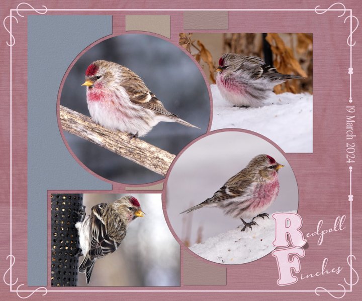
Today a flock of around 30 Redpolls stopped off en route north for a feed. The snow is slowly going. It would appear I sparked some interest in the technique I used the other day and again in this layout. I've given some tips, but should anyone need more instruction, let me know. I created a word frame with a twist, outlined text on the letters R and F, lifted the one comrer. I forgot to mention that I created the letterboard, in the previous layout, matching the colour of the wood frame with the ground squirrels.
1 point
-
Yesterday was a beautiful day, sun shining as it almost always does. Generating more and more heat every day, brought out the first of the ground squirrels. Temperature raised to +13c. Of course I had to take photos of them, also fed them with carrots and nuts. Which they filled their cheeks with to take back to their burrows. The three that emerged were half grown, undoubtedly born later in the season last year. There was a bitter cold wind today, which meant they weren't going to venture out. At least yesterday they had a chance to replenish their larders. Continuing with the topic of photography, when I take photos there are several thoughts on my mind, such as visualizing how the shot will look. Lighting, distracting objects, angle and so on. Hoping to take a shot that will appeal to a wide audience, evoke emotion and compel myself and any viewer to keeping looking. In my opinion, that is the essence of a good photo. The same applies to my layouts. When you create layouts, what thoughts run through your mind?
1 point
-
I created this page for my Alphabet Book.1 point
-
As I've mentioned (ad nauseam, I'm sure) the game I do these pics for has been repeating themes from a long time ago so I've just been tweaking the originals. Today I took the time to create a new one. The upside-down leprechaun stuck in his pot of gold is a freebie from DitzBlitz. I used several papers for the BG at different opacities including a couple from Janet Kemp's the-lucky-one bundle (PS/DS). The posers are my avatar from the game and the font is Celtic Knots, free from Fontspace.1 point
-
Carole's border and page punches, along with her fancy fonts, really don't need any introduction. For the date I created a wooden token. As for the hedgehog I went with a semi watercolour effect. Frame and mask my own. Whilst home with the little girls, I would take them up Badgers lane, once at the top the view is spectacular. They would take their magnifying glasses, I spy insect book, and magnifying insect jars. Needless to say I got those for them. We would turn over stones, to see what was underneath. On one occassion we saw this Hedgehog. Of course I had my camera with me.
1 point
-
My thanks for Cassel for showing me how to use masks in her recent Masks Workshop. I posted the following picture on my Facebook page and it was liked/loved by many of my friends.
1 point
-
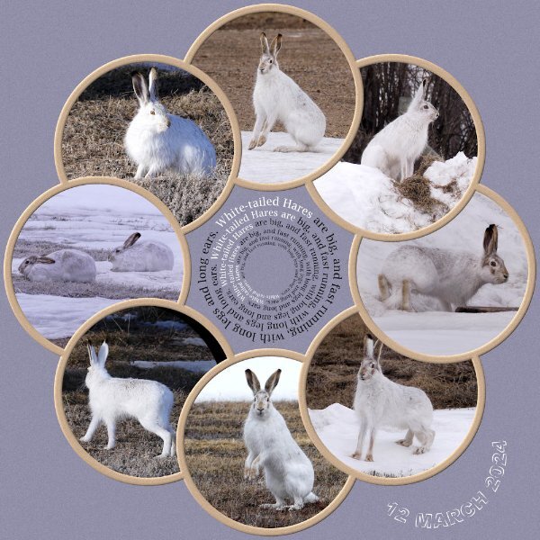
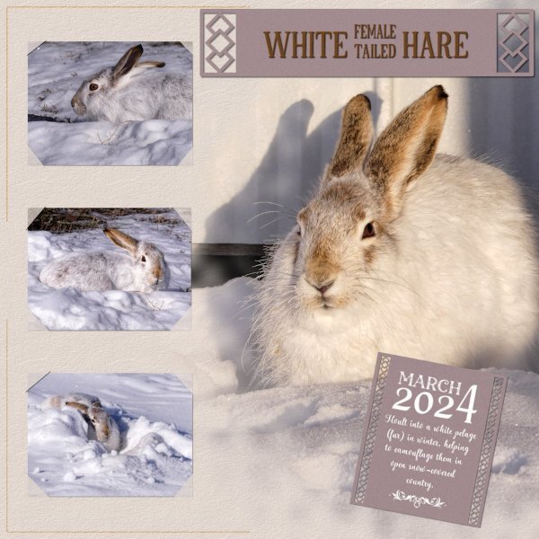
As you can see I've had a superb day outside, being entertained by 6 hares. At home we have a saying Mad March Hares. They aren't mad at all, instead it's the courting behaviour of mating hares. They spent the day, running up, down, over and around the snowbanks in the yard and out in the stubble, chasing one another. Mating suitors.
1 point
-
Here is a second page for the culinary project. Each stock has their own page... instead of putting two or more on one layout. Fonts Lato and Pacifico1 point
-
One of my pickleball players gave me daffodils on Friday. Last year she gave me several bunches but this year she gave me a huge bunch all at one time. Template is from Lab 14-03. I created the plaid background using the daff that is in the center. My small bunch of daffs are blooming but they are not very pretty. Rosemary says I need to feed them...they volunteered...I never thought to feed them. I have found several bunches volunteering in the woods. I hope to dig them after the green dies, store them in a cool dry place and plant them next September. They need feeding also. Maybe next Spring I will have a nice display...fingers crossed!1 point
-
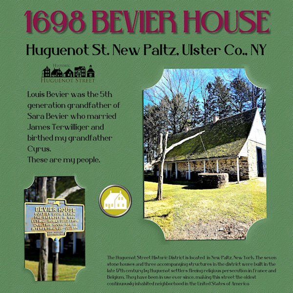
These photos showed up in The Hudson Valley in Pictures yesterday and I couldn't resist as I'm related to Louis Bevier through my father, Harold Terwilliger. His grandfather was married to Sara Bevier, a great-granddaughter of Louis. I've never been to Huguenot Street but a trip is planned! My "template" was just a .jpg so it took some maneuvering to create the "slipped-in" look. Thank goodness for promoted layers! I had to stick with the plain background because of that so I did a colorization and added a texture. The title font is Belisha. I created the brad from a piece of Huguenot art and one in my stash.
1 point
-
This is going to sound really daft. I downloaded the freebie. I had a complete mental block, not knowing how to use it. So I decided to do what I always do, and that is create my own slip it in. You will often see the slip it in technique used in many of my pages.
1 point
-
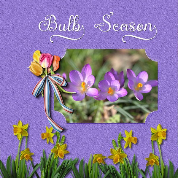
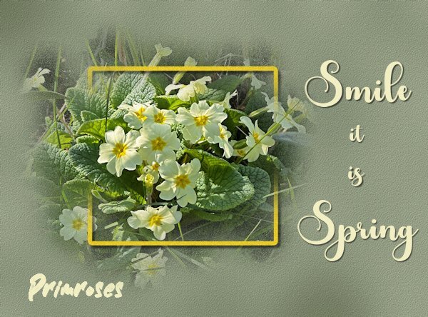
I had a little free time this evening and made something for this challenge, a very nice one too. At the moment a lot of the early bulbs are in flower and the photo I used was taken yesterday on a sunny day. I know I have often lamented about the rain we were getting, but now we have sunny days as well! The cluster with tulips I had made for another layout but it fits here too and the daffodils came from ????? Font is Austin. Enjoy my colorful spring!
1 point
-
Fabulous pages @Ann Seber. TFS!!! 💕 I have a sort of culinary book going at the moment, Graphics myself, fonts Pacifico and Lato. see here https://imgur.com/a/xL7mbzw The second one is from a daily project with papers I made for a designer challenge at DS, the 3rd one is from an album on the Paris arrondissements (here the 4th), and the last one is from my recent trip to Barcelona..1 point


.jpg.94ee827e12448708b74a4c6a855bb238.jpg)
Resized.thumb.jpg.d25811db03a63358cedab1e79f527635.jpg)
.jpg.48e47647f2803f6afd893725cdae7a2a.jpg)