Leaderboard


Popular Content
Showing content with the highest reputation on 03/21/2024 in all areas
-
I made several iterations of this silly theme. I liked the idea of the bright rainbow hairstyles and wanted to keep the rest of the l/o simple. I tried adding a rainbow border to each of them and adding shadows, but I wasn't happy with that. I finally decided to do a frame over all of them and used a cutout effect under each "hole." The biggest issue I had (I really annoy myself sometimes) was picking the gradient for the frame. I lost count of how many different gradients and blend modes I tried. I left them overnight and when I opened them today, I was instantly attracted to this one. Sometimes putting the project away and looking at it later helps if you have the time. The font is Will&Grace free from DaFont. Speaking of having a personal style, I think the purpose of the page plays a big part in it. What I did here is very different than say a birthday card I would make.9 points
-
Scrap Bootcamp Day 9 - Project #4
 8 points
 -
A combination of another photo from the Heemtuin with the split frame technique that Carole demonstrated in the Q&A from las Sunday. This is my first try of it and although it isn't perfect yet I wanted to show what I'm doing. I will practice a bit more, it is a bit different from the masks I normally do, at least I had fun making this.
7 points
-
Catching up, Project 3 used photos from a Halloween parties I knew would have several friends in roughly the same size photos. The theme was drinks / cocktails.6 points
-
Project 4 - used the Spring Skies kit and used photos from work trips down time from a few years ago.4 points
-
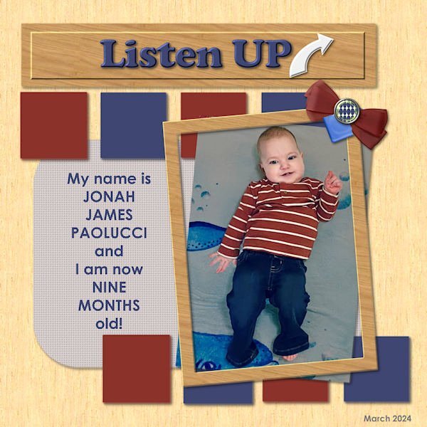
Final Bootcamp project - featuring one of my new great-grandsons. He'll explain... Fonts used are Cooper Black and Century Gothic - old standbys... All elements are mine from my own kit...
4 points
-
Hi, I'm currently working privately on a lot of digital birthday cards and congratulations on the birth in mobile phone format. Many family members and friends have birthdays in the first half of the year😄🌷4 points
-
Same here, Michele! ... I think this applies to all of us here. 🙂4 points
-
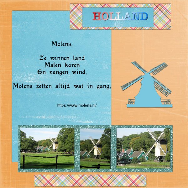
Day 9 This was fun again 🙂 One day we came across the same mill and the "wings" were gone. It took some while to repair (high costs) but now it is again in it's full glory 🙂 I used some elements found on Creative Fabrica, all Dutch things this country is famous for. The waffle is a "stroopwafel" as we call it. Papers where all in my stash. Font is Holland 😉 and Hot mustard (The thick one) I totally forgot how we learned in previous bootcamps to add an edge around a photo with the magic wand, I tend to use mats 🙂 Was a good reminder 🙂 🙂
4 points
-
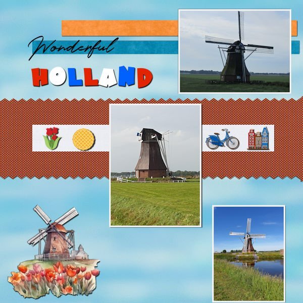
My intention was to have the mills from Far away to close by, but the photo I used wasn't good enough for it. So the mills differ in size, but not as intended. Font is Chartz Kit I used was an old one from PS-Rachel-Martin , the mill sticker is from an old "Holland" scrapkit, the original was red, I changed it to blue.
4 points
-
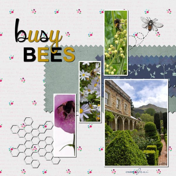
Project 4 Day 9 Well, that is something new I learned today, making that pinking shears effect, thank you, Carole. A few years ago, I was at an afternoon tea at Ohinetahi in Governors Bay, near Christchurch. I arrived home with several pictures of honey bees I'd seen hovering around the flower beds. I decided to use them in this layout. Supplies used were from Jessica Dunn, Rachel Martin, Marisa Lerin, and Violet Irisovna. Jeni
4 points
-
Outrageously bold! I love it.3 points
-
Gorgeous, Corrie! I must go look at the video for the Q & A as I forget all the steps and this effect is really stunning!3 points
-
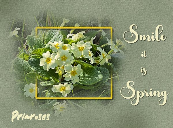
Stunning page! I was taking photos of Primroses in Cornwall in January. I like that you added a shadow to the frame, something I don't normally do for this particular effect, but I do like it. It gives it a nice little bit of depth.3 points
-
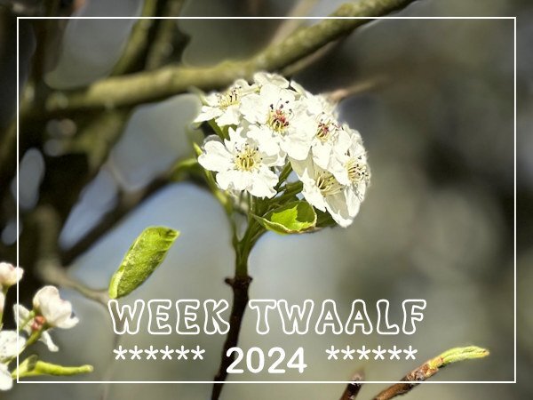
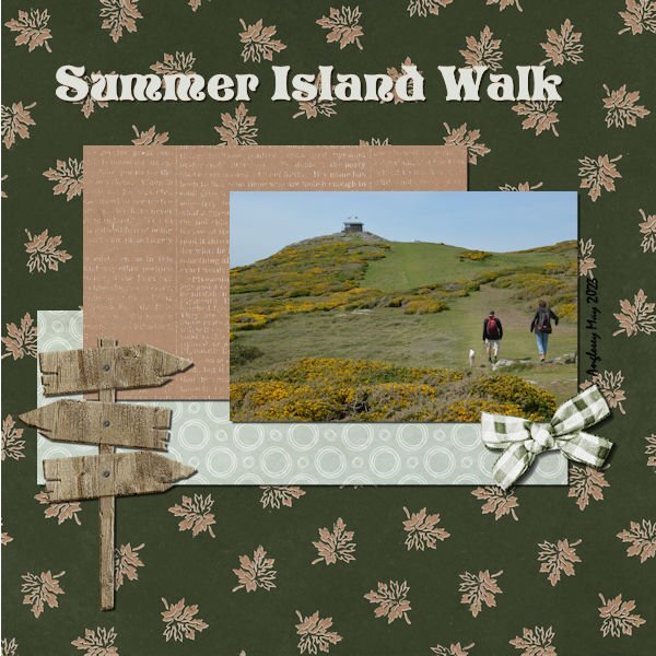
I'm a bit early with my week12 but I don't think it will be getting much better then this. We have lovely Spring days at the moment and there is so much coming into flower. Yesterday we went to the "Heemtuin" in a nearby village where a large natural garden is created which only has wild flowers, trees and shrubs that are native for this area. I was able to take a lot of photos, so in other projects I will use many more. This photo is of a Prunus variety.
3 points
-
Project 4 I dug in my photos and found some photos from a short trip several years ago, a visit to the 'State Pen'. It was a planned trip, so it was fun. I used a bunch of random papers and I guess that is how it looks! I should have planned better. I will try to use a kit next time. I am running to another doctor appointment today, so out of time now.
3 points
-
Busy as a Bee uses 2 papers by Jessica Dunn. Pictures and Hobo Bee are from Bing.3 points
-
Papers are all from Marisa Lerin. The steering wheel is from Canva, and the paperclip is from my kit and recolored. I pretty much followed the tutorial using the same fonts and overcame my addiction to layered fonts. This project was a good refresher for placing shadows, something with which I often struggle.
2 points
-
You got horses! They make good photo subjects. any cows close to home right now...cows are awesome!2 points
-
Thank you Sue, Corrie and Rene. I am finding my tastes/styles in photography is changing too. What most has changed is my passion. Often now, putting creativity first and the fact that I did find a passion in the digital world which lead me back to the my first passion (photography). Now I understand my "real" artist friends (one's that are making their living from it) when they'd pull an all-nighter because they were in the zone. I get that now...although I'm too old to pull all-nighters...but I've been doing some late-late-lighters, especially when I have an idea and I have to get it out of my head (so that I can go to sleep).2 points
-
Styles also evolve. My beginning layouts were a lot like what is being done in the Boot Camp course. Over the years I have changed but yet still mainly do what I call a "clean style". But the embellishments I add have changed over the years. Even now my style is evolving as I'm learning to put together clusters of flowers/greenery/ribbons/other elements on my own that are pleasing to my eye. They are usually small clusters and/or minimal embellishments. They don't overwhelm the photos and the story behind the photos. Once in awhile I will do a layout that has more clusters that are larger than normal when I feel the photo will work well with that kind of layout. It took me years to get to where I am today! My first layout was done on December 30, 2007 and has 3 photos (with rounded corners!) and a title. That's it. Nothing else.2 points
-
Hi all, I can't remember my toys before I was 6, but after that - it was post-war - we children mostly played outdoors or with household objects. There was no money in our large family for toys and children's books. The grandparents usually only gave us useful things, like clothes. We played almost exclusively with small toys, marbles, cards and balls, which we bought at fairs for little money. I then did a lot of drawing with my school supplies (my dream career at the time was "fashion illustrator"😁) or cutting out jewelry from catalogs. I loved reading and always devoured my new school books at the beginning of a new school year. It was only in a children's treatment that I learned beautiful fairy tale books I know, see Scrap. Things were getting better for us in the mid-1960s, then Legos, a melodica and knitting toys and the TV came along. I never had dolls, more like living "baby dolls". From the age of 6 I had to work as a co-teacher act... Today my husband and I fondly remember our childhood toys and adventures in nature. I think by playing in nature we have trained our imagination much more and been able to live out our urge to move.2 points
-
yes, that is it. I think I am still experimenting with styles. I definitely dont have a style as yet. I often sit back in my chair so I'm farther away from the screen and just look at it and see where my eye goes or if I feel it's not quite right. I think I probably overthink. I never thought it could be because I don't have a style; which if I did (have a style) it would be more instinctive to know where something needs to go. Soon as Build A Kit workshop is over I am looking forward to getting back to the Notebook Labs again which means more layouts!2 points
-
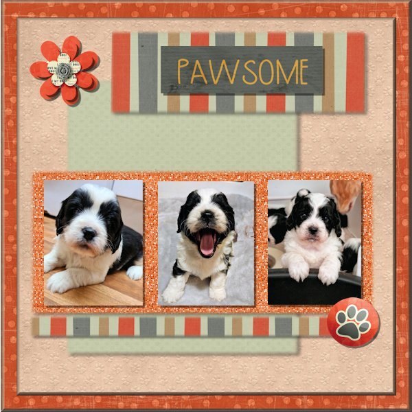
Project 3. A bit late with this one .Puppies again I am afraid ! 5 weeks old on here, growing fast and now exploring time out of the whelping box under the watchful eye of Mum. I have used Gina Jones Fido elements and papers along with Nit Wits papers. I have duplicated the flower and layered them .Hope everyone is having as much fun as me !
2 points
-
This one is really pretty as are those Redpolls, mother nature really knows what she's doing when she creates. I love that background too; do I see a background photo through the pink textured paper as well?2 points
-
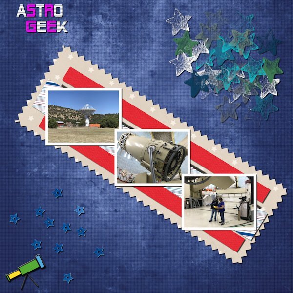
My wife at the controls of one of the large telescopes at the McDonald's Observatory in West Texas.
2 points
-
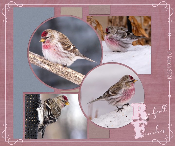
Today a flock of around 30 Redpolls stopped off en route north for a feed. The snow is slowly going. It would appear I sparked some interest in the technique I used the other day and again in this layout. I've given some tips, but should anyone need more instruction, let me know. I created a word frame with a twist, outlined text on the letters R and F, lifted the one comrer. I forgot to mention that I created the letterboard, in the previous layout, matching the colour of the wood frame with the ground squirrels.
2 points
-
Yesterday was a beautiful day, sun shining as it almost always does. Generating more and more heat every day, brought out the first of the ground squirrels. Temperature raised to +13c. Of course I had to take photos of them, also fed them with carrots and nuts. Which they filled their cheeks with to take back to their burrows. The three that emerged were half grown, undoubtedly born later in the season last year. There was a bitter cold wind today, which meant they weren't going to venture out. At least yesterday they had a chance to replenish their larders. Continuing with the topic of photography, when I take photos there are several thoughts on my mind, such as visualizing how the shot will look. Lighting, distracting objects, angle and so on. Hoping to take a shot that will appeal to a wide audience, evoke emotion and compel myself and any viewer to keeping looking. In my opinion, that is the essence of a good photo. The same applies to my layouts. When you create layouts, what thoughts run through your mind?
2 points
-
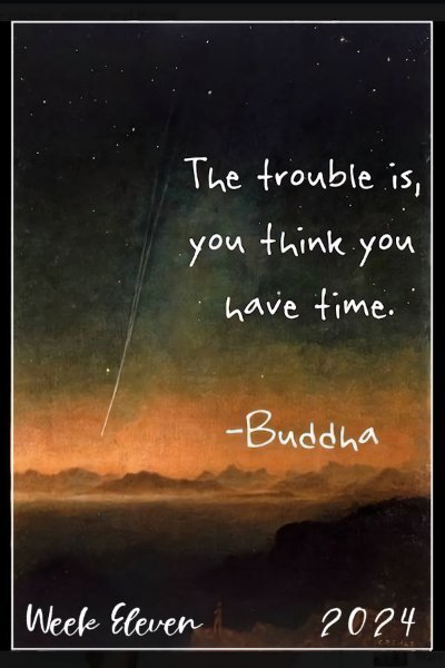
Here is my Week Eleven - I count Sundays so I'm a little behind here. The font is Cardigan Script. This is just a quote about Time. Sue Ewart is the expert on that topic; she will have a Mega Kit for it by the end! 😁
1 point
-
Beautiful, Corrie!1 point
-
S = Schwarzwälder Kirschtorte😋1 point
-
@Cassel: I played around with it but it took a lot of attention away from the already super dark photos. I think it is a great technique: many thanks for showing it to us! I ended up not saving it as a jpg just as a layered file, so it never made imgur or this place but if you like I can show it here. As I said, wouldn't want to miss that entry 😄1 point
-
Susan, that you overthink was an issue with the scripting course as well and at the same time you instinctively know what to do. So try to find your own "style" and I know that such a thing is easier said then done, I struggle with it myself. But in the end we will get there with all the positive comments and help we are getting here in this lovely community.1 point
-
You bet and my admission tickets too when I have something that I can use them on. I love to use the few scripts that I made and will have to think what I can do next. But that will have to wait until I'm back from my trip and photoalbum etc.1 point
-
The layered font is called Kid Zone from CF. It is very easy to use--only three layeres1 point
-
Can't always access the same resources as shown in the video, but I have downloaded some. This was last year when we had a nurses reunion in Cornwall, so a found a poem to go with it. Lost the will to live as it crashed on me twice (did that last night) so haven't changed the drop shadows between elements, but it was interesting how to do this. Are there still the download sheets for each lesson?
1 point
-
Project #4 This time it is all about The Wall and Checkpoint Charlie in Berlin during the Cold War. When we visited there it was a rather gray day, fitting for the feel of the place, it was a bit gloomy! All the papers are from Marissa Lerin gl-20 kit and I didn't use the brighter colors only the more subdued. The tank is a sticker I found on digitalscrapbook.com; the stop sign comes from Travel by DB Magnolia; the fonts are Berlin and Montana rough; the stamp is again made with my own stampscript and I made some paintsplashes .1 point
-
Over the hump: page four of my seven stocks project. On peanut butter. Any fans here? Supplies myself, fonts again Pacifico on title and Lato on body. By now I think I need an extra double page spread before the initial page one on canned tuna and move the first part of the text on page one to that preceding page...( questions...) project.1 point
-
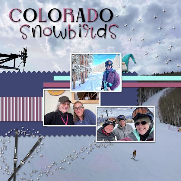
Scrap Bootcamp-Day 9-Project #4. I rotated the photos as I had horizontal ones from my daughter's ski vacation in Colorado last week. Aaron and Deb were visiting her daughter-in-law, Lucy's parents; Magic & Raja's other grandparents. The background is also her photo. The title fonts are Belisha and Birdy. The troll, gem scatters and skis are from my Iceland mega kit.
1 point
-
@Michele I have a curious mind and want to keep learning...anything...until the end. I totally agree. I have captured the Layout of @Sue Thomas (Thank you) and the conversations between her and @Susan Ewart (Thank you) that are very informative and instructive, @Cassel Thank you for this group and your instructions and the group you have formed here.1 point
-
I have a curious mind and want to keep learning...anything...until the end.1 point
-
I think I may have posted in wrong thread. Project #3, 'Adventure'. I was away for the weekend so catching up now
1 point
-
Hopefully, this image is okay for this project. I used a snowflake brush I had in PSP, and covered my background with that, instead of adding any elements to my image. Where I live, I am lucky, because I have such beauty on my doorstep. Thanks Jeni
1 point
-
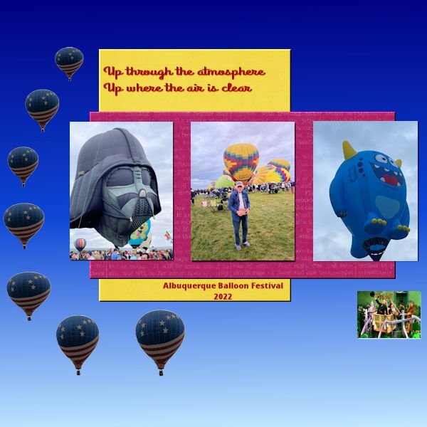
Scenes from the 2022 Balloon Festival in Albuquerque, NM. To be truthful, this pic does not capture the colorful event very well.
1 point
-
Day 7 Project #3 Used 1 paper from site provided “DSF March 2013 Blog Train – Designs by Marisa Lerin.” Glitter also from site provided and paper from Nellie Bell. Pictures, flowers and rainbow strip from Bing search. Fonts are BankGothic Md BT and Vivaldi with a small bevel applied.1 point
-
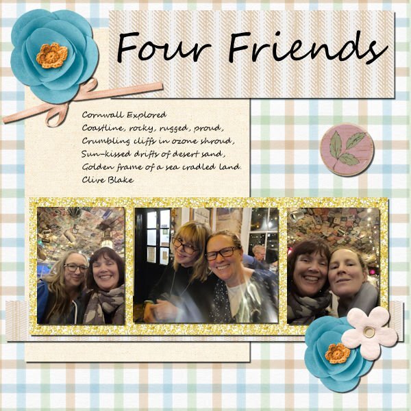
Jackie (on the left) and I have been friends for over 20 years but this was our first time together since well before Covid. I was a real blessing to see her again and catch up! The rose on the table in the center photo is repeated on each of the photos. Actually, this is one photo. I separated each of us into our own photo.1 point
-
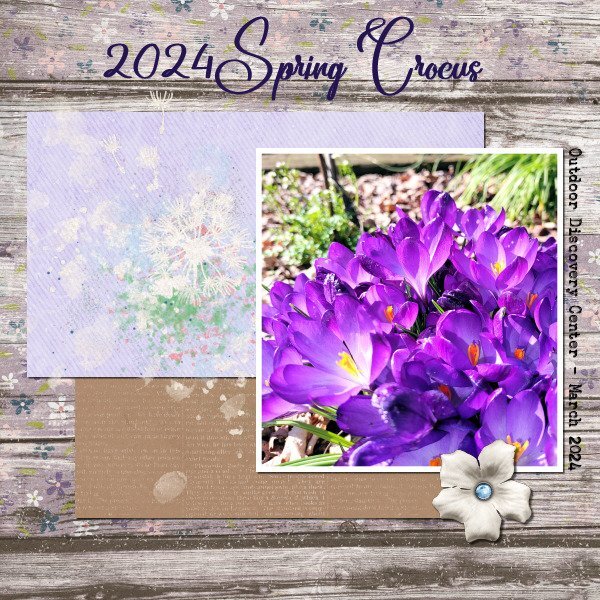
Project 2, but I don't know what day! Guess I am on a spring flowers theme. I took this photo this past week when I visited a garden that my fellow Penn State Master Gardener's maintain, at the Outdoor Discovery Center. I'm not able to participate in gardening activities right now, because I am in 'recovery mode'. The weather has been tempting me tho! I used part of the same kit I used on Project 1, and the same fonts. I tried rotating the background paper so it would look different, but it just looked odd to me, so I used contol + Z and undid it. I also used part of another kit called Dandelion Wishes. I loved seeing the crocus blooming at this garden. Either the chipmunks steal the ones I plant, or the voles eat them, or both....but I keep trying...gotta feed the wildlife 😉
1 point
-
My project 3. I was aiming for a midcentury modern-ish vibe. Supplies myself, Jessica Dunn, Sharon Dewi Stolp. Fonts are Georgia on date and Cuciniere on title. @Cassel: Yes, especially in a PSP WS, lol!!!! 💕😉. I have been playing with them, not enough it seems tho. I find EC gives me what I want faster. The layouts so far are the most elegant recipes ever! An absolute fool proof way to a great layout. Many thanks. Many great examples here in this thread. Fab recipe!1 point
-
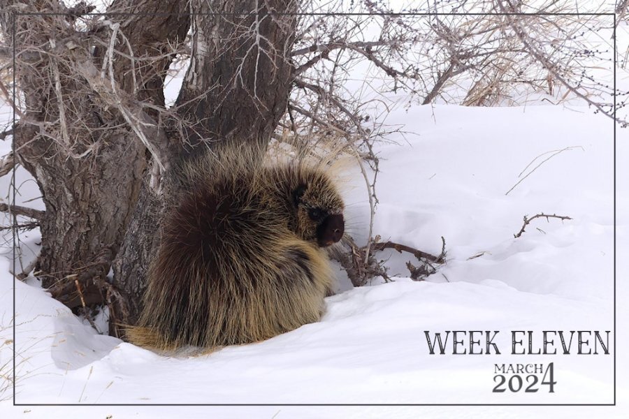
Here is my week eleven. Doing this challenge really does make you realize how quickly the weeks simply fly by. Saturday is the start of a new week for me. I was quite privileged, and awe inspiring to be allowed to get fairly close to this big procupine. (Danielson Park, trail hiking) I didn't feel threateneed by it, as it didn't display any signs of being threatened itself. AS they will retraet up a tree rather than attack. As it was feeding on bark and twigs. They have a more varied diet during the summer months. They have such tiny eyes for its size.
1 point
-
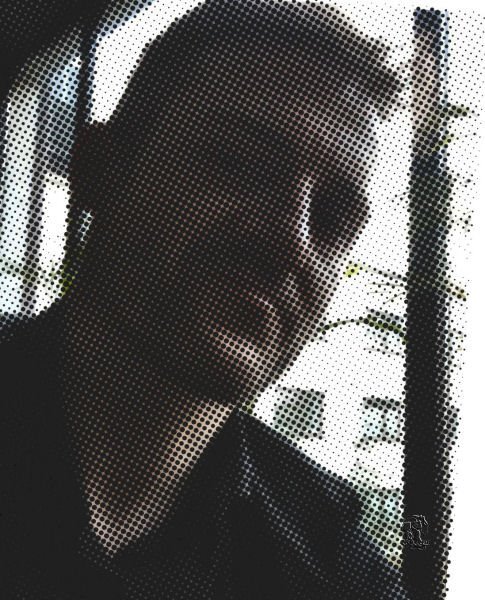
My recent wosk and enormous pleasure, believe me. Selfie taken by Jacek. Super fun in/with PSP9, which can more than I/WE think.
1 point


.jpg.94ee827e12448708b74a4c6a855bb238.jpg)


Resized.thumb.jpg.d25811db03a63358cedab1e79f527635.jpg)