Leaderboard


Popular Content
Showing content with the highest reputation on 03/15/2024 in all areas
-
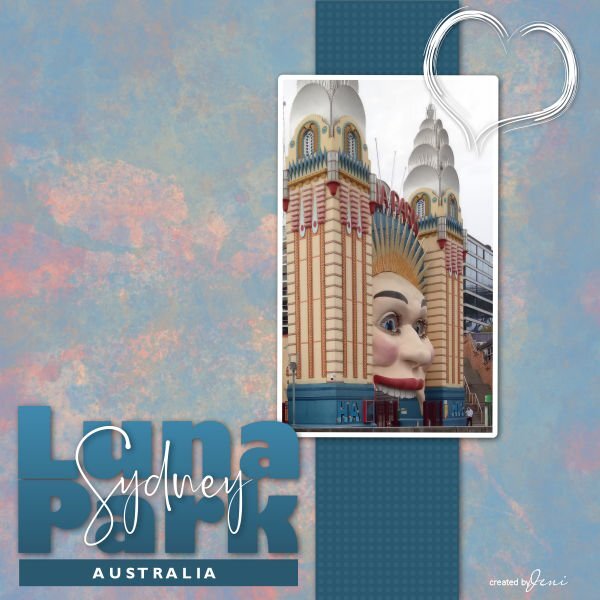
I have had another play with this tutorial. I have used a paper, and heart from VioletIrisovna, at Digital Scrapbooking. I created the ribbon using the Penta Dot and Cross filter. The photograph is one I took in 2020 when in Sydney. Jeni
 7 points
 -
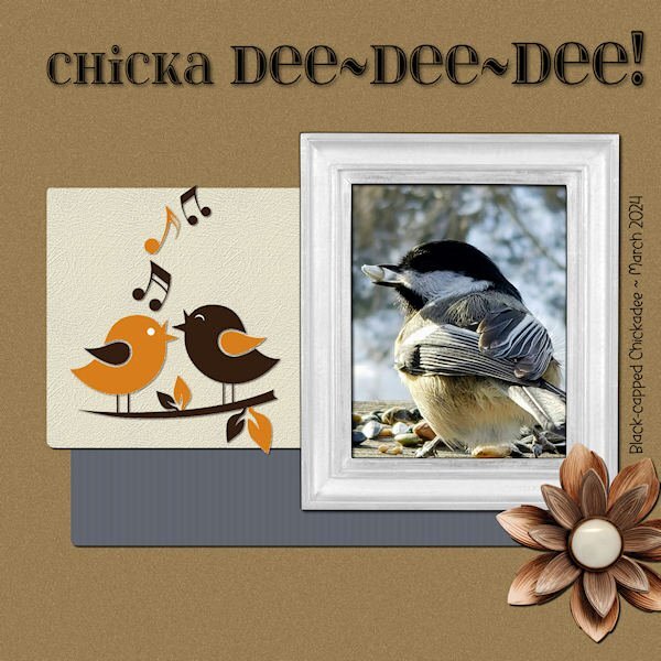
The next Bootcamp layout features one of my favorite little birds. They visit when I'm out filling their feeders and impatiently scold me. Their voice is high-pitched and metallic sounding. They fly back and forth from trees across the street for one seed at a time, making them very busy, indeed. The title font is "itsadzokes01." The side font is "Before the Rainbow." The photo is by Joan Diamond. The cartoon birds are from Dreamstime. The wood flower is from the kit - cpjess-wildwood thicket.
6 points
-
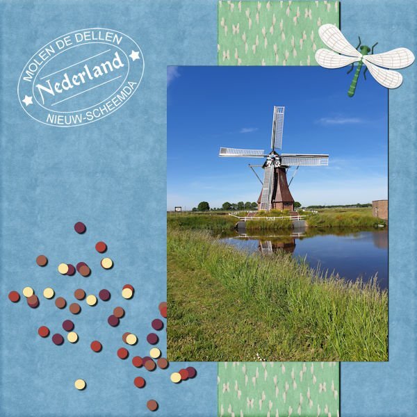
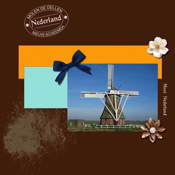
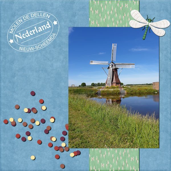
The same mill, taken from the other side. Font: Chartz and arial. The smudge is from Elif Sahi and flowers from Jessica Dunn. Date stamp from Carole.
5 points
-
Hello and many thanks for the vids so far @Cassel, they are all great!!! Hello @everyone. I have a lil gift for everyone: a free mini I made for a designer challenge at DS that is linked here. Supplies myself. Fonts are Bodoni on my NEW poem and Pinky Funky on title. The photo is on a mask.5 points
-
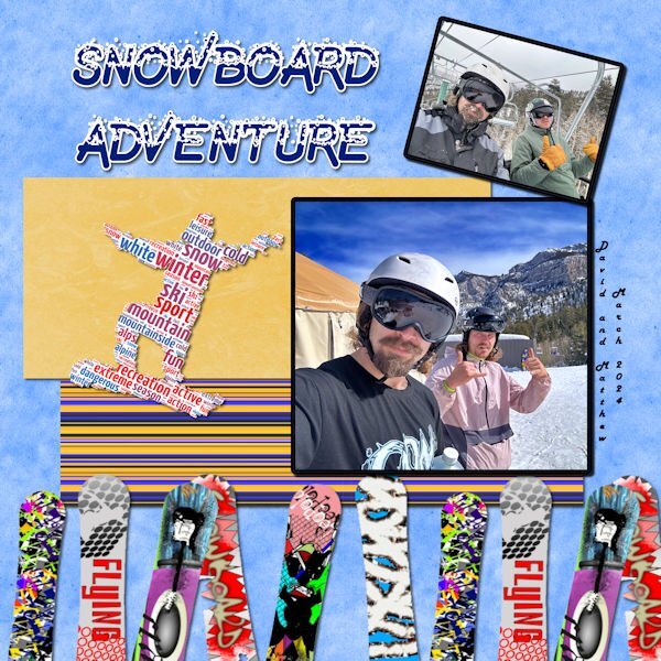
Day 5 - It's Spring Break, and my grandson's are indulging in one of their favorite sports--Snowboarding. David just sent me the photos. I made the background using casssnowtexture script with a modification to the color. The striped paper is from cassstripes2 script. The snowboards and the snowboard word art is from Canva. The font is Undercover Snow from Creative Fabrica.
4 points
-
So this is my Project 2. I tried to recall what you taught us in the mask ws @Cassel. Supplies myself. I used eyecandy for the shadows, as always. Fonts are Sugared Lemons on my NEW poem and Rustic Pantry on title, Quicksand on gardening text. I put a gradient overlay on the left page to make a book-ish look.4 points
-
This is better (Shadow on the green mat)
4 points
-
As I've mentioned (ad nauseam, I'm sure) the game I do these pics for has been repeating themes from a long time ago so I've just been tweaking the originals. Today I took the time to create a new one. The upside-down leprechaun stuck in his pot of gold is a freebie from DitzBlitz. I used several papers for the BG at different opacities including a couple from Janet Kemp's the-lucky-one bundle (PS/DS). The posers are my avatar from the game and the font is Celtic Knots, free from Fontspace.4 points
-
@Cassel: Just to make sure, here is a second Project 0ne. Would not want to miss the entry... 💕Supplies myself and Jen Maddock, fonts are Qiara on title and Myriad Pro on my NEW haiku.3 points
-
My best friend (since I was 12) is moving to Nairn, Scotland inJune. She is looking forward to seeing/learning about all the flora and fauna of her new area. How lucky to see these in the wild.3 points
-
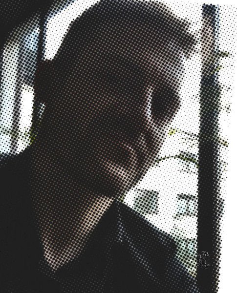
My recent wosk and enormous pleasure, believe me. Selfie taken by Jacek. Super fun in/with PSP9, which can more than I/WE think.
3 points
-
I love them. Each and every garden should see these creatures and says :Nice to see you::)3 points
-
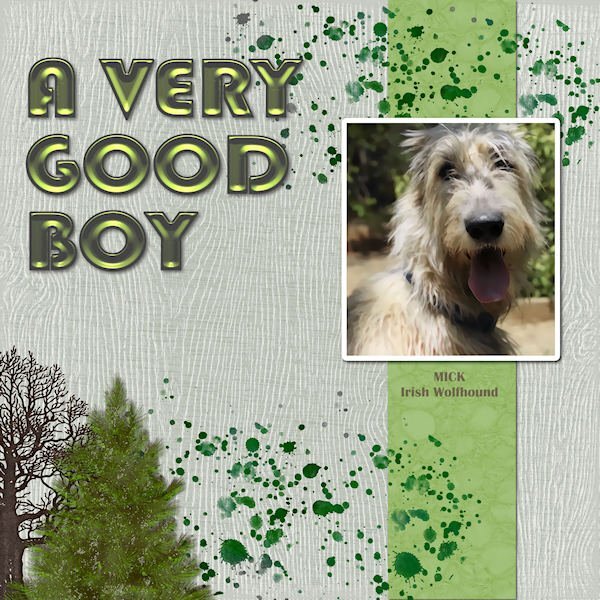
Here's my latest version of New Kid on the Block. This is Mick, our Irish Wolfhound. He's been gone many years now but, as always, they're unforgettable.
3 points
-
Actually just finished with my lunch.
3 points
-
Hey y'all, I'm here too....I'm just slow. I have done Bootcamp a couple of times. It is always a good 'refresh' for me. I will be using 2019. I like a medium gray workspace, and dark gray background. I don't know what photos I will be using. I had some major surgery Feb 22. When I signed up for Bootcamp, I knew it would be during 'recovery time' for me, but I didn't realize how slow recovery would really be, and how limited I would be physically. I am seeing signs of spring out my window, so I may look for photos of spring to use.2 points
-
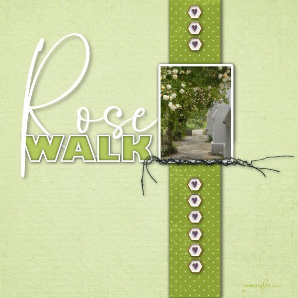
With the scrap page, I used some pieces from Jessica Dunn's Curio Pantry. I started with the word Roses much smaller and decided to enlarge that word to balance the page. Jeni
2 points
-
Carole's border and page punches, along with her fancy fonts, really don't need any introduction. For the date I created a wooden token. As for the hedgehog I went with a semi watercolour effect. Frame and mask my own. Whilst home with the little girls, I would take them up Badgers lane, once at the top the view is spectacular. They would take their magnifying glasses, I spy insect book, and magnifying insect jars. Needless to say I got those for them. We would turn over stones, to see what was underneath. On one occassion we saw this Hedgehog. Of course I had my camera with me.
2 points
-
Project #2 I had a bit of a problem to get the right color for the background but in the end I settled for this dark color as a contrast for the others. The photos I have for this church are not great, they were done 16 years ago with a simple camera. So instead of my own I found a nice one on the internet to use. The clock and the flowers come both from digitalscrapbook.com and the background papers are by Marissa Lerin. Fonts are Berlin and Lucinda calligraphy.1 point
-
Here is page three of my '7 stocks' micro project- Four more to go. TFL! These pages I'm sharing here are the right pages of a spread , the left ones will either have typography, photos or a mix of both and maybe a list of dishes that those stocks are to be used in. Fonts are again Pacifico on title and Lato on body. Supplies myself.1 point
-
Just make sure that you clearly state what lesson you followed, and try to follow the "principles" or tips in each lesson just in a way that I can recognize it in your project. It will just make it easier.1 point
-
It is just so that I can identify which lessons were done. When they differ considerably, I am never sure if it was from the lesson or something else 🙂1 point
-
And a wonderful neck of the woods it is1 point
-
Ha ha! Me, too! I had the same feeling when it was listed. ❤️1 point
-
I = Italian ices1 point
-
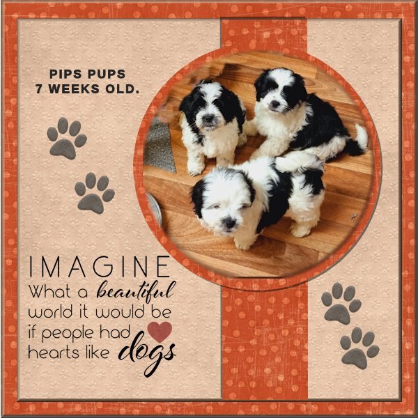
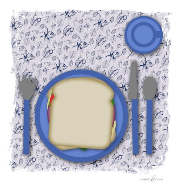
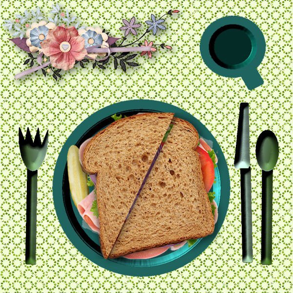
I am glad to see someone new post in our Bootcamp. Welcome to @Jeni Simpson @Jeni Simpson You really balanced the words well. I think the title is great. I would suggest you adjust the shadows. On the title, it looks like the letters are hovering over the paper. I suspect the Blur value was quite high and the offset fairly small. @Barbara Caulton We will never get tired of puppies! Glad to hear that you feel more comfortable this time around. @MoniqueN. Great photo of the windmills. @Ann SeeberLooking at your plate, it is like someone waved a magic wand over mine, and poof... it is now a realistic sandwich! 🙂 Did you use a different shape for the bevel? @bina greene Just for information, was that your project 1 or something else? I am just asking because I keep track of the Bootcamp projects for the upcoming draw. Are you all ready for the second project, tomorrow? If not, you can still catch up. Where are our silent participants?1 point
-
Thanks so much, Bina1 point
-
Thank you, Bina!1 point
-
F = flan1 point
-
@Corrie Kinkel Yes the stamp is made with my own script!😊1 point
-
Day 3 Font is Chartz Scrapkit is from lady22, an old one.(2019) Date script form Carole Photo is my own, taken in the neighbourhood of our home.
1 point
-
On the iPhone, when you pull up a picture, there is an icon which gives you information about the photo. One of the things that shows is "Look Up" which gives you information on your flower or leaf.1 point
-
Day 3 project 1. This one had to be the puppies.!! There were 6 in the litter but I liked this photo of the 3.They were a friends litter but I was lucky enough to have them at my house aged 3 weeks while she was on holiday for 6 days! Great fun producing this one as I have a bit more idea of what I am doing !! I used 2 background papers from Nit Wits and beveled them both. The graphics were also from the Nit Wits site. I made a circular selection from my background paper and placed it under the photo layer for effect. Roll on the next one ! Will it be more puppies I wonder ???
1 point
-
Hi, I have played around a bit with my place setting and sandwich. Jeni
1 point
-
Thank you for the kind words. The intention was to keep the flow of circles, including the date.1 point
-
Besides stunning photos I like the idea of having the text in e circle to match the photo circles!1 point
-
What am I working on ...1 point
-
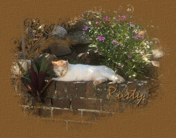
My thanks for Cassel for showing me how to use masks in her recent Masks Workshop. I posted the following picture on my Facebook page and it was liked/loved by many of my friends.
1 point
-
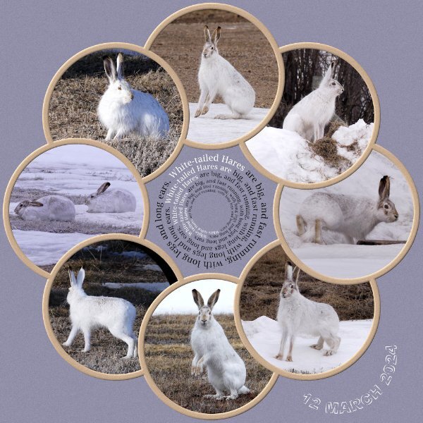
As you can see I've had a superb day outside, being entertained by 6 hares. At home we have a saying Mad March Hares. They aren't mad at all, instead it's the courting behaviour of mating hares. They spent the day, running up, down, over and around the snowbanks in the yard and out in the stubble, chasing one another. Mating suitors.
1 point
-
One of my pickleball players gave me daffodils on Friday. Last year she gave me several bunches but this year she gave me a huge bunch all at one time. Template is from Lab 14-03. I created the plaid background using the daff that is in the center. My small bunch of daffs are blooming but they are not very pretty. Rosemary says I need to feed them...they volunteered...I never thought to feed them. I have found several bunches volunteering in the woods. I hope to dig them after the green dies, store them in a cool dry place and plant them next September. They need feeding also. Maybe next Spring I will have a nice display...fingers crossed!1 point


.jpg.48e47647f2803f6afd893725cdae7a2a.jpg)


Resized.thumb.jpg.d25811db03a63358cedab1e79f527635.jpg)