Leaderboard
Popular Content
Showing content with the highest reputation on 03/12/2024 in all areas
-
5 points
-
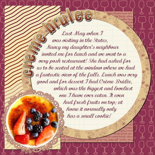
I love desserts, beautifully served. I still have lots of photos from before my Diab II diagnosis...5 points
-
5 points
-
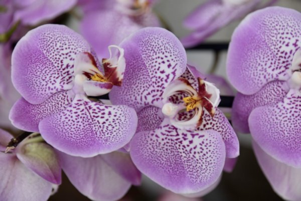
One of my pickleball players gave me daffodils on Friday. Last year she gave me several bunches but this year she gave me a huge bunch all at one time. Template is from Lab 14-03. I created the plaid background using the daff that is in the center. My small bunch of daffs are blooming but they are not very pretty. Rosemary says I need to feed them...they volunteered...I never thought to feed them. I have found several bunches volunteering in the woods. I hope to dig them after the green dies, store them in a cool dry place and plant them next September. They need feeding also. Maybe next Spring I will have a nice display...fingers crossed!5 points
-
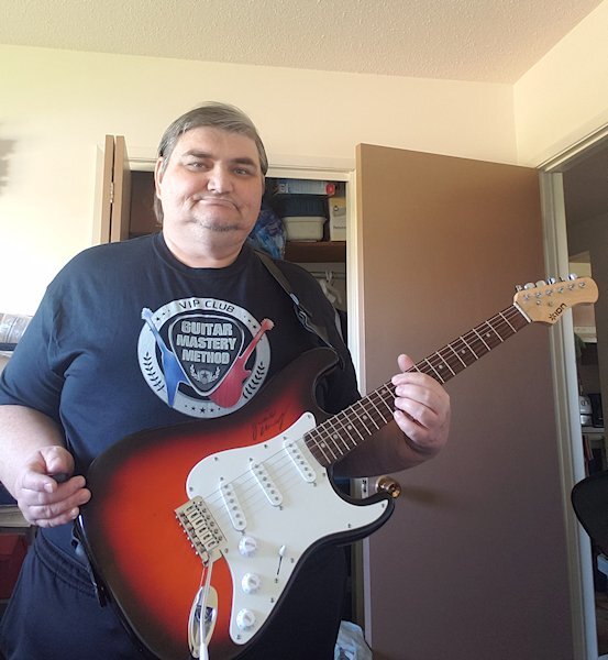
Bootcamp Day 1 Post Good afternoon Everyone! I am looking forward to sharing my creations and seeing what everyone else comes up with. I use Paintshop Pro 2022 Ultimate 64-bit version. My preferred workspace is the Complete Workspace. The Pallets I have open are the Layers, History, Brush Varience, Materials, and Tool Options. For the workspace color, I prefer the Light Grey workspace with the Dark Grey background color. I have decided to use this photo as one of my images I think I will focus my projects around music. Maybe that will inspire me to pick up my guitar again I am very much a beginner but have been fighting "Project Overload" problems Having too much on the go has caused me to lose focus on everything. See you all in "Project Two"4 points
-
Here is a second page for the culinary project. Each stock has their own page... instead of putting two or more on one layout. Fonts Lato and Pacifico4 points
-
My workspace is currently set up as follows: Icon Size - Medium; Text Size - Large; Workspace Colour - Light Gray (I much prefer the light gray to the default setting that I was originally using); Window - Untabbed; Materials Palette - Rainbow. I hope to use this photo in one of the scrapbook pages ...4 points
-
Ah I didn't think about changing colours! But I have not added any pickles - yuck! The tutorial is missing the last stage, where you stick all the layers together (merge/ flatten). I also seems an awfully long winded way of adding layers. Is there not a way to link them together, and move as one stack of images? Or am I ahead of myself?3 points
-
3 points
-
3 points
-
3 points
-
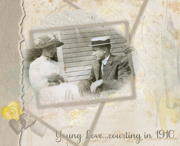
I've been hoping to see this technique presented for a while. It was covered in the March 2024 Q&A, so I had to give it a go. I haven't posted anything for some time, just so bloody busy! Too many irons in the fire, as the saying goes. And no inspiration at all! Every layout I have tried, I have deleted as not worth posting. I do work a lot with old photos, not just my family but others' too. This one is a favourite of mine, from 1910, not my family. The styles, the looks on their faces, the general joy of the moment - are just captivating (to me). So what better material to work with than something I have worked with? Not entirely pleased with the result, but I feel I can post without cringing. It's a start with that split frame effect.3 points
-
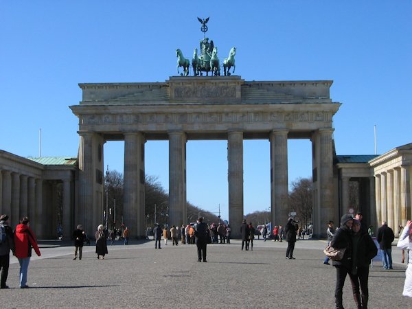
Hi, my workspace is light grey and I use the layers palette, materials, tooloptions, top and bottom toolbars. When scripting I have the history and script output palettes open. The top toolbar has my choice of scripts as well. For this Bootcamp I plan to use photos from a trip to Berlin that we took in 2008, it was the last trip abroad before my husband got seriously ill and since then he isn't able to travel any longer.3 points
-
3 points
-
3 points
-
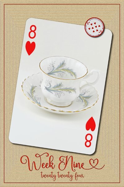
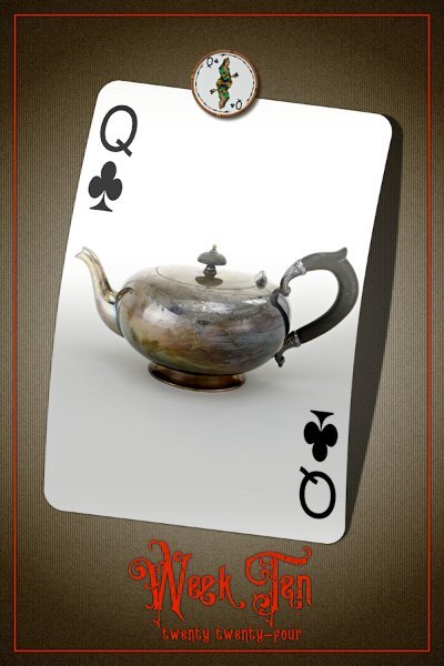
P52 Week 10. Yay! We are in the double digits now. And I'm caught up here (waaay behind in Build A Kit). I used Lifted Photo script (Creation Cassel) and the color of Counting cards script looked quite nice once I put the background in (the outer frame and fonts is the last step I do). I had wondered about putting a shadow on the bigger font (Week Ten) and when I went to put that shadow on I still had the last shadow as a reverse shadow and it made the font pop a bit more so I left it like that. the background is an inverted gradient, then I used halftone (lines) effect and a bit of Add Noise. The font is aptly called Queen Victoria Vintage, likely from CF (there is a bunch in this font family, presumably each with their own glyphs, which seemed plentiful).2 points
-
2 points
-
Hi all, my workspace only offers 'Photography' or 'Essentials' (as I am on PSP 23) - which one should I choose for this bootcamp? I have gone for mid grey with white background for the workspace. My photo is from a recent week in Morocco; not sure what to expect so not sure what other photos I will use, but I took plenty!!!2 points
-
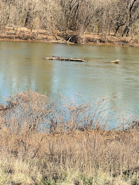
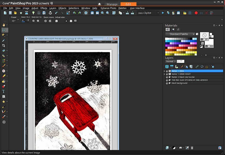
The screenshot of my workspace is customizedd to include several scripts and other commands that I use a lot on the toolbar. For example, I can just click on deselect button, the repeat button, the pick button, etc. I prefer a black background. I have also saved the workspace so that if somthing happens, I can reload it without having to setting it all up again. I will be using the photos from Riverside Park that I took during my visit to Fredericksburg, VA.2 points
-
Yummy and there is nothing wrong with recycling an older layout or using the same idea from an older workshop!2 points
-
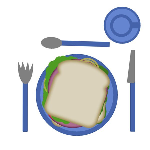
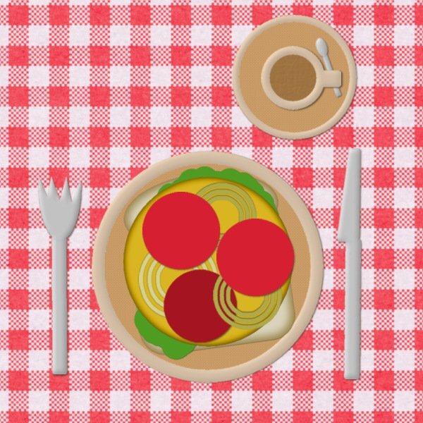
I like this exercise a lot and it is already 4 years after I did it for the first time as a total newbie. At that point I found it all very difficult and could just manage to make the sandwich and table in its most basic form. Today however I made a luxurious version to show how much I have learned in those years, but a rehearsal is always a good idea. The more you learn, the more basic things you tend to forget! I used my own cutlery, I had to polish it and I went shopping for some fresh lettuce and tomato's, onions I had plenty. No pickles and meat for me and I toasted the bread, made a cup of coffee and used my damast tablecloth, a napkin, a plate with strawberries and a little vase with some flowers. All the extra stuff comes out of my stash which has grown over the years considerably.1 point
-
1 point
-
Glad to see all new faces in this Bootcamp. A special welcome to @Sue Booth, @Bill Pearson, and @Rodney Boyd. I am looking forward to seeing your projects. I will be in the forum every night to give feedback to all those who post. And if you have a question, don't hesitate to post it. I might be able to answer it quickly. If not, another member might be faster than me (I have a habit of leaving the computer, sometimes!). @Barbara Caulton I am glad you enjoyed your first Bootcamp, enough to come back a second time. And those puppies are going to be stars! @Ann Seeber Interesting that you don't show the thumbnails in the Layers palette. I guess it has the advantage of displaying more layers at once. So, we will be going on a cruise with you this time around? Woohoo!! @Anne Lamp It is so annoying when computers don't cooperate. Hopefully, everything will be back to normal for you sooner than later. @Donna Sillia Saving your workspace is a GREAT idea!!! Everyone should do that once they have a setup they like. @Sue Booth Have you figured out how to load the Complete workspace yet? @Bill Pearson You will find yourself in great company as we have several members who love nature photos! @Corrie Kinkel Another trip to Europe for us, on the other side of the ocean. @Rodney Boyd You got Rosie from Alberta. Where do you live? Are you in Canada? Eager to hear from more participants. See you tomorrow!1 point
-
You should use the Complete workspace as you will want all the tools and commands. It should be listed just under the Photography and Essential on the home page.1 point
-
Rice pudding, one of my favourite puddings, served either hot or cold. I make a rice pudding once a week. Traditionally made with all milk, and pearle rice, in other words pudding rice. I love the skin, which is flavoured with nutmeg.1 point
-
I made a screenshot of my workspace. You'll notice I don't use thumbnails in my layer palette. Also, be sure to UNCHECK TABBED DOCUMENTS in the WINDOW menu at the top. The photo I've included is of a Viking River Cruise in Europe and I'm planning on documenting a Fantasy Travel Layout using their stock photos.1 point
-
1 point
-
1 point
-
1 point
-
1 point
-
1 point
-
I didn't sign up for bootcamp this time because of the Build A Kit, but I think I am going to give up on that because my PC has been in the shop for over a week and I am so far behind, I will never catch up. I have my laptop to make some comments but I don't have PSP on it and it is to hard to see that kind of stuff on the small screen. Bummer! Oh well I just hope the computer shop will be able to not loose everything on my old PC because that and a evaluation is all I was wanting. (sorry for all the grumbling)0 points


Resized.thumb.jpg.d25811db03a63358cedab1e79f527635.jpg)
