Leaderboard


Popular Content
Showing content with the highest reputation on 01/22/2024 in all areas
-
Day 7 assignment done.... and not without some pain involved. I was concentrating on getting all the elements resized & placed between all the layers and I forgot to save a copy here and there while working. Near the end, my crop tool had a hissy fit and somehow cropped all the layers & I could not undo. There was nothing on the Corel website or forum except some instances of crop tools getting stuck. So, when in doubt, start again. The papers are from a kit by Aimee Harrison and also from Freepik. The top part of the text is part of wordart from Creative Fabrica but I substituted a real rolling pin with Minion font lettering on it. The photos are all snagged from the internet and I tubed several of them (sorry about that crappy shadow on the tarts but the picture was the last one that I tubed (for the second time) so I let it go since supper is now two hours overdue. Thanks to Cassel for a great workshop. I learned a lot (sometimes the hard way) but I thoroughly enjoyed it.
 13 points
 -
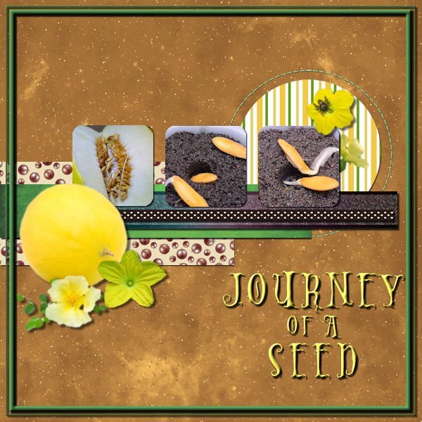
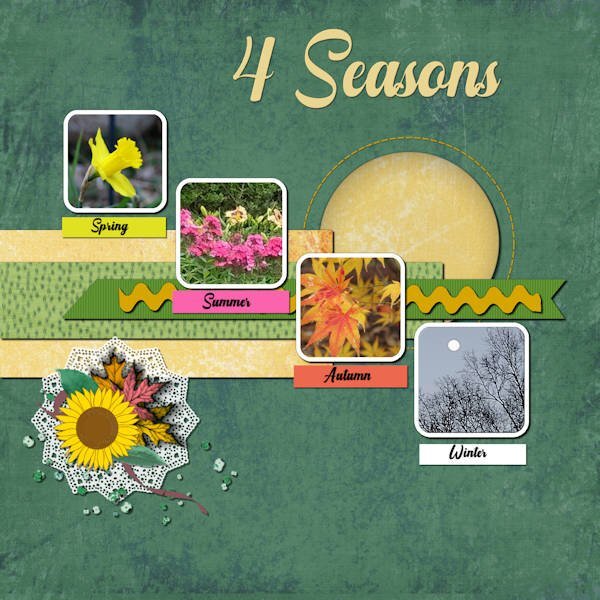
Day 5 done, I decided for this one just to focus on one seed, the Melon that I threw in just for fun and didn't expect to sprout. For just a few days it's doing really well. The font is Holiween one that I really like, all the elements are melon flowers hopefully I will get to see some one day and I added a tiny spider, just because. I used techniques from one of the earlier lessons to add a frame. I didn't like the ricrac so added a second ribbon instead.
12 points
-
Here is my number 6 Template result.
12 points
-
Lesson 3 done!
11 points
-
Day 6.
11 points
-
Day 6.
11 points
-
Here is my Number 7 and last Template result. I have loved every moment of these workshplessons despite being very wobbly at times.This has been a good distraction for me.Thanks to Carole for putting them up for us and thanks to all who participated, some fabulous results.
11 points
-
Here is my day 6.
11 points
-
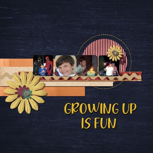
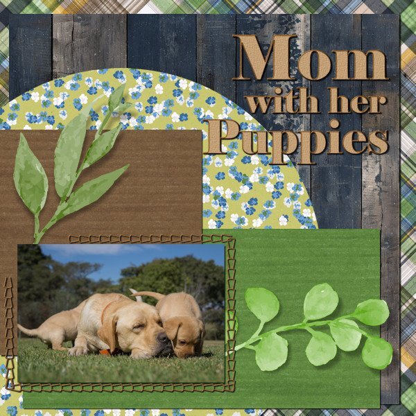
Day 7. Noah has been doing modeling and commercials. In one, he had to portray a child who was happily playing and suddenly dramatically sick. While the director praised his talent, his mother realized she saw the same behavior when she yelled, "Time to go to school!" Is it talent or practice? The kit is a collaboration called Boy of Mine from Go Digital Scrapbooking. The font is Nonplussed from Creative Market.
11 points
-
Lesson 3 done!
10 points
-
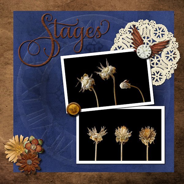
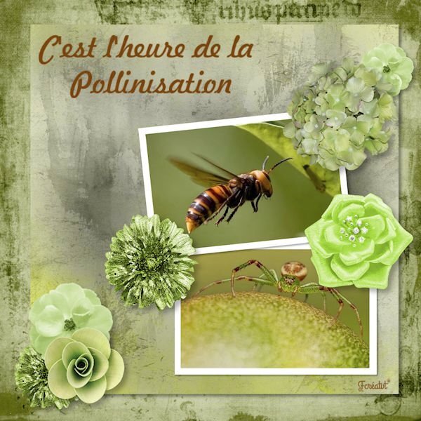
Day 6 What a great video using the blend modes with the textured paper. I used the paper (blue) from the kit as I new I wanted blue anyway. Blend mode used was Multiply. the layer above I had a metal element (was a brass metal clock outer ring element) that I resized to the the blue paper fully then used the blend mode Dodge to make it look like it was part of the paper design (opacity of clock lowered to 38). Ditto for the faint clock hands at 9 and 12, using a blend mode of Softlight and reduce opacity to 57. Title has an inner bevel. Paper doily I used HSL to make it a light ivory instead of stark white. Tiny white clock I added an inner bevel as well. I had a weird message about not being able to save. I'm not super happy with the title fill but was having such issues saving that I just went with it in case catastrophe struck. The deets: Background paper: Riley B Graphics (Creative Fabrica) Blue Paper and white clock face: Janet Scott - elegant autumn mini kit (Digital Scrapbook) Bottom flowers/clock ring/clock hands/wings: (on blue paper): Kerry Dempsy -KMRD Steampunk Elements (Digital Scrapbook) Bee Wax Seal: Billie Irene Steampunk something or other kit (Digital Scrapbook) Font: Samantha Upright (Creative Fabrica) - used glyphs on "S" "t" and "s"
10 points
-
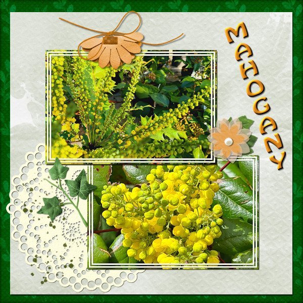
Day 7 Before we got the cold and snow I noticed that the mahogany bushes in my neighborhood already had big fat buds and I have a couple of photos from another year where they are in flower. They mostly flower somewhere in January/February at least where I live. I wanted to use those photos for day 7 and used the diamond template but I rotated t because my photos are landscape format. When I work on something else I often start with a template and rotate it to give me what I want. The colors were a bit of a challenge because the colors of the photos are vibrant and I didn't want to overpower those with vibrant colors of the papers. I couldn't find a kit to my liking so I used what I have is my stash where I store all kinds of things that I find somewhere, mostly for situations like this. So most of it I can't attribute to someone. Besides that I changed some of the colors as well. The doilie is from Marissa Lerin in the kit Fire and Ice and the font is Hobo.
9 points
-
This is Template 6 (extra). I am so sick of it by now. I dither around and arrange and re-arrange and then dither some more and try different effects...until I make myself crazy! All images from online (Pixabay, I think). Changed the texture to one in my stash. Two fonts: Dry Hard Sans and Merry Jolly, both with gradient fills.
9 points
-
I'm not happy (again) with this layout, but it is what it is! I haven't kept all the different techniques I used on each of the elements, pictures, font, papers; but, I did use different blend modes, and I began to take off when I changed the hue>saturation>lightness on the background paper (which was from a marisa lerin kit) and then played with the blend modes and opacity - which worked with what I was trying to do. I played and played and played around with trying to figure out what to do with the elements in the lower left corner and ended up with a doily since it is round to balance the round paper in the top right corner. Of course, you can see that I also played with the placement of the picture layers and placed the title at the top.
8 points
-
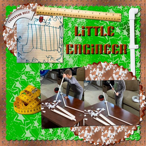
Day 7 Photos of my youngest grandson are from my daughter in law. Thomas loves to build things. The background was created using cass seamless background script with tools from Marisa Lerin. The pvc pipes, ruler and measuring tape were all from in Canva. The pvc patterns were created using cass scatter script and then cass seamless background. The green background paper was actually created by Thomas in Procreate. The font is Super Blash from Creative Fabrica.
8 points
-
Day 7 The hardest thing about this for me was picking out all the papers because of all the colors in the photos. So, other than the main background paper, I decided to use all solids and added different textures to them. I like how it turned out. Carole, thank you so much for the awesome workshop. I came away with new tips from every one of the tutorials.
8 points
-
Lesson 6, cass-Template6.jpg with the kits; The Master Of Time Sampler by Malo Scrap & Christmas dream by Malo Scrap
7 points
-
Day 6 I used kits that I made and the font is World Series.
7 points
-
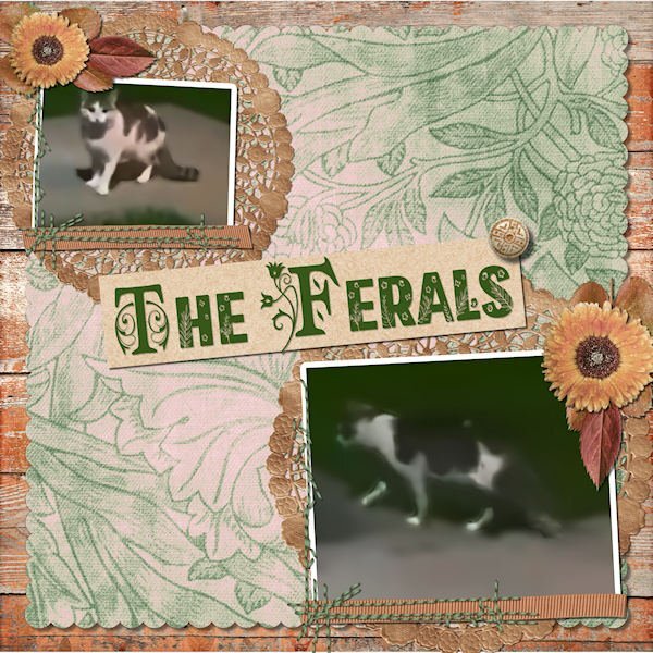
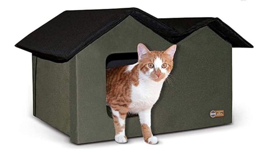
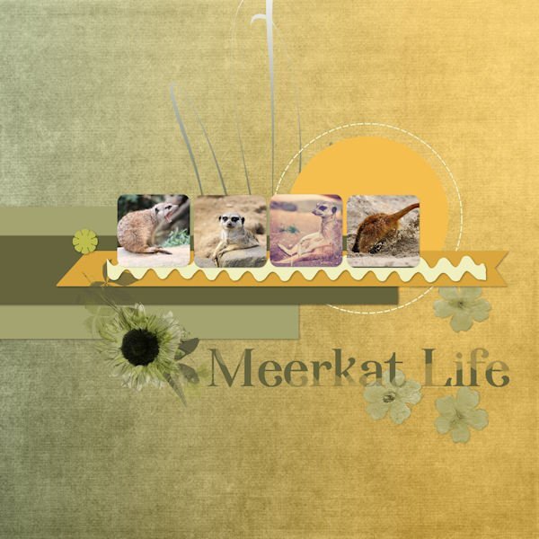
LESSON 7 - A classic scrapbook page, hoping to overcome some really lame photos clipped from a video. A little more involved than I usually do but I think it looks nice. All the elements and papers came from a kit called True Heart Digitals and the fonts are am-index and flora garden. The top cat is a mature female (I think) and the lower one is probably her nearly grown (possibly male) kitten. They seem to act as a bonded pair. She hides under a neighbor's car when I come out on the porch whereas he is bolder and comes running, meowing at me for food. I now have a Cat Cabin on the porch with straw for bedding. I've included a promo photo of it here.
6 points
-
Carole, I used to sell all my kits in a store named Wilma4Ever quite a few years ago when there were many digital scrapbooking stores around. I find that most of the stores are no longer here. I don't do that anymore. They are no longer available, sorry. I found the old preview.
6 points
-
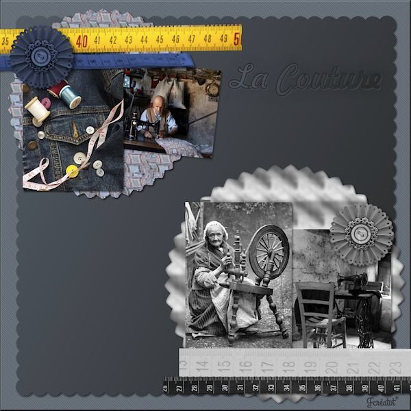
Day 6. Most graphics for the Greek challenge at DS. Zebra paper by Marisa Lerin. Font is Lust.6 points
-
Lesson 2 done. The photos used on this page were obtained from royalty free websites, sorry, I can't remember the names of the websites. Thank you for the lesson @Cassel. Everything is so clearly explained. I took many courses during the '90 learning how to use Paintshop Pro's many features and your lessons are helping me to refresh my memory.
6 points
-
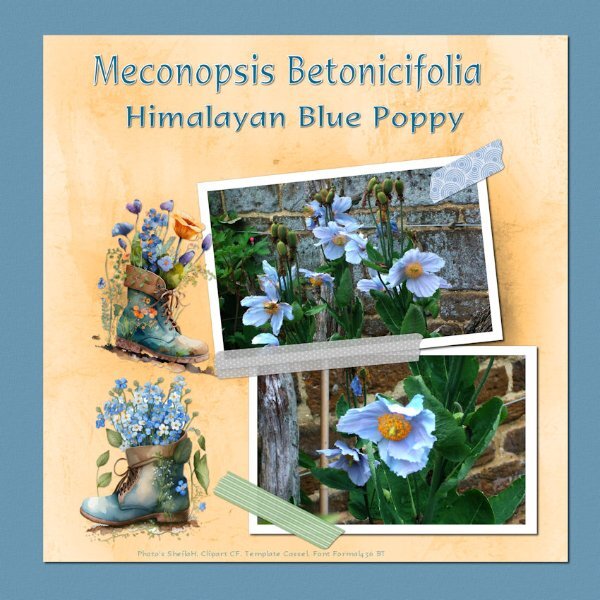
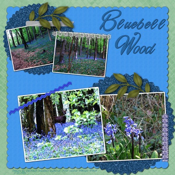
Nice result! Blue is probably the least common flower color.5 points
-
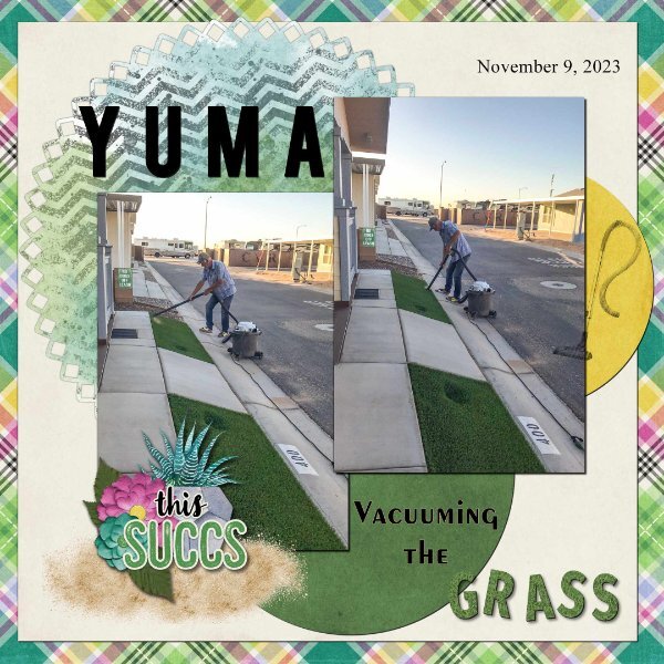
Day 7. Thank you Carole for the templates. I used the diamond membership template. I used a kit from Connie Prince Prickly. Font Fira Sans ExtraBold, Exotc350 Bd BT and Times New Roman. I used Cass GrassTexture script on the word "grass". Speaking of the clip to it script, it is one of my most favourite scrips, I use it all the time when working with templates. I really enjoy seeing all of the great layouts.
5 points
-
Day 7
5 points
-
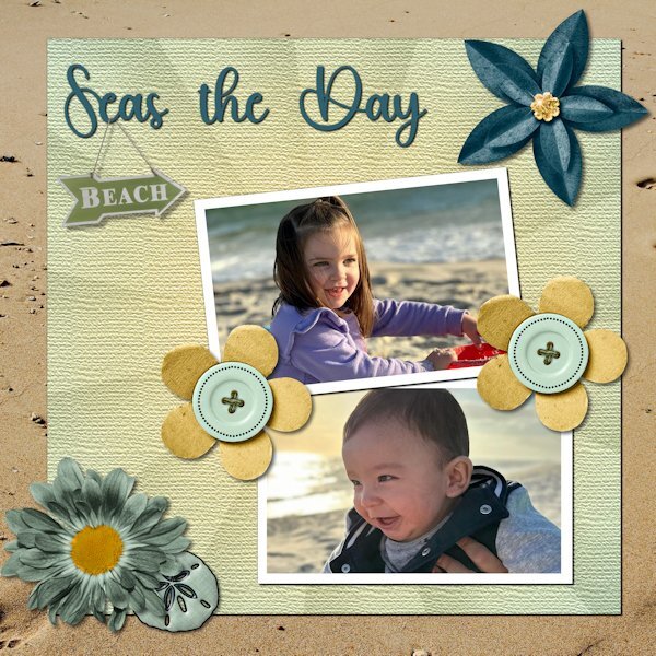
Day 6. Technically, the pictures were taken at Gulf Shores. As a veteran Miamian, I understand the difference between a gulf and the ocean. However, Felix, who is six months old, and Amelia, who is three, are not interested in nuance. Besides, nuanced accuracy would have gotten in the way of the fun title I found. The kit is from Throwing Some Scrap Around by Jodi Watson, which I found on Go Digital Scrapbooking. Unfortunately, the website does not seem to be operational. The font is Hey Beach from Creative Fabrica.
5 points
-
Lesson 7 Winter vibes is the font , All the other items are from my stash or Creative fabrica. The filling of the doily's is a pattern. For the first time I got a subscription for CF 🙂
5 points
-
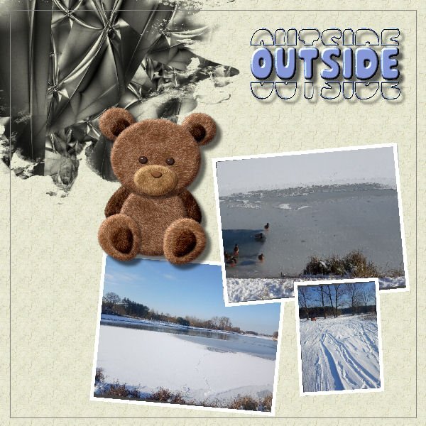
Day4. Outsige is fine but better inside. Not only Teddy Bear thinks so; ) Done without scripts but probably it would be easier with them;)
5 points
-
day 3 I made again my own papers with Quicktile scripts and I made the border around the photo with Stiches by Cassel day 4 here I made the paper with a color from the photo and added a wooden texture day 5 I used the Kit Introspective by Jen Yurko, the little tag is filled by me with the pentablet, I clipped a paper from the kit to the ricrac.5 points
-
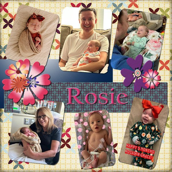
I greatly altered the template and made it into something else entirely. I wanted to really show off our lovely Rosie = AKA Rosalyn Grace. Also her dad hadn't made it into my projects yet, or her grandmom - Carole (my sister).
5 points
-
Workshop Template 5 Diamond. I think I am tired out and there is still 2 more project day templates to go. Thinking about the theme (pictures, etc.) is now the hardest part. I texturized and colored the 3 small papers (that was fun) - I used "tiling" under effects>texture effects for the first time and I like it - gives me some ideas for making ribbons. I played with the Change to Target tool on the flower element in the lower right corner. Interesting that this time there was no TITLE layer. I guess the journaling tells all.
4 points
-
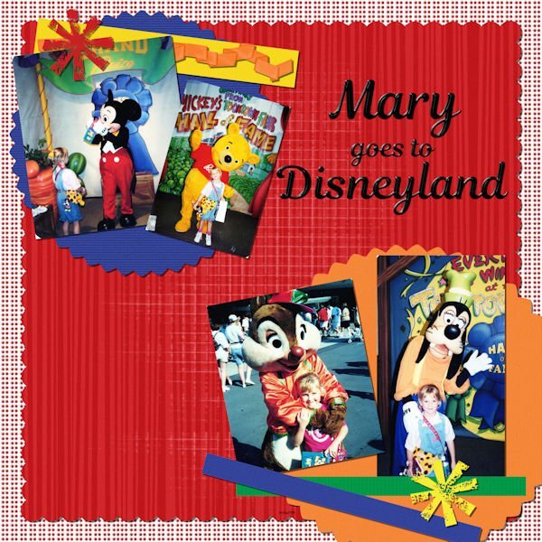
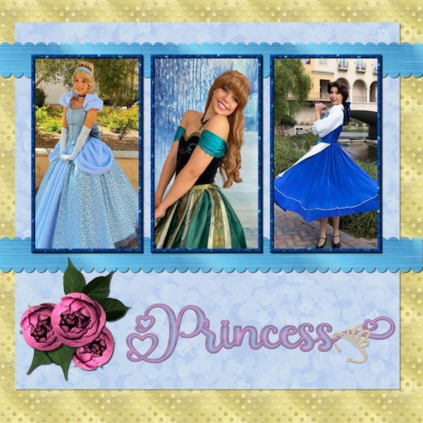
Day 6 - The photos are compliments of my future daughter in law, Lane. She works for a company that does Disney parties for children. The gold dot background is one of my own as is the blue overlay with a lowered opacity. The scalloped ribbons are my own texture, scalloped using cass quick scallop script(what a time saver!). The roses and leaves are from a package that I purchased from deeezy.com. The font is Hilender Rhapsody from Creative Fabrica. I used layer styles for the font, but wanted it to "pop" more and applied Hue and Saturation. The crown is a preset shape that was created from a font. I used VectorTube to apply the diamonds, a directional tube that I made using cassdirectiontube script.
4 points
-
Carole, thank you so much for the Fade Correction reminder. I remember learning this technique and completely forgot it. I will definitely remember it for future uses. Here is the template with the pictures corrected.
4 points
-
Regular Template #5. Took a few liberties with this one and changed some elements. All pix from Unsplash, as usual. I'm having a hard time trying to keep up with all the layouts in this workshop. So many and so much variety and creativity. Carole must be up all night looking at them and commenting. Applause to y'all!
4 points
-
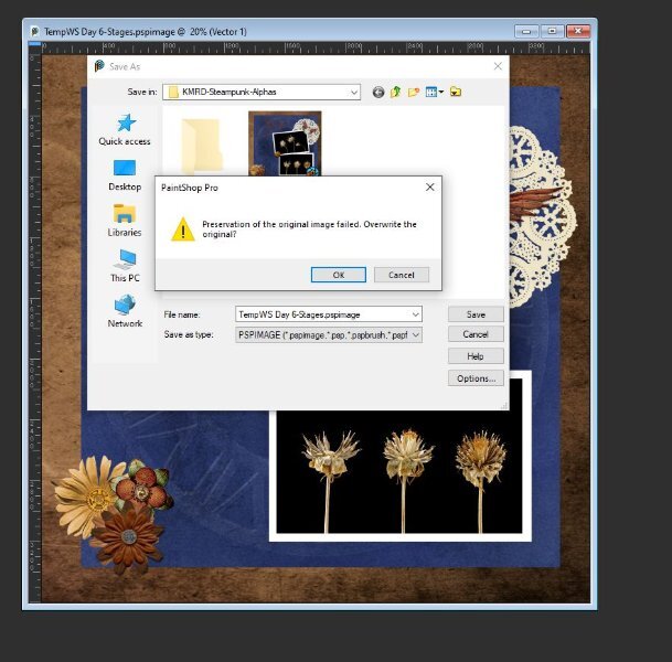
Corrie and Susan - this was happening to me a lot! I kept finding my .pspimage files in the folders for papers, etc. so I talked to Carole and she pointed me to a little script to use for my Saves that has ended the confusion. It's not you, it appears to be a bug in 2023. At my age I don't need any more hints that I'm losing it! LOL3 points
-
Very nice with that dark background!3 points
-
I don't sell mine, but since the Scrapbook Kit Workshop in the beginning of last year, I have decided that that is the best way to keep the many elements and papers I have made.3 points
-
I am looking forward to seeing your project come to life! What an interesting idea. You have good resolve, I often thought about doing something like that, then by day three i see something shiny and forget what I was supposed to be doing. (seeing something "shiny" is a joke my friends and I have about how easy it is to get distracted by something else).3 points
-
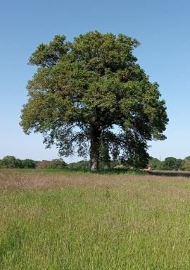
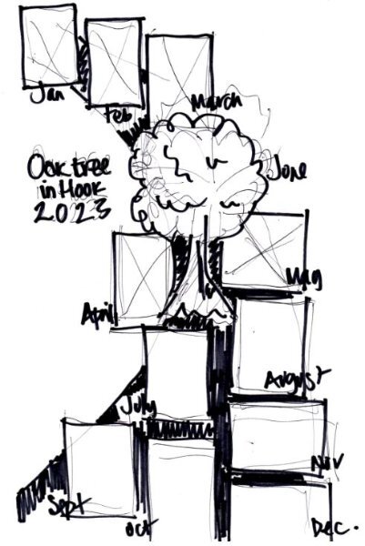
I have not followed what's going on for a few weeks so a bit late into the challenge, sorry but it is the perfect subject for a personal project I started last year that I have not finished the final layout for. I dutifully walked to the same oak tree on the outskirts of our village, once a month for all of 2023, getting the exercise and always having in my mind the creative challenge of how to present the collection of photos at the end. So my project is not quite p52 but very similar. I am still cogitating how to display all twelve of the photos into one photo montage and have made a layout to start with. The scripts that some of you are using on your designs are giving me ideas but here is where I am at so far...
3 points
-
This is regular Template #4. I'm just keeping the templates as they are, not rearranging or changing much. It takes me longer to find an idea for the layout than to actually do it! The font is Lemon with some embossing added. The background paper has paintbrush work by ET Designs, and the images come from Unsplash, bless their hearts since I don't take many photos. Just realized I forgot shadows, regular or reverse! My bad.
3 points
-
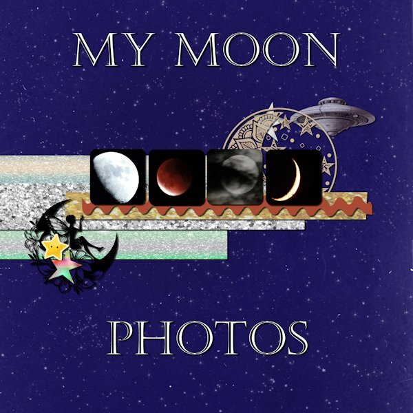
Day 5 Moon photos are mine. Font is Castellar. I have lost track of where the background and other stuff are from. I didn't make notes while working on it.
3 points
-
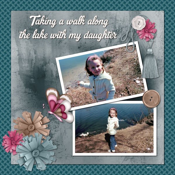
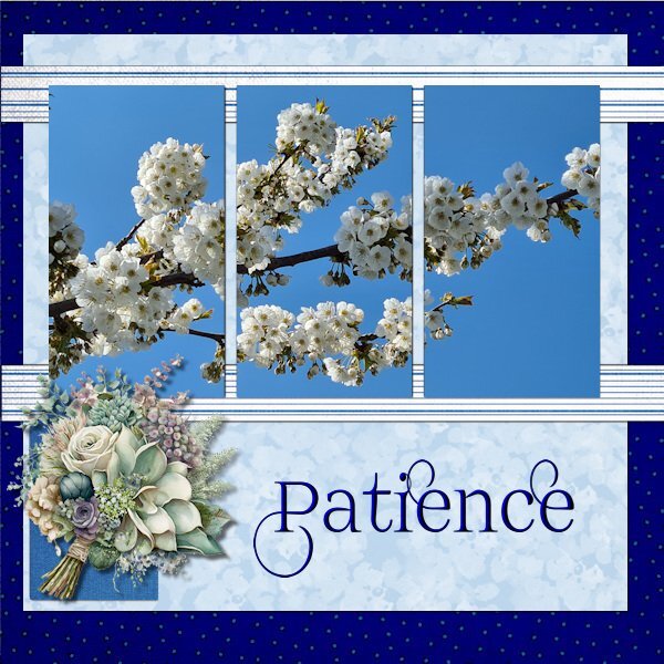
Day 6 Today I'm sticking with my flowers but this photo is from last spring and I choose it because I'm fed up with the cold and the remnants of the snow that makes the footpaths slippery! The timing of this workshop is great as we, my hubby and I are getting a little bit afraid of taking a fall on those slippery paths/roads and that is maybe a sensible thing regarding our ages. Why don't I like being sensible.............. I wanted to use this photo and therefore I used the extra diamond template because I could combine the mask layers in one layer (something we learned in the Magazine Workshop). The papers come from a kit called Denim and I got the dark background by using 2 papers and a blendmode. I really like using the blendmodes and in PSP 2023 that has become so easy. Instead of using the flowers that are in the kit I have chosen I bouquet from my stash. The font is Prida01 and that one has nice glyphs and I gave the text a bevel.
3 points
-
Thank you, Carole This has been a wonderful workshop, and I was able to use the lessons from Make a Kit as well as some of your fantastic scripts to achieve the effects that I used.2 points
-
Carole: Here is the message I got. I clicked okay and "thought" it wasn't saving it at all. Well, clearly I had been in another folder before I did that because it was saving it into that folder, clearly I wasn't paying attention. I kept saving and saving and I could see it wasn't under my Day 6 folder....so, I guess the hitting okay worked fine (the operator obviously didn't work fine -ME!). But other than that. Why do you think it was going to "fail". At the time I was trying to find a nice fill for the font and was trying out all kinds of gradients, then patterns and different settings. Do you think I was just clicking too much too fast and it got messed up trying to save the temp files fast enough?
2 points
-
Thank you for this explanation. I've been using the long way so I don't forget how, but the scripts are great if I have a ton of masks to do.2 points
-
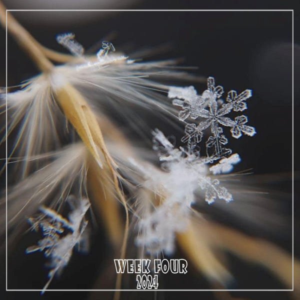
WEEK FOUR - Celebrating our frigid, snowy weather; a nice closeup from the Hudson Valley in Pictures gallery by Cindy Plumb Bishop on 01-20-24. I changed my font from Wide Latin to Showcard Gothic.
2 points
-
I'm younger than you are, but slippery wheater and because I broke my upperarm and tibia plateau a few years ago, we don't like to go outside either with this wheater. If our dog dies, we won't get another one (after 40 years!) , so we don't need to go outside with this kind of wheater.🙂 I like, as always, your layout, spring is in the air with that one!🙂2 points
-
Day 6
2 points
-
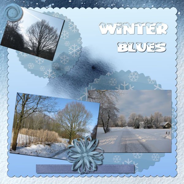
Day 4 Diamond template. The pictures are from Creative Fabrica – Freebie from a day or two ago of watercolor winter scenes. The 3 smaller pictures are from 3 different scenes in the group. I textured and used brightness and contrast on the white layer background; the font is Winter Vibes (sorry, I couldn’t get the one which I downloaded that had snow on it to come up in my font list, so I just went with this one as I like it too. I innerbevelled the font twice and then gave it a slight shadow – I picked the color from one of the pictures. The 3 small pictures I chiseled so that they would stand out since the background large picture is very busy.
2 points
-
Day 5 result. I had promised another new dragon themed tag for a guy who has a "Dungeons & Dragons" group (he has a truck, I don't, but I need one to haul soil etc for my garden so I make tags for his group emails all year). I did try and work with the template but, after inserting all those menacing dragon eyes into the photo slots, I quickly abandoned that idea and deleted them. There was a circle and some rectangles left and, in the spirit of moving placeholders and using the pick tool for scaling, I went completely off script. The paper was a rescaled and recolored wallpaper, the dragons & flames were already in my stash but, because I usually work in tagger scale, I was constantly rescaling things. The pale dragon at top right was a jpeg so I had to tube it (I hate tubing) and there was no clear color definition. After adding it to the paper, I realized that I should have misted it as blurring the edges didn't work well. It was going to be blended into the background so it doesn't look too bad unless you zoom in on some of the edges. It took several attempts with drop shadows to make the flames leap out a bit. Font is Brush Script Std.
2 points

.jpg.7fd3de87bb5e1517d5ec1d61c35860e8.jpg)


.jpg.ea0de3bb5afd63d9d8be16f6b989c0f3.jpg)