Leaderboard


Popular Content
Showing content with the highest reputation on 12/03/2023 in all areas
-
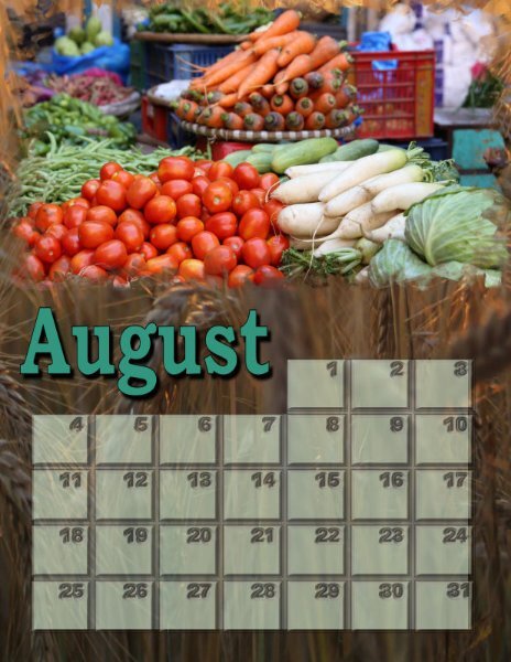
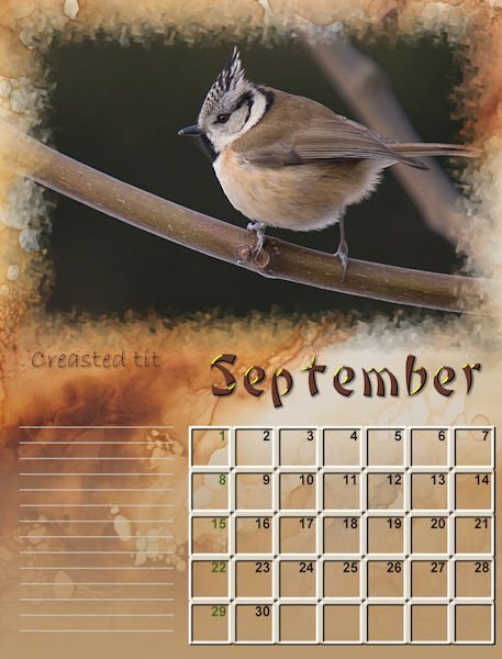
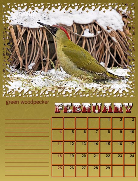
August
 6 points
 -
This seems to be a layout that is a hybrid between the November Word Challenge (Cold) and the December (Christmas) Challenge. Just playing with lots of elements and basing it on a layout I saw on Jessica Dunn's Curio Pantry site.
5 points
-
Now I think I know what you are trying to achieve. For this effect may I suggest you use the adjustment layers. I think you will achieve a much better result, not that I'm saying what you have done isn't lovely, it is. Although you have created 3 distinct frames, you still do that using the adjustment layers. In my example, which I did back in 2018, I have done many different ones since, including oval ones, within a rectangle image, which has distinct frames, like yours. Using the selection tool, and the adjustment layer brightness and contrast. Of course you can still lower the opacity whilst the frame is still selected with the selection tool, within the adjustment layer. The adjustment layers are like masks, you can go back at a later time to change it, when saved as a PSP. There are masterclasses on using the adjustment layers. 'Adjust what' is one. I hope this helps you.
5 points
-
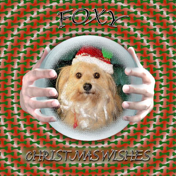
The Yule Ball is from the Harry Potter stories. I pieced together a bunch of different elements including a few touches from Particle Shop onto a background pic of the empty ballroom. The font is, appropriately, Harry P.4 points
-
You lazy, so and so!!!!!! lol, only joking. Carole spoils us with all her wonderful scripts. 🙂 You know, once you have created one adjustment layer, you'll be able to do more, with ease. It really isn't a complicated process, slow or tedious. Yet the effect, like masks will produce a delightful page. Which will allow you to be creative, like I did some out of bounds and more in the leaf layout.4 points
-
I was just trying out the 2023 Holiday postcard freebee and the Echo script. I changed a few things on the postcard. Text, colors, and bevels.
3 points
-
Great calendar, Ann... I am sure your granddaughter will love it...Even more, knowing that Grandma did it,3 points
-
This is especially interesting because it looks telescopic….i think because of the lightest frame in the smaller center and the graduated widths and graduated spaces? Something surely to play around with.3 points
-
On the Home Depot flyer the title was, "Black Friday....Starts Thursday" Love humour in advertising.3 points
-
Mary, those are beautiful! I might try to make those, but I don't understand why you need a mask - can you just plop them right on top? - but then again, I never did see the need for a mask. Ooops! I'm finding it difficult to get the days of the week because I don't watch TV much any more -- you know, when Thursdays were Seinfeld & Friends? Plus my husband and I are retired, and all the days get mushed up. Do NOT subscribe to Katie Pertiet's newsletter! She has a sale on Tuesday, "Template Tuesday", and the emails for it come out on MONDAY morning, subject line "Template Tuesday!" Then she has "Thrifty Thursday", and you guessed it, the email comes out on Wednesday morning with a subject line of "Thrifty Thursday"!! I'm lucky I can get the year right!3 points
-
This one is a mask saved with the frames in various opacity of white.
3 points
-
I put this page in November by mistake. I like the gold. I'm going to use this in some of next year's festive cards, as the greeting/verse on the inside page. It ill make for a novel layout. I will also be able change some of the wording, depending who the recipient of the card is going to be.
3 points
-
3 points
-
3 points
-
3 points
-
3 points
-
3 points
-
3 points
-
Now that the Travel Tale is finished, off to the printer, on its way to my home, I am playing again. Decided to look at that 3 transparent frames with varying opacity. This is what I came up with, but it isn't what I saw (think I saw???)
3 points
-
I'll take it as a compliment, and it's my pleasure to widen the realm of creative possibilities within PSP. I can see, we are going to have to start another holic group. Only this time for scripts. For scriptaholics. I hold Carole totally responsible for this addiction. As how can anyone resist the temptation of her wonderful time saving scripts. hahahahaha.2 points
-
I think if I hear/see the phrase "Black Friday" this many weeks after the actual one, I will scream!2 points
-
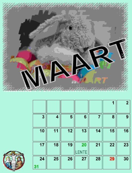
I made at last a first start for the dutch month of March. In this case the echo-script did not do what I wanted, but in a few days I give it antoher go. I am a bit ill. A very bad cold. Bad for me because I have to breath through a hole in my neck, after laryngectomie. It's going better already, but it makes me very tired some days.
2 points
-
Lovely images Jannette! Very coherent design.2 points
-
You are so absolutely right. The brolly is a necessity, all year round. I've packed my British waterproof clothing. My Canada winter clothing will be to hot for home. I won't be taking a laptop this time, but I will have my phone to check in on you all.2 points
-
It wouldn't be christmas without cold, and the white stuff in the northern hemisphere. A perfect combo. You have a nack of arranging elements, creating beautiful layouts, without going overboard.2 points
-
Happy trails, Sue! You will be getting a break from the cold and winds of the prairies and using a brolly instead I think. Looking forward to the layouts to come from the trip.2 points
-
You are absolutely right, I fly out on Wednesday afternoon, arriving at mid day the following day. I will be away for more than a couple of weeks. I fly back on the 31st January. It's going to be a wonderful, special time. I'm told that the girls are now counting down the days of my arrival using their advent calendars. Thank you!2 points
-
I know, right? 🤣 We are spoiled for sure. I am going to give this technique a try, I really like the look. If I ever get Christmas put out that is. My living room is so full of boxes I can barely move. Once it's out and the cards are addressed and out the door I will be FREE and can play. PS Thanks for the good laugh.2 points
-
Providing you save the file with as a PSP, the adjustment layers will reman in tact, and you can slip another photo, of the same size, although you could size up or down, depending on the image, above the original photo. There will be several layers, but you can hide what you don't want to reuse. So yes, you can. They work like masks, you will be able to adjust those layers to suit the new image.2 points
-
I can look but an adjustment layer is just a greyscale layer that acts like a mask. So, a script similar to the Raster to mask might be possible. Something like Raster to Adjustment?? Worth looking into that.2 points
-
Makes me feel warm & fuzzy that others have this going on too! I will swear it's a Wednesday, for example, and then realize it's Tuesday. Better to call 'em brain f@rts than senior moments.2 points
-
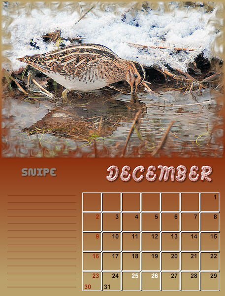
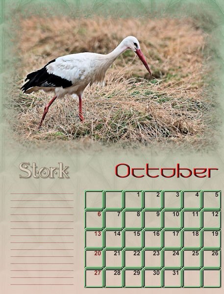
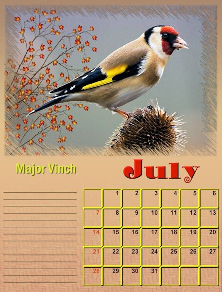
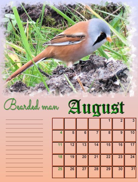
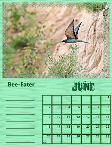
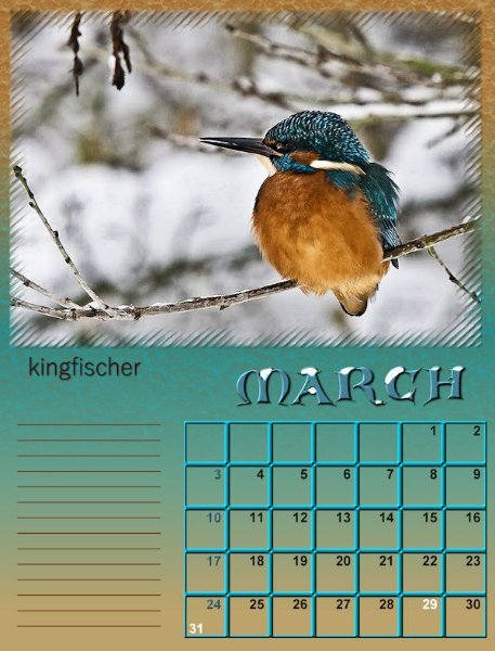
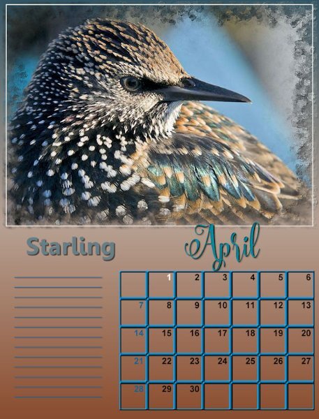
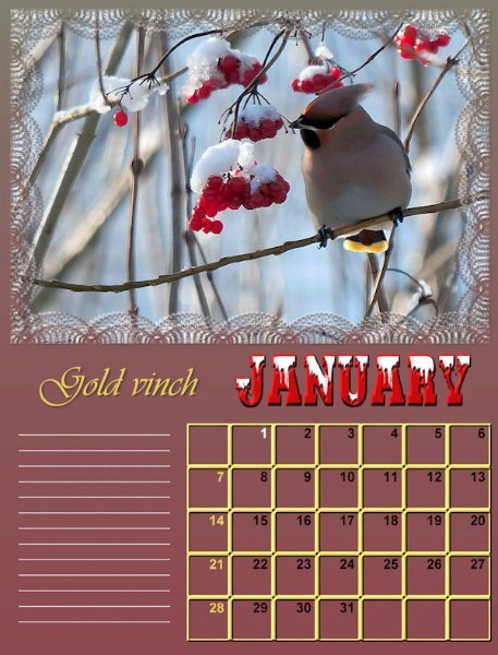
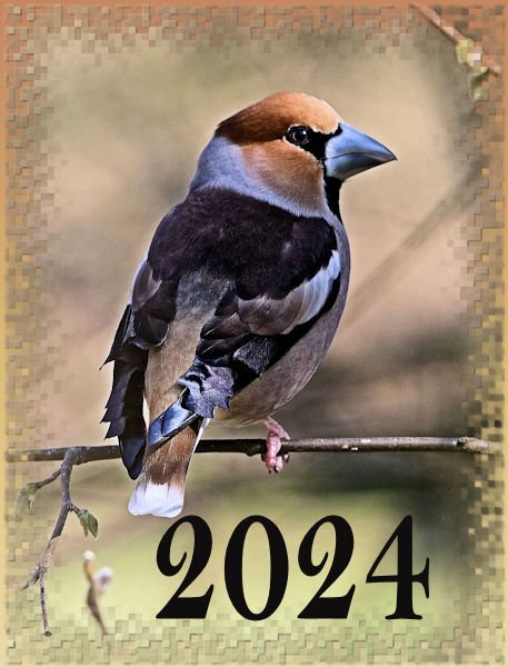
Restarted Calender 2024. all pictures are from : © advanduren nature fotografer. With his permission. Front and back. the birdsname is the Apple vinch.
2 points
-
I saw something similar online, which caught my eye. I decided to create my own. I'll make it more festive with colour, holly etc. Wordart using only fonts.
2 points
-
Carole has transparent frames script. I replicated one of them, it's below. The only other thing I can think of is using the adjustment layers.
2 points
-
Here's what I came up with for COLD. A pic I took last winter or one before of a squirrel waiting for food. I can't help it; I feel sorry for them in bad weather and do the handouts for them and the birds year round. Costs a lot more than it used to! The background is a paper from somewhere, vector frames with bevel. (Might have used the photo here before?)
2 points
-
That little out-of-bound effect is subtle but gives a nice touch!2 points
-
Welcome to December. Here is the December calendar featuring the Amur Leopard this time. Enjoy. I even used a little Out of Bounds on this one. I have posted a full size version on Facebook that will print 11"x8.5" I feature mine on my desktop. The leopard information is from the Beardsley Zoo in Connecticut, where they have successfully bred some new members of this endangered species. Edit: forgot to name the Amur Jaguar font - Sedalia and the journaling is Arial Narrow.
2 points
-
Template 207 by Lady 22. The 4 triangles across the middle contain one continuous photo.2 points
-
Trip to Skyline Drive in the Shenandoah National Park. The path was very rocky and the leaves covered the rocks. Stepping carefully was a wise thing to do. Template 206 by Lady 22.2 points
-
Now then, don't anyone dare laugh, but seeing as I had completed all my festive cards, calendars and everything else related to the festive season a while back. I decided to start thinking of Christmas 2024. I'm currently working on greetings for the inside of cards, something other than the usual plain journaling. I posted the wordart tree earlier. Since then I have done 3 similar to the one below. Although it's white vectors on a black background, they will be colourized. This is how I start any of my word/subway art. I used from vector shape to cut out the & from the bauble.
1 point
-
Where as you created actual frames around your image, and then lowered the opacity of those frames, the image stayed the same. The brightness and contrast adjustment layer alters the actual image, whilst still retaining the sharpness, colours, and quality, although they might be made brighter or less bright. It doesn't alter the opacity. There are a lot of adjustment layers to play with, depending on the look you want to achieve. While you still have the selection tool active, you can add textures, even an inner bevel. Personally I rarely do that. I'm only making you aware of some of the possibilities.
1 point
-
I created this starting with a Globe shared on PSPManiacs.
1 point
-
I just downloaded Samantha Upright and discovered I have several different fonts with Samantha in their names. You may have looked at the wrong font in Character Map as I did. BTW, this is the first font where the Bonus File has a PDF showing every single glyph. I wish every font designer would do that as it's so much easier to see them in a large format.1 point
-
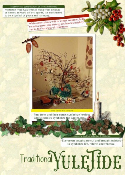
I dug out one of my very old photos from home. It wasn't that long ago that we were discussing the origins of Christmas and it's relation to the Winter Solstice during pagan times, in the campus. I mentioned that my children and I would go out gathering greenery for decorations, and branches for a tree. I have created a Yuletide page. I still make paper chains. I used Carole's label script for the journaling, the pine cones come with PSP. The other elements I have acquired over the years, which I use over and over in other pages, particularly the ivy, which you may recognise.
1 point
-
All the days get blurred in my head at times! It is a good thing I have specific things to do on specific days to help me remember what day we are!1 point
-
I didnt know this. I wonder if Creative Fabrica is the same. I copy the preview to a preview folder (it's easier to choose a font) and several times already the preview shows a glyph and when I go to use it, it doesnt show it either in my font viewer OR Windows Character Map. Also, does anyone have Samantha Upright? Some glyphs copy and paste fine other,(Many others, in fact MOST others) copy the selected glyph I chose, but when I paste in the project it is a whole different one and it's like 9 or ten glyphs away from the one I chose. I've even deleted the font and got an new one. I'm going to start adding the ones I use to a favorites (I can do that in my viewer) and then at the end of the year I will pick a few more I like but havent used and get rid of the majority. I'm sick of spending 1/2 hour going through fonts when i can be using PSP instead. When I first said i had 12K it's ALL the fonts. Some fonts come with many versions (family?). the actual amount I've downloaded is only ("only" 🤣) 4700. So that's not so bad... right? I'm only a "little" font-a-holicy.1 point
-
Your book is fantastic and it will look so cool when printed. It will be hard to equal this gift and I hope your son-in-law will appreciate it and love it because it holds all those memories to cherish for a very long time. I'll try to remember the idea of using a watercolor background in a photo album for my own future albums!1 point
-
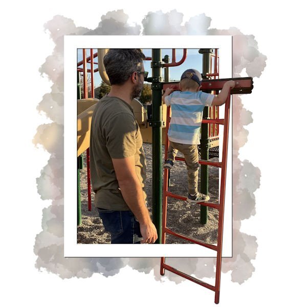
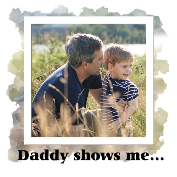
And another And the text: I like to climb in the park. Daddy shows me how to keep my balance, and how to go higher without being scared. Maybe... someday... I will be... a construction worker.
1 point
-
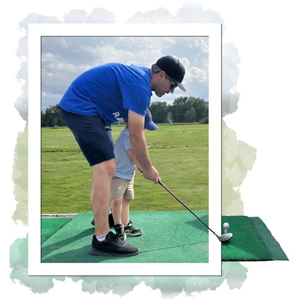
Next page: And the text: I like to play golf. Daddy shows me how to hold the clubs and hit the ball. It is not always easy but it is fun. Maybe... someday... I will be... a golfer.
1 point
-
I guess I can now share the pages I did for my handmade Christmas gift (I picked my son-in-law) so here is the cover for the book.
1 point


a.jpg.3b3457c8bfc9bfc8635f927741c3522d.jpg)


Resized.thumb.jpg.d25811db03a63358cedab1e79f527635.jpg)