Leaderboard
Popular Content
Showing content with the highest reputation on 11/15/2023 in all areas
-
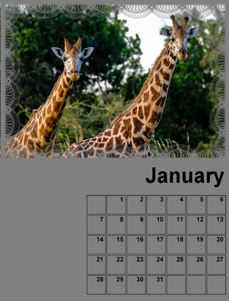
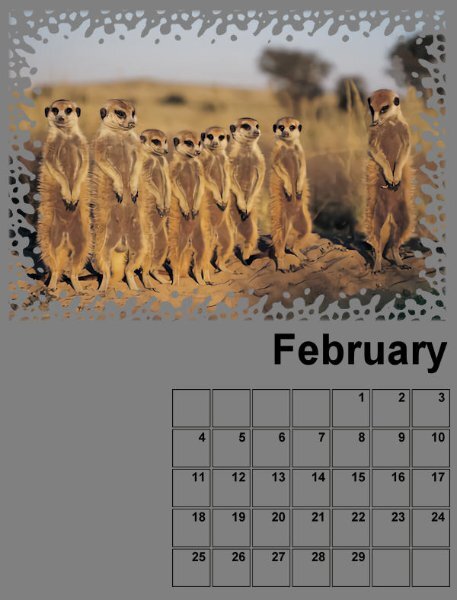
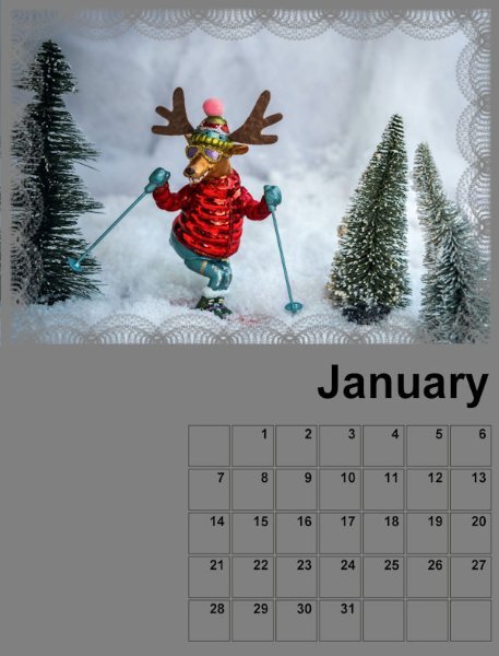
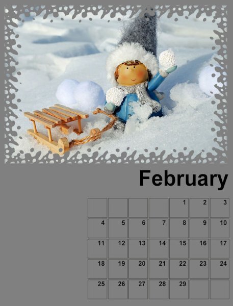
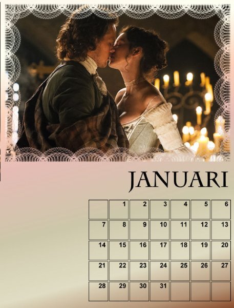
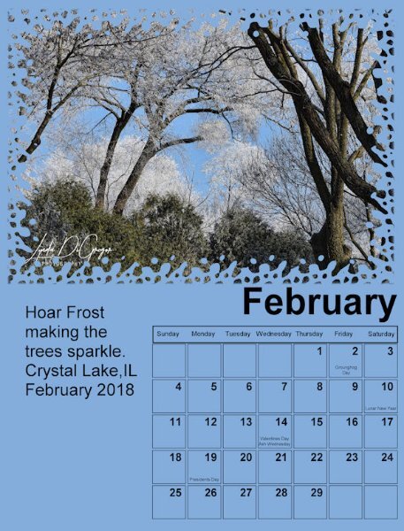
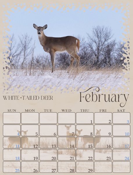
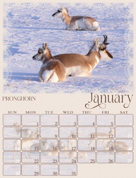
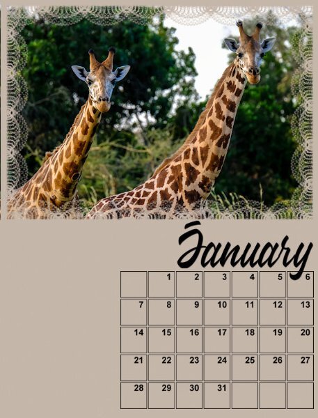
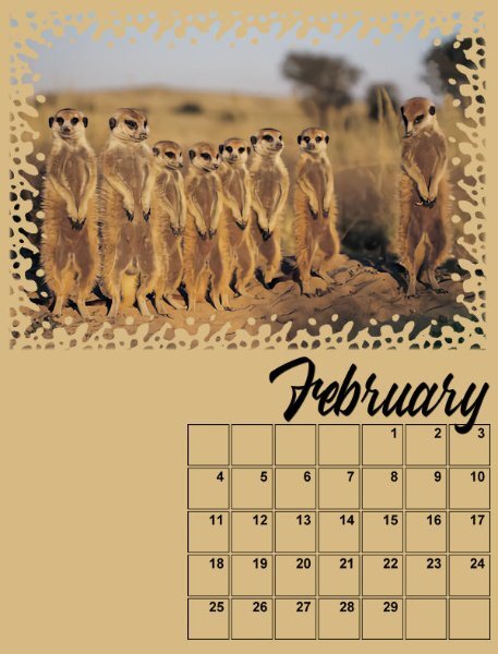
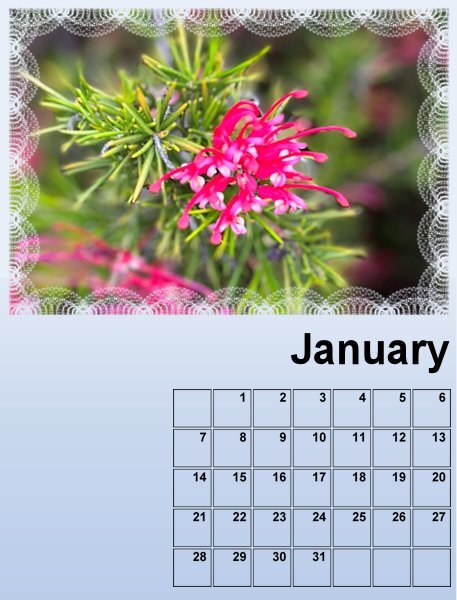
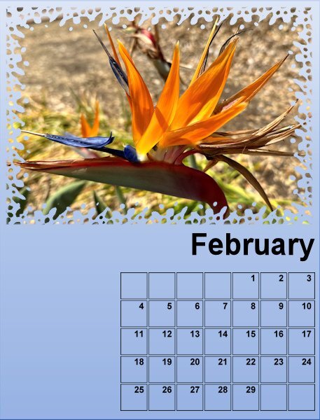
Ever such creative work submitted by talented ladies and gentlemen. Some will know that 3 weeks tomorrow I will be flying home, which had meant that throughout the summer I had been busy plodding away with calendars, cards and advent calendars. This year I made 3 different calendars, insects, landscapes and mammals. It just so happened that I used the very first set of templates for this calendar. So I thought I'd post Jan and Feb, as I am not actually participating this year. I created my own rounded date boxes.12 points
-
11 points
-
Here is my February page, font is Sweet Love the Statue is in our Zoo in Aachen9 points
-
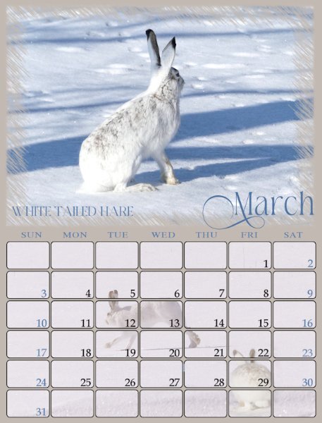
When adding photos to the calendar grid, it can be a bit tricky, as for me I have to have their face, more specifically an eye/eyes unobscured by the grid. In this one I used two photos, adding the hare in the bottom right corner. Making sure everything was in proportion. I'm hoping that if I hadn't mentioned it, everyone wouldn't be any the wiser, thinking it was one photo.8 points
-
Seeing some of the entries in this forum encouraged me to give it a try. I haven't been active with Paintshop Pro or on the Scrapbook Campus for quite a while .It took some extra time to relearn some of the basic techniques on how to use the shapes in the starter image. Rereading some of the campus tutorials helped, thanks to Carole. I will have to get back to it more regularly to stay comfortable with the program. I am always impressed with the artistic skill of many of the contributors. Using all the different accessories to accent their images is such a good skill.7 points
-
7 points
-
7 points
-
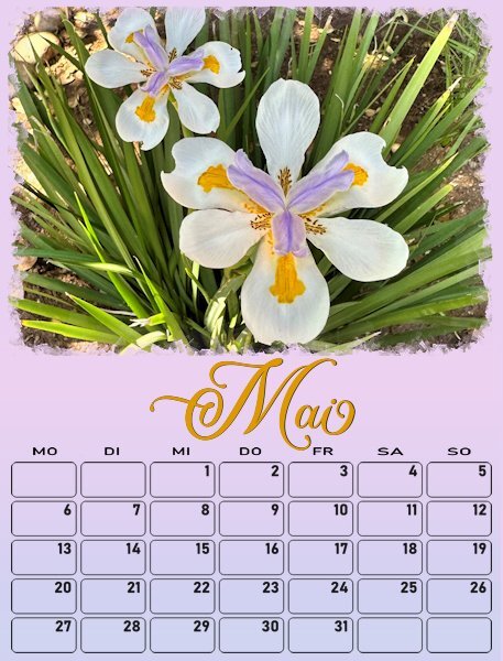
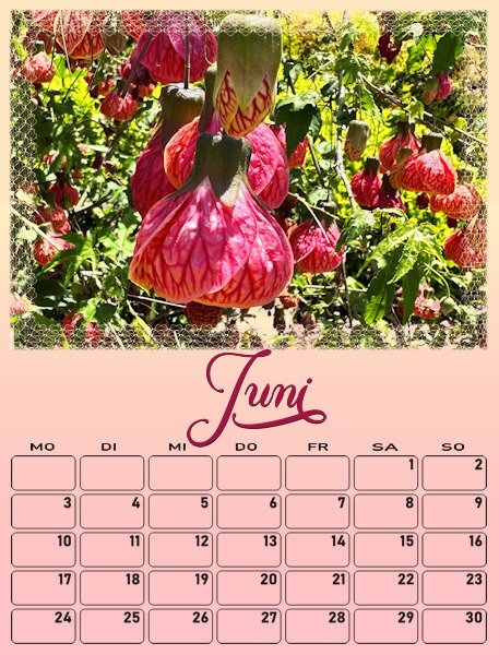
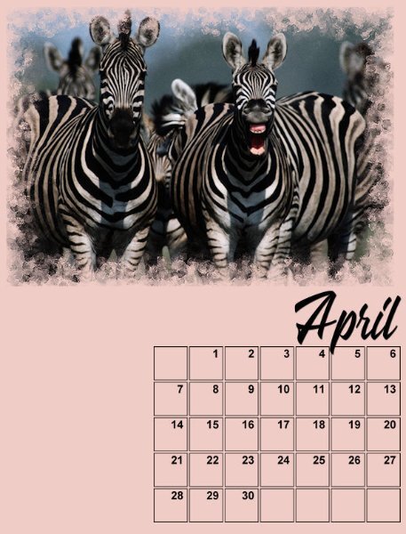
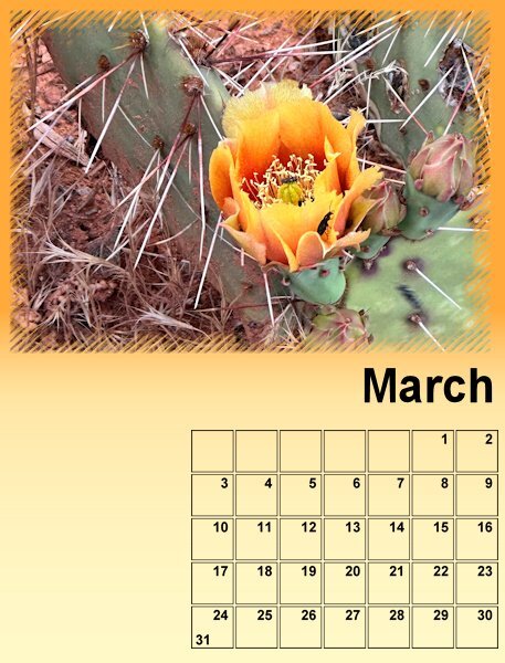
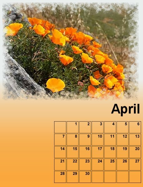
And this are the pages March and April, by the way when I change the font I will change language too. One copy of this calendar will be in German and one in Dutch, because I have to make X-mas presents for different countries and languages! But it will be easy, only the months and the days of the week. All my pages will go by the same principle but the colors will change depending on the colors of the flowers in the photos.7 points
-
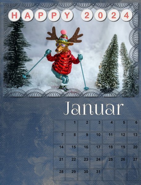
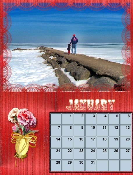
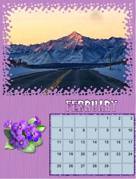
So far, I have only updated the month of January. Just to be different this year, I added Cassel's Alpha Beads. The basic is a freebie, and I changed the font/color following the Alpha Beads tutorial. Credits: Overlay: ps_melo-vrijhof_162544_textures-painted-paper2-paint-paper-09_cu Font: FoglihtenNo07 https://scrapbookcampus.com/the-lab/lab-10-module-06/ Edited: I mentioned it before, but I'll mention it again. All photos are/will be from Pixabay, Unsplash, or Pexels. I downloaded them years ago and use them whenever necessary.6 points
-
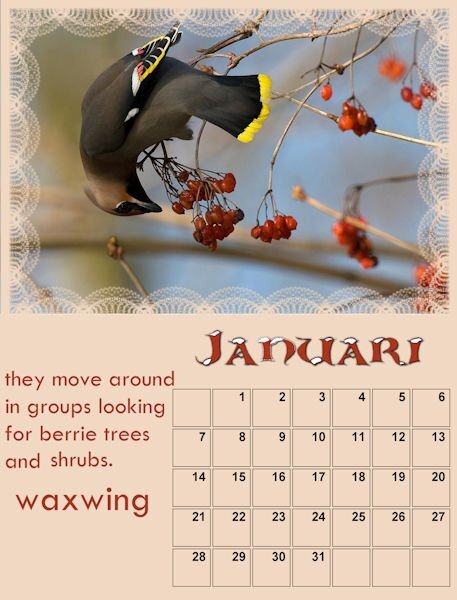
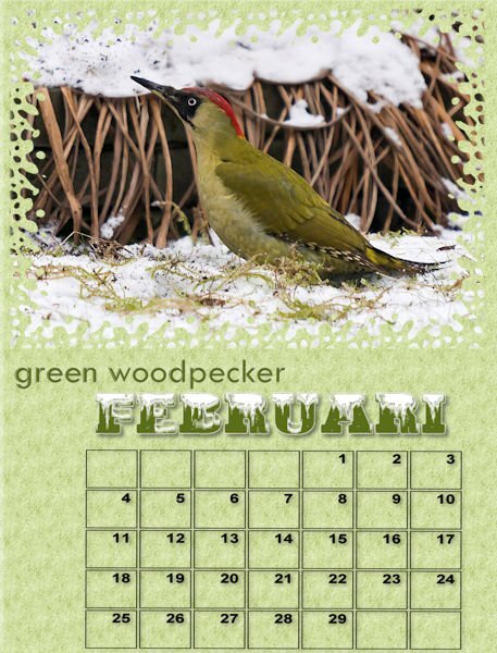
I'v improved the januari and added the februari On the photo of the green woodpecker is a copyright, it is from Ad van Duren nature photografer. I do not have to pay for it as it is for private use. I may use more of his photo's he promised me. I will make a logo to him in exchange. And he wil have a copy of the calendar!!! Now I have to make an extra effort.6 points
-
6 points
-
6 points
-
6 points
-
6 points
-
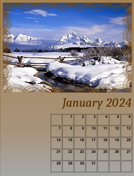
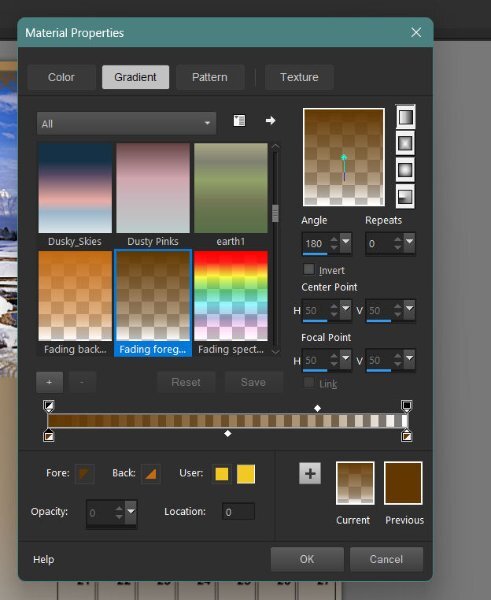
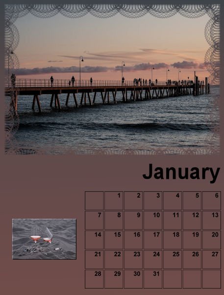
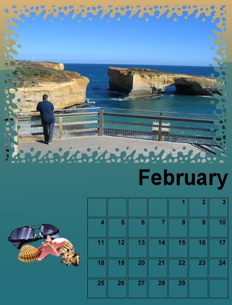
Here is the preview of January and February. I used the technique showed in the lesson with a twist. Instead of using 2 solod colors and the gradient faded background I used one solid color as a base and then chose a matching gradient on an extra raster layer and took it down and played with the blendmodes until I got something that I liked. Fot this 2 pages I used the same color and gradient only with a different blendmode. I will change the font much later in this project so I can do them all in one go. I will probably change the date boxes too because over here the week starts with a Monday.5 points
-
5 points
-
I love what you did with the background of the calendar grid. Excellent idea.4 points
-
I started this page 3 nights ago, all that was left to do was to add a post it note, date stamp, and an alpha bead. All element tutorials can be found in the creative scrap. I think I have the titles of those tuts correct) My very first sighting and photo of this secretive bird will be a memory I shall cherish. I used the same technique that I used on the Great horned Owl. Created a mask, by using hide all, this time I added a frame. If the frame doesn't look right to you let me know4 points
-
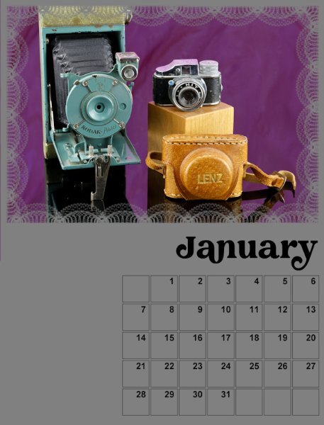
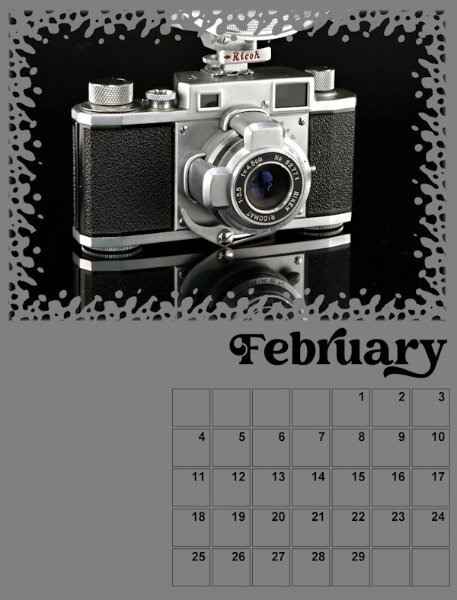
Here is the start of my Calendar - Jan/Feb I mostly have portraits orientation on the cameras I did photograph for the Magazine workshop. So, I will be in the studio shooting again to get some in landscape format. I'm sticking with the Creative Vintage font I used in the Magazine workshop. I will add the background as the lessons continue. I like that we build on each one and then go back to the previous months to add the new techniques. Good practice for me.4 points
-
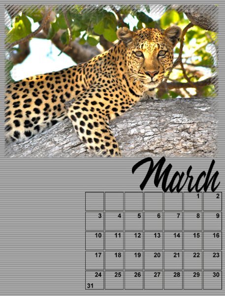
Here are my preliminary Jan and Feb pages. Waiting for the next lesson to proceed further. The topic is Wildlife of Botswana, where, in previous years, I had documented a fantasy vacation to Africa for a Travel Workshop, based on my admiration for the book series, The No. 1 Ladies Detective Agency by Alexander McCall Smith.4 points
-
4 points
-
As suggested by Sue Thomas I have added shadows to the images on this project. I also learned that adding drop shadows as a new layer really helps. When I first tried to add a drop shadow, it wasn't to my liking. But another try just added a second shadow ti the first not a replacement. Then I saw the little box to add the drop shadow as a new layer. Now I can experiment until I get the effect I want. I also changed the images to the proper size as outlined in the instructions. My first go had some images the wrong size (too large). With the resizing the project looked wonky so I had to adjust the images to make it more balanced. Thanks for the learning opportunity.3 points
-
Thanks Lynda. It's also a nice subtle way to use more photos, as I don't have a shortage of photos. I will point out that it has to be a subtle addition, as the days have to take precedence, being clearly visible and legible to cater for all ages of eyes. Creating a calendar isn't any different to creating a magazine or newspaper, as it has to accommodate a wide audience.3 points
-
3 points
-
Wowzers! Both months are gorgeous! I love how you did the date boxes with the lowered opacity photo (is that right?). Did you make a mask out of the date boxes. What creative and wonderful ideas you have. Super inspiring. Have a safe trip, a fabulous time at home and I hope you are able to check in with the Campus so we know how you are doing?3 points
-
Here are my first two months. I thought I would go whimsical this year. Then again, I may change my mind. LOL3 points
-
3 points
-
I have altered the date boxes for the weeks to start on Monday. I have Carole's Custom Calendar script for 2 years now and it works great and is a timesaver too. The script gives the opportunity to choose a different format for the boxes and you can design them too. But I wanted a simple shape, nothing fancy so I can write things inside them. Therefore I have them on the full width of the page. I have spend some time to find a font that I like and that has the glyphs I want. For the time being I have put the month's name in the middle of the page, maybe I'll change it later. I will use the same font for all the months but change the color to match the pages. Font is Almond script. Now I'll have to see what the dates for all the holidays in 2024 are. Some of course are always the same, but not all. And I have to search the ones for Switzerland too, because some of theirs are not celebrated here and visa versa.2 points
-
2 points
-
2 points
-
2 points
-
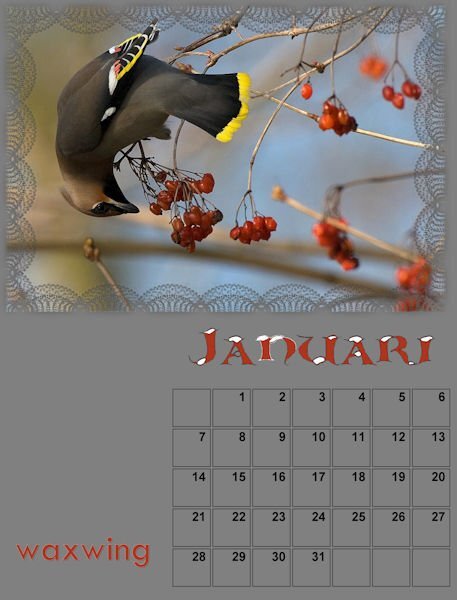
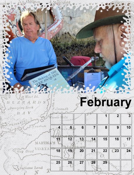
@Cristina Those photos are cute and fun! @Jannette Nieuwboer That bird is a great contortionist! @Michele Whimsical looks fantastic! @Ann Seeber Those pictures already make me smile! @Dan Greenwood Although we have not touched on changing the background, you have a great idea by using a map! @Corrie Kinkel Gradients can add a real touch of "elegance" in place of a solid color. And yes, the months can be edited in any language! That is the advantage of those templates. @Susan Ewart What is that font you are using? It looks like a fun one! @Anne Lamp Cool start. Looking forward to the other months too! @Donna Sillia You are ahead of everyone with your page 😉 @MoniqueN. This is how to personalize these pages. This is so meaningful for you. @Anja Pelzer That is an interesting twist to put the month on the bottom! @Sue Thomas Thanks for sharing your previous calendar pages. It can give ideas of what CAN be done with PSP! @Julian Adams Are you talking about the Gradient Fill or the Gradient Filter? You can check this article for some details on how to use it. Let us know if you need more help. What you have on your PSP is just different from mine because I have set mine to use the Classic Materials palette. You can see how I set it up on this blog post.2 points
-
2 points
-
I think it looks great. The candles on the right balance the picture beautifully.2 points
-
Here is my January page , I used the calendar script in PSP to make the dates and filled the background with a pattern font is White Winter2 points
-
2 points
-
Thank you so much Cristina! It appears, I have my stamp written all over my work, making it unmistakably mine. 🙂 I have also created other different shaped boxes. Including cut box effect. A certain person will know, I won't mention any names, but you know who you are. I love the theme you have used for your calendar, quite ingenious. Like Michele's theme, it goes to show that you don't have to use photos.1 point
-
Oh Anne, that is awful. I just went through some computer woes that took my husband two full days and much research (just to talk to a human) to get it resolved. Once he talked to a real, actual human it was fixed in less than a minute! I wish you luck and a speedy recovery of your e-mail account and all other computer woes. Sometimes, computers are just plain evil!1 point
-
Well it looks like I won't be able to do any more months. Both my Mozilla firefox and google chrome is asking for a varification code sent to my cell phone when I try to sign into my e=mail account. Problem is I don't have a cell phone. If I get this resolved I will be back on. GRRRRR1 point
-
1 point
-
Thanks Ann, actually I don't have the Echo Text script. As I did with the Great Horned Owl page, it's my interpretation of that script. It's a lovely way to showcase photos. As for the Rusty Blackbird, they are of concern, as their wintering grounds are as far as Texas and Florida. They are loosing their natural habitat to crops. Their numbers are at a minimal, they nest in the length and breadth of the Canadian Boreal forest. Being secretive birds, little is known about them. That is why I am going to cherish the memory of seeing this one, as it graced my trees out back, en route south.1 point
-
It's called Creative Vintage. From Creative Fabrica. it does have glyphs and ligatures. I used it for the Magazine workshop and since the cameras are all 40+ yrs old I went for a Vintage style font.1 point
-
To achieve the desired effect in the boxes, would depend on the colours and images used. Some may need a blend mode, along with lowering the opacity. To select the boxes, the selection tool, magic wand is more efficient, than creating a Mask. I will certainly be periodically checking in to check up on you all. I've decided not to take my small laptop this time.1 point
-
1 point
-
1 point
-
1 point
-
1 point
-
I added some text and I made a box with the days in it. I saved the box as a png for future use. As the Nature Conservancy has already sent the 2024 calendar. I used it to label the days. I'm using photos from over the years that I've taken. Each will be used in the month taken. Not sure about the backgrounds yet. I would like to put some shadows of some kind to the frames. Don't know if that's possible. Have to wait and see.1 point
-
hello all... i need to get better at using PSP... ive done some things before, but if you dont use your skills you quickly lose them...1 point
-
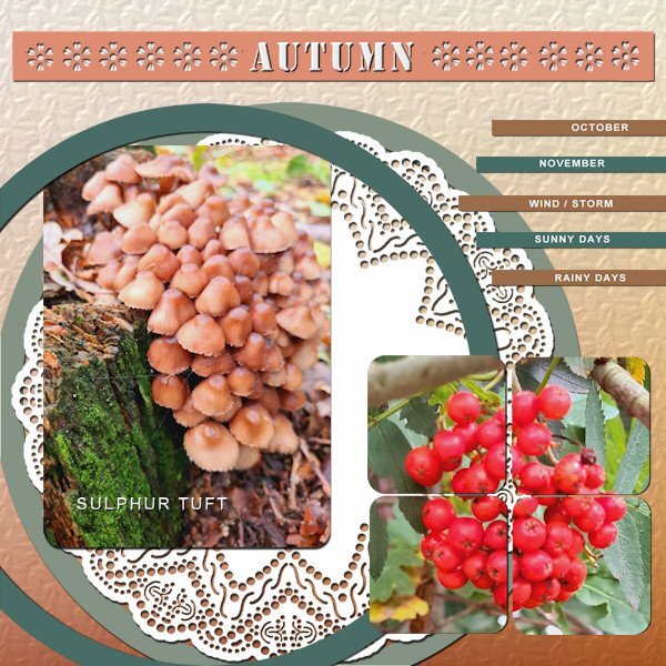
I'm still in the Autumn mood, due to the weather we got this last couple of weeks. I used everything and added an extra square tile so I could use 1 photo in 4 tiles. The color palettte is from the October blogtrain on digitalscrapbook.com. The background has the texture spruce, the doilie is one of a set by Carole which I have for a long time and the fonts are Stencil and Arial. I made a cutout with a brush that is in the the brushes folder.1 point










.jpg.6261982a5cafc25358e1895746365d19.jpg)

