Leaderboard
Popular Content
Showing content with the highest reputation on 10/19/2023 in all areas
-
Hi everyone .Following a lot of e mails back and forth, thank you so much Carole, I think I might be finding my way around, but there again if this is in the wrong place I clearly have not ! The photograph is of my Retriever, Oona, sadly now at Rainbows Bridge but her antics still bring a smile to my face. I have never done a workshop before or indeed been on a forum so this is a big learning curve !9 points
-
7 points
-
Just a little fun with the Daily Look today. A mixture of a bunch of clip art and characters from the game. The font is Mrs.Monster Academy.6 points
-
6 points
-
6 points
-
wonderful layouts around here , page 1 , my sister and 2 nieces on a boat on Rursee / Eifel years ago6 points
-
5 points
-
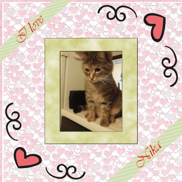
Hi, unfortunately I don't know English, I don't write much, for this reason I rely on Google translator, hoping that it translates well. This is my cat or rather it is my partner's cat, her name is Nika, she has a variable character but by now I have gotten used to her liveliness, she is part of the family My works are simple but I like them that way.4 points
-
wow, what an experiece for you. We were at Elk Island Nat. Park, (it's close to us, 30-40 min) and we drove in and there was one right there beside our truck (glad we were in the truck and not the car), it's just as you say "almost scary in their size". It's amazing how fast they can move too. They do seem to have an air of nobility dont they. Truly magnificent. Well, I think any nature experience is magnificent. A squirrel running along the fence, the LBJs in the bird bath or dirt bathing. It's fascinating to watch and makes you happy.4 points
-
4 points
-
4 points
-
4 points
-
4 points
-
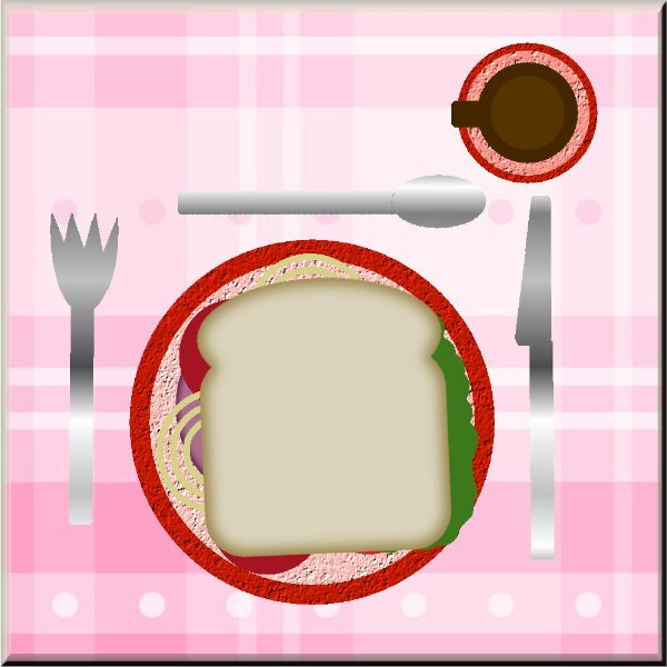
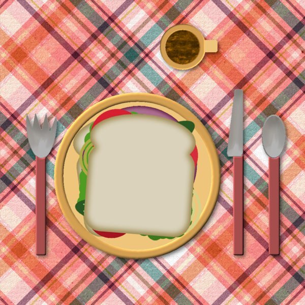
Work space...dark gray Background...medium Standard tool bars for the Edit workspace. I added the script toolbar. I love the light gray work space...it's what I had in PSP 8. It is very bright on my screen so the dark gray works better. Wonder if there are setting for my monitor to ton down the brightness of the light gray. I got carried away with my sandwich...mine always have a lot of meat and tomatoes, some cheese, no onion. Dessert always if possible. Chips sometime. Never drink coffee.4 points
-
4 points
-
Hello, today the video worked. My Lesson 3. Credits on the scrap. Fonts: CF Good Dog, Mia's Scribblings and Erikas Farbband:3 points
-
And we all learned and had an example of two different ways to use it. I understand how foggy a brain is when you are tired. today is that day for me and I'm about to get in a car and drive! Look out world, here I come! With less than 3 hours of sleep. Got home from work after 1am (work was physically exhausting and my hands are really stiff this morning from it), scripted till 3am. Saw my husband leave for work at 3:30am. bed at 4am. Cat woke me up at 5:30am, she was hungry. back to bed, up at 7:30am. thankfully, today is my day off and my appointment is a massage....I might be snoring on the table. ?3 points
-
It was a pleasure to be able to suggest, what you had mistakenly done. The punch is also perfectly aligned, which makes a huge difference. We have all been there, done something we are not happy with, and can't work out why, even more so when the brain is tired, and in turn not functioning as it should.3 points
-
I redid my layout for this challenge, because Sue was very kindly suggesting that I had used the brush tool for my cornerpunch and yes I had done so. I myself wasn't very happy on how it looked, but was to tired to see what was wrong. Therefore I redid it with the eraser brush and now have the cornerpunch as it should be. I have already told Sue that I appreciated her comments and so also here thank you so much Sue.3 points
-
These layouts are very pleasing to my eyes, Mary. Is this still Day 10? You usually label each page, and you didn't this time. Like Corrie said, this will be a wonderful, coherent album of your fascinating trip.3 points
-
3 points
-
3 points
-
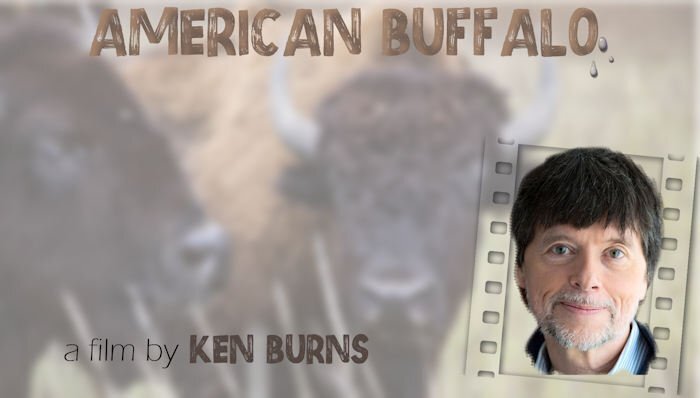
We recently had some chats going on about good programs to watch, many of them on PBS (Canada & US). After watching this two-part documentary by Ken Burns I had to make something to express how profoundly moved I was by this series. He has been making documentaries for 40 years, and his productions are all extraordinary, whether they are light-hearted or heart-breaking. This one had me in tears. He uses the bison as a theme for the near-genocide of a species, and then ties it nicely into the way indigenous people have been treated. It's a hard watch, but so worthwhile.3 points
-
3 points
-
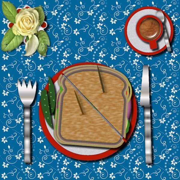
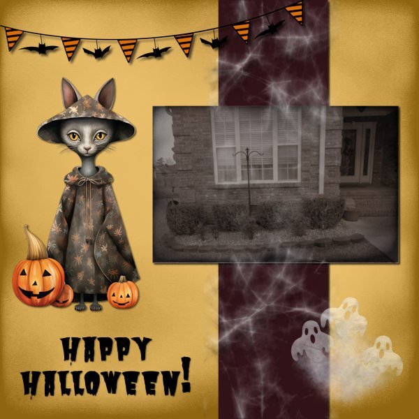
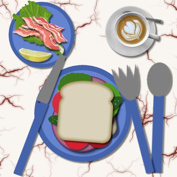
I have to admit. I worked on this yesterday using the download from last year. I don't want to discourage the newbies but I see I am not the first to post a extremely shopped table and sandwich. Some of us have done this several times and have so much fun we do it again. As for as this creation, I got the idea to do a Halloween one a few days ago and one thing led to another as usual. I think I will NOT be eating off that table.3 points
-
3 points
-
Silly me !! It is on here I post I think !! I am using the Complete ultimate interface in PSP 22 Ultimate .My workspace colour is dark grey and my background colour is medium grey. I am using the Standard tool bar. I am using Layers, Materials, and Tool Options.I have tabbed window which I find very helpful.I have made my icon and font size larger. I have hopefully attached a photo on which I will remove the red lead and the person running in the background using the clone tool. If this is not in the in correct place please accept my apologies3 points
-
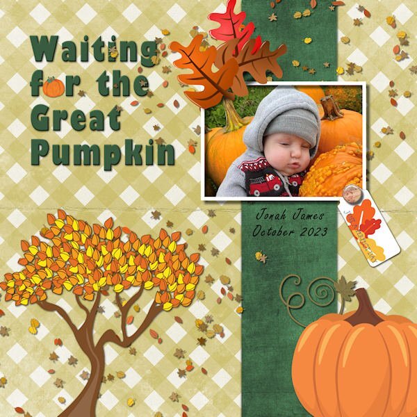
Here's my entry in the Bootcamp's first project: Waiting for the Great Pumpkin. This is great-grand Jonah James, born June 20 this year. I've done this exercise several times so I use old ones as templates. Here are the details: Title Font = Gil Sans Ultra Bold; ID Font = Freestyle Script; Photo = by grandson-in-law Maverick Paolucci; Scatters = cass-frosty fall scatters; Oak leaves, tree and pumpkin are all cliparts from my Fall stash; Background plaid = PS-Janet-Scott-Gingham; tag and brad from Marisa Lerin and Vertical strip = AHA_somewhereintime_papers11-colorized.2 points
-
Over the years I have been fortunate enough to ride the Grasslands National Park, East block and the West block, which extends into the US. I've seen the Prairie Dogs, burrowing Owls, and of course the Native Bison, which are free to roam, without human intervention. Here is a shot I took back in 2016. The North American settlers, committed immoral atrocities of genocide on a mammoth scale of the Native Indians, and it's wildlife. This Bison is allowed to be free, and roam the vast grasslands, as Bison do instinctively migrate. They were introduced on 1999. Look closely at it's eye, it's free and wild. Now look at the next photo. Their eyes are dull, oppressed. I pass this large herd once a week, (raised for commercial use) to go shopping, they are confined, handled by humans, they graze on stubble, and hay.2 points
-
They apparently can move at 35 mph! I wouldn't stand a chance in that race!2 points
-
There isn't a day that goes by, where we don't learn something new in the campus, myself included.2 points
-
Thanks and yes you can use the eraser brush and it gives a cutout effect to the punches; however you can use a regular brush too and that gives the effect of painting on a layer. Look at the difference in the shadows on both layouts. What I wanted was the cutout effect but I was so tired I just didn't saw what was wrong. I like the 2nd because that's what I intended.2 points
-
Having fun with my Daily Look today. Lots of clip art and some of the game characters. The font is Mrs.Monster Academy.2 points
-
Mary this is becoming a great album and so coherent! I love what you are doing here.2 points
-
That's the thing about styles. They're our own, as we find our way. Yours is always dynamic, not static. But, it's interesting how, over time, I've started to recognize other people's layouts even before I see the name.2 points
-
2 points
-
2 points
-
2 points
-
I love these old photos. I have so many because I use them in history articles I write. That's why I started as a member here. I wanted to learn about enhancing these images, but I really enjoy working with other types of layouts as well. PSP is fun, and this group is super-supportive.2 points
-
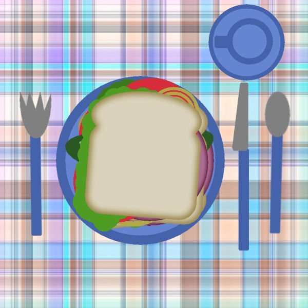
here is my new sandwich, background from a pattern I made for a while. for bread, cheese and meat I used the scripts - - Breads 2, Cheese and Cookies the other toppings are from Picturetube - burgertoppings this is an older one from January Bootcamp have not changed my workspace , I love this one I am not sure which photos I will use2 points
-
2 points
-
2 points
-
Hello I am Henry, I have taken this course a few times but I have been away from doing this for something like a year, so I thought I needed a refresher. I have some old black and white that depict life in the 30's & 40's. I am not sure this is my grandfather, but I know he travelled in this kind of Buggy.2 points
-
2 points
-
2 points
-
Cassel, I recognized your name and knew of your reputation in the paint shop pro community which is why I signed up for this bootcamp. I am now using version 2023 ultimate. My old version was 12. You are right, it is really starting to come back to me now. ?2 points
-
Good morning to all. I am newbie from the UK. I have never done anything like this workshop before and have never used a forum so I have no idea how to post in one! I need to post how I have set up my Psp as per yesterdays boot camp instructions . I found this area by chance but it looks like this area is to say hello. Any advice would be most welcome. Thank you.2 points
-
2 points
-
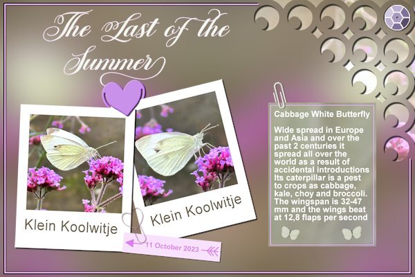
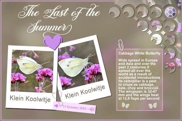
Between all the scripting lessons with the super script-along plus all the normal weekend activities and a husband who got ill, I have managed to make something for the 1-2-3 challenge. Luckily I had most of the requirements already done another time. I only had to adapt the colors to the colors from my photos and Sue I nicked your idea of a big cornerpunch. The last nice ones are on my wish list. I had to renew my subscription for the campus and buy the scripting course and that's enough for now. The background is from the photos with a very big blur. Last week we needed something from the gardencenter and there I noticed these little butterflies that were still active. It was a bit difficult to get decent photos of them, they were only for a short moment on a flower and then moved to the next. And of course they were sitting still in places that I could reach. Therefore I have no photos of them with their wings spread out. The fonts are Michalina and Arial.2 points
-
GRANDDAUGHTER ANNA & HUSBAND, TJ, VISIT HIS FAMILY IN SOUTH KOREA - SEPT 2023 - Anna and Tj live in San Jose, California. She is the daughter of my daughter, Debbie, and aunt to baby Magic and Raja. Anna is a Speech Language Pathologist and Tj is a Senior Software Engineer for Meta. They've been married for 6 years and have 2 cats. All papers and embellishments are from Marisa Lerin "Korea" kit except for flag and map from Google search. Scraplift: Travel Challenge Day 8 by Mary Solaas (mostly for paper layer design). cass-date stamp 13-softlight layer effect +reverse shadow. Font = Agency. This is a departure for me. I usually prefer cleaner, less fussy pages, but this just worked this way, I guess. Maybe it's the Korean influence. ?1 point











Resized.thumb.jpg.d25811db03a63358cedab1e79f527635.jpg)


