Leaderboard
Popular Content
Showing content with the highest reputation on 10/13/2023 in all areas
-
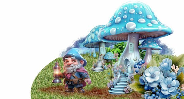
Now that the fairytale months have arrived, I can't stay behind. NO Halloween here. Nevertheless, I am in a fairytale mood. The scrap kit is from Adrienne's design AI. To be able to place the stairs against the mushroom I had to make the base of the mushroom a little wider with the warp tool. I just installed some windows in it too. It came from a castle. The grass just comes out of our picture brush.8 points
-
4 points
-
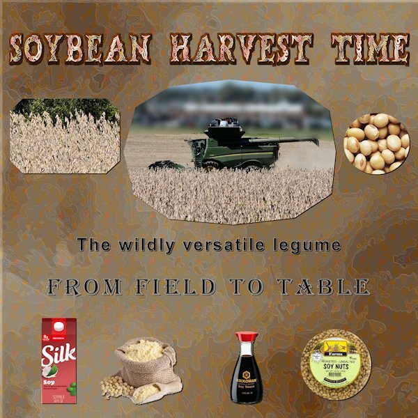
Yesterday was a beautiful day so I was out taking some photos. I got lucky and one of the farmers was out harvesting his soy beans. The two field photos are from the ones I took then. The other pics are "borrowed" from online shopping sights (I know, shame on me) The background paper was created from two papers I downloaded from Creative Fabrica.3 points
-
Welcome Doska! There is a LOT to learn here, and in a nice, pleasant way. Carole is ??? , and the members also help each other when they can. This is a great place to learn, ask for help, show and share your work with others, and inspire each other.3 points
-
3 points
-
2 points
-
Love that background paper. I drink Silk, but the oatmilk version. And the coconut, used to drink the almond until they changed it and now it's gross.2 points
-
2 points
-
2 points
-
2 points
-
2 points
-
2 points
-
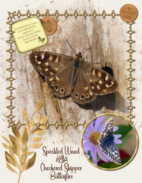
I still have 2 native Aster plants with some flowers on. The little skipper turned up on the 10th October. I was pleasantly surprised to see, and be able to photograph it. Last night I worked on finishing off creating rectangle, and square frames using Carole's frame punches. Now I have all the punches framed, ready for use. I used one them in this page, also used the wood token 2 tutorial to date the page.2 points
-
Nothing related, but I've noticed that now Markus is officially employed here. ? And always trying to help! ?2 points
-
2 points
-
I'm pleased you have found it. For anyone else wanting to know how to create the effect, scroll through to 38 minutes and 30 seconds. Carole demonstrates the technique after creating a shadow box. What threw me was that I was looking at the list of contents of the Q&As. As the shadow box wasn't mentioned. So I scrolled through the months where I thought it would be, and found what I was looking for. Actually Jannette I use 2 slightly different techniques, with the same result. I use vectors, as the edges are ever so much sharper and cleaner. I create each layer, with the colours I'm going to use. ( from vector shape) Creating the shadows after each layer.1 point
-
1 point
-
I did too. CF Spark is ok and I have used it several times with good results. Also have been able to download fonts and graphics which are not the freebies.1 point
-
Donna, I have experience, but they have expanded the Spark offerings so much, I really have experience in two things- Patterns is the big one, but also transparent images. I think Mary is your better bet but I am happy to help if it's something related to plain old patterns or the website in general. One thing I would like to say is that sometime in the summer, before Spark, both Susan and I got a HUGE deal on a one-year membership - was it $4.95 a month for a year, payable all at once, Susan? THEN after purchasing that, they offered a second year for $3.95 a month, payable all at once for the whole year. I worry that they will start charging for Spark separately now that's gotten so big. I think you'll like Creative Fabrica.1 point
-
Unfortunately, the canvas was broken when it arrived. Customer Service so far has been responsive, and I am sending them pictures so that it can be reprinted.1 point
-
Here's mine - I want to see it up and side by side, online and on a white background, but in general I still think yours is better. In the flower world, it has "more music". Just a little if I'm not mistaken. Hopefully I'm wrong because I have made this version my preset shape. After MUCH trial and error -- mostly error, LOL! Thank you so much for the video!1 point
-
1 point
-
1 point
-
1 point
-
1 point
-
I wouldn't know as I totally avoid all horror movies. Just not for me. I do like silly stuff like Beetlejuice and Nightmare Before Christmas.1 point
-
1 point
-
1 point
-
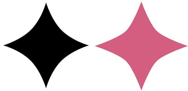
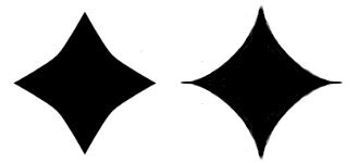
Here is what I can get, left side. I'm using the flower side of the symmetric shape tool, not the shield side of it in case that matters. I think I used 55 on the radius. What I want to get is the right side, but if I go too high on the radius, I get a circle. Round inner is checked, round Outer is unchecked. Is this shape possible using symmetric shapes? with no pen tool?1 point
-
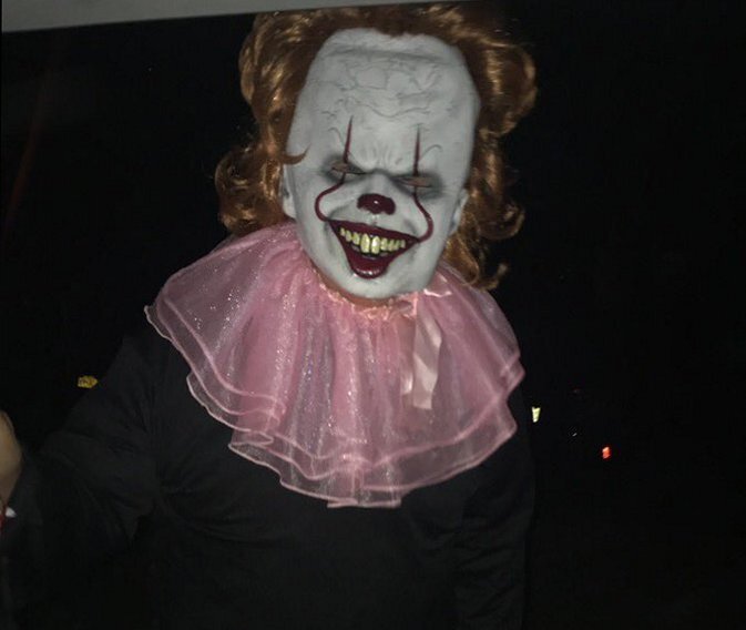
E = Eye-Of-Newt A key ingredient in almost every "Witch" potion . (At least according to cartoons etc. )1 point
-
I like what this plug-in does based on what you showed here. But at the moment I'll have to pass. I'm doing the scripting course which takes much of my time and when I should buy it I need time to play with it. Maybe later and in the mean time I like to see what you make of it.1 point
-
Nice to see you back Lynda. Hope this isn't a self portrait. ?. How's the new house?1 point
-
1 point
-
1 point
-
Cristina, you are always so kind. Although the little details are subtle, they do make the page stand out, which is why I like add them. Of course I have Carole to thank for me being able to do such little things, as without the campus (tutorials etc) my pages wouldn't be as interesting for the viewer.1 point
-
I like them too, they look so real. And I like that the frame they are tucked under is a little off kilter (crooked) and the photo is a little lifted. It's those little details that elevate the layout. Aren't they a delight to discover?1 point
-
Corrie, this must be a great place to visit, and you created a lovely layout.1 point
-
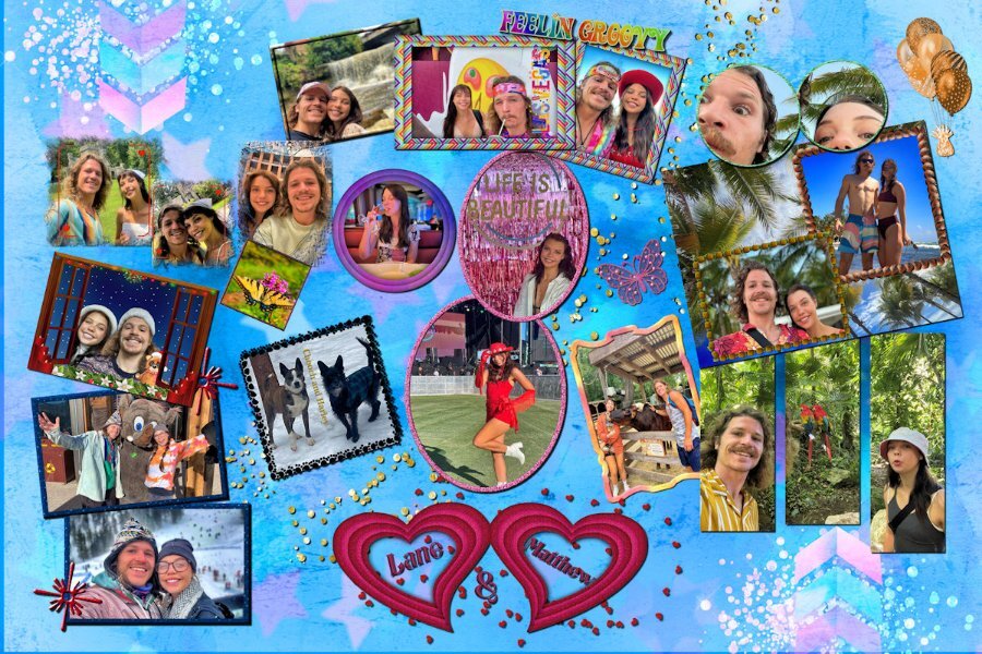
I have been working on this collage for my grandson. He sent me the pictures that he wanted to include. I made the hearts and the arrows and used a lot of techniques learned in the Travel and Magazine workshops. The background was made using the plug in gmic. The original size is the poster size 24 by 36 and will be on canvas from Easy Canvas.1 point
-
1 point
-
1 point
-
1 point
-
1 point
-
1 point
-
Carefully choosing one of my photos for the background, I then added some clipart to create a card. The prints in the snow are either from the white tailed hares or other resident four legged creatures. Placing the dog where some print are visible. No one would be any the wiser who made those prints.1 point
-
1 point
-
1 point
-
1 point


Resized.thumb.jpg.d25811db03a63358cedab1e79f527635.jpg)





.jpg.74d3420d2013f8bca83a1d4c0e89cfd8.jpg)









.jpg.3749fe5a79720b882929739acff408bf.jpg)
