Leaderboard


Popular Content
Showing content with the highest reputation on 09/23/2023 in all areas
-
Day 2 ~ I thought I should give a little bio on this wonderful artist. (Didn't even have to change the color of the mat, just the size!)11 points
-
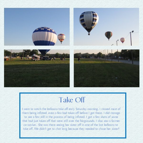
here are now my pages for day 411 points
-
My day 6 project. Even during our trip to Hawaii, I would always go out early mornings to take pictures of flowers and other things. At the time of year we went, ( late April-early May), the Plumeria trees were in full bloom and I fell in love with them. I was lucky to see this lady collecting blooms one day and she was nice enough to pose for a couple of pictures.
 10 points
 -
I rotated the canvas to fit my photo. I again used the same background, font and font color from the previous layouts.
9 points
-
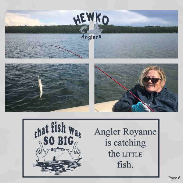
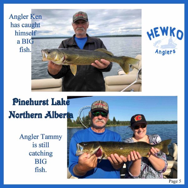
Day 6, fishing is not always about catching the big one, little ones are caught too. The word art is from www.hiclipart.com they have some fun free transparent clipart.
9 points
-
Day 6 of my trip to Het Depot and this page features the glass floor on which you can walk, although not everyone dared to! I saw people very hesitating set a step on that glass flooring! It was difficult to get a photo of the floor because of all the reflection from the glass everywhere. In the end I put my phone on the floor and was able to take a photo of a part of it. I have other photos where you can see the floor and the entrance to the restaurant but those didn't show the colors of the floor very well. Those show more the context of it all, but didn't look good in this page, even if I changed the templates to other dimensions. I'm planning to use these Magazine pages to print an album for the friend I was taking this little trip with. She will be 75 later this year and as she doesn't take much photos I think it will provide a nice gift. Of course I have much more photos of the museum visit and will make more magazine pages for that album. Luckily her birthday is to the end of November, so I have hopefully time enough to do so.
9 points
-
Day 5.A very good tutorial, I learnt a lot about masks, and I have sorted the text issue that I had .
9 points
-
My Page 3
9 points
-
My Page 02
9 points
-
and now day 59 points
-
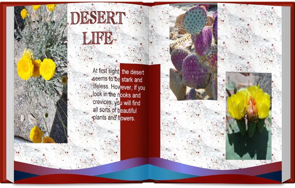
Day 4: Photos of some of the flowers and cacti found in the desert.
9 points
-
Here is my Day 2.
8 points
-
Day 5, the anglers are still catching fish. Still having FUN.
8 points
-
My page 7 - Debra Lennox Art - Mendocino (that's in Northern California, on the Pacific coast, about 3-1/2 hours north of San Francisco). The background gradient is called Baseball, and I used a layer effect of Exclusion. The font is still Agency. I left the template as is because it worked for me. What seems most odd is doing layouts with NO shadows!
7 points
-
So cute. For the first day of Spring, I thought this little meme appropriate...
7 points
-
Wonderful pages, everyone!!! @Cassel: Thanks, Carole!!!!These templates are great! I have some mag style freebies on my blog , in 6x6 which I love and in 6x8 which is close to A5 and spreads beautifully and also comes close to the goodNotes format standard size, which I also love. Font is Raleway, in different weights. I played around with the frame (line work) on page 1 quite a bit and settled for a style that is mostly slate. Not 100% on this one tho. Thoughts?7 points
-
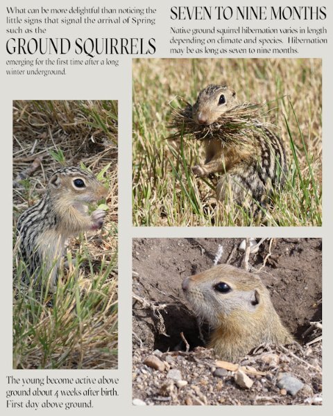
Instead of turning 4 masks into one I decided on two masks. Seeing as I featured the ground squirrel on the front over, and the magazine issue is a Spring one, I deemed it appropriate to dedicate a page to them. After all I have come to know quite a few of them very well, and they me.
7 points
-
Hello everyone! Hello Carole and thank you so much for your patience. ? I cannot believe I nearly missed this and am super excited .... Thanks for this workshop, Carole!!!7 points
-
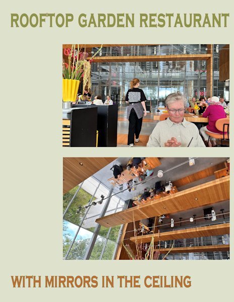
Day 5 features the rooftop garden restaurant were we had a lovely lunch and some much needed "sit down time". Like the whole building it had glass windows everywhere and mirrors in the ceiling. A bit unsettling at least that's what we thought at the time, but maybe we were just tired. Same font, other colors.
7 points
-
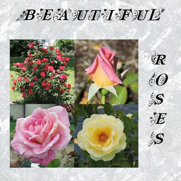
These are so beautiful. I love the watercolor one.6 points
-
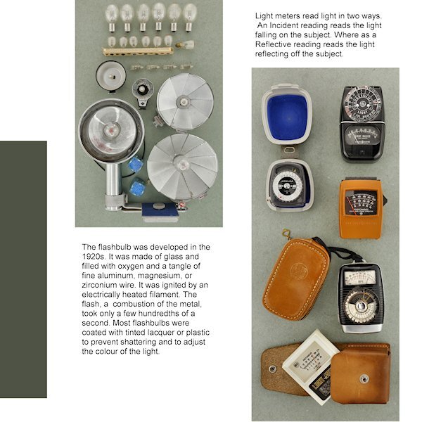
Day 4 Right off the bat I see I forgot to take the stroke off the title. I was going with the yellow-red color on the pouch of the light meter but changed my mind. I like the way we changed the color of the (rasterized) font. It's a neat effect. Still cant decide on a background as anything makes the left photo look dull and grey. Unless I go for a very dark background. My "virtual" editor of my "virtual" magazine would faint of the cost of a full color page! ?
6 points
-
Here is my Day 4,
4 points
-
Hello, here is my page Day 3, I added a photo.
4 points
-
Wow, I didn't realize it was so colorful! This is a great virtual trip you have given us. Thanks Corrie.4 points
-
It seems we all have to get comfortable with the changes that come with getting older. I always say: "As long as I don't look in the mirror I can still feel my younger self"4 points
-
It never ceases to amaze me that although we all use the same templates, the end results are incredibly diverse, covering a multitude of topics and interests. What better way to be inspired whilst learning at the same time. We should all be very proud of our achievements. Whilst acknowledging, and giving credit to Carole. @Carole, I thought I would apologize, before the possibility of being reprimanded! (only joking!) lol4 points
-
Sue I do more or less the same, I had my pages made rectangles in the first Magazine I did, and I have some extras too like a barcode and QR code, ready to use. I just adapted the fonts to this magazine because it has a completely other topic. I'm so glad it takes little time, I have such crazy weeks at the moment. As always your pages are stunning and informative!4 points
-
Thank you Carole. I did play with backgrounds on my day 5. I think I tried every gradient I have and I textured them and left them untextured. I ended up with a background paper. I also played with red color in the small type of the logo as well (Red) but in the end the black seemed better. Would have like a letter with an O or if there was S, L and R in the lower case I could have just did those letters for a little surprise pop. anyway, I used a paper for Brooke Gazerak for this one...for now.
3 points
-
@Marie-Claire Maybe Poncho deserves a whole book, not just a magazine! ? @Corrie Kinkel I think I would be more "confused" by the mirror ceiling than glass walls (although the glass floor might be on top of the list). @Susan Ewart Another advantage of the digital world: you can try as many colors as you want or change your mind. If your background is "neutral" in the photos, maybe the background could be a bright color. Maybe one from the photo itself or one that makes sense based on the logo, or other meaningful element. And you don't have to have the same color all over. You can alternate also to have consistency instead of all different colors. Or choose one color palette that makes sense with the mood, and use that. Also, you COULD consider using a gradient or a textured solid. All possible options. @Shirley From your description, I can't figure out what might have caused that issue with the Text tool. Maybe it was just a fluke? Hopefully, it won't repeat itself. Those designs you share might convert a few of us to that kind of "doodling"! @Donna SilliaDid you mention where you got those waves? They come back, page after page, and it really ties everything together very well. @Anja PelzerNice and clear page. Very legible text (for who can read that language!) @Royanne Hewko That is definitely a perfect theme for a photo magazine! @Dorothy Donn Very informative page. I would suggest leaving a bit of padding around the text on the right column, just to give it some breathing space. @Michele It is fun how the blue matched your photo! @Sue Thomas Who could have guessed that your page is based on the same starting template!? @bina greene The line work is addressed later in the workshop, so as long as you save your projects in layers, you can always come back. On my page, I kept only one frame instead of both. @Anne Lamp Great pose with that lady. I love your background! @Louyse Toupin Did you happen to stretch the photo so it would fit the height? The people at the bottom seem a bit distorted. @Rene Marker Perfect. By rotating the templates, you know what you need to showcase your photos the best. Keep doing that! @Ann Seeber Yes, the absence of shadows is something that will go well in a magazine format. Of course, if one wants to include shadows anyway, I won't reprimand them, but this time around, no shadows also means faster pages! Tomorrow will be the last lesson, but the tutorials will still be available until October 1st, so you still have time to catch up if you had to take a break or start late.3 points
-
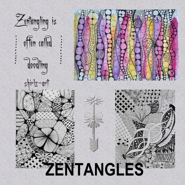
Pinterest, Instagram have lots of ideas for doodle art and zentangle., and plenty of tutorials on youtube3 points
-
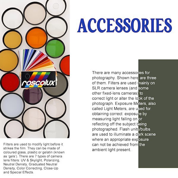
Nice! I recognized a lot of those a accessories from my youth. My dad was a hobby photographer and had his own darkroom which was in fact our bathroom that he could make 100% dark. I liked to be there with him and see the magic happening. In those days it was all black and white of course; he stopped when color photography came and switched to slides.3 points
-
Wow, that would make me dizzy, looking at the ceiling.3 points
-
Day 4, I didn't change the color of one side of the text because it was difficult to read. Maybe because of the underlying colors. I used the OpenBook script because I like it so much. It's a bit thick for a magazine, but that's okay
3 points
-
Day 5. Again used the same background, font and font color from the previous days.
3 points
-
Day 5, I thought I would challenge myself and go for 4 pictures. It wasn't too hard after I got the hang of it.
3 points
-
I agree, I love their pastely (if that's a word) earthy toned palettes.3 points
-
Day 5 Design Seeds is a great resource for me. For those of us who are color challenged, it's a great help to find a different shade of beige and muted colors that go with it.
3 points
-
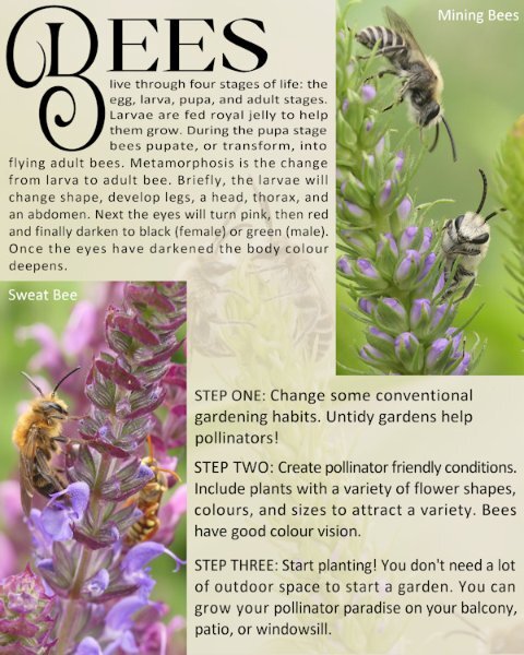
I'm on the ball this morning, as I'm off kayaking this afternoon. Day 5. Once I created the 2 masks as shown in the tutorial, I then used the edit selection tool to place the layers where I wanted them. The background paper is a photo of a pair of mining bees, which I used as an overlay, lowering the opacity greatly. I used the same font as for the Badger page. For those that may be curious or interested the wasp in the background of the sweat bee pic is a solitary wasp (Steniola species), they are ornately marked. (completely harmless). These gorgeous creatures are tiny, at around 8-10mm.
3 points
-
Here is Day 5 - page 6 of Debra Lennox Art - Category: Many Moons - Linocut "Dancing Moon." She does have many moons, but this is my favorite. I have it on my living room wall. Being consistent with the font: Agency. I didn't split the photo mat because I've been waiting for a template with a large area for the image. I'll try a split on page 7 or 8, depending on the templates. The background color and part of the title is flood filled with the off-white of the moon in the image.
3 points
-
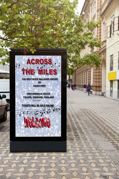
"Across The Miles" beautiful, sweet song. A free mockup which I used in PSP9, a great tube created by Carole, still not perfect used by me.
2 points
-
When I used to drink (gave up both alcohol and coffee years ago), I loved a shot of Bailey's in my coffee, iced or hot. It's delicious!2 points
-
If you go to the public library, look at Dewey Decimal number 741.2. This is Zentangle and other Doodle Arts. The 740s in general are very interesting.2 points
-
I still see my Mom in the mirror. I had no idea we ever looked alike until I got older.2 points
-
I kept trying to get the white text on part of the mat again and this time it worked. So here it is again.
2 points
-
Here is my Lesson-4. I had a hard time to turn part of the text on the mat to white by using Brightness/Contrast. Every time I tried to select the Mat with the magic wand , it selected the mat, and the text and it did not turn that text color to white. So I just left the text all in black. The photos are mine and the Font is Fiolex Girls, which I downloaded many years ago. I kept the pages separate, I do not remember how to turn them into a double page. I think we had a Master class or workshop on that. I need a refresher course.
2 points
-
Double page. The double page was perfect for featuring the Raptors, as stated on the front cover. Some of the many Raptors that have graced me with their presence over the years, around this time of year.
2 points
-
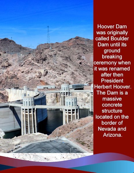
My day 2: I was side tracked the last two days designing a new business card for my son. The photo was an overview of the dam. I used the same background, stripes and colors as the first page. The font is Arial. My photos cannot do justice to the immense size of the dam and its surroundings.
2 points
-
here is now my day 3, I used again a tile from the building for my background2 points
-
Here is my page 3 DEBRA LENNOX ART - PACIFIC OCEAN. Featured is her etching called Salmon on the Fin. As you can see, the fish is diagrammed for consumption. This is one of my favorites of her work but unfortunately, she sold it and there are no prints left either. ?The title font is still Agency. The background is another of her watercolors, "Finding Magic," that was an impressionistic treatment of the Pacific, and I used a Hard Light layer effect.
2 points
-
Page 7 of Shenae's book, siblings
2 points


.jpg.4177f82acc04b98e1628f43aa72bada6.jpg)