Leaderboard
Popular Content
Showing content with the highest reputation on 05/24/2023 in all areas
-
Project 4 I used screenshots this time taken by me a few years ago , It was again an Explore live cam, one I have been watching and chatting on for 10 years. Hog Island Osprey Nest. I elected not to use any scatter because the background etc was already pretty busy. P S- The bird flying silhouette is one I created (using PSP21) from a screenshot I took this year of an Osprey flying into his nest.7 points
-
PROJECT 4 - REPOSTED WITH PICTURE (I HOPE) Fonts used Which - Impact Path? - Cursive Serif - https://www.dafont.com/cursive-serif.font All elements came from the suggested pack. I did modify one paper I used Color Foil Then I used Typography Carole, Thank you for the information on the Music resources.6 points
-
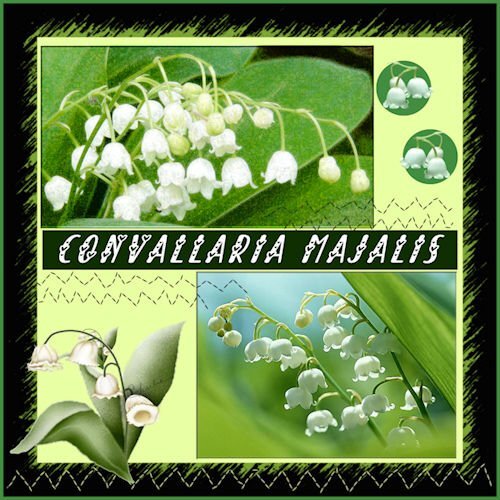
My contribution to the May Challenge. Although not a real challenge to me. I'm used to working with templates. I have Lily of the Valley in my garden but these photos are from the internet. And it is a real may flower here. I guess the are called in France Muguets. Muguet is a woman's name as well I 'v learned just today. I've called them the original name, Convallaria Majalis. There can be made medicine as well. but I do not know what physical ailments it's good for. I had to resize the photos a bit. The name of the font is 'Always Amora'. I love the font in projects like this.5 points
-
At first I thought about wedding dresses, then I decided baby clothes would be the most sentimental. I downloaded a kit by Janet Kemp from PS and used Carole's Hanging Photos script. I'm so glad I bought it because it takes a long time to get this result manually. And it's great that it leaves everything on its own layer; I did some rearranging. The title font is Lovely Blooms from CF and on the baby blanket I used Mix Stitch from Dafont.5 points
-
5 points
-
4 points
-
Project 4 I used the kit that came with this Project (cpjess-spring skies). But you wouldnt know it, unless you took a peak in my layers palette. I used the blue sky paper, duplicated it and turned it upside down so the clouds above were same below - but you wouldnt even see that now as it all blended in, all these two layers had adjustment layers applied to them and both paper layers had different reduced opacity. I used the blue paper (with newspaper writing on it) with a reduced opacity and above that layer I promoted a selection of it to make my pinking shear effect. And above that layer was a photo of mine of Canada geese flying into the pond. I didnt like the photo background look so I played with blend modes and chose "difference" and it made the birds look like a graphic and the pinking shear was lightened against the background of the same paper below it. I thought it looked interesting. Lots of this was me moving layers around and seeing what would happen with the blend mode. This again, was a happy accident. that works better with the two smaller photos. I made the other little strips of paper from the original blue paper and from the new brownish paper. Used also in the title. Font: NNSafari Serif (Creative Fabrica) Photos: mine This was shot on November 20, 2011 and these geese (over 800) had only 2/3rds of the pond as the rest was frozen, and they had to share it with about 6 other species that flew in. It takes about 10 minutes for the geese (coming from the farm fields nearby) to all get landed. the sky is black with Canada geese, it's really quite a site and fun to watch them come in for the landing. This is a very different kind of layout for me.4 points
-
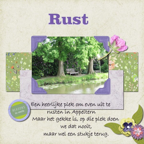
Day 5 We were at an show garden this weekend, the pictures I took there and will be used for this bootcamp. The text says: A lovely spot to get some rest, but the funny thing is, we never sit there but at a spot earlier on. I used parts from kits I had in my stash from pixelscrapper and the text "rust" (rest) I used "enamel" (effects--artistic effects--enamel4 points
-
Project 3 Butterfly - since I did not have same butterfly as in video, I used the same Drop Shadow as other elements such as pictures. Heading Font - Bailenson from Creative Fabrica - https://www.creativefabrica.com/product/bailenson-font/ Digital Scrapbook -- all of the elements listed below were obtained from Digital Scrapbook Green background paper (I used the colour changer tool to change the polkadots to more green) ps_marisa-lerin_1622_polka-dot-8-green_cu.jpg Paper with coloured diamonds in circles (I reduced brightness for part I used behind the title) ps_janet-kemp_137036_memories-traditions-quilt-paper_cu.jpg Paper with diagonal slashes ps_janet-kemp_352811_galentines-day-pink-chevron-paper_cu.jpg Butterfly (I changed the colour to white using the colour changer tool) ps_jessica-dunn_353814_baby-dear-stamp-butterfly_cu.png Folded Paper Flower (I lightened the colour using Adjust/Brightness and Contrast/Brightness and Contrast and adjust just the brightness) ps_marisa-lerin_11181_paper-flower-20-pink_cu.png Sunburst (behind the upper left folder paper flower) ps_jessica-dunn_167072_sunshine-and-snow-mini-sunburst_cu.png ................................ Challenge with font When I add a second line, the spacing is too large. So I created a separate text layer for each line. The spacing between lines is probably not exact. My settings were Offset 13 (I was unable to change) Kerning 69 Miter limit 10 Leading 0 Tracking 0 Challenge with "New Layer" text instead of icon In the layers palette, at the bottom is where I can select "New Layer" and other options. Mine is in text but would prefer to have the icon. I think I tried this before without success, but cannot remember or find the steps to take. I think I even tried reinstalling PSP but still the same thing. This is PaintShop Pro 2022 Ultimate. In PaintShop Pro 2021 (not Ultimate), I have icons.4 points
-
layered template : Cassel Digitalscrapbook, blogtrain, Papers of Elizabeth Minkus, from minikit Oct2018 That Smile. Tag of Sharon Dewi, from minikit SpreadYourWings Font, Lucida Handwriting Photos are mine3 points
-
3 points
-
I think this serves for 2 challenges...DIY and April's Font Challenge...although a little late. The Blue-eyed Grass volunteered in my yard and I love it! There is also a white variety and I think we have a small cluster of it...the white is rare, they say. Blue-eyed grass is deer resistant and drought tolerant. It is a wildflower but they say you can buy it in nurseries. It should be planted in early Spring...I've missed that deadline for this year. Last year I tried to transplant it but critters dug it up. I hope to buy some plants next Spring.3 points
-
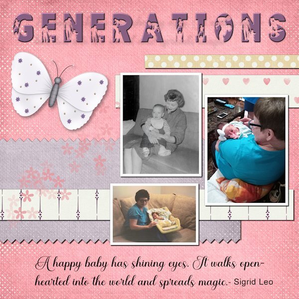
These are pictures of my mom with babies from three generations. She loves babies, and they all have returned the love as they got older. Now she is with me in home hospice. She can still muster a smile when I mention the name of the great-grandkids. The title font is FAMILY from Creative Fabrica. I added an inner bevel to help better define the silhouette. The script is Ernestone, also from Creative Fabrica. The papers and elements are from a kit, Inner Beauty, by Annie C. Digitals. P.S. The black and white picture is me. I wear my hair differently these days.2 points
-
2 points
-
2 points
-
2 points
-
2 points
-
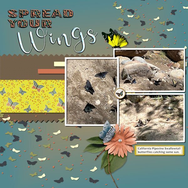
Project 4 - Spread Your Wings Photos by Debbie Lennox-Nevada City, CA Background=jade and yellow gradient Font =Photo caption - Candara Mat with pinked edges= brown fill, weave texture Yellow butterfly mat= jessica-dunn-bohemian-sunshine Flower cluster with shadow= marisa-lerin Yellow butterfly= pngfind.com Label=LF-ChoosetoShine Brad=marisa-lerin-ephemera-butterfly-brad-04 Title Font01=Flora Garden/sculpture texture effect-sky Title Font02=Glamlips/sculpture texture effect-sky Scatters=Marisa Lerin2 points
-
I had very little time to do today's daily look pic. But I had this sweet little kitten from Creative Fabrica* that I fell in love with and never used. I added a mask from Lady22 on a background from AnnieC. The font is, coincidentally, Lazy Cuties also from CF. I added very low opacity drop shadows to everything simply to get rid of the "flat" look. *When we celebrated the campus's 10th anniversary, I won a one month subscription for CF. I've been hooked ever since and cannot foresee ever ending it.2 points
-
@Bonnie and Sue, really fantastic works! Last week I thought of you both. I watched a short report at TV about Pickleball growing more and more in Germany and a bit history of it. I was a bit surprised because I never heard before about this german trend. Thursday, (holiday because of Ascension), there were documentaries (landscape and wildlife) about Ireland, Scotland and England. A special about Wales, that was so beautiful....I was virtually travelling .2 points
-
Learning scrapbooking is often done with practice, looking around for inspiration and trying to recreate projects we admire. This challenge will give you an opportunity to personalize a project while trying to "copy" another one. Of course, you will change the title, the text, and the photos, but you will want to try to replicate the arrangements and some of the effects you see. It is a challenge but in the end, you will learn more about scrapbooking and your PaintShop Pro. In honor of Mother's Day (at least in North America), here is a simple layout you will want to "scraplift". Although this layout was made in a rectangular format, you can easily use the basics in a square format. The translation for this says "Germain Handfield-Chauvette held, in her arms, three generations". And if you want more information on "scraplifting", check out this article.1 point
-
This challenge has had great success in the past so we can continue to have it on a regular basis, don’t you think? Just like those “some assembly required” kits that you can buy for a shelf, a chair, or a picnic table, I am including a 3600×3600 pixels canvas with some shapes. You HAVE to use the shapes in the size and proportions they are. You can move them, rotate them, flip them, and rearrange the layering if you want but you cannot resize them. You need to use ALL the pieces but you can add more if you want. So it is like all the pieces to build a DIY shelf: you cannot change the size of the pieces but you can use them creatively. Obviously, you will want to recolor them or replace them with papers, photos, etc. We just need to be able to recognize the initial shapes. Here is a preview of the shapes involved. Because of the size of the shapes, there will obviously be overlaps. Will it be for papers or photos or both? That is up to you! Click here to download the layered template. Post your projects in the gallery.1 point
-
Have you tried putting the flower under the photo but on top of the green paper? That would hide the stem of the flower. Although my thought on your first layout was to not have as much shadow on the flower and make it look more like a sticker.1 point
-
It sure was fun and surprising. I was not liking my layout, it was too busy when it was a photo background and lowered opacity just looked grey and dull. Then I thought about blend modes and was moving layers all over when the happy accident happened. I could never have predicted what the blend layer (difference) would do since I had multiple layers with adjustment layers below it.1 point
-
Susan,the result with the birds in the background turned out well! It's fun to play with different layers and blend modes. ?1 point
-
1 point
-
Funny you say that, I've been moving around with it, but couldn't decide which way. Thanks for the input!1 point
-
1 point
-
Thank you Libera, I may be bias, but I agree Wales is a beautiful country, particularly the Welsh coastline, and steeped in ancient history.1 point
-
Thanks, I rarely use templates, I tend to create a layout to fit the photos, hence, this challenge made me think of an alternative whilst working within the limits.1 point
-
Definitely one way around the limitations! I read often that working within limits tends to generate more creativity. This is a great example!1 point
-
1 point
-
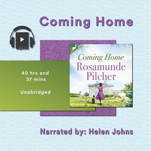
Project 2 - Book number 2. The papers are my creation, the book image from the book cover, headphones a bit of vector art I copied and adjusted. The 'home' in the title is Cornwall for the heroine who is catapulted away during WW2 A very long gentle story. I listened to it whilst doing jigsaws in the winter. It took me weeks to finish it...1 point
-
Your custom gradients are very beautiful. I like the choice of greens that you used with this.1 point
-
Here is yesterday's daily look for my gaming group. The fashion illustration is by Megan Hess, a wonderful artist. I used some elements from AnnieC's contribution to the SYHO (Scrappin' Your ❤️ Out) Lavender Fields Blog Train. One of her flowers worked great as a picture tube ~ created a vector and used the vector tube script to make the frame. The font is Palegina free from Creative Fabrica's 12 Days of Christmas-Beauty-Handwritten-Font-Bundle last year; the bundle is still available as the Beauty Handwritten Font Bundle of 43 fonts for $7. I added a white drop shadow using offsets of -10 and another dark one using offsets of 10.1 point
-
1 point
-
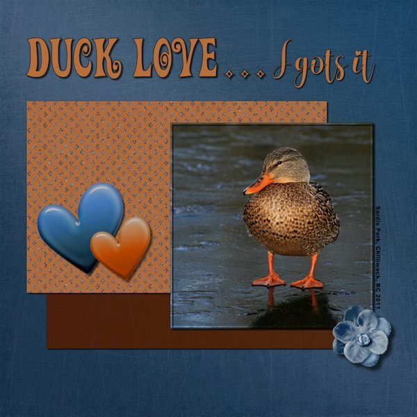
Project 2: Duck Love...I gots it! Another photo from the same photo date and again I used the kits available in the lesson. I'm trying to challenge myself to only use what is in the kit/bundle, but allowing for color changes (absolutely everything was changed). Next bootcamp I will try not do color changes but will get to choose any kit, and only use items from that kit. That's my story, and I can't guarantee I'll stick to it because I probably wont even remember I said this. ?. I used a variety of ways to change the color in the papers/elements to match my vision and often using several on the same paper element. Even making a selection, feathering, and then changing the color of the selection. Good practice for me. Papers and Elements: Rachel Martin Designs; Felicity (Digital Scrapbook) Fonts: Adam Melda, Action Is (Creative Fabrica) and Arial Black (windows). Photo: mine1 point
-
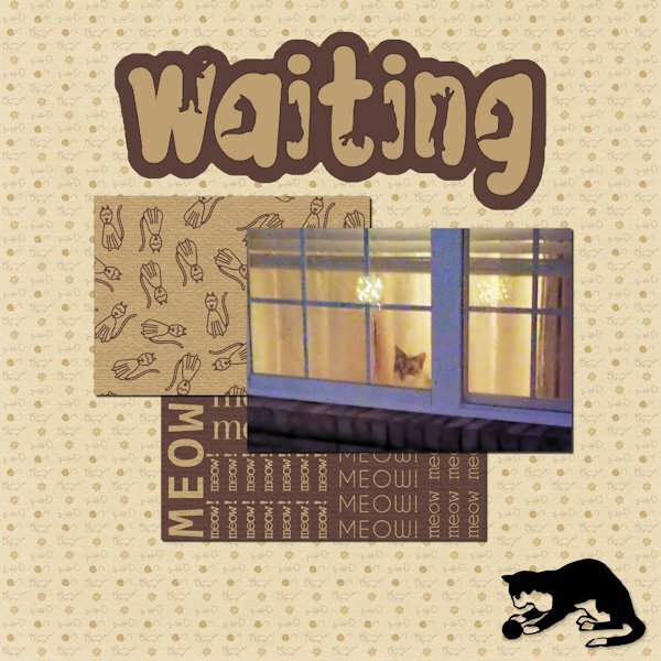
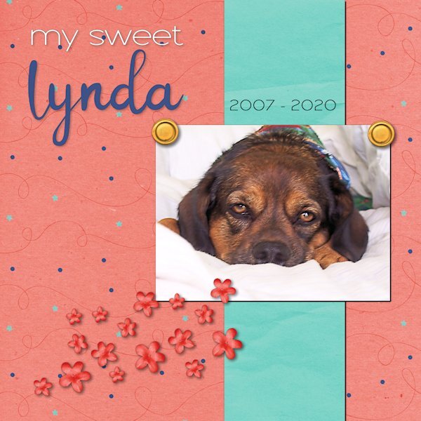
The papers are from Marisa Lerin. The font is The Cat from Creative Fabrica, and the silhouette is from Jessica Dunn at Digital Scrapbook. The little guy in the window is Rudy. He watches when I leave and pops his head up when he hears me pull into the driveway. A side story ... In Lynda's younger days, she would get very excited when I came home. Even though she was deaf in her last few years, she would still poke her head up in the window and meet me at the door. I had no idea how she did it. I finally realized Rudy would wake her to tell her I was home. He was a devoted companion and protector.1 point
-
1 point
-
I tried making low fat peanut butter cookies once. Took a week to chip them off the cookie sheet!1 point
-
1 point
-
Project 1 - I tried to add a frame around the flower picture by using shadow on left and right sides. >>> I have found that for me, I am unable to use the frame tool in Paintshop Pro 2022 for large mages like this one (3600x3600) This may have made the drop shadow that I added for the project look bad around this. The picture was taken with my iphone 5S, yes it is old but still works. The papers I used were from the suggested pack from Digital Scrapbook site .. I did change the colour of one of the papers. For the hearts, I just used the Heart from Preset Shape tool and resized using other papers from the same pack. The font used is Varsity Team. I cannot be sure where I got this.1 point
-
There have been unexpected challenges this week, and I haven't had time to make a sandwich - figuratively and literally. I hope to find a few minutes this afternoon to prepare both. "Linda" means beautiful in Spanish. When she was handed to me, I changed the spelling to a non-traditional one because that's how we do things in our house. She had a beautiful spirit that was always calming. The anniversary of her passing is this weekend. The kit used for the layout is called "Celebration" by whispy's D'zines from GoDigitalScrapbooking.com.1 point
-
Day 3 - Project 1 I used various papers and elements from the bundled kits from Jessica Dunn-Frosty Fall (the mini was provided in the bootcamp). I did adjust some of the colors of the papers and elements to fit my idea. The scatter was from one leaf that I made duplicates of and turned them various ways (then grouped them so I could move, resize and duplicate the group as needed). Fonts are: Night Wolf from Creative Fabrica and Arial Rounded MT Bold from Windows Photo is mine. Carole: I posted in the gallery too, but made a boo-boo and didnt put it in project 1, how do I delete it and/or move it to the project 1 folder?1 point
-
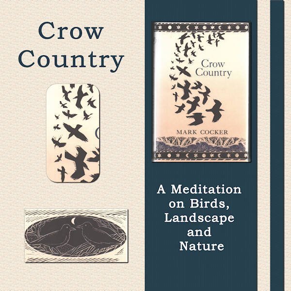
I thought I'd like a change away from my photos of flowers, birds, trees and cathedrals. So, I am going to use books I have loved as my themes for each of the bootcamp projects. Project 1 is Crow Country by Mark Cocker. He writes about his love of birds, in particular the covid family - rooks, crows and jackdaws. It is a lovely piece of nature writing set mainly in Norfolk in the UK and, many years ago, it inspired me to take more interest in birds. The images are all from the book cover. The words are the title and subtitle. The two papers I used were made by me - a simple colour fill with a texture added via EFFECTS then TEXTURE EFFECTS.1 point
-
1 point
-
1 point
-
1 point
-
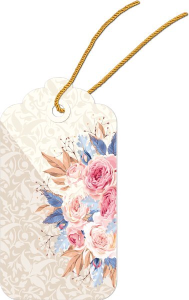
Sherie, I am not an expert in shadowing, but I think you did great with this tag.1 point
-
1 point






Resized.thumb.jpg.d25811db03a63358cedab1e79f527635.jpg)

