Leaderboard
Popular Content
Showing content with the highest reputation on 04/22/2023 in all areas
-
9 points
-
9 points
-
I was so busy looking at all the cool layouts that I forgot to post mine. Here is Lesson 4. I used Amerio for the font and grunged it some more with the eraser tool and lowered the opacity slightly. I had to composite two of the wood slat papers together. It had on each side of the paper, ends of the wood with nails, which would had both sides wit the nails smack in the middle of the layout. So selected the middle of one and pasted over the middle portion and lined it up. I cold see a line on one side so I used the eraser tool large and very soft with very low opacity and and erased over the line and it disappeared. Yay, nice to have success. More from my cousins farm, me wandering around shooting whatever caught my eye. Coffee stains are from a brush set (or two) at Digital Scrapbook.8 points
-
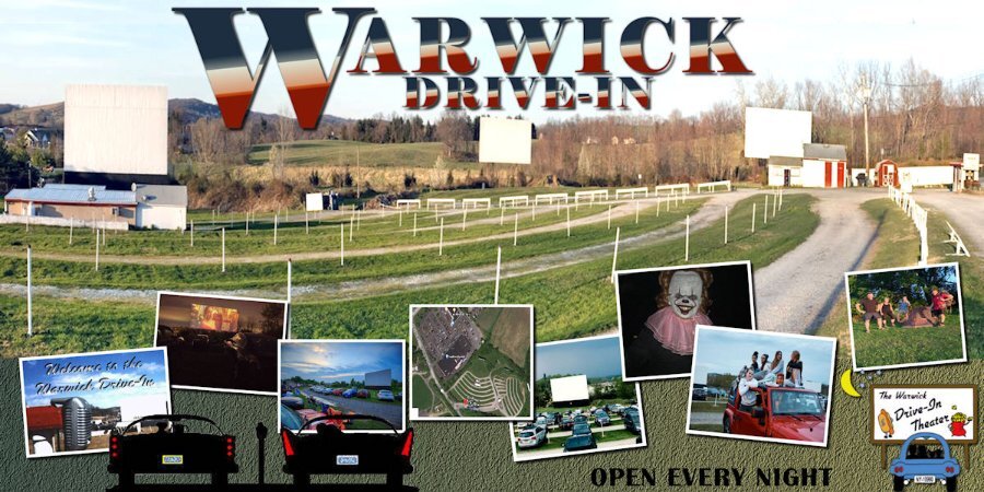
Here is Lesson 5 - My husband and I owned and operated the Warwick Drive-In Theater from 1977 - 1997. Frank's daughter Beth and her husband took over ownership and are still operating it today. I do a little work from home on advertising and social media for the theater. It happened to be a panoramic photo I had handy so, though I don't usually "toot our horn" here we are! The title font is Elephant. The background is a gradient with a little grass texture. We are open every night from March through Halloween. We're located in New York's Mid-Hudson Valley, about 60 miles from New York City. Our visitors have been know to drive up from Long Island for the weekend as there are lots of things to do in our area, including the newest Legoland.8 points
-
7 points
-
Day 5: I don't have a panoramic photo so I used the same trick as in the lesson. I choose a very wide photo of the mountains which was taken on a very clear day with fantastic views all around. The mountain panorama on one side and a view of the lakes on the other. I tried several colors, patterns and gradients for the background but settled for this one made from the 2 colors of the signpost. The fonts are Dreamy Snowland and Fairy Tales. The cowbells and the ice axe were made for another layout.5 points
-
5 points
-
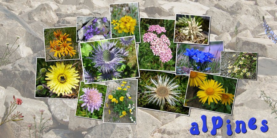
Day 4 and it was a struggle to get something to my liking. I already did the Double Take Challenge as it was called then and that was all about flowers. My theme this time isn't about flowers, but in the Alps are growing beautiful ones and I wanted to use them for this layout. The dilemma was that I didn't want to make more or less the same page although with different flower photos. The idea for this layout is based on template by Yin Design and the background is a photo by Alicja on Pixabay. The font is Groovy Yellow and the little greenery is from my stash.5 points
-
4 points
-
4 points
-
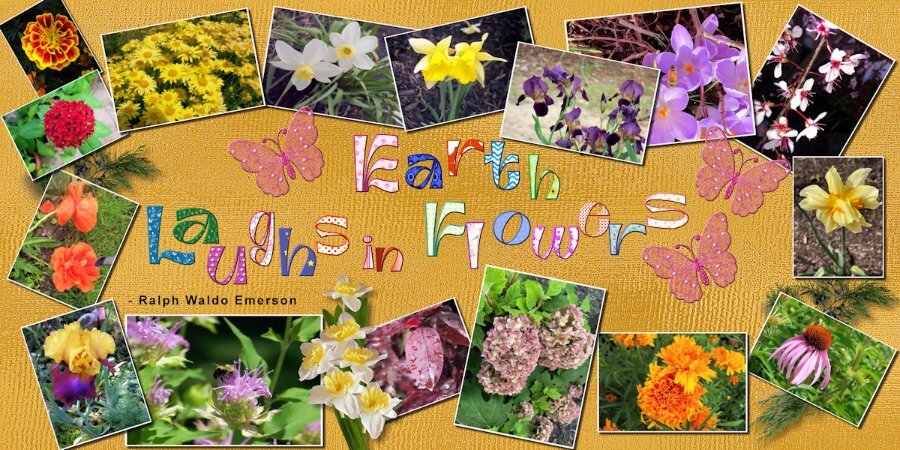
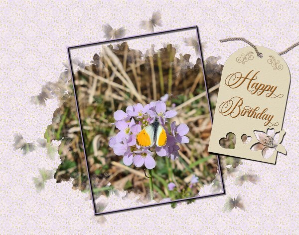
Lesson 4: I decided to use my flower pictures since I had so many of them. I used batch processing to add the white borders but not the size because of the different orientations. I used a script to change the sizes. The background is my gold shimmer, the leaves are from a kit that I purchased and the daffodil bouquet is my own. The font is Ambidexter, another open license font. I had downloaded the cass-alphaseparator script by mistake, but it came in really handy with the title. It not only separated the letters, but they were already formatted to change the fill and the stroke. The butterflies are from my kit and are beveled because a shadow ruined the transparency. I also beveled the title letters(saved the unbeveled file in case Carole doesn't like the bevel) because I thought that they stood out better. I also remembered to save the shadows on a new layer in case those need to be changed. Love that script, Carole!4 points
-
3 points
-
3 points
-
3 points
-
3 points
-
3 points
-
3 points
-
Lesson 5: The only panorama that I had was the last Iceland template that I made. I used it as a faded background, but it is much better full color. I also had to reuse some of the photos since he didn't send me a whole lot. The Title font is Guinness Stout, and the lower font is Gill Sans since it had the first letter its character shapes. The background is the ice texture that I made in Filter Forge. The icicles were also made in FF. I used the cass-shadows script that I just downloaded today. I am not sure if I used it correctly, but it looked ok to me. BTW, Happy Birthday, Carole. I celebrated with a bunch of new scripts.2 points
-
I been busy sewing and playing with PSP and my goodies purchased from the store today at a very generous reduction in price. Seems to have ignited my brain again into doing stuff in PSP as I had got kind of inert with it. I wanted to do things but could not muster much enthusiasm and felt very dull. Anyway, I have had a play and was so pleased with my spoils. I didn't buy many Scripts and things as I already have loads that I really should experiment more with. I really like the Squiggle Script and think it gives a different and pleasing effect to a shape. I applied it to the flower which first started out as brush blobs. The leaves was made from Caroles Leaves Font and the Star was a preset shape. I also used Caroles Sparkling Script to the star.2 points
-
2 points
-
Happy birthday Carole and thank you for all the effort and skill you put in to this Campus.2 points
-
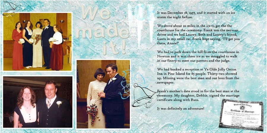
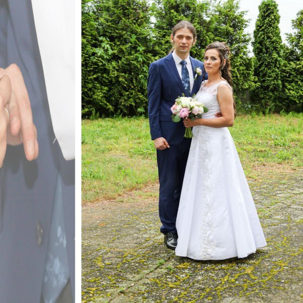
An exciting adventure you and your family, bride, groom and guests who made it, will never forget. Thanks for sharing.2 points
-
I agree with Mary, I love these Drive in layouts. It's got to be one of the most beautiful Drive-In settings I've ever seen. I didnt realize you were that close to NYC.2 points
-
I really love all the colors in this layout. What a great palette you could get from here.2 points
-
Day 5 The panoramic photo is a free wallpaper from wallpapersafari.com. because my own photos are much too small to make a panoramic photo. The small pictures below are my own pictures.2 points
-
Wishing a great day today and all the years ahead. Long life to you and also to the Scrapbook Campus & Creation Cassel store. Going to the store now and getting some goodies. ?1 point
-
1 point
-
1 point
-
You never know when or where those angels pop up....if you are familiar with the "Weeping Angels" from Dr. Who, you best not take your eyes off them. Kidding aside, it was in a garden at by the house. The cars and the trucks were my favorite. Just parked and never moved for 30+ yrs or longer, I should have asked. I love that kind of stuff. I wished I found more rusty stuff though. I was going to head back there but Covid happened and then I found out my hamstring issue was a torn hamstring (1.5 yrs prior!) and sitting for 9 hours in a car was out of the question. Maybe this year or next I hope. One of my pipe dream holidays was to go to Connecticut and what I heard was called the North East Kingdom area. Especially in the fall.1 point
-
1 point
-
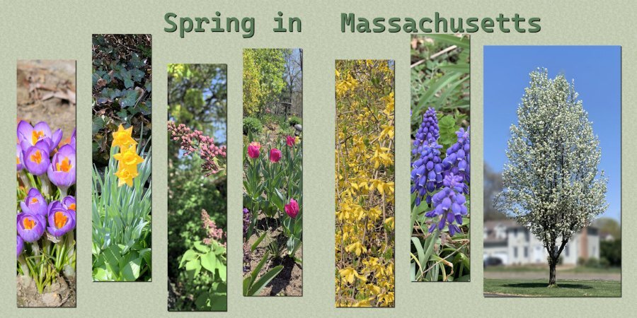
I lived in the historic district of Salem for many years. Spring was spectacular on the North Shore.1 point
-
Impressive, Susan. I've never encountered an angel at the only farm in our family, out in Granby, Connecticut, USA. Those cars buried in the weeds look authentic, though. ?1 point
-
1 point
-
This is beautiful. I love the title and that script sounds interesting. I better add that to my list. the sale starts tomorrow!1 point
-
Lesson 3 in the bag....or in this case in the silos. Photos from a 2017 trip to Saskatchewan to my cousins farm. I found the silos endlessly interesting and somewhat abstract. the sunset there were really amazing (which I didnt take advantage of -a regret). as the crops were not tall I used grasses as a stand-in for crops. I might title it but havent thought of a name yet. I enjoyed this lesson and managed to combine them okay, thanks to tutorial. I used a very light yellow layer below the grasses and reduced the opacity so that I could maintain the yellow-red of the sunset otherwise with the white it got too desaturated.1 point
-
1 point
-
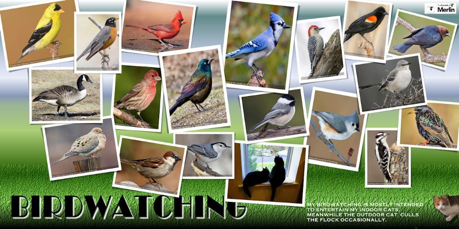
Like Gerry, I chose birds for my Day 4-Scattered. Mine are from using the Merlin App on my mobile phone which records birdsong when I'm out in the yard and then will give me a nice photo to match. The cats are not from Merlin. ? I also used a Yin Template. The background is a Waterfall Gradient with some grass texture at the bottom. The title font is Broadway with an embossed white shadow. My indoor cats, Adam & Eve, are looking out the window and outdoors, Maybelline holds court with the bird flocks. She is quite feral and will not come near me when I leave some food out for her.1 point
-
1 point
-
1 point
-
finished day 2, used another shape, added a bevel and shadow, leaves are picture tubes, ricrac made with script papers with filters in 2unlimited1 point
-
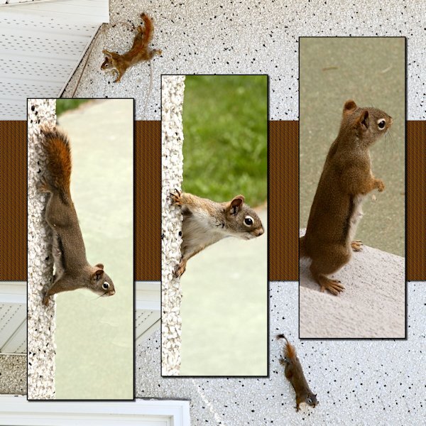
Here is Lesson 2 page 2. . The back ground photos are Spider Squirrel and her baby, whom she had brought out to show my husband. Momma is the one with the almost hairless tail. Mother squirrels will pull their own hair out to line the den for their babies. BEST. MOTHER. EVER. Being the lady she was, she took time to stay grounded (on our back step) andliked to visit the spa for a much needed clean up. She had two litters a year. All the pictures in the slats are of her in the summer. the background photos are early spring. I did a bad extraction of the baby on the bottom left background of this page. I added it because he/she was looking right at me. (side note: that awful green in some of the shots is the patio slabs the previous owners painted. It's the most sickly color...but it's way down the to-do list.1 point
-
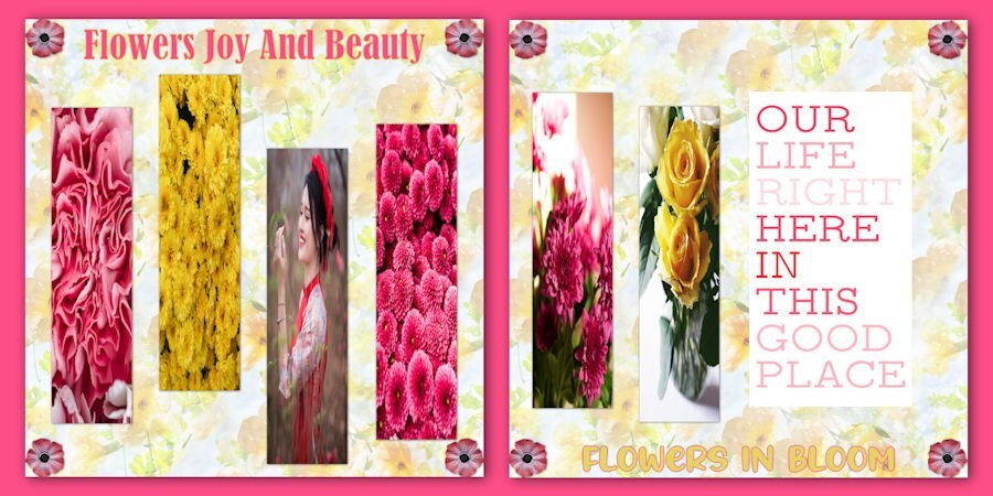
Lesson 2 page 1 I didnt do this as the double page as the background on both sides are slightly different color. I need to work on it more and blend the edge of the one into the other. Sigh. I found this type hard to fit images into. If I had gotten it together I'd have done the abstracts like I had hoped to do. they are good with long rectangles. I do like very much what others have done. So many wonderful places people have been. The layouts are beautiful.1 point
-
I used another one of the templates from Yin Designs. The Clip-to-It script is an indispensable tool when working on a layout like this. My parents were armchair birdwatchers. The feeder was strategically placed where it could be seen through the sliding glass door, and the tattered reference books were nearby in case an interloper flew in for a snack. When I moved back to Alabama, I carried on the tradition. Several feeders were strategically placed where we could enjoy the birds when the dining table. Mother even dragged out the 20-year-old reference books when needed.1 point
-
1 point
-
1 point
-
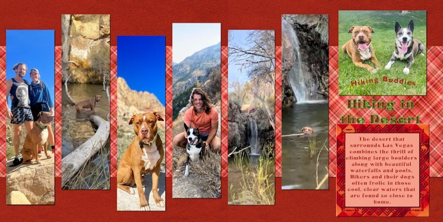
Day 2: The pictures are from my grandsons who live in Las Vegas and frequently hike, taking their dogs with them (and sometimes a girlfriend). The background and frame are from my kit. The font is an open font license called Centaury Display. I filled the Title with some help from Carole using a rust texture in my pattern files and outlined with a green grass texture. I finally figured out how to combine the two images and how to eliminate the line between the plaids thanks to the Blending Pictures Master Class. My grandsons are also trained to send me interesting pictures.1 point
-
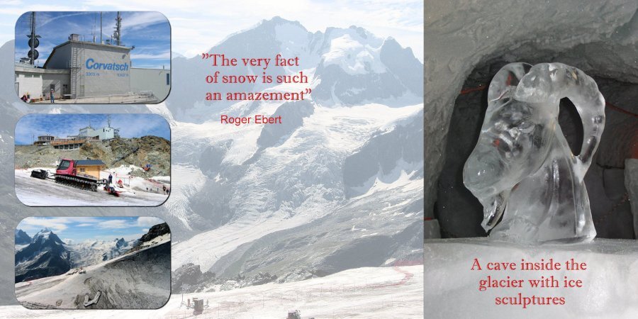
Day 3: I continue with my theme and the photos are from 2004. I'm very sorry to have to tell that the cave inside the glacier with its sculptures is no longer excisting due to the fact that all the glaciers in the Alps are rapidly declining. You can see climate change happening right in front of you. The font is Imprint MT Shadow.1 point
-
Bright beautiful colors. I like that you used the slats for one photo on each page. It's really nice looking like that.1 point
-
1 point


