Leaderboard
Resized.thumb.jpg.d25811db03a63358cedab1e79f527635.jpg)


Popular Content
Showing content with the highest reputation on 02/19/2023 in all areas
-
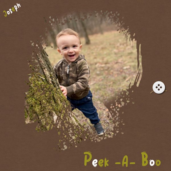
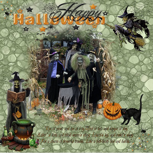
Here is another one ! Font used :Kelly Ann Gothic Paper created with Pattern Tile Elements from a long time ago Picture is mine
 10 points
 -
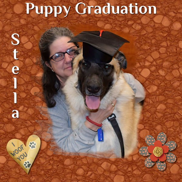
Day 6's project I found easier than the 5th one. This is Stella. She's a giant breed - Great Pyrenees/German Shepherd mix. We went to Puppy Kindergarten when she was about 5 months old. She got expelled. (She's fear aggressive and the teacher was filling in for the regular one and she wasn't comfortable with a 60 lb puppy with behavior issues). We returned to school when the regular teacher returned and Stella was 9 months old and GIGANTIC when she finally graduated from puppy school. I love this method of making a background. Elements are from the Fido kit by Gina Jones.
10 points
-
During the pandemic, small wildlife moved into our small town and took over the deserted yards and streets. Shortly thereafter, the smaller animals seemed to disappear as foxes and coyotes moved in. One brazen fox established a route along the front yards all along my street. They are beautiful creatures and so very good at mouse control. One liked to lie down behind the big maple tree in my front yard and wait for dinner to scamper by. He would appear at the same time each day. The upside is that I no longer have to set mousetraps in my garage & shed. I made the lino background with a small pattern and blurred & blended it. I focused tightly on a close up of the fox's face when using the watercolour brush for masking. The font is Segoe Print. I added a picture frame and then selected out the edge to give it a more rustic look.
10 points
-
Late start (surgery). Took me close to 10 hours to do my 1st lesson. ? I don't use PSP that often and have to hunt for the tools after I figure out which tool I have to use. Really need to start using PSP more than Zoner 18 Pro. At any rate, here's my stab at lesson 1. The words in French I translated as much as I could. Translation had no idea on some of the words.
9 points
-
Day 6 Masks Workshop
8 points
-
Day 5 I was stuck when learning this, but then it all came to me after a bunch of tries, and I just love it. I can't wait to continue to use this. ? I used a scattered hearts brush around the photo
8 points
-
Better Late then Never.....this was a struggle for me....but I finally worked it out (kinda') Anyway, here's my entry for Day 1.....CorvetteKaren
7 points
-
Day 5 Masks Class - Cassel, you were right in everything you said. Not sure how to answer questions in your comments. On that first one, I didn't even see the line at the top. Hope you like this one...
7 points
-
Day 6 finally done. Used my own photo taken at the marina/park near where I live on a crisp autumn day. I spent way too much time on the lino effect and then playing with the frame. I wanted to try dynamic frame style but it really didn't work for me, so I opted to cut off a bit at the bottom right. Then,, when I thought I had something, I realized I'd forgotten the mask! I know what I want in my head, but it usually comes out differently in the layout.
7 points
-
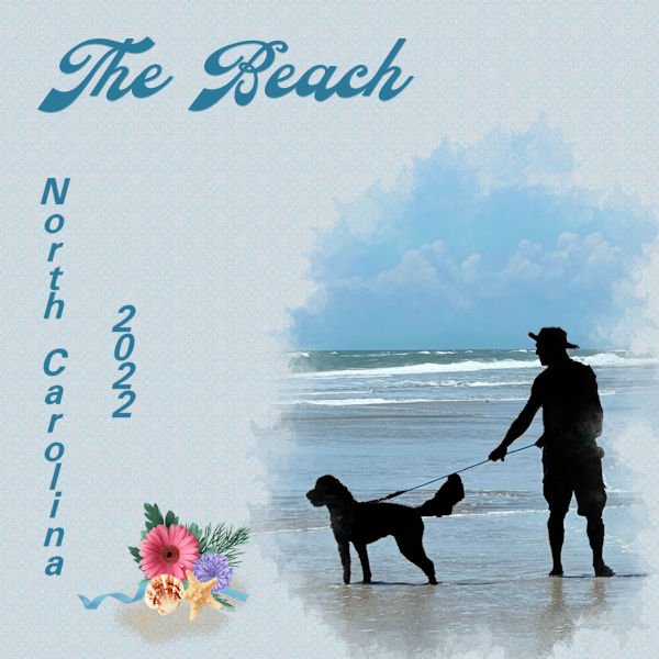
I'm working on catching up. I did do Project 4. Making the mask was interesting. Working on the picture you choose was great. I do like the McBad brushes if you use the F11 Brush Variance. However, I still do not understand it, but Carole shows us what settings to use. The picture is of Joe and Lucy on the NC beach last spring. I had fun making a silhouette of them. I did a kaleidascope (I can't spell) from the picture with a darken blend mode and then put a layer on top of white canvas which I texturized and used an Overlay bend mode and opacity of 83. Think it turned out pretty good. You can just barely see the kaleidascope pattern and so it doesn't distract from the picture. The title font is Cattleya (CF) and the state and date is Free Universal. The cluster at the bottom is mine.
7 points
-
day 5 and day 67 points
-
I used a couple of photos sent to me by my grandson. He lives in Las Vegas and loves the desert. The picture of him sitting on rocks is actually an extraction of him sitting in a tree. I then sat him on some rocks that I had photographed for texture and masked it. I liked the smaller sized background as it reminded me of rocks you would fine in the desert. The large font is called Rainho from deeezy.com, the smaller font is from my Hallmark program appropriately called Handlebar. The small bicycle in the corner is a ding from wmtransport font.
7 points
-
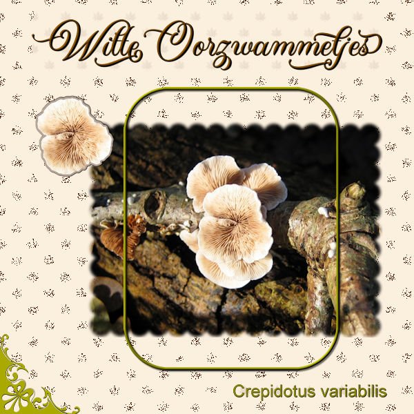
Already day 6 of this workshop and there are so many fantastic layouts done wich such a diversityof subjects! I saved this photo specific for this tutorial; it's not the first time I do this workshop! The fungus in my photo is called a "Sponzenzwam" and if I translate to English it is "Sponge fungus". Not surprising, it really looks like a sponge and I think the linoleum background from the tutorial has something of a sponge too, so it fits. To get the effect I wanted I used a blendmode. Made a simple round frame and put a sponge that I had in my stash as embellishment. This is a fungus that you can eat, for instance just as mushrooms in a sauce or pastadish.
7 points
-
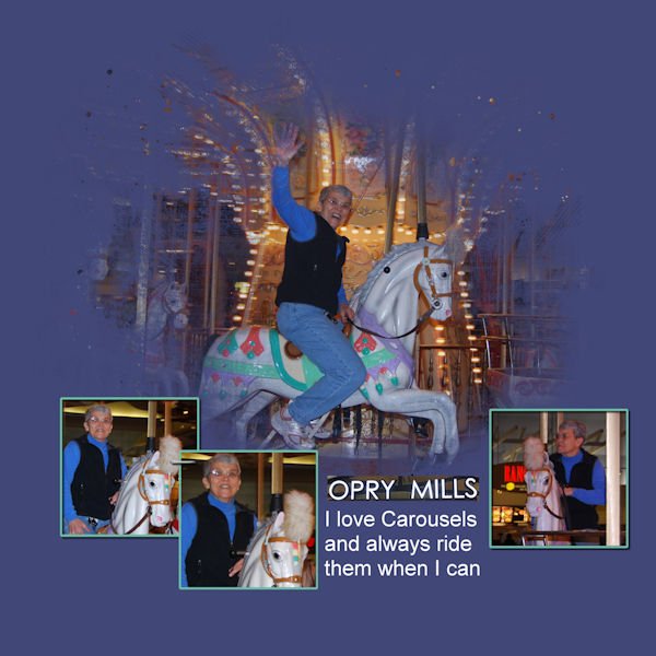
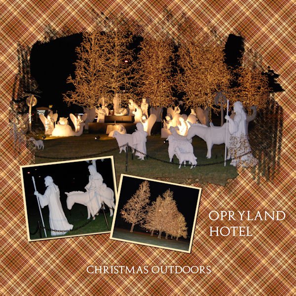
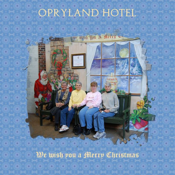
It has been an unbelievably busy week here. I got day one and two partially done but then was not able to scrap...thank goodness for Friday and Saturday (today). I am caught up until Day 7 lesson arrives. I do not like to use patterened backgrounds so this was a challenge for me. I did it but am not sure I like the results. I made many plaids, kaliedoscopes and linoleums until I found something close to my likeing it. I went all the way back to December, 2008 for these photos. Friends and I met in Nashville and toured the Opry Mills Mall, Opryland Hotel inside and outside Christmas decorations and attended the Grand Ole Opry in the Ryman Auditorium, the original home of the Grand Ole Opry. Sadly, there are no photos of the Opry. It was a great trip...one to be remembered. This is Day 1.
7 points
-
Here is my day 5 project. The top font is Bigtime.
6 points
-
My grandson is in Mexico and sent me this picture saying that it would be perfect if his dog was in it. I selected the dog from another photo and instead of extracting it, I used a rectangular mask and used black to eliminate the mask around Chooch. It was so much easier than extracting! The only thing I worry about is the proportion of the dog and asked Matt to let me know if it is too small. If so, I will use a larger picture of Chooch.
6 points
-
Day 5
6 points
-
Day6 Font used :Cardinal Paper created from Picture Quote from the internet Picture is mine Elements are from years ago ,most of them are probably from PNG Tree
6 points
-
Day 2 I created 5 different plaids. Think I would like this one better if I lowered the opacity of the background.
6 points
-
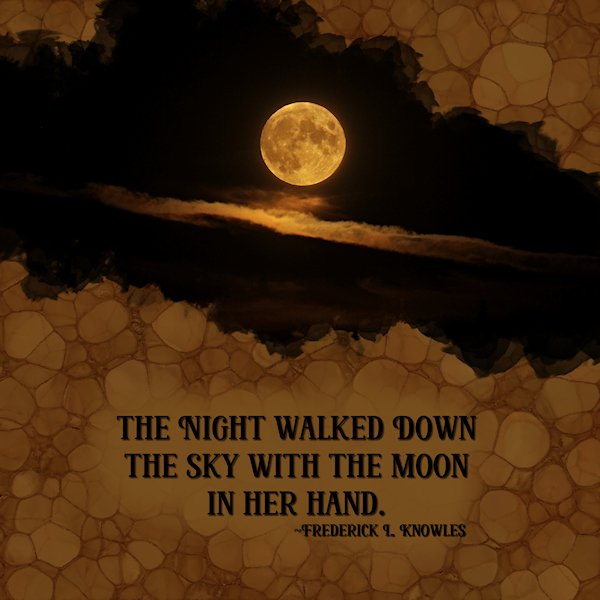
Day 6. All about Linoleum paper. It's almost as fun kaleidoscope paper. This is two lino papers (a yellow and light brown one), with the yellow as the top layer I used multiply and it gave me a darker brown. but it wasnt dark enough so I put a black layer under the two lino layers and reduced the opacity of the middle of these three layers (or the layer above the black which was the light brown one). That way I got it dark and moody for the shot. The moon and clouds are a composite shot of two photo's taken less than a minute a part. I extracted the moon and placed it over the blown out white moon that was in the cloud photo. Font: Risen (from Creative Fabrica) Quote: Frederick L. Knowles (found by searching "moon at night quotes") Photos: mine from Oct. 2022 I'm feeling more comfortable on my second time through the Masks Workshop and trying for adventures things: like the preset shape tool....I know, going where I've never gone before.?
6 points
-
Day 3 The notebook paper and washi-tape are from Janet Kemp on Digitalscrapbook. The paw is from a freebie :Dogs & Cats " kit on the lady22.eklablog.com I hope you don't get tired of seeing pictures of my dog ?
6 points
-
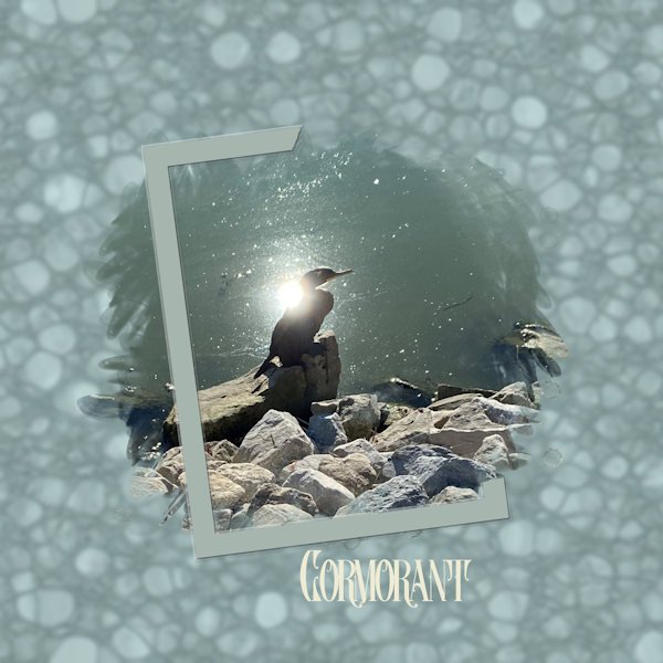
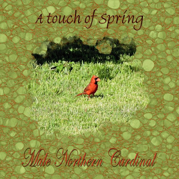
Day 6 project. Both fonts are Bradley Hand ITC . The photo is mine. on the background I followed the instructions using monochrome and then selected the dark "strings" with the magic wand set to brightness with a low tolerance, and flood filled that whit the red from the bird.
5 points
-
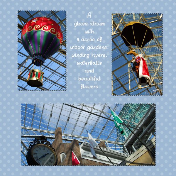
Day 7 The glass atrium at Opryland Hotel. I'm glad we went when we did. Today, you need a ticket, an appointment time and pay to park. I notice some of you are posting more than one photo in the same post. How do you do that. I am not seeing that option. What am I missing?
5 points
-
And, Day 7: The polka dots were blended with a flood fill of 113-196-206 (Multiply 100). Fonts: Only By Request and The Vintage Typewriter.5 points
-
Lesson 2 I don't know what I did with the edges around the photo's at the bottom, but they are not the same width.? Fonts: Celtic md and centaur
5 points
-
Day 6 Diamond Extra. I tweaked the blue frame by the little circle. Made it bigger and used it as a frame, as the inner frame seemed distracting. It was hard to find a background I liked. I tried many versions of the lino paper but could find one I liked. Used a gradient that seemed like the sky... and now having typed that I could have found a photo with the actual sky. Font is Adobe Devanagari and the water droplets on the sign are from Digital Scrapbook - Jessica Dunn Coastal Spring Water Droplets. You can see in the smaller photo that I was shooting through the window. You can see a reflection, sometimes there is no getting away from it. Angle of incidence equals the angle of reflection... sometimes you just cant get out of the angle. I hate physics.
5 points
-
Day 6
5 points
-
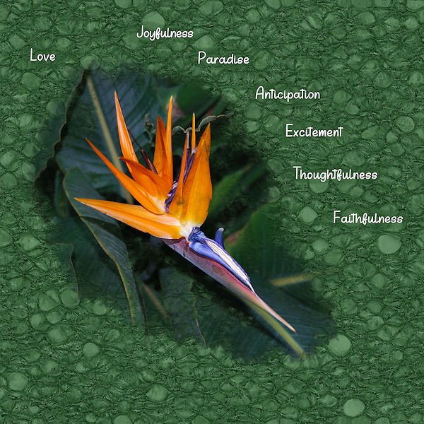
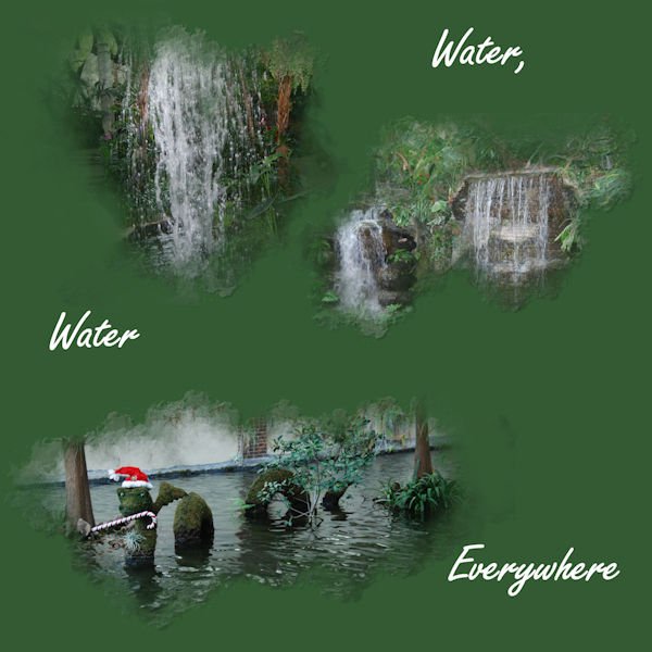
Day 4 If you have never visited the Opryland Hotel, do so if you ever get the chance. It features a glass atrium and surrounded by 9 acres of indoor gardens, winding rivers and waterfalls. The flowers are amazing!
5 points
-
Day 7 and here is the last for my series of fungi. The pattern for the background is made with a leaf brush and the blendmode dissolve. I almost never use that blend mode but here it is fitting to make the leaves looking brittle. This font is Almond Script and I needed some thing to fill the left corner, so I used a corner brush from Carole. Made a sticker out of the fungus in the photo and instead of a white border, gave it a greyish one otherwise it wouldn't stand out on the background. Stickers don't always have a white border.
4 points
-
After a busy 2 days (lunch with out of town family, then funeral visitation on Friday and the funeral on Saturday with a wedding last evening), I have finally had time to do the last 3 days. Day 5: I used a snowflake brush for the mask then made the snowflakes following the Snowflake (2) tutorial in Lab 9, Module 12. I used a flood fill for the background, blending it with ps_elif-sahin_196132_gold-textures-texture-08-template_pu (Darken 100). Igloo Caps is the font. Day 6: I made a bunch of linoleum papers and chose 2 that I felt worked the best. The yellowish one was then used as a frame and has an inner bevel. The background is blended with an RGB of 77-119-60 (Multiply 100) for the background. Font is Only By Request.4 points
-
Day 3 I created several kaliedoscopes...they are in PSP image format and I cannot see the layers...there are more than one kaliedoscope in each PSP image. Yes, I could open them and PSP and give an accurate count...but not right now.
4 points
-
I had a really hard time with Lesson 5's project, finding a picture, getting the size of the photo right, getting the size of the circle right (though I'm still not sure of that), finding the right brushes, etc. I'm not sure if this project properly hits the points that we were supposed to hit, but here goes. This is Annie. She was one of ours.4 points
-
Here's my layout for Day 2....it's not as easy as it looks! LOL Hangin' In--- but way behind?♀️!
3 points
-
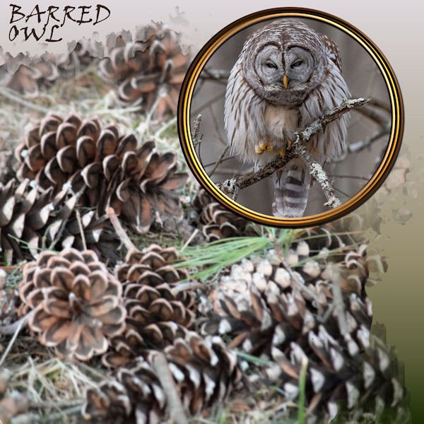
DAY 7 - BARRED OWL + WINTER TEXTURE - Extra template. Font: Viner Hand. Background gradient: Bog. Owl photo: Ed Frampton. Cones: Chuck Calio. I tripled up the circular frame with separate colors for each, treated them to an inner bevel and shadows.
3 points
-
That's me when I can't have ice cream!3 points
-
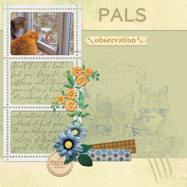
I worked with the Kit of Cintia Dhariana in Feb 2023 Blogtrain #14 digitalscrapbook.com the cats belong to my friend
3 points
-
Wowww a lot of participants and a lot of beautiful layouts! Congratulations to all!3 points
-
@Gabriela Those little gems are perfect details to match the pattern on the frogs. Maybe if you filled the text in black, it would be a bit easier to read? Great choice for the custom mask outline! @Sue Thomas Great background! Using overlays can generate such unique effects and you are obviously having fun with them. Great masks using the vectorpaint! @Susan EwartThat nice doodle frame is quite cute but do you know how easy it is? Check this tutorial for doodle/scribbled outline and apply the same technique to frames. It is clear that you are getting more comfortable with PSP. You are already integrating various lessons from different tutorials and master classes (blending, overlays, etc.) And it will only get easier with more practice. @Ann SeeberA compression setting of 72 is very high. I tend to keep mine between 20 and 30! Are you otherwise having too large files? It is good on your layout with rings that you didn't add a "traditional" shadow on the bird as it would then have looked like a sticker. This is one situation where not adding a shadow is the right choice. @Hank SobahIt looks like you were playing with some overlays. Am I correct? @Donna SilliaYes, I think these last shadows are more appropriate. When you used the script, were the skis horizontal or did you rotate them to add to the layout? The extraction you did was well done. And yes, the smaller "tiles" in that color really match well a desert scene. @sharon thompsonFor the text on path, there is "almost" a shortcut: make the path, then make the text separately, highlight both and go to Object > Fit text to path. Otherwise, check this article. And then, maybe these little tips could help too. @Marie-ClaireIs it possible that you had merged all the frames before adding the shadow? The 3D effect would be more obvious if the shadows were added before the merge as they could shadow the frames individually. And I am not tired of seeing Poncho! @Lesley MapleFor the brushes, if you were to make them smaller, they would blend in more into the mask instead of looking like standalone, and then you would have an easier time concentrating the photo into a limited area of the mask. @Bonnie BallentineGlad to see you catching up. Yes, plaids can be overpowering, and sometimes, it depends on what section of the image you are using. Some areas will have more contrasting colors and will show brightly, while other sections will have more subtle colors. Knowing that in advance, you can select areas to give more of the look you want, but you can also play with overlays, blend modes and opacity. They are all fair game! You know, it is so much fun to see your friends, page after page. It feels like we know them by now! @Corrie KinkelOn that "sponge" layout, I almost thought you made a brush out of that specific fungi, which is something one could do! It matches so well. @Ron Welcome back. I hope you are doing ok now. Speaking of translation, I once translated a tutorial, from French to English and uploaded online. A while later, I stumbled upon a translation of the English tutorial, back into French, and the instructions were hilarious!!! I know Google translate might not be good with technical terms but this was a gem!!! If you are ever stuck on a word, just ask. We have members speaking various languages who would be happy to help. I'll hunt down an old document with translated PSP terms. I'll put that on my to-do list. @Linda J WalkerDon't stress yourself. You probably learn details as you watch the videos, even if you don't do it immediately. We know that other things do happen. Unfortunately, PSP is not always the priority. @Anja PelzerThat is a very interesting scalloped frame. Did you do it from scratch? I love that multiple frame. The shading is perfect too. You had great brushes to create the edge of your mask.3 points
-
I ended up using the mask to "extract" the bird. The double, transparent frame is a PSP frame. The chains are a Picture Tube. I made the rings from circular selections, filled with a gold gradient. The bird photo is by Kim Gragert. Kestrels are pretty, colorful little falcons but I've never seen one in person.
3 points
-
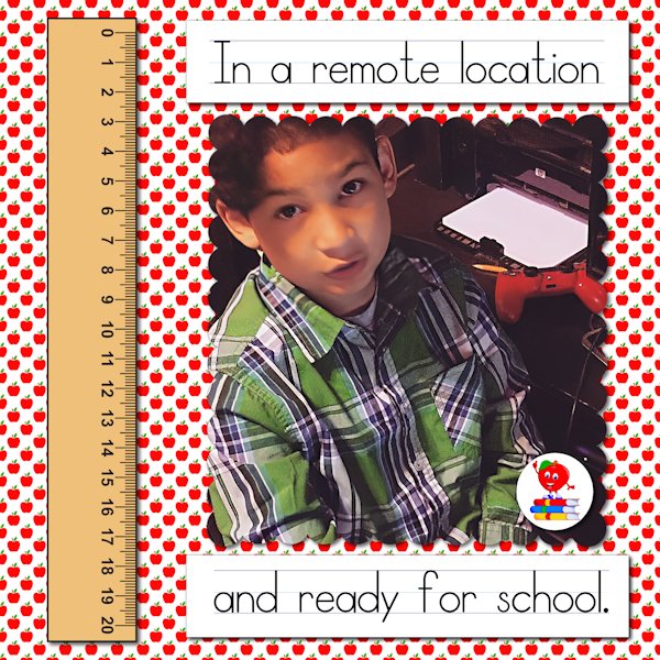
Londyn always made sure he looked his best in case the teacher in case he had to be on camera. This is 5 years ago. All of the elements, including the apple I used for the paper, came from Creative Fabrica. The font is School Rules, also from Creative Fabrica. It is a set of three fonts, one with letters and lines, one with only lines, and the other with only letters. Because I couldn't figure around the blank space using the combination letters and lines, I did them separately on layers and aligned them manually.
2 points
-
Sharon when you want your text easier to read you can use the brushtool with the color of your background and set it to paint behind. Use a new raster layer under your text to paint.2 points
-
Today I learned how to move a mask and how to make polka dots. I also learned that text on top of polka dots is not necessarily a good thing. I played with both the size & blending of the dots as well as the type and size of text and ended up frustrated. I added a border to finish it off. I think that I will make a batch of polka dot washi tape instead and stick to textured or plaid paper in the future. The font is Script MT Bold.
2 points
-
To Hank S. This darling photo reminds me of what my Dad used to say when one of the kids looked like that. He would say if you stick that lip out any further we can play checkers on it. (Thanks for a long buried memory)2 points
-
Carole you asked about the word "Goudvliesbundelzwam" and it really is one word in Dutch! When I translate to English the litteral translation read as: "Golden skin bundle fungus" which as you see the picture of it, comes very close. Languages never stop to amaze me.2 points
-
HI Sharon, the mask in that tutorial had the broken type frame as part of the mask, but I edited it out so I could make my own frame using the preset shape tool (a new thing for me!) and then using guides I made selections to take part of the frame away. All newish stuff for me. Getting braver and braver with PSP. Give it a try. It's based on Carole's design, she deserves the real credit.2 points
-
@Ann SeeberI'm a pet sitter and dog walker. Seven years ago after being a family law attorney for 10 years, I realized I liked dogs more than I liked people so I quit my job and never looked back. It really is my dream job.2 points
-
Carole, Thank you for the advice on the skis. Since I had used the flip it up script, shadows were already made. Instead of using drop shadow again, I manipulated the shadows already there. Do you think the new one is better, and how can it be improved?
2 points
-
Day 4 Masks Workshop - thanks Carole, I didn't even notice the straight line on that day 3 picture. Here's Day 4 with some extra effects.
2 points
-
Day 5 Made another one Font used :Unquiet Spirits Paper created with PatternTile Picture is mine
2 points
-
Day 4 in the bag! I'm finally catching up. Around the same time as the baby squirrely whitetail showed up, this pigeon showed up, strutting her white finery. It left me wondering what's going on, all the wildlife turning up with white pants and white tailcoats. Even the local famous white Magpie made an appearance in my yard this year, far from it's normal territory. None of my pictures were good enough to show this strange sight. When it spreads it's wing and fans it's tail feathers in take off it looks like an angel. So cool. The pigeons are quite comical and thier eye makes them look a little crazy and scatter-brained. Fonts used: Gill Sans Ultra Bold Condensed ("take a walk"), Gold Night ("on the"), Dancing Clarisha ("Crazy"), Good Morning Christmas ("side"). All from Creative Fabrica except Gill Sans...(windows). I used Gina Jones Bright and Cheerful paper 06 for the background, two layers, on upside down and used a blend mode of lighten to get rid of the darker color on the paper. Two borders were used, both by Sheila Reid - at the beach burlap border and Doodlelines page border (both Sheila and Gina are from Digital Scrapbook). Photo's are mine
2 points


.thumb.jpg.fcbf677d3dd30df5c5cde7a939312f1c.jpg)
.jpg.48208242b3dccb4e3595aa9d6c2bc094.jpg)