Leaderboard


Popular Content
Showing content with the highest reputation on 01/28/2023 in all areas
-
Well I finished all 5 projects. As you can tell this is all new to me but I think I did OK considering. I owe it all to a great teacher. Thank you Cassel! My main interest was to learn PSP. The only trouble I had on this one was the text would disappear when I resized to 600. I had to convert it to raster to make it work. Also when I uploaded it the colors are washed out. It looked much better before. ? an apple for the teacher.
 6 points
 -
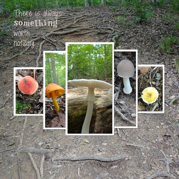
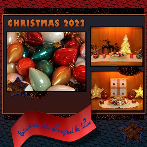
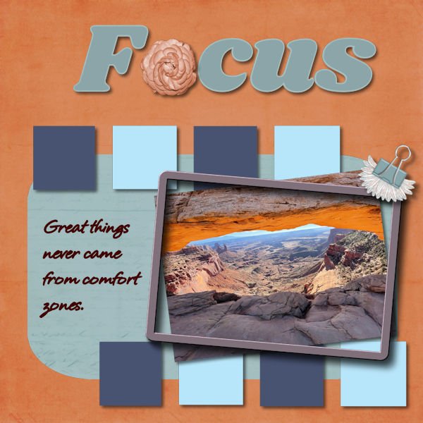
Fonts used 3 Hour Tour................Ghastly Panic Bottom Paper from ps_brooke-gazarek other Papers were actually Pattern Tiles Elements are from Pixabay,PNGTree and some from years ago Quote i found on the internet and the picture is my Grandson when he was little
6 points
-
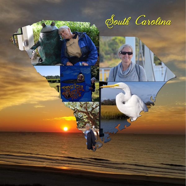
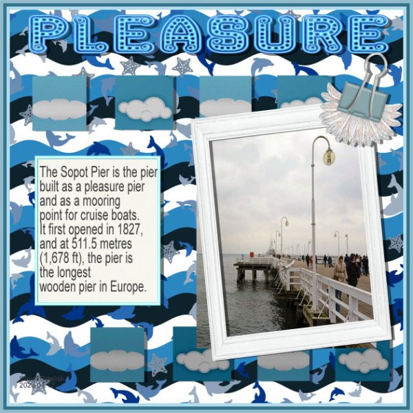
Project5. SopotPier
5 points
-
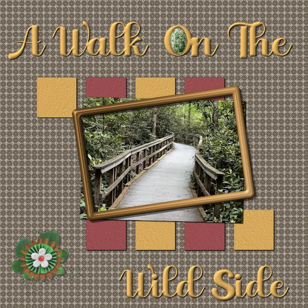
Well, I did finish the 5th project. Couldn't decide on a subject, but finally decided on this picture that Laurie took last spring up east. I've always liked paths that turn a corner - you never know what lies beyond the curve - I always think it is something wonderful and exciting or maybe just wonderful. The papers and elements are mine - the cluster was developed from elements downloaded from Pixel Scrapper at different times. The frame is also from Pixel Scrapper. The font is Aryadata - I'm sure it came from Creative Fabrica at sometime or other. I changed the background paper and the frame with Hue/Saturation/Lightness.
5 points
-
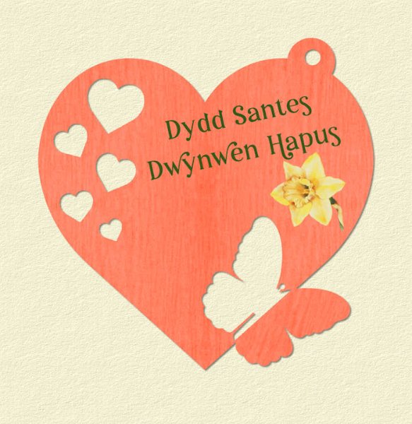
It was Saint Dwynwen's Day on Wednesday in Wales. 25th Jan. I made a tag for an ecard I sent to family and friends in Wales. St Dwynwen's day dates back to the 12 century. A true love story about a young girl named Dwynwen. The Welsh equivalent to the American St Valentines day. I used vector shapes. I had to change it to a raster to add the butterfly.
5 points
-
its was again fun to work in this workshop, some things that I had forget comes back in my mind . here is my project 5 , The red TitleWord is made from a pattern in my photo and I added the clock , the blue is made with a paper credits in the gallery -5 points
-
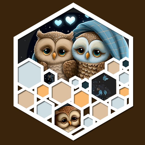
I like the idea to make a stencil, so here is my go on it. I used this lovely owls, which were a freebie by CF a couple of days ago. The colors are taken from the owls and I have saved a version of this layout without the background color to probably use on a card. Next I try the Happy Birthday stencil too and also for use on a card because it is another way to do this.
4 points
-
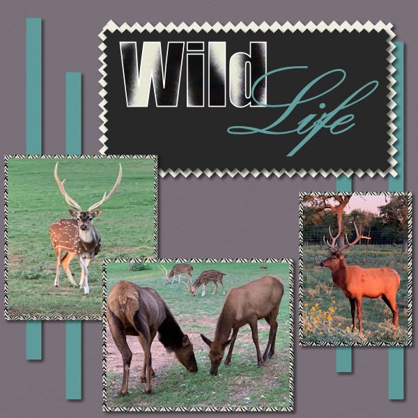
Project 5 I had a ton of fun with bootcamp! and seeing everyone's beautiful work.
4 points
-
Fun project! I had trouble right at the end - my quote didn't save until I converted that layer to a Raster. Is that normal? And at the top of my window, my "File" Menu disappeared from the toolbar! I haven't figured out how to get that Menu back! Thank goodness for the icons on the toolbar to help me out with saving and opening files. Any thoughts on solving this menu issue? Key take-aways from this class: Drop Shadows! Adding more layers (than I was used to) and finding sources for papers and elements. Eraser tool to create a "pinking shear" edge! Using patterns in place of solid colors. Developing my own patterns, too. Great class - now I'm kicking myself for taking so long to sign up for a class! So much easier to watch how it's done and then recreate it, than figuring it out on my own through LOTS of trial and error! Thank you!
3 points
-
Hi all, I know I'm getting a pain in the you know where, but this one is just for Cassel thanks for the window and garland, hope you like what I did with them
3 points
-
Here's another:
3 points
-
I have used this technique several times. I like it! Here is one:
3 points
-
Julie you did a lovely layout for your family and like you I don't have parents or aunts and uncles anymore. When you grow older this is suppost to happen but I still feel a bit lost without them. Luckely I still have 2 nieces to recall old memories with.3 points
-
Lots of lessons learned on Project 4! One of which is that I can't seem to find elements and papers to support what I have in my head of what I want to create! I've downloaded many "freebie" packages but they don't seem to fill the bill. And what are these "tubes" that I read you guys are using? Do tell! Please!
3 points
-
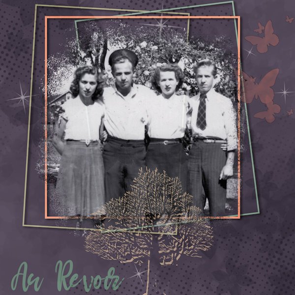
I've known for some weeks that this day would arrive, so I began working on a small tribute to my mother and her siblings, all of whom are now gone. The last uncle just died last night; his brother died last September; and my mom and her sister have been gone longer. I'm not just an orphan but uncle- and aunt-less too! Karel (called Charlie) was 96, so we are not in deep mourning, but I do feel the loss right now...of all of them. Requiescant in pace. The photo is likely from the mid-40s b/c the uncle who died yesterday has on his navy cap. He was underaged but sneaked into the Navy and served on a corvette in the North Atlantic. I do genealogy layouts for my family history, hence the tree.
3 points
-
here is one of my photos and my selected workspace in paintshop 2023. I'm way behind in these because my life is hectic!!!2 points
-
This month's almost out time to think about Feb which marks the depth of winter. This little piece is Lab 6 08 had some problems getting the push brush size to fit the length of the ribbon a bit of trial and error with that. Yes I remembered the shadows this time ?
2 points
-
Here's the other half of the double honeymoon layout...2 points
-
Just an example of using this technique, here's part of a double layout I did for my granddaughter's honeymoon in Feb 2022.2 points
-
I just want to remind participants to try to avoid slippery topics because we want to be a neutral place for everyone to feel welcome. In the past, discussions about political views and religion have caused members to leave. These posts are not at that point yet, but for anyone who is reading, it COULD get slippery. Thank you for supporting each other, even when world events might trigger some strong feelings.2 points
-
LAB 6-7 Sandbrush Scale Pattern Wavy Flag Inspiration Template W used for this LAB Another fun lab. The scale pattern was my favorite. I played with color combinations for quite some time, it's addictive when you want to see just one more combination...an hour later you are still doing it, and the rice is burning upstairs! I know, it's hard to burn rice when cooking on low. If I can melt a colander making spaghetti, I can burn rice (I have...many times). But you aren't reading this for my cooking advice are you? Back to the Lab at hand. The sandbrush was surprisingly easy to do, yet hard to control it just how you want. I'm thankful for the good instruction on the wavy flag. It took me some time to figure out the "shear" setting on the pick tool I couldnt figure out how to get the middle handle(node?) to change from vertical to horizontal. I got there by mistake and took me time to figure out how to change the directional arrow thing. The background scale pattern (which looks like supermans colors - don't get me started on Henry Cavill doing Supermand and NOT doing The Witcher!) has a gradient background and the pattern has a 14% angle with a scale set at 80. the scales looked best in black. I used the sand brush as a paper and for the stars and ovals. The frame around the whole photo/title area has an inner bevel (#2, width 8, smooth 10, depth 7) to help it stand out. Fonts are Gills Sans Ultra Bold Condensed (title) and Adaniya (Creative Fabrica) on the wavy flag. Photo's are mine.
2 points
-
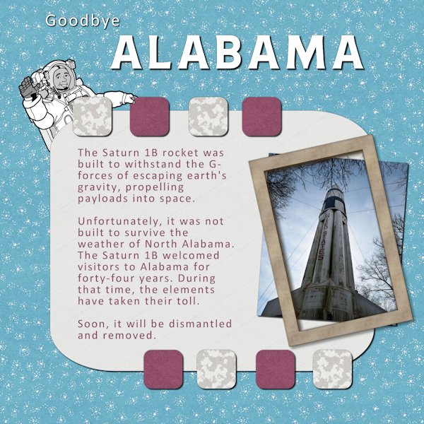
At the last Boot Camp, my Project 5 featured the Saturn 1B rocket at the Welcome Center at the Alabama/Tennessee line. Since then, it has been determined that it is no longer structurally sound. Refurbishing it would require moving it to the NASA Marshal Space Flight Center in Huntsville. In 1979, power lines across roads were temporarily removed. Although the rocket had been dismantled, electrical poles were taken down to accommodate the massive size of the pieces. Today, overpasses make it impossible. The font for the title is Neilvard One and the text font is Calibri which recently became the official font for the US State Department. The papers are from Marisa Lerin.
2 points
-
The next page of our trip to Chattanooga. All papers and elements are mine. The title font is Broadway. The journaling font is Arial.
2 points
-
I am more relaxed when I am enjoying the outdoors. One of my favorite locations for hiking and camping is Algonquin Park. There is just something about the call of a loon that seems to melt away any angst that has built up and allows me to relax. Thanks very much for putting together these sessions Cassel. Greatly appreciated.2 points
-
My stencil ?
2 points
-
After going through my stash of photos, I realize I could do this challenge for weeks with all the uninteresting or bad pix I have! But it's a great way to use a boring photo. I made the "hola" text using individual images for each letter for the first time! That was fun. (Some edges on frames still a bit ragged....oops!)
1 point
-
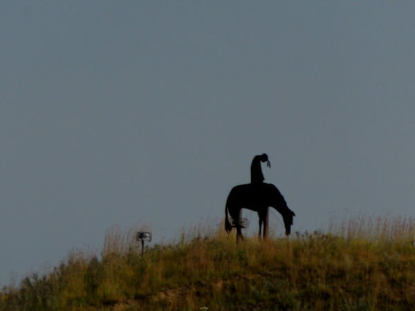 horse statue on the loess hills one image i plan to use1 point
 -
Project5corrected. My pic is too blue. But I like its blue;)
1 point
-
I think I heard that, too, that the optimizer is better at stabilizing the text. It certainly gives you more control over compression. I created shortcuts on my toolbar for both optimizers, .jpg and .png. Very handy. They're right next to Cassel's new Guides script and Open as a New Layer-Rename. Really speeds things up a bit.1 point
-
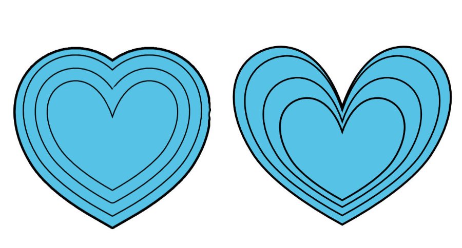
The heart on the left in the example shown was done in another program (Affinity Designer) and shows perfect proportionally spaced borders in nest format. The heart on the right was achieved by copying the shape a few times, enlarging each one separately and then centering them. As can be seen, the simple copy & resizing is not a pretty result. It's the same with rectangles and other vector shapes. Is there a way to achieve the result in PSP (I have 2023) that doesn't involve algebra? ?
1 point
-
Although it is not the quickest way (maybe I should make a script?), there is a way. Draw the largest size you will use (it would work the other way around but here, you have the maximum space used) Center it in your canvas (even if temporarily) using Objects > Align > Center in canvas Duplicate the vector layer Resize by 90%. Uncheck the "Resize all layers" Duplicate the INITIAL vector layer Resize by 80% and so on. Always go back to the initial vector layer to duplicate At the end, the outline will have also been resized. If you want them all the same thickness, you can manually double-click on each shape, and adjust the stroke width. Although it is not quick, it is easy. Would that work with what you want to achieve?
1 point
-
Corrie: That stencil is amazing! Now I have to try that Lab and see what I can do with it. I also like Pirkko's creation. Very different from all the others.1 point
-
Corrie, this is really beautiful. I love honeycombs and this stencil is really fabulous. The owls are so cute too.1 point
-
Pretty well every lesson was new for me. The features that were used that I will use a lot is the merging of different layers so that you can move more than one element at a time. The other was the cutting of the paper using the erase tool. Thanks for organizing and your input Carole.1 point
-
I always wanted to go to space camp but went to music camp instead. In front of the museum there is a Saturn V rocket that is lit up at night. It's an awesome sight as you approach it.1 point
-
Thank you Julie. I hope i have the grit and determination to see it through. At my current pace it's going to be at least a couple years! I think however you (or anyone) do them is the right way to do them. If you jump around, that's perfect too. In the end...we will have gotten to the same finish line, using two different routes. How fun to see what people are doing in any of the labs, especially ones I havent done that I can look forward to. I do think I will try not and be so ridged about the order if I decide to do one oout of order. Going in order means I dont have to choose which one to do, isnt that lazy of me. Sometimes I dont want to think of where do I go next. I also watched Mary go through them and saw all the techniques she was learning and thought, by the end of them, maybe, just maybe, I will remember the techniques without needing a tutorial. A girl can dream eh?1 point
-
Susan, I admire your grit and determination to get through those Labs! I start and stop and start and stop....and jump from 3 to 8 and so on....but they are so helpful. I will persist.1 point
-
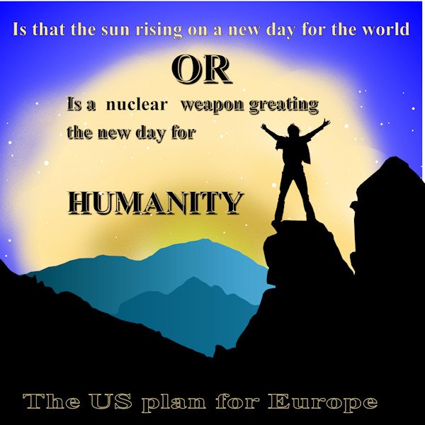
These a lot happening in europe around now. when is someone going to wake up and realise this is the reverse of the 1960's cuban missile crisis. The west should back down and look to see what is happening and take the right action or we are in for a nuclear winter
1 point
-
 I see the Star Trek Entreprise in red!1 point
 -
1 point
-
Thank you for the stencil design lab. You not only did a great job of explaining the technique, but I could follow some of the "how you get from 'here' to 'there' steps" that I haven't been able to master..1 point
-
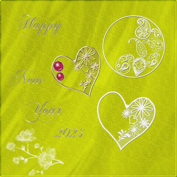
Happy New Year 2023 to all. Not seeing the post of January 4, I am again. Here Stencil. Homemade paper, pattern and texture with brushes. Font ChopinScript. Gems made with script Precious Creation Cassel.
1 point


Resized.thumb.jpg.d25811db03a63358cedab1e79f527635.jpg)