Leaderboard


Popular Content
Showing content with the highest reputation on 01/27/2023 in all areas
-
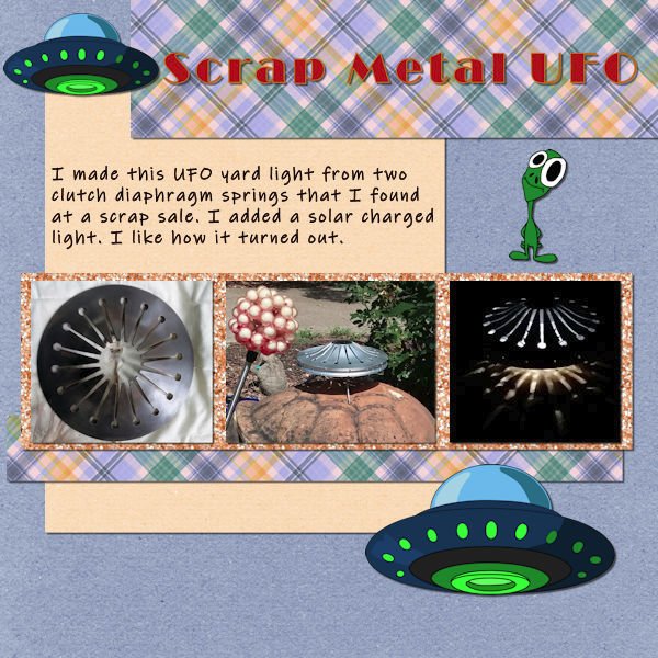
here is my project 4, a visit in a museum in Berlin , credits are all in gallery7 points
-
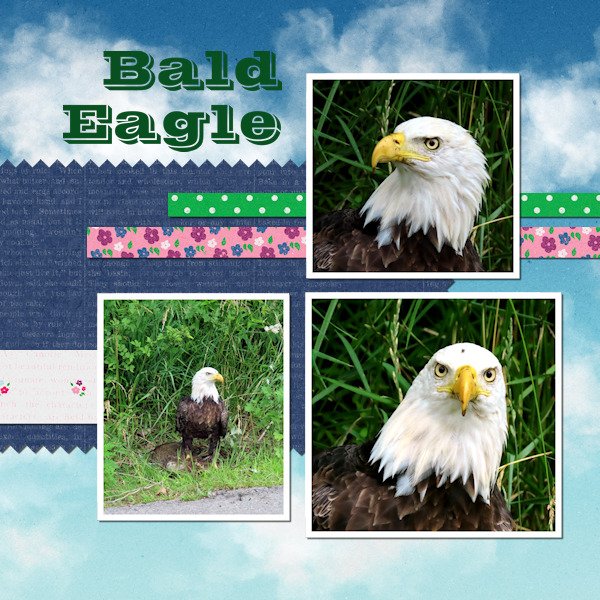
Here in the United States, the Bald Eagle is our national bird. A hundred years ago, it was on the brink of extinction. But it has recovered. There are areas where the birds are known to nest. And I had heard they could be seen on our local creek, but never saw one. One day in July last year, I drove out toward the creek to run an errand. I saw a large bird on the edge of the road. I slowed and expected it to fly away. But it didn't. As I drove past, I realized it was a Bald Eagle! I had to turn around, and get my camera out of my purse! It was very concentrated on eating lunch, which was roadkill in the weeds. I have not been feeling well the past 3 days. I realize now I didn't do anything with the title, and I may have missed another step or 2, but I just don't feel up to it now. Since I had it halfway done, I felt I needed to finish it. I hope to work on Project 5 tomorrow, praying for a better day.
 6 points
 -
The next page of our trip to Chattanooga. All papers and elements are mine. The title font is Broadway. The journaling font is Arial.
5 points
-
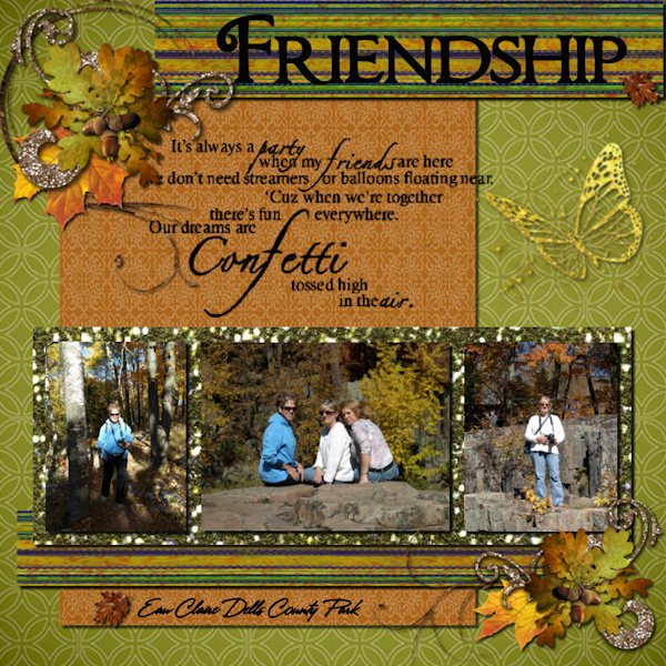
I am more relaxed when I am enjoying the outdoors. One of my favorite locations for hiking and camping is Algonquin Park. There is just something about the call of a loon that seems to melt away any angst that has built up and allows me to relax. Thanks very much for putting together these sessions Cassel. Greatly appreciated.5 points
-
I just want to remind participants to try to avoid slippery topics because we want to be a neutral place for everyone to feel welcome. In the past, discussions about political views and religion have caused members to leave. These posts are not at that point yet, but for anyone who is reading, it COULD get slippery. Thank you for supporting each other, even when world events might trigger some strong feelings.4 points
-
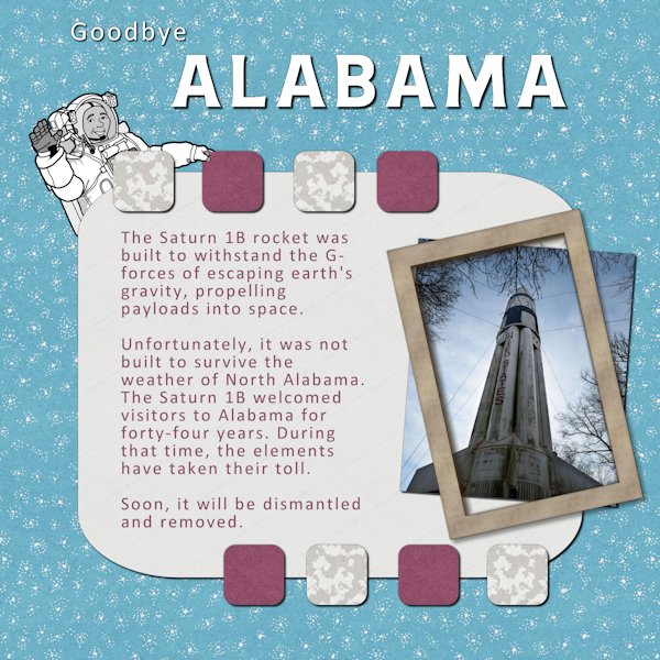
At the last Boot Camp, my Project 5 featured the Saturn 1B rocket at the Welcome Center at the Alabama/Tennessee line. Since then, it has been determined that it is no longer structurally sound. Refurbishing it would require moving it to the NASA Marshal Space Flight Center in Huntsville. In 1979, power lines across roads were temporarily removed. Although the rocket had been dismantled, electrical poles were taken down to accommodate the massive size of the pieces. Today, overpasses make it impossible. The font for the title is Neilvard One and the text font is Calibri which recently became the official font for the US State Department. The papers are from Marisa Lerin.
4 points
-
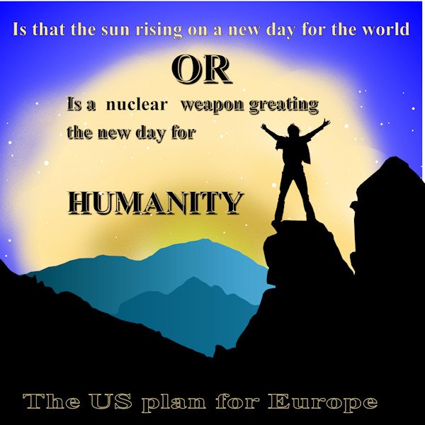
These a lot happening in europe around now. when is someone going to wake up and realise this is the reverse of the 1960's cuban missile crisis. The west should back down and look to see what is happening and take the right action or we are in for a nuclear winter
4 points
-
Project 4. Kit used: PS - Gina Jones-Pretty bird. Font: AR Julian. Fun.
4 points
-
Project 5 I had a ton of fun with bootcamp! and seeing everyone's beautiful work.
3 points
-
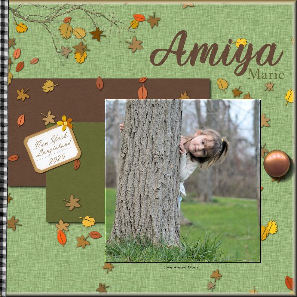
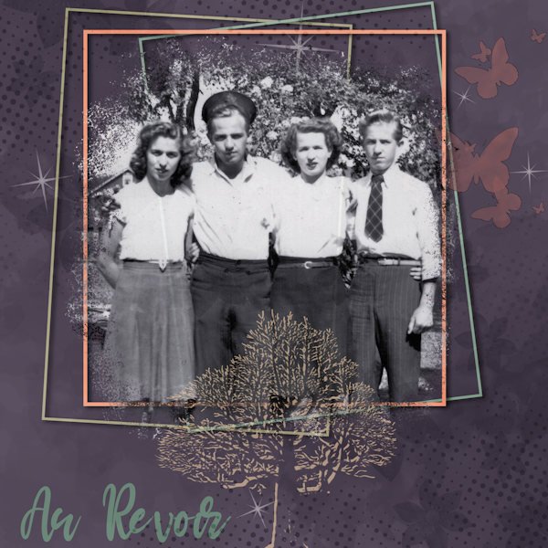
I've known for some weeks that this day would arrive, so I began working on a small tribute to my mother and her siblings, all of whom are now gone. The last uncle just died last night; his brother died last September; and my mom and her sister have been gone longer. I'm not just an orphan but uncle- and aunt-less too! Karel (called Charlie) was 96, so we are not in deep mourning, but I do feel the loss right now...of all of them. Requiescant in pace. The photo is likely from the mid-40s b/c the uncle who died yesterday has on his navy cap. He was underaged but sneaked into the Navy and served on a corvette in the North Atlantic. I do genealogy layouts for my family history, hence the tree.
3 points
-
LAB 6-7 Sandbrush Scale Pattern Wavy Flag Inspiration Template W used for this LAB Another fun lab. The scale pattern was my favorite. I played with color combinations for quite some time, it's addictive when you want to see just one more combination...an hour later you are still doing it, and the rice is burning upstairs! I know, it's hard to burn rice when cooking on low. If I can melt a colander making spaghetti, I can burn rice (I have...many times). But you aren't reading this for my cooking advice are you? Back to the Lab at hand. The sandbrush was surprisingly easy to do, yet hard to control it just how you want. I'm thankful for the good instruction on the wavy flag. It took me some time to figure out the "shear" setting on the pick tool I couldnt figure out how to get the middle handle(node?) to change from vertical to horizontal. I got there by mistake and took me time to figure out how to change the directional arrow thing. The background scale pattern (which looks like supermans colors - don't get me started on Henry Cavill doing Supermand and NOT doing The Witcher!) has a gradient background and the pattern has a 14% angle with a scale set at 80. the scales looked best in black. I used the sand brush as a paper and for the stars and ovals. The frame around the whole photo/title area has an inner bevel (#2, width 8, smooth 10, depth 7) to help it stand out. Fonts are Gills Sans Ultra Bold Condensed (title) and Adaniya (Creative Fabrica) on the wavy flag. Photo's are mine.
3 points
-
Lots of lessons learned on Project 4! One of which is that I can't seem to find elements and papers to support what I have in my head of what I want to create! I've downloaded many "freebie" packages but they don't seem to fill the bill. And what are these "tubes" that I read you guys are using? Do tell! Please!
2 points
-
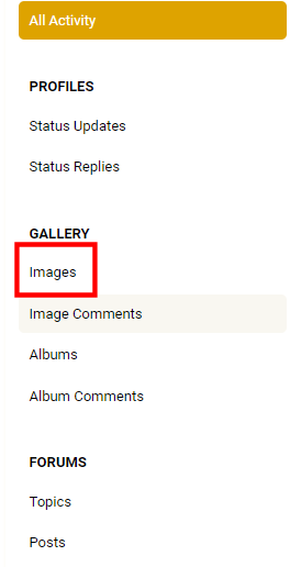
If you want to look at all the images posted by a specific member in the gallery, there is a way. Step 1. Click on any members profile image (or the letter that shows if they have not added an image yet). Step 2. Click on the View their activity button on the yellow band. Step 3. Click on the Albums tab Step 4. Click on Images on the left, to see all their images.
2 points
-
Here it is...
2 points
-
BOOTCAMP DAY 9 - #4 - FROST MOON Background paper: StarWarsMayTheForth kit Title: Bauhaus93 font filled with white glitter Button: SNU_1-2-BuckleMyShoe_Emb-Marble Journaling font: Century Gothic Journaling info: The Farmer's Almanac Frame: Inner Bevel #7 @ 43 Clip + Flower: SNU_1-2-BuckleMyShoe Photo: Fred Coffey-Photographer
2 points
-
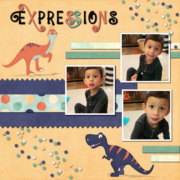
This is my 5-year-old great-nephew, Noah, who loves dinosaurs. The shadows on the dinos were an experiment. I guess I could have treated them as stickers, but it gave me a chance to try something different. The papers and elements are from a collaborative kit called Boy of Mine. The font is Unicorn Express from Creative Fabrica. Carole: The buttons from the previous layout were "as is" from the designer. After your observations, I probably wouldn't have used them. I did try to flip them, but it didn't work in the space I wanted. After this, I will never look at a button the same way again. I'm having trouble with brushes loading. It takes almost two minutes before they are loaded and ready for use. I seem to remember that you had addressed this for someone else before. Would you refresh my memory? Thanks!
2 points
-
Wonderful lesson! This is my fourth project. Again, this was a lot of fun. Joseph became a big brother a little over three months ago ?
2 points
-
2 points
-
Thanks for these. I will have to go back in later to see if I can edit the frame around the images. For now I just used another layer.2 points
-
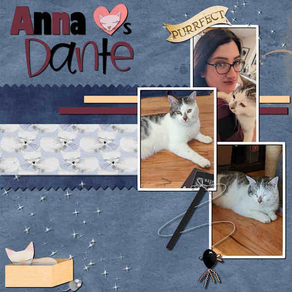
 DAY 9 #4: Anna Loves Dante - My granddaughter has a new cat named Dante. I got a kit from Digitalscrapbook.com by Gina Jones called Every Day is Caturday. The plain papers, the heart and the scatters are from my stash. The patterned paper, word art and cat accessories are from the kit. The fonts used are Gill Sans Ultra and Birdy.2 points
 -
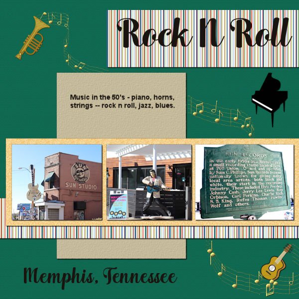
My project 3. This time the papers are mine and the elements are all from different picture tubes. The pictures were taken in Memphis when my daughter and I did a Sunday tour of the sites in Memphis to use for my "M is for Memphis" alphabet book. The font used is Arlington Script. Most of the extra scripts I get are from Creative Fabrica.
2 points
-
its was again fun to work in this workshop, some things that I had forget comes back in my mind . here is my project 5 , The red TitleWord is made from a pattern in my photo and I added the clock , the blue is made with a paper credits in the gallery -1 point
-
Gerry, I brought my family to Huntsville Space Camp many times and we always went to the back lot to see the rocket for it was on the ground at that time. This was one of my favorite places to visit so I brought all my family here at one time or another and even sent one of my grandchildren to the actual space camp. Great stuff!!1 point
-
1 point
-

© photos by Anja Pelzer
1 point -
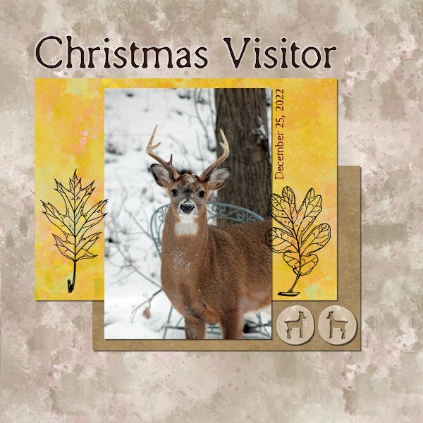
Colin, this photo was taken October 25, 2022. I live in Virginia about 25 miles SW of Washington, DC. Virginia is on the east coast of the US but I live inland. We did have a beautiful Autumn this year. Some years we don't get much color but this year was a colorful year.1 point
-
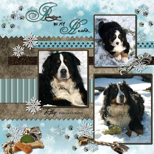
Fonts used ----Copper Alt Caps-----Jellyka Jellyfish-----A&S Heartbeat Papers are from Pixabay Elements are from years ago...... Paw prints is a Picture tupe
1 point
-
This is the adjusted image with frames around the images. I kind of like the effect that it did however the colour fill did not go all the way around the images. Thanks for the reminder of not having to put shadow on paint text or splashes.1 point
-
1 point
-
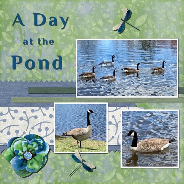
This is my 4th project. No long story for this one. I really didn't come up with any "fun" way to do the title. Papers were from Janet Kemp's Pond Life kit and the elements were from Jessica Dunn's kit Swim with the Fishes. Both kits available at digitalscrapbooking.com. Photos taken at a local pond.
1 point
-
I have just taken a gander through all the pages, as it is currently snowing. What an array of wonderfully creative pages posted. I thought I'd make a start on general ecards. Here are two that I have started, no doubt before they are destined for their intended recipient, they will be tweaked. Currently working on an Easter card. Many of you will know that I keep my pages simple and minimal. Maintaining focus on the photos. I'd better get back to it.
1 point
-
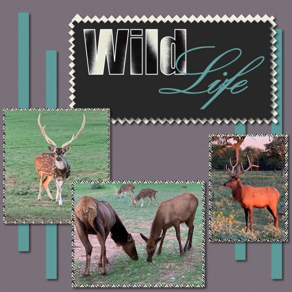
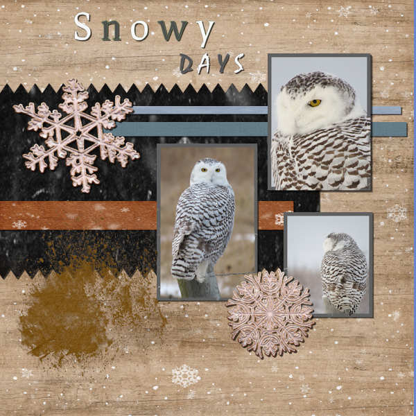
January word Challenge in the campus. START. I didn't clock up the miles yesterday, as I had intended to do. The wildlife had other ideas for me. Before I even set off, I encountered a small flock of black capped chickadees close by. I spent more time being inconspicuous than actually hiking the trails. Either way it was a great afternoon to be outdoors. I haven't done a magazine cover for a short while. My very first page to be be added to the campus since the changes. I forgot to add it to the campus, after posting it on facebook on Sunday. Yearling bull moose. Male Snowy Owl. Black-capped Chickadee.
1 point
-
1 point
-
I changed the font to Arial, but it still seems to look like there is a shadow on the journaling. Not sure, but it is when it is resized to 600 that this happens. Could it be because I textured the paper it is on?
1 point
-
Hi Steve - I usually lock the transparency lock at the top of the layers palette so only one item gets selected. See if that helps...1 point
-
DAY 9 #4: Anna Loves Dante - My granddaughter has a new cat named Dante. I got a kit from Digitalscrapbook.com by Gina Jones called Every Day is Caturday. The plain papers, the heart and the scatters are from my stash. The patterned paper, word art and cat accessories are from the kit. The fonts used are Gill Sans Ultra and Birdy.
1 point
-
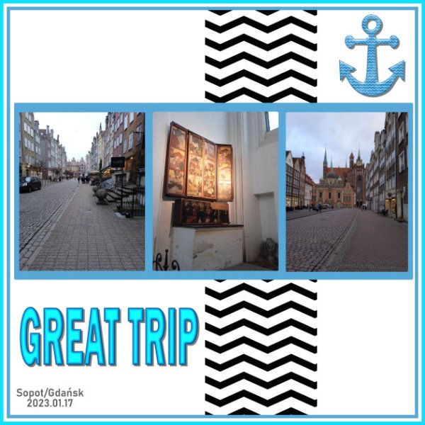
My Project3. With three shots taken during a short, great trip (600 km by train, 20 km by pied-walking) by JK.
1 point
-
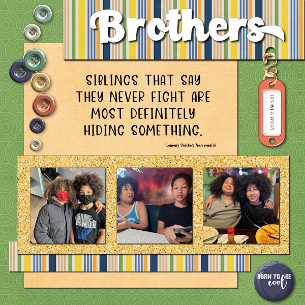
The Boys are now 12 and almost 15. I first met them seven years ago. The elements in the layout are a hodgepodge of stuff. I couldn't decide on what I wanted to do, so I scrolled. And scrolled some more. The fonts are Paladise for the title and Dear Friend for the quote. Both are from Creative Fabrica. The glitters was created using Creation Cassel's script, Glitters-C.
1 point
-
Full disclosure...I've never done any scrapbooking! However, I do create photo books which I believe I can incorporate the scrapbooking skills that I am developing! A win-win! I am not a big glitter person, but I had fun seeing how to use it. I was pleased that I could flood fill the hearts with a 3rd glitter color after creating the "2-tone" glitter to go under my photos.
1 point
-
Project 3 Fonts used are A&S Heartbeat..&....Chocolate Box Used Paper & some Elements from Scrap Kit ....Autumn Breeze ..& ..Autumn Dreams a got years and years ago Some Elements from PNGTree
1 point
-
The quote is one that my wife has used over the years many times. This looks like a perfect spot to do just that.1 point
-
1 point
-
Project 2 We had a couple of buck visit our yard Christmas early evening. It had been a frigid day and they were hungry! I had my camera handy. The font is Remington Typewriter, and I used the chisel effect on the headline. I used the Janet Kemp Woodland Winter kit, from DigitalScrapbook.com
1 point
-
Like mother, like daughter. The main font is Nonplussed and the handwriting font is Annisa, both from Creative Fabrica. The background and drawings are from Pixabay. The papers are by Marisa Lerin from Digital Scrapbook. Anytime I can use SpongeBob SquarePants lyrics in context is a good day.
1 point
-
Project 2 really enjoyed this.
1 point
-
1 point
-
1 point
-
 Yummy Toes Melo Vrijhof: The Guys; Nutcracker fonts: Segoe Print & Alfa Slab One photos: personal1 point
 -
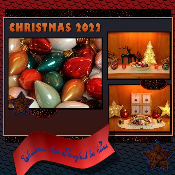
 Spend Clematis flower head in my yard, representing 3 days in my work life...especially the Christmas season.1 point


Resized.thumb.jpg.d25811db03a63358cedab1e79f527635.jpg)


.jpg.69f184b0ad2cf378cb9a152975bec6b4.jpg)