Leaderboard
Popular Content
Showing content with the highest reputation on 01/23/2023 in all areas
-
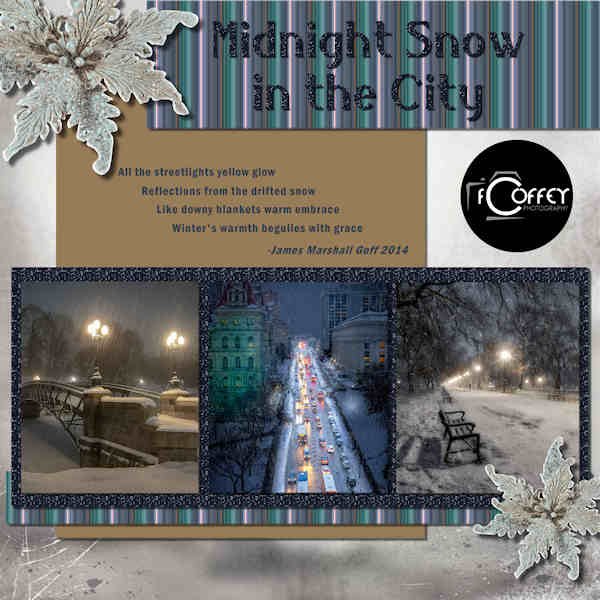
BOOTCAMP DAY 7 - #3 Photos: Fred Coffey-Photographer Setting: Albany, NY Background paper: ps-THLD-Iceland Flowers: ps-Studio4-Iceland Journaling: Poem "Midnight Snow in the City" by James Marshall Goff Journaling Font: Franklin Gothic Demi Condensed Title Font: Belisha Glitter: ps-AHA_somewhereintime_glitters10 @ 25% Stripe pattern created from center photo - jpg in Files on Facebook8 points
-
8 points
-
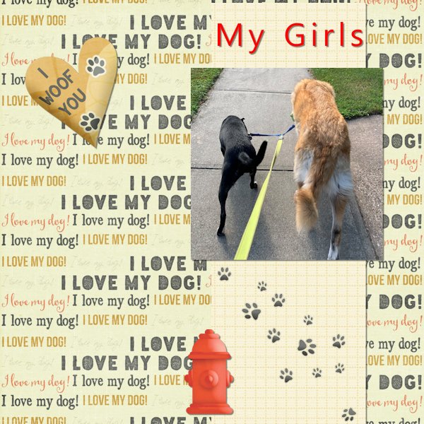
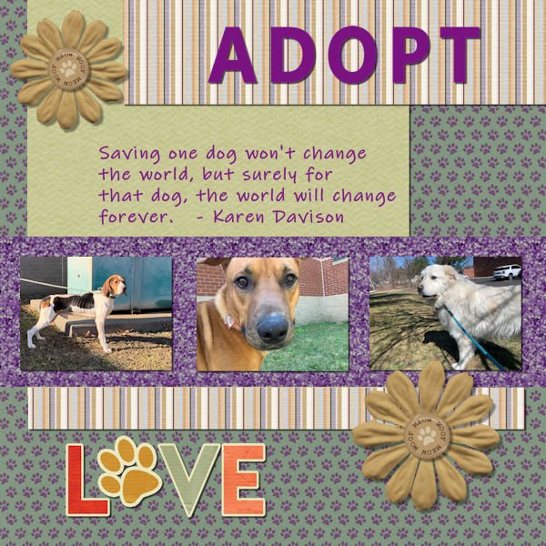
I knew exactly what I wanted to do when this project was given to us. About 10 years ago I quit my job as a lawyer and decided that I really wanted to work with and for dogs. I became a dog walker and pet sitter by day and in my free time I volunteer at my local animal shelter and smaller rescues from time to time. Oh and I'm mom to three dogs. The dog on the left was rescued by the ASPCA along with approximately 300 other hounds in a cruelty/neglect case in Vermont last winter. Our shelter took in about a dozen of the adult hounds and about 20 of the puppies. The rest were sent to various shelters around the country. His new mom & dad sent the shelter an update and a picture. He's living the life and a healthy weight now. The middle dog was transported from Texas to Massachusetts and ended up in our shelter where he quickly found a home. The third dog was on a cross country trip thanks to a Great Pyrenees rescue organization to meet his parents to be. I drove him on one leg of his trip. Sometimes it can be soul crushing but these are three success stories. As for the papers and elements, all came from MarissaL's Pets kit except for the Love element which came from Gina Jones' Fido kit and the glitter which came from the link that Cassel gave us for glitter in the email.7 points
-
The quote is one that my wife has used over the years many times. This looks like a perfect spot to do just that.7 points
-
7 points
-
wow everyone had done a wonderful job, here is my project 3 credits in the gallery7 points
-
Project 3 I used the Janet Kemp Woodland Winter kit again, I think it goes nicely with the critters. I don't like the glitter paper much. I tried to adjust the blend mode, but I was not any happier with it, so I left it alone. Question on the text, you clicked on the checkerboard for no outline. Is that the same as making the width of the stroke 0? Do they do the same thing?7 points
-
Ok I'm a day late but happy new year (Chines) it is now the year of the rabbit. The top banner is a download from the internet the rest are items from my collection of clip art.6 points
-
5 points
-
5 points
-
5 points
-
Full disclosure...I've never done any scrapbooking! However, I do create photo books which I believe I can incorporate the scrapbooking skills that I am developing! A win-win! I am not a big glitter person, but I had fun seeing how to use it. I was pleased that I could flood fill the hearts with a 3rd glitter color after creating the "2-tone" glitter to go under my photos.4 points
-
Hahaha. I'm going to sit here and hold my breath until it comes.?4 points
-
Project 3 This was a lot of fun! My drop shadow is terrible on the rope around the flower. I have to try and redo it, but I think I saved it as a jpg. Trying to improve working with drop shadows.... soon as I resized the rope it looked more ugly lol ? (Sorry Carole, my internet was weak due to the snow/rain where I am, but it appeared on my end..so I reposted )3 points
-
I love it, Mireille! Just added this to my favorites in the store!3 points
-
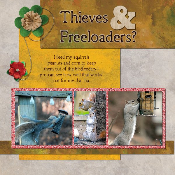
Hahaha I love that Linda. Squirrels are resourceful. I took the dividers out of my hopper style feeder so the squirrels could sit in it in the winter and eat out of the elements. the Magpies taught the pigeons how to land in it as they barely fit. All are welcome in my yard...well, almost all. Only 4 pigeons at time are allowed ( I wish they'd get THAT memo). This morning 16 landed (this is after the first 6 years living here and never seeing a pigeon at all), I usually shoo them off and then let 4 or less stay. They are super poopers. Yuk.3 points
-
WOWZERS! She's a beauty. Did you also do the polka dots on the dress. I like how the the dots in the middle are the black and white in one dot. Very cool.3 points
-
Created the polka dot paper using a pattern I made (I'm sure I learned it from Cassel). The yellow stripes were simply rectangular selection on different layers flood-filled with the color from the original illustration by Bahar. The font is Morebig Sans found through the Free Design Resources newsletter. Lately I've been using drop shadows with zero blur to give my text a little more depth (don't know if that's the right word.).3 points
-
Thanks so much for the WOWZERS, Susan. I have to give credit for the dots in the middle to the original illustrator, Bahar. But I have done half and half on some things I've done.2 points
-
2 points
-
Although a solid color for the background is totally fine, it can also be a place to add a "generic" winter scene and lower the opacity so the data still stand out. That is just another way to approach it. Maybe i'll have to do a challenge of making a data layout! That could be fun!2 points
-
Thank you for the stencil design lab. You not only did a great job of explaining the technique, but I could follow some of the "how you get from 'here' to 'there' steps" that I haven't been able to master..2 points
-
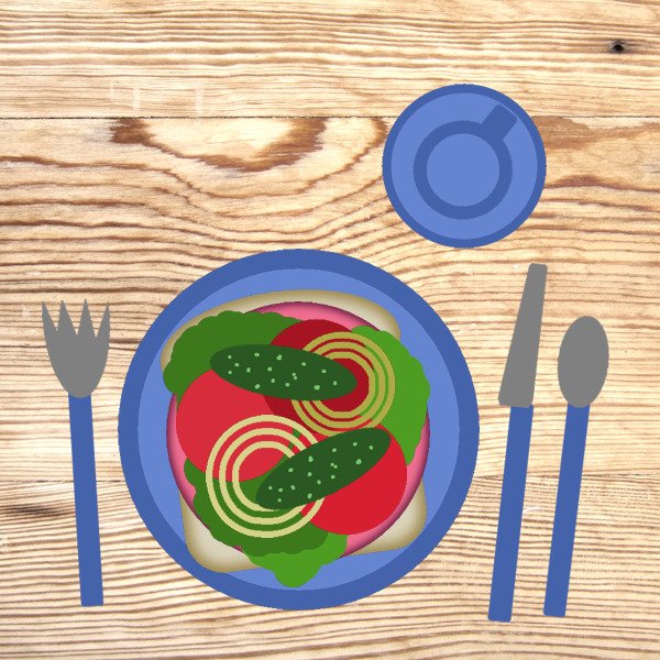
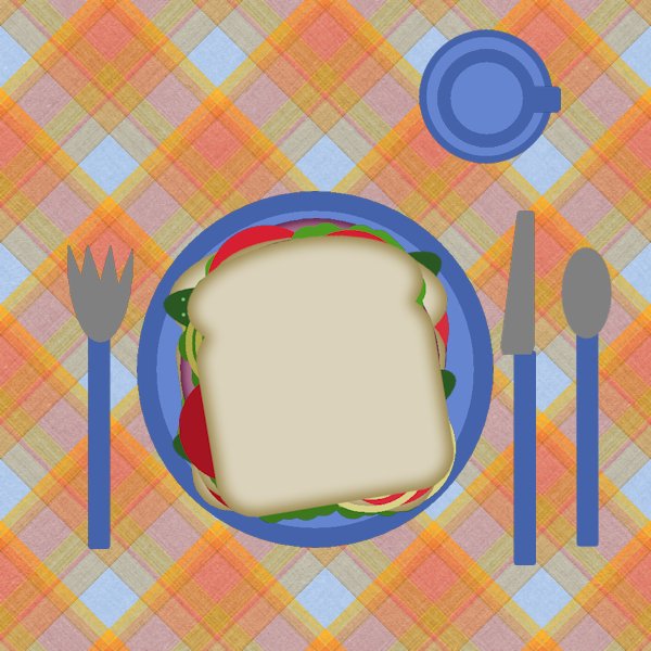
Dear Cindy Harris. I love both of your sandwiches. How neat you took the top piece of bread off so we could see that you put mayo and mustard on your sandwich - AND I can see it on yo ur knife. WOW!!! How thoughtful to put extra meat on the side plate for your puppy! And I, too, like that plaid that you used for your tablecloth. As the captain said (on Galaxy Quest) NEVER GIVE UP. NEVER GIVE UP. Anyway - with the Lord at your side, you'll always be able to get up!!!2 points
-
2 points
-
I got started really late for this daily pic so I relied on my scrapbooking supplies. Found this gorgeous photo on Unsplash which is a wonderful resource; the photographer is Lane Jackman. I used a paper from the ALFLT Jan 2021 Blog Train for the background and another one to make the ribbons. The flower was also in the blog train. The layout was inspired by one of Marisa Lerin's templates from Digital Scrapbook, formerly Pixel Scrapper. The font is Sugarstyle Millenial free from dafont.2 points
-
2 points
-
2 points
-
2 points
-
Day 5 - Project 2 - Magic on the Beach in Costa Rica. My California family is there as we speak, and Magic's mother, Lucy, sent all the photos used on this layout. The frame for the photo is a PSP frame called Transparent; the title font is Hello Butterfly with an inner bevel #7; the text on the right is done in Kleymissky font. The flower embellishment is from my Just Beachy kit by Lin Jane. The toucan is from the eyeinspire fruitloops kit. Lucy included a little poem with the photos she posted. Pura Vida Slow flow Sunshine and resupply of vitamin d Much appreciated after weeks of NorCal rain A new heart home deep on mama Pacifica Magic home Water baby Pool obsessed Heart full of deepest appreciation and reverence for this beautiful planet we call home2 points
-
2 points
-
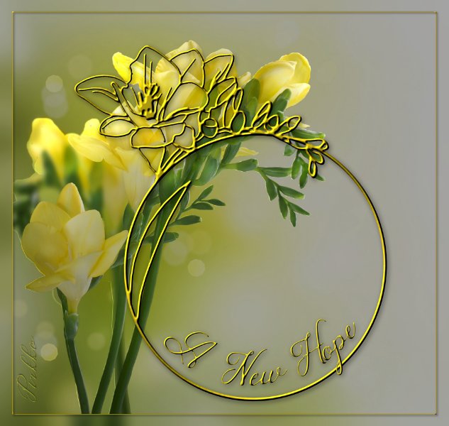
Pirkko, how did you achieve the metallic look of your stencil? Is it from a script? It is beautifully done.1 point
-
1 point
-
Hi Michele Contrary to my habit for creating my papers, I used the script on a 12" 3600x3600 image so that the script could put more pattern then I resized to 1000x1000 so that the texture of the patterns is visible and again resized to 3600x3600.1 point
-
The paper and elements have been randomly selected from the digital scrapbook site.1 point
-
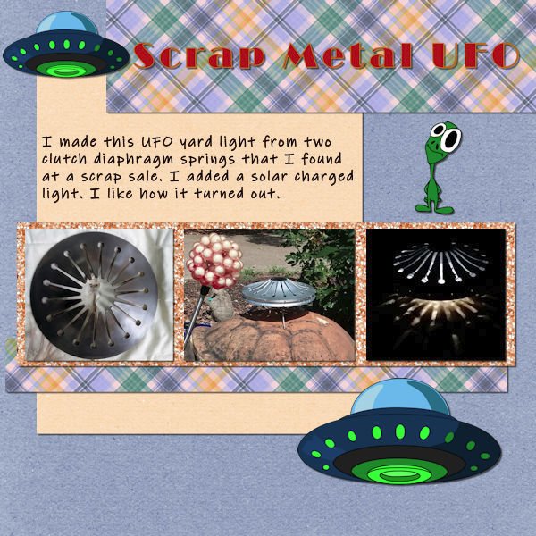
@cindy harrisYou did such a good job on the sandwich!!! That mayo addition was very well done. Can you remember the very first exercise you did a couple of years ago??? Such a progress and I see how your creativity is showing, now that you are getting more comfortable with using PSP! @kasanyInteresting take on my suggestion. I would not have thought of using an abstract style, but hey, everyone has a different style ? @Leslie JostesI see that you avoided a common mistake: you added the shadows on the little bows AFTER you rotated one of them. That is good because if you had added the shadow first, it would have looked odd. This way, it makes sense! @Linda J WalkerTo answer your question, yes, making the stroke material null or setting the stroke size to 0 will achieve the same result. You said you didn't like the glitter paper. Did you try it with a small scale? That would make it not look like glitters but still having texture. But it is ok if you still don't like it. @Anja PelzerGreat work on resizing the photos without distortion. @Thomas WillisThat light is so cool!! I see you are creative outside of the digital world! Calling all the registrants who have not participated yet. Are you doing ok? Are you having issues with the tutorials or how to post your projects? Drop me a message if that is the case. I want you to make the best of this bootcamp!1 point
-
1 point
-
1 point
-
Buddy showed up one day, under nourished and looking for a home. He instantly became a part of the family. He enjoyed "hanging ten" and surveying his vast estate. He also spent a lot of time in my lap. He loved his new wonderful life for years. He developed cancer and you know the rest. Buddy was my buddy. RIP Buddy.1 point
-
1 point
-
1 point
-
1 point
-
1 point
-
Project 1. I made the cluster with the elements in the fall kit from PS cpJess frosty fall mini kit offered for this project. Since I decided not to use fall colors in the mini kit, I colorized the fall leaf scatter provided by Cassel with the hue/saturatiion/lightness to green. the gold flower is from the kit also. In making the cluster which I saved as a pspimage, I made shadows on the individual elements - thanks for that tip, Carole - not sure where you mentioned it, but I remembered it.1 point
-
1 point
-
here is my project 1 , day 3 ein Besuch in Berlin, I blended the photo into the background1 point
-
1 point
-
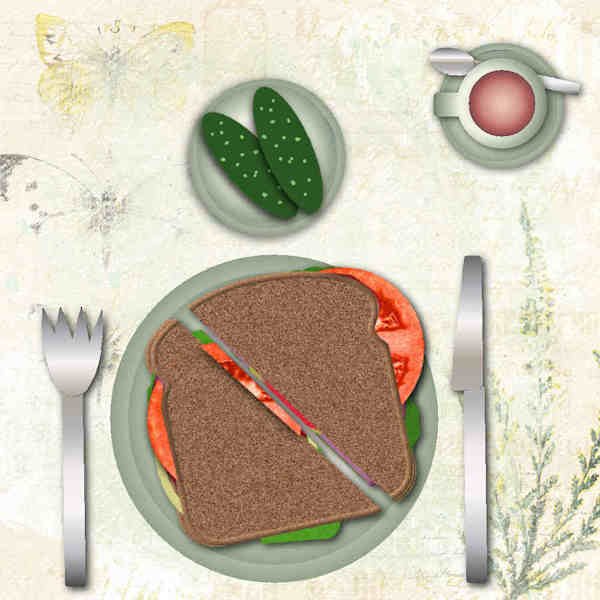
here is my sandwich, I love darker bread and meat, I used 3D-cutout on some elements tablecloth - made with psp gradients - 1 layer flipped 90 degrees and blended1 point
-
1 point
-
1 point
-
1 point




Resized.thumb.jpg.d25811db03a63358cedab1e79f527635.jpg)
