Leaderboard
Popular Content
Showing content with the highest reputation on 11/12/2024 in all areas
-
7 points
-
Background paper by Jessica Dunn, Into the Woods, Grey Wood Paper, 142072. Paw prints by Janet Kemp, 98588, small doodle shape mask template 038. Everything else is mine, except the poem.6 points
-
5 points
-
5 points
-
5 points
-
5 points
-
5 points
-
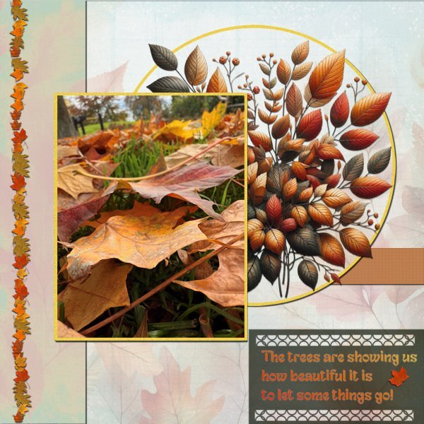
Finally I have completed this layout! I don't think I ever have done that long about making something. However the calendars were a lot more work to complete and print; the first one is in the mail by now. Before doing anything else like the AAM-Challenge I wanted this one done. It was difficult to take it up again and remember what I wanted to make, but this must do. I used a photo of fallen leaves that we have in abundance now, every street is littered with them. The background I have in my stash and I used a leaf picture tube from Carole as well as an Edge punch. The font is Fantasy Snowman, a freebie from CF a couple of days ago and the leaf bouquet came also from CF if I remember correctly. All the colors are taken from the leaves in the circle.5 points
-
Template 258 by Lady 22. Photos taken in August, Sandbridge, VA.4 points
-
I totally get that and what a cool surprise for you when you download. I'm in awe of you and anyone who photographs anything that moves. I have terrible timing. So I really appreciate being able to see those who have good timing.4 points
-
I can't imagine making calendars in 3 languages, it's hard enough to do one language. Thank you for your kind words. I kept to using gradients and that was a challenge, but you learn how to manipulate them to try and make something different for each month. The texture made it look better too.4 points
-
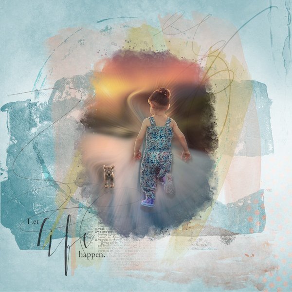
I came across a Challenge on O Scraps using a technique they refer to as Creative Photo Treatments based on the Adamski Effect (which was new to me). I browsed through the layouts in the gallery and was really impressed, so I thought, "Why not?" Playing and experimenting are good for us, right? PSP does not work the same as PS so I had to tinker and adjust and replace some tools to get even close to what they did. There is a link somewhere on their page that takes one to the video on YouTube that shows how to create the Adamski Effect. I'm posting the original photo I used from UnSplash or Pixabay, and then the layout I made. Mine is not like the ones in their gallery, but I just really wanted to try it. The photo effect took way too long! Link to Challenge: https://oscraps.com/community/threads/november-challenge-5-creative-photo-treatments.40747/3 points
-
Wow, beautiful! Gee, I didn't know we were allowed to have the light source on the top right... 😉❤️3 points
-
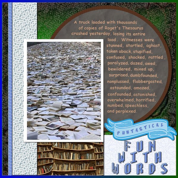
OMG! this is hilarious and I "could care less" or in other words...I do care. and was I not supposed to put that in parenthesis? hahahaha,3 points
-
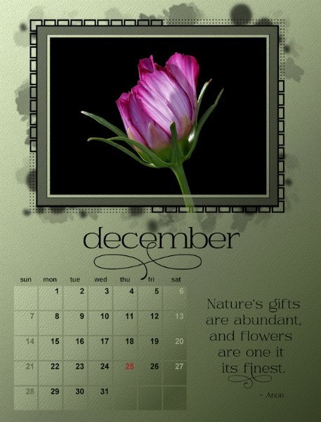
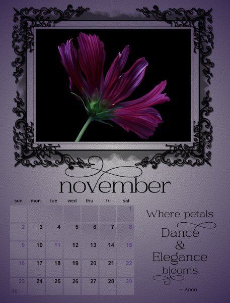
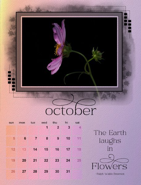
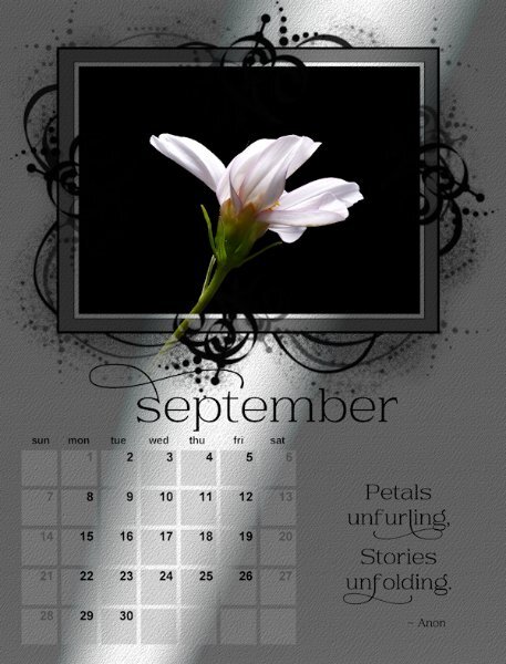
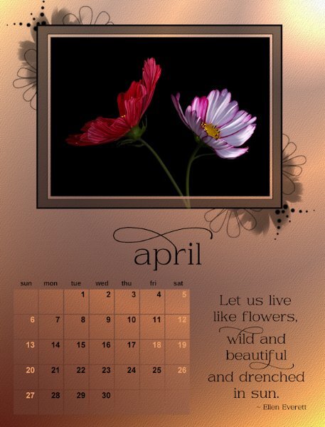
Susan that is an impressive calendar and I agree with you that the colors of the flowers more or less dictate the background colors. It was the same with my mushrooms. All the quotes are a nice touch and I thought of doing that too but decided against it because I have my calendars in 3 languages and that was a bit too much work and searching to get that done.3 points
-
3 points
-
That is funny and very clever! Whoever did the video was talented and knows their grammar. They even mentioned the Oxford Comma which is one of my other bug-a-boos! I can't help it; I'm a word nerd.3 points
-
2 points
-
2 points
-
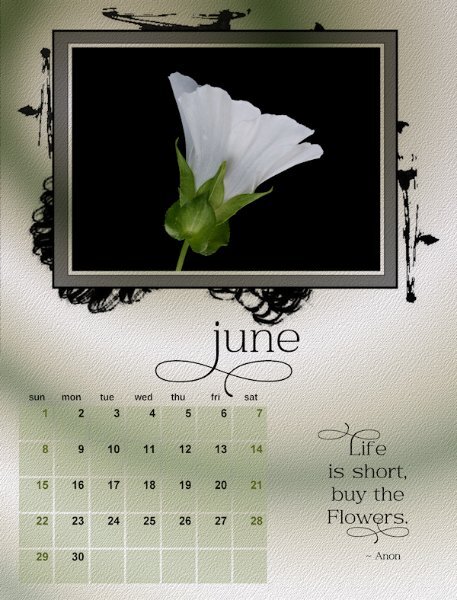
The simplicity of your calendar is undoubtedly ineffable. The vibrancy of the flowers captivates the viewers eye. Which in my view how it should be. May I make an observation? Check the quote. I believe the line 'are one it', should read 'are one of '.2 points
-
Could you make it so you only merged "visible" groups. so that if you don't want one group merged, you could hide it, merge the other groups, then unhide it. At this time I don't think I'd be merging lots of groups. I will often use groups of the layers that are used to make something (element, background paper. etc), then I'd duplicate it, hide the original, and then merge the group. That way if I need to go back and change the background I'd still have the layers intact to make changes to. If you know you will never need to make changes, merging all the groups would be a time saver for sure.2 points
-
Thank you, Susan I made all the squares separately as vectors so that I could lower the transparency on the outer square, then converted to raster. The I added a layer for the brush under the rectangle and merged. I used raster to mask script to make the finished mask. My AI patterns had to be converted to brush before they would work. I haven't tried any preset shapes yet.2 points
-
I was 5ft tall. My "Ace: was 13.2 hands. ( I think), it has been close to 50years ago when I finally sold him to get a bigger horse. None of the others I have had ever had my heart like my little Ace though, He had quite a personality. As far as my collections, most were ell cheap-o's. LOL2 points
-
2 points
-
2 points
-
As a kid I was totally HORSE CRAZY. I collected anything to do with horses, figurines, pictures, books, you name it. For my 8th grade graduation my dad bought me a horse, well he was at that size right between being a pony and and a horse which was the perfect size for me (5ft tall). Dad built a small one horse barn where he could get in out of the weather with a small corral attached. It was my job to feed and take care of him. I don't think I ever saw him go in that stall except when I fed him. I remember seeing him with icicles hanging from his mane and several inches of snow on his back.2 points
-
I merge groups all the time using the Merge-Group-Rename script after using the Raster To Mask script for my photos. Merge-Group-Rename gives me total control over each group which is my preferred method. I certainly wouldn't want all groups to be merged into one layer but each group should still have their own layer. If the script could do that, it might be something I would consider. I've been known to move a photo placement after the group merge so having them all on one layer would defeat that purpose.2 points
-
That poem is appreciated by we cat lovers! Love those faces.1 point
-
We do all have our own preferences. Mine is to have total control over the merge of each group.1 point
-
I think you might want to try the script Rene mentioned: https://creationcassel.com/store/index.php?main_page=product_info&cPath=7_10&products_id=311 This has the advantage of merging only the ones you want, in case there might be one group you DON'T want merged. It is coded to work with one click. And you can bind that script and put it on the Layers palette so it will require minimal cursor movement.1 point
-
Ik heb hetzelfde probleem (gehad) met TFT. Zoekend naar de oorzaak blijkt omdat het op de lijst staat van sites die hun klanten adressen doorverkopen aan criminelen niet meer wordt geaccepteerd door Microsoft (NL) H et programma staat op de zwarte lijst. Tweede mogelijkheid is dat je pc niet de capaciteit meer heeft om het verouderde bestand te accepteren. Wie o wie kan er een nieuwe voor ons maken????1 point
-
Yes, you always measure at the highest point of the withers. Almost all equestrian discipline classes, especially showing, whether leading rein or ridden are categorized by height. Such as section A,B,C or D. Particularly in Wales and UK. Section A Welsh pony maximum height 12h. Section B Welsh pony maximum 13.2h. Then you have the Welsh cob Section. Regardless of the breed, anywhere in the world, a pony is under 14.2h, and a horse is over 14.2h1 point
-
The dark really adds to the impact of the overall layout! I love it.1 point
-
1 point
-
1 point
-
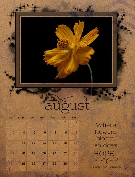
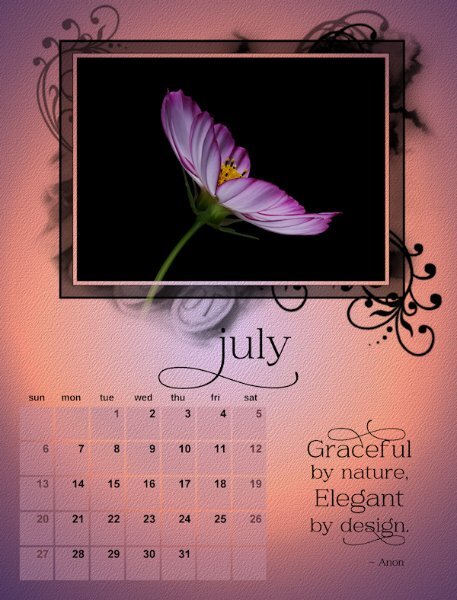
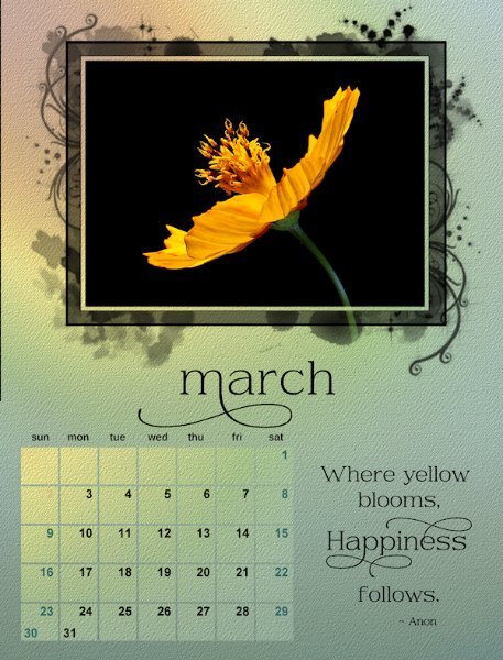
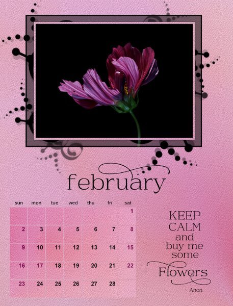
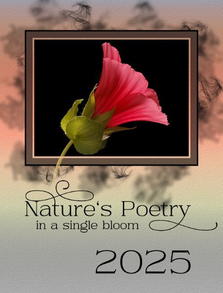
Now that the Calendar WS is over I'll post here I'm starting with the last layout which is actually the first layout of the Calendar. I ended up going quite dark, not like I had started out doing. Kept black for the text/mask and numbers (except the weekends and stat holidays for my province). The font is Daisy and Violette from CF. All the backgrounds are from gradients I have in PSP. Often they are altered (pulled, twisted, stretched, squished, angled, blurred and even stomped on - okay, maybe not stomped on, but if I could have, I would have), blended and I even tried using some masks on them. Oh, and they have a PSP texture added.1 point
-
1 point
-
1 point
-
WOW! Donna! This is breathtaking. to get the opacity, did you lower the opacity of the layers before merging (visible). Super super work!1 point
-
We could be soul sisters. I was horse crazy too. Only I didn't get the horse. But later as an adult I worked/lived on various breeding farms (thoroughbred farm with 10 stallions and a Quarter horse farm) and hunter/jumper farms. Did you collect Breyer horses and Mark's Best of the West horses and gear? Some had moveable legs and necks and came with lots of gear, like saddles and bridles...it was as close as I got to owning a horse.1 point
-
1 point
-
It could almost be a mind teaser. A sinlge image with two owls in it even. lol I love earth toned colours, along with their patterns , shapes, etc which makes interesting works of art. I very much appreciate your words.1 point
-
I notice the hawks - when they sit on my back deck looking for lunch - can turn their heads almost right around too!1 point
-
1 point
-
1 point
-
1 point
-
I have all of Carole's punches, which I love to use. Which allows me to choose a punch, that has a design that can be nigh on found in my subjects.1 point
-
Is it related, at all, to Beetlejuice? 😉 (Note I only typed it one time....)1 point
-
1 point
-
I'm pleased you could see why I used the technique I did. Many things I don't notice until I have downloaded the photos, unless they are almost staring me in the face. As I have to capture what I can when I can when it comes to shooting living creatures.1 point



Resized.thumb.jpg.d25811db03a63358cedab1e79f527635.jpg)
