Leaderboard


Popular Content
Showing content with the highest reputation on 08/24/2024 in all areas
-
Day 5. After reading the comments from others about this assignment, I'm in good company. The first two were done entirely with the warp brush. The third one required a hand-drawn shadow. I was using a mouse, but I suspect it will be easier with a tablet. I'll go back and see if that works better.
 7 points
 -
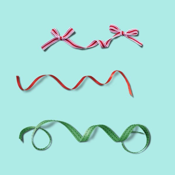
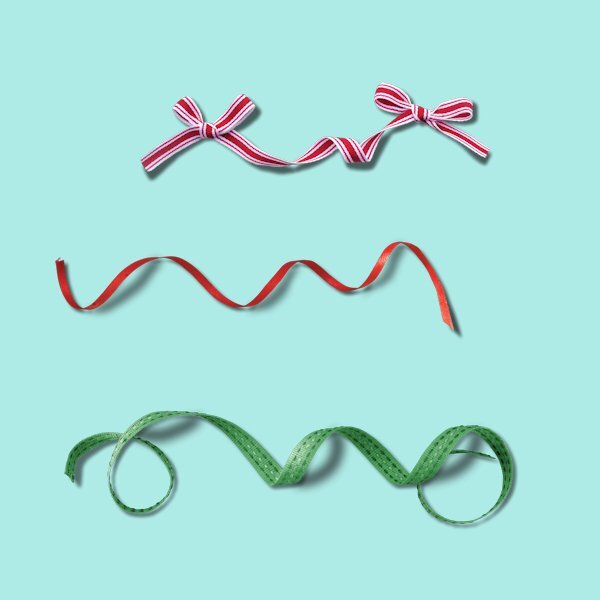
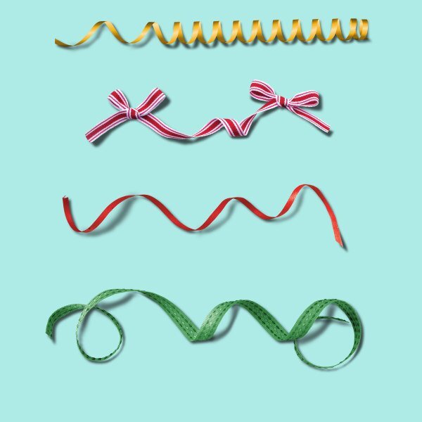
I am not very happy with the results and drawing my own shadows by hand and have them nicely fit with the existing ones is very difficult. Like Rene my hand isn't steady enough to make this into a succes! I'm sorry and will try to avoid using this kind of ribbons unless they are already properly shadowed by the designer. I'll check in the store if Carole has a script for such curly ribbons that have a shadow!! There is a tutorial that explains the making of a curly ribbon with shadows and that is a bit of work but gives a nice result. I did one for the Build a Kit from last year. With using the warpbrush I'm more or less oké now and use it when necessary. What I show here is by no means my first attempt and I forgot how many times I started anew.
7 points
-
I really struggled with this lesson 5. I don't have a steady hand and trying to get the shadows right is very difficult for me.
6 points
-
I am certain I will NEVER use a curly ribbon! 😆 If I find I have any, I may just have to delete them to save my sanity!
6 points
-
I first did it the way I used to shadow (but am not posting it) because I wanted to see if there was any difference in how the shadows worked. To my eye, I saw no difference on the elements so all the extra deleting above elements was just extra work. On the practice I used pretty much the same shadows as Carole for this posted version. The only difference between her version and my other was the shadow on the flower and the frame was a different opacity than Carole's settings. The second image is a cluster I made using elements from a Christmas kit. The shadows used on it were the shadow settings given to me by Jill with some tweaking as I felt needed. As you can see I had a base of a journal card then started layering above it and even included a curly ribbon. This is how I use curly ribbons on my layouts... hide most of it in a cluster. One piece of advice I got about clusters was to always have an odd number of elements in the cluster. Carole's has 5, mine has 11. My cluster will be used on a cover page layout for a series of layouts I do every December called "Document Your December". A layout for each day of the month. I've done this every year since 2017. I also spent some time looking at layouts with clustering in a gallery and I could not see that any of them went the extra steps of deleting parts of shadows. And, they all look realistic to me! However, I can see that it could be useful in some clusters so won't rule out never using it in the future.
5 points
-
Ok, number 5 and it's the best I can do after many goes at it and deleting several times. Shadows are definitely not easy. Didn't really enjoy this one.
5 points
-
Shadow Workshop - Lesson 4
5 points
-
and now the with 2 other ribbons5 points
-
Lesson 5 This was tough one, following the ribbon to see which part should be lifted. I need lots of practice especially where it meets at the bottom. I kept making the brush line too short and then I couldn't get it to match nicely with the reg shadow. I tried 2 extra ones and they were harder.
5 points
-
my day 5 , I think also that I need more practice with it,5 points
-
I really hate unusual shadows. 😄 I did download the page for future use. I have some tomatoes that I have to make into sauce today, so I'll save the practice for later. Carole, I know I make a lot of mistakes with shadows, but will keep practicing. I find shadows harder that vectors. Maybe you should make some preset shapes so we don't have to draw them by hand. LOL
5 points
-
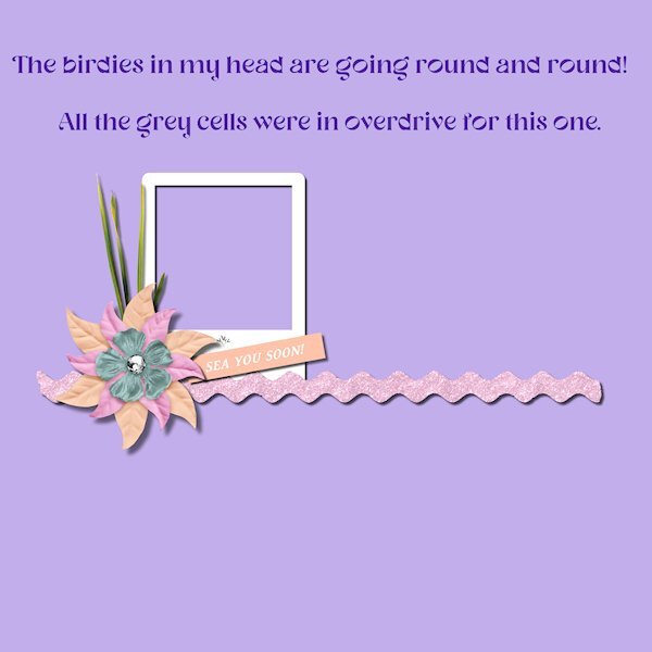
Lesson 6 Whew! Call the fire department, cause my grey cells are sizzling! I'm going to try a number 2 version, but I need to put my head in the freezer for a bit. I too, kept going to the wrong shadow layer and I'm looking at the shadows thinking I don't see a difference. I knew right away I wasn't doing it right. I started again and paused the video for each step, kept track of the settings and named the layers as well. I'm glad to know how to do this, despite not using clusters very often. If I could make nice ones, I'd like to be able to shadow them myself in this way. I think this is one of those techniques that if you do it a lot, then it makes perfect sense. You really have know where you are at all times and don't get distracted by cute furballs wanting a cuddle.
4 points
-
here are my Clusters I used BFCoffee by Just Because Studio4 points
-
Lesson 44 points
-
Lesson 6. It was a bit tricky and if I did it again I would label each layer for better reference. Interesting to do depth shadowing this way though.
3 points
-
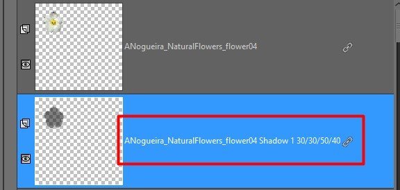
I did this one and it seemed to go more easily than I was expecting. Of course, I started out and in the 3rd iteration of the first element, I chose the wrong shadow...wasn't paying attention that Shadow 2 was on top of Shadow 1. But I Zeee'd out and started over and kept it straight.
3 points
-
I just wanted to say this has been very informative. I have watched each days vid and played around some. I don't do a lot of clusters, ribbons etc. but if I do, I have all the links saved including the link to this page. I have read a lot of Cassel's comments to each member and some of the comments by other members. There is a lot of useful info in them that I may use at some time. Thanks Cassel and everyone that posted there projects and or commented on others.3 points
-
It was a tough one for me too.3 points
-
I don't usually have a problem figuring out which drop shadow in the edit history is for which element. I do all shadows as the last thing. And, I always go from the bottom to the top of the layers palette. So when looking at the edit history, if I scroll all the way to the bottom then scroll back up slowly, I can tell what shadows (or bevel settings if I used a bevel) that I used on each item... last drop shadow = top layer of layers palette. Thanks for the compliment on the shadows... I still don't like them!3 points
-
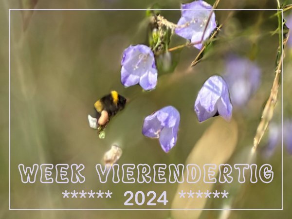
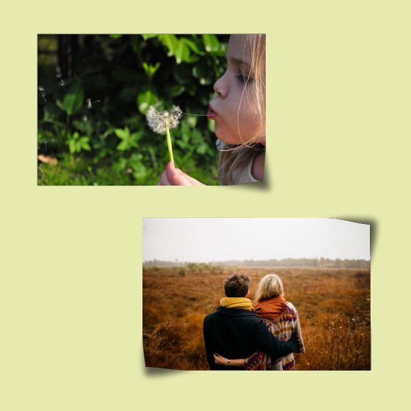
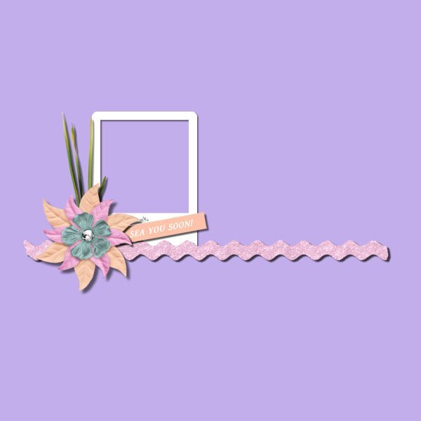
I didn't have to think long which photo would be my photo of this week. This is an extremely lucky shot which I took last Sunday when I was staying with our son and daughter in law. It was taken during a walk in our National Park "Hoge Veluwe" where the heath is in bloom at the moment. I didn't even realize there was a bee in this much bigger photo, only at home when I looked at my photos of the weekend on the PC I noticed it. I was taking a photo of a nice clump of blue harebells (grasklokje) and found a little bee too.
3 points
-
Well, I have found something that I don't like. My hand is just not steady enough to draw a shadow. IMO, mine look like crap and this is not my first try at it! I did also try just using the push brush on those areas (not shown here) and I can live with how they look. When I use curly ribbons on a layout, they usually are encompassed within a cluster or as a base for a flower/foliage so only the end shadows are what need to be tweaked. I'm sticking with that from now on!
3 points
-
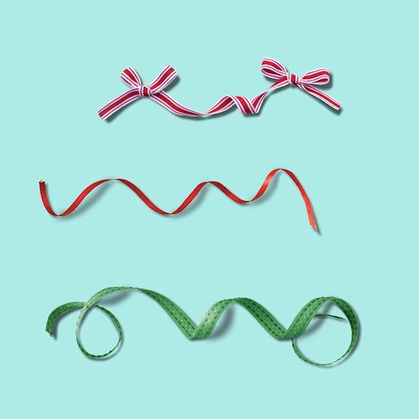
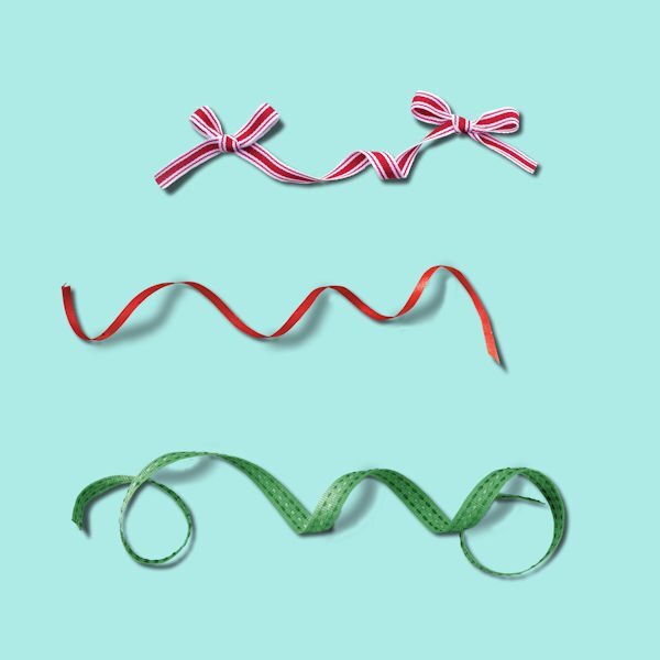
Lesson5 I've added the ribbons to a project but all three on my design are a bit much but show how versatile they can be.
3 points
-
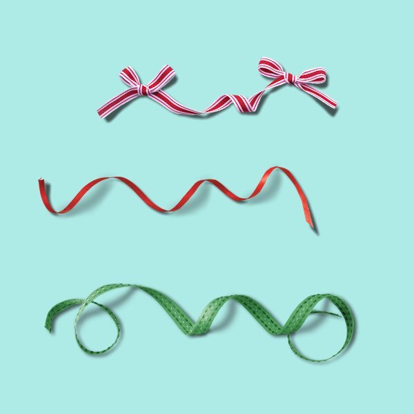
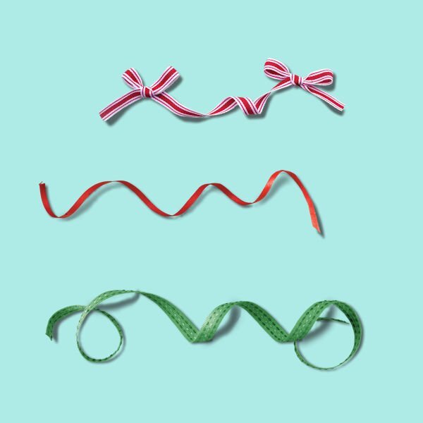
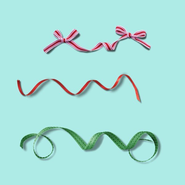
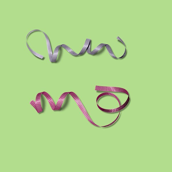
Oh...I don't like the curled ribbons LOL. Here are the three from the lesson plus an extra that I downloaded.
3 points
-
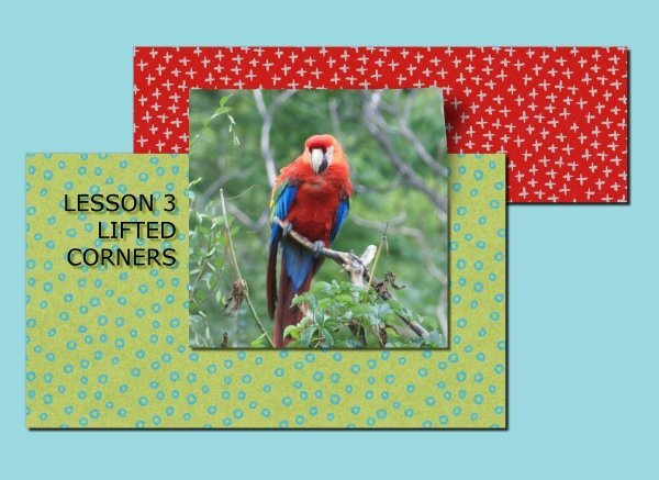
Lesson 3 I still have to practice a lot !3 points
-
Day 4 Need more practice 🙂3 points
-
Exactly! Just looking around my office I have shadows coming in from all directions. Some are harder than others. And they go all directions since some are from windows and others are from lights. One item on a wall actually has shadows on both the left side and right side. Window is to its left and a lamp is to its right. As one scrapper told me once shadowing is subjective and to develop a personal shadowing style. She also said that there isn't always one single light source... unless you are in a controlled environment (like a studio). Also coming from a paper scrapbooking background, there were differences in shadows when looking at the page depending on something as simple as how you are holding the page as well as what time of day or whether you are inside or outside which have different light sources. She uses PS to scrap and always starts with the same basic settings but tweaks them as she builds her layout. I always used to stick to the top left light source on my layouts but as I've progressed and learned from those I admire over the last 15 years, I've become more subjective about shadowing. Funny thing is, when I give the books to my cousin that I do for them, the layouts that get the most compliments are my more recent layouts where I've experimented with shadowing. That makes my heart happy. This workshop though has taught me some new tricks that I can use to further refine the shadows on my layouts. I used the warp trick today on a butterfly on a layout. It looks like it is flying!2 points
-
What a good idea, Rene! Very effective, too. And the advice to use an odd number of items. Excellent!2 points
-
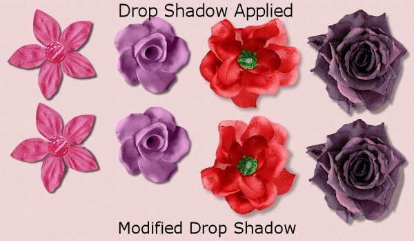
@Susan Ewart Your shadows on the flowers are pretty good. Is one shadow purple or is it an optical illusion? @Euka The flower shadows are good. For the lifted corners, be careful that the push is ALWAYS toward the bottom right even if it is a top corner. And yes, using the Warp brush needs a steady hand. I am grateful to have a graphic tablet as it is easier (for me) to control than a mouse. @Jen Brown Great start. All the shadows look like they are correct on Lesson 1. On Lesson 2, I think you might have moved the white square between the wavy element and its shadow. Do you see that? For your Lesson 3, the lifted shadow looks very good! @Michele you are doing great! Yes, more practice will make the process easier over time. @Marie-Claire Those lifted corners look very good. They are perfectly angled! The flowers are well shadowed too. Good job! @Rene Marker I agree that the Edit History is not very intuitive to use. And if you have several elements that were shadowed, you have no way to know which one was which either. Although you might not be happy with the curly ribbons' shadows, I think they are quite good! @Daniel Hess I don't blame you for hating curly ribbons! They are a nightmare. Yet, they are available in many kits and if they are used they NEED those scary shadows. A "regular" shadow would look even worse! The shadows on the top three ribbons are very good. For the fourth one, you might look at "curving" the ends of the hand-drawn shadows to meet the other pieces. But for the assignment, it is quite a good start. @fiona cookThat is nice to see the ribbons "in action". For the green ribbon, just like I mentioned above to Daniel, see if you could "curve" the ends of your hand-drawn sections to meet the other "flat" pieces. @Donna Sillia Preset shapes for those shadows would be impossible to use as you would never have the same size, thickness, height, or angle for each "loop". For the red ribbon, the shadow is pretty good, although it seems a little thick. For the green one, if you added more blur, it would look even better. @Corrie KinkelEven with a not-so-steady hand, your result is quite good! And no, a script would not be feasible as each loop would need to be custom, and remember: a script cannot SEE the image so it can't tell whether that loop is up or down. @Gerry LandrethI have to say that those shadows are quite good! I do find it easier with a tablet than with a mouse, but I am also more comfortable with it for everything. I know that curly ribbons are very hard to shadow correctly, but from what I see, you are all doing a good job. One important lesson I hope you will remember is that curly ribbons CANNOT have a regular flat shadow. That is the obvious mistake. So, if you choose to just not use those ribbons, that is fine too, but you also know what to do if you really like one of those ribbons and you want to use it. Of course, it is a matter of practice and only a handful of exercises might not be enough for you to feel comfortable yet, but it will come. Tomorrow, we will look at clusters. Don't be scared. We will go through the process one shadow at a time.2 points
-
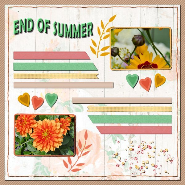
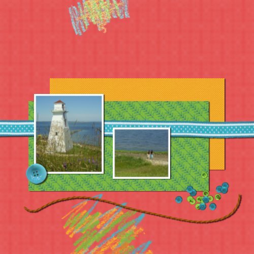
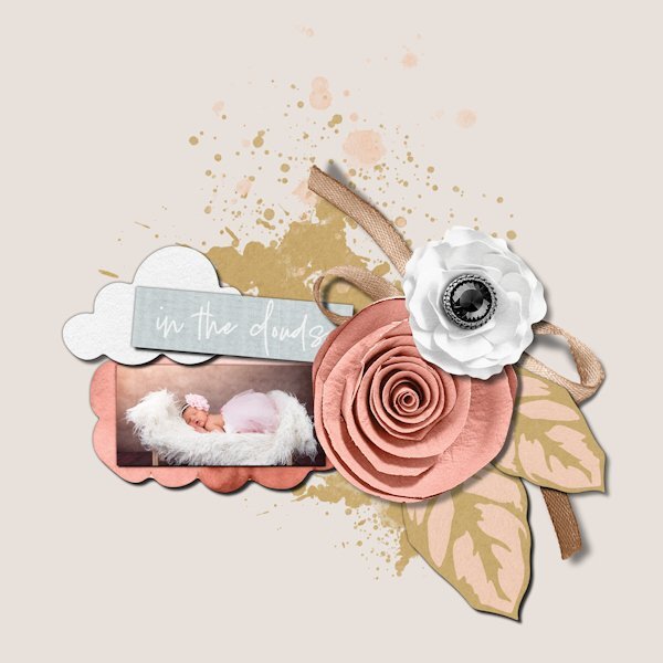
I have been working on this DIY for a couple of days between the Shadow Workshop lessons and some things at home that needed my attention. But in the end I got there. For me the "paper" stripes and the background called for a symmetric layout and I took my colors from the photos. The background papers and scatter are from a kit called Dandy dandelion from cpjess and for the title I used the Shaped Text script by Carole. It was a bit of a puzzle to get all the elements arranged in such a manner that I can live with.
2 points
-
Now there's a good idea. I tend to label the layers anyway but adding the values, brill!2 points
-
This is a good idea. Another way to find the settings that works only if you save the file as a pspimage... check the edit history in the image information. Yes, it is a little overwhelming to see all that stuff at first but once you know what you are looking for, it is easy. I just wish that the edit history had a search function! I prefer using that easier than the history palette.2 points
-
Thank you about the cluster! I've struggled for years to get them to look right. Jill, the gal that I got the shadow settings from said she never uses a warp on her shadows. Another scrapper that does fantastic clustering does (she uses PS). Both look great so I think it is a personal choice.2 points
-
They are logical to me and a good base to start with. Sometimes an adjustment is needed depending on the size of th element of course.2 points
-
Shadow Workshop Lesson 3 I need more practice on how to do lifted corners from the artistic point of view. The method of doing the lift is straight forward and easy to follow, it need practice to make the lifted corner look more realistic. It was a fun lesson to do.
2 points
-
Shadow Workshop Lesson 2
2 points
-
Shadow Workshop Lesson 1
2 points
-
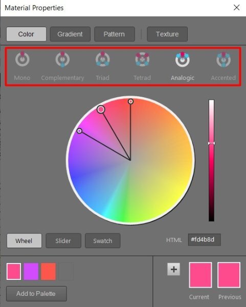
Thank you. I picked the colors from the photo of the duck. I know you often use that method. I also use the newer color palette which helps you choose appropriate colors.
2 points
-
I think I need a new mouse/mouse pad or maybe just steadier hands! I like how manipulating the shadow creates a more realistic effect - BUT - being able to move them to good effect is the tricky bit! @Susan Ewart We do have wombats but not many in my area - being nocturnal unfortunately we mainly see them as roadkill :(.
2 points
-
Learning scrapbooking is often done with practice, looking around for inspiration, and trying to recreate projects we admire. Sometimes, we can be inspired by finished projects, but sometimes, we also have to use our imagination to interpret something. This challenge will allow you to envision something from a “boring” base, and you will have to imagine the end result differently. The sketch is only a written idea, and you can fly with it, modify it, and customize it to fit your vision, your photos, and your supplies. And if you want more information on using sketches, check out this article. Post your project in the gallery.
1 point
-
For me this is logical and therefore not very complicated. No problems with unsteady hands here! I only had to keep my focus on the layers and found the trick in the video to hide the shadowed layers temporarily useful. I have no layered clusters in my stash so I made one just a simple one from elements I have. I find it easier to make a cluster when I'm working on a project and I'll will pay more attention to the shadowing on them if needed.
1 point
-
Day 6. I found interesting layered clusters at Digital Scrapbook. I deleted the shadow layers and started from scratch.
1 point
-
These are really nice! Maybe you had cross lighting, yet still from overhead, just angled and one light with more intensity than the other. I use it in photography. It depends on the light; hard light soft light, the size of the light source, light bouncing in either by ambient light or a reflector (scrim) and especially the distance of the light to the subject which will determine the light drop off (think of the inverse square law) and how hard and/or soft a shadow is. for example, in side lighting you can get a hard shadow and fill some of it in with a reflector and keep some of the hardness in an area with a flag or a black reflector (which of course doesn't reflect at all). Since I work with continuous lights and low shutter speed my stuff is very contaminated with ambient light bouncing all over. At least I'm practicing set ups for when one day my pipe dream comes true and I own studio strobes. So, really I guess we shouldn't sweat it cause somewhere a real life situation will look just like that and you'll be like hey, check that out, life imitating my layout!1 point
-
Yeah, I know that but once it is on a layout, it won't be as noticeable.1 point
-
I'll add the settings to the text of the layer. I can always edit it if I change them.
1 point
-
Lesson 4 I followed the lesson for the Tutorial layout and used the warp brush on the two as shown in the video, pretty much the same settings. the second one was harder, guessing how thick the flowers could be. I used the warp brush on the lower right one only as the other ones I thought would look weird if I did. Also I need to get more aggressive and pull the shadow down more. I like the warp brush though, almost more control it seems...well, sort of. Here are the settings I used (I tried a lot of different ones, sat back and looked and tried more until I thought it was okay) Practice layout settings: Top Left 50-50-45-85 Top right 40-40-40-55 Bottom Left: 35-35-35-65 (then still thought it was too dark and lowered the opacity) Bottom Right: 20-20-55-40 (this one I used the warp brush on. Wondering if I should have pushed in the petal, like Gerry might have done on his layout. His looks lifted and nice)
1 point
-
@Ann SeeberI think I need the script1 point
-
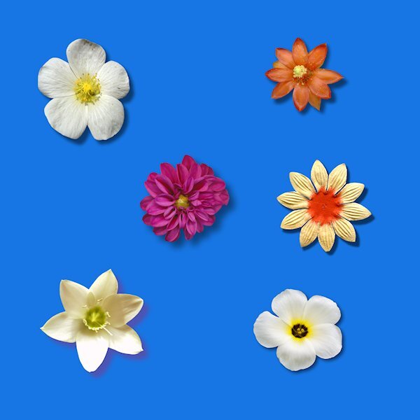
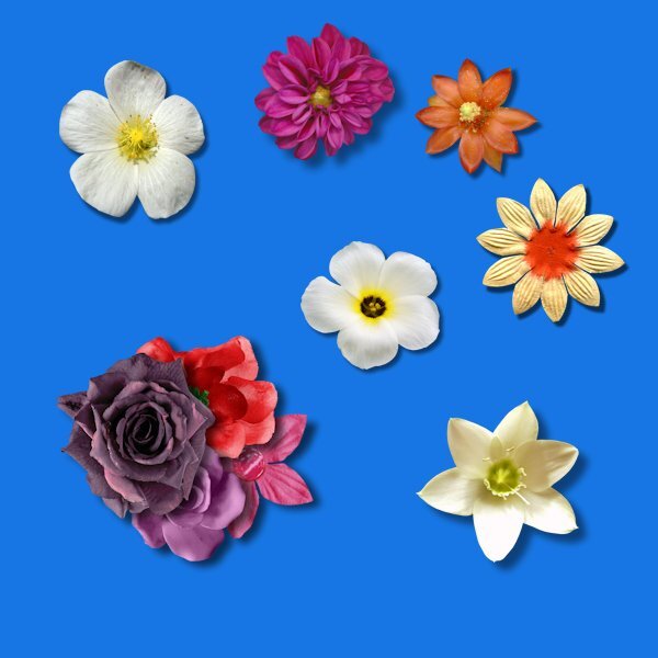
My day 4 "bonus" flowers:
1 point
-
I used settings very close to the video for the 6 flowers in the tutorial. For the extra 4 flowers, I used the settings shared with me by a creative team member of a popular store that uses PSP. She does a lot of flower/foliage clusters and I asked her how she shadowed them. She also does not use any warp on the shadows but you wouldn't know it because of her settings. She has a basic setting that she tweaks as she scraps each element. Her cluster (flower/foliage/etc) is 25-42-61-66. I started with this setting then tweaked if needed. I then positioned the 4 flowers into a cluster and used the warp brush on each of them. I used to use settings much like Carole's but was never satisfied with my clusters (and I like to cluster although not as elaborate as many creative team scrappers). Once I started using Jill's settings, I loved how my clusters looked. Clustering is not for everyone though. I'm just sharing what works for me and the way I scrap.
1 point
-
Day Three I could use some practice. 🤣1 point
-
OK, I gave it the "old college try".
1 point