Leaderboard
Popular Content
Showing content with the highest reputation on 05/29/2024 in all areas
-
6 points
-
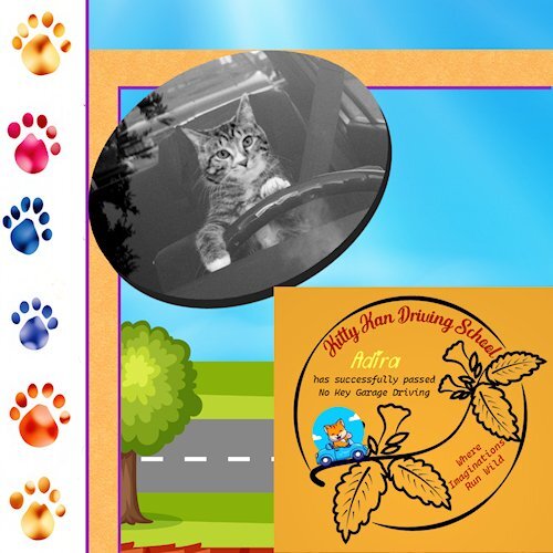
(I admit, I'm obsessed with my cat! I rescued her when she was just 1 lb. We've come a long way) My idea came after seeing her sitting in my car night after night -- the photo is NOT mine - but this cat looks just like Adira!! Amazingly, my car looks just like this car! I got a lot of images from Creative Fabrica and the background from Vecteezy (attribution to: <a href="https://www.vecteezy.com/free-vector/road-background">Road Background Vectors by Vecteezy</a>)5 points
-
5 points
-
My friend, Michelle, will soon be a grandmother! This layout features her daughter (Mother To Be) and son-in-law at their baby shower. Michelle teases her daughter about the baby's name (none has been selected as yet). Michelle calls her (the baby is a girl) Willow Poppy. The blanket near the center was crocheted by Willow Poppy's paternal grandmother. The stork is by Sheila Reid, Oh, Baby, Baby, Digital Scrapbooking,4 points
-
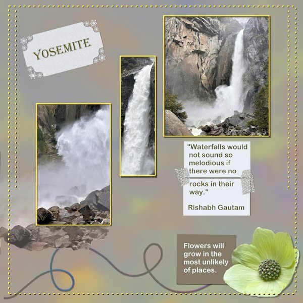
A bit late but I had so many other things to do first, like the card workshop and the photo album about my trip. Both are finished now, my album is at the print service and they estimate it will be ready on Saturday. I like the DIY challenges so I did this about the visit to Yosemite National Park. The waterfalls were spectacular because in Spring they carry a lot of water from the melting snow. The background is a full size photo of one of the falls with a heavy blur and the blendmode color, the paper underneath was a muted green. On the rectangle with the word Yosemite I used a holiday punch from Carole because when I was there we had snow as well as rain and sunshine. The 2 smaller rectangles are papers glued together with some washi tape by Marissa Lerin which I have in my stash. I gave the dots a color and a slight bevel.4 points
-
3 points
-
3 points
-
3 points
-
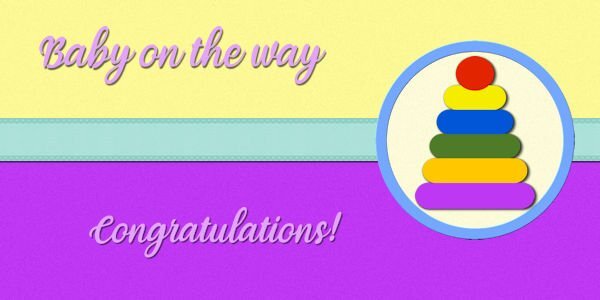
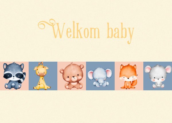
Made me laugh: the text on the baby card! (Card 5) That's a great line.3 points
-
3 points
-
3 points
-
3 points
-
3 points
-
Oh wow! Love the colours and the background fits fine with this card, on my lesson 3 card it didn't work out.3 points
-
I so agree with you, Dee. If I don't manage to get everything done, I can still complete the cards anyway.2 points
-
2 points
-
It makes you so angry but then you can hear of good neighbourly things that go on that restore your faith in human nature. Some of the refugees for example help in the communities giving back a little of what they have received. I greatly admire that.2 points
-
Ann, you always showcase incredible animals in your Wild Cat Calendar. Great work.2 points
-
2 points
-
Love the background (and the photos), and just everything about this layout.2 points
-
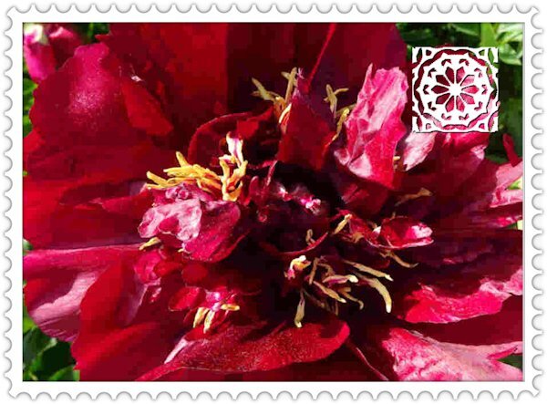
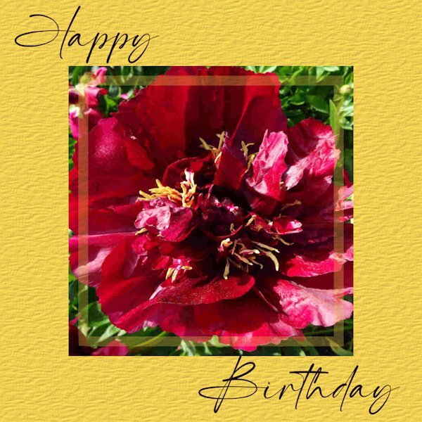
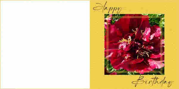
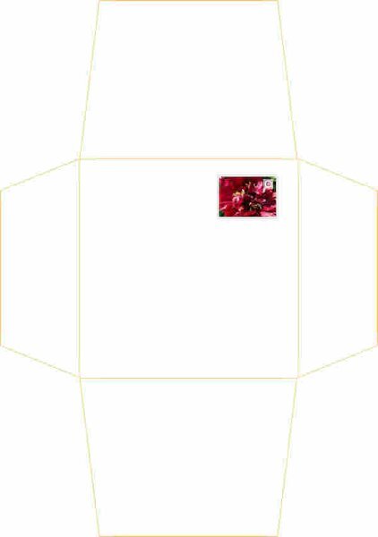
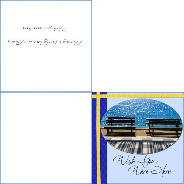
My print outs have come out at the right dimension so I thought I would do another version of a card with the matching envelope using the popular Scrapbook square format. This one is 11cm card but the max I can do with an envelope is 14.5cm square. This card will just have one fold. The peony photo is mine and the background has a 'Paper' effect (Effects/Texture/Paper. I have made a pretend postage stamp for the envelope. No royalty on this one but instead a Brush Tip 'FancyFlower' with a small inner bevel. The Selection border around had the perforations made with the Eraser tool, size:30, Steps 118. (note to self!)2 points
-
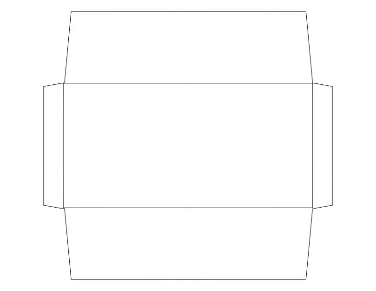
Here is my day 7 made with the Diamond template. I food items are from C F "Barbecue-Cookout-SVG-Clip-Art-69956312" The red white blue ribbon is cass-Bow16-Sample-Blue-White-Red-Ribbonfrom Cassel. The eyelet is from cass-Eyelet2-sample The font is Freestyle Script. The blue sky with cloud top paper if form a photo I took a couple of years ago. I had fun with this one, but can't say I had fun trying to do the envelope, but I finally got it done, hopefully right. I suspect I will never use either one though, but I at least wrote down the instructions on how to make one.2 points
-
Hi , here are my next 3 cards. card4 - gnomes from Creative Fabrica, font Magnolia Sky. card5 - kit tiny and mighty by Jen Yurko, font is Retro Love card6 - font is Starline, photo is mine card 4 card 5 card 62 points
-
2 points
-
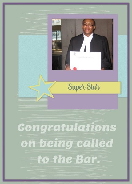
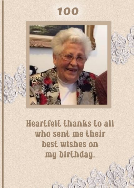
Lessons 6 (extra template) & 7 The grad pic is actually a former college student of mine who went on to law school and invited me to his call to the bar. The 100th birthday pic is a former teacher of mine who celebrated that milestone a couple of years ago and is still with us. She did get many greetings and cards for that occasion.2 points
-
2 points
-
2 points
-
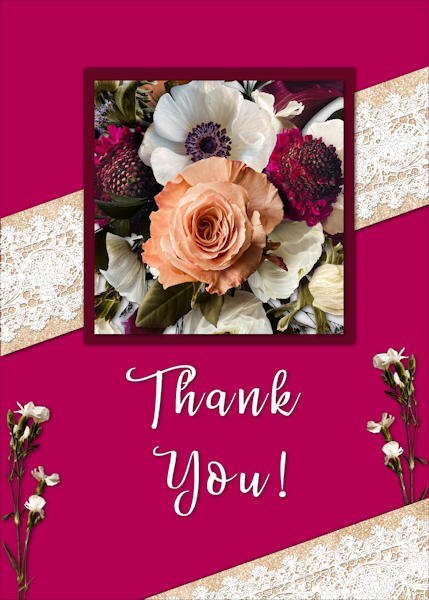
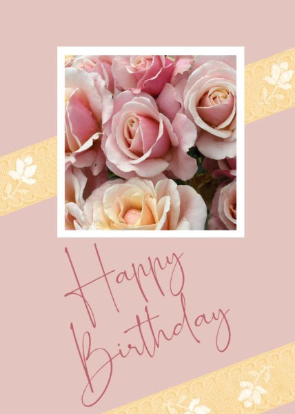
Card 7, at last. I wanted this card to be softer and more feminine than others I have completed. I chose a photograph I took many years ago of a rose bush, although just the roses, I wanted a bouquet-ish look. The ribbon comes from Melo Vrijhof of Digital Scrapbook. This was colourised to match the lemon coloured rose at the bottom of the photograph, using Adjust > Hue and Saturation > Hue Map, something I had never noticed before, thank you, Carole. The font I used is one of my favourites, Romantically Free for personal by maisfontes. I angled it to fit in line with the ribbon without having to reduce to too small a size, and, I think, it works on the angle. Jeni2 points
-
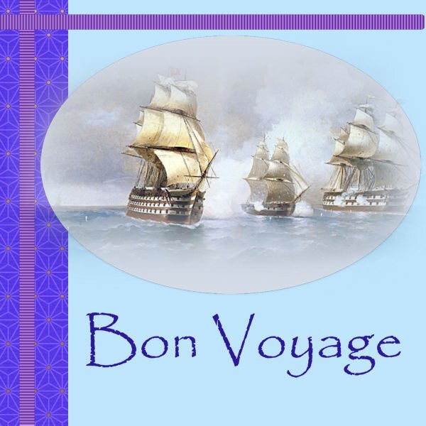
Card 6 at last. I found this beautiful tube of ships at sea and thought of all my ancestors who travelled to New Zealand from various ports around the world, so thought to wish them all Bon Voyage on their 2-3 month journeys. I used a font I have always loved, Papyrus. It has been around forever, and I love the beauty of this font. I added a light drop shadow to the ellipse of the image because it was a soft tube. Jeni2 points
-
2 points
-
2 points
-
2 points
-
2 points
-
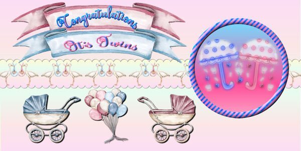
Day 5 - I'm running behind this week. All the images are from Creative Fabrica except for the umbrellas which I made a long time ago and which I made into watercolors using casswatercolor script. Font is called Better Spring Font from CF. The circle design was made from Day 2 stripes lesson. The umbrellas were actually made for a very good friend who had just had twin grandaughter and grandson.2 points
-
2 points
-
2 points
-
Card 6. Just catching up with yesterday's template. It's a bank holiday weekend in UK so juggling hobbies and weather! I may have a graduation card to do soon but didn't want to tempt fate by doing it too early. Instead I just made a holiday card. The Classic Materials Palette option that Carole suggested has worked for me and I find easier to tweak the colours than the swatches set up I had before. Thank you.2 points
-
I like your watermark effect for you the designer. I might nick that idea, especially for the folded cards.2 points
-
2 points
-
2 points
-
2 points
-
2 points
-
2 points
-
2 points
-
2 points
-
Lesson 5 This is one of my favorite quotes. Photo is from the web. I saw these ladies play around 2015. They were in their 80's then.2 points
-
2 points
-
It has been a busy week! I decided to go with an inspirational poster type card. Lesson 1 The photo is mine. Footprints and brad are from Digital Scrapbooking.2 points
-
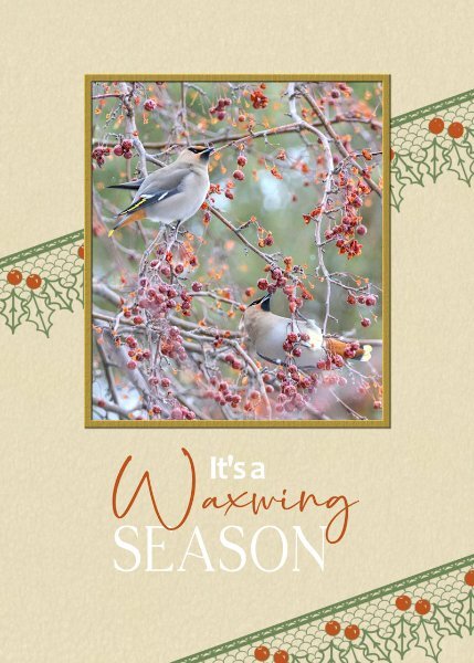
Even though I participated in the first greeting card challenge in 2022, it's always nice to have a refresher. Congratulations to all the participants, who submiited their pages, each every one is a masterpiece, to be proud of. The standard of creativity submitted is exemplary, even from the newbies. Not only that we are an inspiration to each other. Day 7. I kept it very simple. I used a lace brush. Colourised the berries red. I decided not to use a shadow on it. Using it as a stamp. I often use, well not often but always use a bird photo when I create cards for my birding friends. Same goes for my friends that have a passion as I do for insects. The surprise on the inside page for those that receicved invitations to festivals.2 points
-
2 points


Resized.thumb.jpg.d25811db03a63358cedab1e79f527635.jpg)


