Leaderboard
Popular Content
Showing content with the highest reputation on 05/26/2024 in all areas
-
here is card 3, using Black Sheep Collabkit by SweetShopDesigners font is Magnolia Sky16 points
-
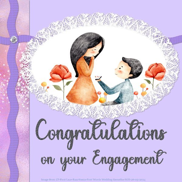
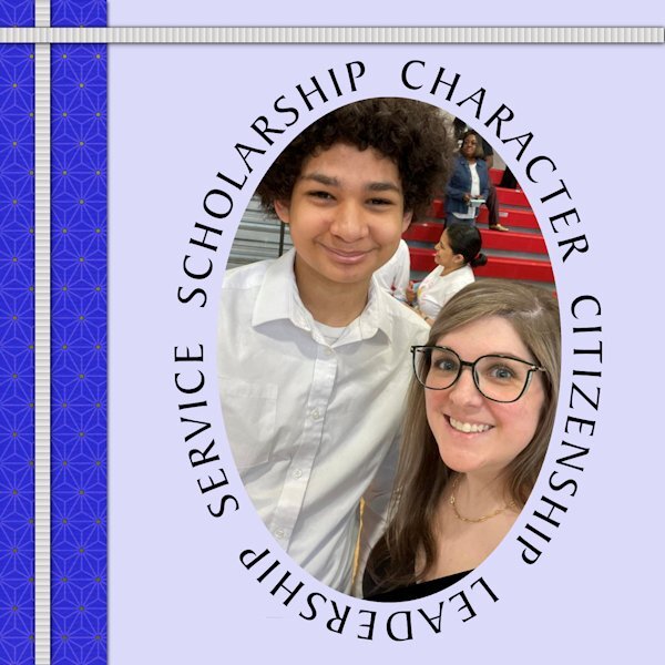
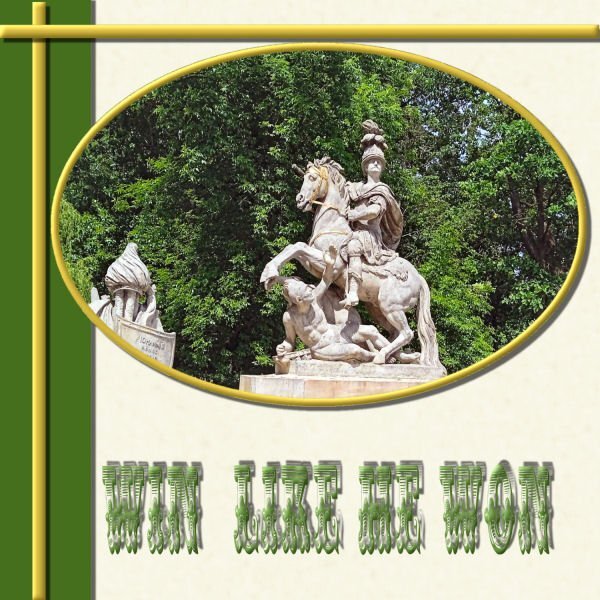
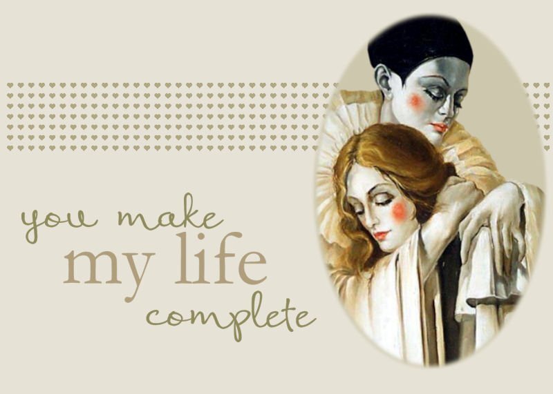
Number 6. Took a while to get going but came up with this one. I made a vector shape from the oval and used the Vector tube script by SS to make the frilly edge using a font called Ruritania. I duplicated and mirrored one to make it look a bit fuller. Another image from CF. I made a ric rac ribbon to see if I could and I did. The wording font is called Wedding Samantha from CF. I used the Primus plugin from Flamming Pear on the font. TFL13 points
-
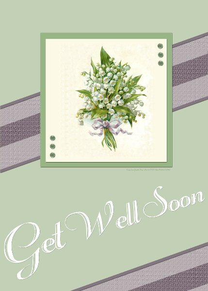
Hi all together , I am very late with my cards, but now I have Card 1 and 2 ready card 1 - My mom 2009 taking pictures of all kinds of flowers and greeneries during a Mothers Day walk card 2 flowers from Creative Fabrica and font is Helena Script, I made no shadows, the frame and squares have a tiny innerbevel13 points
-
12 points
-
11 points
-
11 points
-
11 points
-
11 points
-
10 points
-
10 points
-
10 points
-
9 points
-
9 points
-
9 points
-
9 points
-
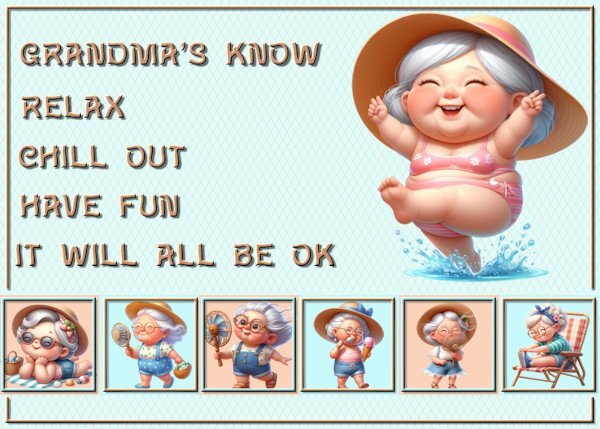
Lesson 5 This is one of my favorite quotes. Photo is from the web. I saw these ladies play around 2015. They were in their 80's then.9 points
-
9 points
-
9 points
-
It has been a busy week! I decided to go with an inspirational poster type card. Lesson 1 The photo is mine. Footprints and brad are from Digital Scrapbooking.9 points
-
9 points
-
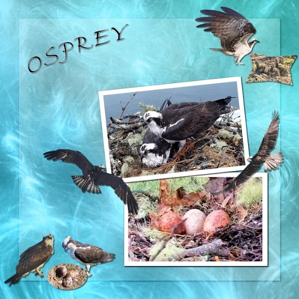
Mt day 6 card. The background is a paper from (Beautiful-Intense-Iridescent-Gradients-18728752) the font is Fine Hand. All the elements are ones I have created over the years from screenshot from an Osprey nest I have been watching for a long time. I went with this background because I thought it looked a little like water and Osprey eat only fish for the most part.9 points
-
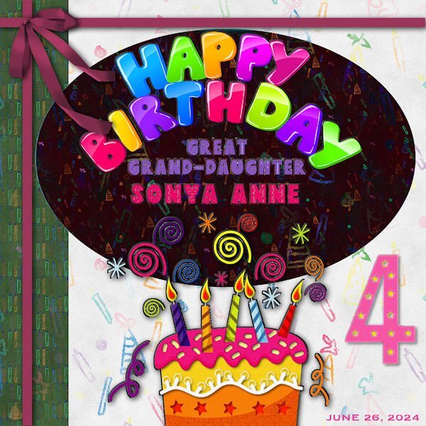
LESSON SIX - A birthday card for my step-great grand Sonya Ann, for June 26. She and Magic are both 4 in June. Her grandmother is my step-daughter, Beth, and her mother is my step- granddaughter, Alycia. I've been playing with this all day and now forget all the steps I took. Chalk it up to my senior moment! 😜 The font for the names is Dingo Nursery. I had fun with all the colors! The Happy Birthday is clipart as is the cake and numeral 4. I used a cass-floppy bow and applied the blinds texture effect to the ribbons.9 points
-
9 points
-
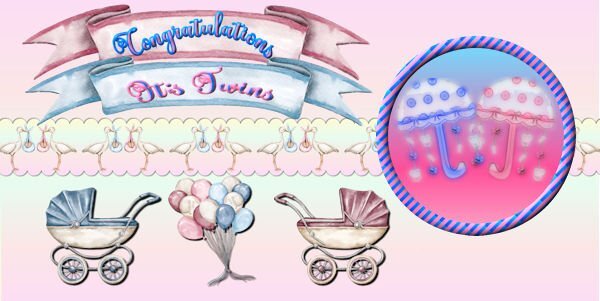
Day 5 - I'm running behind this week. All the images are from Creative Fabrica except for the umbrellas which I made a long time ago and which I made into watercolors using casswatercolor script. Font is called Better Spring Font from CF. The circle design was made from Day 2 stripes lesson. The umbrellas were actually made for a very good friend who had just had twin grandaughter and grandson.8 points
-
8 points
-
8 points
-
I'm more outside these days, not much at the computer, but here are some of my projects............Day 1 If I would use them as actual cards, I would use my cutting machine's print& cut function, Font is Fiolex girls, this font I also used for the birth announcement card for my grandaughter 2 years ago.8 points
-
8 points
-
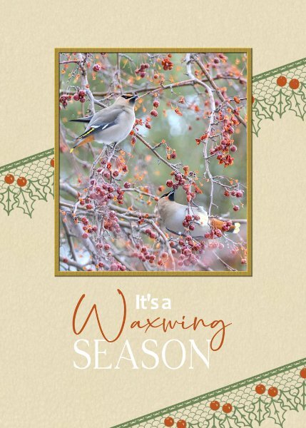
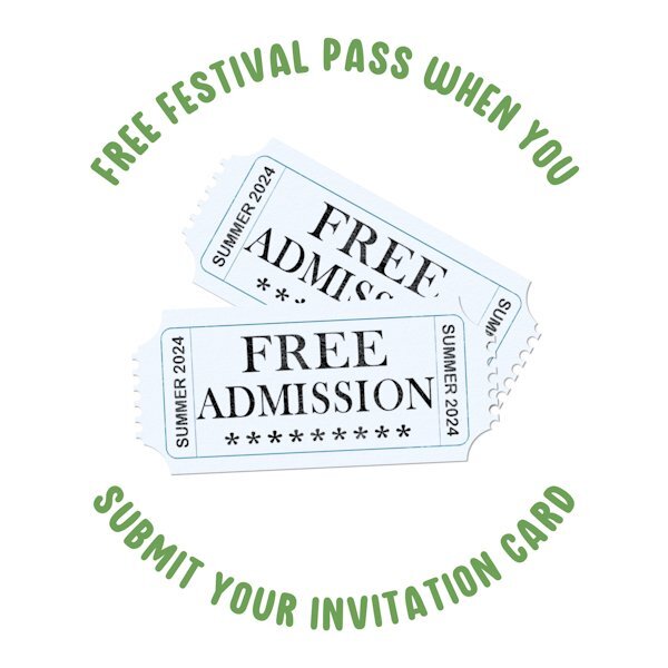
Even though I participated in the first greeting card challenge in 2022, it's always nice to have a refresher. Congratulations to all the participants, who submiited their pages, each every one is a masterpiece, to be proud of. The standard of creativity submitted is exemplary, even from the newbies. Not only that we are an inspiration to each other. Day 7. I kept it very simple. I used a lace brush. Colourised the berries red. I decided not to use a shadow on it. Using it as a stamp. I often use, well not often but always use a bird photo when I create cards for my birding friends. Same goes for my friends that have a passion as I do for insects. The surprise on the inside page for those that receicved invitations to festivals.8 points
-
8 points
-
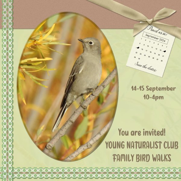
I had to rotate the whole layout, in order to accommodate the photo that I wanted to use. Used cass custom calendar, which I edited to suit my needs. Used the hue map, which I use a lot anyway, to change the colours on the ribbon. Taking a colour from the photo I then used that colour in the bow 3 script. For the background paper I used the photo as an overlay. Townsend's Solitaire. Birds migrating for warmer climes, as winter sets in here. (Autumn)8 points
-
7 points
-
I'm up to Day 3. The butterflies are from the August 2022 ALFLT blog train and the font is Melinda Script.7 points
-
7 points
-
7 points
-
6 points
-
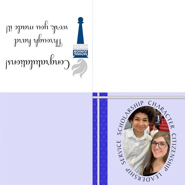
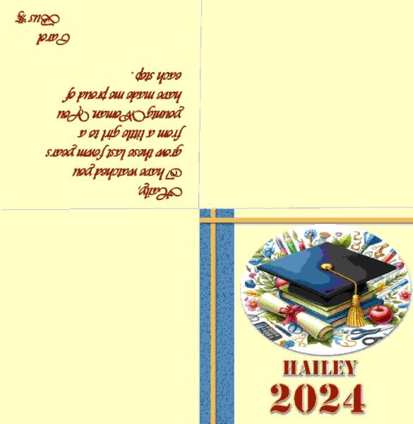
Card 6. Just catching up with yesterday's template. It's a bank holiday weekend in UK so juggling hobbies and weather! I may have a graduation card to do soon but didn't want to tempt fate by doing it too early. Instead I just made a holiday card. The Classic Materials Palette option that Carole suggested has worked for me and I find easier to tweak the colours than the swatches set up I had before. Thank you.6 points
-
I love what you did with the font around the image, it's quite ingenious. It would pass for delicate lace.6 points
-
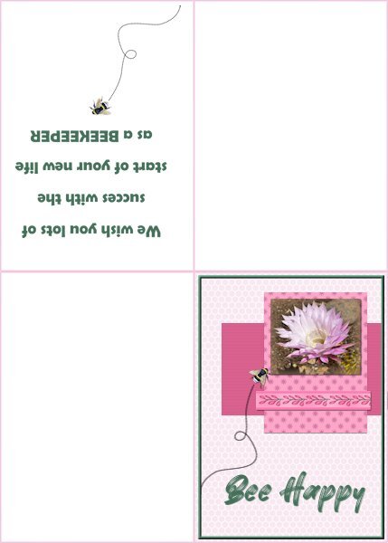
Card6-Extra For this card I followed the tutorial to make a folded card with a text printed inside. Although the card isn't square for me that isn't a problem because my printer and so do I, use European A-4 paper which is better suited for rectangle layouts. I used a photo of an Echinopsis flower and the ribbon is from Chanthalia Desig. The backgroundpaper has an overlay of a honeycomb that I made some time ago. The other papers are colored and one has a little flower again from CD as a pattern, the other a blinds texture. The font is Better Brush and on the inside Berlin sans. The flying bee comes from my stash,6 points
-
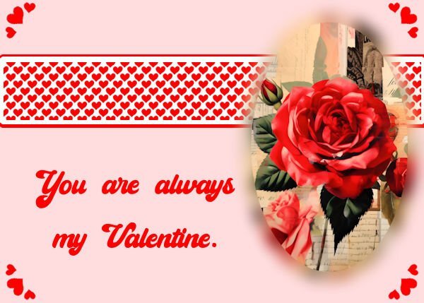
Day 4 The Rose is from Creative Fabrica, Paris Valentine Collage Art Tumbler Wrap Graphic by CraftArt · Creative Fabrica. This was free today (May 25, 2024). The font used is Cheers. It may be this link ... I am unsure where I got it from, but I found this link today Cheers Font - Dafont Free. I did do a selection around the Ellipse from the template to do a cutout of the rose. It had blank space at top and bottom, so I took a small part and stretched it, at top and bottom. Then I decreased the selection by a percentage, inverted the selection and used Gaussian blur on just the outside of the rose part.6 points
-
I decided to follow the video closely; I need to refresh my techniques. I love how it came out. The balloons are from my stash. The main font is Amsterdam from CF and the font is Billy Signature from FDR (Free Design Resources).6 points
-
5 points
-
5 points
-
Hello, I just got to card #2 today. It was a difficult birth. In the future I will always have to work with the card/templates in PSP in forum size. The program kept freezing on me. That's why I made them almost exactly as specified. In my opinion it is well suited for a young birthday child. The star overlay is from DS MarisaL "scifi paper 07-template", the fonts are Sweet Dream and Elegance.5 points
-
5 points
-
5 points
-
4 points
-
Thanks Sue. Another group I used to belong to a long time ago now had a tut on how to make a lace strip using this lovely font and that oval was just begging me to put something frilly on it. A single layer was a bit skimpy so I duplicated and mirrored it to fluff it up a bit.4 points
-
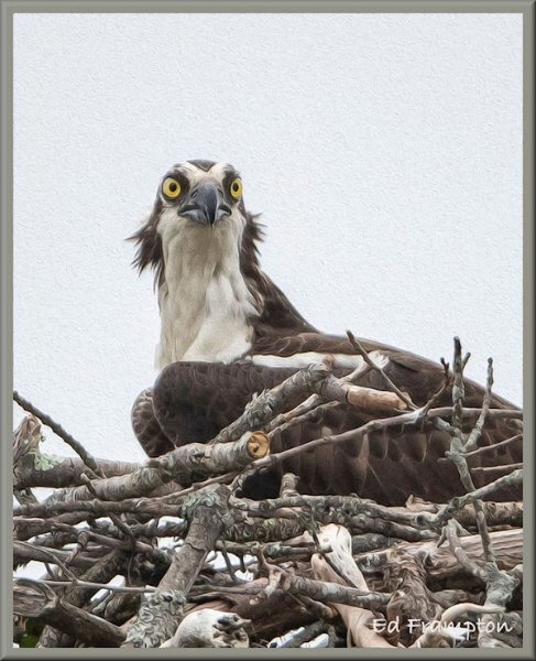
All bird photos taken face on, as you put it look goofy. I tend not to use face on shots, as many look very angry, which doesn't do them any justice.4 points
-
4 points

Resized.thumb.jpg.d25811db03a63358cedab1e79f527635.jpg)
